10,000 search results
(0.034 seconds)
- Paradise Point by Swell Type,
$20.00 Surf's up! Take an unforgettable adventure to the sparkling shores of Paradise Point. Ride our 25 majestic weights, from tranquil tall & thin to thunderous wide & heavy. Expand your horizons with the versatile Variable font to select any spot between. One-of-a-kind activities: Drop in a thrilling Inline weight for stylistic flair. Overlay with the matching Heavy for striking color effects. Discover hidden wonders! Stylistic Alternates will take you to the scenic heights of uppercase in a friendly lowercase style. Or immerse your text in interlocking Discretionary Ligatures for an authentic Tiki Type island experience. Enchanting views: Two versions of each letter and number automatically rotate for a natural, hand-drawn appearance. The Light weights have round ends to simulate a single pen stroke, which matches the center of the Inline weights for a perfect pairing. Explore! If you venture into unknown territory, each weight of Paradise Point contains 775 glyphs for stress-free support of over 200 languages. An all-inclusive getaway: Each weight of Paradise Point includes the features above, and can set readable body text as well as create striking logos and headlines. Use it for restaurant menus, surf and skate brands, or any design project where you want to convey lively, friendly, stress-free fun.
 - Amanah Script by Alifinart Studio,
$15.00 Amanah Script is a handwritten font with a casual and modern calligraphy style. This font offers a large number of Stylistic Alternates, as well as beginning and ending swashes. This font has a total of 1660 glyphs, including capital letters, lowercase, numeral and punctuation, multilingual accents, swashes, and includes a large number of stylistic alternates and heart swashes (for lowercase letters). Amanah Script can be used for wedding card designs, invitation, best for photographer, traveling, blogging watermark or craft. Key Features: - Multilingual Accents - Stylistic Alternates up to 15 choices - Has a heart connected feature - Activate Stylistic Alternate by simply adding "period" (.) and “number” (1-15) to each lowercase letter. - Has ligature features so that the letters connect well together - Has OpenType and PUA Encodes feature. As I mentioned earlier, Amanah Script has a large number of Stylistic Alternates features, up to 15 options for lowercase letters. Interestingly, you can activate all Stylistic Alternates that are owned by each letter, just by typing; letter + period + number. For example: a.1 a.2 a.3 or b.1 b.2 b.3 and so on. As for activating the heart connected for each lowercase letters is quite easy, just by typing; letter + underscore + underscore + underscore + letter. For example: a___a or b___b and so on. If there are things you want to ask, don't hesitate to contact my email. Alifinart Studio alifinart@gmail.com Thank you.
 - URW Geometric by URW Type Foundry,
$35.99 URW Geometric® is a sans serif typeface inspired by the German geometric typefaces of the 1920s but designed for modern usability. The character shapes have optimized proportions and an improved balance, the x-height is increased, ascenders and descenders are decreased. Special glyphs, which are often designed afterwards for the original geometric typefaces from the 1920s, are perfectly integrated in the URW Geometric® . These design characteristics increase the usability and legibility tremendously. With its 10 weights ranging from Thin to Black, plus 10 additional oblique styles, it has a great versatility in mind. The extreme light styles shine bright in large sizes, the middle weights are perfect for body copy and the bolder variants for the use of emphasis information or bring a strong impact to headlines and information. The optically balanced styles are designed to work in perfect harmony together. URW Geometric® is functional, strong, simple and harmonized in form, and at a glance appears as a modern variant of its predecessors. Apart from the basic characters the design has an extra focus on the special glyphs. These are designed for todays needs. For example: the email glyph looks modern and unique, including a perfectly balanced spacing. The numero sign, in modern use called “hashtag”, is space saving and optically balanced for body text. Additionally, various extra and alternate glyphs are designed to provide a friendly usability. Including a wide Latin language support and character sets, URW Geometric® is perfectly designed for today’s requirements. Please have a look at the URW Geometric® Type Specimen (PDF) for further information.
 - Space Armada by Wing's Art Studio,
$10.00 Space Armada - A Science-Fiction Font for Out of this World Designs! Space Armada is inspired by a 1980s interpretation of the future, referencing blockbuster sci-fi action movies of the period, along with the emerging video-game consoles and home computer technologies. It's nine unique fonts are designed to work together in a variety of ways, so you can layer it's different styles on top of each other to retro-futuristic effect!* Here's an example of how it works: Start by placing the Regular font on top of the Bold for a simple base outline. Add contrasting gradients to both fonts for an instant metallic or chrome effect. Take it a step further with one of the readymade Outlines for an embossed look. Overlay the Wireframe font for a glimpse inside the machine! This looks particularly good when you apply a glow effect and reduce it's opacity so the other layers show through. That's just one way to use it. Check out my visuals for more usage ideas! You can also follow my short tutorial! Space Armada is an all-caps font with unique uppercase and lowercase characters, along with a range of alternatives for experimentation with different looks. It also includes punctuation, numerals and language support, plus a selection of underlines and symbols. It's a highly customisable font, perfect for retro designs such as movie titles, posters, games, book covers and more! Every care has been taken to ensure that all fonts align perfectly when layering. Due to the variations in how different software handles text tracking, some minor tweaking may be required for pixel perfect alignment.
 - Sixty - 100% free

- ResPublica - Unknown license

- GothicIlluminate - Unknown license

- Poquito by La Boîte Graphique,
$15.00 Hand-printed caps font ideal for your graphic project.
 - Jungle by Yuanchen Jiang,
$30.00 A wild yet elegant typeface designed for screen display.
 - Ale's Script by Oporto Design,
$9.90 Ale's Script was designed for comics and fun writing.
 - Zebron by Fontron,
$35.00A bold, decorative, striped font for display and headlines. - Wiki by Typotheticals,
$4.00 A Rough Script Face useful for scrapbooking and labelling.
 - Snip Tuck by BA Graphics,
$45.00A well balanced distinctive look; great for all applications. - Reon Sans by Fatchair,
$9.95 A humanist sans serif ideal for advertising and design.
 - Angry Ronin by Artcity,
$16.00 Font designed for lettering dialogue baloons in comic books.
 - Rancho Grande by BA Graphics,
$45.00A well balanced distinctive look; great for all applications. - ADD by Sea Types,
$20.00 A minimalist typography for short texts and individual words.
 - Bernhard Tango by Bitstream,
$29.99An elegant and disciplined script popular for fifty years. - Buddy Lotion by PizzaDude.dk,
$15.00A grafitti and comic like font trapped inside boxes! - Key West by BA Graphics,
$45.00A sans serif casual gothic. Works for many applications. - GirderSuper by Wooden Type Fonts,
$15.00 A heavy slab serif font very useful for display.
 - Hello Arson by Dismantle Destroy,
$19.00 This font is great for CD covers and posters.
 - Antique 7 by Wooden Type Fonts,
$15.00 An Egyptian unbracketed heavy serif font, largely for display.
 - Triron by Fontron,
$35.00A bold, decorative, striped font for display and headlines. - Glossy by Volcano Type,
$19.00Glossy, a font for starlets designed by Sandra Hofacker. - Nuptial by Bitstream,
$29.99An informal script designed at Intertype for wedding invitations. - DNA by Emboss,
$9.95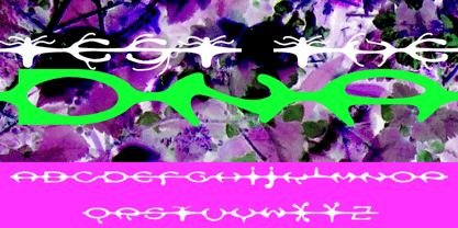 A custom design for the internet typeface design project.
 - Droporado 4F by 4th february,
$30.00 Funny font for decorating posters, logos and small headings.
 - Afarkeset MF by Masterfont,
$59.00 Highly elegant font family for all your creative needs.
 - Fatality by Artcity,
$9.00 Font designed for lettering dialogue baloons in comic books.
 - Maslul MF by Masterfont,
$59.00 Super clear and bright font for headlines and logos.
 - Sheli MF by Masterfont,
$59.00 A rough childish stroked font - ideal for children's books.
 - Anel by La Boîte Graphique,
$15.00 A hand made font ideal for your graphic project.
 - FS Conrad by Fontsmith,
$50.00 Art into type In 2008, Fontsmith were approached by their friend, Jon Scott, to investigate whether a typeface could assume the aesthetic of one artist’s body of work. Jon’s not-for-profit charity, Measure, was organising an event for the artist, Conrad Shawcross, whose giant mechanical installation, entitled Chord, was going on public display in the long-disused Kingsway tram tunnel in Holborn. Chord explores the way we perceive time, as either a line or a cycle. Two enormous machines with dozens of rotating arms and moving in opposite directions, weave rope with almost infinite slowness. An unusual brief Phil Garnham visited Conrad in his Hackney studio to get a feel for his work and ideas. “Conrad is a very clever and philosophical guy. He struggled to see how typeface design had any relevance to him and his art. This was going to be a challenge.” The artist presented the type designer with a pile of rope and a huge diagram of sketches and mathematical workings. “This was, in essence, my brief.” Phil developed three concepts, the simplest of which ticked all the boxes. “The idea of the strokes in the letterforms appearing and ending at peaks or points of origin fitted perfectly with Conrad’s idea of time occurring and ending at two ends of the sculpture.” Two versions Phil planned modules for two versions of the typeface: one with five lines in the letterforms and one with seven. He then drew the modules on-screen and twisted and turned them to build the machine that is FS Conrad. “This is not a simple headline typeface,” says Phil. “It’s not a rigid structure. It has varying character widths, and it’s informed by real typographic insight and proportions so that it actually works as piece of functioning, harmonious type.”
 - Cooper Nouveau by House Industries,
$33.00 Few fonts reach cult status. Despite its ubiquity—and perhaps because of its lack of subtlety—for a hundred years Cooper continues to draw the faithful. It’s even come to define an entire typographic genre and recently starred in its own documentary. Cooper Nouveau is Dave West’s imaginative contribution to the Cooper oeuvre. Drawn in 1966, Nouveau refreshes Oswald Cooper’s original italic with an energetic pitch, simplified contours, and a plump friendly figure. Uniform strokes and generous curves push the font’s playful personality and springy silhouette even further. A selection of swashed characters and ligatures offers options for lively logos and strong captions. While Cooper Nouveau looks laid-back and easy-going, it’s more than capable of pulling it’s own typographic weight. Put it to work where relaxed needs to project confident. Set Nouveau large for eye-magnet posters, packaging, and advertisements. Maximize its youthful energy for kids’ themes, craft action, and apparel bounce. Or set it alongside a master like Benguiat Buffalo or Chalet to show how Cooper Nouveau can communicate on paper and screens with an inherent ability to speak the language of style in many tongues. But like any cult icon: beware! Cooper has a way of setting the needle, and Nouveau just may become your go-to design fix. FEATURES ALTERNATES: Cooper Nouveau contains several alternate characters, which add flair to your designs and can help solve spacing issues LIGATURES: Many letter combinations in Cooper Nouveau form a ligature to solve spacing issues and produce more pleasing designs. COOPER NOUVEAU CREDITS Typeface Design: Dave West Digitization: Dave Foster Typeface Direction: Ben Kiel, with Ken Barber Like all good subversives, House Industries hides in plain sight while amplifying the look, feel and style of the world’s most interesting brands, products and people. Based in Delaware, visually influencing the world.
 - Digital Counter 7 - Personal use only

- Unity Dances - Personal use only

- Gypsy Tarot-Major Arcana - Unknown license

- Shelter Me - Personal use only

- Clink Outlined - Personal use only


