10,000 search results
(0.035 seconds)
- Half Full NF by Nick's Fonts,
$10.00This cheerful charmer is based on Glass-Antiqua, designed by Franz Paul Glass for the Genzsch & Heyse foundry of Hamburg in 1912. Great for engaging headlines with a playful twist. Both versions feature the complete Latin 1252, Central European 1250 and Turskish 1254 character sets, with localization for Lithuanian, Moldovan and Romanian. - Concordia by RMU,
$30.00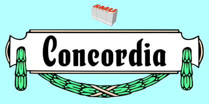 In 1915 the Leipzig based foundry Heinrich Hoffmeister released the bold condensed version of its Sensation font family which is the most outstanding. The letters f, l and the long s have stylistic alternatives. To get access to all ligatures it is recommended to activate both OT features Standard and Discretionary Ligatures.
 - Phillia by Sarid Ezra,
$15.00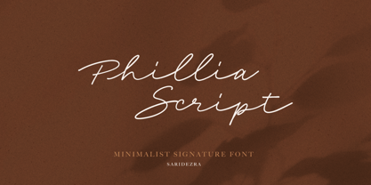 Phillia is minimal and essential signature script that you can use for any purpose such as your own customized signature, logo design, even quotes. You also can use this font for pairing to another font like sans and script. For additional purpose, this font also contains contextual alternates that you can activated from opentype features in Adobe . This font is also support multi language.
 - Gibbs by Typetanic Fonts,
$39.00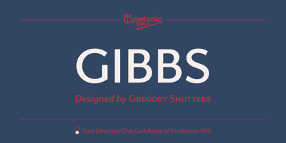 Gibbs is a tough, sophisticated sans, inspired by the unique cast aluminum signs found on board the 1950s luxury liner SS United States and named for its designer, William Francis Gibbs. The design is appropriately transatlantic, somewhere in between industrial American vernacular lettering and English humanist styles. The result is both uniquely stylish and comfortably readable in both text and display sizes. Gibbs received a Type Directors Club award for excellence in 2015.
 - Postmodern Moderne by Jeff Levine,
$29.00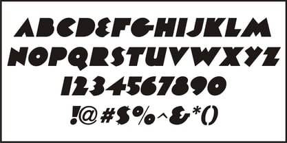 First published in 1938, Letters and Lettering by Paul Carlyle and Guy Loring was a textbook on lettering examples and how to do them. On one of the pages was found a solid black (counterless) Art Deco sans serif design that in its many variations so typified the era. The example shown in that book served as the model for Postmodern Moderne JNL, which is available in both regular and oblique versions.
 - Linotype Chineze by Linotype,
$29.99The German designer Peter Huschka created Linotype Chineze, a family of typefaces that resemble the calligraphic strokes found in Chinese characters, in 2002. Using a variety of brush-like elements, Linotype Chinese imbues the Roman alphabet with an Eastern flair. Try out this font in a menu, a comic book, or on food packaging! Like this foreign feeling? Check out Sinah and Sinah Sans, two other Eastern-inspired font families from Huschka." - P49 by dn.type,
$25.00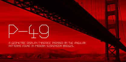 P—49 is a geometric, unicase sans-serif typeface inspired by the angular patterns found in modern suspension bridges. Each letter is constructed on a grid made up of 90° and 45° angles, drawn from the steel trusses supporting the imposing vertical towers of suspension bridges. Every letter, number and punctuation mark strictly follows the grid creating a uniform, contemporary industrial feel to the typeface making it ideal for display use in large point sizes.
 - VVDS London Oatmeal by Vintage Voyage Design Supply,
$15.00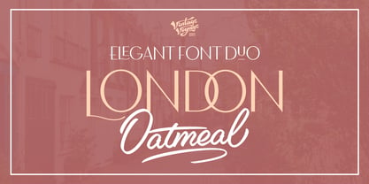 London Oatmeal - a new stylish font duo, an elegant modern art-deco inspired sans with a lot of ligatures with retro look stylish brush script. It's nice font pair for use it in blogs, posters, magazines, logo’s or greeting/wedding cards. The sans has caps lowercase, so you can combine them in many ways. More than 100 OpenType features as Alternates, Swashes and Ligatures.
 - Krafika by Sarid Ezra,
$17.00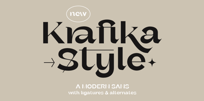 Introducing, Krafika - a modern sans with ligatures and alternates! Krafika is a modern sans with a bunch of ligatures and alternates that will make your poster, cover or logo even more stunning and stand out! You can use this font as a stand alone font for any project such as logo, headline or branding. Also comes with the right arrow and star! This fonts support Multi Language.
 - Downey by Sarid Ezra,
$17.00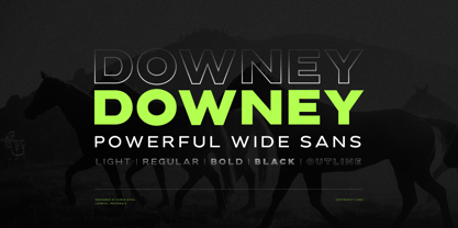 Introducing, a casual and powerful wide sans, Downey Font Family! Downey is a casual and essential all caps sans. With slightly wide form and strong look, this font will suitable for your any project and designs. You can use it for a tittle, logo, quotes, or become a pairing with any font. This font also contain the outline version each weight. This font also support multi language!
 - Meroche by MlkWsn,
$15.00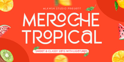 Introducing - Meroche Sweet and Classsy Sans Display Family Meroche Sans Family consists of 4 weight : Thin, regular, medium and bold equipped with 20+ ligatures and alternative letters that look sweet and classy and are very good for your work such as logos, branding, packaging, posters, invitations, insta stories and your advertising needs. If there is anything you need to ask, you can contact me at mlkwsn999@gmail.com
 - Wasp by NaumType,
$29.00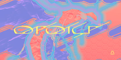 Wasp is a super-display typeface, which in a few words can be described as well-structured calligraphic humanist sans. It's come to life as an idea to make calligraphy-oriented sans but consciously avoid any horizontal middle strokes. Wasp has a few alternates for each letter, which (despite its unruly nature) allows for finding a good-looking solution in almost any typographic situation.
 - Hello Jones by Typefactory,
$14.00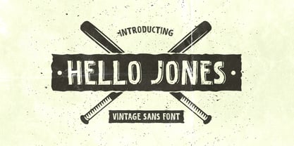 Hello Jones is a unique Vintage Sans font. It can easily be matched to an incredibly large set of projects, so add it to your creative ideas and notice how it makes them stand out!
 - Aptifer Slab by Linotype,
$39.00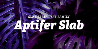 Aptifer Sans and Aptifer Slab are two 21st century typeface families created by Mårten Thavenius. Each family has seven weights, in roman and italic respectively, making 28 font styles in total. A heritage from two design traditions can be seen in Aptifer. One is the robust American gothic typefaces, like M. F. Benton’s, from around 1900. This is combined with the openness and legibility that comes from the humanist tradition. The sans serif part of the family, Aptifer Sans, is designed without excessive details disturbing the reading. Its sibling Aptifer Slab with its wedge slab serifs is more eye-catching but still suited for text settings. The italics fit well into the text flow of the roman. They are a bit narrower than the roman and have cursive characteristics. Both Aptifer Sans and Aptifer Slab are highly legible typefaces and can be used both in print and on screen. Featured in: Best Fonts for PowerPoints
 - Silverline by Fenotype,
$18.00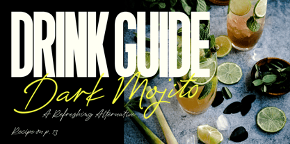 Silverline Script & Sans Silverline Script is a hand drawn signature style script. Silverline is fast and expressive -it’s great for contemporary branding and advertising. Silverline Script is equipped with Contextual Alternates and Standard Ligatures that keep the script eloquent and connections smooth. Contextual Alternates and Standard Ligatures are automatically on. In addition Silverline Script has Swash Alternates for A-Z and a-z that can be used for extra flair. From Discretionary Ligatures you’ll find specially designed ligatures for “and”, “for”, “the”, “at” and “in”. Silverline Script is PUA encoded so you can access extra glyphs in any graphic design software. Another half of the Silverline family is Silverline Sans -a three weight ultra-condensed sans serif that works great with the Script. Silverline Sans is great for making sturdy text word blocks - a great type for any display use from magazine covers to packaging. Try combining Silverline Script with Silver Script -they make a nice contrast together.
 - Norden Display by Asgeir Pedersen,
$19.99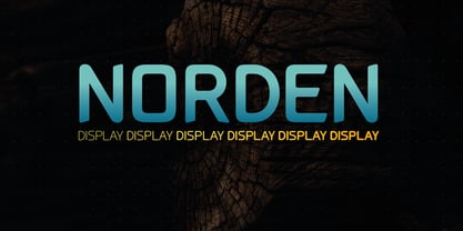 The name Norden means “the Nordic”, as in the geographical area or its countries. Inspired by the simplicity of Nordic and Scandinavian design, the Norden fonts give you clarity of expression, beyond the usual geometric look and feel of traditional sans-serifs. Open and spacious, the shapes of the glyphs play both with and against each other. Round and soft versus square and solid, a basic curve versus a straight line, creating a detached yet distinct style of expression, from the light-as-air Hairline to dark and Bold. The Display variant has diagonal as well as slightly rounded ends, similar to the Standard version but with and edge, so to say. As its name suggests, this font is intended for use in headlines and/or for small chunks of text at medium and large sizes. Norden comes in three variants: Standard, Round and Display.
 - Deca Serif by ParaType,
$30.00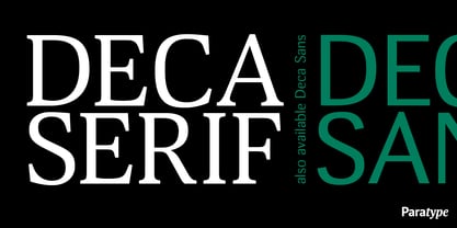 Super family Deca consists of ten fonts. Six sans serif styles form the Deca Sans family and four styles of serif family named Deca Serif . These are low contrast fonts of pure design with ovals bent to rectangular shapes. They are nicely readable in small sizes and can be recommended for scientific, legal, official and business documents. Serif and sans serif fonts were designed in comparable proportions, they are balanced by color and have similar details in basic shapes. These features provide high compatibility and assume collective usage of the fonts in documents.
 - MVB Chanson d'Amour by MVB,
$39.00An old book found at a Paris bouquiniste contained samples of the typeface “Caractère de finance,” a bâtarde design by 18th century typefounder Pierre Simon Fournier. Rather than revive the type, Kanna Aoki decided to reinvent it, using a felt pen to achieve a rustic, handwritten quality, departing from the 18th century model as she saw fit. MVB Chanson d'Amour conveys a soulful elegance that stops short of the ostentatious, overwrought found in many formal scripts. It is lovely and sweet, but never saccharine. - Remontoire by MAC Rhino Fonts,
$36.00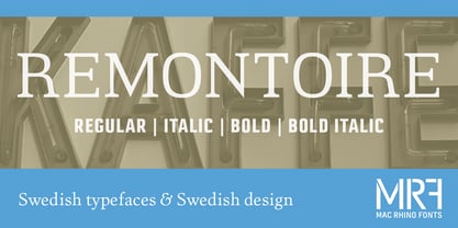 The original sketches who formed the base for Remontoire is known as one of the first typefaces drawn by Karl-Erik Forsberg . It was a result of a competition set up by various typographic organizations in the early 1930. The typeface was never completed and sketches are only to be found on paper. Made only as a single font but some the character can later on be found in other of examples of his work; Carolus and Ericus. MRF developed and expanded the family into 5 weights.
 - Promotional Copy JNL by Jeff Levine,
$29.00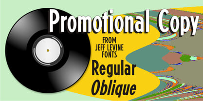 The typeface which inspired Promotional Copy JNL can be found on hundreds of 45 rpm records from the 50s through the 80s, as well as in headlines from articles found in one of the music industry’s leading publications throughout their older issues – it was a favorite and a workhorse. Now’s your chance to create a facsimile of the record label you always wanted to have with your garage band… or at the very least, utilize this font for some clean and crisp text or headline projects.
 - Anselm Serif by Storm Type Foundry,
$63.00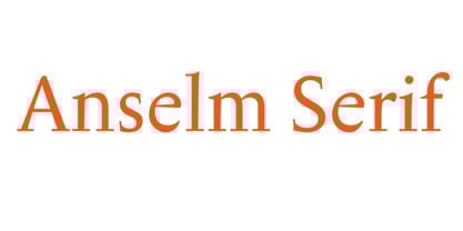 One of the good practices of today’s type foundries is that they release their type families as systems including both serif and sans serif type. Usually, the sources of inspiration need to be well tried with time and practice, since production of a type family is such a laborious and complex process. From the beginning, it needs to be clear that the result will be suited for universal use. Such systems, complete with the broad, multi-lingual variations permitted by the OpenType format, have become the elementary, default instrument of visual communication. Non-Latin scripts are useful for a wide scope of academic publications, for packaging and corporate systems alike. And what about outdoor advertisement designated for markets in developing countries? Cyrillics and Greek have become an integral part of our OpenType font systems. Maybe you noticed that the sans serif cuts have richer variety of the light – black scale. This is due to the fact that sans serif families tend to be less susceptible to deformities in form, and thus they are able to retain their original character throughout the full range of weights. On the other hand, the nature of serifed, contrasted cuts does not permit such extremes without sacrificing their characteristic features. Both weights were drawn by hand, only the Medium cut has been interpolated. Anselm Ten is a unique family of four cuts, slightly strengthened and adjusted for the setting in sizes around 10 pt and smaller, as its name indicates. The ancestry of Anselm goes back to Jannon , a slightly modified Old Style Roman. I drew Serapion back in 1997, so its spirit is youthful, a bit frisky, and it is charmed by romantic, playful details. Anselm succeeds it after ten years of evolution, it is a sober, reliable laborer, immune to all eccentricities. The most significant difference between Sebastian/Serapion and Anselm is the raised x-height of lowercase, which makes it ideal for applications in extensive texts. Our goal was to create an all-round type family, equally suitable for poetry, magazines, books, posters, and information systems.
 - Rancho Quito by Fat Hamster,
$25.00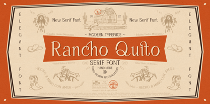 Rancho Quito - Modern and elegant font in warm southwestern style Rancho Quito is a unique & stylish typeface inspired by southwestern & Mexican culture. Desert, country, old west vibes. Sleek and classy ligatures will add a special spirit to your fantastic projects. You can use Rancho Quito font for logo & branding, label & packaging design, heading, magazine and book covers, invitations and postcards, wedding stationery and pretty quotes.
 - Achone by Jadatype,
$15.00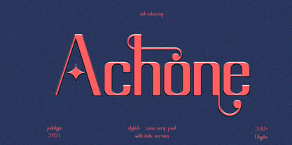 Achone is a sans serif font with a stylish alternative. Achone is able to show a serious impression, and can also be elegant. Achone has regular & italic versions. contains standard English letters and some letters that support multilingualism. Achone can be installed easily on applications such as the adobe family, affinity, or similar applications.
 - Brolink by Sarid Ezra,
$13.00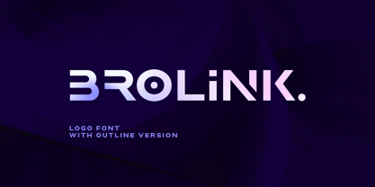 Brolink is a wide bold sans based font with unique lowercase that will make your design looks sci-fi and modern. You can use this font for any purpose, especially to make logotype. You can mix and match the uppercase and lowercase to make your logo more readable. This font also comes with outline style!
 - Normies by Gassstype,
$25.00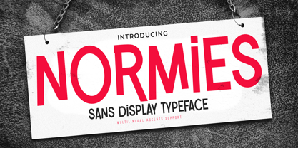 Introducing NORMIES It's Sans Display Typeface is a Textured Natural Style and Authentic Classy Style, this font is great for your creative projects such as watermark on photography, You can activate 9 Alternate glyphs OpenType panel.
 - Deuglas by Sealoung,
$10.00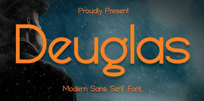 Deuglas is a minimal and neat sans serif font. It can easily be matched to an incredibly large set of projects, so add it to your creative ideas and notice how it makes them stand out!
 - Skeina by MJType,
$25.00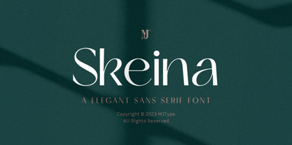 Skeina is an elegant sans serif font that fuses contemporary flair with classic undertones. Designed to offer versatility and sophistication, this typeface can adapt to a multitude of projects, bringing clarity and style wherever it’s applied.
 - Frisky Bug by Bogstav,
$16.00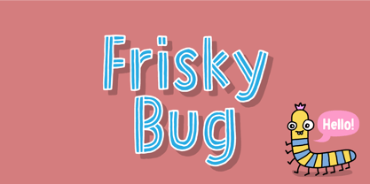 Say hello to my multi-layered handmade sans font - not as frisky as the name, but frisky enough for most designs that needs that extra twist! Mix the 3 layers as you wish for great results!
 - Geotrica by Rockboys Studio,
$15.00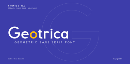 Geotrica is a minimal and neat sans serif font. It can easily be matched to an incredibly large set of projects, so add it to your creative ideas and notice how it makes them stand out!
 - Cheristone by Rockboys Studio,
$23.00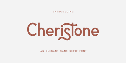 Christine is a minimal and neat sans serif font. It can easily be matched to an incredibly large set of projects, so add it to your creative ideas and notice how it makes them stand out!
 - Murisa Mariana by Murisa Studio,
$10.00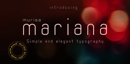 Mariana is a minimal and neat sans serif font. It can easily be matched to an incredibly large set of projects, so add it to your creative ideas and notice how it makes them stand out!
 - Alveru by Sakha Design,
$12.00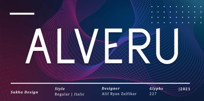 Alveru is a minimal and neat sans serif font. It can easily be matched to an incredibly large set of projects, so add it to your creative ideas and notice how it makes them stand out!
 - Susanna by K-Type,
$20.00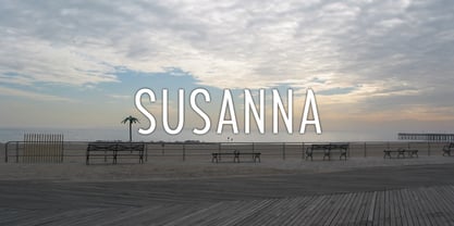 A light sans serif designed for Susanna Lakner’s 22 Days mail art project. The characters were drawn on each of 22 evenings throughout November 2004. In December the drawings were scanned to create the Susanna font.
 - Melatea by San Studio,
$9.99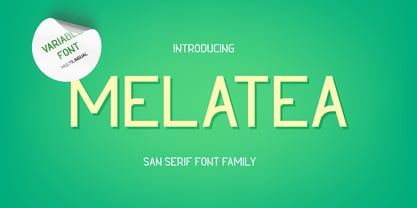 Melatea is a minimal and neat sans serif font. It can easily be matched to an incredibly large set of projects, so add it to your creative ideas and notice how it makes them stand out!
 - Brough by OtterType,
$19.00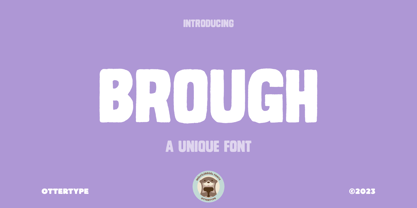 Brough is a carefully crafted bold sans serif font. You can use it for a variety of design projects like posters, business cards, invitations, games, covers, social media posts, quote photos, branding, editorials, and much more.
 - Conmersa by AEN Creative Studio,
$16.00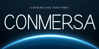 Conmersa is a minimal and neat sans serif font. It can easily be matched to an incredibly large set of projects, so add it to your creative ideas and notice how it makes them stand out!
 - Dolphinero by Murisa Studio,
$10.00 Dolphinero is a modern and adaptable sans serif font. It can easily be matched to an incredibly large set of projects, so add it to your creative ideas and notice how it makes them stand out!
 - Ernest & Emily by Nicky Laatz,
$15.00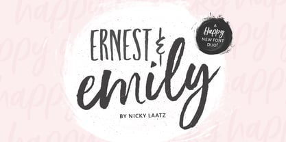 I’d like to introduce you to Ernest and Emily :) ....The happiest font duo you'll ever meet :) They are completely in love with each other, and always get along like a house fire :) Ernest and Emily consist of two lovingly handwritten fonts. A brushed quirky-casual script, and a playful all-caps sans-serif font. Perfect for Type-based creations, branding, websites, merchandise, packaging, quotes, invites, greetings and so much more! All they need is a blank canvas, and they work their magic for you! The brush script comes in 3 variants - Regular, Slanted and Upright- each with its own twist to fit the look you need. Four sweet little heart glyphs can be found by typing the characters { } and [ ] individually. Well now that I've introduced you, I'll let you get properly acquainted! :)
 - Art Gothic HiH by HiH,
$10.00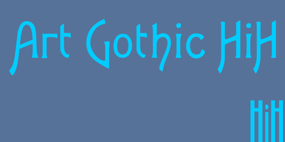 Art Gothic was attributed to the Central Type Foundry of St. Louis, Missouri, USA by Henry Lewis Bullen, writing in INLAND PRINTER in 1907, with a reproduction shown in Kelly’s American Wood Type. The typeface appears on the cover of an issue of “The Superior Printer” pictured in Typology by Heller and Fili dated in the 1870s. Art Gothic was designed in 1884 by Gustav Schroeder and proved to be one of the more popular and enduring of the American-designed Victorian display faces of the period, appearing frequently in ads in various publications. The Hamilton Mfg. Co showed a very similar wood type, No. 232, with a modified and rather heavy-handed upper case in 1892. As late as 1897, it may be found in the advertising section of The Ivy of Trinity College of Hartford, Connecticut and was included in the Norwood Press 1902 Specimen Book. Our font includes a complement of five upper case and four lower case alternatives as follows: 123=C, 125=E, 135=H, 137=S, 172=c, 175=e, 215=m and 247=s. Great for period pieces. ART GOTHIC HIH is clean, readable, and surprisingly modern-looking; unlike so many overly complex Victorian display fonts, it can be used in text sizes.
 - Fellbaum Grotesk by Vintage Type Company,
$15.00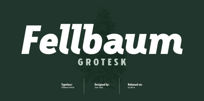 Fellbaum Grotesk is a condensed typeface with both grotesque and cursive/humanist attributes. Fellbaum Grotesk Regular presents a clean, “grotesk” exterior, while the Italic version features faint slab-style flourishes. These characteristics, combined with a subtle stroke contrast and slightly extended x-height make for a distinct, and artisanal appearance. The family was inspired by the condensed & sterile, yet quirky, sans serifs found on a lot of vintage apothecary labels & municipal street signage. Both styles in the family are modest enough to work as secondary fonts, but also sport enough character to work as a primary sans face for wordmarks, logos, headers, etc. Fellbaum Grotesk Features: • 14 Fonts, 7 Weights, 2 Styles • OpenType Support • Adobe CE Language Support • Dingbats