10,000 search results
(0.112 seconds)
- Pristine Light by Gerald Gallo,
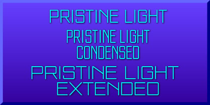
$20.00Some words from the foundry: The Pristine Light fonts are clean and crisp, sans serif, uppercase only. They were designed specifically for those applications where uppercase text is appropriate, such as display, headline, logotype, branding, and similar applications. There are numbers, punctuation, accented characters, symbols, and miscellaneous characters. For convenience the uppercase alphabet is repeated under their respective lowercase keys. - Turista Gorda NF by Nick's Fonts,
$10.00Here’s another offering from the Baltimore Type Foundry, originally called Airport Tourist, which was obviously influenced by Paul Renner’s Futura Display, designed in 1932 for Bauersche Gießerei. This version features tight sidebearings and aggressive kerning, so your headlines will pack a punch. This font contains the complete Latin language character set (Unicode 1252) plus support for Central European (Unicode 1250) languages as well. - Display Board JNL by Jeff Levine,
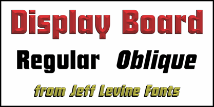
$29.00Display Board JNL is based on Futura Display, which was designed in 1932 by Paul Renner as an extension of his original (1927) Futura family of typefaces. According to Wikipedia, the font was developed as a typeface by the Bauer Type Foundry, in competition with Ludwig & Mayer's seminal Erbar typeface of 1926 Display Board JNL is available in both regular and oblique versions. - Idle Fancy NF by Nick's Fonts,
$10.00This elegant yet playful offering is based on the typeface Domino designed by Alfred Riedel for the German foundry Ludwig & Mayer in 1954. Its large x-height and subtly sinuous curves make it a natural choice for headlines which are both warm and compelling. Both versions of the font include 1252 Latin, 1250 CE (with localization for Romanian and Moldovan). - P22 Cigno by IHOF,
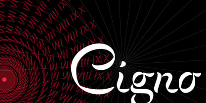
$24.95P22 Cigno is a new digitization of the 1950s Italian typeface by Aldo Novarese for the Nebiolo foundry. This semi-formal script has a definite mid-century European flavor suitable for menus, invitations and poster work. Along with the accurate rendition of the regular weight, designer Colin Kahn has added a lighter companion font for another variation on Cigno. Both fonts feature a full Western European character set. - Enge Journal Antiqua by RMU,
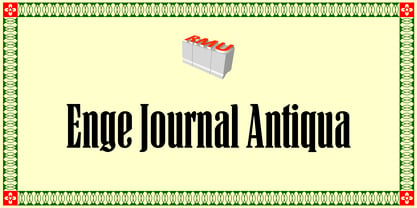
$30.00Hermann Zehnpfundt’s Enge Journal Antiqua, released by the Emil Gursch Foundry, Berlin, in 1910, revived and redesigned. This font contains also a long s, which can be reached by typing option + b, or turning the round s into the long one by using the OT feature historical forms. It is recommended to also use the OT feature discretionary ligatures to get access to all ligatures in this font. - Wilhelm Klingspor Gotisch by Linotype,
$40.99Wilhelm Klingspor Gotisch appeared in 1925 with the Klingspor font foundry in Offenbach, Germany. Designer Rudolf Koch based his work on the Gothic forms of the 14th century and his broken letter font is often seen in advertisements. However, the ornamental letters do not match today’s legibility standards and Wilhelm Klingspor Gotisch is therefore recommended for use in headlines and short texts with a point size of 12 or larger. - Classification JNL by Jeff Levine,
$29.00Sometimes it's easy to find a name to fit a font design, other times it's a struggle because of the sheer number of digital fonts available and the number of names already taken. Classification JNL stretches a point to arrive at its name. The attractive sans design was found as a hand-lettered title on a piece of vintage sheet music called "My Hawaiian Souvenirs". During the 1940s, the popular mode of travel to other countries was by steamship. Steamship passengers were assigned their accommodations by the type of passage they booked (such as First Class and Tourist), thus they were in various levels of classification. This aside, Classification JNL is a nice alternative to "standard" condensed fonts for design projects. - Cooper Black by Linotype,
$40.99Oswald Bruce Cooper designed Cooper Black, an extra bold roman face, based on the forms of his earlier typeface Cooper Old Style, which appeared with Barnhart Brothers & Spindler Type Founders in Chicago. Copper Black was produced by Barnhart in 1922 and acquired in 1924 by the Schriftguß AG in Dresden, where it was later completed with a matching italic. Although Cooper Black appeared in the first third of the 20th century, it still looks contemporary and it can be found on storefronts in almost any city scene. The flowing outer contours create forms that are both strong and soft, making Cooper Black an extremely flexible font. - Droeming - Personal use only
- Dirty Flamingo - Unknown license
- New Cicle - Unknown license
- el Diablo - Unknown license
- Arcade by Solotype,
$19.95A neat face with pronounced spur serifs which several foundries have already digitized. We like ours better though, because we have drawn a lowercase which was lacking in the original. Barnhart Bros. & Spindler of Chicago introduced this type in 1888. - Crestwood by Ascender,
$29.99Crestwood is an updated version of an elegant semi-formal script typeface originally released by the Ludlow Type Foundry in 1937. Crestwood is best used at larger sizes, and is wonderful for invitations and greeting cards. Character Set: Latin-1 - Europa Text by Solotype,
$19.95This circa 1910 European face was introduced into the United States by a German type foundry traveling salesman during the great depression of the 1930s. We have used it quite successfuly in sizes as small as 10 and 12 point. - Westmore by Solotype,
$19.95Based on one of the earliest Tuscans, from Thorowgood's foundry. The original was very poorly rendered in 1822, but keep in mind that decorative types were still quite new in the early 1800s. We redrew it, but kept it recognizable. - Bandstand by Solotype,
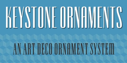
$19.95Our notes say this was originated at the Barnhart Bros. & Spindler foundry in Chicago, and named Cable. Perhaps so, but we didn't find it in any of our BB&S catalogs. We made a few changes to improve the color. - LTC Keystone Ornaments by Lanston Type Co.,
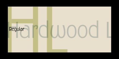
$24.95 - Hardwood LP by LetterPerfect,
$39.00 - Bushwhacked NF by Nick's Fonts,
$10.00Central Type Foundry of St. Louis issued this quirky little gem under the name of Quaint Roman around the turn of the twentieth century. This version is a little less gnarly than the original, but retains all of its eccentric charm. - Black Grotesk by ParaType,
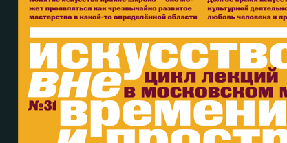
$30.00 - Huntsman by Solotype,
$19.95Issued from the Haddon Foundry in England. Most of their original faces had names beginning with H, like their own name. Some of their types were designed by Phil May, but we cannot guarantee that this is one of them. - Troyer AR by ARTypes,
$30.00The Troyer AR ornaments are based on the first series of ornaments designed for American Type Founders by Johannes Troyer (1902-69). They were cast in 36 and 48 point in 1953 by ATF who said that they ‘mark a distinct and refreshing departure from the motif of earlier ornaments, and add a crisp touch to your finer printing’. Kenneth Day, in The Typography of Press Advertisement (1956), found them 'clean-cut and bright and clearly showing their calligraphic origins . . . useful for single decorative touches'. - LTC Camelot by Lanston Type Co.,
$24.95Camelot was the first of over 100 typefaces designed by Frederic Goudy. The upper case characters were drawn in 1896 for the Dickinson Type Foundry. Goudy was so encouraged by his check for $10 (double what he asked for the drawings), that he spent the next 50 years designing type. The lower case was added by the Dickinson foundry. This Lanston digital release includes a Text version based on the smaller point sizes of the metal type and a Display version based on the larger sizes. The two appear different in size but share the exact same line weight when at the same point size. - Spinwash by Hanoded,
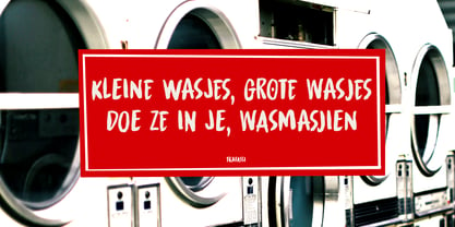
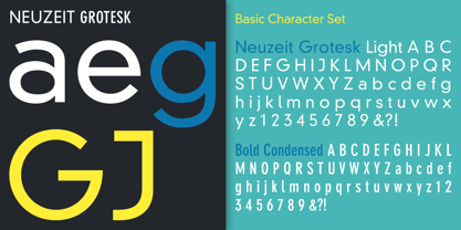
$15.00 - DIN Neuzeit Grotesk by Linotype,
$40.99The German Standards Committee suggested the light Neuzeit-Grotesk’ font in 1970 for use in official signage, traffic directional systems, etc. The typeface had been designed by Wilhelm Pischner and appeared with the font foundry D. Stempel in 1928. The font Neuzeit Grotesk was once the standard in the print industry, as a timeless typeface with no real distinguishing features. Like other typefaces of the 1920s, DIN Neuzeit Grotesk reflects the philosophy of the times, Form is Function.’ - Cat Finger by TypoGraphicDesign,
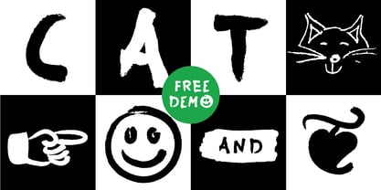
$9.00The typeface Cat Finger is designed from 2021 for the font foundry Typo Graphic Design by Manuel Viergutz × Carmen Thiemer. The display font based on the human hand. Started analog with acrylic paint, a finger and a white paper. After scanning, a digital brush was created. With the help of a touch tablet, this brush was used as a writing tool. One font-stlye written with the left hand (left) and one with the right hand (right). - Brothers of Metal - Unknown license
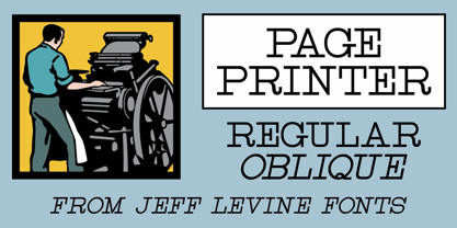
- Page Printer JNL by Jeff Levine,
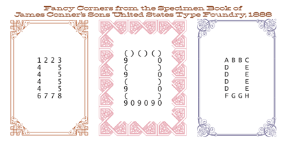
$29.00 - Conners Corners NF by Nick's Fonts,
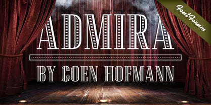
$10.00 - Admira by FontForum,
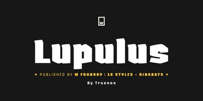
$19.99 - Lupulus by W Type Foundry,
$25.00Lupulus is a typeface inspired by the works of german expressionist artist and type designer Rudolf Koch. Drawing inspiration from types such as Neuland and Kabel for some of its features, it possesses a gothic and contemporary essence. Its constant rhythm; strict, solemn, yet boldly exuberant keeps it clean and functional. Its expressiveness allows for a wide range of uses: short texts, headlines, posters and branding, for which it is exceptionally well-suited. Lupulus consists of 17 fonts: 8 weights, 8 italic variables and one free ornamental variable. Featuring alternate characters, it is a comprehensive and versatile set built to suit your design needs. It comes fully equipped with Opentype for any and all technical requirements. Learn about upcoming releases, work in progress and get to know us better! On Instagram W Type Foundry On facebook W Type Foundry wtypefoundry.com - Kappa by W Type Foundry,
$25.00Kappa is a modern sans serif with humanistic and geometric features. Its structure is slightly narrow to fit in a greater range of platforms (moreover if you print it, you may save a lot of paper), and its height is higher allowing a great legibility in small sizes. This family is composed with the display version and the text version providing a broad spectrum of solutions, making this family easier and friendlier to use. Designed with powerful OpenType features in mind. Each weight includes alternate characters, ligatures, fractions, special numbers, arrows, extended language support, small caps and many more… Perfectly suited for graphic design and any display / text use. The 36 fonts are part of the larger Kappa super family. Learn about upcoming releases, work in progress and get to know us better! On Instagram W Foundry On facebook W Foundry wtypefoundry.com - Leighton by Red Rooster Collection,
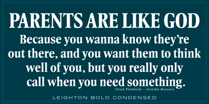
$45.00Leighton is a four-weight serif font family that was created in 1993 by Paul Hickson (P&P Hickson) and Steve Jackaman (ITF) exclusively for ITF’s Red Rooster Collection. Its designs are loosely based on the typeface Lectura, which was designed in 1966 by Dick Dooijes for the Amsterdam Foundry. Leighton is a conservative, demi-serif font in a Dutch style. It is ideal for upscale corporate projects and excels at any size. - Pomfrit Dandy NF by Nick's Fonts,
$10.00This elegant monocase design is based on a nineteenth-century offering from Britain’s Stephenson Blake Foundry named "Fry’s Ornamented No. 2". Stylish, witty and debonair, it will add grace and charm to any project. The font features bracketed fleurons in the greater than and less than positions, and no math operators. Both versions of this font contain the Unicode 1252 (Latin) and Unicode 1250 (Central European) character sets, with localization for Romanian and Moldovan. - Estricta by Graviton,
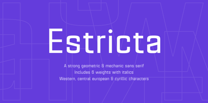
$24.00Estricta font family has been designed for Graviton Font Foundry by Pablo Balcells in 2017. It is a sans serif typeface with a geometrical and mechanic appearence, its sharp, angular edges provide a strong and solid design. It has been conceived to be most suitable for short and middle length text blocks, as well as on all sized headlines. Estricta consists of 12 styles. Each containing small caps and glyph coverage for several languages. - Modernista FA by Fontarte,
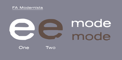
$39.00An inspiration for two fonts of FA Modernista was the second page of Polish vanguard magazine "Praesens" Nr 1 from 1926 designed (as the first page) by Henryk Stażewski. The type applied - Baccarat was a sans serif from Polish foundry Jan Idźkowski i S-ka. Fonts FA Modernista imitate the effect of letterpress with spilled printing ink. Letters of two cuts vary in distortion as in the old days of letterpress technology. - Mensura by Graviton,
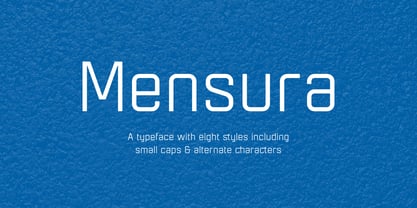
$20.00Mensura font family has been designed for Graviton Font Foundry by Pablo Balcells in 2012. It is a modular, geometric typeface with subtle rounded angles that provides a soft, pleasent appearence. It has been conceived to be primarily a display typeface, but given its clarity it can also be used for composing short and intermediate length texts. Mensura consists of 8 styles and 4 weights plus italics. Each containing small caps and several alternate characters. - Tuerca by Graviton,
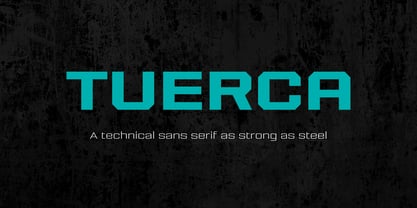
$24.00Tuerca font family has been designed for Graviton Font Foundry by Pablo Balcells in 2021. It is a slightly extended sans serif typeface with a strong technical appearence. Its squared, angular shapes provide a futuristic and robust aesthetics. It has been conceived to be most suitable for logos, headlines and display design pieces as well as short length text blocks. Tuerca consists of 8 styles, each containing small caps and glyph coverage for several languages.
