4,385 search results
(0.019 seconds)
- Astroz by Gravitype,
$14.90 Astroz is a single weight display font inspired by sci-fi culture and space environments. It has been conceived for logos, headlines and posters. The sharp lines mixed with perfect circles give a wonderful futuristic aesthetic. In addition, alternates of letter “A” and number “1” are included to give you more stylistic options. Multilingual support is available.
 - Mouse Paw by Alexander Sharkov,
$5.00 My home mouse, Hector, drew this wonderful font for kids. He tried very hard and hopes that you will like the result of his work! This font is perfect for advertising various children's brands, decorating children's books, and generally any children's projects! Hector and I believe that the font Mouse Paw will help you in any business.
 - Tarotee One by Monotype,
$29.99Traditional as Gutenberg, fresh as a sealed deck of playing cards - Tarotee One Arabesques is a remarkable set of ornaments that combine and recombine in endlessly beautiful combinations. Created by Tony Lansbury (and if you're still wondering what "tarotee" means, here's a hint - tear open that deck of cards mentioned above and look at the backs). - WOODTYPE Collection by Borutta Group,
$19.00 WOOD TYPE COLLECTION from Mateusz Machalski is a set of wonderful, warm, and weathered hand made typefaces designed by Mateusz Machalski. The Inspiration for this collection comes from a wooden letter blocks and other old technologies used for printing. WTC supports 40 different languages and contains over 300 glyphs per style. The Family consists of 20 typefaces. ENJOY!
 - Nada Qonita by Ghuroba Studio,
$15.00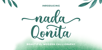 Nada Qonita is a modern calligraphy font that feels beautiful classy, elegant, and modern. It is perfectly suited for a wide variety of projects! This font is PUA encoded which means you can access all of the wonderful glyphs and swashes with ease! It also features a wealth of special features including alternate glyphs and ligatures.
 - Langoustine Rouge NF by Nick's Fonts,
$10.00A typeface named Sorbonne, unearthed by intrepid font-finder Dan X. Solo, provided the pattern for this quaint little charmer. The exaggerated serifs make it stand out in a crowd, while still retaining an understated elegance. This font contains the complete Latin language character set (Unicode 1252) plus support for Central European (Unicode 1250) languages as well. - Rakia by Greater Albion Typefounders,
$15.00 Why not take a giant leap back to the 1970s? Rakia is a science-fiction inspired font, with classic overtones of the 70s. Alternatively, it is a 1970s font with scoff overtones. Take your pick! It’s an all capitals face, with a strong suggestion of speed and motion about it. A wonderful display font and fun to use!
 - Huxley Vertical by Bitstream,
$29.99 The PARATYPE library is our latest major addition, consisting of more than 370 typefaces. In the spirit of the perestroika changes and following the collapse of the Soviet Union, a group of Russian type designers quit the state-owned Polygraphmash foundry to establish ParaType, the first, and now largest Russian digital type foundry. The ParaType team under the supervision of Vladimir Yefimov creates new typefaces and explores the Russian typographic heritage by making digital versions of existing Russian designs: these include the hits of Soviet typography such as Literaturnaya and Journal Sans. Most ParaType fonts are available in Western/Roman, Central European, Turkish and Cyrillic encodings. The Russian constructivist and avant garde movements of the early 20th century inspired many ParaType typefaces, including Rodchenko, Quadrat Grotesk, Ariergard, Unovis, Tauern, Dublon and Stroganov. The ParaType library also includes many excellent book and newspaper typefaces such as Octava, Lazurski, Bannikova, Neva or Petersburg. On the other hand, if you need a pretty face to knock your clients dead, meet the ParaType girls: Tatiana, Betina, Hortensia, Irina, Liana, Nataliscript, Nina, Olga and Vesna (also check Zhikharev who is not a girl but still very pretty). ParaType excels in adding Cyrillic characters to existing Latin typefaces — if your company is ever going to do business with Eastern Europe, we recommend you make them part of your corporate identity! ParaType created CE and Cyrillic versions of popular typefaces licensed from other foundries, including Bell Gothic, Caslon, English 157, Futura, Original Garamond, Gothic 725, Humanist 531, Kis, Raleigh, or Zapf Elliptical 711.
 - P22 Cigno by IHOF,
$24.95 P22 Cigno is a new digitization of the 1950s Italian typeface by Aldo Novarese for the Nebiolo foundry. This semi-formal script has a definite mid-century European flavor suitable for menus, invitations and poster work. Along with the accurate rendition of the regular weight, designer Colin Kahn has added a lighter companion font for another variation on Cigno. Both fonts feature a full Western European character set.
 - Hexagraph by Red One Graph,
$12.00 Thanks for checking out Hexagraph Font! This is my first font and type face in foundry world. Hexagraph inspired by geometrical form of hexagon shape, produces a series of letters that have a sci-fi - technological impression. This font is very unique in that it is entirely an extension of the hexagon shape. You can use this font for magazine cover, game support graphic elements, tech product advertisements, or whatever.
 - Knuckleball by Bebop Font Foundry,
$25.00 Knuckleball is a wonky, octagonal sans-serif typeface produced by Bebop Font Foundry in 2023. The font shares its name with the elusive knuckleball - a baseball term for a pitch that is thrown without spin. The throw is erratic and unpredictable due to the airflow over the motionless seams. The strange and unexpected letterforms of the font represent the pitch's movement. Knuckleball is ideal for logos, branding, and merchandise.
 - Bodoni Classic Swing by Wiescher Design,
$55.00 Bodoni Classic Swing is another of my decorative additions to Bodoni’s family of typefaces. Bodoni did not design decorative versions. His quest was for purity in book design. He was purely as a printer who had to cut his own fonts because there simply weren't any foundries in those days. I think if Giambattista were alive today he would design many decorative typefaces. Yours molto classico, Gert Wiescher
 - ALS Bingley by Art. Lebedev Studio,
$63.00 Bingley is a beautifully old-fashioned, proper, and full of class body typeface. The British feel of this face comes from its inspirational source—a tombstone script from Oxford. The characters are squat and nearly square in proportions, even cursive comes with a pronounced breadth. Generous counters and pleasant stroke weight contrast ensure high legibility of any text set in Bingley. Pronounced serifs and drop-shaped terminals further enrich the experience.
 - Doric by Linotype,
$29.99Originally released by the Stephenson Blake foundry in England, Doric is modeled on one of the sans serifs of William Caslon IV, who was the first to interpret sans serif letterforms into a typeface (1816). Doric Bold has large, heavy capitals with uniform letter widths. It is often used for classified advertising in newspapers because these qualities coupled with a large x-height allow greater legibility at small point sizes. - Rum Sans by Trine Rask,
$30.00 Rum Sans is designed inside out based on modular counters. Rum Sans is a text & display family suitable for any purpose, any media, any size. A humanistic modular sans serif in five weights containing small caps, italic, swashes, alternative characters, old style, lining, tabular & proportional figures. Design date: 2001-2014 The complete family consists of Sans Serif & Serif in both sharp and soft version + the display fonts Rum Plakat & Rum Silhouette.
 - Rummy Tall by Bunny Dojo,
$23.00 Rummy, the stout, scrappy font inspired by sports branding and 1940s film, has grown up and is ready to take on new responsibilities. The result: Rummy Tall. Still powerful, precise, and packed with personality, Rummy Tall's added height brings with it even more versatile charm. Track Rummy Tall tightly for a sturdy foundation, or give Rummy Tall some breathing room for an unexpected air of nobility. Reach new heights!
 - Packard Patrician NF by Nick's Fonts,
$10.00Here’s a new take on the hand-lettered alphabet Oswald Bruce Cooper used in ads for the Packard Motor Company, later converted into a metal typeface by the Barnhard Brothers & Spindler foundry. This version has smoother outlines and an increased x-height, but retains all of the elegant charm of the original. Both versions of this font include the complete Unicode Latin 1252 and Central European 1250 character sets. - Hancock Pro by Red Rooster Collection,
$60.00 Hancock Bold Condensed is slab serif typeface. The original Hancock design was produced by the Keystone Type Foundry, circa 1903; a condensed version was added circa 1917 by Lanston Monotype. Steve Jackaman (ITF) designed and produced a digital version of Hancock in 1994, and completely redrew the typeface for its 2017 release. The new version has a 40% larger glyph set, and supports Latin 1 plus Central/Eastern European languages.
 - Old Claude LP by LetterPerfect,
$39.00 Old Claude was drawn by Paul Shaw to simulate an old cut of the classic (Claude) Garamond type designs of the 16th & 17th centuries. The pronounced rough edges and coarse letter shapes create the effect of letterpress printing with old foundry type onto handmade paper. The companion Old Claude Expert includes small caps and old-style figures. This "antiqued" design works equally well for both text and display.
 - Thorowgood Wide by Wooden Type Fonts,
$20.00 One of the original Clarendon types, an English design, here derived from a specimen taken from an American foundry, no identifying marks. With a tall x-height, wide version, unlike more traditional Clarendons, not a square serif but bracketed. Unique to this Clarendon are the rounded openings at the points where the horizontal and vertical stems meet in the capital B, D, P and R, not common in other Clarendons.
 - Botany by Adam Ladd,
$25.00 Botany is a distinct, hand-drawn display font with flourish designed to be unique and beautiful, yet functional — carefully drawn for quality but still rough enough to display the handmade, textured appearance. Capitals evoke a natural elegance and grab attention. Botany is great for display, branding, logos, packaging, titles, and more. Botany features: display (flourish) and text styles; regular and italic styles; flourish stylistic alternates; closed counter stylistic alternates.
 - Tecnica Slab Stencil by Graviton,
$20.00 Tecnica Slab Stencil font family is the stencil version of Tecnica Slab font family, it has been designed for Graviton Font Foundry by Pablo Balcells in 2014. Tecnica Slab Stencil consists of 8 styles. The 4 “Stencil 1” styles contain a narrow stem for big sizes type and/or rigid materials printing, and the 4 “Stencil 2” styles contain a wide stem for small sizes type and/or light materials printing.
 - Madame by Linotype,
$40.99 The font, Madame, first appeared in a sample with similar fonts, presented by the Fonderie Typographique Française in the 19th century. The font consists of three cuts, letters, accents and numericals. The flamboyant Madame is meant for titles and headlines, emphasis in text or as initials. It combines well with both serif and sans serif fonts, but should be used sparsely to maximize the advantages of its ornate forms.
 - Spinosa BT by Bitstream,
$50.99Stephen Chick, of In Your Typeface Productions (IYTP) foundry, has created this rather prickly type design. Although for display, it is surprisingly legible at smaller point sizes. There is an Inline version, and also an Inline Extra version, which has only the inner contours of the Inline itself, which can be combined with the Regular to create cool two-color effects. The extended glyph set supports Central Europe. - Tecnica Stencil by Graviton,
$20.00 Tecnica Stencil font family is the stencil version of Tecnica font family, it has been designed for Graviton Font Foundry by Pablo Balcells in 2014. Tecnica Stencil consists of 8 styles. The 4 “Stencil 1” styles contain a narrow stem for big sizes type and/or rigid materials printing, and the 4 “Stencil 2” styles contain a wide stem for small sizes type and/or light materials printing.
 - Rum Serif by Trine Rask,
$30.00 Rum Serif is designed inside out based on modular counters. Rum Serif is a text & display family suitable for any purpose, any media, any size. A humanistic modular Serif in five weights containing small caps, italic, swashes, alternative characters, old style, lining, tabular & proportional figures. Design date: 2011-2014 The complete family consists of Sans Serif & Serif in both sharp and soft version + the display fonts Rum Plakat & Rum Silhouette.
 - Wood Rounded JNL by Jeff Levine,
$29.00 This reinterpretation of Caslon Rounded showcases one of the early attempts of type foundries to create a novelty ‘rounded’ typeface for general use. While the lettering might easily convey a more modern look of 1960s or 1970s pop typography, its roots definitely lay in the later part of the 19th Century and the heyday of wood type design. Wood Rounded JNL is available in both regular and oblique versions.
 - Alternate Gothic Pro EF by Elsner+Flake,
$35.00 In 1903, the typeface family Alternate Gothic was developed for ATF (American Type Foundry) by Morris Fuller Benton. It was Benton’s intent to solve many diverse layout problems with the development of a narrow Sans with different width values. The Alternate Gothic enjoys great popularity to this day. Therefore, Elsner+Flake re-worked the typeface family, added all European fixed accents and complemented it with an Antique version.
 - Business Letter JNL by Jeff Levine,
$29.00 One of the text fonts showcased within the pages of the John Ryan Foundry (Baltimore, MD) specimen book from 1894 is a squared type face with rounded corners called “Geometric”. The original design has been updated slightly by substituting straight lines for the inner corner curves to add a small contemporary touch to a classic alphabet from the 19th century. Business Letter JNL is available in both regular and oblique versions.
 - Makeads by Sryga,
$22.00 Makeads, a typeface exuding subtle authority, brings a touch of seriousness to the creative palette. Rooted in the foundations of Bauhaus aesthetics, this font effortlessly balances boldness and sophistication. The supertight kerning and unique texture contrast strike an air of balance between formal and casual, making it an ideal choice for projects that demand a touch of gravitas. Makeads is the silent powerhouse that commands attention without raising its voice.
 - Locarno by ITC,
$29.99Locarno is the work of British designer Alan Meeks and is his adaptation of Rudolf Koch's original design for the Klingspor type foundry. The unique design of the roman weight features geneous capitals and a reserved lowercase. The italic capitals have an open, engraved decoration that combines perfectly with the lowercase with its tall, elegant ascenders. Locarno is a typeface with the sophisticated look of the 1920s and 30s. - Deco Revisited JNL by Jeff Levine,
$29.00 Inspired by a retro Art Deco poster as well as many of the true classic Art Deco type designs of the 1930s and 1940s, Deco Revisited JNL is a bold, black, stencil-influenced design with no counters. Although being a contemporary design, its use in any retro project will truly evoke a feeling for the “streamline” era. Deco Revisited JNL is available in both regular and oblique versions.
 - Fomalhaut by Device,
$39.00 A modern, geometric sans serif display font with a hint of the future and the alien. The familiar letter-shapes are reimagined, with key stokes being placed in unusual positions without impacting the readability. The 'Solid' variants have certain counters filled in, creating a bold and unusual rhythm that is very effective in shorter settings. The different versions can be mixed for effect, while letterspacing adds a sharp, clean sophistication.
 - Giza by Font Bureau,
$40.00 The sixteen styles of Giza bring back the colorful power and variety of the original Egyptian letterforms, a glory of the Victorian era. Designer David Berlow based the family on showings in Vincent Figgins’ specimen of 1845, the triumphant introduction of this thunderous style. The truly unforgettable “Nine” weights were designed for ultimate emphasis in posters, and do their most effective work in the very largest of sizes.
 - Lishbona Naskh by Vanarchiv,
$66.00 This font family is simplified Arabic which was inspired from the modern Naskh style, where the reverse contrast is low and the counter forms are open. The original design is from the Lisboa Sans typeface (Latin), published on 2005 and after some years, this multi-script family is the compromise and balance between these two different scripts. This typeface contains characters for setting Arabic, Persian and Urdu languages.
 - Boston Blackie NF by Nick's Fonts,
$10.00This bold, bodacious blackletter typeface is based on an offering from the 1832 Boston Type Foundry catalog. Although it generally appears to be a sober Old English font, there are a few quirky turns here and there, which make it a lot of fun. The Postscript and Truetype versions contain a complete Latin language character set (Unicode 1252); in addition, the Opentype version supports Unicode 1250 (Central European) languages as well. - Spire by GroupType,
$19.00 Originally designed by Sol Hess for the Lanston Monotype Foundry in 1938, this revival was designed by Ann Pomeroy in the early 90s. Spire is a condensed serif with a very 1930s retro look. PLEASE NOTE: Each Spire font (Regular, Extra Light and Monoline) include a companion Expert font in the download. The Experts feature several alternate glyphs. The Family includes three Styles and three Expert styles. 6 fonts all together.
 - Alternate Gothic Pro Antique by Elsner+Flake,
$35.00 In 1903, the typeface family Alternate Gothic was developed for ATF (American Type Foundry) by Morris Fuller Benton. It was Benton’s intent to solve many diverse layout problems with the development of a narrow Sans with different width values. The Alternate Gothic enjoys great popularity to this day. Therefore, Elsner+Flake re-worked the typeface family, added all European fixed accents and complemented it with an Antique version.
 - Sunbeam by Kustomtype,
$25.00 Sunbeam is a new, classy & modern typeface that looks incredible! The contrasting lines and vibrant shapes give sunbeam a sleek and elegant look. Sunbeam is a versatile typeface that's full of character, using optical correction for better legibility, sunbeam is the perfect fit for graphic design, editorial design, magazines, posters, logotypes, brands and corporate design. Sunbeam is designed by Coert De Decker in 2019 and published by Kustomtype Font Foundry.
 - Suerte by Resistenza,
$39.00 Say hello to Suerte. This new typeface with inverted contrast and bifurcated serifs was inspired by Caslon’s Italian type and by Aldo Novarese’s Estro, published by the turinese foundry Nebiolo. Our aim was to develop a wood type typeface adding a new personality incorporating Tuscan serifs. The complete alphabet was designed with a flat long brush and Indian ink and then vectorized. Suerte contains a big set of icons and dingbats.