10,000 search results
(0.125 seconds)
- Hadhelia Script by Picatype,
$14.00 Hadhelia Script is modern calligraphy design. This font is casual and pretty with swashes. Can be used for various purposes. such as logo, product packaging, wedding invitations, branding, headlines, signage, labels, signature, book covers, posters, quotes and more. Hadhelia Script features OpenType stylistic alternates, ligatures and International support for most Western Languages. To enable the OpenType Stylistic alternates, you need a program that supports OpenType features such as Adobe Illustrator CS, Adobe Indesign & CorelDraw X6-X7, Microsoft Word 2010 or later versions. If you need help or have any questions, please let me know. I'm happy to help. Thanks & Happy Designing!
 - Safrina by Cocodesign,
$12.00 Safrina Script is a modern calligraphy design, including Regular. This font is casual and beautiful with swash. Can be used for various purposes. such as logos, product packaging, wedding invitations, branding, headlines, signage, labels, signatures, book covers, posters, quotes, and more. Safrinal Script includes a change of the OpenType language style, binding and international support for most Western languages. To activate the OpenType Stylistic alternative, you need a program that supports OpenType features such as Adobe Illustrator CS, Adobe Indesign & CorelDraw X6-X7, Microsoft Word 2010 or newer versions. How to access all alternative characters using Adobe Illustrator:
 - Scalter by Dirtyline Studio,
$25.00 SCALTER was designed in the early April and published in July 2020. Scalter Serif is inspired by the characteristics American vintage sign then the sans serif it’s combination retro typeface. All shape of this typeface is make strong and more contrast, giving a more dynamic and retro feel. Scalter are available in 5 Widths (Condensed – SemiCondensed – Normal – SemiExpanded – Expanded) with matches 4 style (Serif – Semi Serif – Sans Bold- Sans Black - Script) with a total 42 Styles. Also includes support for 26+ Latin (Extended) Languages.
 - CAL iWasLike Pro by California Type Foundry,
$47.00 CAL iWasLike™ Pro is totally for sure the amazing friendly font you need for, like, everything! Its conversational tone makes reading fun and enjoyable! Designed for friendly, paragraph reading ease on screen or medium res print, with the full set of OpenType features. It's design gives it the most even text shade for digital fonts, and has less holes in the text for easier reading. iWasLike™ is a large x-height, informal text and caption font designed to render well for Apple Quartz and Microsoft devices, low res to high res printing, with full Western Central European, and Turkish support, small caps, superiors, inferiors, fractions, as well as some special additions like music symbols, pricing feature, arrows, and two sets of circled numbers.
 - Onick by Wordshape,
$- While researching the history of Onitsuka Tiger's branding and graphic design, I came across an odd, yet highly appealing piece of custom lettering on the company's ONICK ski boots from the 1970s. Reminiscent of aspects of the typeface Black-Out by Eli Carrico (released by my type foundry Wordshape), yet vertically compressed with razor-sliced counters and odd stencil element that makes up one of the legs of the "K", the ONICK lettering is a potential source for an intriguing modular font. I immediately thought of Ryoichi Tsunekawa as a potential collaborator to bring this piece of lettering to full-fledged life in the contemporary context. Based in Nagoya, Tsunekawa runs an independent type foundry called Dharma Type, including three specialized foundry sub-labels: Flat-It, devoted to display lettering; Prop-A-Ganda, a series of fonts inspired by and based on retro propaganda posters, movie posters, retail sign lettering & advertisements in the early 20th century; and Holiday Type, a series of decorative and retro scripts for holiday use. The past year has seen a flurry of notice of his work abroad, having been featured in both MyFonts' "Creative Characters" and YouWorkForThem's newsletter. As the work of most Japanese type designers is almost wholly unnoticed abroad, for Tsunekawa to be interviewed by two of the most popular type distribution companies in the world is definitely something beyond the norm. Perhaps it is because he works independently, or perhaps it is due to the charm and friendliness with which his typefaces are infused. Either way, this attention is both welcome and appreciated. Beyond mere charm, Tsunekawa's work is nuanced, detailed, and accessible due to its high level of finish. His fonts stand apart from his contemporaries in Latin typeface design in Japan due to his fascination with pop, vernacular and historical lettering from "non-pure" sources- whereas type designers like Kunihiko Okano and Akira Kobayashi have spent years analyzing the essence of Western letterform construction and unlocking the essence of Latin forms, Tsunekawa views surface and the awkward nature of his sources as being of value, as well. His irreverence for the formal doctrines of history imbue his typeface designs with a rugged inventiveness that would be missed by most- glyphs without source designs are guessed at and approximated, often in a manner wildly divergent from what Western eyes would assume. It is in these moments that I find sheer delight in Tsunekawa’s work and what make me most pleased to invite him aboard Neojaponisme and Onitsuka Tiger’s type development project. His assorted typefaces show an eclecticism in finish and as holistic systems- Tsunekawa's return email to me about the proposed type project showed a digital sketch of how a completed typeface family from the source lettering might look, rendered with an effortlessness and dedication to detail that belies a skilled craftsperson. Further development showed Tsunekawa’s rigor- the typeface in development rapidly featured glyphs ignored by many: a full set of fractions, Eastern European diacritics and accents, superior and inferior numerals, alternate characters, and custom ligatures - all designed with regulated, detailed spacing. ONICK is a typeface Tsunekawa should be proud of- an homage to a moment in history rendered in the absolute best fashion. We are proud to present it to the world! --Ian Lynam
 - P22 Cezanne by P22 Type Foundry,
$79.94 This font set, created for the Philadelphia Museum of Art, celebrates the work of influential French artist Paul Cézanne. P22’s Cezanne font allows you to beautify your documents with a faithful rendition of the artist’s handwriting, while Cezanne Sketches recreates a variety of imagery from the artist’s work. Cezanne Pro includes full western and central European character sets and Cyrillic for typesetting in dozens of languages. It features several types of numerals, ligatures, snap-on swashes, and word glyphs. The Pro version includes over 1,200 glyphs and “smart features” that will automatically substitute letter combination's to create an even more natural handwriting effect than was possible with Cezanne Regular.
 - Fleabitten by Hanoded,
$15.00 I love going to flea markets and second-hand stores; in fact a lot of the furniture in our home is second hand (or pre-loved, a euphemism I find rather peculiar). I personally believe that buying used products is a good way to help this planet, as no new stuff needs to be made and the old stuff gets a second life. Fleabitten is a ‘western style’ serif font. You could use it to pimp the posters for your line dance festival, but hey, be creative! I am sure you’ll find some good use for this very nice pre-loved font. Yes, pre-loved: I loved it first!
 - Nostalgic Script by Dhan Studio,
$17.00 Nostalgic Script is a modern brush font, organic, dynamic and energetic sytle. It can used for various purposes. such as the title, signature, letterhead, signage, labels, newsletters, posters, logo, correspondence, wedding invitations, badges, etc. Nostalgic Script features 315 Glyphs, 143 alternate characters, including initial and terminal letters, alternates, ligatures and International support for most Western Languages is included. Nostalgic Script is coded with PUA Unicode, which allows full access to all the extra characters without having special designing software. Mac users can use Font Book , and Windows users can use Character Map to view and copy any of the extra characters to paste into your favourite text editor/app.
 - Penster Bross by Letterhend,
$17.00 Penster Bross is a standout bold font with rough and stamp version. The texture of the font makes this font looks great for retro and vintage theme.This font is also suitable to be applied especially in logo, and the other various formal forms such as invitations, labels, logos, magazines, books, greeting / wedding cards, packaging, fashion, make up, stationery, novels, labels or any type of advertising purpose. Features : - rough and stamp version - numbers and punctuation - multilingual - PUA encoded We highly recommend using a program that supports OpenType features and Glyphs panels like many of Adobe apps and Corel Draw, so you can see and access all Glyph variations.
 - Charlotte Sans by ITC,
$29.99Although designer Michael Gills was influenced by 18th century French type designer Pierre-Simon Fournier, Charlotte is best described as a modern roman typeface. Its clean cut style, accentuated by a strong vertical stress and unbracketed serifs, exudes an authoritative tone, guaranteeing its effectiveness for almost all text setting applications, but especially where a formal unmannered appearance is desired. - Brenda Script by Seniors Studio,
$23.00 Brenda Script is a beautiful formal script, contemporary typeface with classic roots and an elegant touch. It can be used for various purposes.such as logos, wedding invitations, headings, t-shirts, letterhead, signage, lable, news, posters, badges etc. Brenda Script features 405+ glyphs and 160 alternate characters. including initial and terminal letters, swashes, alternates, ligatures and multiple language support.
 - Going Places JNL by Jeff Levine,
$29.00 Based on hand lettering from a January 26, 1930 ad for the 1930 Fox Studios film "Let's Go Places", the lettering is an ultra bold serif design with numerous ball terminals throughout the character set. The typeface is both formal, yet casual and playful in appearance. Going Places JNL is available in both regular and oblique versions.
 - LTC Law Italic by Lanston Type Co.,
$24.95 Law Italic was designed as an imitation of a formal style of penmanship used in legal documents. It has a more pronounced angle than standard italics. It is intended to be used by itself but can be combined with other faces to suit a designer's inclination. Historically, this face was once used by Bruce Rogers strictly for headings.
 - Charlotte Serif by ITC,
$29.99Although designer Michael Gills was influenced by 18th century French type designer Pierre-Simon Fournier, Charlotte is best described as a modern roman typeface. Its clean cut style, accentuated by a strong vertical stress and unbracketed serifs, exudes an authoritative tone, guaranteeing its effectiveness for almost all text setting applications, but especially where a formal unmannered appearance is desired. - Agilita by Linotype,
$29.99 Created by German designer Jürgen Weltin, Linotype’s Agilita is a contemporary humanist sans serif family with a wide variety of weights, including both ultra thin hairline options and heavier, dark type. Agilita has rather classical proportions; its clear ascenders and descenders lend more distinct word shapes. Weltin’s design has a dynamic, yet strong and very functional appearance with a fine but clear emphasis on the horizontals. This traditional approach makes it a versatile typeface for large-scale text setting, but it can also be used in complex information design projects, and orientation systems, for example. Hence it was developed carefully into a wide range type family system consisting of 32 styles. This even covers the requirements for display and headline setting. Corresponding condensed weights are suitable where horizontal space is scarce, as in narrow columns and tables, for example. The Agilta Hairline and Agilta Ultra Thin styles were especially made for display use. These fonts should be set at a minimum size of 20 pt for printed project, and about 40 pt on output to laser printers, depending on the paper used. Agilita’s character sets include special symbols and signs that may be used in dictionaries; like arrows for lemmata and signs for cross references, idioms or colloquial language. There are two sets of arrows available in each weight for use in orientation systems. Each font in the Agilta family is built according to Linotype’s Extended European character set guidelines. These offer support for more than 48 Latin-based languages used in Western, Central, and Eastern Europe, including Baltics and Turkey.
 - FormPattern Color Six by Tarallo Design,
$14.99 Use this font to make lines, borders, patterns, backgrounds, unique bullets, or use it inline within text. Let your imagination explore the possibilities to combine these geometric shapes. Use letter spacing to connect the shapes in a continuous pattern, or space them apart horizontally. Stack them vertically and control their distance with leading (line spacing). Make fields of pattern and explore layering and opacity for color mixing. FormPattern Color Six takes inspiration from mosaic patterns seen in the south of Italy. It is easier to use this font to make patterns than to use drawings because you can control the size, color, and spacing from the type menu. It is also an effective way to make web graphics that are responsive with text. Using it is simple. As you type, forms will appear instead of letters. Each font in this collection is a colored set. The sets are primary, secondary, tertiary, analogous, dark, old world, vintage, greyscale, cool grey, and warm grey. There is a solid font that can be colored in the same way as regular fonts. The color fonts are accessed in the type menu where you would normally find the different weights or italics Most design software, such as Illustrator, InDesign, and Photoshop provide a glyphs palette where you can choose the precise form you want. It can work with the simplest text editors too. However, these may not support the color options. FormPattern Color Six is a vector-based and fully scalable SVG OpenType format. Color fonts are supported by Photoshop 2017, Illustrator 2018, and QuarkXPress 2018 (and later versions). This version of FormPattern Color Six is compatible with all FormPattern fonts by Tarallo Design. The display artwork shows it paired with the typeface Scanno.
 - Bank Sans EF by Elsner+Flake,
$35.00 With its extended complement, this comprehensive redesign of Bank Gothic by Elsner+Flake offers a wide spectrum for usage. After 80 years, the typeface Bank Gothic, designed by Morris Fuller Benton in 1930, is still as desirable for all areas of graphic design as it has ever been. Its usage spans the design of headlines to exterior design. Game manufacturers adopt this spry typeface, so reminiscent of the Bauhaus and its geometric forms, as often as do architects and web designers. The creative path of the Bank Gothic from hot metal type via phototypesetting to digital variations created by desktop designers has by now taken on great breadth. The number of cuts has increased. The original Roman weight has been augmented by Oblique and Italic variants. The original versions came with just a complement of Small Caps. Now, they are, however, enlarged by often quite individualized lower case letters. In order to do justice to the form changes and in order to differentiate between the various versions, the Bank Gothic, since 2007 a US trademark of the Grosse Pointe Group (Trademark FontHaus, USA), is nowadays available under a variety of different names. Some of these variations remain close to the original concept, others strive for greater individualism in their designs. The typeface family which was cut by the American typefoundry ATF (American Type Founders) in the early 1930’s consisted of a normal and a narrow type family, each one in the weights Light, Medium and Bold. In addition to its basic ornamental structure which has its origin in square or rectangular geometric forms, there is another unique feature of the Bank Gothic: the normally round upper case letters such as B, C, G, O, P, Q, R and U are also rectangular. The one exception is the upper case letter D, which remains round, most likely for legibility reasons (there is the danger of mistaking it for the letter O.) Because of the huge success of this type design, which follows the design principles of the more square and the more contemporary adaption of the already existing Copperplate, it was soon adopted by all of the major type and typesetting manufacturers. Thus, the Bank Gothic appeared at Linotype; as Commerce Gothic it was brought out by Ludlow; and as Deluxe Gothic on Intertype typesetters. Among others, it was also available from Monotype and sold under the name Stationer’s Gothic. In 1936, Linotype introduced 6pt and 12pt weights of the condensed version as Card Gothic. Lateron, Linotype came out with Bank Gothic Medium Condensed in larger sizes and a more narrow set width and named it Poster Gothic. With the advent of photoypesetters and CRT technologies, the Bank Gothic experienced an even wider acceptance. The first digital versions, designed according to present computing technologies, was created by Bitstream whose PostScript fonts in Regular and Medium weights have been available through FontShop since 1991. These were followed by digital redesigns by FontHaus, USA, and, in 1996, by Elsner+Flake who were also the first company to add cursive cuts. In 2009, they extended the family to 16 weights in both Roman and Oblique designs. In addition, they created the long-awaited Cyrillic complement. In 2010, Elsner+Flake completed the set with lowercase letters and small caps. Since its redesign the type family has been available from Elsner+Flake under the name Bank Sans®. The character set of the Bank Sans® Caps and the Bank Sans® covers almost all latin-based languages (Europe Plus) as well as the Cyrillic character set MAC OS Cyrillic and MS Windows 1251. Both families are available in Normal, Condensed and Compressed weights in 4 stroke widths each (Light, Regular, Medium and Bold). The basic stroke widths of the different weights have been kept even which allows the mixing of, for instance, normal upper case letters and the more narrow small caps. This gives the family an even wider and more interactive range of use. There are, furthermore, extensive sets of numerals which can be accessed via OpenType-Features. The Bank Sans® type family, as opposed to the Bank Sans® Caps family, contains, instead of the optically reduced upper case letters, newly designed lower case letters and the matching small caps. Bank Sans® fonts are available in the formats OpenType and TrueType.
 - Lacoste Celtic by Ronny Studio,
$19.00 Introducing, Lacoste Celtic, A sophisticated ligature serif from us. This typeface has been made carefully to make sure its premium quality and luxury feel. The ligatures makes this typeface unique and stands out rather than the regular serif font, very suitable for logo, headline, tittle, and the other various formal forms such as invitations, labels, logos, magazines, books, greeting / wedding cards, packaging, fashion, make up, stationery, novels, labels or any type of advertising purpose. Features : - Lowercase & Uppercase - numbers and punctuation - multilingual - ligatures - alternates - PUA encoded Please contact us if you have any questions. Enjoy Crafting and thanks for supporting us! :) Thank you
 - Helenium by Greater Albion Typefounders,
$14.95 Informal does not have to mean aggressively modern or casual. Helenium is inspired by some hand drawn capitals that I found added to a 19th century map. It's a great font for informal titles and headings that still keep an air or regularity and ever so slightly period elegance. It manages to be formal and casual all at once, as well as classical and modern. Helenium's range of different weights and drop shadow effects make it useful for hierarchical titles and headings. Helenium miniscule adds greater flexibility by extending the family with a fun range of rounded lower case forms.
 - Wimp Stars by Letterhend,
$19.00 Introducing, Wimp Stars - A nostalgic display typeface. The sharp edges make this font looks great and standout for tittle, headline, logo, etc especially for old and retro style theme. Perfectly to be applied to the other various formal forms such as invitations, labels, logos, magazines, books, greeting / wedding cards, packaging, fashion, make up, stationery, novels, labels or any type of advertising purpose. Features : uppercase & lowercase numbers and punctuation multilingual alternates & ligatures PUA encoded We highly recommend using a program that supports OpenType features and Glyphs panels like many of Adobe apps and Corel Draw, so you can see and access all Glyph variations.
 - The Riskeys by Letterhend,
$19.00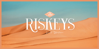 The Riskeys is a stylish and sophisticated modern serif font. This typeface has can be used for modern theme or vintage looks with ligatures & alternates. Very suitable for logo, headline, tittle, and the other various formal forms such as invitations, labels, logos, magazines, books, greeting / wedding cards, packaging, fashion, make up, stationery, novels, labels or any type of advertising purpose. Features : uppercase and lowercase numbers and punctuation multilingual ligatures alternates PUA encoded We highly recommend using a program that supports OpenType features and Glyphs panels like many of Adobe apps and Corel Draw, so you can see and access all Glyph variations.
 - English Script by Linotype,
$40.99English Script Regular is a typeface made in the manner of English Copperplate, a kind of writing that was very popular in England during the 18th Century. Also referred to as English Round Hand, the style was promulgated by various writing masters, who published copybooks of their handwriting for students to use as guides. The style has remained popular to this day, and almost no sort of font is more readily identifiable with the ideas of formal," "old fashioned," "traditional," or "high society." English Script Regular is the perfect choice for use on wedding invitations and other announcements." - Madre Rose by Letterhend,
$17.00 Madre Rose is a sophisticated sans serif with 3 weight style to choose from, bold, thin and regular. It has many beautiful ligatures which you can play around to match your project, whether for a standout headline, or for a tagline, you name it. The unique letterform makes this font one of a kind! Perfectly to be applied to the other various formal forms such as invitations, labels, logos, magazines, books, greeting / wedding cards, packaging, fashion, make up, stationery, novels, labels or any type of advertising purpose. Features : 3 weight style uppercase & lowercase numbers and punctuation multilingual alternates & ligatures PUA encoded
 - Handyrush by Zamjump,
$19.00 Introducing Handyrush Script font. It was inspired by retro typography designs in the 80's. There are over 250 glyphs in this font including Multilanguage Support. The OpenType feature with Stylistic Alternate to replace letters in the middle and end with a swash, and there are 3 swashes, and to display stylistic alternates it's quite easy just by typing characters+underscor / underscor+characters. specially for swash just type underscore underscore + a / b / c. Handyrush Script is very suitable for application especially on logos, and various other formal forms such as invitations, labels, logos, magazines, books, greeting / wedding cards, packaging, fashion, make up, stationery, novels, labels or all types of advertising purposes .
 - Michiana Pro by BluHead Studio,
$39.00 Michiana Pro is my new, hand-crafted connecting script! I've been hand lettering cards and envelopes to my wife and family in this type style for years and decided it was time to make a font based on it. I typically start with a single thin stroke for each letter, then build up the weight of the heavy stroke, so there ends up being a lot of charming variations in terms of style and color. The overall finish is rough, yet friendly. Perfect for invitations, place cards, love notes, and with its large x-height, it sets nicely for text. I grew up running around the dunes and beaches along Lake Michigan in northwest Indiana, and I think the shoreline and dune grass has inspired my aesthetic. Michiana Pro takes the name from a small area along the lake between the Indiana and Michigan state lines. There are a lot of nice, modest homes nestled in the duneland forests. Thinking about what it's like back there, it's like having a bowl of steaming hot comfort food. So I hope Michiana Pro feels that way to you too. Michiana Pro features include: + extended character set for Western European language support + 1,205 glyphs + lowercase beginning and ending swashes + contextual initial and final letterforms + alternates for L, R, Z, f, g, p, t and y + 140+ ligatures + superior and inferior figures for unlimited fractions + ordinals (st, nd, rd, th) + 4 ornamental swashes + available in both OTF and TTF formats
 - Technical SCRIPTURE by MMC-TypEngine,
$19.00 ‘Technical Scripture’ 2015-2021 A manuscript look, Pixel labyrinthine Display Type System… Plus, an Optical “Layered Game”, Retro Futuristic Sci-Fi Digital interface evolving placeholder… Now with 3D Styles! It was designed as a pair to its brother font ‘Technical Signature’ a Small Caps Font, both inspired by antique Greek, mosaics zig-zag ornaments “ancient times computer” intentionally as a Romanic variation with same metrics... Searching for Technical Solutions, it resulted in many combined styles by matching the primary ones so there’s plenty variations for multi-purpose texting like layered typesetting or simply monochromatic designs… Plus got accurate streaming resolution, therefore some sub-families like Stamp and Texture implicates greater points for minimum size as Regular and Light is appropriated to Small Optical Text reductions. *The New 3’s Upgraded Edition Improvements consisted of Correct ‘Font Info’ (verified data-debugging) rescaled glyphs, quick design review, better style linking with correspondent renamed fonts, addition of automatic OT features encoding, 3D Styles and Italics. Ps. This actual Typeface was quickly re-edited for technical reasons and hasn’t yet reached the intended design, it will soon receive a more tangible redesign upgrade, mainly in lowercases to enhance cursive style. Due to other priorities. Tip: Give preference to THE LYSERGIC UPPERCASES! Multilanguage Support: Western & Eastern European, Baltic, Turkish, Greek, and Cyrillic. This Type is pleasant to Technician Compositions, Such as Briefs layouts manuscript, Old Engineering & Crafts Logos or Support Text, Op-Art Posters, Stamps, Labels, movies and Cartoons Ludic Scripts, sites and of course Video Games! Try ‘Technical Scripture’ & Have some Power to the Pixel! Padang!
 - Agile Sans by Fenotype,
$25.00 Agile Sans is a contemporary humanist font family with classicist roots. Hence its name, Agile Sans suits many occasions from branding to publications, web and applications. From formal to casual, bold to refined, this font covers it all. Agile Sans comes with nine weights with corresponding true-italics. Built-in small capitals and several numeral styles are included as well. If you’re seeking for an alternative to more common humanist sans serifs, look no further and grab a future classic.
 - Stimul by Ivan Petrov,
$39.00 Stimul is a singular monoline sans serif font family. The type idea is based on experiments with the grapheme of the letters. Sitmul contains a huge amount of alternative glyph forms which vary from fairly conventional to very whimsical. Mix them to enrich your text set by a myriad of unpredictable combinations. The font family consists of four typefaces with two different styles in each: uppercase and lowercase. Each typeface also has 5 stylistic sets and an alternative set of figures. The font provides multilingual support: Western Latin, Central European, Turkish, Baltic and Cyrillic. Sitmul is perfect for short texts, headlines, posters, logotypes and so on. Using Stimul you can always expect the unexpected which will definitely stimulate your creativity!
 - Malden Sans by Monotype,
$49.00 Malden Sans is a mischievous grotesque sans serif with charming details that gives designers a solid typographic voice. It was created by Michele Patanè with regular and condensed widths, as a utilitarian typeface family for print and digital environments. It was originally designed as part of a type system for cinema magazines, and embodies the devil-may care attitude of the silver screen. Designer Michele Patanè looked back to an earlier era of typography to create the typeface, embracing unusual details, rather than ironing them out. “There is a very naive way of using typography in the 30s and 40s, something not as clean as how it’s used in the late 50s and 60s when everything passed through a rationalisation of the typographic palette,” he explains. “In film magazines you can still see a bit of roughness, and I like that.” This is a design that’s desperate to be used in editorial environments, and has been created to stand up to lower quality paper. It would be equally at home on posters, packaging, and even in digital environments where designers are looking for something more expressive than another geometric sans serif. Malden Sans includes a Normal and Condensed range, with 7 weights in the normal and 6 in the Condensed, both including italics.
 - The Donald NF by Nick's Fonts,
$10.00Something about the swoopy loops in the uppercase characters of this typeface, originally called "Ronde", reminds one of the signature 'do of a certain real-estate-mogul-turned-TV-celebrity, and so this font was named. Delightfully different, this face can be playful or formal, as suits the the occasion. To complete its nineteenth-century creds, the font includes classic bishops fingers at the ASCII tilde and ASCII circumflex positions. Both versions of the font include 1252 Latin, 1250 CE (with localization for Romanian and Moldovan). - Dosky by takoliko,
$10.00 Dosky is a groovy, retro, bubble font. It have a big and bubbly anatomy. Inspired by 70s vibe and culture. The font is perfect to create a project that have a retro feeling but have a little bit modern and modest on it. Dosky support multilingual language also came with 6 font style : Reguler, Condensed, Expanded and Oblique styles. Dosky can be used as a fun or a formal kind of project. It can easily be matched to your projects, and good for communicating your brands.
 - Rellyan by Gatype,
$12.00 Hello friends... We are proud to present our new font. Rellyan's new natural script with handwriting and script style makes this font look elegant, natural, stylish. Rellyan will be perfect for invitations, logos & branding, photography, advertising, watermarks, social media posts, product packaging, product designs, labels, wedding designs, stationery, special events or anything else that requires a taste for handwriting. Rellyan brings OpenType style alternatives, International binders, and support for most Western Languages is included. To enable the OpenType Stylistic alternative, you need a program that supports OpenType features such as Adobe Illustrator CS, Adobe Indesign & CorelDraw X6-X7, Microsoft Word 2010 or later. Thank you very much for viewing and enjoying it.
 - Byzantus by Tower of Babel,
$10.00 Byzantus is a versatile blackletter-inspired font that was designed primarily with legibility in mind. Byzantus can be used in many situations that could use a bit of style, whether it be an informal concert poster, or a more formal wedding invitation. Its versatility allows Byzantus to shine in many applications. Byzantus also works well not only as an uppercase/lowercase font, but also as an all caps font.
 - Isfahan by Scriptorium,
$18.00Isfahan is based on the middle-eastern style decorative initials Willy Pogany drew for his edition of The Rubaiyat of Omar Khayaam. This font has both full-size capitals and reduced size small-caps versions of each letter, but although it could be used as a titling font, it is really intended more for decorative character placement. - P22 FLW Exhibition by P22 Type Foundry,
$29.95 This font set is the second in a series from P22 Type Foundry based on the lettering styles of Frank Lloyd Wright. Created in 1931, the Exhibition lettering was intended primarily to accompany Frank Lloyd Wright's exhibition drawings and models. Many of the 72 Extras were designed to form continuous linking borders. Combinations of these geometric forms can provide endless variations of decorative elements in the style of Frank Lloyd Wright. Many of these images were based on Mr Wright's "Saguaro Forms and Cactus Flowers" illustration for an unused Liberty magazine cover of 1926. Other imagery in this set was derived from assorted geometric designs by Wright. Exhibition Regular, Light, and Bold have been remastered and now contain almost 400 characters including support for Western and Central European languages.
 - Horse Belonk by Arterfak Project,
$16.00 Introducing "Horse Belonk" a western style font. Designed well and inspired by cowboy, rodeo, texas, and vintage designs. This font is based on serif form and reversed contrast, featuring strong looks with the spurs in the middle. Horse Belonk is a display font with an additional Extrude style that you can apply to get a 3-Dimensional typographic design. It's bold, brave, and elegant to use on title or headline, poster, flyer, stickers, vintage logos, signboards, packaging, and more! Packed with extra special characters that allow you to create more magnificent designs. Here what you'll get : Uppercase Smallcaps Numbers & punctuation Ligatures Stylistic alternates Catchwords : And, Or, Is, The, By, On, Be, To, Out, End, In, Will, With, Of, No, For, From, At, Am, Pm. Thank you for watching! Cheers
 - Sassoon Montessori by Sassoon-Williams,
$48.00 Typefaces following Montessori Institute guidelines for reading and handwriting. With these fonts, the crucial stages of letter formation are made easier for parents and teachers to produce consistent worksheets. Children should then progress towards an efficient and mature joined-up handwriting. Free to download resources: How to access Stylistic Sets of alternative letters in these fonts
 - SandraOh by Chank,
$59.00Sandra Oh is a quirky modern take on the classic serif fonts of the 20th century, updated here with a wiggle in her walk and a giggle in her talk. A Chankstore classic from the earlier days of the internet, this font is now available in OpenType format for the first time. Perfect for indie films or youtube videos. - Ancient Funeral by Phonnastudio,
$12.00 The ancient funeral is a modern blackletters typeface for use. it is a strong and vintage font inspired by the classic Victorian typeface style combined with a strong style. it can also be used for modern and elegant projects. what you get: Alternative letter Number and Punctuation Lettering script format font Include Multilingual support in Latin simple.
 - Liony by Tkachev,
$20.00 Liony is a pixel font with four font styles. Liony is an experiment to convert the script-style calligraphy into bitmap format. It looks great in display sizes and also works well when used smaller.