10,000 search results
(0.031 seconds)
- Toma Sans by JAM Type Design,
$- Toma Sans is a sans serif type family of seven weights plus matching italics. Influenced by the geometric-style sans serif faces that were popular during the 1920s and 30s, the fonts are based on geometric forms that have been optically corrected for better legibility. Toma Sans has a functional look with a friendly open touch. While the ExtraLight and the black weights are great performers in display sizes the light, regular and medium weights are well suited to longer texts. The small x-height and the restrained forms lend it a distinctive elegance. The typeface has an extended character set to support most European languages.
 - Moho Sport Pro by John Moore Type Foundry,
$36.00 As an ingredient of the large family of display typefaces "Moho", John Moore Type Foundry presents another variation of fonts consisting of two components: a main font Moho Sport based on a thick outline overlapping and Moho Sport Top, a counterblocks as shape or inside filler. Both typographic forms, Open Type, empty and filled complement one another to create interesting layering headlines for announcements, posters, marks or logo design, labels etc. This combination of both typefaces can still gain more interest if the forms are colored using graphic patterns, drawings or photographs. A nonoverlapping version is also available in Moho Sport Fat and your partner Moho Sport Fattop.
 - Woshingtan by Sealoung,
$15.00 Have you ever had a dream to write as a professional calligrapher? Penmanship or spencerian script? Now you have this unique opportunity to try the early American handwriting. Introducing Washington calligraphy scrpt. This font is calligraphy font with a classic style and a touch of elegance, inspired by the handwriting of Italian women and ancient manuscripts. Carefully designed to work together in harmony that makes it very suitable for any design work that requires a classic, formal or luxurious. Try Desirable Calligraphy, enjoy the richness of OpenType features and let her fun and elegant excitement make you happy and enhance your creativity! You can use this font very easily.
 - Retro Head by 50Fox,
$20.00 “Everything old is new again,” as they say. Introducing "Retro Head" - A retro-modern inspired typeface with a bold, charming and versatile look. This font is also equipped with an opentype feature to support your creations. You will get : Retro Head Regular Retro Head Italic Ton of glyphs Ligatures & Alternates Works on PC & Mac Simple installations Accessible in Adobe Illustrator, Adobe Photoshop, Adobe InDesign, even work on Microsoft Word. PUA Encoded Characters – Fully accessible without additional design software. Language Support: Afrikaans, Albanian, Czech, Danish, Dutch, English, Estonian, Finnish, French, German, Hungarian, Italian, Latvian, Lithuanian, Norwegian, Polish, Portuguese, Slovak, Slovenian, Spanish, Swedish, & much more.. Thank you for looking.
 - DST Helfita by Designsation,
$16.00 This first font was made as an experimental work for us. learn a alot of typeform from other typeface in the past, bring us to this grace position. We learn about Variable font and all the thing to do some improvement in our work. such a nice time to present this new font to the world as the ground breaking of our mission to scale up our skill and to step up into the next vision as a font designer. We create this font with variable and Open Type features. Some instances including, from thin to black. and on the variable font has and oblique style.
 - Memoire by Reserves,
$49.00 Memoire is an elegant linear hairline contemporary sans. It is based on the underlying form of Vanitas, yet is rendered in a nearly monolinear hairline weight. Memoire is intended to be used selectively for headline use starting at 60pt and above. Stylistically, Memoire retains Vanitas’ alluring, sophisticated sensibility that is directly inspired by high fashion. The delicate linear form creates a sense of cohesiveness and lends the typeface an intriguing lightness of character. The upright styles are complimented by a pairing of optically adjusted true italics, which were purposefully adapted to retain the sharpness of their counterparts. Abandoning traditionally executed cursive italic letterforms retains Memoire’s sharp characteristic through each style.
 - Armin Grotesk by W Type Foundry,
$25.00 As a graphic designer, sometimes it’s impossible not to be inspired by the Swiss Style, specifically the work of Armin Hofmann, who is one of its best exponents. Grids and grotesk and neo-grotesk typefaces are a fundamental part of the tools that make this aesthetic possible. A visual language that has caused full admiration since we were students. Therefore, we decided to design Armin as an homage to Hofmann’s work. Technically, we added stylistic sets applied to the letters –G, R, a, g, h, l, m, n, r, t, u, y– to make Armin more eclectic and suitable for the creation of any visual language.
 - Gomme Sans by Dharma Type,
$29.99 Gomme Sans is a wide and masculine sans-serif family for text designed by Ryoichi Tsunekawa and the whole family consists of 6 weights from ExtraLight to ExtraBold and their matching Italics. The basic concept of this family is not only to make an impact by masculine, squarish letter form but also to be legible and readable even on small size screen by the sophisticated design, and their large x-heights. Gomme Sans supports almost all European languages: Western, Central, South Eastern Europeans and afrikaans. And proportional figures, superior figures, inferior figures, denominators, numerators, fractions, ordinals and case-sensitive-forms can be accessed by using OpenType features.
 - PGF Orqquidea by PeGGO Fonts,
$29.00 For usage details feel free to download the technical Specimen document https://peggofonts.com/pdf/PGF-Orqquidea-Manuscrita_Specimen.pdf PGF Orqquidea Manuscrita is a font mainly based on the calligraphy hand- made by the Chilean designer, calligra- pher and teacher Marcela Aguilera (Lanascribe) complemented by the il- lustration and type design work made by Pedro González (Peggo FontsTM). As part of the creation of the “Orqquidea family”, which contains a Sans, a Script, complemented with an ornaments and decorations sets, in addition to a huge set of typographic resources de- signed to enrichyour layouts in the cre- ation of graphic pieces such as labels , packaging, editorial work, retail graph- ics and branding design.
 - Wood Craft by Rometheme,
$25.00 Hello, introduce our new font “Wood Craft” is a bold display font, this font looks cool, unique, cartoon, playful, catchy and easy to use. Wood Craft Font is the best choice for your professional design projects, including : logo, poster design, t-shirt, headline, flyer, cd cover album, quotes, business card, branding, magazines, social media, advertisements, product designs, or something that need playful or cartoon looks. Highlight : - Easy instalation - Work on PC or Mac - PUA Encoded Support - Basic Latin A-Z - Numbers - Symbols - No special software is required, The fonts can be opened and used in Adobe Illustrator, Adobe Photoshop, Adobe InDesign, even work on Microsoft Word.
 - Kingsmith by Keristyper Studio,
$14.00 Kingsmith is a script typeface inspired by vintage typography and fonts in the 40s. The basic letters are simple but modified with stylistics to make it look more attractive, there are many alternatives. Great for logos, titles, t-shirts, packages, and anywhere else you need this kind of lined, legible script font. Kingsmith Font multilingual support: Afrikaans, Albanian, Catalan, Danish, Dutch, English, Estonian, French, Finnish, German, Icelandic, Indonesian, Italian, Malay, Norwegian, Portuguese, Spanish, Swedish, Zulu, and many more. What’s Included : Web Fonts Standard & Multilingual glyphs Ligature Works on PC & Mac Simple installations Accessible in Adobe Illustrator, Adobe Photoshop, Adobe InDesign, and even work on Microsoft Word. Hope you enjoy our font!
 - Pearlone by Sarid Ezra,
$15.00 Introducing, Pearlone (Read : Pearl One), a stylish stencil serif! Pearlone is a stylish and modern stencil serif that will make your project more elegant and appeal. This font called Pearl-one, because the dot in some characters inspired by the beautiful pearl. This font comes with regular and bold style that have a contrast look. You don't one to use the pearl version? Don't worry, it comes also in regular form. You can access the regular form with uppercase, and the special one from lowercase. You can use this font for any purposes, such as a branding logo, poster, or even editorial! This font also support multi language. Happy Designing!
 - Blue Village by Issam Type,
$18.00 Blue Village – A Two-faced Modern or Vintage Serif Font with a fancy, playful, unique, and versatile vintage style. It looks amazing at display sizes and is easily readable in text size. This font also have a lot of unique alternate and ligature that will create amazing design projects. Blue Village with it’s vintage / retro style work well for branding projects, logo, wedding designs, social media posts, advertisements, product packaging, product designs, label, photography, watermark, invitation, or whatever project you’re working on. What’s Included? Uppercase & lowercase letters, numbers, punctuation Ligature & Huge Stylistic alternate Multilingual support If you have any questions, please feel free to get in touch. Thank you
 - Escoffier Capitaux by steve mehallo,
$19.23 Escoffier Capitaux is named for culinary legend Auguste Escoffier (1846-35) and inspired by lettering used in vintage French advertising – including the work of commercial illustrator/fashion designer Ernst Dryden (1887-1938) WITH a hearty serving of 1960s ligatures influenced by the work of Herb Lubalin (1918-81) as well as a twist of Claude Garamond (1480ish-1561) AND featuring many alternate characters and extravagant extras, Escoffier Capitaux is enough to fill out your menu, add zest to your cook book, greeting card, resume or just the right amount of sauce to your blog. DINNER IS SERVED No substitutions, please. Minimum service per person. Warning: May taste gamey.
 - The Holler by Javatypestd,
$10.00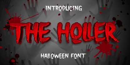 Introducing The Holler Font with a scary Halloween theme. Masterfully designed to become a true favorite, this font has the potential to bring each of your creative ideas to the highest level To access the alternate glyphs, you need a program that supports OpenType features such as Adobe Illustrator CS, Adobe Photoshop CC, Adobe Indesign, and Corel Draw. What’s Included : - Web Font - Standard glyphs - Ligature and Alternate - Works on PC & Mac - Simple installations - Accessible in Adobe Illustrator, Adobe Photoshop, Adobe InDesign, even work on Microsoft Word. - PUA Encoded Characters – Fully accessible without additional design software. - Fonts include multilingual support Thank you for your purchase! Hope you enjoy our font!
 - Huxley Cyrillic by HiH,
$12.00 Huxley Cyrillic is based on our Huxley Amore Bold, retaining all the Western and Central European characters of the latter, while adding upper and lower case Cyrillic characters. Huxley Cyrillic, like Huxley Amore, is visually simple and direct and yet sophisticated and unexpected. Those are the qualities that give it such freshness in so many applications. This font is intended for display use. It is highly condensed and is therefore difficult to read below 18 points. It works well at 36 points, but really works best at 48 points and larger. Huxley Cyrillic has 499 glyphs. I think we should have made at least one more!
 - Barlouth by Pixesia Studio,
$10.00 Introducing Barlouth - A Modern Handwritten Font Barlouth is a delicate, elegant and flowing handwritten typeface with lovely and well-balanced characteristics. Its soft curves and natural writing make it distinct and beautiful. Barlouth gives lovely typographic harmony for a wide range of design needs, including quotes, poster design, personal branding, promotional materials, logotype, product packaging, etc. Add it to your most creative ideas and see how they come to life! FEATURES - Stylistic Alternates - Ligatures - Uppercase and Lowercase letters - Numbering and Punctuations - Multilingual Support - Works on PC or Mac - Simple Installation - Support Adobe Illustrator, Adobe Photoshop, Adobe InDesign, also works on Microsoft Word Hope you Like it. Thanks.
 - Golden Sand by Fidan Fonts,
$19.80 Inspired by the retro cars/motorcycles, desert and wild west the Golden Sand script stays classy and elegant. It's a handwritten font which includes full set of uppercase and lowercase basic characters, multilingual symbols, numerals, punctuation and ligatures. It's works perfectly for handwritten quotes, greeting cards, posters, branding, book cover designs, packaging, wedding stationery, album covers, social media posts and many more. Latin-based Language Support. If you want to type with stylistic ligatures make sure you have them turned on (use a capable software like Photoshop, Illustrator, InDesign, Word, Pages etc). Note: If you don't use this font with these programs stylistic ligatures won't work. Happy creating!
 - Editors Hand by Jen Wagner Co.,
$16.00 Say hello to Editor's Hand, perfect for creating handwritten notes, quotes, logos, or just adding a hand-written touch to any project! This font was designed to create the feel of an actual magazine editor's notes on a design proof. While other handwritten fonts have some visible letter patterns, Editor's Hand comes with three sets of letters that automatically alternate, so you don't have to worry about swapping them out yourself! Note: this feature works in Adobe and most Desktop programs (i.e. Word, Pages, etc.), but does not work in Canva I hope you love using this font as much as I have! I can't wait to see what you create!
 - Luisina by Keristyper Studio,
$14.00 Luisina Script is a handwritten font reflecting calligraphy lettering. This font is inspired by hand-written, pop culture and urban culture. It includes numbers, punctuation, alternates, ligatures, and supports other languages. It is perfect for adding a hand-lettered style to your stationery, headlines, branding, and wedding invitation. Luisina Font multilingual support: Afrikaans, Albanian, Catalan, Danish, Dutch, English, Estonian, French, Finnish, German, Icelandic, Indonesian, Italian, Malay, Norwegian, Portuguese, Spanish, Swedish, Zulu, and many more. What’s Included : Standard & Multilingual glyphs Ligature Works on PC & Mac Simple installations Accessible in Adobe Illustrator, Adobe Photoshop, Adobe InDesign, and even work on Microsoft Word. Hope you enjoy our font!
 - Funky Rhythm by Epiclinez,
$18.00 Funky Rhythm is a luxurious signature script font with a natural flow. This font is a good choice for an Instagram post, movie titles, album cover, book/ebook title, YouTube cover, and of course high-end, sophisticated branding design. So what's included: Basic Latin, numbers, symbols, and punctuations Simple Installations: works on PC & Mac Multilingual Support includes Afrikaans Albanian Catalan Danish Dutch English Estonian Finnish French German Italian Norwegian Portuguese Spanish Swedish Zulu. Accented Characters : ÀÁÂÃÄÅÆÇÈÉÊËÌÍÎÏÑÒÓÔÕÖØŒŠÙÚÛÜŸÝŽàáâãäåæçèéêëìíîïñòóôõöøœšùúûüýÿžß Accessible in Adobe Illustrator, Adobe Photoshop, Adobe InDesign, even works on Microsoft Word PUA Encoded and fully accessible without additional design software Thank you! We hope you enjoy our font!
 - Sidney Hayden by Grezline Studio,
$15.00 Sidney Hayden is a brand new modern script font that comes with a neat and dynamic looks. Sidney Hayden is perfect use for a logotype, typography design, product packaging, quotes, t-shirt design, label poster, headings, letterhead, cutting sticker, hot stamping, signage,and anything that need modern taste. This font is very easy to use, you can even mix and pair it with other fonts to provide a fresh and authentic looks to your design projects. Feature : - A lot of Alternates ( With a Total of 540+ Glyphs ) - Multilingual Language - Works on PC & Mac - Simple installations - Accessible in the Adobe Illustrator, Adobe Photoshop, Adobe InDesign, even works on Microsoft Word.
 - TA Kenisans by Tural Alisoy,
$35.00 TA Kenisans is a combination of two fonts. You can create very good works with Geometric and Grotesque style. This typeface also equipped with useful OpenType features such as Ordinal, Superior, Stylistic Alternates, Proportional Figure, Fraction, Tabular Figure, Numerator & Denominator. Each font file covers Western & Eastern Europe Latin language, as well as other Latin based languages – over 200 languages supported! This is a new real multi-purpose typeface that will be perfect for logo, packaging, greeting cards, presentations, headlines, lettering, posters, branding, quotes, titles, magazines, headings, web layouts, mobile applications, art quote, typography, advertising, invitations, packaging design, books, book title, & nearly any other type of creative design you’re working on.
 - Axeon by Rometheme,
$25.00 Axeon is a modern futuristic typeface with elegant in every single letter. This font looks modern, sci-fi, futuristic, future, readable, stylish, catchy and easy to use. Axeon Font is the best choice for your professional design projects, including: logo, poster design, t-shirt, headline, flyer, cd cover album, quotes, business card, branding, magazines, social media, advertisements, product designs, or something that need modern or futuristic looks. Highlight: - Easy instalation - Work on PC or Mac - PUA Encoded Support - Basic Latin A-Z and a-z - Numbers - Symbols - No special software is required, The fonts can be opened and used in Adobe Illustrator, Adobe Photoshop, Adobe InDesign, even work on Microsoft Word.
 - Kalkal by Gunjan,
$40.00 Kalkal is slab serif typeface with five style, inspired by sign-board. It looks like many typeface with three dimensional. The main layer is regular and in-liner bring little spark in the Typeface. Two shadow layers gives an eye catchy impression and opacity layer is charm of the family. This five layered typeface can be used alone or combined, which makes it a versatile. This type works both for vintage and modern designs. Now let’s see how it works: In-liner layer Regular layer Shadow one layer Shadow two layer Opacity shadow layer kalkal with its five layers gives you flexibility to design.
 - Rengoku by Skinny Type,
$14.00 Rengoku is a bold script font with smooth curves is great for Branding, Logo Design, Lettering, Logotype, Clothing, Poster, magazine, packaging, posters, shopping bags, t-shirts, book covers, photography, special events and other design projects. Features : - Uppercase & Lowercase - Numerals - Punctuations (OpenType Standard) - Accents (Multilingual characters) - Ligatures and Alternate - Works on PC & Mac - Underline swashes - Simple installations - Accessible in the Adobe Illustrator, Adobe Photoshop, Adobe InDesign, even works on Microsoft Word. How to access alternate glyphs? you can see it on this link ( http://goo.gl/1vy2fv ) I hope you enjoy this font. If you have any questions please don't hesitate to drop me a feedback :)
 - Elisetta by Sudtipos,
$39.00 Musical notes and letterforms, silences and white spaces, pentagrams and lines, music and writing have much in common and go beyond time, cultures, styles and locations. This new typeface emerges from the blend between the lyrics and the harmony, rhythm, femininity and luminosity of the traditional musical forms. It`s not about blues or rock, tango or salsa, instead it recovers the neoclassical characteristics of the current musical notation system and revitalize the essence of its signs. Taking care of both the function and the form, Elisetta has been specially designed for the writing of texts and musical sheets considering all its elements and communication needs. This source of inspiration also makes the font really good for extensive texts, since its design is based on situations that require high line performance, great readability and high aesthetic coherence. With 5 variables that vary in weight and style, the typography gathers asymmetry and organic nature in vertical structure, narrow horizontal proportions, high x height and extreme contrast between black and white. Elisetta Book has been created for the writing of clear texts and long lines composed in small sizes inside and outside the pentagram; Elisetta Italic intensifies the organic nature of the musical keys by offering softer signs, contextual alternates and initial caps; finally, Elisetta Display increase and emphasize the contrast between vertical stems and horizontal lines to highlight short texts and titles. For those who love music and for those who like romantic forms, this typography has a lot to offer: Elisetta is the best option to write light words with style, compose clear and rhythmic lines and read comfortable paragraphs with high performance. You can tell everybody this is your font, how wonderful life is while you're in the world! * This typeface was originally designed and supervised as «Elisa», the main project of the Master in Typography at University of Buenos Aires, Argentina.
 - Maiers Nr. 8 Pro by Ingo,
$27.00 A handwritten ”font for technicians“ from ca. 1900. Very geometrical, rigid forms borrowed from the typical characteristics of Jugendstil / Art Nouveau. This script is found in an old magazine which was issued sometime in the years shortly before WWI. The original copy, produced by means of a galvanized plate, is just 7 centimeters wide. It served as the model for technical professions in which, at that time, the captions of drawings were still done by hand. ingoFonts has not only digitized this beautiful typeface, we have also extended it to a whole family. In »Maier’s Alte Nr. 8« special attention was given to ensure the ”uneven“ edges, typical of handwritten script, remained effectively noticeable even in the digitized form. As a result, this ”technical“ font retains a handmade touch, while »Maier’s Neue Nr. 8« is the clean version with exact contours. The Art Nouveau forms, which are characteristic for the period of origin around the turn of the century around 1900, look especially pretty. The high degree of abstraction also seems strange in Maier's No. 8, especially when the age of the original is known. It is generally assumed that it was not until the Bauhaus in the late 1920s that such "modern" typefaces were created. Maier's No. 8 is a generation older! So many of today's supposedly "ultramodern" typefaces look quite old in comparison. In addition to the original two weights, Light and Bold, the Maiers Neue Nr. 8 got a regular and a extra-bold weight. Furthermore, the Neue is also available in italics. Although this is only a slanted version, unlike common practice, it is inclined to the left. Maier’s Nr. 8 Pro is suitable for all European languages. It includes ”Latin Extended-A,“ for Central and Eastern Europe incl. Turkish, and even Cyrillic and Greek, too. The font includes several stylistic alternates as well as a number of ligatures.
 - Planet Express by Estudio Calderon,
$29.99 Family type designed by Felipe Calderón. This type is a display with a modern style and a different and innovative concept. The development of this type was a challenge because it was set out from the begining as a script font with ornaments and complements, where the round shapes do not have prominence in the result. Planet Express is an interesting job from the aesthetic point of view, it works for big scale texts and contains little shadow-cuts in each character to give it more personality and stand out among other fonts from this gender. I hope this new project works to solve issues in design. Planet Express is composed of Regular & Italics, it has 250 intelligent ligatures to produce the best signs in big scale, it is perfect for branding and works very well with the geometric complements. It is designed with programming in opentype: Ligatures, Discretionary ligatures, Stylistic Alternates, Stylistic set 01, Stylistic set 02, Stylistic set 03, Stylistic set 04, Stylistic set 05, Stylistic set 06, Stylistic set 07, Stylistic set 08 & Stylistic set 09, multiple language support and a complete set of extras like arrows, catchwords, flags, emblems, hands, fleurons & crossed elements. Planet Express can be used in different ways, each character pretends to cover the needs in any circumstance where it is used. It is funny to write words and play with the complements. It also works with current concepts in graphic design like sports, cars, hip hop, music, social network, skateboarding and more. Everybody can use this font, it works with different languages like italian, french, portuguese, danish, german and so forth. See specimen and samples here. Enjoy it!
 - Charpentier Sans Pro by Ingo,
$41.00 A humanistic sans serif The first version of this font was created in 1994 within the framework of the bid placed by the city of Graz to become the location for the Winter Olympics in 2006. Appropriately, its original name was ”Olympia.“ The font is intended to embody classic ideals as well as to meet modern demands. The proportions of Charpentier Sans are directly derived from Roman capitals and the humanistic book-face. The contrast between strokes and thin strokes is based on medieval uncial script. And thus, a modern serif sans was created emphasizing thick and thin strokes together. Thanks to its traditional form language, Charpentier Sans is very legible, adapts to various forms of content and expresses a kind of calmness and certainty. Details resulting from writing with the quill guarantee that the font doesn’t appear too rough and unemotional. Even the tiny, pointed mini serifs contribute to the unmistakable appearance of the font. They create an exciting contrast to the soft flowing forms of the letters and are, to a great extent, conducive to the legibility. Consequently Charpentier Sans always appears with an extremely sharp and clear outline. Charpentier Sans Italique has an even more distinct ductus derived from writing. Especially the rounded forms from a, e, f, g and y reflect the handwritten humanistic cursive. Charpentier Sans is comprised of many ligatures, including discretional ones, plus proportional medieval and capital figures for the normal type as well as disproportional tabular figures with a consistent width. Above and beyond the ”normal“ Latin typeface system, small caps are available as an especially elegant form of distinction.
 - Palatino Nova Paneuropean by Linotype,
$67.99Palatino® Nova is Prof. Hermann Zapf's redesign of his own masterpiece, Palatino. The original Palatino was cut in metal by August Rosenberger at D. Stempel AG typefoundry in Frankfurt, and released in 1950. Palatino was later adapted for mechanical composition on the Linotype machine, and became one of the most-used typefaces of the 20th Century. Palatino was designed for legibility, and has open counters and carefully weighted strokes. The type was named after Giambattista Palatino, a master of calligraphy from the time of Leonardo da Vinci. Palatino is a typeface based on classical Italian Renaissance forms. A modern classic in its own right, Palatino is popular among professional graphic designers and amateurs alike, working well for both text and display typography. Hermann Zapf and Akira Kobayashi redeveloped Palatino for the 21st Century, creating Palatino Nova. Released by Linotype in 2005, the Palatino Nova family is part of Linotype's Platinum Collection. Palatino Nova includes several weights (Light, Regular, Medium, and Bold), each with companion italics. Four styles (Regular, Italic, Bold, and Bold Italic) have Greek and Cyrillic glyphs built into their character sets. The Palatino Nova family also includes revised versions of Aldus (now called Aldus Nova), as well as two titling weights. The first titling weight, Palatino Nova Titling, is based on Hermann Zapf's metal typeface Michelangelo, including Greek glyphs from Phidias Greek. The heavier titling weight, Palatino Nova Imperial, is based on Sistina. The fonts in the Palatino Nova family support all 48 Western, Central, and Eastern European languages. Additional features: ligatures and historical ligatures, Small Caps, ornaments, and a range of numerals (proportional & tabular width lining and Old style Figures, fractions, inferiors, and superiors)." - Palatino Nova by Linotype,
$50.99 Palatino® Nova is Prof. Hermann Zapf's redesign of his own masterpiece, Palatino. The original Palatino was cut in metal by August Rosenberger at D. Stempel AG typefoundry in Frankfurt, and released in 1950. Palatino was later adapted for mechanical composition on the Linotype machine, and became one of the most-used typefaces of the 20th Century. Palatino was designed for legibility, and has open counters and carefully weighted strokes. The type was named after Giambattista Palatino, a master of calligraphy from the time of Leonardo da Vinci. Palatino is a typeface based on classical Italian Renaissance forms. A modern classic in its own right, Palatino is popular among professional graphic designers and amateurs alike, working well for both text and display typography. Hermann Zapf and Akira Kobayashi redeveloped Palatino for the 21st Century, creating Palatino Nova. Released by Linotype in 2005, the Palatino Nova family is part of Linotype's Platinum Collection. Palatino Nova includes several weights (Light, Regular, Medium, and Bold), each with companion italics. Four styles (Regular, Italic, Bold, and Bold Italic) have Greek and Cyrillic glyphs built into their character sets. The Palatino Nova family also includes revised versions of Aldus (now called Aldus Nova), as well as two titling weights. The first titling weight, Palatino Nova Titling, is based on Hermann Zapf's metal typeface Michelangelo, including Greek glyphs from Phidias Greek. The heavier titling weight, Palatino Nova Imperial, is based on Sistina. The fonts in the Palatino Nova family support all 48 Western, Central, and Eastern European languages. Additional features: ligatures and historical ligatures, Small Caps, ornaments, and a range of numerals (proportional & tabular width lining and Old style Figures, fractions, inferiors, and superiors)."
 - Torcao by insigne,
$24.00 Torcao is one of the sporks of the font universe, a useful and functional outlier. Half square, half circle, this uncommon squircle of a family with its asymmetry of curved and angular shapes drives through headlines and body copy with forward velocity. The robust, technical appearance is light-hearted and inviting, and its organic nature plays off of its one-of-a-kind kinks and hybrid forms. Torcao is not merely an experimental font, though. The figures have been crafted and refined into a functional, hard-working typeface that lends itself to many sizes and environments. The font family features a tall x-height and light modulation, which give the typography its unique color highly effective in headlines but still quite legible in longer text. This family contains a comprehensive range of nine weights--slender to black--and features condensed and extender selections for a complete set of forty-eight fonts. The font has been decked out for experienced typographers, together with swash alternates and simplified titling. The typeface also contains a range of numeral sets, together with fractions and old-style figures. OpenType-capable programs including Quark or the Adobe suite allow quick changes to ligatures and alternates. Previews of these options can be found in the .pdf brochure. Torcao also features the glyphs to enable all Central, Eastern, and Western European languages. In all, the font supports around forty languages that utilize the prolonged Latin script, making it an excellent option for multi-lingual publications and packaging. Simple, technical, and open, the Torcao type family could just be the perfect choice for your web type or print project.
 - Tim Sale by Comicraft,
$39.00 If you're familiar with the work of Eisner Award winning artist Tim Sale, you'll also be familiar with the soft curves and hard edges of the characters he brings so vividly to life in the pages of GRENDEL, BATMAN and SUPERMAN. Now you can get to know a selection of the characters Tim has been working on his whole life, and Comicraft has been kind enough to arrange them in alphabetical order for you! Based on Tim's own hand lettering work in the lost Dark Horse classic, BILLI 99, the Tim Sale font brings together the class and finesse of Hunter Rose, the elegance and charm of Bruce Wayne and the honesty and trustworthiness of Clark Kent. Don't go into the big city alone at night without it. See the families related to Tim Sale: Tim Sale Lower & Tim Sale Brush.
 - Klaster Sans by Kobuzan,
$29.99 Klaster Sans is a massive geometric sans-serif typeface inspired by the first German geometric fonts. In particular, their clear, but rough forms and not perfect curves. As well as minimal optical compensators. Due to all this, the letters look weighty and powerful. Klaster Sans has 14 styles. From neat thin to extremely heavy. And it's all in italics. Or one variable font with two adjustment axes. All styles include an extended set of Latin characters and basic Cyrillic. It has support for 210 languages. Also contains stylistic alternatives, case-sensitive forms, arrows, fractions, tabular figures, circled figures and other. Features: – Total glyph set: 657 glyphs; – 14 styles (7 weights x italic) + variable; – Support 210+ languages; – Latin Extended; – Cyrillic Basic; OpenType features: – Uppercase, lowercase; – Proportional, circled, tabular numerals, superiors, inferiors, fractions; – Punctuations and symbols; – Arrows; – Stylistic sets (ss01); – Ligatures; – Case-sensitive forms.
 - MotionBats by Victor Garcia,
$28.00 MotionBats are a sort of movable type otherwise. It is a symbol font type family integrated by 9 styles. The idea behind designs is to give to typographic pictograms –static for definition– the dimension of motion. In pursue of this spirit, each font shows a complete motion sequence. MotionBats are inspired on the photographic work of Eadweard J. Muybridge [1830-1904] –a talented multi-faceted Englishman– who worked in USA by the second half of the 19th century. In those early times of photography, he started –almost by chance– taking a comprehensive and impressive photographic sequential series of human and animal locomotion. This way, he placed himself more than a decade ahead from the beginning of cinematography. This type design family points to pay a humble and certainly incomplete homage to such a pioneering and amazing Muybridge's work.
 - Supera Gothic by W Type Foundry,
$25.00 Supera Gothic is a design inspired by the early geometric and humanist typefaces of the 20th century. Its characters draw inspiration from Erbar Grotesk by Jakob Erbar and Johnston by Edward Johnston; hence, in heavier weights, the “f” and “t” bars are pointed which honor Erbar’s work, and Supera’s uppercases and numbers reflect Johnston’s proportions and features. The result is a sans serif family with both, a historical and modern touch perfectly suited for all types of graphic works. Super Gothic comes in 9 weights plus its matching italics and is equipped with a large range of opentype features. Fun fact, Erbar had attended calligraphy classes carried out by Anna Simons, who was a former student of Johnston (Tracy, 1986). Maybe in modern times, they had met through social media, and some collaborative work would have risen, who knows.
 - Royal Avenue by Prestigetype Studio,
$21.00 Introducing Royal Avenue, a display serif font that exudes the sophistication and fancy feels you're looking for. Each is carefully character crafted with a unique touch. It's versatility and stylish appearance make it an excellent choice for any project, from logos and branding to packaging and social media graphics. Royal Avenue is the perfect choice for any project. With multilingual support, ligatures, and an extensive alternate feature set, this font allows for freedom to explore and experiment with different variations, adding a unique touch to your designs and making them truly one-of-a-kind. It enables greater flexibility and creativity in your design work. This font is perfect for catching your audience's attention and is ideal for any design project that requires a touch of elegance and style, making it a must-have for any designer or creative. We recommend using it for titles, headlines, and other attention-grabbing elements. To get the most out of Royal Avenue, we recommend using programs that support OpenType features and Glyphs panels, such as Adobe apps and Corel Draw. This will enable you to access all the glyphs and variations of the font and make your design projects truly unique. We hope you enjoy using Royal Avenue as much as we enjoyed creating it. For any questions or inquiries, please email us at info@prestigetype.com. Get your hands on Royal Avenue today and elevate your design projects to new heights.
 - Chemicalife by IKIIKOWRK,
$15.00 Proudly present Chemicalife - Hand Drawn Letterpress Type, created by ikiiko Take advantage of "Chemicalife," a stunning hand-drawn letterpress typeface created to take your poster designs to new heights, and embrace its retro appeal and aesthetic attraction. The distinctive "Regular" and "Rough" forms of this typeface, each with its own compelling personality, provide your projects an unsurpassed degree of versatility. Discover the world of purposeful imperfection with Chemicalife's "Rough" aesthetic. This variation celebrates the natural flaws of handcrafted artwork and is inspired by the genuine charm of vintage letterpress prints. Every word and character exudes an artistic rawness that gives your posters a sense of true craftsmanship. These imperfections and uneven edges are the telltale signs of an artist's touch. This typeface is perfect for an vintage poster, movie title, packaging, food & beverages, magazine design, fashion brand, classic stuff, quotes, or simply as a stylish text overlay to any background image. What's Included? 2 Weight : Regular & Rough Uppercase & Lowercase Numbers & Punctuation Multilingual Support Works on PC & Mac
 - Helter Slab by Dora Typefoundry,
$15.00 NEW! Helter is a slab-serif font that gives off a clean and very elegant feel that has a strong and bold look. the slab is thick and does not regret the size of the width. The slab-serif helter is perfect for your upcoming project which is applied especially to various other formal forms such as invitations, labels, logos, magazines, books, greeting / wedding cards, packaging, fashion, make up, stationery, novels, home decor labels, book / cover titles, special events and many more. Features: • Full set of uppercase letters, • Numbers & Punctuation • Characters with accents • Supports Multiple Languages This type of family has become a work of true love, making it as easy and enjoyable as possible. I really hope you enjoy it! I can't wait to see what you do with Helter Slab! Feel free to use the #Dora Typefoundry tag and # Helter Slab font to show what you've done visit my Instagram : https://www.instagram.com/doratypefoundry/