10,000 search results
(0.029 seconds)
- Shakila by Alifinart Studio,
$17.00 Shakila Script is a handwritten font created at the end of March 2021. It is a unique bold font with a pretty and charming casual style with many variants of beautiful swashes, as well as an alternative to capital letters. Shakila is a lovely and delicate font duo (script and sans serif), that exudes elegance and class. This font was particularly crafted for those who need a beautiful and refreshing look to their designs. Also, this font is perfect for branding projects, logo, product designs, invitation cards, wedding cards, stationery designs, advertisements, label, photography, blogging, social media or watermark. Key Features: - Multilingual Accents - Alternative capital letters - Stylistic Alternates up to 20 choices - Has a heart connected feature for a-z and A-Z letters - Available shortcut for Stylistic Alternate by simply adding "period" (.) and “number” (1-20) to each letter. - Has lots of ligatures so the letters connect well together - Has OpenType and PUA Encodes features. This font has a total of 885 glyphs, including capital letters, uppercase alternates, lowercase, numeral and punctuation, multilingual accents, beginning and ending swashes for lowercase, and includes a large number of stylistic alternates and heart swashes (for lowercase-lowercase and uppercase-uppercase). The advantage of the Shakila Script font compared to other fonts is that the alternative capital characters are in 1 font file, so it will make it easier for you to work. Therefore, you are free to choose it as you like, especially this font has the OpenType and PUA Encodes features which means you can access all of the glyphs and swashes with ease. As I mentioned earlier, Shakila Script has a large number of Stylistic Alternates features, up to 14 options for letter a-z and up to 20 options for letter b d h k l. In fact, there is also a swash feature in the form of a connected for the combination of each lowercase-lowercase and uppercase-uppercase letters. Interestingly, you can activate all Stylistic Alternates that are owned by each letter, just by typing; letter + period + number. For example: a.1 a.2 a.3 or b.1 b.2 b.3 and so on. As for activating the heart connected for each letter a-z or A-Z is quite easy. Namely by simply typing; letter + underscore + underscore + letter. For example: a__a or A__A and so on. Shakila Script is a Font Duo pack that pairs with Shakila Sans. The two were created at about the same time, but made in separate file packages. The reason I created this font duo is to make your projects more harmonious and unique. At the end of the sentence, Shakila Font Duo is a very authentic and amazing. If there are things you want to ask, don't hesitate to contact my email. For complete details, please visit my Behance profile. Alifinart Studio alifinart@gmail.com Thank you.
 - Sweet Kulfi by Putracetol,
$28.00 Sweet Kulfi - Quirky Display Font Introducing "Sweet Kulfi", a quirky display font that adds a playful touch to your designs. Inspired by hand-lettered bold typefaces, this font is perfect for those looking to inject some fun into their projects. With both uppercase and lowercase versions available, you can mix and match to create unique designs that stand out. Sweet Kulfi also comes with a ligature feature that adds an extra cute touch to your work. For those looking to add a playful yet stylish touch to their designs, Sweet Kulfi is the perfect choice. This font works well for a variety of projects such as logos, titles, cover designs, headlines, apparel, comics, book covers, cards, posters, and anything that requires a childlike feel. It's great for those who want to bring a sense of fun and playfulness to their designs. Sweet Kulfi comes with a range of features including uppercase and lowercase letters, OpenType alternates and ligatures, numbers, punctuation and symbols. This font also supports multiple languages, making it easy to use for international projects. Inside the zip package, you'll find the Sweet Kulfi font available in OTF, TTF, and WOFF formats. With these formats, you can easily use Sweet Kulfi in a variety of design applications such as Adobe Photoshop, Illustrator, InDesign, or any other software that supports these formats. If you're looking for a font that is both playful and stylish, then Sweet Kulfi is the perfect choice. With its unique hand-lettered style, this font is perfect for a variety of design projects that require a fun and creative touch. In summary, Sweet Kulfi is a quirky display font with both uppercase and lowercase versions, OpenType alternates and ligatures, numbers, punctuation and symbols, and multilingual support. This font is perfect for a range of design projects that require a playful touch, such as logos, titles, cover designs, apparel, comics, book covers, cards, posters, and more.
 - Textus Receptus by Lascaris,
$60.00 Textus Receptus is a historical revival based on the Roman and Greek types used by Johann Bebel (and later also Michael Isengrin) in Basel in the 1520s. The Roman is a low-contrast medium-to-heavy Venetian reminiscent of Jenson or Golden Type. The unusual polytonic Greek, not previously digitized, is lighter in weight and supplied with all the ligatures and variants of the original. Yet when used without historial forms the Greek has a surprisingly contemporary feel: it’s quirky and playful as a display face, but still easily legible in running text. Bebel’s Greek extended and refined the one used for the first printed Greek New Testament, Desiderius Erasmus’ Novum Instrumentum Omne, published in Basel in 1516 by Johann Froben. The name of the font was chosen in honor of this edition, which was so influential that it was later called the Textus Receptus (the “received text”), serving as the basis for Luther’s German Bible in 1522 and much subsequent scholarship for over 300 years. Following 16th century practice, Textus Receptus contains 130 ligatures and stylistic alternates for Greek, accessible either with OpenType features or with five stylistic sets. The Greek capitals, often printed bare in early editions, have been equipped with accents and breathings for proper polytonic or monotonic typesetting. The Roman includes both standard and historical ligatures along with the abbreviations and diacritics typically employed in early printed Latin. For expanded language coverage it has the entire unicode Latin Extended‑A range and part of Latin Extended-B. The capital A is surmounted by a horizontal stroke, as in some 16th century Italian designs, and the hyphen and question mark have both modern and historical form variants. Mark-to-base positioning correctly renders fifty combining diacritics, and with mark-to-mark positioning the most common diacritics may be stacked, permitting, for example, accents and breathings on top of length-marked vowels. Numerals include old-style, proportional lining and tabular lining. For further details, please download the 31-page Textus Receptus User Guide.
 - FS Kitty by Fontsmith,
$50.00 Cute FS Kitty is the type equivalent of Bagpuss: plump, cute, cuddly and not fond of exercise. So don’t go giving it a run-out on body copy; FS Kitty is an all-caps font made for showing off in posters and headlines, and on products, point-of sale and especially sweets. Blubber Kitty had been quietly curled up in Phil Garnham’s sketchbook for a year before he brought it out to be brushed up. “It was in the mix as a basic form when I started thinking about FS Lola. It was a twisted, bubbly beauty – quite squishable and huggable. The working file was called Blubber. “At that time it was a basic construction of strokes. I created the ‘A’ first, purely as a shape to play with, not as type. I flipped it for ‘V’, and copied that for a ‘W’. I flipped the ‘W’ for an ‘M’... I thought, ‘This looks a bit wacky, but I like it,’ and just carried on. The most tricky characters were the ‘B’ ‘P’ and ‘R’. I must have drawn about 20 kinds of B for this, just to get it to fit.” Variety “When the regular weight of Kitty had been designed,” says Jason Smith, “it just felt like a natural progression to go on and explore how far we could go with it: Light, Solid, Headline, Shadow.” Phil Garnham thinks there’s still more to come. “There are some really individual characters in this font that I think have yet to be exploited: the Greek Omega symbol, the strange face in the ampersand. Like Bagpuss, Kitty has kept a low profile so far. “We know people are using Kitty. In fact, it was the first of any of our fonts that we sold on the day it was released. But I still haven’t seen it out there in the wild. It’s going to be a exciting moment.”
 - Anglecia Pro by Mint Type,
$- Anglecia Pro is an exquisite and versatile system of three transitional serif typefaces designed to work together in editorial design. Sharing the same skeleton, vertical axis, and trapezoidal uncurved serifs, each of these faces bears different key dimensions and different contrast typical for three different type epochs. Anglecia Pro Text is a typeface designed for general typesetting in average reading sizes. Although it features a vertical axis, its soft skeleton, relatively small x-height and prominent ascenders and descenders give the typesetting a traditional warm texture with a slight contemporary touch. Anglecia Pro Title incorporates proportions of familiar transitional serif typefaces but exposes higher-than-average vertical contrast which makes it useful for setting captions, pull quotes or general purpose text in sizes of 12 pt and above. Anglecia Pro Display, still having non-rectangular serifs and the same soft skeleton as the rest of Anglecia Pro system, features extreme contrast, much thinner serifs and exaggerated ball terminals typical for Didone modern serif families. Its large x-height and tighter letter spacing suggests larger text sizes e.g. in decorative headlines, extra large pull quotes or logos. Altogether these three typefaces form 36 styles – each supporting numerous Latin-based languages as well as major Cyrillic languages. In roman styles the Cyrillic script comes in two flavours accessible via OpenType alternates – to choose either more traditional and curvy (default) or more formal and rigid type texture. In italics this feature affects uppercase and small caps. Also, each style is packed with OpenType features: ligatures, small caps, six sets of digits, superiors and inferiors, fractions, ordinals, and respective punctuation varieties including all-cap punctuation. There are also language-specific alternates for Polish kreska, Romanian Ș/ș, Catalan punt volat, and correct small-cap versions for Turkish/Azerbaijani i/ı. Some of the styles of Anglecia Pro can be found in Mint Type Editorial Bundle together with other fonts which make some great pairs. Check it out!
 - Sancoale Softened by insigne,
$22.00 Sancoale Softened is the new rounded companion to Sancoale. While the original Sancoale is crisp and defined, its delicate forms also lend themselves well to a lighter, more rounded version. The stems of Sancoale Softened are blunted, and its corners have been carefully rounded, avoiding the “sausage” look seen with some rounded fonts. This blend of definition and delicacy makes the Sancoale Superfamily versatile and appropriate for a variety of applications. The design minimizes the characters to their essence, leaving a default set of simple characters without notches or spurs. However, the typeface family’s slightly technological feel still appears friendly and approachable to the reader. It’s slightly condensed proportions and tall x-height also make the design readable at a wide range of sizes, which works especially well for web pages. These softer letterforms give Softened its unique, futuristic look--great for distinguishing your text or display. There are six weights with true italics. All insigne fonts are fully loaded with OpenType features. Sancoale Softened is also equipped for complex professional typography, including alternates with stems, small caps and plenty of alts, including “normalized” capitals and lowercase letters. The face includes a number of numeral sets, including fractions, old-style and lining figures with superiors and inferiors. OpenType capable applications such as Quark or the Adobe suite can take full advantage of automatically replacing ligatures and alternates. You can find these features demonstrated in the .pdf brochure. The Sancoale family also includes the glyphs to support a wide range of languages, including Central, Eastern and Western European languages. In all, Sancoale Softened supports over 40 languages that use the extended Latin script, making the new addition a great choice for multi-lingual publications and packaging. Sancoale Softened continues with Sancoale’s successfully simple, geometric and legible structure. With its suitability for a wide range of uses, the Sancoale superfamily is a very economical and versatile addition to any designer’s font collection.
 - FS Kitty Variable by Fontsmith,
$199.99Cute FS Kitty is the type equivalent of Bagpuss: plump, cute, cuddly and not fond of exercise. So don’t go giving it a run-out on body copy; FS Kitty is an all-caps font made for showing off in posters and headlines, and on products, point-of sale and especially sweets. Blubber Kitty had been quietly curled up in Phil Garnham’s sketchbook for a year before he brought it out to be brushed up. “It was in the mix as a basic form when I started thinking about FS Lola. It was a twisted, bubbly beauty – quite squishable and huggable. The working file was called Blubber. “At that time it was a basic construction of strokes. I created the ‘A’ first, purely as a shape to play with, not as type. I flipped it for ‘V’, and copied that for a ‘W’. I flipped the ‘W’ for an ‘M’... I thought, ‘This looks a bit wacky, but I like it,’ and just carried on. The most tricky characters were the ‘B’ ‘P’ and ‘R’. I must have drawn about 20 kinds of B for this, just to get it to fit.” Variety “When the regular weight of Kitty had been designed,” says Jason Smith, “it just felt like a natural progression to go on and explore how far we could go with it: Light, Solid, Headline, Shadow.” Phil Garnham thinks there’s still more to come. “There are some really individual characters in this font that I think have yet to be exploited: the Greek Omega symbol, the strange face in the ampersand. Like Bagpuss, Kitty has kept a low profile so far. “We know people are using Kitty. In fact, it was the first of any of our fonts that we sold on the day it was released. But I still haven’t seen it out there in the wild. It’s going to be a exciting moment.” - Carbon by Typodermic,
$11.95 Carbon, the brutalist unicase typeface, boasts a refined modularity that is perfect for creating bold headlines. Its capsule forms make for a unique design element that will draw attention to any layout. Since the year 2000, graphic designers have been relying on Carbon to bring a strong visual impact to their work. This typeface is not just visually stunning, but it’s also highly versatile. Carbon comes in seven different weights, making it easy to adapt to any design need. It even includes italics for added variety. But what truly sets Carbon apart are the two special effect styles that allow designers to create truly distinctive designs. Carbon is not just a typeface, but a tool that designers can use to create memorable designs. Whether you’re designing for print or digital media, Carbon is the perfect choice for bringing your vision to life. With its unique features and versatility, it’s no wonder that Carbon has been a mainstay in graphic designers’ toolboxes for decades. Most Latin-based European writing systems are supported, including the following languages. Afaan Oromo, Afar, Afrikaans, Albanian, Alsatian, Aromanian, Aymara, Bashkir (Latin), Basque, Belarusian (Latin), Bemba, Bikol, Bosnian, Breton, Cape Verdean, Creole, Catalan, Cebuano, Chamorro, Chavacano, Chichewa, Crimean Tatar (Latin), Croatian, Czech, Danish, Dawan, Dholuo, Dutch, English, Estonian, Faroese, Fijian, Filipino, Finnish, French, Frisian, Friulian, Gagauz (Latin), Galician, Ganda, Genoese, German, Greenlandic, Guadeloupean Creole, Haitian Creole, Hawaiian, Hiligaynon, Hungarian, Icelandic, Ilocano, Indonesian, Irish, Italian, Jamaican, Kaqchikel, Karakalpak (Latin), Kashubian, Kikongo, Kinyarwanda, Kirundi, Kurdish (Latin), Latvian, Lithuanian, Lombard, Low Saxon, Luxembourgish, Maasai, Makhuwa, Malay, Maltese, Māori, Moldovan, Montenegrin, Ndebele, Neapolitan, Norwegian, Novial, Occitan, Ossetian (Latin), Papiamento, Piedmontese, Polish, Portuguese, Quechua, Rarotongan, Romanian, Romansh, Sami, Sango, Saramaccan, Sardinian, Scottish Gaelic, Serbian (Latin), Shona, Sicilian, Silesian, Slovak, Slovenian, Somali, Sorbian, Sotho, Spanish, Swahili, Swazi, Swedish, Tagalog, Tahitian, Tetum, Tongan, Tshiluba, Tsonga, Tswana, Tumbuka, Turkish, Turkmen (Latin), Tuvaluan, Uzbek (Latin), Venetian, Vepsian, Võro, Walloon, Waray-Waray, Wayuu, Welsh, Wolof, Xhosa, Yapese, Zapotec Zulu and Zuni.
 - Binder by Grype,
$16.00 Our Binder Family is a revival and expansion of Binder-Style, a typeface designed by Joseph Binder and released by D. Stempel AG in 1959. It originally was a single weight. In later film type adaptations, a bold style, and an outline with drop shadow style were made available. However, this typeface never really had a true sense of family or larger language compatible character set. The original Binder-style typeface found revived popularity with its super condensed style when it appeared on the movie poster for "Silence of the Lambs". It was always a disappointment to me how this typestyle had never gained more traction in use. And so, many years later, we decided to revive the original typestyle, and expand it with a range of weights and obliques to pair with those weights. We've moved most of the unusual lowercase forms to a Stylistic Alternates feature, along with unicast alternates for the Capitals. The family includes a full standard character set with expansive international support of latin based languages, and 4 weights jumping from Thin to Bold, along with 4 accompanying obliques. This family is ready for you to eat it up with a nice glass of Chianti. Here's what's included with the Binder Family: 538 glyphs per style - including Capitals, Lowercase, Numerals, Punctuation and an extensive character set that covers multilingual support of latin based languages. 4 weights: Thin, Light, Regular, & Bold. Accompanying Obliques with each weight/width style. TTF formatted fonts have been hinted for optimal performance. Here's why the Binder Family is for you: You're in need of a stylish condensed font with a variety of weights and obliques for your designs You're a fan of the typographic works of Joseph Binder, but wish there was more to them You love the style of Agency and Bank Gothic, but want something uber-narrow You are desperate to recreate the movie poster from Silence of the Lambs You just like to collect quality fonts to add to your design arsenal
 - FF Good by FontFont,
$72.99 FF Good is a straight-sided sans serif in the American Gothic tradition, designed by Warsaw-based Łukasz Dziedzic. Despite having something of an “old-fashioned” heritage, FF Good feels new. Many customers agree: the sturdy, legible forms of FF Good have been put to good use in the Polish-language magazine ‘Komputer Swiat,’ the German and Russian edition of the celebrity tabloid OK!, and the new corporate design for the Associated Press. Although initially released as a family of modest size, the typeface was fully overhauled in 2010, increasing it from nine styles to 30 styles, with an additional 30-style sibling for larger sizes, FF Good Headline. In 2014, the type system underwent additional expansion to become FontFont’s largest family ever with an incredible 196 total styles. This includes seven weights ranging from Light to Ultra, and an astonishing seven widths from Compressed to Extended for both FF Good and FF Good Headline, all with companion italics and small caps in both roman and italic. With its subtle weight and width graduation, it is the perfect companion for interface, editorial, and web designers. This allows the typographer to pick the style best suited to their layout. As a contemporary competitor to classic American Gothic style typefaces—like Franklin Gothic, News Gothic, or Trade Gothic—it was necessary that an expanded FF Good also offers customers both Text and Display versions. The base FF Good fonts are mastered for text use, while FF Good Headline aims for maximum compactness. Its low cap height together with trimmed ascenders and descenders give punch to headlines and larger-sized copy in publications such as newspapers, magazines, and blogs. There is even more good news about FF Good: it has something of a serif companion. Łukasz Dziedzic built FF Good to work together with FF More, creating in a powerhouse superfamily that is versatile in both its function and aesthetic.
 - Spac3 halftone - Personal use only

- Goudy Bookletter 1911 - 100% free

- Basica v.2012 - Personal use only

- Djs symbols - Personal use only

- Equ - Personal use only

- Toony Sans by Mans Greback,
$59.00 Toony Sans stands as a modern interpretation of classic typography. A nod to beloved animations, its crisp, sans-serif form captures an essence of professionalism with just a touch of nostalgic charm. Toony Sans presents a clean, streamlined look, perfect for projects requiring clarity and elegance. Its sharp edges and precise design give it a contemporary feel, yet there's an undeniable warmth that resonates with every character.
 - Automoto by Device,
$39.00 Automoto is built from a limited number of curved and straight segments that have been flipped and rotated. It has an extensive set of two- and three-letter ligatures that form a triple ribbon resembling a model car racetrack. For clarity, some character combinations were excluded as they proved to be ambiguous in context. The upper- and lowercase characters can be freely intermixed according to taste.
 - Bango Pro by JCFonts,
$30.00 Bango Pro is a lively, heavyweight font with a strong cartoon feel, perfect for poster design, packaging, and anything that needs to draw attention - in an informal way. Originally released with uppercase and unicase characters only, this new version (commissioned in 2013 by a London-based design agency) includes lowercase characters and some additional OpenType features, like stylistic alternates, fractions, localized forms, among others.
 - LP Cervo by URW Type Foundry,
$35.99 LP Cervo is a typeface designed by German type designer Peter Langpeter. LP has been running his own design studio since 1995, working as a typeface and logo designer, as a calligrapher, cartographer and illustrator. During this time LP created a large number of excellent new typeface designs. With its styles Grotesk, Lapidar, Semiserif and Serif the LP Cervo is well suited for various design possibilities
 - Medoc by Kustomtype,
$25.00 Medoc is a clean and fresh font, designed with the intention of producing a good readable modern typeface. Medoc has historical roots, though it's redesigned with precision and a high contrast. Medoc will catch the reader's eye immediately. Both the regular and italic match in perfect harmony. Useful for titling, head text, magazines, posters and all your graphic work that need a nice and modern look!
 - Southwave by FHFont,
$19.00 Southwave is script font with a hand-lettered, modern caligraphy style, with OpenType feature include in the font. Suitable for design, element design, wedding, event, t-shirt, logo, badges, sticker, and awesome work. Features Of The Font: - All Standard Character, Symbol, Multi-lingual Support, Ligature, Stylistic Sets and Swashes. - PUA Encoding Follow Me: - https://www.instagram.com/FHFont - https://twitter.com/FH_Font - https://www.facebook.com/FHFont/ - https://id.pinterest.com/feydesign/
 - Payung Senja by Zamjump,
$17.00 Introducing, Payung Senja is a beautiful handwritten typeface with an elegant style that is here to give a luxurious impression to your designs, made with consistent strokes to produce works that enhance your designs, complete with alternative ending swashes that will add to the luxurious impression. impact on your design. Payung Senja is perfect for Branding, Logos, Magazines, crafts, quotes, book covers, wedding invitations and more.
 - FF Justlefthand by FontFont,
$65.99 Dutch type designer Just van Rossum created this script FontFont in 1990. The font is ideally suited for advertising and packaging, festive occasions, editorial and publishing as well as poster and billboards. FF Justlefthand provides advanced typographical support with features such as ligatures, small capitals, alternate characters, case-sensitive forms, fractions, and super- and subscript characters. It comes with tabular oldstyle and proportional oldstyle figures.
 - LTC Halloween Ornaments by Lanston Type Co.,
$24.95 Halloween is a time when perfectly reasonable people choose to reenact some lost pagan rituals. No one seems to know why exactly, but Halloween has been celebrated in its present form for a little over one hundred years. This set of ornaments dates back to the early 20th century and depicts a “classic” Halloween collection of black cats, pumpkins, witches, and other indispensable Halloween ornaments.
 - Cubevano by Lafontiva,
$19.00 Cubevano is a geometric, modular display typeface. It is the result of fascination with geometry, impossible objects and work of artists such as Oscar Reutersvärd. Family was created in 6 styles for any type of graphic design, such as logos, covers, posters, signs, shirts, etc. It looks best in large sizes. Cubevano typeface comes with uppercase and lowercase letters, numbers, currencies, punctations and multilingual support.
 - Hokkien by AdultHumanMale,
$12.00 HOKKIEN is an all caps sister to my other font Penang. It was inspired by some old pieces of Art Deco signage I had discovered in Penang Malaysia, The font is available in one weight for now. The font is loaded with plenty of foreign extras and currency symbols. I have also included an alternate cap S which works better visually in blocks of copy.
 - Bellamy by Calamar,
$12.00 Bellamy is a hand-drawn calligraphic script with dancing baseline and lots of possibilities. This expressive font will look awesome on your cards, wedding invitations, headings, branding materials, quotes, t-shirt and any other amazing projects you are working on. Bellamy includes Upper and Lowercase Basic Characters, Alternates Lowercase Characters, Standard Ligatures, Numbers and Punctuation. Bellamy has multilingual support for the Western and Central European Languages.
 - Egorycastle by Seventh Imperium,
$40.00 Egory castle was inspired from the history of the medieval age. The idea was to make us interested to explore in the aspect of art and decorative letters forms. Lots of studies that we have learned from history in middle age and inspiration from many different sources make very valuable references for us to develop a new idea in the development of this typeface.
 - Segno Brush by FSdesign-Salmina,
$39.00 Segno. A Splash of Freshness. Cool, young and fresh, Segno surprises with his informal character and convinces for its careful execution. Its rounded forms and serifs evoke discretely the flow of a brush. Due to its moderate inclination Segno is easily readable and suits to more typographic purposes than you probably would expect from an informal typeface. Add a splash of freshness to your artwork, with Segno.
 - Steffi by Epiclinez,
$18.00 This font is perfect for adding a little love and warmth to your designs--in a way that feels authentic and personal. Whether you're designing a t-shirt or logo, this cute hand-drawn font will add a friendly touch to any project. So what’s included : Basic Latin Uppercase and Lowercase Numbers, symbols, and punctuations Multilingual Support. Simple Installations works on PC & Mac Thank You.
 - Nightcap JNL by Jeff Levine,
$29.00 It's not a new idea - combining two typefaces into one design, but when it works, it makes for an interesting novelty font. Nightcap JNL is a fun typeface that can be used by itself, or along with the two original fonts that comprise it (Parkitecture JNL and Typesetter Oblique JNL) to create some wonderful retro headlines. Nightcap JNL contains only the alphabet, numbers and basic punctuation.
 - ITC Stone Sans by ITC,
$40.99 Sumner Stone worked together with Bob Ishi of Adobe to create the Stone family fonts, which appeared in 1987. Coincidentally, ishi is the Japanese word for stone, which precluded any squabbling about whose name the font would carry. The family consists of three types of fonts, a serif, a sans-serif and an informal style. The Stone fonts are very legible and make a modern, dynamic impression.
 - Herchey by Ilham Herry,
$25.00 Introducing the new script font called Herchey. High quality script font with swashes inspired by modern vintage design and baseball logo. Plus OpenType features with Stylistic Alternates, Swashes, Ligatures, Stylistic set, Terminal Form and Ornament that allows you to mix and match pairs of letters to fit your design. This font is good for vintage design, t-shirt, logo, labels, badges, posters and etc.
 - Fette Gotisch by Linotype,
$29.99Fette Gotisch font is an interpretation of Gothic scripts in the style of the 19th century. During this time, the individualistics handwritings of the past were used to create and define new broken letter forms. This style has heavily influenced the designs of the majority of today's broken letter fonts. The strong appearance of Fette Gotisch made it popular as a typeface for emphasizing text. - Rekord Antiqua by RMU,
$30.00 Rekord Antiqua, regular and semibold, released 1911 by Wagner & Schmidt, is a perfect body text partner for Art Nouveau display fonts. Both styles come with a long s, which can be reached by the OT feature of historical forms or by typing [alt] + b. In addition, you find two framing elements on [alt] + P and [alt] + p, and an oblique style was added too.
 - Roman Ionic by Jawher Matmati,
$25.00 Roman Ionic is a unique revival of a typeface that was once popular and used in many late 19th century and early 20th century music publishing houses, such as Durand et fils. It displays a happy marriage between the beautiful features of the Clarendon type and the legibility of the Scotch roman class and is thus aimed to work for titling and body text.
 - Daffadowndilly NF by Nick's Fonts,
$10.00Here’s another offering based on the work of Alf Becker, long-time contributor to Signs of the Times magazine. This only comes from the 1940s, and is a light and bouncy single-stroke face that’s sure to pep up any project it graces. This font contains the complete Latin language character set (Unicode 1252) plus support for Central European (Unicode 1250) languages as well. - Mogiena by Muksal Creatives,
$15.00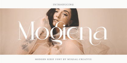 Mogiena Modern serif Font typeface with beautiful alternate and ligature, special glyphs, ornament and multilingual support. It's a very versatile font that works great in large and small sizes. Perfect for editorial projects, Logo design, Clothing Branding, product packaging, magazine headers, or simply as a stylish text overlay to any background image. Features: Lowercase and Uppercase Ligature Numerals & Punctuation Accented characters Multiple Languages Supported
 - Claudie by Epiclinez,
$18.00 Claudie is a stylish script font suitable for wedding invitations, logotype, and product branding. Fall in love with its authentic and romantic feel, and use it to create outstanding designs! So what’s included : Basic Latin Uppercase and Lowercase Numbers, symbols, and punctuations Ligatures Multilingual Support. Accented Characters : ÀÁÂÃÄÅÆÇÈÉÊËÌÍÎÏÑÒÓÔÕÖØŒŠÙÚÛÜŸÝŽàáâãäåæçèéêëìíîïñòóôõöøœšùúûüýÿžß PUA Encoded and fully accessible without additional design software Simple Installations works on PC & Mac Thank You!
 - EFCO Brookshire by Ephemera Fonts,
$45.00 Brookshire was inspired by the lettering seen on the Almanac ephemera paper when I visited the flea market in France. The result is a lovely piece of neo-Victorian fun that brings back the joy of 19th-century shop signs and flamboyant design ethos. Brookshire is ideal for poster work and signage, or anywhere that you want to bring back the joy of high Victorian design ethos.


