10,000 search results
(0.069 seconds)
- Legend by Nandatype Studio,
$10.00 Legend font with simple models of natural and comic, you can take advantage of the opportunity at any time one wonderful way to highlight the celebration of the feast of your best, because these fonts will be a driving force for purposes such as cover design, wedding invitations, party , graduation, birthday, gathering, etc. Font Legend if you want to use for your work this font can be used to easily and simply because there are a lot of features in it contains a complete set of letters lower and uppercase letters, assorted punctuation, numbers, and multilingual support.
 - 1682 Writhed Hand by GLC,
$42.00 This funny font was created inspired from a contract of sale for a field prepared by a French notary in the end of the year 1682 (December seventh). We have worked to transform the almost illegible original form into a contemporary usable typeface, but keeping the special "writhed" appearance. It is a "pro" font containing Western (including Celtic) Eastern and Central European, Icelandic, Baltic, and Turquish diacritics. The numerous OTF alternates and ligatures(about 5 different glyphs or ligatures for almost each basic lower case letter) made the font looking like a real various hand as closely as we can do it.
 - Gridlock by I Can Be Your Type,
$10.00A condensed font using constructivism history to convey the cold hearted steel of machinery and progress. Gridlock tries it's best to fit as much info as possible in a small space neatly in line and with the subtle curves and smoothness of bent steel. The inspiration for Gridlock actually came accidentally after designing some lettering for a self-promo project and it needed something that just was condensed with visual appear. So imagining about how condensed fonts feel, I imagined them being squished together just like cars in traffic are forced to work together to make it to their end destination. - Sakamoto by Gatype,
$10.00 Sakamoto font with simple models of natural and comic, you can take advantage of the opportunity at any time one wonderful way to highlight the celebration of the feast of your best, because these fonts will be a driving force for purposes such as cover design, wedding invitations, party , graduation, birthday, gathering, etc. Font Sakamoto if you want to use for your work this font can be used to easily and simply because there are a lot of features in it contains a complete set of letters lower and uppercase letters, assorted punctuation, numbers, and multilingual support.
 - Tupã by Just in Type,
$19.00 Tupã is the Brazilian indigenous word for thunder, that is worshiped like God in their mithology (in Tupi language). The typeface was developed to be strong and with great impact. The UPPERCASE was carefully designed with a lot of different features, and the lowercase is a mix of small caps and traditional forms, which brings a lot of personality and uniqueness to the design. Tupã familly is composed by two weights and four styles: Regular, Italic, Bold and Bold Italic. It’s a project recommended for titles, logos, posters and everything else you think it works. Take a look at the complete Specimen here.
 - Riga by Ludwig Type,
$45.00 Riga is a space-saving and legible typeface designed to work equally well on paper and on the computer screen. Its personality is clear and practical, yet warm and polite. Riga is suitable for a wide range of typography such as editorial, websites, packaging and corporate design. Economical proportions, high x-height and open letter forms guarantee good performance in narrow columns and tight headlines. Riga is exceptionally readable at small point sizes and elegant at larger ones. Riga comes in 18 styles and weights and contains a large number of OpenType features. For small sizes on screen Riga Screen is also available.
 - Sweet Christmas Monogram by Yoga Letter,
$14.00 "Sweet Christmas Monogram" is a script monogram font with a Christmas theme. This font is very beautiful with a variety of Christmas decorations equipped with a large logo in the form of a very amazing Monogram letter. This font is perfect for Christmas, New Years, invitations, and many other types of work. This font is very complete, because it is equipped with uppercase and lowercase letters, uppercase alternates, lowercase alternates, swash and titling, ligatures, monogram, multilingual support, numeral and punctuation. How to use this font is very easy and there is also a guide for its use in the preview.
 - Cabrito Contrast by insigne,
$29.99 The Cabrito family is back again to make a statement. Released as a complement to the children's book, The Clothes Letters Wear, the original Cabrito is light-hearted, fun, and easy to read. Now, balancing this friendliness with a new elegance, Cabrito Contrast steps forward--a handsome typeface with an extra-sophisticated sensibility injected into the design. Still bright and playful in its Cabrito ancestry, this new Cabrito member approaches the field with a cleaner, more reductionist form, ensuring that its polished look retains the readability. Regular features and Italic forms of the 54 fonts include upright alternates, ligatures, and old figures. A range of weights include extended and condensed variants. To preview any of these interactive features, see the PDF manual. The family also includes language support for 72 Latin-based languages, and there are over 600 glyphs for further refining your work. Cabrito Contrast is best used for logos and packaging as well as flyers and websites, though its readability makes it a great option across a wide variety of works. In short, it’s well-designed just for you. Take a stroll with Cabrito Contrast, and see how much fun refinement can be. Along the way, take a look at a few other members of Cabrito, too and see how well the likes of Original, Inverto or Didone can pair with the new Contrast.
 - Churchward Alien by BluHead Studio,
$25.00 Churchward Alien is the latest OpenType font family released by BluHead Studio, LLC. from the exciting and unique typeface library of Joseph Churchward. The quirky chopped-top motif gives this four weight family a unique presence suitable for display work, but the lighter weights work equally well for short text runs.
 - Isra by Linotype,
$187.99Isra, designed by Almamoun Ahmed in 2005, is a modern Kufi and a winner in Linotype’s first Arabic Typeface Design Competition. The highly geometric and condensed form make it ideal for magazine headlines, advertising, and general display usage, while the large body height and clear forms make it suitable for short text settings. The font includes a matching Latin design and support for Arabic, Persian, and Urdu. It also includes proportional and tabular numerals for the supported languages. - Ellabette by Bombus Hollow,
$24.00 Ellabette™ is a script font that was created by a wedding stationery designer after working in the industry for over a decade and getting request after request for script fonts that were formal but legible. Ellabette is warm and inviting, playful but elegant. Perfect for all things weddings, branding, editorial, social media, and websites. Designed with weddings in mind with fun special ligatures like "RSVP" "and" and "to" and works beautifully for legible address lists and envelope printing.
 - Cern by Wordshape,
$20.00 Cern is a family of20 weights of neutral, yet formally nuanced grotesk typefaces that takes inspiration from the original metal types from Switzerland, yet had a slightly larger x-height for more pronounced legibility. Cern is designed to be highly readable in print and on-screen. The italic variations are true italics and have been designed for smooth, fluid reading and text-setting. The Cern family works equally well for text typesetting and for display design work.
 - SF Old South Arabian by Sultan Fonts,
$9.99Historical Background Old South Arabian Script (OSA) was used before the Islamic era not only in the southwest corner of the Arabian Peninsula, but actually in the entire Peninsula. In addition, samples of OSA have been found as far as Uruk in Mesopotamia, Delos in Greece, and Giza in Egypt. Archaeological finds show that as far back as the 8th century BCE, OSA was used in trade, religious writing, and in civil records. Following the spread of Islam in Yemen, the decline of OSA began in the 7th century CE as it was gradually supplanted by Arabic script. OSA was typically known by the name of the then-dominant peoples in the Southern Peninsula. At various times, it was known as Sabaean, Qatabani, or Hadramite, among others. Although it was used for a variety of languages, OSA is most strongly associated with Sabaean. Many Peninsular languages borrowed OSA before introducing further changes of their own. Prime examples are the Thamudic, Safaitic, and Lihyanite scripts which eventually developed into independent scripts. The westward migration of the Sabaean people into the Horn of Africa introduced the South Arabian consonantal alphabet into the region. The transplanted script formed the roots of the Geez script of Ethiopia, which, in time and under presumably external influences, developed into a rich syllabary unlike any other Semitic script in history. Even a cursory examination of the letter forms of Modern Ethiopic writing reveal a striking similarity to South Arabian Script. OSA inscriptions typically reveal a dominant right-to-left directionality, although there are also many cases of alternating directions, known as boustrophedon writing. Figure 1 is a fine example of this style of writing. OSA inscriptions were discovered early in the 19th century. Soon thereafter, two orientalists, Gesenius and Rödiger, made great strides towards deciphering the script. Styles of Writing Old South Arabian inscriptions have survived primarily on stone, ceramic, and metallic surfaces. Hundreds of artifacts have been found and, to this day, continue to be discovered. Some of the best examples number of inscriptions on softer materials, such as wood and leather, have also been discovered. Although there is a significant difference between the styles of letters on the hard surfaces and those on the soft. Old South Arabian (Musnad) is composed of 29 letters , that is one letter more than the Arabic alphabet, which is between “S” and “Sh”, and names “Samekh”. Aspects of difference between Musnad and the present Arabic writing is that Musnad is written in separate letters, and the shape of the letters do not change according to its place in the word. However, some letters change according to the beginning of the writing. Musnad is either prominent, or deep. Prominent writings are for important writings and deep writings are for ordinary. The material on which the Musnad was written were stones, rocks, wood, and metal. In the course of its development the Musnad use appeared in the “Lehyanite’, “Thamudic”, “Safaitic”, pen to which many changes and amendments were made. And from it “Habashi’ writing was born. As regards his place among the Arabs of the Peninsula , when we look at the internet and its role in cultural dialogue , the Arabs of the Peninsula considered Musnad inscription which was indisputably their national writing until the dawn of Islam. It was used by people in all parts of Arabia in their homeland and abroad . It was their means of chronology and record of their glories and history.2- Features of Musnad Script: 1. It is written from right to left and vice versa. 2. Its letters are not joined. 3. Shape of letters are uniform despite their positions in the word. 4. Words are separated by vertical lines. 5. A letter is doubled in case of assertion. 6. No points and punctuations. 7. Easy to be learned by beginners. My OSA Musnad Font My design and technical work is only a treatment of the OSA Musnad as a symbol of writing. And it is possible to use in computer.. My design is not aimed at demonstrating the linguistic and intellectual structure of the Old South Arabian (Musnad). It is so simple that it could be easy to learn by learners and those who are interested in the OSA Musnad letters in computer. The basis of such importance is that it spares a lot of time and effort for researchers and students in this field. Formerly they used to write the Musnad texts either by handwriting or scan them , But now they can easily write its texts in OSA Musnad by using keyboard directly, so that they can change , amend and fulfill easily and accurately . So, we made use of speed, easiness and accuracy. And anyone interested in the South Arabian history in any part of the world can due to this design read and write OSA Musnad letters most easily. This design will also be used by historians and archeologists. , as well as specialist linguistics . The design also demonstrates the aesthetics of the Himyarit writing. About this font family Old South Arabian is An Arabic, Old South Arabian and Latin typeface for desktop applications ,for websites, and for digital ads. Old South Arabian font family contains two types: Old South Arabian and Old South Arabian serif. The font includes a design that supports Arabic, Old South Arabian and Latin languages. Old South Arabian typeface comes with many opentype features. - Goldbill by Wahyu and Sani Co.,
$20.00 Goldbill is modern sans serif typeface which designed based on geometric shapes. It is not just another geometric typeface, the uppercase letters were designed to have more squared form instead of circular and the lowercase retain the circular looks. It was designed with 2 axes variable; x-height and weight that generates 54 fonts with 3 different x-heights and 9 different weights. The basic version of Goldbill is the best for text, while the Goldbill XS with the narrowest x-height is ideal for display text, logo, etc, and the one with the largest x-height, Goldbill XL would be good for heading, shorter paragraph text or web font. Goldbill type family with its 3 different x-heights would be a great type system for any modern graphic design and typographic work. Each font has 470+ glyphs which covers Western and Eastern Europe Latin based languages, and also equipped with some OpenType Layout Features, such as: Denominators, Fractions, Standard Ligatures, Localized Forms, Numerators, Ordinals, Scientific Inferiors, Subscript, Superscript, and Tabular Figures.
 - Wolverton by Greater Albion Typefounders,
$10.00 The extensive Wolverton family was inspired by a turn of the 20th century luggage label designed by the London and North Western railway. The Wolverton family combines period flair and charm with respect for the modern need for legibility and purposefulness. The family has at its heart four Body text faces (regular, italic, bold and bold italic). These are complimented by three display text faces, offering upper and lower case letter forms, all offered in regular, oblique, bold and bold oblique forms. Four all-capital based display design are also included if offered in the same four style, making an extensive and flexible family suitable for a wide range of uses; everything from setting large amounts of text to large scale signage and poster work. Wolverton offers a unique blend of charm an modern flexibility, why not give it a try today? All faces include lining and old style numerals and are extensively kerned. Individual faces are all economically priced and substantial discounts offered for the purchase of larger sets of typefaces.
 - Bourgeois Slab by Barnbrook Fonts,
$75.00 Bourgeois Slab is built upon the framework of Bourgeois, our popular geometric type family. As with the sans-serif Bourgeois, Slab’s letter forms are thoroughly contemporary in look and feel. Echoing mid-century modernism in style, Slab’s overall look is friendly and businesslike, more expansive and expressive than Bourgeois’s pared-down asceticism. The slab-serif’s development and vigorous uptake during the early-Victorian-era Industrial Revolution, means that we endow slab-serif faces with characteristics of sturdiness, durability and trustworthiness. At the same time, we appreciate the slab-serif’s raison d’etre: They’re made to grab your attention. Bourgeois Slab and Slab Condensed when combined, offer 24 styles suited for text of all kinds and sizes. Both are particularly good for for text-heavy projects and for designers seeking a robust, authoritative-but-genial voice for branding and logo work.
 - Retail Packaging JNL by Jeff Levine,
$29.00 The retail storage box for a vintage metal numbering stamp manufactured by the American Numbering Machine Company had its brand name hand lettered in an Art Nouveau style that most likely went back to the 1920s, as the company was in existence from 1908 to around 1971. Numbering machines were used in offices, schools, libraries, and anywhere a series of numbers needed to be marked onto printed items. Similar to what was called a ‘crash numberer’ used in letterpress shops, the machines could be set to do a run of digits [for example: 4000, 4001, 4002] or repeat numbers for forms used as carbon copies. As computers took over most forms of printing, the use of numbering machines dwindled, but they are still available. The American Numbering Machine Company was one of several Brooklyn, New York companies that specialized in the manufacture of these machines. Retail Packaging JNL replicates the lettering from their packaging, and is available in both regular and oblique versions.
 - Linotype Textra by Linotype,
$40.99Linotype Textra is a clever twist on the sans serif genre, designed by Jochen Schuss and Jörg Herz in 2002. Schuss says this about Linotype Textra: "Two in one! The same Linotype Textra, which is so neutral and practical for long text passages turns into an eye-catching headline type when used in larger point sizes. The trick? It's all in the details. The type's clear, robust forms give it a high degree of legibility when used in smaller point sizes for texts. When used in larger sizes, the angular, slightly irregular forms that give the type its strong character become apparent. Hence the name Linotype Textra: pure text with a little something extra!" With 15 weights, the Linotype Textra family provides graphic designers with a good basis for almost any type of work. The five regular weights have matching true italics and old style figures, and the five small cap weights include tabular figures. - Brewmaster Modern by FontMesa,
$12.00 Brewmaster Modern is a very contemporary script that will work well for sign lettering and t-shirt designs, it also resembles the lettering used for Budweiser Racing.
 - Dahlia Darling by Sulthan Studio,
$12.00 This beautiful handwritten font we made very attractive with a natural touch we worked back to clean smudges and into smooth lettering it's easy when you cut as well as print stickers and other cool work you're working on this font has 3 front swashes and 3 back swashes for lowercase and one alternative for uppercase, 98 ligature Fonts include uppercase and lowercase letters, punctuation numbers, and language support
 - Animated Gothic by BA Graphics,
$45.00 A great animated fun design. Works really well for kid's stuff and children's books.
 - Hagedi MF by Masterfont,
$59.00 Tattoo? Crazy look? this naughty, works best for wild and crazy headlines or signage.
 - Bhamious by Rometheme,
$18.00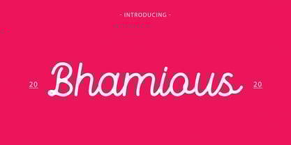 Bhamious is a Monoline Font, It has a elegant, classy look and cool. It’s a great font for fashion, apparel projects, signature, album cover, logo, branding, magazine, social media, & advertisements, but also works great for other projects. Highlights: Standard glyphs (Uppercase, Lowercase, Numeral & Punction) Work on PC or Mac PUA Encoded Support Fonts include multilingual support for; ä ö ü Ä Ö Ü ß ¿ ¡ No special software is required, The fonts can be opened and used in Adobe Illustrator, Adobe Photoshop, Adobe InDesign, even work on Microsoft Word.
 - Creslina by Rometheme,
$22.00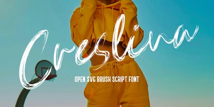 Creslina – Open SVG Brush Script font. It has a elegant, classy look and beauty. It’s a great font for fashion, apparel projects, signature, album cover, logo, branding, magazine, social media, & advertisements, but also works great for other projects. Highlight : Standard glyphs (Uppercase, Lowercase, Numeral & Punction) Work on PC or Mac PUA Encoded Support Fonts include multilingual support for; ä ö ü Ä Ö Ü ß ¿ ¡ No special software is required, The fonts can be opened and used in Adobe Illustrator, Adobe Photoshop, Adobe InDesign, even work on Microsoft Word.
 - Questya by Patria Ari,
$15.00 Questya is a modern and elegant decorative serif with combination of curvy and edgy form. The upper form of glyphs chopped and the lower form/shape curved. This font suitable for projects related to wedding, crafts, branding, or aesthetical preview.
 - Monteria by Melvastype,
$29.00 Monteria is a clean brush script font with nice flow and soft forms. The basic letters are quite simple but if you want to make it look more showy there is a plenty of alternates to make it happen. It is suitable for logos, titles, t-shirts, packages and where ever you will need this kind of lining and legible script font. Monteria includes lots of Stylistic Alternates that gives you many options to customize your text. There are multiple options for upper case letters. Lower cases has options for initial forms, final forms, end swashes and multiple options for ascenders and decenders. All the Stylistic Alternates has also language support.
 - PT Root by ParaType,
$40.00 PT Root is a contemporary sans serif with strict, laconic forms. It’s a versatile typeface that provides a wide range of possibilities. Regular style works great in long texts (both on screen and in print), as well as in the interfaces. Medium and Demibold are good for signage, while the lightest and boldest styles look great in large sizes and are suitable for the brand identity. PT Root is a sans serif with 10 weights and a variable version. Its character set includes extended Latin and extended Cyrillic, three arrow variants, fractions, index numbers and letters. PT Root automatically lifts dashes and brackets with the case change. Its characters have stylistic variants, including the single-storey a, a strikethrough zero and some local alternates for Bulgarian and Serbian Cyrillic. PT Root can work in a project both independently and in pairs. Contemporary serif typefaces are the best text companions for it — try for example PT Serif, Yefimov Serif or Scientia. In case PT Root is the only text typeface in the project, then combine it with serious typefaces, such us technical (Din Condensed as an example) or pronouncedly contemporary typefaces, including postmodern ones, from Stapel or Spile to Helsa.
 - Klaud by Tour De Force,
$25.00 Klaud is our new slab serif family with 14 styles. It is compact, stable typeface that's carefully designed to suit in every possible situation where an working horse typeface could be used. Klaud is good balanced, visually equalized family that looks and feels smooth in longer texts and paragraphs, but works well in headlines also cause it's gentle decorative letter parts. Strong look is achieved by more squared then rounded characters design. As mentioned, Klaud is perfect to fit into any designer's project – from editorial use as the main typeface to situations where you are looking for a couple of words only like posters or packages. It is fully legible and versatile as web font also. Klaud is offered with OpenType features like Numerator, Denominator, Fractions, Small Caps, Oldstyle Figures, Lining Figures, Standard Ligatures, Case Sensitive Forms, Arrows, Alternate Annotation Forms.
 - Heinz by Wiescher Design,
$39.50 Heinz is inspired by the poster design of Heinz Schulz-Neudamm for Fritz Lang’s famous silent movie Metropolis. Heinz Schulz-Neudamm did quite a lot of work for the German branches of big American movie companies like 20th Century Fox or MGM. His most famous work is probably the title lettering for the Metropolis movie. The original drawing for that poster sold in 2005 in London for 398.000 Pound Sterling (approx. US $ 600.000). I designed a completely new font in the feeling of Heinz’s lettering. Enjoy. Yours historically, Gert Wiescher
 - Waterlord by Raditya Type,
$14.00 Waterlord is made to support the work of designers who are used to making work with contemporary styles. This font is great for various design styles, modern or old school.
 - Island Sans by BA Graphics,
$45.00A beautiful face that really works well for any application a distinguished clean look. Headlines, subheads and text anything goes. Will also work as a bolder version of California Sans. - Weiss by Bitstream,
$29.99In this face designed for Bauer in the twenties, Emil Rudolf Weiss used tiny serifs with many inversions and alternative forms to create the mannered texture peculiar to this form. - Insider by Characters Font Foundry,
$25.00 Insider is a warm & legible grotesque. It’s custom made for Insider Consulting in Düsseldorf, Germany. It’s highly legible in small sizes because of the basic proportions and the balanced inner forms. It’s optimized for setting longer texts, but also works very well in headlines and leads. The fonts contain loads of OpenType features to spice up your design. The matching Stencil font is very suited for creative designs. The Stencil Regular has the same dimensions as the Insider Regular, so you can mix them without hassle. The font family has real italics and not just mathematically slanted romans. The dynamic cursive shapes root in handwriting. With 9 styles (5 weights + 4 italics), the family is very versatile and can be used for designs with a complex typographical hierarchy.
 - Show Card Casual JNL by Jeff Levine,
$29.00 Alf Becker graced the pages of "Signs of the Times" magazine month after month for decades, presenting attractive and unusual hand lettered alphabets as inspiration for other sign painters and show card writers. From straightforward text faces to novelty ideas, Becker's talent as a master sign crafter was constant in his work. Show Card Casual JNL is one example of what is referred to as a "one stroke" alphabet (utilizing a single brush stroke in each direction to form the letter or number). Its casual look and playful charm allow for a message to be presented in an informal format that is pleasing to the eye. The type design is available in both regular and oblique versions. Special thanks to Tod Swormstedt of ST Publications for providing the reference material.
 - Electrostatic JNL by Jeff Levine,
$29.00 Electrostatic JNL was inspired by the 1930s lettering for radio station WMCA in New York City. It was found as part of an ad for the station in a 1932 radio broadcasting trade magazine. WMCA went on the air Feb. 6, 1925. According to Wikipedia, the "MCA" call letters stood for the Hotel McAlpin, where the station's original studio and transmitter were located. "W" is the call sign prefix for all broadcast stations East of the Mississippi River; with the exception of KDKA (Pittsburgh), which was the nation's first commercial radio station. This bold novelty typeface with lightning bolds intersecting the characters can be used to represent anything from electricity to stormy days; power generators to brute force and so forth. Electrostatic JNL is available in both regular and oblique versions.
 - Architype Fodor by The Foundry,
$99.00 Architype Crouwel is a collection of typefaces created in collaboration with Wim Crouwel, following his agreement with The Foundry, to recreate his experimental alphabets as digital fonts. Crouwel's most recognized work was for the Van Abbe and Stedelijk museums (1954 –72) where he established his reputation for radical, grid-based design. The Fodor letterforms were created for the magazine published by Museum Fodor, Amsterdam. To save cost it was designed to be ‘typeset’ on their own electric typewriter. The resulting monospaced effect was combined with a background of orange overlaid with pink dots that provided a page grid to align the text to. The title set on the dot matrix formed the 'system' for construction of the ‘digital effect’ letterforms. Now Architype Fodor recreates these letterforms as a truly digital font.
 - Lullaby by Ania Szerszen,
$20.00 Lullaby is a display font that works great for headlines, posters or logotypes. With its regular rhythm, soft lines, some non-standard ligatures and two versions of each character (caps as alternatives), it gives many possibilities for any kind of typographic artworks. It works best with auto kerning in OpenType savvy applications.
 - Frank Reaction by Will Stewart,
$40.00 A high quality hand rendered pencil script that includes a variety of contextual alternates to ensure the best handwritten look. Frank Reaction works brilliantly when used for both display and body copy and it is available for both print and web application. Use Frank Reaction to give your work personality and life.
 - Filmtone by Olivetype,
$18.00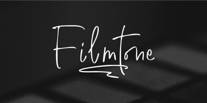 Create beautiful work with Filmtone, the perfect typeface for adding a touch of personality to your designs. With its casual style, Filmtone is perfect for headlines, invitations, posters, and more. So what’s included : Basic Latin Uppercase and Lowercase Numbers, symbols, and punctuations Multilingual Support. Simple Installations works on PC & Mac Thank You.
 - Doncaster by Greater Albion Typefounders,
$8.50 Doncaster is a bold display face which emphasises legibility and clarity. The seven typefaces have a timeless quality, making them equally at home today or even in Victorian inspired design work. All of the faces are ideal for poster work, signage or for really eye-catching but not ostentatious headings and titles.