10,000 search results
(0.043 seconds)
- Aphrodite Slim by Typesenses,
$57.00 Aphrodite Slim Pro is not just a lighter version of its sister Aphrodite Pro. Aphrodite Slim Pro has duplicated the quantity of characters of its partner, and that means more than 500 new glyphs, reaching a total of more than 1000. More delicate and meticulous, Aphrodite Slim Pro is once more a new typography with deep calligraphic ideals: We immersed ourselves into the world of each calligraphy ductus and each calligraphy masters by studying from decoration to lettering books. This was the key for the logic of Aphrodite Slim’s behavior. The new concept of Aphrodite Slim Pro was to join diverse styles of calligraphy in one in order to achieve an autonomous expressiveness, in fact, this is what calligraphy aims to, and we agreed to bring those ideals to the world of typography: It is justifiable to be inspired in hundred-year-old calligraphies, but it is even better if the results you obtain have a plus. A personal plus. During the creation process we were wondering whether it was possible to mix certain strokes of such rigid styles as uncial, (Li·n’s favourite style), with strokes of the copperplate, (Sav’s favourite style), and also to take and mix cualities of cancelleresca cursiva, formata and moderna; finally giving our creation a roman-transition italic look. So Aphrodite Slim takes ideals and aspects from those formal styles, following its own logic though, and emphasizing the fact of being a decorative typography. Calligraphy masters of our past are who we are in debt with. They are the cause we have lovely letters now. They have been spontaneous at the moment of creation, what differs from the type-designers of nowadays, whose spontaneity is more limited. Digital faces that we are used to see these days are a result of long hours of optical adjustments, grids, macros and inspirations of other existing typography, but without personal contributions. Aphrodite Slim wants to refute this. Its mission is to rescue de spontaneity of the artesanal lettering in order to obtain unique words; those which only calligraphy masters of our past or lettering artists of our present could give us. We have worked hard to achieve this, making Aphrodite the most universal font we could: It was necessary to study the most common words, focalizing more in the ones referring to “sensitivity”, of four of the most spoken languages in the world. Aphrodite Slim has an enormous quantity of decorative characters and special ligatures for phrases and words in English, French, Spanish and German. (See English, Français, Español, Deutsch PDF in the gallery section). We promise there is no existing type that decorates/ligates glyphs and words like Aphrodite Slim does: It is the first time a font like this really considers its purpose. -The way glyphs are ligated is insane- : Aphrodite Slim rescues some ideals of persons like Jan van den Velde (Italian cancilleresca writing of XVI Century) who understands ascenders and descenders as possibilities to beautify the lines of writing with curved strokes that seem to be dancing above and below of the words. This master also creates ascenders and descenders even where they are not necessary, on letters that do not actually need them: Aphrodite Slim takes this ideal. The font counts with a wide range of glyphs that seem not to be satisfied with its more primitive form and prefer to extreme their parts to be decorative. It also existed masters of calligraphy like José de Casanova of XVII Century, who, with a magnificant skill and a really personal mark, had the particularity of ligating words that were actually separated with spaces. This is another innovative feature in Aphrodite Slim. An investigation of the most common beginnings and endings words of the English language was done. Having that feature activated (discretionary ligatures), common words will start to ligate or to be decorated even when they are separated by spaces. Impossible to forget Francesco Periccioli of XVII Century and our experience us designers to face with works of him: His letters, that today are included in the group of cancellerescas modernas, have been a direct inspiration to the oldstyle figures and historical forms variables in Aphrodite Slim. Giovanni Antonio Tagliente (XVI Century) and his particular way of making tails and diagonals longer than usual, qualities that our creation reflects too. Finally, our adventures in Biblioteca Nacional and Barrio San Telmo, Buenos Aires, were essential for us to make Aphrodite Slim more complete and interesting: Sav did an excellent work when studying how the decorative miscellanea and swirls of early XX century were. She also investigated what particularities made those roman titling characters look antique so she could rescue some ideals for the oldstyle figures and historical forms variables. This also leaded her to create the ornaments variable in Aphrodite Slim. We are really proud of presenting Aphrodite Slim Pro, a typography that was the result of days and nights of working hard, because we do love what we do; and we are glad we are living in a present that gives us the possibility to spread this kind of art, because that is the way we consider our job: Aphrodite Slim Pro is Art. Hope you can appreciate the enormous work this type has. Features. Aphrodite Slim Pro is the most complete variable. It includes more than 1000 glyphs. Thanks to the Open-Type programming, it counts with a easy way to change/alternate glyphs if the application in which the font is used supports this. The variables contained in Aphrodite Slim Pro are also offered separately. Aphrodite Slim Text: It is the variable for lines and paragraphs. Thus it is the least ornamental and the most accurate to achieve a satisfying legibility. It has the Standard Ligatures feature in order to improve the possible conflicts some glyphs could have by others. Aphrodite Slim Contextual: It is the one that makes emphasis in decorating. It has the particularity of ligating/decorating words of common use in English, French, Spanish and German. It also has the quality of ligating common beginnings and endings of the common words in English. Aphrodite Slim Stylistic: With similar features of Slim Contextual. It includes a set of decorative numbers for a display use. Aphrodite Slim Swash: This one has special beginnings and endings to decorate words. Aphrodite Slim Endings: It makes words look as a signature. Aphrodite Slim Historical: It adds an antique look to the written word. It also has the special historical ligature function. Aphrodite Slim Titling: This one is the most decorative. Its copperplate inspired ornaments give words a special color, in order to handle the quantity of decoration, it comes with the standard ligature feature, which has the most common ligatures plus others that make decorative swirls not to be conflictive. Aphrodite Slim Ornaments: A set of 52 ornaments. Aphrodite Slim Pro includes all this features plus the Stylistic Set 1; Stylistic Set 2 and the possibility of Slashed Zero. We recommend you to check out the gallery in order to see all these features in action.
 - Cabrito by insigne,
$24.00 After my son was born, I found myself reading him a lot of books. A LOT of books. Some were good, some were great, but I found myself wanting to develop something using my skills and interests to make something that only I could make. In short, I realized my son needed to be indoctrinated—I mean, introduced into the wonderfully wild world of fonts. So, I set about to make a board book to teach about typography, called “The Clothes Letters Wear.” You can learn more about the book here. I’ve made the captivating illustrations bright and colorful, and the use of different letter forms makes for a fascinating read to delight ages young and young at heart. And, as an added bonus, this children’s book has a custom designed font. I’m always looking for an excuse to design a new font, and this book created the perfect alibi. Drum roll, please. I now give you … Cabrito (“little goat” en Español). This new serif typeface incorporates the latest research on typographic legibility for children, features to make it—well, extra legible. A little background: studies show that Bookman Old Style is one of the most readable typefaces, and as a consequence or perhaps the reason why, it is used thoroughly for children’s books. This font became my initial inspiration for the typeface. Then, I found more legibility research saying that (brace yourselves) Comic Sans is also very legible for beginning readers, much due to the large x-height and softer, easily recognizable forms. In addition, forms that are closer to handwriting also seem to be more legible. Once I threw all that into my cauldron and stewed it a bit, the result was a pleasantly rounded typeface that includes not-so-strictly geometric, handwriting-inspired forms for the b, d, p, and q. Es guapo! Cabrito’s slender weights are simple and fun, with extras that turn any “bah humbug” into a smile. Add lighter touches to your project with the typeface’s included sparkles or rainbows (not included). Splash a little more color on the page with the firmer look of the thicker weights. Cabrito’s upright variations across all weights are matched by optically altered italics, too, giving you even more variety with the font family. This modern typeface’s bundle of alternates can be accessed in any OpenType-enabled software. The fashionable options involve a significant team of alternates, swashes, and meticulously refined aspects with ball terminals and alternate titling caps to decorate the font. Also bundled are swash alternates, old style figures, and small caps. Peruse the PDF brochure to check out these options in motion. OpenType-enabled applications like the Adobe suite or Quark allows comprehensive control of ligatures and alternates. This font family also provides the glyphs to aid a variety of languages. Cabrito is a welcoming, everyday font family by Jeremy Dooley. Use it to convey warmth and friendliness on anything from candy and food packages to children’s toys, company IDs or run-of-the-mill promotional material. Cabrito’s unique appearance and high legibility make it equally at home in print as it is on a screen.
 - Foundry Dat by The Foundry,
$50.00 Foundry Dat is created with a common horizontal dash grid structure for accurate layering when characters are superimposed. Foundry Dat’s integrated background aligns vertically and horizontally, when set solid, forming a continuous pattern. Foundry Dat’s companion family Foundry Dit functions as a legible correspondence font, with a ‘typewriter’ feel. Each family contains: light, regular, medium and bold weights. Foundry Dat comes with a series of dashes to extend the background grid. Characters can also be offset to make different patterns – in the process becoming images – a graphic language with total integration of form and function.
 - Galagar by Jadatype,
$12.00 Galagar is a font with a strong look. The font is suitable for your branding name, poster title, event, or group name, supported by the font that gives a strong effect to the reader. has its own market and fans. can be used in adobe illustrator, photoshop, or microsoft word. By purchasing this font, you will get: - Uppercase and Lowercase letters - Alternates Characters - Ligatures - Numbering and Punctuations - Multilingual Support - Works on PC or Mac - Simple Installation - Support Adobe Illustrator, Adobe Photoshop, Adobe InDesign, also works on Microsoft Word. Thank you
 - Kau by Scholtz Fonts,
$21.00 Kau is a quirky, sans serif display font in two weights. Its funky, stencilled outline bursts onto the page with in-your-face energy, just demanding to be noticed. Kau Black is big and bold, specially crafted for posters, headlines, ads and logotypes. Kau Light forms a perfect foil - clear, skinny and edgy. Use the two together, in a contrasting explosion of form, to create exciting contrasts and vibrant designs The font has all the features of a fully professional typeface. Language support includes all European character sets.
 - Afish by Borutta Group,
$29.00 AFISH was born out of the need to create a variable serif display typeface – so that any headline on the poster would easily fit. The form of the letters comes naturally from Didone style typefaces, while many of the characters have an experimental form that will not leave the audience indifferent. AFISH will be ideal for posters and strong headline and branding use. The entire family consists of one weight and five widths. Karol Mularczyk and Małgorzata Bartosik worked on the project under the creative direction of Mateusz Machalski.
 - Wolfsbane by Groen Studio,
$12.00 Wolfsbane is a brush script that is beautiful and unique, it is a model of modern calligraphy typefaces, in combination with a calligraphy writing style. Font features: - Contextual swashes - Contextual Alternates - Standart ligatures - Discretionary ligatures - Initial Forms - Terminal Forms - Stylistic Alternates - Stylistic sets Font file included: Wolfsbane OTF Can be used for various purposes.such as headings, logos, wedding invitation, t-shirt, letterhead, signage, lable, news, posters, badges etc. To enable the OpenType Stylistic alternates, you need a program that supports OpenType features such as Adobe Illustrator CS, Adobe Indesign & CorelDraw X6-X7.
 - DR Krapka Square by Dmitry Rastvortsev,
$29.99 In the DR Krapka Square typefamily, the pixel has a square shape. The font supports OpenType features and contains small capitals, ligatures, oldstyle figures, terminal forms, historical forms, stylistic sets. The dingbats, arrows, emoji are also present. For small texts, it is recommended to use DR Krapka Square-FontSize10px in the font size 10 px. DR Krapka Square typefamily supported European languages based on Latin, Cyrillic and Greek scripts. If you want to use fonts with a different shape of pixels, there are also typefaces from DR Krapka family: DR Krapka Round, DR Krapka Rhombus.
 - Litera by ITC,
$29.99Litera was designed in 1983 by Michael Neugebauer, who used the same strict constructed design found in his typeface Circulus. In its figures are the clear geometric forms of the circle, triangle and rectangle, which were also the main forms of Bauhaus designs. The overall look of Litera is modern, clear and light. Distinguishing characteristics are the openness and the e and P and the particularly long cross stroke of the G. The cool Litera is best for middle length texts and headlines. Similar typefaces include Futura from Paul Renner and Avenir from Adrian Frutiger. - Linotype Fehrle Display by Linotype,
$29.99Erich Fehrle designed this robust alphabet for headlines and titles in 1976. The constructed figures of Linotype Fehrle Display were built on the geometric form of the rectangle. Lines of text look closed and compact. The letter forms are the result of fine open spaces. Design-specific characteristics of Linotype Fehrle Display are its serif-like additions to the strokes of the figures a, c, G or M, and the alternating rounded and angular outlines of the figures a, e, s and others. Typefaces similar to Linotype Fehrle Display: Bigband, Frutiger 95. - Linotype Red Babe by Linotype,
$29.99Linotype Red Babe is part of the Take Type Library, chosen from the entries of the Linotype-sponsored International Digital Type Design Contests of 1994 and 1997. With Red Babe, Austrian designer Moritz Majce produced an energetic typeface which gives an impression of movement and change. The letter forms seem to be composed of countless fragments which can’t sit still, fragments which make the original forms burst and then draw them back together with their own rhythm. Linotype Red Babe is best used for headlines in larger point sizes. - Cookery by Los Andes,
$29.00 Cookery is a contemporary, friendly and authentic hand-drawn brush pen typeface with irregular baseline. It is well-suited to display use for book covers, logotypes, packaging, restaurant menus, invitation cards and advertising, among other uses. Get the most out of Cookery's 613-character set by activating OpenType features including letters having the capability to automatically adjust between connected and disconnected forms, alternates, swashes, initial/terminal forms, old style figures, etc. All these alternatives provide a wide range of possibilities to give your compositions a natural, playful and unique look.
 - Tropika Island by Aiyari,
$30.00 Introducing a new Tropical Display Font Family called Tropika Island, inspired from my previous typeface (Dreadful Font Family & Saturday Night Font Family) combined with Midcentury Tiki Art Signage. The special features on Tropika Island is Tropika Interlock that comes with 3224 pair of ligatures, Stylistic Alternate, & Stylistic Set 01-03. Tropika Casual is complementary and contains OpenType features as ligatures, Terminal forms, Initial forms, Stylistic Alternates. Tropika Island Font Family is best used for headings, logo types, apparel design, invitations, posters, flyers, greeting cards, packaging, book covers, printed quotes, cover album, movie, and more.
 - Europa Grotesque by Red Rooster Collection,
$49.00 Europa Grotesque is a condensed sans serif font family that was originally designed by Sam Ardell (TP) in the 1950’s for the Techni-Process Collection. Steve Jackaman (ITF) acquired the rights to the TP Collection in 1991 and produced Europa Grotesque in its digital form in 1994. Europa Grotesque has impressive impact at display and subhead sizes, and its geometric forms sustain that distinctiveness in both all-caps and lowercase. The family is flexible and freeform enough to support both a laid-back feel while still feeling tight and controlled.
 - Adantine by Greater Albion Typefounders,
$9.95 Adantine offers the opportunity to bring Victorian Elegance and Character to modern design work. It is inspired by the hand-lettered captions often seen on old sepia-toned postcards, but also has some of the spirit of 19th century advertising cuts. Adantine is offered in regular and text faces, as well as all and small Capitals forms with purpose made swashed capitals, and in a decorative embossed form. It can be used to set small amounts of text, as well as for headings and display purposes. Bring some steam-age elegance to your next project!
 - Foundry Fabriek by The Foundry,
$99.00 Foundry Fabriek was inspired by the concepts behind industrial fabrication, where and how parts of materials or structures are united. The systematic grid, formed by stencil shapes, is indicative of the work of Wim Crouwel, consultant on the development of this typeface. The compact character widths of Foundry Fabriek are consistent over the five weight progression, giving flexibility for a variety of applications. The characteristic letterforms have an extra dynamic in large scale, perhaps in cast concrete or laser cut metal, to form integrated components in architectural or signage projects.
 - Biscuit Boodle by insigne,
$11.00 Biscuit Boodle is a fun and uplifting script from Portland Studios Illustrator Justin Gerard. The characters are brush drawn with a slight texture. The font comes packed with OpenType alternates and ligatures. Included are small caps, old style figures, titling alternates and ending swashes. Sixty-four optional ligatures add a slapdash quality to your copy and make sure that no two letters in a word are alike, and auto replacing word ligatures add to the fun. The Biscuit Boodle family also includes an even more spontaneous alternate and even ornaments for even more creative options.
 - Kozmetica Script by Sudtipos,
$69.00 Kozmetica is new original elegance from the dynamic team of Koziupa and Paul. Soft, warm forms made of pensively fluid strokes make for comfortable and classy delivery with just enough ornamentation to evoke the rich days of art deco. Kozemtica comes with plenty of alternates, focusing in particular on the degree of lowercase ornamentation. The setting can be simple and straightforward, or swashed with hairlines seamlessly emanating and swirling from beginning or ending forms. Designed by Koziupa and digitized by Ale Paul, Kozmetica’s ideal use is in packaging design.
 - Filson Pro by Mostardesign,
$26.00 Designed by Olivier Gourvat in 2014, Filson Pro is a new geometric sans serif family with versatility in mind. With its 575 glyphs and its round aspect, this typeface covers all kind of graphic and web design projects. This font family contains 16 fonts from Thin to Black with a professional range of Opentype functions such as pro kerning,lining and oldstyle figures, stylistic alternates, case sensitive forms, localized forms and f-ligatures. For better typographic control, Filson Pro also includes Opentype class kerning with thousands of kerning pairs.
 - HWT Catchwords by Hamilton Wood Type Collection,
$24.95 Catchwords have always been offered alongside standard alphabets in wood type catalogs and so often appear on posters as a decorative punch that they have become part of the wood type vernacular. Words like 'The', 'And', 'To', 'For', and less common abbreviations could be inserted into a design along with decorative ornaments or stars when space was tight or to add variety in the design. HWT Catchwords features over 80 words based directly on designs offered by Hamilton and other wood type manufacturers of the 19th and early 20th Century.
 - Ashtronaut by Chank,
$20.00 Like a phoenix rising from the ashes, the new Ashtronaut font is on fire and blasting off into outer space. This futuristic new font combines basic geometric forms like circles and dashes to form uppercase shapes that are softer and more traditional and lowercase letters with sharp and abstract characteristics. The result is a minimalist style that creates distinct and innovative new glyphs and letter combinations. The basic Bold variety is the strongest of the bunch. Try overlapping it with the other styles — Inlines, Outlines, and Bulbs — in different colors for dramatic and exciting effects.
 - Margarita by PampaType,
$60.00 Alejandro Lo Celso’s tribute to Bodoni takes the form of a humorous fat face for display use, in both solid and engraved forms. Four years after Bodoni’s death, Margherita, Giambattista’s widow, published the two volumes of the famous Manuale Tipografico, a significant catalogue even today. Margarita’s curves are extremely sensual, it should be set only at huge sizes. The typeface includes several ligatures both standard and discretionary, and a set of contemporary ornaments to set nice frames and patterns. We hope you enjoy working with this fancy type. See more at PampaType.com.
 - Mariangelica by Allouse Studio,
$16.00 Proudly Presenting, Mariangelica A Handwritten Script Font. Mariangelica is perfect for any titles, logo, product packaging, branding project, megazine, social media, wedding, or just used to express words above the background. Mariangelica also come with Multi-Lingual Support. Enjoy the font, feel free to comment or feedback, send me PM or email. Thank You!
 - Historyline by Allouse Studio,
$16.00 Proudly Presenting, Historyline A Minimalist Monoline Font Historyline is perfect for any titles, logo, product packaging, branding project, megazine, social media, wedding, or just used to express words above the background. Historyline also come with Multi-Lingual Support. Enjoy the font, feel free to comment or feedback, send me PM or email. Thank You!
 - FF Koberger by FontFont,
$41.99 German type designer Manfred Klein created this blackletter FontFont in 1991. The font is ideally suited for film and tv, poster and billboards as well as software and gaming. FF Koberger provides advanced typographical support with features such as ligatures, alternate characters, case-sensitive forms, and stylistic alternates. It comes with proportional lining figures.
 - Qarllottey by Allouse Studio,
$16.00 Proudly Presenting, Qarllottey a Modern Elegant Script Font. Qarllottey is perfect for any titles, logo, product packaging, branding project, megazine, social media, wedding, or just used to express words above the background. Qarllottey also come with Multi-Lingual Support. Enjoy the font, feel free to comment or feedback, send me PM or email. Thank You!
 - Groovy Syndrome by Haksen,
$18.00 Groovy Syndrome is perfect for shirts, retro designs, procreate, stickers, logos, branding, greeting cards, Cricut projects, posters, magazines, social media, prints and more! There are three fonts included - Regular, Outline and Extrude. You can use these three fonts to create your own retro quotes and words! Hope You enjoy it. All the Best, Haksen
 - Yoehline by Allouse Studio,
$16.00 Proudly Presenting, Yoehline A Handwritten Signature Font. Yoehline is perfect for any titles, logo, product packaging, branding project, megazine, social media, wedding, or just used to express words above the background. Yoehline also come with Multi-Lingual Support. Enjoy the font, feel free to comment or feedback, send me PM or email. Thank You!
 - Demigoldetty by Allouse Studio,
$16.00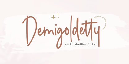 Proudly Presenting, Demigoldetty A Monoline Handwritten Font. Demigoldetty is perfect for any titles, logo, product packaging, branding project, megazine, social media, wedding, or just used to express words above the background. Demigoldetty also come with Multi-Lingual Support. Enjoy the font, feel free to comment or feedback, send me PM or email. Thank You!
 - Borda by The Northern Block,
$39.00 A carefully drawn geometric typeface. Exacting angles are combined with smooth corner details to form a clean, legible font with a modern appearance. The compact nature of the letterforms allows for great use of space across text layouts. Details include 6 weights with italics, extended European & Cyrillic character set, manually edited kerning and Euro symbol.
 - Bufon by DeMilán Studio,
$20.00 Bufon is a font that holds many ligatures (815); a characteristic that intervenes in the rhythm of words. For this aim, a study of the combination of signs in the text was made. The interest was to detect the most frequent duets and trios of letters. Three languages were studied; English, French and Spanish.
 - Linotype Marcu San by Linotype,
$29.99Marcu San is part of the Take Type Library, which features the winners of Linotype’s International Digital Type Design Contest. Designer Markus McCallion designed his sans serif font with unusual forms based on circles and circle fragments. Legibility is thus decreased for the sake of a unique look and a variety of design possibilities. - Renitha by Allouse Studio,
$16.00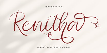 Proudly Presenting, Renitha a Lovely Calligraphy Font Renitha is perfect for any titles, logo, product packaging, branding project, megazine, social media, wedding, or just used to express words above the background. Renitha also come with Multi-Lingual Support. Enjoy the font, feel free to comment or feedback, send me PM or email. Thank You!
 - Minescript by Allouse Studio,
$16.00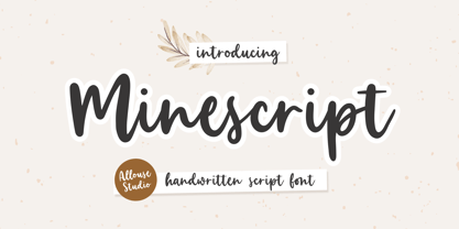 Proudly Presenting, Minescript A Handwritten Script Font. Minescript is perfect for any titles, logo, product packaging, branding project, megazine, social media, wedding, or just used to express words above the background. Minescript also come with Multi-Lingual Support. Enjoy the font, feel free to comment or feedback, send me PM or email. Thank You!
 - Clothingline by Allouse Studio,
$16.00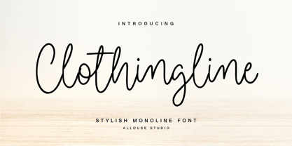 Proudly Presenting, Clothingline a Stylish Monoline Font. Clothingline is perfect for any titles, logo, product packaging, branding project, megazine, social media, wedding, or just used to express words above the background. Clothingline also come with Multi-Lingual Support. Enjoy the font, feel free to comment or feedback, send me PM or email. Thank You!
 - Duquesne Dark Woodcut by Greater Albion Typefounders,
$18.00 Duquesne Dark Woodcut is a new typeface in the spirit of 19th century American wood cut typefaces. There is an almost rustic simplicity to its heavily serifed letter forms, ideal for capturing the spirit of the mid-west, or early Victorian Britain. Long live the era of the Cowboy and the Steam Navigation Canal!
 - Juicetime by Allouse Studio,
$16.00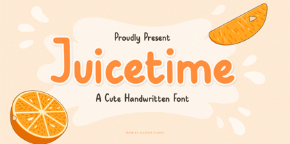 Proudly Presenting, Juicetime A Cute Handwriten Font. Juicetime is perfect for any titles, logo, product packaging, branding project, megazine, social media, wedding, or just used to express words above the background. Juicetime also come with Multi-Lingual Support. Enjoy the font, feel free to comment or feedback, send me PM or email. Thank You!
 - Galaxy Placebo by Adante Creative,
$23.00 Introducing by Adante.Creative Proudly Presenting Galaxy Placebo Galaxy Placebo is a bold Display font Galaxy Placebo is perfect for product packaging, branding projects, megazine, social media, wedding, or just used to express words above the background. Galaxy Placebo has multilingual support. Enjoy the font, feel free to comment or feedback, send me PM or email.
 - FF Layout by FontFont,
$41.99 German type designer Gerd Wippich created this script FontFont in 1996. The family has 7 weights, ranging from Regular to Bold (including italics) and is ideally suited for festive occasions and editorial and publishing. FF Layout provides advanced typographical support with features such as ligatures and case-sensitive forms. It comes with tabular lining figures.
 - Mellorine by Allouse Studio,
$16.00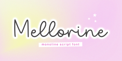 Proudly Presenting, Mellorine A Monoline Script Font Mellorine is perfect for any titles, logo, product packaging, branding project, megazine, social media, wedding, or just used to express words above the background. Mellorine also come with Multi-Lingual Support. Enjoy the font, feel free to comment or feedback, send me PM or email. Thank You!