10,000 search results
(0.05 seconds)
- RM Hunky by Ray Meadows,
$19.00 This distinctive chunky design has a wide range of possibilities as a display face. With a nod towards Deco this strong, bold and well balanced font has a wide range of uses. Due to the nature of this design there may be a very slight lack of smoothness to the curves at extremely large point sizes (around 200 pt and above).
 - Florest Display by Kaligra.co,
$19.00 Florest Display is a clean bold and simple vintage sans serif font, with smooth edges and touch of many beautiful alternate characters make this font look Elegant & stylist. It contains an uppercase alphabet with numbers and symbols. Designed with Stylistic Alternates and Contextual Alternate in some characters that allows you to mix and match pairs of letters to fit your design.
 - Echo Ethnic by HIRO.std,
$17.00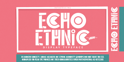 Echo Ethnic is a Display Typeface This font describes about ethnic, culture, uinque, dynamic, artistic, and easy to use. FEATURES - Support Opentype Features - Numbering and Punctuations - PUA Encoded Characters - Multilingual Support - Works on PC or Mac USE Echo Ethnic works great in logotype, craft, branding, magazine, poster, apparel and any projects that need all about Ethnic taste. Enjoy using! Thanks. HIRO.std
 - Avocado Sans by ArtyType,
$29.00 This ‘pear-shaped’ typeface literally defines its original design inspiration in the first capital letter. The clean-cut lines and uniquely curved letterforms, combined with a thoughtful mix of squared & rounded terminals, all help make Avocado Sans such a stylish and legible font, very easy on the eye. Available in two practical weights, Light & Regular, each offering alternate style options.
 - Cica by Alive Fonts,
$40.00 Ok, I'm allergic to cats and have never had one, but I can still create a typeface that embodies feline character! Cica combines the careful nature of cunning cats with the playfulness of kittens. It's simply fun to use and expresses multiple personalities depending on your choice of all upper case, lower case or mixing the two. Take Cica home with you today!
 - Zanderley by Greater Albion Typefounders,
$15.00 Zanderley was inspired by a small, almost random sample from a turn-of-the-last- century calligrapher’s instructional manual. It’s a bit Roman, mixed with a little blackletter and a lot of random decorative fun.The family consists of two typefaces- Zanderley regular is a heavy, friendly an d fun display face. They are well complimented by Zanderley initials. Try them out soon!
 - Redoneta Rounded by Rafael Jordan,
$30.00 Redoneta Rounded is an extension of Redoneta font family created by Rafael Jordan, adding kindness to the rational geometry, keeping its workhorse vocation mixing efficiency and the beauty of simplicity. Redoneta Rounded is available in 6 weights and its matching italics. It has an extended collection of OpenType features, including seven stylistic sets to customize how performs in multiple ways.
 - Maple Lane by Okaycat,
$29.00 Maple Lane is a refined traditional serif font composed by the Okaycat design team, Natsuko Hayashida & Luke Turvey, in 2014. Bold letterforms contrast with fine seriffed detail at Maple Lane to offer style excellence with fancy embellishment options. This nicely balanced serif is designed to mix and match with the more relaxed and casual version of Maple Lane,
 - Buchmann by HIRO.std,
$14.00 Buchmann is Display Font This font describes about about fear, bold, taft, manly, hard, power, stiff, mighty, brave, gallant, rigid. FEATURES - Uppercase letters - Numbering and Punctuations - PUA Encoded Characters - Multilingual Support - Works on PC or Mac USE Buchmann works great in any branding, magazines, poster, social media posts, clothing, advertisements, product packaging, product designs, label, quotes and any projects. Enjoy using! Thanks. HIRO.std
 - Curves Accent by Blackout,
$20.00Curves accent is based on the idea of accents. We add small details to increase interest. Some say small details make all the difference; the font seeks to prove this. This font is fun, open, and ready to accent any work it is placed on. It may very well be used to add the special touch most people would love to see. - Is This The End by Intellecta Design,
$19.90 Is This the End has three different ornamental endpieces ready to use in end chapters, final pages in books, magazines and several artistic representations. Each endpiece may be used in different languages like German, Bulgarian, Croatian, Danish, Spanish, Finnish, French, Dutch, Italian, Norwegian, Polish, English and Portuguese. Intellecta Design researched these endpieces from the very rare Richard Gans type catalogue from 1882.
 - Closer Text by Mint Type,
$35.00 Closer Text is a narrower, more compact version of previously released Closer. Closer Text is a highly customizable Swiss grotesque with overclosed aperture. Featuring some humanistic shapes, Closer Text feels less bland though still relatively neutral. Closer Text comes in 9 weights (18 styles altogether), features extensive language support including Cyrillic and is highly customizable with 7 stylistic sets to mix and match.
 - Kwark by Hanoded,
$15.00 Kwark is a nice, cartoonesque outline font with a bit of grunginess. Yes, it is an all caps font, but upper- and lowercase letters differ in shape, so you can mix and match. The name is not really related to the way the font looks: kwark means 'curd' in Dutch. You think that sounds delicious? Well, then give Kwark a try!
 - Dempsey by Just My Type,
$25.00 Creative people tend to mix printing and cursive, i.e. some letters connected, some not. Why? Who knows? Handwriting analysts have a field day with this sort of thing. Have a field day of your own with Dempsey, based on the writing of Tucson film teacher, media artist and programmer, Vikki Dempsey. It’s fun, assertive and will make you look even more creative.
 - Ziggity by Pelavin Fonts,
$20.00 With its tall, slinky letterforms and perky switchbacks, Ziggity may not be your father's typeface, but don't let that fool you. It's ready and willing to step right up and say what's needed with a unique angle on things. Ready to use as-is or with any variety of angles, outlines or shadows, it will make your message memorable if not downright adorable.
 - Eurydome by Emboss,
$30.00 Eurydome is one of Jupiter's many moons, and was named after Eurydome, the mother of the Graces in Greek mythology. Eurydome was inspired by the Grotesque face Venus, with an additional flair added to the lowercase a, b, d and g. Eurydome was designed to complement any display face that may be used in your project. Add grace to your layout, with Eurydome.
 - The Milade by TM Type,
$12.00 The Milade is inspired by the retro style in combination with the hand lettering style.The Milade has many alternative swash & ligatures characters and has opentype features like a stylistic alternatice, stylistic set, ligature, and swash so you can mix and match as you want. This font is PUA encoded which means you can access all of the amazing glyphs and ligatures with ease!
 - Precious Serif by G-Type,
$60.00 Precious Serif is a distinctive, modern slab serif typeface, first released in 2003 and now refreshed in 2017. This contemporary, chunky gem is the sister typeface to our Precious Sans family, both sets designed with similar metrics and characteristics to ensure they pair together seamlessly in print & digital applications. Mix Precious Sans & Serif together in a block of text to wonderful effect!
 - Town And Country JNL by Jeff Levine,
$29.00 Town and Country JNL features a mix of block-style characters along with rounded ones found so often in the Art Deco fonts of the 1940s. Modeled from the hand-lettered title on a piece of sheet music from that era, this unusual coupling of two distinct design styles works despite it breaking all of the obvious rules of typography.
 - The Thief Bird by Lemur,
$14.00 The Thief Bird is an informal grotesque font. Although informal and grotesque may seem to be two quite different ideas, we have to dig into the origin of this typeface in order to understand the matter. The concept behind The Thief Bird was inspired by the adaptation that the vintage sign painters made when they took the grotesque style characters they saw in newspapers and magazines and reproduced them using a brush, aiming to make the prices of the products displayed on wooden boards stand out, as opposed to highlighting large headlines (such as the idea behind fonts like Franklin Gothic). The Thief Bird takes the language from sign painters and turns it into a font --this time around not aiming to set prices but to bring children stories to life. Thus, some legibility features from grotesque fonts were mixed with the brush calligraphy to add grace and zest to a font intended for children. The Thief Bird is a playful display font, with cheerful ligatures and alternate characters. It is really attractive for setting short paragraphs that tell stories for little people. The Thief Bird has one single weight and it’s ideal to be used in storybooks, candy packaging, films, toys, logos, labels, etc. The font has an extended set of 643 characters supporting 219 Latin languages. It has a complete set of small caps, sensitive cases, more than 30 pairs of ligatures, alternate characters and much more. This cool, informal and laid back typeface will be the perfect match for illustrations of fairy tales, comics for children and any product or publishing for the little ones. The Thief Bird supports this languages: Abenaki, Afaan Oromo, Afar, Afrikaans, Albanian, Alsatian, Amis, Anuta, Aragonese, Aranese, Aromanian, Arrernte, Arvanitic (Latin), Asturian, Atayal, Aymara, Bashkir (Latin), Basque, Bemba, Bikol, Bislama, Bosnian, Breton, Cape Verdean Creole, Catalan, Cebuano, Chamorro, Chavacano, Chichewa, Chickasaw, Cimbrian, Cofán, Corsican Creek,Crimean Tatar (Latin),Croatian, Czech, Dawan, Delaware, Dholuo, Drehu, Dutch, English, Estonian, Faroese, Fijian Filipino, Finnish, Folkspraak, French, Frisian, Friulian, Gagauz (Latin), Galician, Ganda, Genoese, German, Gikuyu, Gooniyandi, Greenlandic (Kalaallisut)Guadeloupean, Creole, Gwich’in, Haitian, Creole, Hän, Hawaiian, Hiligaynon, Hopi, Hotcąk (Latin), Hungarian, Icelandic, Ido, IgboI, locano, Indonesian, Interglossa, Interlingua, Irish, Istro-Romanian, Italian, Jamaican, Javanese (Latin), Jèrriais, Kala Lagaw Ya, Kapampangan (Latin), Kaqchikel, Karakalpak (Latin), Karelian (Latin), Kashubian, Kikongo, Kinyarwanda, Kiribati, Kirundi, Klingon, Ladin, Latin, Latino sine Flexione, Latvian, Lithuanian, Lojban, Lombard, Low Saxon, Luxembourgish, Maasai, Makhuwa, Malay, Maltese, Manx, Māori, Marquesan, Megleno-Romanian, Meriam Mir, Mirandese, Mohawk, Moldovan, Montagnais, Montenegrin, Murrinh-Patha, Nagamese Creole, Ndebele, Neapolitan, Ngiyambaa, Niuean, Noongar, Norwegian, Novial, Occidental, Occitan, Old Icelandic, Old Norse, Oshiwambo, Ossetian (Latin), Palauan, Papiamento, Piedmontese, Polish, Portuguese, Potawatomi, Q’eqchi’, Quechua, Rarotongan, Romanian, Romansh, Rotokas, Sami (Inari Sami), Sami (Lule Sami), Sami (Northern Sami), Sami (Southern Sami), Samoan, Sango, Saramaccan, Sardinian, Scottish Gaelic, Serbian (Latin), Seri, Seychellois Creole, Shawnee, Shona, Sicilian, Silesian, Slovak, Slovenian, Slovio (Latin), Somali, Sorbian (Lower Sorbian), Sorbian (Upper Sorbian), Sotho (Northern), Sotho (Southern), Spanish, Sranan, Sundanese (Latin), Swahili, Swazi, Swedish, Tagalog, Tahitian, Tetum, Tok Pisin, Tokelauan, Tongan, Tshiluba, Tsonga, Tswana, Tumbuka, Turkish, Turkmen (Latin), Tuvaluan, Tzotzil, Uzbek (Latin), Venetian, Vepsian, Volapük, Võro, Wallisian, Walloon, Waray-Waray, Warlpiri, Wayuu, Welsh, Wik-Mungkan, Wiradjuri, Wolof, Xavante, Xhosa, Yapese, Yindjibarndi, Zapotec, Zulu, Zuni.
 - Ongunkan South Picene by Runic World Tamgacı,
$50.00 South Picene (also known as Paleo-Sabellic, Mid-Adriatic or Eastern Italic) is an extinct Italic language belonging to the Sabellic subfamily. It is apparently unrelated to the North Picene language, which is not understood and therefore unclassified. South Picene texts were at first relatively inscrutable even though some words were clearly Indo-European. The discovery in 1983 that two of the apparently redundant punctuation marks were in reality simplified letters led to an incremental improvement in their understanding and a first translation in 1985. Difficulties remain. It may represent a third branch of Sabellic, along with Oscan and Umbrian (and their dialects), or the whole Sabellic linguistic area may be best regarded as a linguistic continuum. The paucity of evidence from most of the 'minor dialects' contributes to these difficulties. The corpus of South Picene inscriptions consists of 23 inscriptions on stone or bronze dating from as early as the 6th century BC to as late as the 4th century BC. The dating is estimated according to the features of the letters and in some cases the archaeological context. As the known history of the Picentes does not begin until their subjugation by Rome in the 3rd century, the inscriptions open an earlier window onto their culture as far back as the late Roman Kingdom. Most are stelai or cippi of sandstone or limestone in whole or fragmentary condition sculpted for funerary contexts, but some are monumental statues.
 - The Action Man Extended font, conceived and crafted by Iconian Fonts, is a dynamic and versatile typeface that captures the essence of movement and agility. As part of the broader Action Man font fam...
- Gyoza by Ahmad Jamaludin,
$15.00 Introducing Gyoza - Font Family (4 Fonts) Gyoza - was designed in late 2022 and published on January 2023. The Typeface was inspired by the 90’s playful cartoons and comic books. This font comes with 4 weights; Regular, Semibold, Bold, and Black. Gyoza - available with the variable fonts in weights and the Ink Trap. With the regular style, you'll have the correct anatomy of the fonts. with the Ink Trap style, it added more extreme space on the Ink Trap. Gyoza - contains everything you need to create stunning typography – from headline fonts to body text fonts - all in one place. Whether you're starting out or you've been designing for years, Gyoza has everything you need. Can be used for modern and vintage designs, and also can be easily paired with some graphic elements (Illustration, Photography) this font is perfect for, Logotype, Branding, Title, and Packaging. So take your design skills up a notch and get started on some fresh new projects with Gyoza today! Similar Item: Gunydrops : LINK HERE Kelpo : LINK HERE Swipe : LINK HERE Replay : LINK HERE What you get : Gyoza Regular Gyoza Semibold Gyoza Bold Gyoza Black Features : Ligatures Instructions ( Access special characters, even in circuit design ) Letters, numbers, symbols, and punctuation No special software is required to use this typeface even work in Canva Multilingual Support Language Support: Danish, English, Estonian, Filipino, Finnish, French, Friulian, Galician, German, Gusii, Indonesian, Irish, Italian, Luxembourgish, Norwegian Bokmål, Norwegian Nynorsk, Nyankole, Oromo, Portuguese, Romansh, Rombo, Spanish, Swedish, Swiss-German, Uzbek (Latin) Please contact us if you have any questions. Enjoy crafting and thanks for supporting us! Come and say hello over on Instagram! https://www.instagram.com/dharmas.studio/ Regards, Dharmas Studio
 - Bruno Ace Pro Rounded by Stiggy & Sands,
$29.00 Auto-Techno-Motive Stance in a softer package. Bruno Ace Rounded Pro is a fresh derivative of our Bruno Ace Pro typeface. It draws its inspiration from modern automotive logotypes. This geometric sans-serif has a wide stance with a tall x-height for a strong look and appeal, as well as ease of legibility. The SmallCaps and extensive figure sets offer a more extensive range of use as well as a more intense vibe. Bruno Ace Rounded Pro has an obviously softer feel to it compared to the original. See the 5th graphic for a comprehensive character map preview. Opentype features include: - SmallCaps. - Full set of Inferiors and Superiors for limitless fractions. - Tabular, Proportional, and Oldstyle figure sets (along with SmallCaps versions of the figures). - Stylistic Alternates for Caps to SmallCaps conversion.
 - City Boys by Dharma Type,
$19.99 City Boys is a fashionable contrasted sans-serif that can be used in almost any situation. City Boys has basic, natural and neutral letterforms and skeletons for a wide range of usage. The glyphs are somewhat humanist yet they have vertical stress for modern and sophisticated impression. The ratio of the contrast was carefully designed for modern usage –websites, digital, printings and merchandises–. City Boys consists of 7 weights and their matching Italics for a wide range of usages. Farther, City Boys is supporting international Latin languages and basic Cyrillic languages including Basic Latin, Western Europe, Central and South-Eastern Europe. Also CSS covers Mac Roman, Windows1252, Adobe1 to 3. This wide range of international characters expands the capability of your works. City Boys Soft is a softly rounded version of this City Boys.
 - City Boys Soft by Dharma Type,
$19.99 City Boys Soft is a fashionable contrasted sans-serif that can be used in almost any situation. City Boys has basic, natural and neutral letterforms and skeletons for a wide range of usage. The glyphs are somewhat humanist yet they have vertical stress for modern and sophisticated impression. The ratio of the contrast was carefully designed for modern usage –websites, digital, printings and merchandises–. City Boys consists of 7 weights and their matching Italics for a wide range of usages. Farther, City Boys is supporting international Latin languages and basic Cyrillic languages including Basic Latin, Western Europe, Central and South-Eastern Europe. Also CSS covers Mac Roman, Windows1252, Adobe1 to 3. This wide range of international characters expands the capability of your works. City Boys is a normal corner version of this City Boys Soft.
 - Yella Delisa by Aqeela Studio,
$25.00 With the help of the distinctive decorative typeface Yella Delisa, you may create the appearance of handmade lettering. Greek (of course), a Latin character set, and diacritics are all included in the multilingual lettering font Yella Delisa. Your modern graphic design requirements are best served by this distinctive style. If you want to add some flair to long text, choose this font because it has a really good flow. It can be applied to packaging, branding, and social media content. Additionally, Yella Delisa is the best typeface for branding and packaging organic products. Additionally, you can design invitations for weddings and baby showers using this typeface's romantic emotions. This typeface is perfect for you, especially if you're seeking one for Instagram quote posts or any other social media content!
 - Arable by Heyfonts,
$18.00 Arable Font Is "Unique Display Font" refers to a specific type of typography that is characterized by its distinctive, one-of-a-kind design, and it is typically used for eye-catching and decorative purposes. Here's a detailed explanation of what a unique display font is: -Distinctive Design: Unique display fonts stand out because of their distinct and unconventional design. They often deviate from traditional letterforms and can take on a wide range of creative and artistic shapes. Unlike standard, legible fonts used for body text, display fonts prioritize aesthetics over readability. -Specialized Use: Display fonts are not intended for extended reading. Instead, they are used in small quantities for headlines, titles, logos, posters, banners, invitations, and other design elements where visual impact is essential. Their unique and attention-grabbing design makes them ideal for drawing attention to specific text. -Creative Freedom: Designers have creative freedom when creating unique display fonts. This allows for a wide array of styles, from whimsical and ornate to futuristic and abstract. Some display fonts may be inspired by art movements, cultures, historical periods, or nature, leading to highly original and thematic designs. -Limited Character Set: Display fonts often have a limited character set compared to standard fonts. They typically include uppercase letters, numbers, and basic punctuation marks, but may lack lowercase letters or extended characters. This limitation is due to their specialized use and focus on visual impact. -Customization: Some unique display fonts are custom-designed for specific projects or brands. Designers work closely with clients to create a font that aligns with the brand's identity or the project's theme, ensuring a truly unique and tailored result. -Combination with Other Fonts: In many design projects, unique display fonts are paired with more standard, legible fonts to achieve a balance between visual impact and readability. This combination allows for a harmonious and effective overall design.
 - Aeonis by Linotype,
$29.99 After Generis™, Aeonis™ is the second large family of typefaces by Erik Faulhaber. The basic Aeonis sans-serif form references Ancient Greek lapidary inscriptions from the 9th century BC. Between the poles of antiquity and modernity, a deliberate contradiction of round and rectangular forms gave way to a new and energised font: Aeonis. Aeonis is available in three widths and seven weights, all of which have been carefully coordinated in terms of their proportions. The clear contrast in the bold stroke intensity emphasises the organic nature of the font and creates exciting aesthetics. In light of their open forms, the letters guarantee a good level of readability, even in small point sizes. Given that the dynamic individual forms of Aeonis also fit perfectly in a functional image, this typeface is ideal both for complex, text-heavy documents as well as for logos and display text settings. Particular attention was paid to ensuring carefully coordination proportions: all styles and weights have the same cap height, as well as identical ascender heights, x-heights, and descender lengths. The widths of all figures, currency symbols, mathematical operators, and special characters have been carefully aligned for tablular settings. Aeonis is an extremely systematic design. All of its widths and weights may be combined with one another, without restrictions. For users who do not like the open A, an alternate A with a crossbar is included in each font as well.
 - Roller Poster by HiH,
$12.00 Roller Poster is named after Alfred Roller. In 1902, Roller created a poster to advertise the 16th exhibit of Austrian Artists and Sculptures Association, representing the Vienna Secession movement. The exhibit was to take place in Vienna during January & February 1903. The location is not mentioned because everyone in Vienna knew it would be held at the exhibit hall in the Secession Building at Friedrichstraþe 12, a few blocks south of the Opernring, near the Naschmarkt. Designed by Joseph Maria Olbrich in 1897, the buiilding has been restored and stands today as one finest of the many fine examples of Art Nouveau architecture in Vienna (see vienna_secession_bldg.jpg). Because of its dome, it is called “the golden cabbage.” The poster itself is unique. The word “secession” is in one type style and takes up two-thirds of the elongated poster. At the bottom of the poster are the details in a different lettering style. It is this second style at the bottom that is the basis for the font Roller Poster. In keeping with our regular naming conventions, we were going to call it Roller Gezeichnete (hand-drawn), but the wonderful play on both words and the shape of the three S’s in secession was too compelling. In November 1965 there was an exhibit of Jugendstil and Expressionist art at the University of California. Alfred Roller’s Secession Poster was part of that exhibit. Wes Wilson was designing promotional material at Contact Printing in San Francisco. Among their clients was a rock promoter named Bill Graham, staging dance-concerts at Fillmore Auditorium. Wilson saw the catalog from the UC exhibit and Roller’s lettering. Wilson adapted Roller’s letter forms to his own fluid style. The result was the poster for the August 12-13, 1966 Jefferson Airplane/Grateful Dead concert at Fillmore put on by Graham (BG23-1). Wilson continued to use Roller’s letter forms on most of the posters he did for Graham through May 1967, when he stopped working for Graham. The posters were extremely successful and the lettering style along with Roller’s letter forms were picked up by other artists, including Bonnie MacLean, Clifford Charles Seeley, James Gardner, and others. The Secession poster and the Fillmore posters have inspired a number of fonts in addition to ours. Among them are JONAH BLACK (& WHITE) by Rececca Alaccari, LOVE SOLID by Leslie Carbarga and MOJO by Jim Parkinson. Each is different and yet each clearly shows its bloodlines. Our font differs in two ways: 1) the general differences in the interpretation of the letter forms and 2) the modification of the basic letter form to incorporate the diacriticals within the implied frame of the letter, after the manner of the original design by Roller. We borrowed Carbarga’s solution to the slashed O and used it, in a modified form, for other characters as well to accomplish the same purpose. We recommend that you buy ours and at least one of the other three. According to Alaccari, a version called URBAN was released by Franklin Lettering in the 70’s (and is shown on page 51 of The Solotype Catalog). For comparison of our font to original design, see image files roller_poster_2s.jpg of original poster and roller_poster_2sx.jpg showing reconstruction using our font for the lower portion (recontructed area indicated by blue bar). Please note the consistency of character width. In the lower case, 23 of the basic 26 letters are 1/2 EM Square wide. The ‘i’ is an eighth narrower, while the ‘m’& ‘w’ are one quarter wider. All the Upper Case letters are 1/8 EM wider than the lower case. This is to make it easier to fill a geometrical shape like a rectangle, allowing you to capture a little of the flavor of Wes Wilson’s Fillmore West poster using only a word processor. We have also included a number of shapes for use as spacers and endcaps. If you have a drawing program that allows you to edit an ‘envelope’ around the letters to distort their shape, you can really get creative. I used Corel Draw for the gallary images, but there are other programs that can accomplish the same thing. The image file “roller_poster_keys.jpg” shows the complete character set with the keystrokes required for each character (see “HiH_Font_readme.txt” for instruction on inserting the non-keyboard characters). The file “roller_poster_widths.jpg” shows the exact width of each character in EM units (based on 1000 units per EM square). You will notice that the font is set wide for readability. However, most programs will allow you to tighten up on the character spacing after the manner of Roller & Wilson. In MS Word, for example, go to the FORMAT menu > FONT > CHARACTER SPACING. Go to the second Drop-Down Menu, labeled ‘Spacing’ and select "condensed' and then set the amount that you want to condense ‘by’ (key on the little arrows); two points (2.0) is a godd place to start. Let your motto be EXPLORE & EXPERIMENT. Art Nouveau has always been one of my favorite movements in art -- I grew up in a home with a couple of Mucha prints hanging on the living room wall. Perhaps because of that and because I lived through the sixties, I have enjoyed researching and designing this font more than any other I have worked on. Let’s face it (pardon the pun), Roller Poster is a FUN font. You owe it to yourself to have fun using it.
 - Billowed by Ingrimayne Type,
$9.00 Billowed is a typeface family inspired by a simple shape that tessellates in three different ways: in a single orientation, in two orientations, and in four orientations. The shape resembles a billowing sail, with two concave edges that are adjacent and two convex edges, also adjacent. Forcing letters into this template shape results in some oddly shaped letters, but the result should not be judged by individual letters but by how the words and strings of words appear. Billowed was designed as an alternating-letter font in which two sets of characters alternate. The alternating is done automatically in applications that support the OpenType feature contextual alternatives (calt). To get the ripple pattern not just horizontally but also vertically, lines should alternate between the right and left styles and leading set to the same value as the font size. Billowed is monospaced with tight letter spacing to accentuate the ripple pattern. The family includes outline styles that can be used in a layer above the solid style to add color. Undulate was not designed for any particular use but as a challenge to fit letters into a particular geometric shape. The unusual patterns that result are eye-catching and may be useful for advertising or signage and in other places where one wants attention-grabbing lettering.
 - Mid Century Sans by Dharma Type,
$19.99 Mid Century Sans (MCS) is composed of high-geometric shapes. László Moholy-Nagy —professor in the Bauhaus— said “Typography is a tool of communication. It has to be communication in its most intense form. The emphasis must be on absolute clarity since this distinguishes the character of our own writing from that of ancient pictographic forms.” As same as you can see in modern typefaces in the early twentieth century, MCS has very efficient, clear and minima letterforms. There are not any decorative parts in the skeleton of letters. At the same time, Mid Century Sans has one more feature. In the middle of the twentieth century, one big movement which was called Mid-century modern had occurred. The Mid-century modern movement in the U.S. was an American reflection of the International and Bauhaus movements and it was slightly more organic in form and less formal than the International Bauhaus-style. In other words, it was friendly and stylish. We added Mid-century-spices to the Bauhaus-modernism. The basic letter form is geometric yet it has very friendly strokes and human touch. Mid Century Sans consists of 8 weights and their matching Italics for a wide range of usages. Farther, Mid Century Sans is supporting international Latin languages and basic Cyrillic languages including Basic Latin, Western Europe, Central and South-Eastern Europe. Also MCS covers Mac Roman, Windows1252, Adobe1 to 3. This wide range of international characters expands the capability of your works. Lowercase "a" has OpenType stylistic alternates for advanced typography.
 - Geiger by WyldType,
$14.99 Geiger is a geometric typeface inspired by type found in the intros of Commodore 64 games, its attention to the grid and its limited set of building blocks. The design of Geiger respects these criteria to create a sturdy alphabet without diagonals, and loosen its grip on the classic limitations to produce a complete character set worthy of today`s high-resolution displays with a retro touch. The properties of classic computing platforms, like their limited memory and low-resolution displays, required that the designers and programmers of the time devise and use certain techniques to produce interesting visual results. These platforms offered limited sets of default building blocks from which to build more complex graphics and type, and some skilled coders would work around these limitations to produce the unexpected. One of the areas that saw experimental digital type flourish is the Commodore 64 intro scene. The Geiger family includes four styles (regular, oblique, bold and bold oblique), all include common ligatures (fi, ff, ffi, fj, fl, jj, tt, Th, TT) and a few stylistic alternates (K, L). A particular attention was paid to the pattern created by the vertical stem and negative spaces of tightly set text, especially for Geiger Bold. Geiger produces good results at a size of 30pt or more, but we suggest using it at higher display sizes.
 - Sworded by Fabulous Rice,
$35.00 Sworded is a font family of 8 fonts that was inspired by such diverse things as architecture, tombstones, video games, watching old movies or reading comic books. The art of creating beautiful letters has slowly declined with the rise of the digital age and its solid-colour, 2D fonts. And most of the time, the care given to typography in cultural products just isn't what it used to be anymore. This was the inspiration for Sworded, a family of 4 layerable fonts that can bring a feeling of depth to its letters, and offers endless possible combinations. Sworded Regular is the basic shape of all the characters. Sworded Deep gives an impression of depth to characters or acts on its own as an illusion. Sworded Bright can be used as the bright side of a bevel. Sworded Dark can be used to flesh out the dark side of a bevel. Sworded Shadowed is a contour font with a shadow effect. Sworded Wire is a wire font without depth indication. Sworded Outline is an outline font. Sworded Hatched is a variation of Sworded Shadowed with lines giving a gradient illusion. But of course, any font can be combined with any other font(s) to obtain various results. There are hundreds possible combinations with these eight fonts. Have fun!
 - Bibliophile Script by Sudtipos,
$79.00 A friend once jokingly told me that what I really do is mine extinct arts for parts to use in modern things, like going to the scrapyard to pick up bumpers, quarter-panels and dashboards off of Datsuns and Ponies to build a shiny new Ferrari. I still kind of grin at that, but I certainly do spend a lot of time looking at old things and imagining ways they would work today. This shiny new Ferrari here is called Bibliophile, and it contains scrap heap parts from various pages by Louis Prang, the Prussian-American printer and publisher who inspired my Prangs fonts. This is my second engagement with the late 19th century man, and it’s quite a bit more intricate than just an italic Didone with a connected lowercase. Bibliophile marries Round Hand calligraphy with Italian capitals, two styles not often relayed in the same alphabet, but work together beautifully when combined well. When you combine them well with a few long-practised tricks of the trade, then mix in a few trusted features from my previous work over the years, you get my usual crazy exuberance, like 17 different shapes for the d, 21 different forms for the y, endings, beginnings, swashes, ornaments, and so on. It’s no secret that I can get carried away when I’m so consumed by an idea. — Bibliophile comes in 2 weights, each of them with over 900 glyphs covering all the latin languages. Bibliophile also comes with a bold weight, something I’m always reluctant to do with something as adventurous and complex as the structure of this historical mashup. But I couldn’t chase away the idea of increasing the contrast while maintaining the hairlines in a lowercase this narrow. Part of it was the curiosity about the outcome, and part was the sheer challenge of it. I think it turned out OK. Words set in either weight will show delicateness and elegance, and the more time you spend inside the font and micro-manage the setting, the more ways you will find to magnify either. Bibliophile can be as muted or luxurious as you want it to be. This is the kind of alphabet that fits well in fashion marketing and high-end packaging, from the very subdued to the super-exquisite. Enjoy the gleaming new vehicle made with freshly polished old parts.
 - Sweet Valentines by Mozatype,
$13.00 Sweet Valentine’s is a minimalist handwritten font. It is a quirky and cute display font. As its name implies, Sweet Valentine’s is a charming, romantic font – perfect for weddings, Valentine’s Day, and anniversary celebrations. This font is ideal for crafting, branding, and decorates any project. This font is perfect for wedding invitations or your blog. Also with their help, you can create a logo or beautiful frame for your home. Or use it for your business, book covers, stationery, marketing, magazines, and more. Fall in love with its incredibly versatile style and use it to create spectacular designs! Use this font for any crafting project that requires a personalised look! What’s Included : - Works on PC & Mac - Easy to use ( Installations ) - Compatibility Windows, Apple, Linux, Cricut, Silhouette, and Other cutting machines Thank you for purchasing this font. Please appreciate, if you like this. ENJOY it :)
 - Roberto by Letterara,
$12.00 Roberto is a charming and magical hand-lettered script font. The playful rounded characters make it the perfect font for creating stunning calligraphy results. Roberto comes packed with beautiful swashes, that will allow you to add a decorative touch within seconds. Get inspired by its authentic feel and use it to create greeting cards, branding materials, business cards, quotes, posters, and more! What’s included: • Works both on Mac & PC • Simple installations • Alternate, Swash & Ligature • Accessible in the Adobe Illustrator, Adobe Photoshop, Adobe InDesign, CorelDraw, even works on Microsoft Word. • Multi-lingual Support: ä ö ü Ä Ö Ü ß ¿ ¡ • To access the alternate glyphs, you need a program that supports OpenType features such as Adobe Illustrator CS, Adobe Photoshop CC, Adobe Indesign, and CorelDraw. More information about how to access alternate glyphs, check out this link (http://goo.gl/ZT7PqK) To stay up to date for my latest job, follow me and let’s be friends because there will be many promos.
 - Costiera by Almarkha Type,
$28.00 Introducing Costiera – Elegant Handbrush is a brush script that is written casually and quickly. Letters are made with brushes on paper. Then scanned and carefully drawn into vector format. That is why Costeria has charming, authentic and relaxed characteristic,has 2 styles of regular and slant variations with a more natural look to your text with a more natural look to your text. You can activate Ligature OpenType panel to make these two styles. It also has many alternatives and underlines that make your text and design more interesting. Costiera is perfect for homeware designs,branding projects, Logo design,Quotes roduct packaging Works on PC & Mac Simple installationsAccessible in the Adobe Illustrator, Adobe Photoshop, Adobe InDesign, even work on Microsoft Word. PUA Encoded Characters – Fully accessible without additional design software. Fonts include multilingual support Image used : All photographs/pictures/vector used in the preview are not included, they are intended for illustration purpose only. Cheers! Thank You
 - Decorya by Ahmad Jamaludin,
$15.00 Introducing DEKORYA – a brand new serif with all the nostalgic vibes! DECORYA typeface is a beautiful and inspiring mix of classic calligraphy and modern serif with 46 unique ligatures and special alternates. Comes in 3 versions: Condensed, Regular and Expanded DECORYA is made mainly for headlines, titles, and other short texts and is well-suited for advertising, vintage mood boards, branding, logotypes, packaging, titles, editorial design, modern logos, websites, social media quotes, wedding branding, modern and vintage design What's Included? Dekorya Main File 46+ Special Alternates and Ligatures Condensed, Regular and Expanded Instructions (Access special characters in all apps, even in Cricut Design) Accessible in Adobe Illustrator, Adobe Photoshop, Microsoft Word even Canva! PUA Encoded Characters. Fully accessible without additional design software Language Support: Danish, English, Estonian, Filipino, Finnish, French, Friulian, Galician, German, Gusii, Indonesian, Irish, Italian, Luxembourgish, Norwegian Bokmål, Norwegian Nynorsk, Nyankole, Oromo, Portuguese, Romansh, Rombo, Spanish, Swedish, Swiss-German, Uzbek (Latin) Thank you Dharmas Studio
 - Richtive Script by Mans Greback,
$69.00 Richtive Script is a sharp brush typeface. This calligraphy font's vivid style and strong movements instantly gets the attention of its spectator, and the lettering has a powerful motion while maintaining clarity. Drawn and created by Mans Greback and Toni Studio in 2022, this handwritten lettering has a wild appearance and a vigorous personality, perfect for a cool handwritten logotype. Write ¤ # < after any word to make a tail. Example: Signed¤ Use underscore _ to make a swash. Example: Super_man Use multiple underscores for different swashes. Example: Love______letter (Download required.) The font is built with advanced OpenType functionality and has a guaranteed top-notch quality, containing stylistic and contextual alternates, ligatures and more features; all to give you full control and customizability. It has extensive lingual support, covering all Latin-based languages, from Northern Europe to South Africa, from America to South-East Asia. It contains all characters and symbols you'll ever need, including all punctuation and numbers.