10,000 search results
(0.03 seconds)
- FDI Triumph by FDI,
$29.00 FDI Triumph revives Albert Auspurg’s “Triumph” typeface originally released in 1929 by the type foundry Ludwig Wagner in Leipzig. The forgotten design was carefully digitized from the original wood type font and extended to cover the Western codepages Win 1252 and Mac Roman.
 - Kapra by Typoforge Studio,
$15.00 To design a font Kapra, I was inspired by a You And Me Monthly published by National Magazines Publisher RSW „Prasa” that appeared from Mai 1960 till December 1973 in Poland. The font Kapra is designed in eight versions – lower and uppercase characters.
 - Taylor Julianne by Grezline Studio,
$15.00 Taylor Julianne is a bold display font with vintage charm. This font was created to give your headlines and logotype projects a strong and confident touch. Taylor Julianne font is also usable in a wide range of works such as logos, covers, posters, quotes, product packaging, merchandise, social media and much more! Feature : - Accompanied by aesthetic ornaments - Multilingual Language - Works on PC & Mac - Simple installations - Accessible in the Adobe Illustrator, Adobe Photoshop, Adobe InDesign, even works on Microsoft Word.
 - Mollies by ErlosDesign,
$10.00 Mollies is an elegant and luxurious sans serif font. Trendy and stylish, this font will elevate each of your creations. Mollies is PUA encoded which means you can access all of the glyphs and swashes with ease! The file you will get is: • Works on PC & Mac • Simple installation • Can be accessed in Adobe Illustrator, Adobe Photoshop, Adobe InDesign, and even works in Microsoft Word. • Encoded PUA Character - Can be accessed completely without additional design software. Enjoy!
 - Wallgain by Keristyper Studio,
$14.00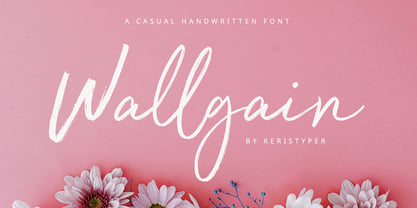 Introducing Wallgain A rustic, dapper handwritten font with a personal touch. With quick dry strokes and a signature style. Wallgain Handwriting Font multilingual support: Afrikaans, Albanian, Catalan, Danish, Dutch, English, Estonian, French, Finnish, German, Icelandic, Indonesian, Italian, Malay, Norwegian, Portuguese, Spanish, Swedish, Zulu, and many more. What’s Included : Standard & Multilingual glyphs Ligature Works on PC & Mac Simple installations Accessible in Adobe Illustrator, Adobe Photoshop, Adobe InDesign, and even work on Microsoft Word. Hope you enjoy our font!
 - French Armoire by DimitriAna,
$22.00 French Armoire is a subtle, modern calligraphy font that will give a casual chic look to your designs. It supports Central, Eastern, Western European, Baltic, Turkish and Greek languages and it is delivered in OpenType format. French Armoire has over a 1000 glyphs, with a variety of opentype features in Latin and Greek alphabet: Stylistic alternates, contextual (positional) alternates, swashes, 2 stylistic sets of initial and terminal forms and standard ligatures. The font is fully unicode-mapped (PUA encoded).
 - Oilvare by Adam Ladd,
$25.00 Oilvare is a hand-drawn, layered typeface inspired by vintage painted signs and oil cans. While sturdy, it also has a softer side—wide proportions, oval-inspired forms, curled angle strokes, and a medium contrast all help give it a little bit of distinction from the typical sans serif. Mix, match, and layer the styles to your liking. Carefully drawn, when you enlarge the typefaces, the subtle irregularities become more apparent and harken to hand lettering of the past.
 - Mister Crack by Olivetype,
$18.00 Say goodbye to boring typography and hello to an impactful visual experience! Mister Crack's rough texture adds depth and dimension to your designs, making them stand out from the crowd. Whether you're designing a vintage-inspired poster or crafting a powerful logo, this typeface injects charisma and attitude into every word. Mister Crack features : Standard Latin Numbers, symbols, and punctuations Multilingual Support. Fully accessible without additional design software Simple Installations Works on PC & Mac Thank You.
 - Wedding Doodles Too by Outside the Line,
$19.00Wedding Doodles Too is the follow-up font to the popular Wedding Doodles. This font gives you all you need to make your own invitations, announcements, RSVP cards, save your date cards and thank you notes. Font includes 3 sets of hand-lettered words… save our date, thank you and RSVP. Just add a wedding cake, flowers, top hat, wedding bell, heart or flower and you are done. Check out Wedding Doodles, you may need both. - Seventies by Lián Types,
$37.00 'Meeeeoooow'! Seventies is another of my 'funkadelic' attempts (1) to fill the existing gap of seventyish looking fonts. In my opinion, that decade has a hidden treasure regarding type that remains unexplored: Only very few fonts rescue its 'groovy' essence, its ‘colourful’ qualities. But, don't have a cow man , and keep on truckin! With Seventies, my new foxy mama , your projects will stand out among the rest. Since there’s not much information available about this kind of lettering I had to get ideas from other styles: Nowadays it’s easy to find all kind of books or guides to understand and practice how different styles of calligraphy and lettering should be done. However, for some reason, 60s and 70s letters seemed to ignore/be free of rules... Was this suggesting the birth of postmodernism? I incorporated some ideas of the copperplate style of calligraphy: The ductus of its forms may be compared to the way letters are made in snell/engrosser’s script. Obviously, this is just the idea behind; the delicacy of thins is replaced here with the graceful imprint of really thick thicks with a brushy look and tons of good vibe . Seventies will work awesome in posters, brands, magazines, book-covers of any kind, due to its modern look adapted to our century. Well, catch you on the flip~side ! STYLES To make you more psyched , Seventies is a layered font! See examples in the posters using Seventies Shade, Seventies Shine and Seventies Printed. NOTES (1) My first one was with Beatle in 2014.
 - Nightshade by MKGD,
$13.00 Nightshade was my attempt to bring the Old English fonts up to date. The capital letters still contain flourishes, but they look more machined and less calligraphic. I called the font Nightshade after the plant of the same name. Like the plant, it may be considered to be beautiful or poisonous depending on one's outlook. As a result, it can be applied when an attractive, ornate look is required, or it can be used when there is a need to create a more chilling effect. Nightshade has a glyph count of 389 and supports the following languages Afrikaans, Albanian, Asu, Basque, Bemba, Bena, Bosnian, Catalan, Chiga, Colognian, Cornish, Croatian, Czech, Danish, Embu, English, Esperanto, Estonian, Faroese, Filipino, Finnish, French, Friulian, Galician, German, Gusii, Hungarian, Icelandic, Indonesian, Irish, Italian, Kabuverdianu, Kalaallisut, Kalenjin, Kamba, Kikuyu, Kinyarwanda, Latvian, Lithuanian, Low German, Lower Sorbian, Luo, Luxembourgish, Luyia, Machame, Makhuwa-Meetto, Makonde, Malagasy, Malay, Maltese, Manx, Meru, Morisyen, North Ndebele, Norwegian Bokmål, Norwegian Nynorsk, Nyankole, Oromo, Polish, Portuguese, Romanian, Romansh, Rombo, Rundi, Rwa, Samburu, Sango, Sangu, Scottish Gaelic, Sena, Shambala, Shona, Slovak, Slovenian, Soga, Somali, Spanish, Swahili, Swedish, Swiss German, Taita, Teso, Turkmen, Upper Sorbian, Vunjo, Walser, Zulu
 - PF Mellon by Parachute,
$35.00 PF Mellon is a modernist variable grotesque with mixed roots. Its unconventional aesthetic is the product of an exploration into the art of emphasizing titles, headlines and text in captivating and unpredictable ways. Contrary to conventional practices of highlighting text with heavier weights, PF Mellon proposes an intriguing new scheme based on striking and attention-grabbing compositions of narrow and extended letterforms- even when set in lowercase. Part geometric and part grotesque, PF Mellon’s expressionist alphabet and extravagant style challenge conventions of visual culture in an Art Deco-like manner. PF Mellon’s rebellious idiosyncrasy takes its cues from the eccentric personality of our popular PF Venue, an earlier geometric sans serif characterized by its daring combinations of non-uniform structures. PF Mellon’s basic design skeleton was influenced by nineteenth and early twentieth century condensed sans serif typefaces such as Stephenson Blake's Grotesque No.77 and ATF’s Alternate Gothic, adding an extra contrast to the thickness of strokes. PF Mellon is also available as a variable font format which you may request it free of charge from Parachute® once you purchase the whole type family.
 - Conium by MKGD,
$13.00 I designed Conium to be a sister font to Nightshade. It was meant to have the appearance of the hemlock plant without being too derivative; it’s thin drooping stems conjure images of Hamlet’s mad Ophilia clutching sickly weeds while thinking them to be flowers. It also projects the appearance of an ice cold, wrought iron, cemetery gate. The sort that one might pass on a damp overcast day. A fitting compliment to an Edward Gorey illustration from top, right down to the frigid ground from which it sprang. Conium has a glyph count of 388 and supports the following languages Afrikaans, Albanian, Asu, Basque, Bemba, Bena, Bosnian, Catalan, Chiga, Colognian, Cornish, Croatian, Czech, Danish, Embu, English, Esperanto, Estonian, Faroese, Filipino, Finnish, French, Friulian, Galician, German, Gusii, Hungarian, Icelandic, Indonesian, Irish, Italian, Kabuverdianu, Kalaallisut, Kalenjin, Kamba, Kikuyu, Kinyarwanda, Latvian, Lithuanian, Low German, Lower Sorbian, Luo, Luxembourgish, Luyia, Machame, Makhuwa-Meetto, Makonde, Malagasy, Malay, Maltese, Manx, Meru, Morisyen, North Ndebele, Norwegian Bokmål, Norwegian Nynorsk, Nyankole, Oromo, Polish, Portuguese, Romanian, Romansh, Rombo, Rundi, Rwa, Samburu, Sango, Sangu, Scottish Gaelic, Sena, Shambala, Shona, Slovak, Slovenian, Soga, Somali, Spanish, Swahili, Swedish, Swiss German, Taita, Teso, Turkmen, Upper Sorbian, Vunjo, Walser, Zulu
 - Swonderful by The Ampersand Forest,
$19.00 Everyone loves an Art Deco typeface. And there are hundreds of similarly-designed deco faces out there! But not one of them seems to have every form of every character that you want or need at any given moment. That’s why Swonderful was created! It has more letterform variations than you can shake a stick at (if you're inclined to shake sticks at things). With four variations of every uppercase form, two variations of every lowercase form (plus diacritical characters for the standard set), you’re bound to find the character you need for any given project, whether the style is French Art Deco, American Streamline Moderne, or Jazzy Midcentury Gaspipe. Just switch between stylistic sets! And you’ll find all those characters in three standard weights: Light, Regular, and Bold. They’re designed as a unicase, so they’re all height-compatible, and every set works with every other set, so you can mix and match to your heart’s delight!
 - Alpha Dance - Unknown license

- Above the Beyond by My Creative Land,
$27.00 Above the Beyond is a font family that contains a high contrast Contemporary Garamond Serif and a Casual Signature Brush script. The serif comes in two styles - Regular and Italic - the italic angle is similar to the one used in the Script font. The main difference between traditional Garamond and Above the Beyond Garamond is that the ascenders are significantly shorter which makes the serif fonts more suitable for branding design and helps to reduce the distance between lines without scarifying the legibility. The Italic style has many stardard ligatures as well as calligraphic ones. Above the Beyond Script is full of OpenType enhancements such as ligatures and alternates - everything that is needed to create an organic handwritten look. It is fully unicode mapped and can be used in any software - either using OpenType panel of the application in use or your OS default Font management software - Character Map or FontBook - by copy-pasting the glyphs you need. The font family is perfect for all kind of designs: quotes, t-shirt, branding, social media, magazines, cards, packaging etc.
 - Samaritan Tall Lower by Comicraft,
$49.00 Fifteen hundred years from now, a man will be selected to go back in time to prevent a catastrophic event which turned his world into a dystopia. Sent back in time, he was enveloped in empyrean fire, the strands of energy that make up time itself. Crash-landing near Astro City in late 1985, he learned how to master and channel the empyrean forces that had suffused his body -- finally learning to control his powers in time to prevent the destruction of the Space Shuttle Challenger, the event he had been sent to avert. He described himself to journalists as nothing more than "a Good Samaritan", and has continued to help his fellow man in Astro City ever since. John JG Roshell has also been struggling with the empyrean challenge of fitting all of Kurt Busiek's ASTRO CITY dialogue into balloons with the regular Samaritan font, so he created the Samaritan Tall font to help his fellow comic book letterers! It's kinda the same thing, really.
 - Polar by Daniel Uzquiano,
$150.00 Polar is a sans-serif grotesk with characteristic ink traps and rounded vertexes. Polar is a variable font. It is versatile, modern, elegant and neutral. It can be displayed in a range from 200 to 900 in its weight axe to play many different roles. The font has 5 predefined instances, Thin Display, Light, Regular, Bold and Heavy Display, in two styles, regular & italic, with 716 glyphs each of them. Polar has 25 OpenType features such as ligatures, fractions, stylistic alternates, localized forms, old-style figures, etc. It can be suitable for long texts. It also works great as a perfect display font for all caps headings, especially with its thin and heavy weight variants. Polar covers Latin, Central European characters & supports 101 languages: Afrikaans, Albanian, Asu, Basque, Bemba, Bena, Breton, Catalan, Chiga, Colognian, Cornish, Croatian, Czech, Danish, Dutch, Embu, English, Esperanto, Estonian, Faroese, Filipino, Finnish, French, Friulian, Galician, Ganda, German, Gusii, Hungarian, Igbo, Inari, Sami, Indonesian, Irish, Italian, Jola-Fonyi, Kabuverdianu, Kalaallisut, Kalenjin, Kamba, Kikuyu, Kinyarwanda, Koyraboro Senni, Koyra Chiini, Latvian, Lithuanian, Lower Sorbian, Luo, Luxembourgish, Luyia, Machame, Makhuwa-Meetto, Makonde, Malagasy, Maltese, Manx, Meru, Morisyen, Northern Sami, North Ndebele, Norwegian Bokmål, Norwegian Nynorsk, Nyankole, Oromo, Polish, Portuguese, Quechua, Romanian, Romansh, Rombo, Rundi, Rwa, Samburu, Sango, Sangu, Scottish, Gaelic, Sena, Serbian, Shambala, Shona, Slovak, Soga, Somali, Spanish, Swahili, Swedish, Swiss, German, Taita, Tasawaq, Teso, Turkish, Upper, Sorbian, Uzbek (Latin), Vietnamese, Volapük, Vunjo, Walser, Welsh, Western Frisian, Yoruba, Zarma, Zulu.
 - American Authors by Celebrity Fontz,
$29.99American Authors is a unique collection of signatures of 75 famous American authors, poets, writers, and novelists. A must-have for autograph collectors, desktop publishers, history buffs, fans, or anyone who has ever dreamed of sending a letter, card, or e-mail "signed" as if by one of these famous literary figures. This font includes signatures from the following literary figures: Joel Barlow, Charles Brockden Brown, J. Fenimore Cooper, Stephen Crane, Richard H. Dana Jr., Theodore Dreiser, W.C. Bryan, Timothy Dwight, T.S. Eliot, Ralph Waldo Emerson, William Faulkner, Eugene Field, Philip Freneau, Robert Frost, Hamlin Garland, Alexander Hamilton, Bret Harte, Nathaniel Hawthorne, Lafcadio Hearn, Ernest Hemingway, W.D. Howells, Henry James, John P. Kennedy, Washington Irving, Oliver Wendell Holmes, Julia Ward Howe, Francis Scott Key, Sidney Lanier, James Russell Lowell, Edgar Lee Masters, Cotton Mather, Herman Melville, George John Nathan, Henry W. Longfellow, Edna St. Vincent Millay, Eugene O'Neill, Thomas Paine, Edgar Allan Poe, J.K. Paulding, Sydney Porter (aka O. Henry), Carl Sandburg, Samuel Sewall, John Howard Payne, W.H. Prescott, W. Gilmore Simms, Captain John Smith, Gertrude Stein, Harriet Beecher Stowe, John Trumbull, Daniel Webster, Noah Webster, Samuel L. Clemens (aka Mark Twain), John G. Whittier, Thomas Wolfe, Henry D. Thoreau, Walt Whitman, Emily Dickinson, Jacqueline Susann, Louisa May Alcott, Wystan Hugh Auden, Pearl Buck, Edgar Rice Burroughs, F. Scott Fitzgerald, Erle Stanley Gardner, Horace Greeley, Zane Grey, Sinclair Lewis, Jack London, Norman Mailer, Ogden Nash, Beatrix Potter, Ezra Pound, John Steinbeck, Leon Uris, Thornton Wilder. This font behaves exactly like any other font. Each signature is mapped to a regular character on your keyboard. Open any Windows application, select the installed font, and type a letter, and the signature will appear at that point on the page. Painstaking craftsmanship and an incredible collection of hard-to-find signatures go into this one-of-a-kind font. Comes with a character map. Article abstract: American Authors is a unique collection of signatures of 75 famous American authors, poets, writers, and novelists in a high-quality font. - P22 Tyndale by IHOF,
$24.95Quill-formed roman/gothic with an olde-worlde flavor. Some background in the designer's own words: "A series of fonts came to mind which would be rooted in the medieval era -for me, a period of intense interest. Prior to Gutenberg's development of commercial printing with type on paper in the mid-1400s, books were still being written out by hand, on vellum. At that time, a Bible cost more than a common workman could hope to earn in his entire lifetime. Men like William Tyndale devoted their energies to translating the Scriptures for the benefit of ordinary people in their own language, and were burned to death at the stake for doing so. Those in authority correctly recognized a terminal threat to the fabric of feudal society, which revolved around the church. "This religious metamorphosis was reflected in letterforms: which, like buildings, reflect the mood of the period in which they take shape. The medieval era produced the Gothic cathedrals; their strong vertical emphasis was expressive of the vertical relationship then existing between man and God. The rich tracery to be seen in the interstices and vaulted ceilings typified the complex social dynamics of feudalism. Parallels could be clearly seen in Gothic type, with its vertical strokes and decorated capitals. Taken as a whole, Gothicism represented a mystical approach to life, filled with symbolism and imagery. To the common man, letters and words were like other sacred icons: too high for his own understanding, but belonging to God, and worthy of respect. "Roman type, soon adopted in preference to Gothic by contemporary printer-publishers (whose primary market was the scholarly class) represented a more democratic, urbane approach to life, where the words were merely the vehicle for the idea, and letters merely a necessary convenience for making words. The common man could read, consider and debate what was printed, without having the least reverence for the image. In fact, the less the medium interfered with the message, the better. The most successful typefaces were like the Roman legions of old; machine-like in their ordered functionality and anonymity. Meanwhile, Gutenberg's Gothic letterform, in which the greatest technological revolution of history had first been clothed, soon became relegated to a Germanic anachronism, limited to a declining sphere of influence. "An interesting Bible in my possession dating from 1610 perfectly illustrates this duality of function and form. The text is set in Gothic black-letter type, while the side-notes appear in Roman. Thus the complex pattern of the text retains the mystical, sacred quality of the hand-scripted manuscript (often rendered in Latin, which a cleric would read aloud to others), while the clear, open side-notes are designed to supplement a personal Bible study. "Tyndale is one of a series of fonts in process which explore the transition between Gothic and Roman forms. The hybrid letters have more of the idiosyncrasies of the pen (and thus, the human hand) about them, rather than the anonymity imbued by the engraving machine. They are an attempt to achieve the mystery and wonder of the Gothic era while retaining the legibility and clarity best revealed in the Roman form. "Reformers such as Tyndale were consumed with a passion to make the gospel available and understood to the masses of pilgrims who, in search of a religious experience, thronged into the soaring, gilded cathedrals. Centuries later, our need for communion with God remains the same, in spite of all our technology and sophistication. How can our finite minds, our human logic, comprehend the transcendent mystery of God's great sacrifice, his love beyond understanding? Tyndale suffered martyrdom that the Bible, through the medium of printing, might be brought to our hands, our hearts and our minds. It is a privilege for me to dedicate my typeface in his memory." - Go by Canada Type,
$24.95 Five years into the 21st century and the promise of nanotechnology, high-end popular culture design seems to thrive on combining opposites and drawing a fine line between traditionally contradictory ideas. This is seen in modern society's usual cultural frontrunners - like consumer electronics, fashion items, music packaging and publications, where it is evident that traditionally complex marketing statements of fashionability and lifestyle are attempted with simple minimalism. But at the typographic end of this realm, the creative majority still uses old faces that help the modern statement only in passing. Some of the more adventurous creative professionals actively seek new elements to emphasize contemporary impact in their modern design. To those adventurous types (pun intended), Canada Type presents this new face called Go. It is very much a child of the new millennium, inspired by the unmistakable minimalist style of modern 21st century corporate logos, recent design shifts in electronic music and club-marketing collateral, and disc jockeys who have enthusiasm, energy, precision and total control of each and every vibration traveling from mixer to speakers. Go is an original modern techno-lounge face that offers the eyes pleasing collages of friendly minimal forms that give the words an impression of simplicity and depth at once. This is a font that prides itself on its precise grouping of elements and just enough original creativity in combining those elements. The precision builds the sharp edge sought for modern statements, while the creativity keeps the message rejuvenated, clear and interesting. Go's character set consists of a versatile and unexpected, yet mild mix of the uppercase and lowercase forms, with multiple variations on the majority of the letters. The e being a vertical mirror of G is only the first of the pleasant surprises. More than 30 alternates are inside the font. All the accented characters in Go have been meticulously (perhaps obsessively) drawn to be unusual for logos and short statements. Take a look at the character map and be ready for a space-age surprise. To borrow a Star Trek cliché, this font can Go where no font has gone before.
 - Rufina STD by TipoType,
$13.00 Rufina was as tall and thin as a reed. Elegant but with that distance that well-defined forms seem to impose. Her voice, however, was sweeter, closer, and when she spoke her name, like a slow whisper, one felt like what she had come to say could be read in her image. Rufina's story can only be told through a detour because her origin does not coincide with her birth. Rufina was born on a Sunday afternoon while her father was drawing black letters on a white background, and her mother was trying to join those same letters to form words that could tell a story. But her origin goes much further back, and that is why she is pierced by a story that precedes her, even though it is not her own. Maybe her origin can be traced back to that autumn night in which that tall man with that distant demeanor ran into that woman with that sweet smile and elegant aspect. He looked at her in such a way that he was trapped by that gaze, even though they found no words to say to each other, and they stayed in silence. Somehow, some words leaked into that gaze because since that moment they were never apart again. Later, after they started talking, projects started coming up and then coexistence and arguments, routines and mismatches. But in that chaos of crossed words in their life together, something was stable through the silence of the gazes. In those gazes, the silent words sustained that indescribable love that they didn't even try to understand. And in one of those silences, Rufina appeared, when that man told that woman that he needed a text to try out his new font, and she saw him look at her with that same fascination of the first time, and she started to write something with those forms that he was giving her as a gift. Rufina was as tall and thin as a reed, wrote her mother when Rufina was born.
 - Chiq by Ingo,
$36.00 The name suggests it: the Chiq is based on a well-known system font from Apple's classic Mac OS operating system. By revamping and expanding good old “Chicago“, I want to make that 90s tech charm available for the future. The model consisted of just a single style and inspired me to create “Chiq Bold,” which later became the starting point for the entire font family. The shapes of the Chiq are constructed according to a very simple principle. The contrast of stems and hairlines becomes more pronounced towards the bolder cuts. A few basic shapes form the framework for all characters. The shapes are very regular and sometimes form somewhat unusual figures, which has a negative effect on readability and makes the font rather unsuitable for long passages of text, but results in a very even typeface. This is particularly true for the extra-wide “UltraExpanded,” which is so wide that you can no longer recognize word images but literally have to spell them out. In this way, words are turned into letter bands with a great decorative effect. With variants from “Light” to “Black”, from “Normal” to “Ultra Expanded” and the italics, Chiq reaches beyond its archetype. This opens up a wide range of uses. It is even clearer, even more sober, and to a certain extent speaks an even more modern formal language. Chiq is also a variable font!
 - PMN Caecilia eText by Monotype,
$29.99PMN Caecilia™ is the premiere work of the Dutch designer Peter Matthias Noordzij. He made the first sketches for this slab serif design in 1983 during his third year of study in The Hague, and the full font family was released by Linotype in 1990. The PMN prefix represents the designer's initials, and Caecilia is his wife's name. This font has subtle variations of stroke thickness, a tall x-height, open counters, and vivacious true italics. Noordzij combined classical ductus with his own contemporary expression to create a friendly and versatile slab serif family. With numerous weights from light to heavy, and styles including small caps, Old style figures, and Central European characters, PMN Caecilia has all the elements necessary for rich typographic expression. eText fonts - the optimum of on-screen text quality With our new eText fonts that have been optimised for on-screen use, you can ensure that your texts remain readily legible when displayed on smartphones, tablets or e-readers. The poor resolution of many digital display systems represents a major challenge when it comes to presenting text. It is necessary to make considerable compromises, particularly in the case of text in smaller point sizes, in order to adapt characters designed in detail using vector graphics to the relatively crude pixel grid. So-called 'font hinting' can help with this process. This, for example, provides the system with information on which lines are to be displayed in a particular thickness, i.e. using a specific number of pixels. As font hinting is a largely manual and thus very complex technique, many typefaces come with only the most necessary information. What is unimportant for a text printed in high resolution can result in a poor quality image when the same text is displayed on a screen, so that reading it rapidly becomes a demanding activity. Specially optimised eText fonts can help overcome this problem. An extremely refined and elaborate font hinting system makes sure that these fonts are optimally displayed on screens. Monotype has not only adopted font hinting for this purpose but has also thoroughly reworked the fonts to hone them for display in low resolution environments. For example, the open counters present in the letters C, c, e, S, s, g etc. have been slightly expanded so that these retain their character even in small point sizes. Also with a view to enhancing appearance in smaller point sizes, line thickness has been discreetly increased and x-height carefully adjusted. Kerning has also been modified. Don't leave the on-screen appearance of your creations to chance. Play it safe and use eText fonts to achieve perfect results on modern display devices. Many typefaces, including many popular classics, are already available as eText fonts and new ones are continually being published. The eText font you can purchase here are available for use as Desktop Fonts or Web Fonts. Should they be used in Mobile Devices such as smartphones, tablets or eReaders, please contact our OEM specialists at sales-eu@monotype.com. - Colorado by Juliasys,
$- Nature is fond of stripes. Animals have them, plants have them and the rainbow has them. Besides being beautiful, stripes in nature have various origins and functions. But only Homo sapiens gave them symbolic meaning. In the American flag, the 13 stripes symbolize the 13 colonies that declared independence from Britain. In the French “Tricolour” flag, they represent Paris and the king of France. And in Russia’s “Georgiyevskaya lenta,” they symbolize the death and resurrection of St. George, the dragon-slayer. The font family COLORADO , named after the beautifully striped Colorado potato beetle, can be used to construct all kinds of symbolic or just beautiful messages. And thankfully, you need no OpenType diploma to do this. To get your texts multi-striped and multicolored, follow this simple procedure: Write the message with one of the COLORADO fonts and apply a color. Then copy and paste in place, and apply a second font and color. Repeat this again if wanted – and the masterpiece is done. COLORADO ’s language support covers about 100 languages. It has a Western European, a Central European and an Extended Cyrillic character set.
 - Balune by Authentype,
$12.00 Balune Family Font created by Authen Type. This font features a classic and elegant style, perfect for: Balune Family Font designs are very beautiful to use in branding designs for brochures, logos, and invitations with a neat and varied font concept. Script font features a gorgeous handwritten style that infuses this beautiful script with authenticity and charm! Standard glyphs uppercase and lowercase letters Numerals, a large range of punctuation and ligatures. Lowercase letters include ending swashes. Works on PC & Mac. Simple installations, accessible in Adobe Illustrator, Adobe Photoshop, Adobe InDesign, even work on Microsoft Word. PUA Encoded Characters – Fully accessible without additional design software. Fonts include multilingual support for; ä ö ü Ä Ö Ü ß ¿ ¡ Image used: All photographs/pictures/logo/vectors used in the preview are not included, they are intended for illustration purposes only. Thank you for your purchase! Hope you enjoy our font! Designers: Ekayasa.
 - Roses Bolero TP by Authentype,
$12.00 Roses Bolero TP Elegant Sans Serif is a sans serif font with full set of uppercase and lowercase letters, multilingual symbols, numerals, punctuation and ligatures. Roses Bolero elegant sans serif font classic and elegant style for poster design, magazines, beauty branding with a flower-shaped asterisk glyph suitable for your beautiful and elegant design concept. Features Standard glyphs uppercase and lowercase letters Numerals, a large range of punctuation and ligatures. Lowercase letters include ending swashes. Works on PC & Mac. Simple installations, accessible in the Adobe Illustrator, Adobe Photoshop, Adobe InDesign, even work on Microsoft Word. PUA Encoded Characters – Fully accessible without additional design software. Fonts include multilingual support for; ä ö ü Ä Ö Ü ß ¿ ¡ ________________________________________________________________________________________________________________________________________________ Image used : All photographs/pictures/logo/vector used in the preview are not included, they are intended for illustration purpose only. Thank you for your purchase! Hope you enjoy with our font! Designers: Ekayasa.
 - Scriptuale by Linotype,
$29.00The Scriptuale family, which contains eight styles, is a contemporary upright calligraphic face. Designed by German designer Renate Weise in 2003, this family of typefaces speaks to the present, while at the same time reflecting on a lyrical past. The letterforms of the Scriptuale family are romanticized, they reference German calligraphic styles from the 19th and early 20th Centuries. For instance the design of Scriptuale's uppercase strays from the canon of classical proportion into romantic idealism. While the C and O are drawn according to the ancient quadratic proportions - almost twice as wide, optically, as the E or the L - the letter A is wider than would be expected, and the D narrower. These subtle differences introduce a different rhythm into text set in Scriptuale than Italic styles of calligraphy may offer. Scriptuale's Gs merit special notice: both the upper and lower case G lunge slightly forward, further enhancing the dynamic quality of the text. Also unique in Scriptuale's design is the lowercase width: the letterforms appear slightly condensed; they have large x-heights to compensate for this. In a delightful twist, the number 2's beak has been closed by drawing it full-circle, back into the stem: this references a style of letter design that was practiced, among other places, by artists from the old Klingspor foundry in Offenbach Germany. Typefaces constructed there easily captured the zeitgeist of the romantic period, but are less calligraphic than Scriptuale (e.g., Rudolf Koch's Koch Antiqua). A semi-serif face (like Prof. Hermann Zapf's Optima or Otl Aicher's Rotis Semi), some of Scriptuale's letters have serifs (D), and some do not (A). And although both the B and the E normally have the same "structure" on their left side, Weise has drawn them differently in Scriptuale. These strengthen the calligraphic-like quality of the family. Traces of the pen are easy to see in Scriptuale's design; it is a thoroughly calligraphic face. The eight typefaces in the Scriptuale family include Light, Regular, Semi Bold, and Bold weights. Each weight has a companion italic. Scriptuale is similar to one other contemporary calligraphic family in the Linotype portfolio, Anasdair , from British designer - White Rabbit - Unknown license

- Dosca by Ardyanatypes,
$10.00 Dosca is a unique and elegant display font with a unique Sans serif style. This font offers nine different thickness options, ranging from Thin to Black, providing a variety of options for a variety of applications. Each Dosca thickness has its own unique characteristics, so you can choose the one that best suits your design aesthetic. For example, Thin may be suitable for a light and elegant design, while Black may be used for a more dramatic and bold appearance. Additionally, Dosca comes with various OpenType features. These include features such as ligatures, which allow certain characters to be combined beautifully, and alternative letterforms that provide more design options. With this feature, you can create more interesting and unique text elements in your designs. Dosca is designed to support multiple languages so it is suitable for use in many countries. This makes it very versatile and suitable for a variety of multilingual design projects. So, if you're looking for a font that combines the beauty of Sans serif with a variety of thickness options, useful OpenType features, and multilingual support, Dosca is the perfect choice to meet your design needs. A guide to accessing all alternatives can be read at http://adobe.ly/1m1fn4Y Adobe Photoshop go to Window - glyphs Adobe Illustrator go to Type - glyphs Features: A – Z Character Set a – z Characters set Numerals & Punctuations Ligatures & Alternates Multilingual
 - Coffee and Danish JNL by Jeff Levine,
$29.00 In the collection of vintage and historic images available online from the Library of Congress is one of the exterior of the Town Talk Diner in Minneapolis, Minnesota. Regrettably, on May 28, 2020, the Town Talk Diner was damaged by vandalism, and subsequently destroyed by a fire that engulfed the building early on the morning of May 29th due to civil unrest following the death of George Floyd. The restaurant first opened in 1946, closed in 2011 and subsequently re-opened under new ownership in 2014 with French cuisine, then from 2016 until its demise as an American bistro. While this was not known at the time of selecting the image for a typographic model, subsequent research on the diner turned up these facts. The large vintage sign above the entrance was in big, bold Art Deco letters with rows and rows of bulbs for illuminating the name at night. Coffee and Danish JNL, modeled from the image of that sign, is available in both regular and oblique versions. Perhaps, in a way, the type design will serve as a bit of historic recognition for a popular eating spot.
 - Quaint Gothic SG by Spiece Graphics,
$39.00 Distinctively Art Nouveau with a touch of Arts & Crafts, Quaint Gothic is a typographic gem from the late nineteenth century. Also known as Desdemona, this undulating and organic typeface is a versatile and refreshing alternative to many of the font designs on the market today. Quaint Gothic comes complete with an alternate set of caps and a new set of lowercase characters. And for your convenience, a nifty set of small caps and small figures are included in this version. You may also want to access the word-on-a-wave logotypes like “to” and “and” located in the special character slots. They’re great for constructing provocative headlines and titles. Quaint Gothic is also available as an OpenType font. It contains lining and oldstyle figures, prebuilt fractions, stylistic alternates, a wide variety of discretionary ligatures and word ornaments. These advanced features currently work in Adobe Creative Suite InDesign and Illustrator. Check for OpenType advanced feature support in other applications as it gradually becomes available with upgrades.
 - Cadmium by AVP,
$- Cadmium has a comprehensive latin character set and many Opentype features to enhance text, including small capitals, case-sensitive forms, superscript and subscript. Plenty of numeral variants include old-style figures, lining figures and fractions. Default numerals are proportionally spaced. Alternative styles for a handful of key characters provide some useful variations where stylistic sets can be implemented. The fonts are presented as four width-based sub-families: Expanded, Normal, Condensed and Compressed. Each width has a matching range of six weights and italics (obliques). Regular and Bold weights are style-linked, together with their respective oblique forms. Each width differs in its basic construction but all fonts share the same vertical metrics and may be used in combination with each other. Letter spacing is optimised for text sizes but is tolerant of significant tracking changes. Cadmium is good for signage, publicity and packaging, screen credits and titling, general print and publication, as well as web and screen applications.
 - Clinto by XdCreative,
$29.00 Clinto Sans Serif Clinto Sans is a simple geometric sans serif font Clinto Sans are constructed using basic geometric shapes such as circles, squares, and triangles. The letterforms are based on simple geometric proportions, resulting in a consistent and harmonious visual rhythm. Clinto sans serif fonts embrace simplicity and have a minimalistic approach. They aim to reduce letterforms to their essential elements, eliminating any unnecessary embellishments or flourishes Clinto Sans also has Straight Lines and Clean Edges. Clinto Sans also have open apertures, which refer to the space enclosed by the curved or diagonal strokes of certain letters like "a," "e," "g," and "s." The open apertures contribute to legibility and readability, especially at smaller sizes. Special features: - Ink trap Ink traps are small recessed areas or notches incorporated into the corners or junctions of letterforms. They were originally designed for letterpress printing to prevent ink from filling in and distorting the shapes, especially at small sizes. However, in modern digital fonts, ink traps are often used as a design element to add visual interest and maintain legibility at small sizes or in low-resolution environments. - Alternates Stylistic alternates offer alternative shapes or forms for certain letters in the font, a, e, g, and r, etc. Stylistic alternates can be accessed through OpenType features in design software. OpenType is a font format that allows for advanced typographic features and character substitutions, you can access the alternate letterforms through the glyphs palette or the OpenType panel in their design software and apply them selectively to specific letters. Thank You _
 - Piggy Bank by Missy Meyer,
$12.00 PIGGY BANK is a casual handwriting font, smoothed and cleaned for cutting and crafting, but also sharp and crisp for print projects! It contains two uppercase sets of letters, so you can mix and match for a hand-written look. It's useful for everything from kids' designs to branding, from book covers to product packaging! The PIGGY BANK family contains two weights - regular and bold - so you have options that will be easy to read no matter how large or small your design will be. Plus, it has my usual 500+ glyphs, including tons of punctuation and over 300 accented characters for language support!
 - Fresh Roomettes by Nathatype,
$25.00 Wanna make your branding spark? Looking for a gorgeous and stylish font? If you need to create a big, bold logo for your business, work on a poster for an event, or whatever your project may be-then we've got what you want. Fresh Roomattes - A Signature Font Fresh Roomattes is an elegant signature font. Every swash, stroke, and curve was created to entice happiness and elegance. Great choice for your logo, book cover, poster, t-shirt, branding, and advertisement needs. Our font always includes Multilingual Support to make your branding reach a global audience. Features: Ligatures Alternates PUA Encoded Numerals and Punctuation Thank you for downloading premium fonts from Nathatype
 - !Disc Inferno® BASIC - Unknown license

- ALS Script - Unknown license

- Digtos by Keristyper Studio,
$14.00 Introducing, Digtos Brush a masculine display font that is made with hand lettering with the brush pen. This type of font is perfectly made to be applied especially in logos, and the other various formal forms such as invitations, labels, logos, magazines, books, greeting/wedding cards, packaging, fashion, makeup, stationery, novels, labels, or any type of advertising purpose. Multilingual support: Afrikaans, Albanian, Catalan, Danish, Dutch, English, Estonian, French, Finnish, German, Icelandic, Indonesian, Italian, Malay, Norwegian, Portuguese, Spanish, Swedish, Zulu, and many more. What’s Included : Web Fonts Standard & Multilingual glyphs Ligature Works on PC & Mac Simple installations Accessible in Adobe Illustrator, Adobe Photoshop, Adobe InDesign, and even work on Microsoft Word. Hope you enjoy our font!
 - Richea by Keristyper Studio,
$14.00 Richea is a casual script font, with a clean high contrast stroke, slanted and fun character. This type of font is perfectly made to be applied especially in logos, and other various formal forms such as invitations, labels, logos, magazines, books, greeting/wedding cards, packaging, fashion, makeup, stationery, novels, and labels, or any type of advertising purpose. Multilingual support: Afrikaans, Albanian, Catalan, Danish, Dutch, English, Estonian, French, Finnish, German, Icelandic, Indonesian, Italian, Malay, Norwegian, Portuguese, Spanish, Swedish, Zulu, and many more. What’s Included : Standard & Multilingual glyphs Ligature Works on PC & Mac Simple installations Accessible in Adobe Illustrator, Adobe Photoshop, Adobe InDesign, even work on Microsoft Word. Hope you enjoy with our font!


