10,000 search results
(0.036 seconds)
- Spring Note by Letterhend,
$7.00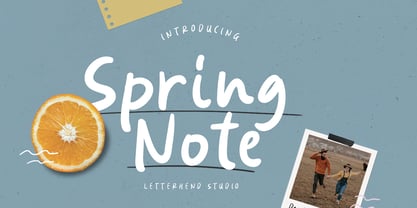 Spring Note is a playful yet usable font that you can use for any of your projects. Perfect for cute quote, branding, and anything. This font already support multi language. Also comes with two style, Regular and Bold! Happy Creating!
 - Pandanus by Hanoded,
$15.00 Pandanus is a lovely, handwritten typeface with a lot of flair. It is stylish, elegant and highly legible, making it an ideal font for texts and cards. Comes with a full range of diacritics and alternates for the lower case letters.
 - Tattooflash Marie by Otto Maurer,
$14.00 Tattooflash Marie is made for Tattoofans, Tattoostudios and Tattoo artists. Make your own tattoo flash with your Name or the Names of your children. The Font is made for your skin but you can also make Tattooposter, Tattooequipment and more.
 - Stay Gold by Decade Typefoundry,
$35.00 Stay Gold Script is a highly usable, powerful typeface. Perfect for everything from street wear brand to wedding invitations, sports team logos to band logos. Use it however you see fit. Just one thing - it’s not designed for all-caps settings.
 - Gavuel by Amera Type,
$15.00 Introducing Gavuel font with a unique, bold and wide sans serif look. The carefully crafted nodes and each line can create a luxurious look for high-level graphic branding Gavuel will be a perfect choice for labels, packages, covers, headlines, etc
 - Muthiara by Abo Daniel,
$17.00 Muthiara is a beautiful script font and perfect for lettering project like cutting vinyl, silhouettes, t-shirt design, mugs, advertisements, book covers, posters, business cards, social media and more. It includes 51 ligatures, support for multiple languages and offers PUA encoding.
 - Walske by Bryantamanh,
$12.00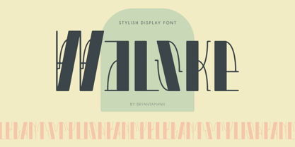 Introducing Walske. Stylish, Classic, Modern, Elegant display font. Inspired by ancient historical architecture that makes the font has a unique personality, you can use it for every project in different themes for branding, headline/title, posters, packaging, & more. Multilingual support.
 - Dawnora by Typomancer,
$24.00 Inspired by aurora, one of the most impressive phenomenon. Dawnora is a spirited serif font comes with various weights and many opentype features, suitable for both simple text and elegant lettering. Especially, Initials style for drop cap and special usage.
 - Metal Core by Vozzy,
$10.00 Metal Core is a set of strong and nervous fonts and perfect for lettering on vintage music (and not only for these) style labels, posters, t-shirts, logo etc. All available characters with sample designs you can see at the preview.
 - Lovely Rose by Namara Creative Studio,
$14.00 Lovely Rose Romantic calligraphy script font inspired by lovely valentines themes. This font is suitable for greeting card, wedding invitation, instagram post, quotes and so on. Feel free to follow, like and share. Thanks so much for checking out my shop!
 - Tamarind Brush by OCSstudio,
$13.00 Introducing the new Tamarind Brush Font! A casual font, with brush letters. Perfect for: using bold, brushed handwritten based designs :) Use it for Branding, Logos, Greeting Cards, Stationery Designs, Invitations, T-shirts, Clothing, Packaging Designs, Posters, Typography Designs and much more!
 - Juni july by Sulthan Studio,
$12.00 Juni july - I made this lovely font full of love for my work with heart balloons tied with a ribbon The swashes are attachable and perfect for any craft needs as well as logos, stickers, wedding invitations, greeting cards and more.
 - Circlet by Solotype,
$19.95Like many of the Victorian decorative fonts, this one had caps only when Barnhart Bros. and Spindler brought it out. In 1990, we decided to draw a lowercase for it, making it more versatile. A good font for period typography. - Eisha Script by Jorsecreative,
$22.00 The Eisha is a modern, handwritten calligraphic font with a sophisticated flow. It’s perfect for branding, wedding invitations, diaries, cups, mugs and greeting cards. Eisha has a smooth texture, so it will be perfect for all kinds of printing techniques.
 - Dialog Anila by Prioritype,
$12.00 Simple and eye-catching display fonts for your design touch. You can apply it to packaging designs, posters, logos, quotes, merchandise etc. See some of the previews above for reference. Features: -Uppercase -Lowercase -Numeral -Punctuation -Multilingual -PUA Encoded -Opentype Features
 - Blank Manuscript by Aah Yes,
$14.95Blank Manuscript allows you to produce sophisticated musical scoresheets even on basic Word Processors - anything from simple plain staves to complex full-page orchestral scores of your own design, to write in the notation yourself. The basic stuff is really easy and straightforward, but there's some quite advanced things you can do as well. So Copy and Save these Instructions. • The main stuff is simple and tends to follow the initial letter. Treble, Bass and Alto clefs are on upper case T B A (there are more clefs, below). The 5 Lines for the clefs are on L or l. • A small v will give a small vertical line (like a bar line) and a Big U will give a Big Upright - these can start or end a line or piece. • Time Signatures - type the following letters: Think of W for Waltz and it's easy to remember that 3/4 time is on W. Then from that they go up or down together like this: V=2/4 W=3/4 X=4/4 Y=5/4 Z=6/4 Compound Times are on H I J K like this: H=3/8 I=6/8 J=9/8 K=12/8 Common Time and Cut Common symbols can be found on semi-colon and colon respectively (all begin with Co- ). 2/2 3/2 are on lower case a and b, 7/4 and 7/8 are on lower case c and d, 5/8 is on small k (think POL-k-A) • Flat signs are on the numbers. Flat signs on LINES 1 to 5 are on numbers 1 to 5. Flat signs on SPACES 1 to 5 are on numbers 6 to 0 (space 1 being above line 1, space 5 being above the top line of the stave). Sharp signs are on the letters BELOW the long-row numbers. Which is q w e r t for the sharp signs on Lines 1 to 5, and y u i o p for sharp signs on spaces 1 to 5. Doing it this way means it works the same for all clefs, whether Treble, Bass, Alto, Tenor or any other. Sharp and Flat Signs always go in this order, depending on how many sharps or flats your key signature requires: Treble Clef Sharps t i p r u o e Flats 3 9 7 4 2 8 6 Bass Clef Sharps r u o e t i w Flats 2 8 6 3 1 7 = Alto Clef Sharps o e t i w r u Flats 7 4 2 8 6 3 1 • Guitar Chord Boxes are on G and g (G for Guitar) Upper Case G has a thick line across the top Lower case g has an open top, for chords up the fretboard TAB symbols are available: Six-string Tablature is on s & S for Six. Four-string Tablature is on f & F for Four. (Lower case has the "TAB" symbol on it, Upper Case has just the lines to continue.) Five-string tablature, is on lower case "j" (as in BAN-j-O) and of course L or l will continue the 5 lines. •RARE CLEF SIGNS including Tenor Clef, are on various punctuation marks, i.e. dollar, percent, circumflex, ampersand & asterisk, above the numbers 4 to 8. NOTE: The important symbols were kept on the letter and number keys, which are fairly standard all over, but some of the less important symbols are on various punctuation keys, which in different countries are not the same as on my keyboard. If it comes out wrong on your system, all I can say is it's right on the systems we've tried, and they'll be in here somewhere, probably on a different key. CLOSING THE ENDS OF THE LINES and BAR-LINES is done with the 3 varieties of brackets - brackets, brace and parentheses - Left/Right for the Left/Right end of the line. Parentheses L/R () which are above 9, 0 give a clef with a small vertical upright (the same as a bar line). Brace L/R and Brackets L/R (both on the 2 keys to the right of P on my keyboard) will close off a staff line with tall upright bars. Brace gives a double upright - one thick, one thin. Brackets give a single tall upright. A Big Upright is on Big U, (Big U for Big Upright) and a small vertical line is on small v (small v for small vertical). The Big Upright is the maximum height, and the small vertical is exactly the same height as a stave. And there's a tall upright Bar, on Bar (which is to the left of z on my keyboard, with Shift,) which is the same height as the bar on upper case U but twice as broad. • There's a staff intended for writing melodies, which is a little bit higher up than an ordinary treble clef giving a space underneath to put lyrics in - on m and M for Melody line. Lower case has the Treble Clef on, Upper case M has just the higher-up staff lines with no clef. (Use mMMMMMMM etc.) However this clef will be in the wrong place to put in sharp and flat signs, key signatures and so on, so if you use this clef you'll have to write the sharps, flats and key signature yourself. There's also a clef that's smaller (less tall) than the ordinary clef, but with the same horizontal spacing so it will align with other standard-sized clefs - on slash (a plain clef) and backslash (with a Treble Clef). • There are some large brackets for enclosing groups of staves, such as you'd use on large orchestral scores, on Upper Case N O P Q R, which can aid clarity. N and O on the left, Q and R on the right. P is a Perpendicular line to be used on both sides to increase the height of the enclosure, in this way but with the staff lines in between: N Q P P P P P P O R OTHERS —————————————— • Repeat marks are on comma (left) and period/full stop (right). • Hyphen is left as a sort of hyphen - it's a thin line like a single staff line, with the same horizontal spacing as ordinary staff lines - in case you want to draw a line across for a Percussion Instrument, or a Title or Lyric Line. • Space is a Space, but with HALF the width or horizontal spacing as ordinary staff lines, so 2 space symbols will be the same width as a clef symbol or line. • Grave (to the left of 1 on the long row, or hold down Alt and type 0096 then let go) gives a staff line that is one eighth the width of an ordinary staff line. • If you want manuscript in a clef and key which requires a flat or sharp sign in the space underneath the 5 lines, they’re on = equals and + plus . SYMBOLS • Many of these symbols will only be useful if you have worked out in advance which bars will need them, but they are here in case you've done that and wish to include them. • Symbols for p and f (piano and forte) are on 'less than' and 'greater than' < > (above comma and full stop) and m for mezzo is on Question, next to them. They can be combined to make mp, mf, ff, pp, etc. These signs -- and other signs and symbols like Pedal Sign, Coda Sign and so on -- can be found on various punctuation mark keys, including above 1, 2, 3 in the long row, and others around the keyboard. There's a sort of logic to their layout, but in different countries the keys are likely to give different results to what is stated here, so it's probably best to just try the punctuation and see if there's any you might want to use. (But on my keyboard a Coda sign is on circumflex - because of the visual similarity. Pedal sign is on underscore. A "Sign" symbol is on exclamation mark.) They were only included in case you really need them to be printed rather than handwritten. • However, a Copyright symbol is deemed necessary, and also included are a "Registered" symbol and a TradeMark symbol. They are found in the conventional places, and can be accessed by holding down ALT and typing 0169, 0174 or 0153 respectively in the numberpad section and letting go. • Staff lines with arco and pizz. above are on capital C and D respectively ---C for ar-C-o. • An empty circle above a staff line (to indicate sections by writing letters A, B, C or 1,2,3 inside for rehearsal marks) is on n. The actual signs for an A, B, C and D in a circle above the staff line can be produced by holding down ALT and typing 0188, 0189, 0190 and 0191 respectively and letting go. • The word "Page", for indicating page numbers, is on the numbersign key. • The two quotes keys, (quote single and quote double) have symbols representing "Tempo is", and "play as triplets", respectively. • INSTRUMENT NAMES There's a whole lot of Instrument Names built in (over a hundred) which can be printed out above the clef, and you do it like this. Hold down Alt and type in the given number in the numberpad section, then let go. For Piccolo it's 0130, for Flute it's 0131, Cornet is on 0154, Violin is on 0193, and the numbers go up to over 0250, it's a fairly complete set. There's also a blank which is used to align un-named clefs on 0096. Put them at the very beginning of the line for the best results. Here they are: WOODWIND Piccolo 0130 Flute 0131 Oboe 0132 Clarinet 0133 Eng Horn 0134 Bassoon 0135 Soprano Sax 0137 Alto Sax 0138 Tenor Sax 0139 Baritone Sax 0140 Saxophone 0142 Contrabassoon 0145 Recorder 0146 Alto Flute 0147 Bass Flute 0148 Oboe d'Amore 0149 Cor anglais 0152 Pipes 0241 Whistle 0242 BRASS Cornet 0154 Trumpet 0155 Flugelhorn 0156 Trombone 0158 Euphonium 0159 Tuba 0161 French Horn 0162 Horn 0163 Tenor Trombone 0164 Bass Trombone 0165 Alto Trombone 0166 Piccolo Cornet 0167 Piccolo Trumpet 0168 Bass Trumpet 0170 Bass Tuba 0171 Brass 0172 VOICES Vocal 0175 Melody 0176 Solo 0177 Harmony 0178 Soprano 0179 Alto 0180 Tenor 0181 Baritone 0182 Treble 0183 Bass 0197 (see also PLUCKED STRINGS) Descant 0184 Mezzo Soprano 0185 Contralto 0186 Counter Tenor 0187 Lead 0206 BOWED STRINGS Strings 0192 Violin 0193 Viola 0194 Cello 0195 Contrabass 0196 Bass 0197 Double Bass 0198 Violoncello 0199 Violin 1 0200 Violin 2 0201 Fiddle 0252 PLUCKED STRINGS Harp 0202 Guitar 0203 Ac. Gtr 0204 El. Gtr 0205 Lead 0206 Bass 0197 Ac. Bass 0207 El. Bass 0208 Slide Gtr 0209 Mandolin 0210 Banjo 0211 Ukelele 0212 Zither 0213 Sitar 0214 Lute 0215 Pedal Steel 0216 Nylon Gtr. 0238 Koto 0239 Fretless 0244 KEYBOARDS + ORGAN Piano 0217 El. Piano 0218 Organ 0219 El. Organ 0220 Harpsichord 0221 Celesta 0222 Accordion 0223 Clavinet 0224 Harmonium 0225 Synth 0226 Synth Bass 0227 Keyboards 0228 Sampler 0249 PERCUSSION and TUNED PERCUSSION Percussion 0229 Drums 0230 Vibes 0231 Marimba 0232 Glockenspiel 0233 Xylophone 0234 Bass marimba 0235 Tubular Bells 0236 Steel Drums 0237 Kalimba 0240 OTHERS Harmonica 0246 Mouth Organ 0247 FX 0251 Intro 0243 Verse 0245 Refrain 0248 Chorus 0250 un-named 0096 (this is a small spacer stave for aligning clefs without a name) ALSO copyright 0169 registered 0174 TradeMark 0153 Rehearsal marks 0188-0191 (giving A, B, C, D in a circle, an empty circle is on n ) Clef signs for Treble Bass Alto without any staff lines 0253-0255 An Alphabetic List of all signs: a 2/2 time b 3/2 time c 7/4 time d 7/8 time e sharp sign, centre line f Tab sign for 4-string tab g Guitar Chord Box, no nut h half-width stave I sharp sign, third space up j Tab sign for 5-string tab k 5/8 time l Lines - 5 horizontal lines for a stave m Melody Clef - a standard clef but placed higher up, with Treble sign n Stave with an empty circle above o sharp sign, fourth space up p sharp sign, space above stave q sharp sign, bottom line r sharp sign, fourth line up s Tab sign for 6-string tab t sharp sign, top line (fifth line up) u sharp sign, second space up v vertical line (bar-line) w sharp sign, second line up x Fretboard, four strings y sharp sign, first space up z Fretboard, five strings A Alto Clef B Bass Clef C “arco” above stave D “pizz.” above stave E Double Vertical Lines F Four Horizontal lines (for 4-string tab) G Guitar Chord Box with nut H 3/8 time I 6/8 time J 9/8 time K 12/8 time L Lines - 5 horizontal lines for a stave M Melody Clef - a standard clef but placed higher up, plain N Bounding Line for grouping clefs - top left O Bounding Line for grouping clefs - bottom left P Bounding Line for grouping clefs - Perpendicular Q Bounding Line for grouping clefs - top right R Bounding Line for grouping clefs - bottom right S Six Horizontal lines (for 6-string tab) T Treble Clef U tall, thin Upright line V 2/4 time W 3 / 4 time X 4/4 time Y 5/4 time Z 6/4 time 1 flat sign, first line up (the lowest line) 2 flat sign, second line up 3 flat sign, third line up 4 flat sign, fourth line up 5 flat sign, fifth line up (the top line) 6 flat sign, first space up (the lowest space) 7 flat sign, second space up 8 flat sign, third space up 9 flat sign, fourth space up 0 flat sign, space above stave - Ashemore Softened by insigne,
$32.00 Following the success of the Ashemore family, it became clear that a rounded version of Ashemore would be a great addition to the product line that would allow designers even more design choices. Ashemore Softened’s rounder forms compliment the face well as the original font eschewed straight lines. The rounded terminators give the face a sense of friendliness that is unsurpassed. The distinct and flamboyant style of Art Nouveau and the Arts and Crafts style remain, but the blunted terminators give the face a more technological and contemporary look and feel. The Ashemore Softened family has a full range of six weights from thin to black and includes condensed and extended options for a total of 36 fonts. The typeface also includes some unique OpenType alternates that make the superfamily even more versatile. Ashemore Softened is equipped for complex professional typography, including alternates, small caps and many alternate characters. The face also has a number of numeral sets, including tabular figures, fractions, old-style, lining figures and superiors and inferiors. OpenType-capable applications such as Quark or the Adobe Suite can take full advantage of automatic ligatures and alternates. You can find these features demonstrated in the .pdf brochure. Ashemore Softened also includes the glyphs to support a wide range of languages, including Central, Eastern and Western European languages. In all, Ashemore Softened supports over 40 languages that use the extended Latin script, making the new addition a great choice for multi-lingual publications and packaging. The original Ashemore was designed by Jeremy Dooley with production assistance from Lucas Azevedo and Marcelo Magalhaes. Kerning assistance from iKern.
 - Chico by Type-Ø-Tones,
$49.00 Chico was by designed by Javier Mariscal and Josema Urós specifically for the final roll of credits in the animated film Chico y Rita. The goal was to design a typeface with a good readability but that conveyed a strong script character and, in some way, tuned to the style of line used throughout the film. Using a modular sans-serif as a template, Javier Mariscal reinterpreted the forms freely, while maintaining gridlike proportions. Chico can be useful for comic-book lettering, editorial work and display applications.
 - Unpack by PintassilgoPrints,
$19.00 Unpack is a soft and inviting face. It is available in two cuts, upright and slanted, both all-caps with 2 options for each letter for a nice uneven organic look. The family counts also with a picture font, loaded with some handy extras like banners, stars and ornaments. This versatile family fits greatly many usages. Type some food name and you'll get hungry, type a toy and you'll want to play. Don't believe it? You don't even need to unpack it to try!
 - Bhiver by Maculinc,
$14.00 Bhiver is a san serif font with an angled and curved style in every corner, we made it with a display style that is perfect for making product packaging such as: Coffee Packaging, Ice Cream Packaging, Beauty Packaging, and for Brochures, Templates, Social Media Post, and etc. Bhiver is also equipped with Swash which you can access according to what we have provided, form sentences as you like by combining Swashes to make it look more attractive like the example that I have previewed.
 - Byngve by Linotype,
$29.99Inspired by calligraphic styles from 15th century Italy, master Swedish typographer Bo Berndal designed the Byngve font family. With four styles-Regular, Italic, Bold, and Bold Italic-Byngve proudly shows its process: Berndal wrote out the entire family by hand before digitizing it and converting its beauty into a typeface. Byngve is most suited for advertising uses, and for greeting cards. The name Byngve comes from Bo Berndal's two Christian names: Bo Yngve. He just put the two names together and it formed Byngve"." - Asta by LLW Studio,
$16.00 Asta, named after the adorable pup in the “Thin Man” movies from the 1930‘s and early ‘40‘s, is an Art Deco / Streamline Moderne all-caps display font. Inspired by forms from the iconic machinery of the day like trains and autos, Asta has a heavy and masculine proportion, a cut-in “grille” effect and a slight slant which emphasizes its moderne roots. Fantastic for illustration or retro applications like antique product “logos,” signs and vintage packaging, or for a fun & funky ‘70‘s Disco look.
 - Venice Bridge by Typestory,
$15.00 Venice Bridge is an elegant and distinct serif font. It has a classy, elegant and modern look that can be used for logos, branding, invitations, stationery, wedding designs, social media posts, and much more! What’s Included : Web Font Ton of glyphs Ligature, Alternate & Swashes Works on PC & Mac Simple installations Accessible in the Adobe Illustrator, Adobe Photoshop, Adobe InDesign, even work on Microsoft Word. PUA Encoded Characters – Fully accessible without additional design software. Thank you for your purchase! That’s it !! Have fun using our font 🙂
 - Boggle Royale by Abbasy Studio,
$15.00 Introducing Boggle Royale, is layered display typeface. It was inspired by the vintage design on the circus and festival signage. Boggle Royale also comes with 3 font, Regular, Shadow, and Hatch. it will make a perfect combination for you to create more detailed designs. Boggle Royale is perfectly suitable for made to be applied especially in logo, and the other various formal forms such as invitations, labels, logos, magazines, books, greeting / wedding cards, packaging, fashion, make up, stationery, novels, labels or any type of advertising purpose.
 - Rick's Cafe by NorFonts,
$30.00 Rick's Cafe font is my emulation of those typefaces used in newspapers, it's being inspired from my "NorB TypeWriter" typeface. You may want to use this font with any word processing program for text and display use, print and web projects, apps and ePub, comic books, graphic identities, branding, editorial, advertising, restaurant menus, newspapers, scrapbooking, cards and invitations and any casual lettering purpose… or even just for fun! Rick's Cafe font comes in 4 styles, Normal and Bold each with Italic and Condensed versions.
 - Delisha by Nissa Nana,
$20.00 Delisha is a beautiful script font. It has a classy, elegant, and modern look which can be used for logos, branding, invitations, stationary, wedding designs, social media posts, and every other design which needs a handwritten touch. What's included: Delisha OTF Numeral and Punctuation Stylistic Alternates , Ligatures, and Swashes International Language Works on PC & Mac Simple installations Accessible in Adobe Illustrator, Adobe Photoshop, Adobe InDesign, even works on Microsoft Word. Thank you for your purchase! Hope you enjoy with our font! Best Regards, Nissa Studio
 - Relove by Storictype,
$17.00 Relove typeface is a all caps typeface decorative-serif font embodying vintage and elegant curves with functional structure with a extra ornaments.it was inspired by natural forms and structures and the curved lines. with strong and sleek letters, which create a brilliant foundation for the flourished alternatives to rest. The result is beautiful interlocking and totally unique designs. Relove Typeface is great for any kind of display purpose from branding, emblem, advertising , t-shirt , etc you name it. Features : Uppercase Numbers & Punctuation Alternate 1 Alternate 2
 - Rozelle by Asenbayu,
$12.00 Rozelle Fonts are serif fonts with rounded edges. These fonts are formed as a unique multipurpose font, you can use them in vintage, retro, and modern designs. These fonts are perfect for a variety of projects, such as branding, poster displays, logo designs, magazine covers, and more. These fonts are perfect for you who need unique serif fonts! Rozelle fonts feature opentype, kerning, and alternates packed in 4 fonts: Regular, Italic, Bold, Bold-italic. Rozelle fonts include uppercase letters, lowercase letters, numeral, punctuation and multilingual support.
 - P22 FLW Terracotta by P22 Type Foundry,
$29.95The lettering and 100 extras for this font set, the third in P22’s Frank Lloyd Wright series, are derived from letterforms and decorative embellishments found in Wright’s early work (1893–1910) and in his book, The House Beautiful (1896–97). Wright based his delicate graphic designs on stylized natural plant forms. Users go this font can adorn their graphics with these beautiful motifs. Terracotta Regular and Terracotta Alt have been remastered and now contain almost 400 characters including support for Western and Central European languages. - Neology by Shinntype,
$49.00 To see the “auto-mix” effect, go to the Webfont page. This typeface has been designed to demonstrate a hypothesis: consistency in letter form and style is not essential to fluent reading. The Neology fonts also include both plain constituents, Neology Deco (1920s-style minimalist geometric) and Neology Grotesque (similar to Helvetica etc., but with a small x-height). All fonts have both three-quarter and full cap-height lining figures. The plain fonts have stylistic alternates (“a” for Deco and “g” and “l” for Grotesque).
 - Silent Dreams by RagamKata,
$14.00 Present to you for New Modern Unique Serif, Silent Dreams! Silent Dreams is a sophisticated ligature serif from us. This typeface has been made carefully to make sure its premium quality and luxury feel. The ligatures makes this typeface unique and stands out rather than the regular serif font. This font is very suitable for logo, headline, tittle, and the other various formal forms such as invitations, labels, logos, magazines, books, greeting / wedding cards, packaging, fashion, make up, stationery, novels, labels or any type of advertising purpose.
 - Kaffemoster by Hanoded,
$16.00 Kaffemoster is a Swedish slang word for a lady, usually a bit older, who likes to drink coffee and gossip while she’s drinking it. I have decided to study a bit of Swedish, so I downloaded an app and I am practising my Swedish vocabulary every night! Det går långsamt, men jag klarar det! Kaffemoster is a nice, handmade pencil font. It comes with extensive language support (including Swedish) and a nice set of alternates for the lower case letters. Kaffemoster är ett riktigt bra typsnitt!
 - Werksatz by Identity Letters,
$39.00 Inspired by early grotesque typefaces such as Akzidenz Grotesk and Venus, Werksatz is our contemporary interpretation of this beloved genre. Some things are timeless. These are the things that only get better with use. The aforementioned typefaces certainly belong into this category. Rediscovered by designers from every generation again and again, they are here to stay. However, as tools evolve and technology moves on, even a well-tried design has to adapt to this evolution continuously in order to stand the test of time. Werksatz is such an adaptation, taking the best from the invincible classics and infusing them with the warm blood of today’s tech. With 10 weights from Thin to Black, each with painstakingly fine-tuned obliques, and more than 940 characters per style, this font family is ready for the future. Its Extended Latin support ensures you won’t miss a letter in any of hundreds of languages. Special glyphs like three variations of arrows and additional shapes will make your design work so much easier—for well-structured forms as well as radical editorial layouts. Among a treasure trove of OpenType features, you’ll find essentials such as Capital Spacing, Case-Sensitive Forms, and Ligatures, but also advanced functions like Small Caps, Subscript and Inferior figures and letters, plenty figure sets (Lining Figures, Tabular Figures, Old-Style Figures, circled and squared figures, figures for small caps … you get the idea), Slashed Zero, and more. You’ll discover that Werksatz is less formalistic and rigid than your average neogrotesk typeface. Sure, you can use it for serious business—whether in corporate design, branding, editorial design, publication design, or web design for industries and topics ranging from politics, government, management, or law to technology, entrepreneurship, commerce, or finance. However, Werksatz is much more versatile than that. Its more human appearance also allows for effective use in culture, fashion, art, entertainment, sports, exhibitions, leisure, and luxury. It’s an excellent choice for wayfinding applications, apps, packaging, and all kinds of nonfiction books. Other Grotesks with big names are left behind outdated by their proprietors, but Werksatz is here to stay. The classic industrial warmth of these letterforms will age like fine wine.
 - Span by Jamie Clarke Type,
$25.00 Span is a modern chiseled style family that flaunts its engraved heritage with sweeping serifs and sculptural forms. Bridging the contemporary and traditional, Span appears exuberant yet dignified. Designed primarily for luxurious headlines and titles, Span’s strong vertical stress is softened by elegant organic curves while its compact height accentuates the deep serifs. The family offers five weights, each with three widths and italics. The condensed styles provide an invaluable advantage when designing within narrow spaces. Span’s italics strike a balance between true italics and oblique letterforms to create a change in rhythm while preserving its chiselled style. A variety of additional features enhance Span's typographic capabilities including restrained swashes and flourishes are available in both roman and italic styles. Span also introduces an additional set of capitals for exceptional typographic control over uppercase settings. ‘Mid Caps’ sit midway between full-height capitals and lowercase letters and extend Span's title setting options to All Capitals, Capitals with Mid Caps and Capitals with Small Caps. Choose Span and take full control over your title settings and produce classic typography with statuesque poise. Overview: 30 styles comprised of 5 weights, 3 widths and accompanying italics Additional features include alternate characters, swashes, Small Caps and Mid Caps 987 glyphs per style See the Specimen Supported Languages: Albanian, Asturian, Basque, Breton, Bosnian, Catalan, Croatian, Czech, Danish, Dutch, English, Estonian, Faroese, Finnish, Filipino, French, Galician, German, Hungarian, Icelandic, Indonesian, Irish, Italian, Kurdish, Latin, Latvian, Lithuanian, Malay, Maltese, Moldavian, Norwegian, Occitan, Polish, Portuguese, Romanian, Samoan, Serbian (Latin), Slovak, Slovenian, Spanish, Swahili, Swedish, Tagalog, Turkish, Walloon, Welsh, Wolof, Zulu
 - Celticmd - Unknown license

- The Stack Stone by Putracetol,
$18.00 The Stack Stone - Display Font a bold, quirky display font with a fun, trendy street style vibe. The Stack Stone is a versatile, stacking typeface perfect for retro or modern design aesthetic. The Stack Stone was hand-drawn, making its outlines somewhat irregular and quirky. It has an almost hand-lettered look; the characters jump around the baseline giving it a charming but urban look and feel. The Stack Stone suitables from posters designs to t-shirts and packaging, Stacked Letter will give your designs that alternative look and make your creative work look amazing. With a The Stack Stone , it will be very suitable for your project, which is related to fun, trendy street style vibe. Such as story books, illustrations, comic books, t-shirts, posters, greeting cards, logos, branding, stickers, svg, crafting. The alternative characters were divided into several Open Type features such as Swash, Stylistic Sets, Stylistic Alternates, Contextual Alternates, and Ligature. The Open Type features can be accessed by using Open Type savvy programs such as Adobe Illustrator, Adobe InDesign, Adobe Photoshop Corel Draw X version, And Microsoft Word. The Stack Stone is also support multi language.
 - Madigna by Kartiny Type,
$12.00 Madigna Script is one of the Elegant script fonts that comes with a very beautiful character change, a kind of classic copper decorative script with a modern touch, designed with high detail to present an elegant style. You will get: File Madigna Madigna Script is interesting because the typeface is pleasing to the eye, clean, feminine, sensual, glamorous, simple and very easy to read, because of the many luxurious letter connections. I also offer a number of decent stylistic alternatives for some of the letters. The classic style is very suitable to be applied in various formal forms such as invitations, labels, restaurant menus, logos, fashion, make up, stationery, novels, magazines, books, greeting / wedding cards, packaging, labels or all kinds of advertising purposes. . . Madigna has alternate characters, including multiple language support. With OpenType features with alternative styles and elegant ligatures. The OpenType features don't work automatically, but you can access them manually and for best results your creativity will be required in combining variations of these Glyphs. If you need help or have any questions, let me know. I'm happy to help. Thanks & Happy Designing.
 - Argo Supernova by Eliezer Grawe,
$9.00 Argo Supernova is a sans serif font, inspired by science fiction titles. Delicate on the thinest weights, strong on the thickest ones, it is perfect for modern branding and logo design, editorial design, web design, packaging and various other projects. Argo Supernova has a geometric and open structure, with shapes that create a solid texture on the page. Its large x-height produces good reading in long texts and its peculiarities, such as curved bars and endings, generate a strong presence in titles. The Argo Supernova family consists of 8 weights with matching italics, with Extended Latin character set. The italics makes use of more curves and smoothness, creating an interesting variation in design. • 16 styles: 8 weights + 8 italics; • 602 glyphs in each weight; • Special SS02 feature: "bend" alternates for majority of caps characters with curved details; • OpenType features: Access All Alternates, Stylistic Alternates, Standard Ligatures, Discretionary Ligatures, Numerators, Denominators, Fractions, Superior and Inferior Numbers, Kerning, Localized Forms, Lining Figures, Oldstyle Figures, Proportional Figures, Tabular Figures, Slashed Zero, Stylistic Set 1 to 6. • Supporting 219 latin based languages, which are spoken in different 212 countries.
 - Crown Jewels by TofinoType,
$120.00 Crown Jewels is a massive Super Pro font like no other. This must be one of the most complex font ideas ever imagined. Based on an original font by George Williams, Crown Jewels takes that original idea to a whole new level. Containing thousands of glyphs, it has the size and complexity for any fancy job. This font is like hundreds of fonts in one. Many OpenType features and sub-styles to give you hundreds of different looks. Every single capital letter has been hand-sculpted into a unique complex shape like no other. Multi-language support for numerous countries including Greece and Russia. It also has advanced Open Type features like converting numbers to Roman Numerals automatically for your art projects. Numbers from 1 to 3,999,999,999 can be converted automatically to two different Roman Numeral styles. This font also comes with a nice large pdf manual explaining every function so please read it in its entirety so you can use this font successfully. There is a optional add-on font of Flourishes containing over 800 complex glyphs that can be used with this font or any font you already own. It will bring your fonts and art projects to life. It also has numerous OpenType features programmed so that each feature simply outputs 94 flourishes at a time to your keyboard. There is also a complete color-coded pdf directory of each and every one so you can find the shape you want fast. Every single one is available in recent versions of Photoshop and InDesign by simply turning on a OpenType feature and hitting a key on the keyboard. There is also a separately programmed ligature feature in case that is the only OpenType feature you have and just with that feature every single glyph can be placed into your documents easily. Crown Jewels is priced so you don't have to lay siege to the tower to afford it. It has a very low cost per glyph and is actually one of the best values here. This font took over nine years to make and it’s still just pennies a glyph. Usage: Photoshop styles, InDesign, Promotion Logos, Monograms & Signatures....That’s where it shines and it’s made for art, cards, fancy documents, really super fancy labels & even notes to Mom. If you have a fancy art project that needs doing this is the font to use.
 - Viva Beautiful Collection by Cultivated Mind,
$19.00 Continue your branding with the ever popular Viva Beautiful font. A new hand-painted brush script collection by Cultivated Mind. Viva Beautiful is back with nine new fonts that include six scripts, a caps font, free words font, free extras and plenty of alternates/ligatures. There are five sets of alternates for every letter adding to the uniqueness of your designs. The new Viva Beautiful scripts are a much cleaner brush script than the original. All scripts come in pro and regular versions. Both versions are Latin Pro. Pro scripts include 260 alternates and 8 common ligatures. Ligatures are programmed to pop up when specific letter pairs are typed. Try the alternates and ligatures together to give your designs a realistic hand-painted look. The all caps font is a basic version that includes 5 common ligatures and looks great paired with the scripts. Regular versions include Latin Pro characters but do not include alternates and ligatures. Viva Beautiful Collection works best for beauty products, music branding, film, television, cookbooks, book covers, food marketing, magazines, and websites. Check out Cultivated Mind Type on Instagram for fun Viva design ideas. Bring beauty to your designs with Viva Beautiful! Fonts designed by Cindy Kinash. Poster designs by Corinne Alexandra.
