10,000 search results
(0.064 seconds)
- Malpicamoln by Allouse Studio,
$16.00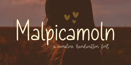 Proudly Presenting, Malpicamoln A Monoline Handwritten Font Malpicamoln is perfect for product packaging, branding project, megazine, social media, wedding, or just used to express words above the background. Malpicamoln also multilingual support. Enjoy the font, feel free to comment or feedback, send me PM or email.
 - Village by Matteson Typographics,
$19.95 Frederic Goudy’s Village typeface was originally used exclusively for his Village Press publications. Designed in 1903, Village is a Venetian book face with sturdy, open forms. Steve Matteson digitized this typeface from books printed by the Village Press. An excellent companion to any of Goudy’s other typefaces.
 - Princetown by ITC,
$40.99Richard Jones designed Princetown, an all caps font with strong, geometric letterforms, in 1981. Princetown's design was inspired by college and university sportswear, with its blocky forms and heavy outline. The Princetown font is an excellent choice for any work associated with sports or collegiate life. - Comic World by Fox7,
$12.00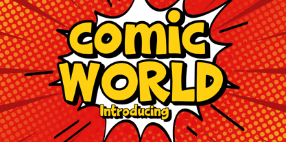 Comic World is a cool, vintage styled display font. It is the perfect font for titles or words needing a more dramatic emphasis. Whatever the topic, this font will be a wonderful asset to your font library, as it has the potential to enhance any creation.
 - Going to School by Tlatous Type,
$19.00 Introducing Going to School Font by Tlatoustype Going to School is a Fun Modern Handwritten Font. Going to School is perfect for Book Cover, product packaging, branding project, megazine, social media, wedding, or just used to express words above the background. Going to School also multilingual support.
 - P22 Ridley by IHOF,
$24.95 Ridley is a calligraphic-influenced, decorative, medieval font combining Roman and Gothic forms. It is named for Nicholas Ridley and similar in style to Staunton’s Latimer font. Ridley and Latimer were protestants burned together at the stake in 1555 during the reign of Queen “Bloody” Mary.
 - Nimbo TTW by Talavera,
$10.00 This is a playful collection of 135 diagrams based on letterforms from different styles. You can use this symbols as bullets, ornaments, but also to make your own mandala-like exercises and release some stress out! Nimbo, by the way, is the word for "halo" in spanish.
 - FF Network by FontFont,
$41.99 Dutch type designer Max Kisman created this display FontFont in 1991. The font is ideally suited for logo, branding and creative industries and music and nightlife. FF Network provides advanced typographical support with features such as ligatures and case-sensitive forms. It comes with proportional oldstyle figures.
 - Runa Serif by Monotype,
$29.99Swedish designer Lennart Hansson began designing letterforms at the age of 20, and since then his exceptional calligraphic artwork has been on exhibit throughout the world. Hansson won the Nordic Typeface Competition in Copenhagen for his typeface Runa Serif, inspired by the forms of ancient Viking runes. - Amberstone by Timurtype,
$14.00 Introducing by Timur type Amberstone A Handwritten Script Font Amberstone is perfect for product packaging, branding project, magazine, social media, wedding, or just used to express words above the background. Amberstone also has multilingual support. Embelish your designs with our original fonts. Enjoy the font, thank you!
 - PR Scrolls 05 by PR Fonts,
$10.05 Inspired by food labels, signs and coats of arms, PR Scrolls is a collection of images which can be used for framing text in contexts where antiquity, craftsmanship, or traditional quality are conveyed. Most of the glyphs are presented in a range of four or more widths.
 - Aviano Royale by insigne,
$34.99 Aviano returns to lend its classic line to its newest variation, Aviano Royale--named so because of the rich flow the calligraphic capitals give the established font. The extended lowercase characters give an air of formality to the face as well and bestow on the family a deeper sense of wealth and power. This recent development of a timeless font, part of insigne’s annual tradition of adding to the Aviano family, was elected the clear winner in a poll of insigne design’s social media followers. And is it any wonder why? The long-handed elegance of Royale features graceful script capitals as well as widely tracked and smaller titling capitals, all which make Royale ideal in high-end applications and branding where titling with a taste of gentility is required. Royale’s suite boasts a number of OpenType alternates, most importantly of which are the alternate forms for the capitals. Whereas the default forms of the face are regal, it’s flourishes must be activated through the swash set. For a look more restrained, activate the stylistic alternates. It’s like having three different fonts in one! Additionally, there are baseline lowercase forms. The lowercase forms are 20% smaller in height than Aviano’s lowercase forms, so the families are not interchangeable. However, they can still be used well together. The script capitals could also be used separately as drop capitals and nicely complement any of the other 12 Aviano families. It’s time to look beyond common. For the look of refinement you desire, design with Aviano Royale.
 - saxMono - Unknown license

- HS Alhuda by Hiba Studio,
$50.00 HS Alhuda is a display typeface. It can be used for titles and graphic projects, which support Arabic, Persian Urdu and Kurdish. It has been created based on modern kufi style. It enjoys flexibility between sharp and curved lines in the structure of characters. This supports with a beautiful appearance and wonderful geometric structure. The sharp endings in the bottom of character also give an aesthetic addition to the character. (8) Weights has been created for this typeface between the heariline weight and heavy weight. Besides, those six additional weights which can be used in headline, has baseline parts are more thicker than the vertical parts. One has a regular form and the others has a stencil form in the middle using various styles. This typeface with its diversity of (14) weights is intended to be an attempt for a good addition to Arabic typography.
 - Debs by Scholtz Fonts,
$9.95 Debs was inspired by a thank you note sent from one of my friends to another. The recipient liked the handwriting so much that he passed the note on to me after having asked permission from Debs, the writer. I enjoyed the vigor and looseness of the handwriting, as well as admiring its legibility and style. Debs has all the characteristics of modern handwriting: It appears loose, unstructured, and free, while maintaining good form and great legibility. Its baseline is varied, creating an impression of notes written by busy people, while its characters remain well formed and readable. Debs comes in five styles, regular, lite, black, wide and wide-black. Use Debs for advertising, for casual greeting cards, for a casual, handwritten look on music or fashion media. Debs has all the features usually included in a fully professional font. Language support includes all European character sets.
 - Amigo by Monotype,
$29.00Amigo was designed by Arthur Baker in 1989 and consists of a single weight. Its basic forms are based on Venetian old face types, as can be seen for example in the slightly slanted cross stroke of the lower case e. But Baker also gave his figures eccentric contours, for example, a marked stroke contrast which gives the look of having been written with a broad-tipped pen, and the change in stroke is by no means regular in the lower case characters. The heavier upper parts become thinner as they progress downward, in contrast to the tendency of most text typefaces. The eccentricity of the forms give the characters a lively almost comic look and is best highlighted in large point sizes. However, Amigo is also legible in point sizes as small as 10 and well-suited for middle length texts and headlines. - Christmas Reign by Mans Greback,
$59.00 Christmas Reign is a very decorative festive typeface. It is a professional typeface, containing advanced but easy-to-use. OpenType functions, such as contextual alternates and ligatures. Try it and see how each letter pair behaves differently, magically creating new ways to connect as the text goes on. Use it for a stand-alone logotype, or for a longer text which requires that extra touch of magic and mystery. Each letter has more than 10 alternate variations, making it truly adaptable with hundreds of possible ways to write any word. Very easy to use functions! Use characters + < > * # to create Christmas symbols. Example: +Merry Christmas+ Use ( ) [ ] to make a decorative border around any word. Underline _ makes a space with borders. Example: (Santa_Claus) The typeface has very extensive lingual support, and works for all European languages, including Cyrillic and Greek. It also contains numbers and all characters you will ever need.
 - Humblest Pro by Gleb Guralnyk,
$15.00 Hi. Introducing a new version of my one of the most popular fonts. Now Humblest Pro includes much more characters and has west european multilingual support. This font has a smooth and clean shape without any grain unlike the original one. Almost all of the capital leters has two version, for the begining and for the ending of the word. The final alternative letter will be automatically replaced if you type a big last letter in the word (check out if the "contextual alternates" opentype feature is activated). Decorative swashes are now a part of the font. To use this decorative lines just type an underscore character and the corresponding number from _00 to _39 (make sure that “standard ligatures” opentype feature is activated). Also a lot of ligatures for small letters are available, please check out the previews with all available glyphs. Thank you and have fun!
 - DeBorstel Brush Pro by Ingo,
$49.00 A personalized cursive written with the pointed brush The strange name of this font means nothing other than ”brush,“ but only the Dutch understand it. The typeface is spirited, amusing and flashy. I made the handwritten original of DeBorstel Brush quickly and without interruption with a pointed brush. In the capitals, DeBorstel Brush appears to be almost too balanced for handwriting. In contrast, the lower case letters are intentionally very individual and uneven. A bit more life is added to the typeface with ligatures activated which are constructed with alternative letter forms — and as a result, a number of problematic letter-combinations are improved. And if this typeface is still not lively enough for you, the additional alternative character forms a e g i j l n o s t u z are available with the Open Type-Function ”Discretional Ligatures“. DeBorstel Brush is suitable for all European languages. It includes ”Unicode Latin Extended-A,“ for Central and Eastern Europe incl. Turkish, and even Cyrillic and Greek, too.
 - Goldbill by Wahyu and Sani Co.,
$20.00 Goldbill is modern sans serif typeface which designed based on geometric shapes. It is not just another geometric typeface, the uppercase letters were designed to have more squared form instead of circular and the lowercase retain the circular looks. It was designed with 2 axes variable; x-height and weight that generates 54 fonts with 3 different x-heights and 9 different weights. The basic version of Goldbill is the best for text, while the Goldbill XS with the narrowest x-height is ideal for display text, logo, etc, and the one with the largest x-height, Goldbill XL would be good for heading, shorter paragraph text or web font. Goldbill type family with its 3 different x-heights would be a great type system for any modern graphic design and typographic work. Each font has 470+ glyphs which covers Western and Eastern Europe Latin based languages, and also equipped with some OpenType Layout Features, such as: Denominators, Fractions, Standard Ligatures, Localized Forms, Numerators, Ordinals, Scientific Inferiors, Subscript, Superscript, and Tabular Figures.
 - Vernon by Giles Edwards,
$25.00 Vernon’s inspiration came while researching and investigating a 'legible' typeface design for tangible purpose. The main characteristics of ‘Vernon’ can be seen in the slightly modulated strokes that reference the natural and friendly humanist proportions of the humanist hand, with open interior letterspace characteristics. The subtle detailing and finishing of strokes and junctions – seen in the curved tail of the lowercase ‘l’ and the head serif of the lowercase ‘i’, create a smooth rhythm along the baseline. Utilizing the ‘contextual alternative’ feature of OpenType, Vernon substitutes select characters in words with word-shapes that may cause visual confusion to some readers. Vernon uses subtle character differentiation in the detailing of the inner-shape / counter space from similar letter shapes (for example: ‘p’, ‘d’, ‘g’ and ‘q’) to assist in creating the contextual alternate designs. Vernon is recommended for use as a text typeface, as it performs well at small text sizes (12 point size and below) intended for continuous reading of printed instructional and presentational information, especially where an inclusive audience demographic is required.
 - Moho Condensed by John Moore Type Foundry,
$40.00 Moho is inspired by the Victorian sans shapes, movements and expressions of modernism art deco and constructivism, conceiving a decorative and elegant font, modern and readable display. This provides a retro look style of elegance of the 30s. Moho Condensed font family is straight, vertical, with joints and links or curvilinear or angular. Moho provides an innovation in the form of letters, to replace traditional forms of curves by straight or vice versa. Condensed Moho is a category of square letter, has an efficient OpenType programming for Moho OT Condensed, and basic for Moho Std families to compose texts in European languages of East and West, having wide set of over 610 glyphs. Designed to hold and typesetting over 14 pts or less increasing readability depending on the tracking. Moho Condensed is ideal for publishing newspaper and magazine design, convenient for the design covers and labels due to its space saving. Moho Condensed typefaces are closely related to the arts and fashion are very useful in creating logos and brands.
 - Moho Style by John Moore Type Foundry,
$45.00 Moho is inspired by the Victorian sans shapes, movements and expressions of modernism art deco and constructivism, conceiving a decorative and elegant font, modern and readable display. This provides a retro look style of elegance of the 30s. Moho Condensed font family is straight, vertical, with joints and links or curvilinear or angular. Moho provides an innovation in the form of letters, to replace traditional forms of curves by straight or vice versa. Condensed Moho is a category of inline square letter, has an efficient OpenType programming for all Moho family, and basic for Moho Std Style family to compose texts in European languages of East and West, having im Pro a wide set up to 610 glyphs. Designed to hold and typesetting over 14 pts or less increasing readability depending on the tracking. Moho Condensed is ideal for publishing newspaper and magazine design, convenient for the design covers and labels due to its space saving. Moho Condensed typefaces are closely related to the arts and fashion are very useful in creating logos and brands.
 - Wolverton by Greater Albion Typefounders,
$10.00 The extensive Wolverton family was inspired by a turn of the 20th century luggage label designed by the London and North Western railway. The Wolverton family combines period flair and charm with respect for the modern need for legibility and purposefulness. The family has at its heart four Body text faces (regular, italic, bold and bold italic). These are complimented by three display text faces, offering upper and lower case letter forms, all offered in regular, oblique, bold and bold oblique forms. Four all-capital based display design are also included if offered in the same four style, making an extensive and flexible family suitable for a wide range of uses; everything from setting large amounts of text to large scale signage and poster work. Wolverton offers a unique blend of charm an modern flexibility, why not give it a try today? All faces include lining and old style numerals and are extensively kerned. Individual faces are all economically priced and substantial discounts offered for the purchase of larger sets of typefaces.
 - Zapfino Arabic by Linotype,
$29.99 Zapfino Arabic is designed by Nadine Chahine as the Arabic companion to Hermann Zapf’s iconic Zapfino typeface, with the approval of Prof. Zapf. The design is an evolution of Arabic calligraphic traditions that combines Naskh and Nastaaliq to form a backward slanted calligraphic style. The character proportions refer to Naskh traditions but the isolated and final forms bring with them an exaggerated swash-like movement that references the extravagant ascenders and descenders of Zapfino. The font contains a large number of contextual variants that work to create a smooth flow of pen movement, as well as 10 stylistic sets. The character set supports the Arabic language as well as basic Latin. Zapfino Arabic is meant to be used as a display typeface, for logos, greeting cards and short headlines. It could also work for short pieces of text, for poetry or chapter introductions, when used in a generous type size and with ample space around it. Its design is soft and elegant, and leaves a lot of room for typographic playfulness.
 - Gainsborough by Fenotype,
$30.00 Gainsborough - a clean-cut display pack. Gainsborough is a display combo pack of three styles and extra swooshes. Gainsborough fonts are straightforward with characteristic clarity. All the three fonts are designed to play together. Gainsborough is very easy to use. Gainsborough Pen is a clear script inspired by handwriting with pigment pen but polished clean to be legible and inviting. It’s equipped with Contextual Alternates and Standard Ligatures for smooth flow and connections between letters. In addition there’s Stylistic and Swash Alternates for standard characters. Gainsborough Sans is a sturdy street-sans ready for action. It’s has zero contrast and angular geometric shapes. It’s great for bold headlines. Gainsborough Serif follows pretty much the same proportions but with the serifs and a little bit of contrast and round shapes. Try combining Gainsborough Swooshes with Gainsborough Pen - type one character with Swooshes in the end of a word typed with Pen and you’ll have an ending swash reaching below the word. There’s different shapes and length swooshes + a couple of center balanced ornaments.
 - Kandidat by Fontroll,
$30.00 Imagine being printer in the early nineteenth century, your stock isn’t the finest, your lead characters are worn out: Voilá Kandidat Rough. But wait, Kandidat isn’t the usual scan-an-old-book,-put-the-glyphs-in-a-font-and-you’re-done-font. Kandidat Rough has a variety of whopping 14 alternates for most characters. Our algorithm changes the letters automatically. All you have to do is turn on Contextual Alternates in your layout app. The algorithm is the best we’ve seen so far, and it’s so good that even same words appear in different forms. And should by coincidence words have the same glyphs, just assign a different Style Set to the first letter, and all other letters in the word will change as well (well, it depends a bit on your software). The mechanism isn’t perfect and maybe we stretched OpenType capabilities a bit over the top, but we yet haven’t seen any better routine for switching letters on the fly. Is it worth to mention that Kandidat Rough not only speaks English, but also German, French, Spanish, Dutch, Danish, Norwegian, Swedish, Croatian, Turkish and most likely some other languages? Maybe. To be sure whether your language is supported, this is the typeset of all letters: ABCDEFGHIJKLMNOPQRSTUVWXYZÀÁÂÃÄÅÆÇÈÉÊËÌÍÎÏÑÒÓÔÕÖØÙÚÛÜÝĆČĐĞ݌ފŸŽ abcdefghijklmnopqrstuvwxyzàáâãäåæçèéêëìíîïñòóôõöøùúûüýÿćčđğıœşšž Apart from that we also included the following punctuation and currency symbols: !"#$%&'()*+,-./:;?@[\]_{|}¡©«®°±¶·»¿×–—‘’‚“”„†•…‹›⁄≠☞ €¢$£¥ This sums up to nearly 3000 glyphs per font, and we have three of them: Regular, Italic and Bold. All neatly kerned. All in all a great repertoire for even the most demanding book or advert jobs with a look of old times. And now imagine you are sick of the rugged print experience Kandidat Rough delivers: go for Kandidat. This is our Scotch-ish ancestor the Rough version was made from. A sturdy, friendly, round, warm friend from the beginning of the nineteenth century. A bit dark, maybe. You will like it. Kandidat has the aforementioned type set plus complete Baltics, Eastern Europe and Cyrillic. Plus a couple of gimmicks like fleurons, stars, circled numbers, arrows, and, and, and… Kandidat Regular additionally has small caps for Latin based scripts (not Cyrillic). The spick and span Kandidat font set also consists of Regular, Italic and Bold cuts. The bold cut is on the very bold side and can nicely be used for headings, whereas Italic is a great companion for Regular. It took us some time and trouble to finish this project, but after all we are very proud of our little feat and hope you will enjoy Kandidat as much as we do. Enjoy!
 - Flaminia by Andinistas,
$39.95 Flaminia is a typeface family of 4 members designed by Carlos Fabián Camargo G. The central idea started as Dingbats and titles labeled with fine-tipped brushes and flat tip for graphic design related restaurant menus, instructions, packaging, food containers and labels. Thus began the process of drawings and letters integrated by shapes and counterblocks that seem inaccurate yet but at the same time clean and attractive. For this reason each variable suggests fresh brushstrokes that combine ideas from Roman and italic calligraphy. Flaminia members work separately or together by solving needs in different scenarios. This will enhance its properties in order to control and diagram titles, subtitles and short paragraphs with an effusive and manuscript character. Flaminia is useful for generating a flavor of "hand lettered by skilled artists lettering." In conclusion, Flaminia Regular and Italic are used to write short paragraphs. His ascending and downs are lower that the X height. Its width is imperceptibly condensed to save horizontal space. Its smooth lines and finishes simulating a crescent moon have been made with fine-tipped brush. The contrast between thick and thin has medium intensity. Its complement is an ideal italic to emphasize words and phrases. Its conceptual characteristics are similar with foundation's handwriting, except for his companion who takes ideas from the ornamental italic calligraphy. Flaminia Black is compact and ideal for ranking information such as words and titles. Its personality is based on ornamental penmanship italics mixed with humanistic ideas outlined with contrast-type, flat-tipped brush thickness. Its overall width is slightly condensed, rising and falling are short compared to an exaggerated X height. Its smooth lines and terminations as in a crescent moon simulate the path of a broad brush. Its amount of contrast between strokes have average intensity. In brief, push to the limit parameters such as the type and amount of contrast, size, backward, forward, overall width, etc. And finally, Flaminia Dingbats offers three sets of different illustrations, a total of almost 90 drawings useful in communications related to: Food, Clothes and Sketchy. Each carefully wrought through research, testing, analytical design, visual strategy and high-definition of Bezier paths, optimizing time and work to their users. And in conclusion, I have plans to continue expanding the family with more complete versions in the future.
 - Bodrum Sweet by Bülent Yüksel,
$19.00 Bodrum Collection: 1- Bodrum Sans 2- Bodrum Sweet 3- Bodrum Stencil 4- Bodrum Slab 5- Bodrum Styte 6- Bodrum Soft "Bodrum Sweet" is a sans serif type family. Designed by Bülent Yüksel in 2018/19. The font, influenced by style serifs, popular in the 1920s and 30s, is based on optically corrected geometric forms for better readability. "Bodrum Sweet" is not purely geometric; it has vertical strokes that are thicker than the horizontals, an “o” that is not a perfect circle, and shortened ascenders. "Bodrum Sweet" some corner is rounded. These nuances aid in legibility and give "Bodrum Sweet" a harmonious and sensible appearance for both texts and headlines. Bodrum Sweet provides advanced typographical support for Latin-based languages. An extended character set, supporting Central, Western and Eastern European languages, rounds up the family. The designation “Bodrum Sweet 14 Regular” forms the central point. "Bodrum Sweet" is available in 10 weights (Hair, Thin, Extra-Light, Light, Regular, Meduim, Bold, Extra-Bold, Heavy and Black) and 10 matching italics. The family contains a set of 650+ characters. Case-Sensitive Forms, Classes and Features, Small Caps from Letter Cases, Fractions, Superior, Inferior, Denominator, Numerator, Old Style Figures just one touch easy In all graphic programs. Bodrum Sweet is the perfect font for web use. You can enjoy using it.
 - Thicker by Zetafonts,
$39.00 Thicker is a type-family designed for Zetafonts by Francesco Canovaro with Andrea Tartarelli. A geometric sans typeface on steroids, it was first designed in the muscular Extrablack weight with the aesthetics of high-power dynamic typefaces used in sports communication, and then developed in the lighter weights where the shapes show some vintage-inspired proportions and the slightly squared look that nods to Novarese famous Eurostile, eponymous with retro-futurism. With these diverse influences the typeface allows for both impressive display use and effective logo design as well as more fine-tuned editorial use in body text - with a natural inclination for effective and powerful advertising. Sports typography usually uses italics to add dynamism and impact, and Thicker complies with this by offering a choice of three alternate italic forms with different slant, made even more customizable by the inclusion of variable font technology that allows fine tuning of the weight range as well as precise choice of typeface slant. In each of the 44 weights of the typeface family (as well as in the all-in-one variable type solution) Thicker offers a extended charset of over 900 latin, Cyrillic and Greek glyphs, covering over two hundred languages and including useful Open Type features (Alternate forms, Positional Numerals, Small Caps and Case Sensitive Forms) for flawless typesetting.
 - The Fottina Script by madjack.font,
$14.00 The Fottina Script is a calligraphic script font that comes with beautiful alternative characters. a mixture of copper calligraphy with a zipper style. Designed to bring the elegance of style. The Fottina Script attracts good, clean, feminine, sensual, glamorous, simple and very easy to read fonts. The classic style is very suitable to be applied in various formal forms such as invitations, labels, menus, logos, fashion, make up, stationery, letterpress, romantic novels, magazines, books, greeting / wedding cards, packaging, labels. The Fottina Script has 450 flying machines. including multiple language support. With OpenType features with alternative styles, binders and characters, it allows you to mix and match pairs of letters to suit your design, as well as a touch of ornament to make this font look elegant. To activate the OpenType Stylistic alternative, you need a program that supports OpenType features such as Adobe Illustrator CS, Adobe Indesign & CorelDraw X6-X7, Microsoft Word 2010 or newer. (Windows), Letter Books (Mac) or software programs such as PopChar (for Windows and Mac). How to access all alternative characters using Adobe Illustrator: https://www.youtube.com/watch?v=XzwjMkbB-wQ How to use the font style set in Microsoft Word 2010 or later: https://www.youtube.com/watch?v=NVJlZQ3EZU0 There are additional ways to access alternatives / swash, use Character Map (Windows), Nexus Fonts (Windows) Font Book (Mac) or software programs like PopChar (for Windows and Mac) How to access all alternative characters, using Windows Character Map with Photoshop: https://www.youtube.com/watch?v=Go9vacoYmBw Thank you for your visit.
 - Amica Pro by Eclectotype,
$40.00 Welcome Amica Pro, a workhorse sans designed to give your branding a friendly, approachable look. What is it that makes a typeface friendly? Eclectotype undertook extensive research* in this and the results are in! To cut a long story short, friendliness in sans serif fonts can be summed up in two words – short and fat. Basically, think Danny DeVito in letter form. The shortness in Amica Pro is achieved (somewhat counterintuitively) by pushing up the x-height. This, coupled with short ascenders and descenders, gives the text a squat appearance. For the fatness, that's easy in the bolder weights, but how to carry this through to the lights? Here, the fatness equates to roundness, so the letterforms, even if the stroke weight is light, have a rotund appearance from the wideness and roundness of the circular glyphs. When thinking about friendliness, we think about inclusiveness. To this end, Amica Pro supports a super wide range of latin-based languages, as it uses Underware's Latin Plus character set, as well as extra support for Vietnamese. Amica Pro is best used for branding, logos, infographics etc. It will give your UI a friendlier feel, but that doesn't mean it's not serious. There are many useful typographic features, including alternates, numerous figure styles, automatic fractions and case-sensitive forms. The italics are carefully optically corrected "sloped romans" and as such they are the same width as their upright equivalent, so changing your copy to italics will not mess around with the spacing. *I looked at a few fonts and drew some lazy conclusions.
 - Motorix by Ampersand Type Foundry,
$24.00 Motorix is a typeface of alternatives. A versatile and highly flavorful constructivist design in three weights with corresponding italics, and hundreds of variant forms. Motorix’ interchangeable letterforms yield a multitude of combinations that elicit electronic rhythms and at times take on humanistic forms. The name Motorix is a pseudo-feminized variant (the ‘-ix’ suffix being derived from ‘-trix’) of the German word ‘motorik’, which refers to both electronic music and human motor skills. The typeface lives up to its energetic name, synthesizing precise rhythms and alphabetic waveforms into a uniquely upbeat and spunky typeface.
 - Madurai Slab by insigne,
$24.00 Chennai’s market-tested type styles have taken new form once again. The geometric forms of Chennai and its derivant Madurai, both successful in web-based applications and logotypes, have now been adapted for the superfamily Madurai Slab, a potent, square slab serif ideal for headlines and posters. Under the surface of Madurai Slab’s straightforward geometric structure, the font’s exaggerated vertical serifs provide the face with an extra chunk that commands the reader’s attention and gives the font more impact in its heavier styles. The extra-fortified forms are anything but monotonous, though. The bolder structure of the slab is instead rational, diligently thought-out, with minimally contrasting strokes, making the sturdier look particularly legible in shorter textual content blocks. This child of Madurai contains a comprehensive range of nine weights--slender to black--and features condensed and extender selections for a complete set of fifty-four fonts. All users of the Madurai Slab collection can access numerous OpenType alternates. Madurai Slab is furnished for experienced typographers, together with alternates, compact caps and many alts like “normalized” capitals and lowercase letters that come with stems. The typeface also contains a range of numeral sets, together with fractions, old-style and lining figures with superiors and inferiors. OpenType-capable programs including Quark or the Adobe suite allow quick changes to ligatures and alternates. Previews of these options can be found in the .pdf brochure. Madurai Slab also features the glyphs to enable all Central, Eastern and Western European languages. In all, Madurai Slab supports around forty languages that utilize the prolonged Latin script, making it an excellent option for multi-lingual publications and packaging. This richness of options makes this the best slab serif family for websites as well as for print, motion graphics, logos, t-shirts and the like. Madurai Slab is a great choice when looking for a Neo-Grotesque slab serif font. In the hands of a learned designer, this new slab offers the potential for beautiful and well-blended layouts. With its widths adjusting to compact and extended content blocks, this typeface is perfect for the headings, captions and other brief, immediate messages that you need to drive your message home.
 - Magendfret by sugargliderz,
$24.00 Magendfret is a typeface that was designed very mechanically. However, it is also the optimal typeface for expressing soft warmth. Magendfret was designed by constructing a "line." That is: it is based on the concept "it is the combination of a straight line and a curve with a character." I made the character from the act of using and constructing a vector graphics editor, a mouse, and a keyboard. That, I thought when constructing it, should make neither a roman type nor italic type into a novel form, and a very general form. Once those characters were bit-map-ized, they traced again mechanically by the vector graphics editor. It became a soft impression by this work. The very mechanical act of changing the thickness of a line uniformly constitutes the family. The thickness of seven patterns was created first and, finally it results in four patterns. Respectively, styles called Light, Regular, Medium, and Bold are attached as usual. The name Magendfret is meaningless. It is an anagram of a certain words selected very arbitrarily.
 - Mirella Script by Intellecta Design,
$52.90 Mirella Script is a modern and clean approach of the classic French Bastarde script style. Mirella has the follow resources : - Lots os ligature forms (using contextual alternates open-type feature), - many stylistic alternates for each letter (upper- and lowercase and all accessed with the glyph palette), a set of 55 ornaments and fleurons accessed with the glyph palette or using the Ornaments feature); - initial and final letters with artistic variations accessible using the initial and final form open-type features - a tour-de-force kerning work: almost 700 gliphs in this font was adjusted to your kern pairs handly. In non-OpenType-savvy applications it works well as an unusual and beautiful script style font. We ever suggest the use of the glyph palette to find ideal solutions to specific designs, because the high number of gliphs. The sample illustrations will give you an idea of the possibilities. You have full access to this amazing stuff using InDesign, Illustrator, QuarkXpress and similar software. Mirella Script has original letters designed by Iza W and overall creative direction plus core programming by Paulo W.
 - Garrulous by Missy Meyer,
$12.00 Looking for a tall, skinny, rounded serif font, with a fun hand-written feel? Look no farther than Garrulous! Garrulous is a mixed-case font, with the lowercase letters standing just as tall as the uppercase, so you can mix and match uppercase and lowercase in the same word for an extra fun look. It also comes with 32 double-letter ligature pairs, 17 uppercase and 15 lowercase, so you won't have the exact same letter twice in a row. As usual, the letters in Garrulous have been cleaned up extensively, to make everything sharper and easier for crafters and for any print projects. And I've included over 300 extended Latin characters for language support. Garrulous includes: - Standard characters A-Z, a-z, 0-9, and punctuation - 32 double-letter ligature pairs - Over 300 extended Latin characters for language support
 - Mister Arigato by Colllab Studio,
$19.00 "Hi there, thank you for passing by. Colllab Studio here. We crafted best collection of typefaces in a variety of styles to keep you covered for any project that comes your way! Mister Arigato is a modern, unique calligraphy font inspired by traditional Japanese and Korean brush lettering. It gives you that little extra something you always been looking for. We do more than just type, we help you show how much you care in your most precious brand. This font is a great option for any project that involves sending letters as a decorative piece of artwork (attach it to a mug, or place on a greetings card), or for use for branding purposes(headline, logo, etc.). Though it is not double-width, the letters easily tailor to any word-spacing. A Million Thanks www.colllabstudio.com
 - Quirky by Fine Fonts,
$29.00 The origin of Quirky lay in the Duke Ellington number It don't mean a thing if it ain't got that swing. For some time I had wanted to create a font from expanded stroked lines. I wanted to produce a light-hearted font, but with some classic touches. One day, whilst doodling in Adobe Illustrator, Quirky’s letterforms just appeared on screen as if from nowhere. First I drew the test word ‘hamburgefonts’ and then just kept going, unable to stop. Character after character appeared as if by magic. From the start, Quirky had a life of its own. The letterforms are rather more sophisticated than merely outlined stroked lines. Subtle adjustments to compensate for optical effects have been been incorporated. For example, horizontal stems have thicknesses slightly less than vertical stems and where stems join together, the thickening effect has been reduced by cutting into the joint. Being almost monoline, Quirky works well reversed out of a solid background and for TV credits. The Quirky fonts are fun fonts, so set, laugh and enjoy! I hope Quirky will give you as much pleasure in using it as I got in creating it! Shortly after the roman version was born, an italic version and then a thin version were created to form a family of three fonts.
 - Volatile Serif by Mans Greback,
$59.00 Volatile Serif, designed by Mans Greback, is a luxurious and romantic typeface that exudes an air of softness and delicate beauty. Its flowing, liquified forms, and delicate swirls evoke feelings of empathy, creating a sense of connection and warmth. This font is perfect for high-end projects that demand a touch of fine elegance. Inspired by the gentle movements of water, the designer sought to capture the essence of fluidity in Volatile Serif. The result is a typeface that feels alive, as if its character is organically creating the word, making it a perfect choice for luxury brands, romantic designs, and storytelling. The font is built with advanced OpenType functionality and has a guaranteed top-notch quality, containing stylistic and contextual alternates, ligatures, and more features; all to give you full control and customizability. It has extensive lingual support, covering all Latin-based languages, from Northern Europe to South Africa, from America to South-East Asia. It contains all characters and symbols you'll ever need, including all punctuation and numbers. Mans Greback is a Swedish typeface designer with a passion for creating unique and versatile fonts. With an extensive background in design and typography, Mans has built a reputation for his meticulous attention to detail and prolific craftsmanship. His many fonts are widely used by designers around the world, making his work synonymous with creativity and innovation.
