10,000 search results
(0.078 seconds)
- Blackstripe by Mirror Types,
$15.00This font was inspired by the bricks of my wall, I stared at them all the time thinking, wouldnt be great if fonts live in cooperation with bricks, and then, it came to my mind…A font family that shows naked bricks, like it is RIGHT on the middle of design process. The main features are the informal and wired look that make it worthwhile for bands and informal invitations, flyers, for concerts or infantile designs. - Grace by Linotype,
$29.99Grace was designed by Elisabeth Megnet and appeared with Linotype in 1992. The font is a part of the package Calligraphy for Print, which also contains Ruling Script and Wiesbaden Swing. Calligraphy for Print 2 completes the set. These packages offer modern calligraphy fonts particularly well-suited to use in posters, magazines and advertisements. The basic style of Grace is based on the Gothic miniscule of the 13th century. It represents a modern philosophy held by Andre Guertler, Professor of Typography in Basel with whom Megnet once studied. With this philosophy, calligraphy is not to be seen as a decorative art, and fonts created according to this tenet have far fewer ornamental strokes. They are eccentric, drawn out and almost bulky. Like Gothic forms, one of the predecessors of this font, Grace gives vertical lines a particular emphasis. This font is not meant for long texts but makes a distinctive impression in shorter texts or headlines. - Optika by Designova,
$15.00 The design concept of OPTIKA is inspired by our all-time best-selling typeface NORD Optika is a minimal and modern Sans-Serif typeface that makes your designs stand out from the crowd. Optika is an all-purpose typeface, a perfect choice for creating logotypes, branding, headlines, corporate identities, and marketing materials for web, digital & print alike. The typeface will be a great option for branding, logo/logotype design projects, marketing graphics, banners, posters, signage, corporate identities and editorial design. Adding extra letter spacing will make this font the perfect choice for minimal headlines and logotypes, as shown in the promo designs attached. Handcrafted and designed with powerful OpenType features in mind, each weight includes extended language support with Western European, Central European and South Eastern European sets. A total of 394 glyphs are available. Optika typeface includes 14 fonts in total, with seven upright weights (Thin / Light / Regular / Medium / Bold / Heavy) and Italic equivalents of all seven weights.
 - Christmas Peachy by Yoga Letter,
$20.00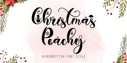 Christmas Peachy is a charming and festive handwritten font adorned with delightful Christmas ornaments. Its elegant strokes and decorative accents bring a touch of holiday magic to your design projects, making it perfect for creating warm and inviting Christmas-themed materials.
 - Nouveau Poster JNL by Jeff Levine,
$29.00 When master letterer Hugh Gordon and his student, Ross F. George developed a set of lettering pens between June 16, 1913 and Sept. 1, 1914, they had no idea that their invention (which they named Speed-Ball®) would still be in use nearly a hundred years later. The C. Howard Hunt pen company [originally of Camden, New Jersey] became the original (and sole) distributor of these pens. By 1915 an instructional booklet entitled "Modern Pen Lettering" was produced, and it was copiously illustrated with examples of layouts, lettering techniques and an assortment of alphabets for the user to learn. Nouveau Poster JNL is Jeff Levine's interpretation of a sanserif design found within the pages of this vintage publication.
 - Bernyck by Eurotypo,
$24.00 Bernyck is a vintage fonts inspired by bold advertisers hand lettering styles, popular in the late 1940s through the early 1950s. It has the same charm as his brother “Cinefile”, but, this time, connected and with more alternates. The Bernyck family is integrated by Bernyck and Bernyck Extrude to interact together. To this we add a beautiful set of 131 ornaments, Bernyck Ornaments and of course, Bernyck Ornaments Extrude. The Open Type features include a full international character compliment, standard and contextual alternates, swatches, stylistic sets, initial forms, standard and discretionary ligatures. All this makes the text lively and bouncy, without the monotony of obviously repeated letterforms. A total of 634 glyphs to offer you many more options for your designs! Bernyck, like all our fonts, was carefully designed, controlled and tested in both aspects: readability and technical aspects. We take care of the kerning pairs, hinting and the precise programming of the Open Type functions; as well as the final touch of each glyph. Bernyck adapts well to titles, packages, invitations, greeting cards, magazines and book covers, children's material, fashion, logos and, posters and wherever you need a fun and sympathetic display font.
 - April Blossom by Angele Kamp,
$22.00 April Blossom is a sweet, brush font with a playful character. This fun will look gorgeous on all your branding materials, cards, quotes, and any other lovely projects you are working on.
 - Digot 03 by Fontsphere,
$16.00 DIGOT 03 is an innovative two-font family that blends minimalism and geometric precision to create a visually striking and modern design. These fonts are perfect for those seeking a clean and contemporary look for their projects. --- Usage Recommendations DIGOT 03 is a font that thrives in environments where simplicity and clarity are valued. It works exceptionally well in both digital and print formats. Consider using DIGOT 03 in the following situations: Web Design: DIGOT 03 can add a touch of modernity to website designs, providing a clean and contemporary experience for users. Poster Design: Whether creating event posters or advertising material, DIGOT's bold and eye-catching letterforms make it a perfect choice for grabbing attention. Logo Design: This font, despite its very experimental approach, can help establish a strong and memorable brand identity. Its simplicity allows the logo to be easily recognizable and versatile across various marketing channels. Iconography: As DIGOT 03 is built upon geometric principles, it excels in creating visually appealing icons and symbols that follow the same minimalist style. --- DIGOT 03 is the perfect font for designers and creatives who appreciate simplicity and have a keen eye for detail. With its unique minimalist geometric style, DIGOT offers endless possibilities for creating clean and impactful designs.
 - Hazard by Ergibi Studio,
$20.00 Introducing Hazard! Stylish Marker Font is a smooth brush font. With a style that looks original, this font has its own uniqueness and when meeting with others will provide a dynamic and pleasant closeness. It is suitable for all your design projects such as quotes, poster designs, personal branding, promotional materials, logos, product packaging, and more. It includes a bonus swash weight to let you add even more to your design.
 - Gangnam by Ditatype,
$29.00 Gangnam is a captivating display font that dances to its own rhythm, embodying the spirit of the vibrant Gangnam district. Gangnam strikes the perfect balance between subtlety and impact, with a weight that is not bold, allowing the Korean-inspired letterforms to take center stage. The characters in Gangnam showcase a unique Korean touch, capturing the essence of the dynamic and stylish district. The large letters, while not bold, maintain a visible presence, creating an overall design that is both graceful and attention-grabbing. Gangnam is not just a font; it's a visual journey through the eclectic streets of Gangnam. In addition, enjoy the features here. Features: Alternates Ligature Multilingual Supports PUA Encoded Numerals and Punctuations The Korean-inspired design ensures that Gangnam infuses a sense of style and cultural authenticity into any project. Gangnam fits in headlines, logos, posters, flyers, branding materials, greeting cards, print media, editorial layouts, and many more designs. Find out more ways to use this font by taking a look at the font preview. Thanks for purchasing our fonts. Hopefully, you have a great time using our font. Feel free to contact us anytime for further information or when you have trouble with the font. Thanks a lot and happy designing.
 - Urbanhive by Jaetwo Type,
$45.00 Urban Hive : reinterpreting three-dimension to the typeface A blueprint consists of two-dimensional elements changes into a three-dimensional structure. What works would be created by reversing the process? The building components were divided into three parts : Facade, Inside space and Construction materials to apply all the features to the typeface. This is Facade version.
 - Motting by Zane Studio,
$15.00 INTRODUCE ! Motting script - a new modern calligraphy font, fresh, cute, eye-catching, with a joyful heart. Great for greeting cards, branding materials, business cards, quotes, posters and more! Motting script too - includes lots of alternate characters. Encoded with Unicode PUA, which allows full access to all additional characters without any special design software. Mac users can use Font Book. Windows users can use the Character Map to view and copy one of the additional characters to paste into your favorite text editor. For people with opentype-enabled software: Alternate can be accessed by turning on the "Alternate Styles" and "Ligature" buttons on Photoshop's Character panel, or through any software with a glyph panel, e.g. Adobe Illustrator, Photoshop CC, Inkscape. Files include: - Motting script. OTF - Motting script. TTF Thank you for buying!
 - Micelina by Gatype,
$14.00 Micelina modern script style sweet calligraphy, decorative characters and dancing baseline! Very pretty on invitations such as greeting cards, branding materials, business cards, quotes, posters and more! Micelina comes with 338 glyphs. Alternate characters are divided into several Open Type features such as ,Stylistic Alternates. The Open Type feature can be accessed using Open Type savvy programs such as Adobe Illustrator, Adobe InDesign, Adobe Photoshop version of Corel Draw X, and Microsoft Word. And this Font has provided PUA unicode (custom coded font). so that all alternative characters can be easily accessed in full by a craftsman or designer. Thank you for your purchase!.
 - Celestial Script by Gatype,
$14.00 Celestial Script modern script style sweet calligraphy, decorative characters and dancing baseline! Very pretty on invitations such as greeting cards, branding materials, business cards, quotes, posters and more. Celestial Script comes with 427 glyphs. Alternate characters are divided into several Open Type features such as, Stylistic Alternates. The Open Type feature can be accessed using Open Type savvy programs such as Adobe Illustrator, Adobe InDesign, Adobe Photoshop version of Corel Draw X, and Microsoft Word. And this Font has provided PUA unicode (custom coded font). so that all alternative characters can be easily accessed in full by a craftsman or designer. Thank you for your purchase!.
 - Lingstone by Gatype,
$12.00 Lingstone Script modern script style sweet calligraphy, decorative characters and dancing baseline! Very pretty on invitations such as greeting cards, branding materials, business cards, quotes, posters and more! Lingstone Script comes with 441 glyphs. Alternate characters are divided into several Open Type features such as , Stylistic Alternates. The Open Type feature can be accessed using Open Type savvy programs such as Adobe Illustrator, Adobe InDesign, Adobe Photoshop version of Corel Draw X, and Microsoft Word. And this Font has provided PUA unicode (custom coded font). so that all alternative characters can be easily accessed in full by a craftsman or designer. Thank you for your purchase.
 - Stepon by Putracetol,
$22.00 Stepon is a versatile display font that offers a plethora of creative possibilities. This font is characterized by its bold, modern, and unique design, making it an excellent choice for a wide range of projects. The distinctive feature of Stepon is its versatility, with six different variations that include inline, outline, texture, and rough styles. Each variation stands strong on its own and can be easily combined with others, allowing you to unleash your creativity in various ways. Whether you're working on a logo, branding materials, invitations, packaging, posters, headlines, business collateral, greeting cards, magazines, films, or any other design project, Stepon has got you covered.
 - Jantan by Sulthan Studio,
$13.00 Jantan is a new fresh & modern script with a handmade calligraphy style, decorative characters and a dancing baseline! So beautiful on invitation like greeting cards, branding materials, business cards, quotes, posters, and more. The alternative characters were divided into several OpenType features such as Stylistic Alternates, and Ligatures. The OpenType features can be accessed by using OpenType savvy programs such as Adobe Illustrator, Adobe InDesign, Adobe Photoshop Corel Draw X version, And Microsoft Word. And this Font has given PUA unicode (specially coded fonts). so that all the alternate characters can easily be accessed in full by a craftsman or designer.
 - Blushbutter Whimsy by Blushbutter,
$45.00I've always loved drawing faeries and I love using them in my scrapbooking pages. So after hunting around for a unique decorative fairy font for my crafts I couldn't quite find what I wanted to use, so I decided to create a whimiscal set of fairy drawings and characters that would suffice. I was influenced in the drawing of the fairies by my love of the 3D poser graphics art,several awesome comics, Alphonse Mucha and several Masters of Art. I couldn't really say what influenced me to draw the letter charaters as I did except I just sat down to draw and they appeared on my blank photoshop canvas. These decorative Fairy Uppercase letters would be great to use in fabric crafts,textiles, embroidery patterns, scrapbooking, greeting cards, Rubber stamps, name titles, Calligraphy, the possiblities I feel are endless when thinking of craft applications. - Blushbutter Fairy Floss by Blushbutter,
$45.00I've always loved drawing faeries and I love using them in my scrapbooking pages. So after hunting around for a unique decorative fairy font for my crafts I couldn't quite find what I wanted to use, so I decided to create a whimiscal set of fairy drawings and characters that would suffice. I was influenced in the drawing of the fairies by my love of the 3D poser graphics art,several awesome comics, Alphonse Mucha and several Masters of Art. I couldn't really say what influenced me to draw the letter charaters as I did except I just sat down to draw and they appeared on my blank photoshop canvas. These decorative Fairy Uppercase letters would be great to use in fabric crafts,textiles, embroidery patterns, scrapbooking, greeting cards, Rubber stamps, name titles, Calligraphy, the possiblities I feel are endless when thinking of craft applications. - Tangier by Viswell,
$17.00 Tangier is a contemporary display serif font that embodies a refined sense of style and elegance. With its sleek and modern design, Tangier is perfect for use in a variety of creative projects, such as logos, titles, and headlines. The font comes in two styles - regular and italic - both of which feature strong contrast between thick and thin lines. The regular style is perfect for creating attention-grabbing headlines or adding a touch of sophistication to body text, while the italic style can be used to add a stylish flair to subheadings or pull quotes. Tangier's strong serifs give it a classic and timeless feel, while its modern design adds a touch of contemporary flair. Its versatility makes it suitable for use in a wide range of settings, from high-end branding and marketing materials to editorial and fashion layouts.
 - Lunar Pop by Prioritype,
$19.00 Lunar Pop - Display Font. Bold and fun fonts are here to accompany your design projects. Consists of 2 styles, namely Regular & Outline which further adds to the creative value of this font. Perfect for poster design, branding, crafting, merchandise and more. Features: Uppercase, Lowercase, Numeral, Punctuation & Multilingual. Multilingual contained: Afrikaans, Albanian, Asu, Basque, Bemba, Bena, Breton, Catalan, Chiga, Cornish, Danish, Dutch, English, Estonian, Filipino, Finnish, French, Friulian, Galician, German, Gusii, Indonesian, Irish, Italian, Kabuverdianu, Kalenjin, Kinyarwanda, Luo, Luxembourgish, Luyia, Machame, Makhuwa-Meetto, Makonde, Malagasy, Manx, Morisyen, North Ndebele, Norwegian Bokmål, Norwegian Nynorsk, Nyankole, Oromo, Portuguese, Quechua, Romansh, Rombo, Rundi, Rwa, Samburu, Sango, Sangu, Scottish Gaelic, Sena, Shambala, Shona, Soga, Somali, Spanish, Swahili, Swedish, Swiss German, Taita, Teso, Uzbek (Latin), Volapük, Vunjo, Zulu. Thanks!
 - Pirouette by Linotype,
$40.99Pirouette is based on a logo that Japanese designer Ryuichi Tateno created for a packaging design project in 1999 (a shampoo container!). Tateno's logo experimented with complex, overlapped swash letterforms. He continued to develop these outside of the initial packaging project, until they took on a life of their own. Eventually, Tateno designed a full typeface out of the logo, Pirouette, which was the first place display face in Linotype's 2003 International Type Design Contest. The Pirouette typeface contains six different fonts. The basic font is Pirouette Regular. This is an engraver's italic lowercase paired with elaborate swash capitals. The swash capitals have two visual elements in their forms: thick strokes and thin strokes. Pirouette Text includes the same lowercase as Pirouette Regular, but the uppercase letters are much shorter and simpler. This "text" font can be used to set longer amounts of copy. Pirouette Alternate contains different lowercase glyphs and additional ligatures, which can be used as substitutes for the lowercase forms in the Pirouette Regular and Pirouette Text fonts. Pirouette Ornaments contains swashes and other knick-knacks that can either be added onto the end of a letter, or used as separate decorative elements or swooshes (accolades) on a page. Pirouette Separate 1 and Pirouette Separate 2 are two fonts that can be layered over top of one another in software applications that support layering (e.g., most Adobe and Macromedia applications, as well as QuarkXPress). Pirouette Separate 1 contains the thick stroke elements from Pirouette Regular's uppercase letters, as well as the same lowercase glyphs that can be found in Pirouette Regular and Pirouette Text. Pirouette Separate 2 contains only the thin stroke elements from Pirouette Regular's uppercase letters. By layering Pirouette Separate 1 and Pirouette Separate 2 over one another, you can give the uppercase letter's thick and thin stroke elements different colors and create unique, more calligraphic designs. The Pirouette family, Tanteno's first commercial typeface, was greatly influenced by the calligraphic and typographic work of the master German designer, Prof. Hermann Zapf, especially his Zapfino typeface. - Nestapha by Flawlessandco,
$9.00 Nestapha is an elegant Arabic-style font that is perfect for a variety of design applications, for example those related to Ramadan. There's some connected letters and some alternates that suitable for any graphic designs such as branding materials, t-shirt, print, business cards, logo, poster, t-shirt, photography, quotes .etc This font support for some multilingual. Also contains uppercase A-Z and lowercase a-z, alternate character, numbers 0-9, and some punctuation. If you need help, just write me! Thanks so much for checking out my shop!
 - Pial by Eurotypo,
$20.00 Pial fonts Family includes: Pial Regular that is totally hand-designed, casual and youthful, with lines that sometimes swell extremely, contain 546 glyphs with many stylistic variations, swashes and ligatures. Pial Sans Regular and Expanded, also hand-designed, and Pial Serif Regular and Condensed to add a little seriousness. We have added also, a font of ornaments, extras and catchwords in the family. Using this font you will achieve a very elegant and warm work. Pial Family is very versatile and ideal for logotype design, magazines and book covers, children's material, fashion, headlines, cards, posters, websites, packaging and, basically, anywhere you want.
 - Vermors by Blankids,
$25.00 Hello, Are you looking for a vintage playful font? Do you want of creating Something that stand out and inspire creativity, imagination, and endless fun? Wait no more, we will give you the best choice. Vermors a Vintage Serif Font Vermors a Vintage Serif Font a Vintage Display Font, Inspiring from vintage style typography. This font is perfect for a design that makes it more attractive and playful. made with a very good level of aesthetics making this font suitable for book cover, poster, packging, merchandise, logotype and much more. Vermors font includes Multilingual Support, among others : Afrikaans, Albanian, Asu, Basque, Bemba, Bena, Breton, Catalan, Chiga, Cornish, Danish, Dutch, English, Estonian, Faroese, Filipino, Finnish, French, Friulian, Galician, German, Gusii, Indonesian, Irish, Italian, Kabuverdianu, Kalenjin, Kinyarwanda, Luo, Luxembourgish, Luyia, Machame, Makhuwa, Meetto, Makonde, Malagasy, Manx, Morisyen, North Ndebele, Norwegian Bokmål, Norwegian Nynorsk, Nyankole, Oromo, Portuguese, Quechua, Romansh, Rombo, Rundi, Rwa, Samburu, Sango, Sangu, Scottish Gaelic, Sena, Shambala, Shona, Soga, Somali, Spanish, Swahili, Swedish, Swiss German, Taita, Teso, Uzbek (Latin), Volapük, Vunjo, Zulu FEATURES : Uppercase Lowercase Number Punctuation Multilingual PUA Encode Opentype
 - Scansky by Satori TF,
$20.80 Scansky is a carefully crafted contemporary modern sans serif typeface. It comes with 28 fonts, regular and condensed sub-families, and matching italics. Scansky was designed to give a distinct, corporative look to your artwork, suited for signage, web, and corporate print material. It is equipped with an extended character set to support Central, Eastern and Western European languages. And the good news is that the SemiBold weights are free of charge so you can try it. :)
 - Aesop by Fine Fonts,
$29.00 Aesop was developed from some book jacket lettering drawn by Michael Harvey for an edition of Aesop’s Fables by a master Japanese Artist. It is based upon a pen-drawn script, and is characterised by a lively sense of movement and grace. Aesop Plus, being an OpenType font, contains many alternative characters and additional ligatures which can be automatically substituted to enhance the liveliness of set text, where the application in which it is used, permits.
 - Sevil alias Esra Lite - Unknown license

- Old Wood JNL by Jeff Levine,
$29.00 One of the charming features of vintage wood type is the unusual interplay of stroke widths or letter shapes that can vary from character to character. In today's world of digital perfection, a set of letters, numbers and punctuation marks must conform to rigid standards of uniform lines, balanced curves and other form-and-function rules that has often removed the human feel from the overall type design. While this is fine when applied to most text fonts and some modern display faces, Old Wood JNL is a simple throwback to an earlier time when type design was an artistic, not engineering endeavor. Modeled in part from vintage source material, this wood type design retains that charming imperfection of a time long passed.
 - Fleischmann Gotisch PT by preussTYPE,
$29.00 Johann Michael Fleischmann was born June 15th, 1707 in Wöhrd near Nuremberg. After attending Latinschool he started an apprenticeship as punchcutter in the crafts enterprise of Konstantin Hartwig in Nuremberg, which ought to last six years. For his extraordinary talent Fleischmann completed his apprenticeship after four and a half years, which was very unusual. 1727 his years of travel (very common in these days) began, during which he perfected his handcraft by working in different enterprises as journeyman. First location was Frankfurt/Main where he worked for nearly a year at the renowned type foundery of Luther and Egenolff. Passing Mainz he continued to Holland, where he arrived in November 1728 and stayed till he died in 1768. In Amsterdam he worked for several type founderies, among others some weeks for Izaak van der Putte; in The Hague for Hermanus Uytwerf. Between 1729 and 1732 he created several exquisite alphabets for Uytwerf, which were published under his own name (after his move to Holland Fleischmann abandoned the second n in his name), apparently following the stream of the time. After the two years with Uytwerf, Fleischmann returned to Amsterdam, where he established his own buiseness as punchcutter; following an advice of the bookkeeper and printer from Basel Rudolf Wetstein he opened his own type foundery 1732, which he sold in 1735 to Wetstein for financial reasons. In the following Fleischmann created several types and matrices exclusively for Wetstein. In 1743 after the type foundery was sold by Wetstein’s son Hendrik Floris to the upcoming enterprise of Izaak and Johannes Enschedé, Fleischmann worked as independent punchcutter mostly for this house in Haarlem. Recognizing his exceptional skills soon Fleischmann was consigned to cutting the difficult small-sized font types. The corresponding titling alphabets were mostly done by Jaques-Francois Rosart, who also cut the main part of the ornaments and borders used in the font examples of Enschedé. Fleischmann created for Enschedé numerous fonts. The font example published 1768 by Enschedé contains 3 titling alphabets, 16 antiquacuts, 14 italic cuts, 13 textura- and 2 scriptcuts, 2 greek typesets (upper cases and ligatures), 1 arabic, 1 malayan and 7 armenian font systems, 5 sets of musicnotes and the poliphonian musicnotesystem by Fleischmann. In total he brought into being about 100 alphabets - the fruits of fourty years of creative work as a punchcutter. Fleischmann died May 27th, 1768 at the age of 61. For a long time he was thought one of the leading punchcutters in Europe. A tragedy, that his creating fell into the turning of baroque to classicism. The following generations could not take much pleasure in his imaginative fonts, which were more connected to the sensuous baroque than to the bare rationalism of the upcoming industrialisation. Unfortunately therefore his masterpieces did not survive the 19th century and person and work of Fleischmann sank into oblivion. The impressive re-interpretation of the Fleischmann Antiqua and the corresponding italics by Erhard Kaiser from Leipzig, which were done for the Dutch Type Library from 1993 to 1997, snatched Fleischmann away from being forgotten by history. Therefore we want to place strong emphasis on this beautiful font. Fleischman Gotisch The other fonts by Fleischmann are only known to a small circle of connoisseurs and enthusiasts. So far they are not available in adequat quality for modern systems. Same applies the "Fleischman Gotisch", which has been made available cross platform to modern typeset-systems as CFF Open Type font through the presented sample. The Fleischman Gotisch has been proved to be one of the fonts, on which Fleischmann spent a good deal of his best effort; this font simply was near to his heart. Between 1744 and 1762 he created 13 different sizes of this font. All follow the same principles of forms, but their richness of details has been adapted to the particular sizes. In later times the font was modified more or less sensitive by various type founderies; letters were added, changed to current taste or replaced by others; so that nowadays a unique and binding mastercopy of this font is missing. Likewise the name of the font underwent several changes. Fleischmann himself probably never named his font, as he did with none of his fonts. By Enschedé this textura was named Nederduits, later on Nederduitsch. When the font was offered by the german type foundery Flinsch in Frankfurt/Main, the more convenient name of Fleischmann-Gotisch was chosen. In his "Masterbook of the font" and his "Abstract about the Et-character" Jan Tschichold refered to it as "Duyts" again. To honour the genious of Johann Michael Fleischmann we decided to name the writing "Fleischmann Gotisch PT" (unhyphenated). Developing the digital Fleischman Gotisch I decided not to use one of the thirteen sizes as binding mastercopy, but corresponding to the typical ductus of the font to re-create an independent use of forms strongly based on Fleischmann´s language of forms. All ascenders and descenders were standardised. Some characters, identified as added later on, were eliminated (especially the round lower case-R and several versions of longs- respectively f-ligatures) and others were adjusted to the principles of Fleischmann. Where indicated the diverse characters were integrated as alternative. They can be selected in the corresponding menu. All for the correct german black letter necessary longs and other ligatures were generated. Through the according integration into the feature-code about 85% of all ligatures in the type can be generated automatically. Problematic combinations (Fl, Fk, Fh, ll, lh, lk, lb) were created as ligatures and are likewise constructed automatically. A historically interesting letter is the "round r", which was already designated by Fleischmann; it is used after preceding round letters. Likewise interesting is the inventive form of the &-character, which is mentioned by Tschichold in his corresponding abstract. Nevertheless despite all interpretation it was very important to me to maintain the utmost fidelity to the original. With this digital version of a phantastic texturfont of the late baroque I hope to contribute to a blossoming of interest for this genious master of his kind: Johann Michel Fleischmann. OpenType features: - Unicode (ISO 10646-2) - contains 520 glyphes - Basic Latin - Latin-1 Supplement - Latin Extended-A - Latin Extended-B - Central European Glyhps - Ornaments - Fractions - Standard ligatures - Discretionary ligatures - Historical ligatures - Kerning-Table
 - Diecast by Device,
$39.00 A companion piece to Mulgrave, this font is the intermediary design between the chunky Victorian style that Mulgrave reproduces and the Ministry of Transport sans introduced in 1933 and digitised as Ministry. Although they date from between 1910 and 1933, these signs show the beginnings of several features Ministry later incorporated, notably the thinner strokes and the more modern forms of the G, M, R and S. The letter widths are approaching a monospace - the L, F and E are relatively wide compared to the W and M, a feature that may have something to do to the casting process. These idiosyncracies were all ironed out when the first version of the MOT alphabet was produced. The Device digitization, as with Mulgrave, stays true to the worn and repainted original metal source material and preserves the unusual widths.
 - Egon by TipografiaRamis,
$29.00 Egon is a contemporary Slab-Serif typeface family built in ten styles—extra-light, light, regular, bold and black weights in roman and italic respectably. This is a refreshed (second) edition of Egon Serif, originally designed in 2008. The typeface has been updated—four new styles in ExtraLight and Black weights were added to the family and minor adjustments to glyph shapes (mostly italics) have been made.The typeface is designed with industrial and architectural flavor, as homage to Egon Eiermann, one of Germany’s great architects of 20th century. Egon is ideal as text and display font for publication use. Egon is released as OpenType single master with a Western CP1252 character set.
 - Mergansers by Tyler Jamieson Moulton,
$11.00 Merganser is a Typeface intended for text and copy and was inspired to serve the avid community of Birders. Birders and birding material historically have a lot to say. Merganser serves that tendency because its designed legible at small scales. The Natural world also inspires the slightly humanist strokes of Merganser. Merganser was created as part of the Type@Cooper winter certificate in Type Design.
 - Melliyan by Sulthan Studio,
$12.00 Melliyan is a new, fresh, funny, interesting, and cute calligraphy font with heart that can be connected front and back. You will have an amazing idea when you make greeting cards, branding materials, business cards, quotes, posters, and more! Melliyan includes many alternative characters. It is coded with Unicode PUA, which allows full access to all additional characters without having special design software. Mac users can use Font Book. Windows users can use the Character Map to view and copy one of the additional characters to paste into your favorite text editor. For people who have opentype-capable software: Alternatives can be accessed by turning on the "Alternative Style" and "Ligature" buttons on the Photoshop Characters panel, or through any software with glyph panels, such as Adobe Illustrator, Photoshop CC, Inkscape.
 - Deadfall by Mofr24,
$11.00 Discover Deadfall, the ultimate horror display font that will send shivers down your spine! What sets Deadfall apart is its unique blend of fear-inducing aesthetics and multilingual capabilities. This Monospace typeface exudes a captivating dripped and splash style, adding an extra layer of terror to your designs. Notably, Deadfall supports the Cyrillic alphabet, making it an ideal choice for a global audience. Deadfall offers both regular and italic variations, granting you even more creative possibilities. Whether you're designing posters, crafting marketing materials, conjuring chilling movie titles, creating Death metal logotypes, or working on Halloween-themed crafts, Deadfall will infuse your projects with a bone-chilling atmosphere. To ensure versatility, consider pairing Deadfall with related font families or other typefaces that complement its macabre charm. Its functional aspects include an extensive character set and special features, making it suitable for a wide range of applications. The design concept behind Deadfall revolves around the idea of capturing the essence of horror. The font's distinctive dripped and splash style adds a sense of chaos and unease to any composition, immersing the viewer in a world of terror. The inclusion of the Cyrillic alphabet reflects our commitment to providing a font that caters to diverse audiences, bringing fear to every corner of the globe. We created Deadfall to meet the demand for a truly spine-tingling font that conveys a sense of horror and foreboding. Whether you're a graphic designer looking to evoke fear or a Halloween enthusiast seeking to amplify the spooky atmosphere, Deadfall is here to unleash terror in your designs. Get ready to embrace the darkness with Deadfall - the ultimate font for all things haunting and macabre!
 - Lilard by Putracetol,
$28.00 Lilard - Elegant Serif Font Lilard - Elegant Serif Font is a beautiful typeface that exudes sophistication and grace. The font was designed with the idea of creating a classic and elegant look, while still maintaining a modern and clean feel. The result is a font that is versatile and can be used for a variety of projects such as branding, logos, packaging, photography, and more. The design of Lilard font is inspired by the timeless and elegant look of serif fonts, but with a contemporary twist. The designer wanted to create a font that would stand out and be memorable, while also being easy to read and understand. The elegant curves and sharp serifs make Lilard a perfect choice for projects that require a touch of elegance and sophistication. Lilard font is best used for projects that require an elegant and refined look. This font is perfect for use in wedding invitations, business cards, and other high-end print materials. The font works well when paired with other sans-serif fonts, which helps to create a modern and clean feel. Lilard font comes with a variety of features that make it stand out from other fonts. The font includes uppercase and lowercase letters, as well as opentype features such as alternates and ligatures. Additionally, the font includes numbers, punctuation, and symbols, making it a versatile choice for a variety of projects. The font also supports multiple languages, making it a great choice for international projects. If you're looking for a font that is elegant, sophisticated, and versatile, Lilard - Elegant Serif Font is the perfect choice. Its unique design and features make it an ideal choice for a variety of projects. Use this font to add a touch of elegance and refinement to your designs and make them stand out. In summary, Lilard - Elegant Serif Font is a beautiful and elegant font that is perfect for high-end projects. Its unique design, features, and versatility make it a great choice for a variety of projects, including branding, logos, packaging, photography, and more. With its opentype features, multiple language support, and easy-to-use formats, Lilard is sure to become a go-to font for designers looking for an elegant and refined look.
 - Anjeli by Sulthan Studio,
$14.00 Anjeli - a fresh, cute,handwritten font with a cute heart to connect with as well as a large selection of swashes. Great for greeting cards, branding materials, business cards, quotes, posters and more! Anjeli - includes many alternative characters. Coded with Unicode PUA, which allows full access to all additional characters without having any special design software. Mac users can use Font Book. Windows users can use the Character Map to view and copy any of the additional characters to paste into your favorite text editor. For people who have opentype-capable software: Alternatives can be accessed by activating the "Alternative Styles" and "Ligature" buttons on Photoshop's Character panel, or via any software with a glyph panel, eg. Adobe Illustrator, Photoshop CC, Inkscape.
 - Pantera by Lián Types,
$39.00 ROARRR! THE STYLES -Pantera Pro is the most complete style, and although its default look is mono-rhythmic it gets really playful and crazy like the examples of the posters by just activating the Decorative Ligatures button in the Open-type Panel of Adobe Illustrator. However, I recommend using also the Glyphs Panel because there you'll find much more variants per letter. Pantera Pro is in fact, coded in a way the combination of thicknesses will always look fantastic. -Pantera Black Left, and Pantera Black Right are actually “lite” versions of Pantera Pro: They have very little Open-Type code, so what you see here is what you get. Pantera Black Left has its left strokes thick, while Pantera Black Right has its right strokes thick. -Pantera White is a lovely member in this family that looks lighter and airy, hence its name. With the feature Standard Ligatures activated (liga) the font gets very playful. -Pantera Caps is based on sign painters lettering and since it follows the same pointed brush rules as the other styles, it matches perfectly. -Pantera Claws like its name suggests, is a set of icons that were done by our dear panther. THE STORY It is said that typography can never be as expressive as calligraphy, but sometimes it can get close enough. I tend to think that calligraphic trials, in order to work well as potential fonts, need first to go through very strict filters before going digital: While calligraphy is synonym of freedom (once its rules are mastered), type-design, in the other hand, has its battlefield a little tighter and tougher. When I practice pointed brush lettering, there are so many things happening on the paper. And most of them are delicious. The ones who know my work may see that although many of my fonts are very expressive, my handmade brush trials are much more lively than them. With that in mind, this time I tried to go further and rescue more of those things that are lost in the process of thinking type when first sketches are calligraphic. I wondered if I could create something wild, hence its name Panther, by understanding the randomness that sometimes calligraphy conveys and turning it to something systemic: With Pantera, I created an ordered disorder. Like it happens a lot in many kinds of lettering styles, in order to enrich the written word the scribe mixes the thickness of the strokes and the width of the letters. Like one of my favorite mentors say (1), they make thoughtful gestures Some lively strokes go down with a thick, while some do that with a thin. Some letters are very narrow, meaning some of them will need to be very wide to compensate. Why not?. The calligrapher is always thinking on the following letters, and he/she designs in his head the combination of thicks and thins before he/she executes them. He/she knows the playful rhythm the words will have before writing them. It takes time and skill to master this and achieve graceful results. Going back to the font, in Pantera, this combination of varying thicknesses and widths of letters were Open-Type coded so the user will see satisfactory results by just enabling or disabling some buttons on the glyphs panel. I'm very pleased with the result since it’s not very easy to find fonts which play with the words' rhythm like Pantera does, following of course, a strong calligraphic base. I believe that if you were on the prowl for innovative fonts, this is your chance to go wild and get Pantera! NOTES (1) Phrase by Yves Leterme. In fact, it’s the title of a book by him. EPILOGUE Esta fuente está dedicada a mi panterita
 - Eco Hand Kid by TypoGraphicDesign,
$19.00 The typeface Eco Hand Kid is designed from 2022 for the font foundry Typo Graphic Design by Manuel Viergutz as a political statement #climatejustice 4 font-styles (Cond, Bold, Outline, Icons) with 948 glyphs (Adobe Latin 3) incl. 100+ decorative extras like icons, arrows, dingbats, emojis, symbols, geometric shapes, catchwords, German Capital Sharp S, zodiac signs, ligatures (type the word #LOVE for ♥︎ or #SMILE for ☺ as OpenType-Feature dlig) and stylistic alternates (8 stylistic sets). For use in logos, magazines, posters, advertisement plus as webfont for decorative headlines. The font works best for display size. Have fun with this font & use the DEMO-FONT (with reduced glyph-set) FOR FREE! Font Specifications ■ Font Name: Eco Hand Kid ■ Font Styles: 4 (Cond, Bold, Outline, Icons) + DEMO (with reduced glyph-set) ■ Font Category: Sans Serif Display for headline size ■ Glyph Set: 948 glyphs (Adobe Latin 3) incl. 100+ icons (decorative extras like arrows, dingbats, emojis, symbols) ■ 93 languages: Afrikaans Albanian Asturian Asu Basque Bemba Bena Breton Catalan Chiga Colognian Cornish Croatian Czech Danish Dutch Embu English Esperanto Estonian Faroese Filipino Finnish French Friulian Galician German Gusii Hungarian Igbo Indonesian Irish Italian Kabuverdianu Kalaallisut Kalenjin Kamba Kikuyu Kinyarwanda Latvian Lithuanian Lower Sorbian Luo Luxembourgish Luyia Machame Makhuwa-Meetto Makonde Malagasy Maltese Manx Meru Morisyen North Ndebele Norwegian Bokmål Norwegian Nynorsk Nyankole Oromo Polish Portuguese Quechua Romanian Romansh Rombo Rundi Rwa Samburu Sango Sangu Scottish Gaelic Sena Serbian Shambala Shona Slovak Soga Somali Spanish Swahili Swedish Swiss German Taita Teso Turkish Upper Sorbian Uzbek (Latin) Volapük Vunjo Walser Welsh Western Frisian Yoruba Zulu ■ Design Date: 2022 ■ Type Designer: Manuel Viergutz
 - Trump Script by Canada Type,
$29.95 One of the earliest fonts published by Canada Type was Tiger Script, Phil Rutter's digitization of Jaguar, Georg Trump's 1967 wild calligraphic brush face. In 2010, when the font was revisited for an update, it was shown that it too light for applications under 24 pt, and too irregular for applications over 64 pt. So the face was redigitized from scratch. This new digitization brings a more seamless contour and a much steadier stroke, and much better outlines for use at both extremes of scaling. Language support was also greatly expanded, and many alternates and ligatures were added to the redigitized character set. The name was also changed to Trump Script, to better reflect the origins of the design. Trump Script is a master calligrapher's hand producing very uncommon jolts and bursts of sharpness. It showcases some of the most suprising letter forms ever drawn, like the very unique treatments of B, K, W, Y and Z. In the lowercase one can see the cattiest g ever made, and some of the wildest shapes in the f, j, p, y and z. Trump Script comes in all popular formats. The TrueType and PostScript packages are comprised of two fonts. The OpenType version, Trump Script Pro, combines both fonts into one, and includes features for intelligent substitution in software that supports advanced typography. Language support includes Western, Central and Eastern European character sets, as well as Baltic, Esperanto, Maltese, Turkish, and Celtic/Welsh languages.
