10,000 search results
(0.071 seconds)
- Moyt by Outerend,
$20.00 "Moyt" is a display slab font that has an art deco retro feel in a slanted modern design. This family is perfect not only for TV and film titles and credits but also for holiday season materials such as greeting cards, Christmas cards and many other purposes. Individual fonts - light, regular, medium and bold - are available in addition to a variable version which can be perfect if you would like to adjust its weights in detail. Hope you’ll have fun using this typeface for your projects.
 - Kungfu Brush by Ditatype,
$29.00 Kungfu Brush is a captivating game-themed display font designed in uppercase, infusing the essence of martial arts and the artistry of brush strokes. It features a distinct brush-style accent that brings a sense of handcrafted artistry to each letter. Inspired by the fluid movements of martial arts, the font captures the energy and elegance of brush strokes. This unique feature adds a touch of creativity and authenticity, making this font stand out from conventional display fonts. Designed with fairly low contrast, Kungfu Brush prioritizes a balanced and harmonious visual experience. The subtle differences in stroke width across the letters create a smooth and comfortable reading experience. With its uppercase design, Kungfu Brush exudes power and strength. Each letter commands attention and showcases the boldness of martial arts. The font's uppercase style adds a sense of authority and captures the spirit of determination found in the martial arts realm. You can also enjoy the available features here. Features: Multilingual Supports PUA Encoded Numerals and Punctuations Kungfu Brush fits in headlines, logos, posters, titles, branding materials, print media, editorial layouts, website headers, and any projects that aim to capture the essence of combat, adventure, and discipline. Find out more ways to use this font by taking a look at the font preview. Thanks for purchasing our fonts. Hopefully, you have a great time using our font. Feel free to contact us anytime for further information or when you have trouble with the font. Thanks a lot and happy designing.
 - Shandora by Flawlessandco,
$9.00 Shandora is a handcrafted script, that gives a feel of girly font type. An Original typeface that suitable for any graphic designs such as branding materials, t-shirt, print, business cards, logo, poster, t-shirt, photography, quotes .etc This font support for some multilingual. Handcrafted Script that contains uppercase A-Z and lowercase a-z, alternate character, numbers 0-9, and some punctuation. If you need help, just write me! Thanks so much for checking out my shop!
 - Saraya by Flawlessandco,
$9.00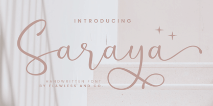 Saraya is a beautiful script handwritten font that exudes sweetness and girly charm. An Original typeface that suitable for any graphic designs such as branding materials, t-shirt, print, business cards, logo, poster, t-shirt, photography, quotes .etc This font support for some multilingual. Modern Sweet Retro that contains uppercase A-Z and lowercase a-z, alternate character, numbers 0-9, and some punctuation. If you need help, just write me! Thanks so much for checking out my shop!
 - Alvenda by Flawlessandco,
$9.00 Alvenda is a handcrafted script, that gives a feel of girly font type. An Original typeface that suitable for any graphic designs such as branding materials, t-shirt, print, business cards, logo, poster, t-shirt, photography, quotes .etc This font support for some multilingual. Handcrafted Script that contains uppercase A-Z and lowercase a-z, alternate character, numbers 0-9, and some punctuation. If you need help, just write me! Thanks so much for checking out my shop!
 - Calentine by Flawlessandco,
$9.00 Calentine is a handcrafted script, that gives a feel of girly font type. An Original typeface that suitable for any graphic designs such as branding materials, t-shirt, print, business cards, logo, poster, t-shirt, photography, quotes .etc This font support for some multilingual. Handcrafted Script that contains uppercase A-Z and lowercase a-z, alternate character, numbers 0-9, and some punctuation. If you need help, just write me! Thanks so much for checking out my shop!
 - Kinslee by Flawlessandco,
$9.00 Kinslee is a handcrafted script, that gives a feel of girly font type. An Original typeface that suitable for any graphic designs such as branding materials, t-shirt, print, business cards, logo, poster, t-shirt, photography, quotes .etc This font support for some multilingual. Handcrafted Script that contains uppercase A-Z and lowercase a-z, alternate character, numbers 0-9, and some punctuation. If you need help, just write me! Thanks so much for checking out my shop!
 - Mahezty by DRM Works,
$19.99 Mahezty is a modern, bold and fashionable serif display font. This font is imposing and features uniquely shaped letters, and as a result, it will easily match a wide range of creations that require a distinct touch. Mahezty is perfect choice for people looking for modern, minimalist, elegant, clean, beauty design styles. Suitable for almost any graphic designs such as identity, business cards, branding materials, gift cards, t-shirt, cover, thumbnail, print, poster, photography, quotes .etc
 - Sign Maker JNL by Jeff Levine,
$29.00In 1948, Joseph Struhl pioneered an innovative do-it-yourself sign kit for retail merchants. Die-cut letters and numbers made from flexible sheets of vinyl with the ability to adhere to smooth surfaces by static electricity; his "Magic Master Interchangeable Sign Kits" became a great success. Jeff Levine has paid tribute to this innovative method of in-store advertising with Sign Maker JNL. Because of their die-cut shapes, the design style of the static cling letters have unique characteristics. Companion fonts (based on other Struhl sign kits) are Cling Vinyl JNL and Cling Vinyl Clear JNL. - Orphic by Flawlessandco,
$9.00 Orphic is a display retro font with a fun and bold style that perfect for your boho-themed projects such as poster design, branding materials, t-shirt, business cards, logo, photography, quotes, and more. Try out some alternate characters for another visual result! This font support for some multilingual. Also contains uppercase A-Z and lowercase a-z, alternate character, numbers 0-9, and some punctuation. If you need help, just write me! Thanks so much for checking out my shop!
 - Rosyid by Flawlessandco,
$9.00 Rosyid is a beautifully crafted Ramadan Arabic font style that is perfect for your creative projects. An Original typeface that suitable for any graphic designs such as branding materials, t-shirt, print, business cards, logo, poster, t-shirt, photography, quotes .etc This font support for some multilingual. Modern Sweet Retro that contains uppercase A-Z and lowercase a-z, alternate character, numbers 0-9, and some punctuation. If you need help, just write me! Thanks so much for checking out my shop!
 - Elisetta by Sudtipos,
$39.00 Musical notes and letterforms, silences and white spaces, pentagrams and lines, music and writing have much in common and go beyond time, cultures, styles and locations. This new typeface emerges from the blend between the lyrics and the harmony, rhythm, femininity and luminosity of the traditional musical forms. It`s not about blues or rock, tango or salsa, instead it recovers the neoclassical characteristics of the current musical notation system and revitalize the essence of its signs. Taking care of both the function and the form, Elisetta has been specially designed for the writing of texts and musical sheets considering all its elements and communication needs. This source of inspiration also makes the font really good for extensive texts, since its design is based on situations that require high line performance, great readability and high aesthetic coherence. With 5 variables that vary in weight and style, the typography gathers asymmetry and organic nature in vertical structure, narrow horizontal proportions, high x height and extreme contrast between black and white. Elisetta Book has been created for the writing of clear texts and long lines composed in small sizes inside and outside the pentagram; Elisetta Italic intensifies the organic nature of the musical keys by offering softer signs, contextual alternates and initial caps; finally, Elisetta Display increase and emphasize the contrast between vertical stems and horizontal lines to highlight short texts and titles. For those who love music and for those who like romantic forms, this typography has a lot to offer: Elisetta is the best option to write light words with style, compose clear and rhythmic lines and read comfortable paragraphs with high performance. You can tell everybody this is your font, how wonderful life is while you're in the world! * This typeface was originally designed and supervised as «Elisa», the main project of the Master in Typography at University of Buenos Aires, Argentina.
 - Il Tempo Gigante - Unknown license

- Small Talk - Unknown license

- Small Talk - Unknown license

- Kyren by Twinletter,
$13.00 Introducing “Kyren Font” – A Handwriting Masterpiece. Kyren Font is a true masterpiece in the world of display fonts. Its stunning handwriting theme adds an authentic touch to your creative projects, making it the ideal choice for those seeking a genuine handwritten feel. Whether you’re designing invitations, posters, or branding materials, Kyren Font effortlessly captures attention and brings a unique, personal touch to your designs. Crafted with meticulous attention to detail, Kyren Font exudes the charm and warmth of handwritten script, creating an immediate connection with your audience. Its versatility is unmatched, making it suitable for a wide range of applications, from wedding invitations to blog headers. Kyren Font enhances readability and style with its elegant strokes and fluid lines, providing a natural and appealing look to your text. It also supports various languages, ensuring that it resonates with a global audience. Elevate your creative projects with the timeless elegance of Kyren Font. Explore this exceptional typeface today and let your designs flourish with the beauty of authentic handwriting. – PUA Encoded Characters – Fully accessible without additional design software.
 - RAYOH by Product Type,
$13.00 Rayoh is a stylish and freedom-loving graffiti display font. With two variations available, regular and shadow, this font gives a unique touch to projects that require rich and beautiful handwriting. With Rayoh, you can bring freedom and creativity to your designs. This font combines bold graffiti and beautiful handwriting elements to create an amazing combination. Expressive designs and bold characters make Rayoh the perfect solution for projects that want to stand out. With this font, you can create a striking poster, a cool merchandise design, or unforgettable promotional material. Their different variations provide flexibility in customizing the desired style and effect. Use regularly for a plain look and bring out the beauty of handwriting, or choose shadow for a dramatic shadow effect that adds depth and dimension to your design. Rayoh is the right choice for those who want to add a touch of freedom and uniqueness to their creative projects. Immediately choose Rayoh as your flagship font and see how your design steals attention and attracts potential customers in no time. What’s Included : - File font - All glyphs Iso Latin 1 - Ligature, Alternate - We highly recommend using a program that supports OpenType features and Glyphs panels like many Adobe apps and Corel Draw, so you can see and access all Glyph variations. - PUA Encoded Characters – Fully accessible without additional design software. - Fonts include Multilingual support
 - Moon Bleacher by GuseType,
$14.00 Moon Bleacher is a display experimental aesthetic serif font that have sharp edge to make it look more elegant and luxury, Moon Bleacher inspired by nuance of mysterious thing, but keep it elegance with contrast line on each character. This font can be use in various project like, posters, magazines, logos, banner, invitations, brochure, album cover design and many more. Moon Bleacher also has several features including multiple languages support, punctuation marks, symbols, alternative and ligature. Moon Bleacher ready to stylish your beautiful word.
 - LTC Italian Old Style by Lanston Type Co.,
$39.95LTC Italian Old Style is not to be confused with the English Monotype font also called Italian Old Style, which is an earlier design from 1911 based on William Morris’s Golden Type that is based on Nicholas Jenson’s Roman face. Goudy went back to Jenson’s original Roman and other Renaissance Roman faces for his inspiration and the result is what many consider to be the best Renaissance face adapted for modern use. Bruce Rogers was one of the biggest admirers of Italian Old Style and designed the original specimen book for Italian Old Style in 1924 using his trademark ornament arrangement. These ornaments are now contained in the pro versions of the Roman styles—Regular Pro and Light Pro. With most digitizations of old metal typefaces, one source size is often used as reference (as was Goudy’s method for his own cuttings of his Village foundry types) so that all sizes refer to one set of original artwork. The original hot metal fonts made by Lanston Monotype (from Goudy’s drawings) and other manufacturers used two or three masters for different size ranges to have optimal relative weights—smaller type sizes would need proportionally thicker lines to not appear thin and larger sizes would require thinner lines to not appear to bulky. The variations in size ranges can also be affected by the size of the cutter head in making the master patterns. The light weights of LTC Italian Old Style were digitized from larger display sizes (14, 18, 24, 30, 36 pt) and the regular weights were digitized from smaller composition sizes (8,10,12 pt). The fitting for the regular weights is noticeably looser to allow for better setting at small sizes. Very few font revivals take this approach. Italian Old Style, originally designed by Frederic Goudy in 1924, was digitized by Paul Hunt in 2007. In 2013, it has been updated by James Grieshaber and is now offered as a Pro font. The newly expanded Pro font includes all of the original ligatures, plus small caps and expanded language coverage in all 4 Pro styles. - Night Train by FontMesa,
$19.95 Night Train is a new font built from the ground up; while Night Train may resemble an old classic wood type there are a few lines that make this font a little more modern setting it apart from other wood type revivals. If you're a railroad enthusiast you're sure to enjoy the steam locomotive graphic located on the less than and greater than keys on all versions of this font, due to the fine detail of this train illustration the best printing results will be at 600dpi or higher on a laser printer. An alternate K and R are within the Night Train fonts, for Win Type1 these alternates are on the left and right bracket keys, for Truetype and OpenType you may access the alternates by using the Character Map in Windows or Adobe Illustrator, for OpenType you may also find them on the stylistic alternates page of the glyph map in Illustrator. There's something new with Night Train that the sign making people will love, for the first time FontMesa is pleased to offer a block shadowed version in four directions. One fill font is all that is needed for all four open faced fonts, you'll need an application that works in layers in order to use the fill font with the open faced fonts, simply place the fill font in its own layer then move it behind one of the open faced fonts of Night Train. The Night Train name has been on my list to use as a font name for a few years, a friend from years ago used to sail his boat in the Mackinac race from Chicago to Mackinac Island, the name of that boat was the Night Train. Watching the 2010 Olympic four man U.S. bobsled team win gold with their sled also called Night Train has inspired me to complete this font.
 - Retro Feeling by Prestige Artsy Studio,
$12.00 Retro Feeling is a bold and beautiful retro font that will take you back in time. It features a unique italic font that adds a touch of elegance to any design project. Perfect for vintage-themed designs. Retro Feeling will give your project a distinct and timeless look. Its versatility and elegance make it perfect for various design uses, from logos, posters, and display headlines to packaging and branding materials. Bring the retro vibe to your design project with Retro Feeling!
 - Contraption by Pink Broccoli,
$14.00 Slightly off-kilter to give this rigid geometric a little personality, Contraption started as a digitization of a film typeface called Intrigue by Lettergraphics. From there, this mechanical typeface was expanded into a giant family of useful widths, weights, and obliques: from spindly thin and light weights, to chunky bold and blacks. An additional Inline style has been developed to further enhance the family dynamic.
 - ALS Rundgang by Art. Lebedev Studio,
$63.00 ALS Rundgang is a decorative font designed specially for advertising purposes that reminds one of electronic display boards and bitmap typefaces. It includes only capital letters. Some of the letterforms are deliberately misshaped to have a teenage angular look‚it’s a bit crazy and out of proportion. Rundgang is well-suited for any youth-aimed design, such as various event and campaign materials, periodicals, flyers, leaflets, posters and other youngish marketing stuff.
 - Bigtrack by Nathatype,
$29.00 Bigtrack is an uppercase display font with vintage looks. Their sharp corners and clean lines exude a sense of strength and confidence. With its heavy weight, this font ensures that your message stands out with authority. The generous spacing between characters adds to its legibility and imparts a sense of grandeur to your text. As a special bonus, this font includes ornaments. Bigtrack fits in headlines, logos, branding materials, and many more.
 - Classic Grotesque by Monotype,
$40.99 Classic Grotesque by Rod McDonald: a traditional font with a modern face. The growing popularity of grotesque typefaces meant that many new sans serif analogues were published in the early 20th century. Setting machines were not compatible with each other but all foundries wanted to offer up-to-date fonts, and as a result numerous different typeface families appeared that seem almost identical at first glance and yet go their separate ways with regard to details. One of the first fonts created with automatic typesetting in mind was Monotype Grotesque®. Although this typeface that was designed and published by Frank Hinman Pierpont in 1926 has since been digitalised, it has never achieved the status of other grotesque fonts of this period. But Monotype Grotesque was always one of designer Rod McDonald’s favourites, and he was overjoyed when he finally got the go-ahead from Monotype in 2008 to update this “hidden treasure”. The design process lasted four years, with regular interruptions due to the need to complete projects for other clients. In retrospect, McDonald admits that he had no idea at the beginning of just how challenging and complex a task it would be to create Classic Grotesque™. It took him considerable time before he found the right approach. In his initial drafts, he tried to develop Monotype Grotesque only to find that the result was almost identical with Arial®, a typeface that is also derived in many respects from Monotype Grotesque. It was only when he went back a stage, and incorporated elements of Bauer Font’s Venus™ and Ideal Grotesk by the Julius Klinkhardt foundry into the design process, that he found the way forward. Both these typefaces had served as the original inspiration for Monotype Grotesque. The name says it all: Classic Grotesque has all the attributes of the early grotesque fonts of the 20th century: The slightly artificial nature gives the characters a formal appearance. There are very few and only minor variations in line width. The tittles of the ‘i’ and ‘j’, the umlaut diacritic and other diacritic marks are rectangular. Interestingly, it is among the uppercase letters that certain variations from the standard pattern can be found, and it is these that enliven the typeface. Hence the horizontal bars of the “E”, “F” and “L” have bevelled terminals. The chamfered terminal of the bow of the “J” has a particular flamboyance, while the slightly curved descender of the “Q” provides for additional dynamism. The character alternatives available through the OpenType option provide the designer with a wealth of opportunities. These include a closed “a”, a double-counter “g” and an “e” in which the transverse bar deviates slightly from the horizontal. The seven different weights also extend the scope of uses of Classic Grotesque. These range from the delicate Light to the super thick Extrabold. There are genuine italic versions of each weight; these are not only slightly narrower than their counterparts, but also have variant shapes. The “a” is closed, the “f” has a semi-descender while the “e” is rounded. Its neutral appearance and excellent features mean that Classic Grotesque is suitable for use in nearly all imaginable applications. Even during the design phase, McDonald used his new font to set books and in promotional projects. However, he would be pleased to learn of possible applications that he himself has not yet considered. Classic Grotesque, which has its own individual character despite its neutral and restrained appearance, is the ideal partner for your print and web project.
 - RF Rufo by Russian Fonts,
$29.00 Rufo — condensed geometric sans serif with the closed forms. Contains 12 fonts. 6 regular and 6 italic. From thin to black. A rich palette gives full freedom for creativity and bright decisions. Extensive area of use. The versatility of the sans serif typeface covers various aspects of graphic design. Web, printed materials, clothing, logos, posters, labels and much more. Rufo is pragmatic typeface. Can save space and will accommodate a large amount of information in a limited space. The font was designed so that condensed letters remains readable even in small sizes. Opentype: alternate numbers, oldstyle numbers, arrows, fractions and automatic fractions, case sensitive forms, superscript and subscript, numerators and denominators. Support: cyrillic, cyrillic extended, latin, latin extended (Western European, Central European, South-East).
 - Planet N - Personal use only

- Planet NS - Unknown license

- Planet S - Unknown license

- Scarab Solid - Unknown license

- Planet X - Unknown license

- Beta Block - Unknown license

- Scarab Border - Unknown license

- SP Honey Bunny by Studio Pulp,
$12.00 Discover the effective simplicity of SP Honey Bunny, a masterfully crafted display font created in 2023 by Studio Pulp. Inspired by the character Honey Bunny, the partner of Pumpkin in the cinematic classic "Pulp Fiction" (1996), this font, while not taking center stage, exudes a striking presence. This remarkable typeface, designed with meticulous attention to detail and craftsmanship, showcases versatility that seamlessly complements various design projects, particularly excelling in titles. The three well-balanced weights provide the freedom to unleash your creativity, while the clear, open forms optimize readability. SP Honey Bunny, anchored in a clean grid design, embodies modern minimalism and accessible elegance. Whether you're working on web design, graphic design, or print materials, this font adds a touch of timeless class to your creations. Be inspired by the seamless blend of functionality and aesthetics in SP Honey Bunny. Specifically crafted to meet the demands of 2023, this font brings a contemporary flair to your projects while remaining true to Studio Pulp's legacy of dedication to quality and innovation. Transform your typographic landscape with SP Jody and leave a lasting impression.
 - Bella Lolly by Bosstypestudio,
$14.00 Bella Lolly is a new calligraphy font which is fresh, funny, interesting and with a cute heart that can be connected. It is suitable for greeting cards, branding materials, business cards, quotes, posters, and more! Bella Lolly includes many alternative characters. Coded with Unicode PUA, which allows full access to all additional characters without having special design software. Mac users can use Font Book. Windows users can use the Character Map to view and copy one of the additional characters to paste into your favorite text editor. For people who have opentype-capable software: Alternatives can be accessed by turning on the "Alternative Style" and "Ligature" buttons on the Photoshop Characters panel, or through any software with glyph panels, e.g. Adobe Illustrator, Photoshop CC, Inkscape. Thank You!
 - Sophia Bianca by Bosstypestudio,
$12.00 Sophia Bianca is a new calligraphy font which is fresh, funny, interesting and with a cute heart that can be connected. It is suitable for greeting cards, branding materials, business cards, quotes, posters, and more! Sophia Bianca includes many alternative characters. Coded with Unicode PUA, which allows full access to all additional characters without having special design software. Mac users can use Font Book. Windows users can use the Character Map to view and copy one of the additional characters to paste into your favorite text editor. For people who have opentype-capable software: Alternatives can be accessed by turning on the "Alternative Style" and "Ligature" buttons on the Photoshop Characters panel, or through any software with glyph panels, e.g. Adobe Illustrator, Photoshop CC, Inkscape. Thank You!
 - Mitha Silva by Sulthan Studio,
$14.00 Mitha Silva is a new calligraphy font which is fresh, funny, interesting and with a cute heart that can be connected. It is suitable for greeting cards, branding materials, business cards, quotes, posters, and more! Mitha Silva includes many alternative characters. Coded with Unicode PUA, which allows full access to all additional characters without having special design software. Mac users can use Font Book. Windows users can use the Character Map to view and copy one of the additional characters to paste into your favorite text editor. For people who have opentype-capable software: Alternatives can be accessed by turning on the "Alternative Style" and "Ligature" buttons on the Photoshop Characters panel, or through any software with glyph panels, e.g. Adobe Illustrator, Photoshop CC, Inkscape.
 - Broceta by IbraCreative,
$17.00 Broceta- A Playful Monoline Kids Font Broceta, a Playful Monoline kids font, exudes a whimsical charm that captivates the essence of youthful creativity. With its seamless monoline strokes, this font radiates a sense of simplicity and innocence, making it a perfect choice for projects targeting a younger audience. Broceta’s characters boast a delightful playfulness, each letter dancing with a unique flair that evokes the carefree spirit of childhood. The monoline design ensures a consistent and smooth visual flow, enhancing readability while maintaining an air of lightheartedness. Whether used in storybooks, playful branding, or educational materials, Broceta adds a touch of joy and imagination to any project, making it an enchanting font for those who seek to infuse their designs with a delightful sense of wonder. Broceta is perfect for branding projects, logo, wedding designs, social media posts, advertisements, product packaging, product designs, label, photography, watermark, invitation, stationery, game, fashion and any projects. Fonts include multilingual support for; Afrikaans, Albanian, Czech, Danish, Dutch, English, Estonian, Finnish, French, German, Hungarian, Italian, Latvian, Lithuanian, Norwegian, Polish, Portuguese, Slovak, Slovenian, Spanish, Swedish.
 - Twogether Sans by Sudtipos,
$39.00 Twogether Sans builds upon the achievements of Twogether Rounded, creating a more comprehensive system and positioning itself as a suitable choice for general text usage. By removing the rounded elements from each character, Twogether Sans gains increased flexibility and a broader range of possibilities for different types of projects. It retains the essential characteristics of its counterpart, such as proportions, x-height, small caps, ligatures, numerals, and the construction of the italic variant. This version also introduces distinctive alternate characters for "T," "Y," "y," and "a." However, in this case, the position of the "a" with an old-style eye has been adjusted to enhance legibility in this context. These details maintain consistency with the Rounded version while reinforcing Twogether Sans' unique personality. It remains an excellent choice for branding, editorial design, promotional materials, packaging, and digital applications.
 - Knight Souls by Ditatype,
$29.00 Knight Souls is a captivating display font inspired by epic medieval adventures. Designed in uppercase, this typeface captures the spirit of heroic quests with its bold and commanding style. The consistent letter proportions of Knight Souls create a sense of balance and harmony throughout the font. This design choice guarantees that every character fits seamlessly together, resulting in a typographic composition that exudes strength and resilience. With sharp endings, Knight Souls adds an element of dynamism and edge to the font. Each letter is defined by precise angles and sharp corners, evoking a sense of power and determination. This feature lends a bold and assertive quality to the font, reflecting the courage and bravery of knights on epic quests. High letter contrast in Knight Souls emphasizes readability and visibility. The distinct difference between thick and thin strokes enhances the visual impact of each character, making them easily distinguishable and captivating to the eye. The high contrast design adds depth and intensity to the font, making it stand out in any game-themed design. You can also enjoy the available features here. Features: Multilingual Supports PUA Encoded Numerals and Punctuations Knight Souls fits in headlines, logos, posters, titles, branding materials, print media, editorial layouts, website headers, and any projects that aim to transport players to a world of valor and fantasy. Find out more ways to use this font by taking a look at the font preview. Thanks for purchasing our fonts. Hopefully, you have a great time using our font. Feel free to contact us anytime for further information or when you have trouble with the font. Thanks a lot and happy designing.


