10,000 search results
(0.07 seconds)
- The Riskeys by Letterhend,
$19.00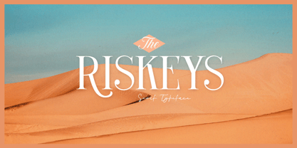 The Riskeys is a stylish and sophisticated modern serif font. This typeface has can be used for modern theme or vintage looks with ligatures & alternates. Very suitable for logo, headline, tittle, and the other various formal forms such as invitations, labels, logos, magazines, books, greeting / wedding cards, packaging, fashion, make up, stationery, novels, labels or any type of advertising purpose. Features : uppercase and lowercase numbers and punctuation multilingual ligatures alternates PUA encoded We highly recommend using a program that supports OpenType features and Glyphs panels like many of Adobe apps and Corel Draw, so you can see and access all Glyph variations.
 - Bosento by Gatype,
$12.00 Hi everyone, come back from us The Bosento font is perfect for Your projects today are branding, poster design, t-shirts, invitations, designs for children, and editorial design. You will find a lot of glyphs, including ligatures, to look elegant in this bold serif. OpenType features include style sets, character variants, starting and ending forms, and multilingual support. Important information: To access the alternatives, you must have access to an older version of Photoshop to copy/paste the glyphs from the included PSD, OR the Glyphs Panel, which can be found in Photoshop CC or any Version of Adobe Illustrator. Cheer!
 - Alles Kaputt by Kitchen Table Type Foundry,
$16.00 Alles Kaputt means ‘everything’s broken’ in German. I always wonder why my stuff breaks so easily, especially my mobile phones (I have had 7 in the last two years). Maybe I am careless, but I believe that there is a more or less scientific explanation that chaos and destruction are far easier than harmony and creation. I am no scientist, so don’t take my word for it! Alles Kaputt is a nice script font. I made it with a felt tip pen I borrowed from the kids. Use it for texts on product packaging, book covers and websites. Or, whatever you fancy!
 - Kiwi by Atlantic Fonts,
$26.00 Kiwi gives natural energy to every project with its sweet and spirited forms and a variety of tasty options. Be bold using it as all-caps including its fun set of discretionary double-letter ligatures, or be distinctly playful, combining upper-lower, with bushels of loosely interlocking ligatures. Kiwi font family also includes delicious Kiwi Fruits, a striking and juicy collection of graphic fruit illustrations by illustrator, Amy Dietrich. For inviting packaging, magazine, and books, or say, a cool-looking apple for your cider pressing party invite, Kiwi is a great pick. Shown here with Quince font, also by Atlantic Fonts.
 - Madre Rose by Letterhend,
$17.00 Madre Rose is a sophisticated sans serif with 3 weight style to choose from, bold, thin and regular. It has many beautiful ligatures which you can play around to match your project, whether for a standout headline, or for a tagline, you name it. The unique letterform makes this font one of a kind! Perfectly to be applied to the other various formal forms such as invitations, labels, logos, magazines, books, greeting / wedding cards, packaging, fashion, make up, stationery, novels, labels or any type of advertising purpose. Features : 3 weight style uppercase & lowercase numbers and punctuation multilingual alternates & ligatures PUA encoded
 - Albeit Grotesk Stencil Caps by Cloud9 Type Dept,
$20.00 Albeit Grotesk Stencil Caps is a graphic geometric stencil-style all caps display font family of four weights (Light, Regular, Medium and Bold) with slightly exaggarated diacritics for better readability making it ideal for headlines.
 - Sightseeing Boat JNL by Jeff Levine,
$29.00 The free form hand lettering comprising the titles and credits for the 1966 romantic comedy “The Glass Bottom Boat” were the model for Sightseeing Boat JNL, which is available in both regular and oblique versions.
 - Ayi Dingbats by Ayi Studio,
$10.00 Font family designed for ornament use in texts, with four variants, arrows, emoji, geometry and symbols.
 - Extra MF by Masterfont,
$59.00 Geometric forms make this elegant font a great choise for invitations and signs, indoor and outdoor.
 - Volta by Linotype,
$29.99Volta is a robust typeface from the 1950s. A revisit to styles that were en vogue at the turn of the century, Bauer type foundry designers Walter Baum and Konrad Bauer designed this type family in1955. The form of Volta's letters are similar to those in New Transitional Serif typefaces, like Cheltenham and Century. Developed after the Didone (i.e., Bodoni) style types, New Transitional Serifs speak more to the zeitgeist of the late 19th Cntury, and were typographic adaptations to it's newer technologies. Already in the period of mass production, typographers and printers at the dawn of the 20th Century had to cope with larger print runs on cheaper materials. The robust letterforms of New Transitional Serifs were designed to compensate for this, but they were also ingenious little inventions in their own right. Form the beginning, the new, peculiar forms of New Transitional Serif letters were adopted for use by advertisers. Their robustness also allowed them to be used in virtually all sizes. Volta was designed especially with advertising display usage in mind. The x-height of Volta's letters is higher than average for serif faces. It is recommended that Volta be used exclusively for shorter tracks of text, above 12 point. Headlines look dashing set in Volta. Four different font styles are available for the Volta typeface: Regular, Medium, Medium Italic, and Bold." - Maiers Nr 21 Pro by Ingo,
$42.00 A handwritten ”font for technicians“ from ca. 1900. Very geometrical, rigid forms borrowed from the typical characteristics of Jugendstil / Art Nouveau. This script is found in a magazine from the Otto Maier publishing house, Ravensburg, which was issued sometime in the years shortly before WWI. The magazine is entitled ”Schriften-Sammlung für Techniker: Verkleinerte Schriften der wichtigsten Alphabete“ (Collection of scripts for technical specialists: reduced scripts of the most significant alphabets) and published by Karl O. Maier. The original copy, produced by means of a galvanized plate, is just 7 centimeters wide. It served as the model for technical professions in which, at that time, the captions of drawings were still done by hand. The characters have been scanned, digitized and greatly magnified. Special attention was given to ensure the ”uneven“ edges, typical of handwritten script, remained effectively noticeable even in the digitized form. As a result, this ”technical“ font retains a handmade touch. Especially worthy of note are the Jugendstil forms characteristic at the turn of the19th century. In comparison, many alleged ”ultramodern“ font types of today suddenly look quite old-fashioned. Maier’s Nr. 21 Pro is suitable for all European languages. It includes ”Latin Extended-A,“ for Central and Eastern Europe incl. Turkish, and even Cyrillic and Greek, too. The font includes several stylistic alternates as well as a number of ligatures.
 - Kiddy Sans by TypoGraphicDesign,
$19.00 CONCEPT/CHARACTERISTICS What is a childlike, naive writing, acting not boring static, has enough personality/character and yet is easy to read? › Oversized points › Slightly curved, warm and friendly bars › Open, friendly forms › Organic, lightly battered forms APPLICATION AREA The friendly, playful and warm character of the font »Kiddy Sans« would look good at display size for party flyer & movie poster, music covers or headlines in magazines or websites… TECHNICAL SPECIFICATIONS Headline Font | Display Font | Sans Serif Font »kiddy Sans« with 8 styles & 366 glyphs, inkl. accents & €
 - Tomate by Re-Type,
$45.00 Tomate started in 2006 as a brush lettering exercise for a poster and was later used for the ReType identity. In 2008 its author decided to turn it into a super fat typeface suitable for packaging and mass consumption products. The possibilities of ultra heavy forms are explored in this alphabet; trying to solve the design problems that these sort of forms present. Tomate shows influences from the beautiful Goudy Heavyface Italic which is a design the author admires.
 - LifeAfterCollege by Ingrimayne Type,
$13.95 The LifeAfterCollege family began as a set of four fonts based on two styles of Ranger, which are slab-serif, geometric fonts with no curves. Two of the four are outlines with hollow insides, and two have-filled insides. The two fonts that are outlined have been taken apart and made into three typeface that can be layered. This allows one color for the inside, another for the middle ring, and a third for the outside outline.
 - Olazy by PizzaDude.dk,
$20.00 Slightly curly and very romantic! Olazy can be used for anything that needs a twist of elegance or romance - or would fit perfectly for children's toys! Contains both fi and fl ligature!
 - WTF Ghosrain by Wasabib Type Foundry,
$11.00 WTF Ghosrain is a creepy and spooky looking display font. It is perfectly suitable for any Halloween-related project or crafty idea! This font is perfect for making Halloween poster or flyer.
 - The Soulty by Forberas Club,
$16.00 The Soulty made for something interesting and excited, or you can make your wedding invitation with this beautiful font and you can use this font for your party or cute moment. Cheers
 - The British Telegraph by Vintage Voyage Design Supply,
$14.00 The British Telegraph font family was inspired by classic headers of Britain newspapers from the middle of XX century. Classic look with three width – Light, Regular and Bold. Great for headers, signs or logos. Also, working well for text blocks. - The British Telegraph Light: Use it for text blocks, or for gently light header typographic. Try to make more wide tracking with capitals, it looks good. - The British Telegraph Regular: Great for simple message, quotes, subheaders (If the header is Bold) or advert slogans. - The British Telegraph Bold: Is a killing title buddy. Massive, strong, bold and in the same time – very gentle. Perfectly for main words, headers, signs or logo's. The British Telegraph has full glyph set with standard and discretionary ligatures (Open Type Features).
 - Heatwood by Balpirick,
$15.00 Heatwood is a cute signature font. Whether you’re looking for fonts for Instagram or calligraphy scripts for DIY projects, Heatwood will turn any creative idea into a true piece of art!
 - Personal Manifesto by Thomas Käding,
$15.00 This holographic font is great for writing your own manifesto, or for giving your anonymous letters to the government that personal touch that shows you care. Also good for children’s books.
 - Blackmindlify by Allouse Studio,
$16.00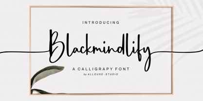 Proudly Presenting, Blackmindlify A Calligraphy Font. Blackmindlify is perfect for any titles, logo, product packaging, branding project, megazine, social media, wedding, or just used to express words above the background. Blackmindlify come with beginning swash for uppercase, beginning and ending swash for lowercase, also Multi-Lingual Support. Enjoy the font, feel free to comment or feedback, send me PM or email. Thank You!
 - Smilecake by Balpirick,
$15.00 Smilecake is a Cute Fun Handwritten Font. Smilecake Cute is a neat and casual handwritten font. Whether you’re looking for fonts for Instagram or calligraphy scripts for DIY projects, this font will turn any creative idea into a true piece of art! Smilecake also multilingual support. Enjoy the font, feel free to comment or feedback, send me PM or email. Thank you!
 - Angels Cookie by Balpirick,
$15.00 Angels Cookie is a Modern Fat Handbrushed Font. Angels Cookie is a fun and sweet brushed handwritten font. Whether you’re looking for fonts for Instagram or calligraphy scripts for DIY projects, this font will turn any creative idea into a true piece of art! Angels Cookie also multilingual support. Enjoy the font, feel free to comment or feedback, send me PM or email.
 - T-Air - Unknown license

- SF Rasmi by Sultan Fonts,
$29.99 Rasmi font It is a font for print and the web. Especially for coordinating university and school books, scientific research, exams, government and corporate correspondence, and coordinating financial, judicial, and diplomatic documents. The Rasmi font family includes four weights: thick for headlines, bold for subheadings, medium for body text, and thin for footnotes and explanations. The font supports Arabic, Latin, Persian, Urdu, and Kurdish languages. The graphic designer can use Rasmi variable font to reach wider options in working with the text.
 - Baby Soul by Forberas Club,
$19.00 Baby Soul made for something interesting and excited. You can use this font for your party or cute moment. Cheers
 - Tamepik by Forberas Club,
$16.00 Tamepik made for something interesting and excited. You can use this font for your party, love story or cute moment.
 - Nouveau Roundcorner JNL by Jeff Levine,
$29.00 1920s sheet music for the song "You Can't Get Away From It" provided the hand lettered title which acted as the basis for Nouveau Roundcorner JNL. A square letter form with rounded terminals, this condensed face is perfect for titling, yet has a bit of an informal, casual charm to it.
 - National Champion by Kyle Wayne Benson,
$4.00 National Champion is an overly confident geometric slab that comes in four weights. He is best suited for those looking for a well colored, balanced and spaced font in the College genre. He's got a 3/4 cap lowercase, lots of language options, opentype fractions and meticulous hinting for web use.
 - Black Corps by Pixesia Studio,
$23.00 Introducing Black Corps - Military Serif Font Black Corps is a military serif font that comes in four distinct styles - solid, inline, outline, and stencil. This versatile font is perfect for use in a wide range of design projects, including branding, advertising, and packaging. Its military aesthetic makes it suitable for use in official documents and military communications, and its four different styles allow you to create a wide range of looks. The solid style of Black Corps is bold and straightforward, making it perfect for use in headlines and titles. The inline style adds a touch of elegance, while the outline style is light and airy. And the stencil style is perfect for creating a rough, rugged look. FEATURES - Uppercase and Lowercase letters - Numbering and Punctuations - Multilingual Support - Works on PC or Mac - Simple Installation - Support Adobe Illustrator, Adobe Photoshop, Adobe InDesign, also works on Microsoft Word Hope you Like it. Thanks.
 - Brightland by Pixesia Studio,
$23.00 Introducing Brightland - Condensed Sans Serif Font Brightland is a condensed sans serif font that comes in four distinct styles - solid, solid italic, line, and line italic. This versatile font is perfect for use in a wide range of design projects, including branding, advertising, and packaging. Its clean, modern aesthetic makes it suitable for use in a variety of settings, and its four different styles allow you to create a wide range of looks. The solid style of Brightland is straightforward and uncomplicated, making it perfect for use in headlines and titles. The solid italic style adds a touch of flair, while the line style is light and airy. And the line italic style is perfect for creating a more playful, imaginative look. FEATURES - All Caps - Numbering and Punctuations - Multilingual Support - Works on PC or Mac - Simple Installation - Support Adobe Illustrator, Adobe Photoshop, Adobe InDesign, also works on Microsoft Word Hope you Like it. Thanks.
 - Eezyl by Partu Haodis,
$25.00 A title font that looks better as larger the font size. First of all, it is designed for use in the upper-case format. Feature style: futurism, space, modernism, glyph variety (uniqueness (minimum automatic generation)). A kind of „s‟ in the lower-case format sets the tone and emphasizes the character, formed in the Prime Numbers Nebula — they determined its appearance, and influenced the style as a whole. Particular attention is paid to the kern: the kern table is formed manually, taking into account absolutely all the glyphs included in the font-family. Two types of stress (grave, acute) for all letter glyphs. The font contains basic Latin and several additional tables, as well as three types of quotation marks, a non-breaking space and a hyphen, a short, medium, and long dash. For a set of mathematical expressions there are centrifugal signs: equal, minus (not a hyphen or minus-hyphen), plus, multiplication (X-shaped and dot), plus-minus, division. The font was made for 3 years.
 - ITC Simran by ITC,
$29.99ITC Simran was created by the London designer Satwinder Sehmi in 1998. The Indian influence is recognizable at first glance and lends the font an exotic feel - at least to the western eye. Sehmi borrowed forms and feelings from northern Indian writing systems for this typeface. Both the upper and lowercase letters make use of the same lowercase forms, but the upperacse letters have the addition of a horizontal bar running over them at the ascender height. This feature is directly reminiscent of writing systems in northern India, and is ITC Simran's most distinguishing characteristic. But there were other influences as well: Sehmi was also inspired by uncial forms when designing this typeface. ITC Simran exhibits the typical look of writing with a broad-tipped pen, with its strong strokes, as well as characteristic letter forms, for example, the a or h. ITC Simran is a fascinating and harmonious symbiosis of a variety of influences from different cultures. This font is best used for headlines and short texts in point sizes of 12 and larger. - Orka Condensed by S6 Foundry,
$60.00 Orka Condensed Sans is a stylistic font developed within a set grid that creates harmony and form through elegant forms, for use at both text and display sizes. Orka Condensed is perfectly suited for headlines, large-format prints, brand identities, social media, advertising, editorial design, posters, magazines, logos, headings, body copy, digital and more. Multi-language support.
 - Rifleman by Open Window,
$19.95 What a nice tranquil feeling you get from the wide forms of this font. The air of spontaneity was the most important thing about developing Rifleman. The forms were carefully and slowly constructed and then loosely traced with a paintbrush. Maybe the original drawings will become a font someday but i like to think that they won't for some reason. Surprisingly Rifleman is left to only the bare essential elements, anything that wasn't necessary was left out or removed. The goal was to make it as lightweight as possible to make up for the intricate detail. Rifleman is a surprisingly lightweight font offering lends itself to speedy typesetting!
 - Bayamo by Monotype,
$29.99 Emil Bertell's Bayamo is a contemporary, digital take on the brush script tradition. It echoes the loose forms and energetic personality of sign painted letters, tapping into the current nostalgia for hand-drawn type. “I think most script fonts nowadays are either some kind of modern calligraphy, or synthetic/mechanical scripts,” says Bertell. “This one leans more towards a classic American sign painting tradition.” Contextual alternates ensure that lowercase characters change depending what's next to them, mimicking the more varied word shapes created by sign writers. Well suited for branding projects, packaging and headlines, Bayamo also pairs well with strong sans serif, and other typefaces with angular forms.
 - Rainesta by Digitype Studio,
$22.00 Rainesta comes with 7 unique font styles, you can use them according to your project, whether for headlines or taglines. This font is very suitable to be applied to various other formal forms such as websites, ebooks, labels, logos, magazines, books, packaging, fashion, make-up, stationery, labels, or all kinds of advertising purposes. Features: 7 styles uppercase & lowercase numbers and punctuation multilingual ligatures PUA encoded Thank you.
 - Slatterine by Greater Albion Typefounders,
$11.95 Slatterine is a retro-futuristic family, inspired by the second streamline era of the 1950s It's ideal for any design work that needs to suggest bygone visions of the future, or to have a retro-space-age effect. Slatterine's horizontally shaded glyphs give a strong sense of motion, whether coupled with the regular form's sharply leaning oblique angle, the perpendicular form, or the reverse leaning 'Lefty'.
 - Parto by Naghi Naghachian,
$78.00 Parto Font family is designed by Naghi Naghashian. This Font is developed on the basis of specific research and analysis on Arabic characters and definition of their structure. This innovation is a contribution to modernization of Arabic typography, giving the font design of Arabic letters real typographic arrangement and providing more typographic flexibility. It enables, moreover, the use of this typeface for decorative headlines. This step was necessary after more than two hundred years of relative stagnation in Arabic font design. Parto supports Arabic, Persian, and Urdu. It also includes proportional and tabular numerals for the supported languages. Parto Font is available in Regular and Bold. Parto design fulfills the following needs: A Explicitly crafted for use in electronic media fulfills the demands of electronic communication. Parto is not based on any pre-digital typefaces. It is not a revival. Rather, its forms were created with today’s technology in mind. B Suitability for multiple applications. Gives the widest potential acceptability. C Extreme legibility not only in small sizes, but also when the type is filtered or skewed, e.g., in Photoshop or Illustrator. Parto's simplified forms may be artificial obliqued in InDesign or Illustrator, without any loss in quality for the effected text. D An attractive typographic image. Parto was developed for multiple languages and writing conventions. E The highest degree of geometric clarity and the necessary amount of calligraphic references. This typeface offers a fine balance between calligraphic tradition and the contemporary sans serif aesthetic now common in Latin typography.
 - Links by HouseOfBurvo,
$36.00 Links was built adhering to a strict grid of 'linked' squares; and comes with special "Grid Glyphs" that line up perfectly with all characters. These Grid Glyphs can be used to create an invisible grid for your layout or as a background to enhance your design. Perfect for posters, logos and headlines, this font is available in four styles; Round and Square with accompanying obliques. This font was inspired by much of the lettering from the Dutch movement, or Functionalism which in turn was a descendant of the International Style pioneered by the Swiss. In keeping with these traditions, Links was build adhering to a strict grid of linked squares, taking a clear scientific approach to construct each character. One of the main features of International Style is the implementation of a Grid. This font has built in special characters that I call 'Grid Glyphs'; these Grid Glyphs line up perfectly with every character, enabling you to construct your own grid that echoes the form of the characters. These glyphs can also be used to create a background for your layout, as can be seen in the gallery pictures.
