10,000 search results
(0.032 seconds)
- Junior Detective JNL by Jeff Levine,
$29.00 A 1930s kids' premium booklet from Post cereals called "Inspector Post's Junior Detective Corps Manual #2" offered up some great hand lettering in an Art Deco sans serif style. Bold, authoritative and perfect for headlines or titling, Junior Detective JNL now recreates this hand lettering in digital form.
 - Wonky Kitten by The Arborie,
$11.00 Here we have a loopy and whimsical font called Wonky Kitten. Its crazy and unstructured form gives this font a mad personality while maintaining an air of innocence. It's perfect to use in book titles, children's and teen branding, as well as type for a poster or canvas.
 - Pleasure by ITC,
$29.99Pleasure is the work of German designer Holger Seeling, a condensed open sans serif typeface featuring a shadow behind each character. Its geometric forms are flexible and best used closely spaced. Pleasure reflects no particular time or setting and is therefore ideal for a wide variety of headline applications. - Jennerik by Ingrimayne Type,
$9.95 Jennerik is a plain, serifed face in which the strokes are uniform or monolinear. It has four weights and each weight has both upright and italics styles. Its name reflects its plain, simple design. It is slightly condensed and the regular style was originally designed for printing rough drafts.
 - ITC Souvenir Monospaced by ITC,
$34.99The Souvenir typeface was originally drawn by Morris Fuller Benton in 1914 as a single weight for the American Type Founders company. It was revived in 1967 by Photo-Lettering and optimized for phototypesetting equipment. ITC was formed in 1971 and, with the help of Photo-Lettering, introduced ITC Souvenir as one of its first font families. ITC Souvenir was designed by Ed Benguiat and comes in four weights, each with a matching italic. In 1983, Ned Bunnel's ITC Souvenir Monospaced was released; this is a monospace version of ITC Souvenir. - Yasmine by Arabetics,
$39.00 The Yasmine type family follows the guidelines of the Mutamathil Taqlidi type style. It has one glyph for every basic Arabic Unicode character or letter and one additional, final-position, glyph for each Arabic letter that is normally connected with other letters from both sides in traditional cursive Arabic strings. Yasmine employs four fixed x-height values, two above and two below the x-axis. Values are high to give a slight vertical overall look. Its design uses full curves with equally distributed weight. Yasmine family includes all required Lam-Alif ligatures and uses ligature substitutions, and marks positioning but it does not use any other glyph substitutions or forming. Text strings composed using types of this family are non-cursive with stand-alone isolated glyphs. It employs our “natural Arabic input” method where first glyph is displayed in its non-isolated form. Tatweel (or Kashida) glyph is a zero width space. Keying it before any glyph will display that glyph isolated form. Keying it before Alif Lam Lam Ha will display the Allah ligature. Yasmine family includes both Arabic and Arabic-Indic numerals, all required diacritic marks, Allah ligature, in addition to all standard English keyboard punctuations and major currency symbols. The fonts in this family support the following scripts: Arabic, Persian, Urdu, Pashtu, Kurdish, Baluchi, Kashmiri, Kazakh, Sindhi, Uyghur, Turkic, and all extended Arabic scripts.
 - Amudi by Arabetics,
$39.00 The Amudi type family follows the guidelines of the Mutamathil Taqlidi type style. It has one glyph for every basic Arabic Unicode character or letter and one additional, final-position, glyph for each Arabic letter that is normally connected with other letters from both sides in traditional cursive Arabic strings. Amudi employs four fixed x-height values, two above and two below the x-axis.. Values are high to give a slight vertical overall look. Amudi family includes all required Lam-Alif ligatures and uses ligature substitutions, and marks positioning but it does not use any other glyph substitutions or forming. Text strings composed using types of this family are non-cursive with stand-alone isolated glyphs. It employs our “natural Arabic input” method where first glyph is displayed in its non-isolated form. Tatweel (or Kashida) glyph is a zero width space. Keying it before any glyph will display that glyph isolated form. Keying it before Alif Lam Lam Ha will display the Allah ligature. it Amudi family includes both Arabic and Arabic-Indic numerals, all required diacritic marks, Allah ligature, in addition to all standard English keyboard punctuations and major currency symbols. The fonts in this family support the following scripts: Arabic, Persian, Urdu, Pashtu, Kurdish, Baluchi, Kashmiri, Kazakh, Sindhi, Uyghur, Turkic, and all extended Arabic scripts.
 - JF Matisse by The Jumping Foxes,
$60.00 A font inspired from Henri Matisse’s cutouts and color palette. The font was created from outlining forms without being constrained by any reason or rational proportions. It has a deliberately disorienting and unsettling tone. Tension exists throughout sometimes clear and abrupt lines, creating a vibrant and rebellious font. It’s best used for short and bold headlines or titles. This font shouts attention.
 - Fresh & Roast by Typia Nesia,
$20.00 Fresh and Roast is a bold italic serif. It is suitable for a coffee shop or cafe branding with retro / vintage theme. and it is perfectly to be applied to the other various formal forms such as advertising design, vintage garage design, adventure / mountain hiking brand, animation or movie, poster quote, book / novel cover and any type of advertising purpose.
 - Ekaliptus by Yinon Ezra,
$9.90 Ekaliptus, Display Condensed and Humane Typeface, Containing 4 Weights + 4 Matched Italics, Can be used for Headlines and Logos. Two Styles that work well together to form a better tool for you.
 - Albeit Grotesk Caps by Cloud9 Type Dept,
$40.00 Albeit Grotesk Caps is a graphic geometric all caps display font family of four weights (Light, Regular, Medium and Bold) with slightly exaggarated diacritics for better readability making it ideal for headlines.
 - Invader by Yeahllow,
$20.00 Invader is a display font designed specifically for display, headline, logotype and similar applications. It is not intended for text use or for use at small sizes.
 - Virgin by John Moore Type Foundry,
$95.00 Virgin is a hybrid typeface with a Victorian spirit, based on script forms of Romanesque ornamentation. With his rich variety of stylistic forms, ornaments and catchwords, Virgin is a chance to create completely new texts, varied and elegant. About 1100 Glyphs allow users to create words out standard, thanks to its Opentype programming in countless combination of alternates. The variety of styles makes it easy to create texts according to your taste and use because Virgin offer an unlimited combinations of stylistics alternates. Virgin is ideal for humanistic texts, tourist ads, liquor and wine labels, fashion and even for cosmetic purposes. Virgin is presented in solid and inline version, and a basic version for web in lighter weight, also providing a refined collection or ornaments and catch Words. Virgin has been specially designed for logotype, packaging & publishing design project. Virgin evokes the richness of nature in its biodiversity.
 - ITC Goudy Sans by ITC,
$29.99 Frederic W. Goudy designed three weights of this friendly-looking sans serif font from 1922-1929 for Lanston Monotype in the United States. Goudy was attempting to impart freedom and personality to the sans serif form at a time when geometric sans serifs, such as Futura, were gaining rapid world-wide popularity. To achieve this challenging goal, he looked to lapidary inscriptions and manuscript writing for inspiration. He included elements such as slight swellings of terminal strokes, slab serifs on a few of the caps, alternate uncial forms, and a few swash strokes. The result is uniquely Goudy: charming, instinctive, and just right for adding warmth to magazine or advertising layouts. The design staff at ITC updated and filled out the family for a total of eight styles in ITC Goudy Sans. ITC Goudy Sans® font field guide including best practices, font pairings and alternatives.
 - Roma by Canada Type,
$29.95 Tom Lincoln's award-winning type design work since the 1960s has been one way or another of expressing his fascination for the Roman majuscules inscribed at the base of the Trajan Column in Rome. This time he has really outdone himself by bringing us Roma, a definitive, contemporary, mature sans serif expression of those majuscules. With Roma, Lincoln is not satisfied with simply creating a proper "Trajan Sans". He goes on to make it a family of four weights, with built-in small caps and oldstyle figures, then he really goes to town with the options he makes available for shading and multi-color settings. Precise renderings of the Roma capitals are provided in different fonts that can function individually or be layered atop each other for two- or three-color treatments. The Roma family comes with extended language support that spans the majority of Latin-based languages. For more information on the design, complete character sets, technological features, and print tests, consult the accompanying PDF.
 - Kunstgewerbe NF by Nick's Fonts,
$10.00J. M. Bergling called the inspiration for this typeface “modern”—at least, it passed for modern in 1914. Its bold, sinuous forms and unusual decorative treatment suggest stained glass of a certain era, and so its name is German for “Arts and Crafts”. Both versions of the font include 1252 Latin, 1250 CE (with localization for Romanian and Moldovan). - Mestre by Tipotecture,
$19.99 Mestre is a German & Dutch inspired geometric sans-serif designed. Its solid and formal shapes are embedded with a discreet humanist flair resulting in a very versatile contemporary hybrid and a highly functional and flexible font for many of today’s branding & UX requirements. With its rational forms and its large x-height, Mestre is perfect for long texts in small sizes allowing a comfortable reading. Its open forms, moderate & balanced proportions, neutral appearance and solid structure grant a high legibility on paper and on screens. With its extensive 8 weights and corresponding true italics, more than 900 glyphs per font, extended character set to support Central and Eastern European as well as Western European languages and a wide OpenType features set (small caps, case-sensitive forms, lining, tabular & old-style figures, scientific superior/inferior figures, fractions, a set of arrows, etcetera) it is meant to build visual hierarchies of any detail and complexity in editorial design or deliver the best performance for branding purposes. Mestre is a great choice for modern, contemporary and professional typography.
 - Asillynne by Reyrey Blue Std,
$12.00 Say Hi! to new handwriting typeface Asillynne. Asillynne come with natural movement make your design looks elegant, classy and beauty for your latest project. This font is ideal for branding and decorate your any project, are perfect for wedding invitation or your blog. Also with their help, you can create a logo or beautiful frame for your home. Or just use for your book covers, stationery, marketing, magazines and more. Features : · All Uppercase and Lowercase · Number & Symbol · Supported Languages · Alternates and Ligatures · PUA Encoded
 - Hollie Mally by Good Java Studio,
$500.00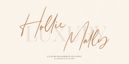 Hollie Mally handwritten font is a natural & modern script font. It's perfect for logos, invitations, stationery, wedding designs, social media posts, advertisements, product packaging, product designs, label, photography, watermark, special events or anything. This font includes ligatures and Multilingual support. What are the advantages of Hollie Mally? - Very simple installation - PUA Encoded open - Very great for branding, logotype, handlettering, invitations, or fashion branding. - Multilingual Support - Support for Adobe Illustrator, Corel Draw, Indesign or Adobe Photoshop - Support for MAC or WINDOWS
 - Snow Blue by Girinesia,
$17.00 Hello guys... We proudly presenting our new font. It's name SNOW BLUE. SNOW BLUE is modern display font. SNOW BLUE is a bold decorative font perfect for your celebration party like Halloween, Chrismast or New Year. SNOW BLUE would perfect for Titles for kid`s book, scrapbook, logo, icon, phrases or quotes for winter greeting cards ( Halloween, Christmas or New Year holidays), photo overlay, short phrases, children’s book, gift shops tag, presentation in social media Pinterest, Instagram, Facebook or others.
 - Sacramento Pro by Stiggy & Sands,
$39.00 The Sacramento Pro family of typefaces was inspired by a monoline, semi-connected script from hand-lettering artist brochure work of the 1950's and 1960's. With its sophisticated upright stance, it stands on a thin line between formal and casual lettering styles, yet it has a commanding presence for headlines and titles. The Slim adds a fine pen-line style, while the Stout style expands the formal/casual dichotomy much further than the original weight. Opentype features include: - Contextual Alternates for initial and final forms. - Stylistic Alternates for an alternate lowercase t. - Discretionary Ligatures* for catch words like “and”, “at”, “by”, “for”, “of”, “or”, “the”, “to”, and “with”. - Full set of Inferiors and Superiors for limitless fractions. - Proportional and Oldstyle figure sets. * Discretionary Ligatures not included in the Stout style due to heavyweight nature.
 - Butter Sweet by The Paper Town,
$16.00 Butter Sweet is a charming smooth cursive script with a little french touch. It’s perfect for handcrafted brands that are looking for a bold script font with an authentic handwritten feeling. Use it for blog headers, signatures, elegant branding, wedding stationery, products packaging, instagram quotes, greeting cards, social media posts, and so much more. Butter Sweet is designed with a large selection of Opentype features such as contextual alternates, a full stylistic set (Uppercase and lowercase), 38 regular ligatures, 18 terminal forms ligatures, 22 beautiful terminal forms for lowercase letters and you have 4 different ampersands to play with. Software Requirement: ButterSweet can be used in any software though alternates, ligatures and terminal forms require a software that is Opentype capable. Note that you won’t be able to access them features in softwares such as Canva. How it works: Make sure you have activated the « standard ligatures » option in your Opentype panel (Illustrator & Photoshop) Add an «8» after your ending letter to switch to a terminal form letter. Multilingual support is also available for the single letter terminal form. Language support ButterSweet includes multilingual characters for western and central and European languages.
 - Levy by Lithographe,
$36.00 Good for typography, good for close paragraphs, good for titles logo, markers, use with numbers, Capitals and Cases. use Special symbols as design elements. One can be used for others. Good for closed groups. Limbos, good to go with Serif, Sans serif or old english. use it with variety and any design light or heavy. the weight is black, so it wont matter. hope you enjoy the font and use it.
 - 13_Roshi - Personal use only

- 13_Fletcher - Personal use only

- 13_Ghosts - Unknown license

- 13_Misa - Unknown license

- Andrea Handwriting II by StuArt,
$9.00 Since the release of the first Andrea Handwriting in 2008, requests have come in for additional weights of the four variants in the font family. Andrea Handwriting II includes 16 fonts featuring four weights of the four original styles in the first release which have been improved for a more polished look, but still with a personal and casual feel. Sixteen styles – what’s your type?
 - Ambicase Fatface by Teeline Fonts,
$48.00 Most fonts include uppercase and lowercase letters. Some experimentally-minded designers have proposed unicase typefaces as well: rather than having two different forms for a given letter, unicase fonts have one, chosen from the upper- or lowercase forms. Ambicase Fatface takes the next step, offering not "either/or", but rather "both/and". Each letter in Ambicase Fatface is a combination of its traditional upper- and lowercase forms, in an extra-bold style. Its inventive, hybrid forms are a bolder take on those of its 2010 sibling typeface, Ambicase Modern. Ambicase Fatface stands out as a carefully crafted experimental font: its eccentric forms do not hinder its readability. It is suitable for high-style display settings. Ambicase Fatface offers a large character set and extensive OpenType features. Most notably, in modern OpenType-aware applications, Ambicase Fatface can be set in swash mode, which features sophisticated decorative flourishes that differ depending on whether the letter is at the beginning, middle, or end of a word. Ambicase Fatface is available in two optical sizes: Regular and Poster. At very large sizes, the Poster cut, with its finer details, is recommended.
 - Campeno by Craft Supply Co,
$20.00 Geometric Precision Let’s step into the world of Campeno, a Geometric Sans Serif font that embodies precision and order. This font is the epitome of geometric perfection, making it an ideal choice for various editorial applications. Editorial Excellence Campeno’s geometric form is what sets it apart and makes it a top choice for editorial needs. Whether you’re working on magazines, long-form text, or other editorial projects, its geometric precision enhances readability and offers editorial excellence. Versatile Typography What makes Campeno even more exceptional is its versatility. It seamlessly adapts to diverse design contexts, ensuring that it can be used for a wide range of projects, from magazines to websites and beyond. Engaging Readability Beyond its geometric aesthetics, Campeno excels in providing engaging readability. It guides the reader through the content, focusing on the message while maintaining a visually appealing design. In Conclusion In summary, Campeno – Geometric Sans Serif is the font that brings precision and clarity to your editorial projects. Its geometric form ensures that your content is not only engaging but also visually appealing, catering to a broad readership while maintaining a high standard of clarity. Whether you’re working on magazines, websites, or other editorial endeavors, Campeno stands out as a font that combines aesthetics with functionality, offering editorial excellence for your projects.
 - AM Siola by URW Type Foundry,
$39.99 AM Siola is designed as a pure display font. The starting point for this type design was a customized logotype. Logotypes usually just need the design of some characters to form a harmonious, individual lettering. Obviously, it is much more difficult to create a complete font on the basis of just a few characters. The semi-serifs partly running in the opposite direction form the basic idea for this font. AM Siola can well be used for packaging design, logo design and individual headlines for anything from advertising to posters.
 - AM Sans One by URW Type Foundry,
$39.99 When designing AM Sans One, it was a great challenge for me to develop a modern sans serif, which despite the large number of existing fonts in this sector has its own unique character. Starting point for the design concept was the cap O, designed as a rectangle with rounded corners, and not as usual as a circle or oval. The O should form the basis for the whole alphabet. Another feature are the characters with oblique starting and end strokes such as "A, V, W". These have not exactly straight, diagonal lines, but have a slight curvature. Thus, these letters do not look too geometric. Also the cap K deviates slightly from the usual shape which makes AM Sans One different from other already existing fonts. I could well imagine applying this font for areas such as engineering or architecture.
 - Croissant by ITC,
$39.00Phillip Kelly first drew the Croissant typeface in 1978 for Letraset. Back in the 1970s and 80s, Letraset's rubdown lettersheets were a popular means of designing with type. Today, many of these nostalgic classics are available in digital format. Linotype is pleased to re-present Croissant. This experimental typeface is built up out of round, brush-like strokes, creating heavy, and black letters. These forms are best used for display signage and headline text. If you are designing for a local bakery or donut shop, this typeface may be the perfect fit. The dark, heavy character that Croissant lends to the page is similar to Cooper Black , one of the most renowned American type designs ever produced. If you are looking for a typeface with Croissant's feel, but need to set smaller headlines or text, check out that family's offerings." - Dirty Sundae by Fenotype,
$19.00 Dirty Sundae is a casual hand drawn typeface with interlocking ligatures. Dirty Sundae comes in four styles: Regular and Condensed plus Regular and Bold version of them both. Dirty Sundae suits great into a film title, as a logotype for a cartoon or an animation film or for a new superhero, as well as in a jazz gig poster, magazine, packaging and branding. It can be easily fit into a vintage or modern context as long as it’s on the cheerful side. Dirty Sundae is equipped with 128 interlocking ligatures that you can access by turning on Discretionary Ligatures in any OpenType savvy program or by fetching them manually from the character window.
 - VVDS Ginsburg by Vintage Voyage Design Supply,
$10.00 Ginsburg it's a modern display all-caps font-family based on geometric forms and abstract wavy lines with an old school constructivism look. Inspired by Moses Ginsburg architecture projects. Playful, modern, suitable for many typography projects as headers, logos, block texts, etc. You may be more strict in your typography or you may be more groovy or playful with alternates characters. Use this family in vintage spirit for TV series, Podcasts titles, exhibition posters or design a modern extreme sport brochure, . Flexible, Catchy and Brazen — it's all about Ginsburg! Six widths: Thin / Light / Normal / Medium / Semi Bold / Bold. Opentype Features as Stylistic alternates, Oldstyle figures / Fractions. Multilingual
 - Mortice by ArtyType,
$24.00 I set out to create a solid, bold, strong, rugged font, one that would lend itself to any industrial type of use, and by that I mean industry in general, but probably sectors that would still be considered male preserves such as carpentry or metalwork. I thought specifically of mortice & tenon joints, whilst toying with shape and form for this self imposed challenge. I was also visualizing a router tool used for producing most wood joints nowadays. I think the general premise worked out well; in the end I settled on the name Mortice, referring to the slots or negative spaces that the matching part, or tenon would fit into.
 - Linotype Automat by Linotype,
$29.99Distinguishing characteristics of Frank Marciulano’s Linotype Automat™ are its strictly constructed basis and its uniquely placed stroke contrasts. The emphasized vertical strokes are reminiscent of bars and give text a static feel. The forms of the letters are distinctly modern, an interpretation of a typeface meant for machines. Automat is not recommended for text but is particularly good for headlines in large point sizes, which allow its unusual forms to really stand out. - Gladiola by Melvastype,
$32.00 Gladiola is a smooth and balanced brush script font. It is suitable for logos, titles, t-shirts, packages and where ever you will need this kind of lining and legible script font. Gladiola includes lots of Stylistic Alternates that gives you many options to customize your text. There are two sets of upper case letters. Lower cases has options for initial forms, final forms, end swashes and multiple options for ascenders and descenders.
 - Abudabi by Etewut,
$20.00 Abudabi is a connected script typeface that includes 3 font styles: • REGULAR for signs and basic text • BOLD for titles and highlights • STONE for single words or backgrounds
 - Display Intense by Gerald Gallo,
$20.00 Display Intense is a display font designed specifically for display, headline, logotype and similar applications. It is not intended for text use or for use at small sizes.


