10,000 search results
(0.199 seconds)
- Imagine a font that decided one morning to leap out of the digital ether, do a few stretches, and embody the audacity of an 80s arcade game crashing a cyberpunk party. That's Bandwidth BRK by AEnigma...
- Wellmere Sans by Greater Albion Typefounders,
$16.00
- Woodmark JNL by Jeff Levine,
$29.00
- FF Priska Serif by FontFont,
$30.99
- Spirit Board by Gleb Guralnyk,
$14.00
- Photogenic by Ef Studio,
$15.00
- Nouveau Dreams JNL by Jeff Levine,
$29.00
- Futura ND Display by Neufville Digital,
$45.25
- FF Pop by FontFont,
$41.99
- Cutting Corners by Just My Type,
$20.00
- FF Zan by FontFont,
$41.99
- Moppetops LL by Leftover Lasagne,
$25.00
- Corridor 24 by Illuminaut Designs,
$10.00
- Dragonblood by Hanoded,
$20.00
- FF Bull by FontFont,
$30.99
- Geometos Neue by Graphite,
$17.00
- Netherfield by Ef Studio,
$15.00
- Mellin by Greater Albion Typefounders,
$7.95
- Caliny by Marc Lohner,
$21.00
- FF Klunder Script by FontFont,
$30.99
- Galerie Simpson by chicken,
$17.00
- FF Offline by FontFont,
$41.99
- Popular Records JNL by Jeff Levine,
$29.00
- FF Overdose by FontFont,
$41.99
- Chennai Slab by insigne,
$29.00
- Anglez by Hurufatfont,
$29.00
- Akme Pro by Hackberry Font Foundry,
$24.95 - FF Studio by FontFont,
$41.99
- Fictional Friend by Hanoded,
$15.00
- FF Metamorph by FontFont,
$41.99
- Xspace by Artyway,
$14.00
- The font Orange Juice is like the wild, energetic friend that brings the party to any design. Crafted by the talented Brittney Murphy, it's as if she dipped her brush in pure sunshine and zest, captu...
- Ah, The Mighty Avengers font by SpideRaY—now that's a typeface that packs more punch than Hulk on a caffeine buzz! This font isn't just a collection of characters; it's a heroic assembly of letters t...
- The KG Lego House font is a distinctive and charming typeface created by Kimberly Geswein, an artist known for her wide array of font designs that capture personality and emotion. KG Lego House, like...
- As of my last update in April 2023, the font "Chicken Butt" designed by Tom Ledin isn't a widely recognized typeface in major font libraries or among the common databases I reference. However, in cre...
- Komika Hand - Unknown license

- Komika Text Kaps - Unknown license

- Diettersen by Maulana Creative,
$14.00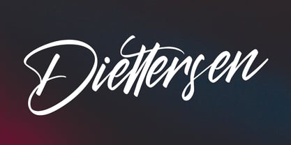
- Golfyd by Aisyah,
$12.00
- Earhtroline by Qwrtype Foundry,
$14.00

