10,000 search results
(0.043 seconds)
- Harond by Arterfak Project,
$29.00 Introducing Harond font, a bold serif font with a retro touch. Inspired by the dynamic and chubby typography style of the 70s, this font exudes a delightful, playful, yet elegant impression, making it ideal for various design themes, especially in the realm of food-related design. Harond is a display font best suited for larger sizes. Its plump form and tight spacing offer a delightful design experience and captivate attention. It's the perfect choice for use in posters, decals, logos, branding, flyers, promotional materials, motion graphics, packaging, and much more! But that's not all you get with this font. In addition to the standard alphabet, Harond also comes with multilingual support and numerous special characters, making it easier to enhance your designs.
 - Breve Text by DSType,
$50.00 Breve was designed for use in editorial projects. Simple but with enough personality to stand by is own, in a quest for a more forceful and contemporary appearance. All the fonts in Breve superfamily, share the same exact structure, both in terms of anatomy and functionality. The Text versions provide a softer and warm feel to the typographic palette and is intended for use in much longer passages of text, while the Title versions are distinguished by non-descending letterforms, making the titles and headlines much more uniform and interesting. The News version is more classic, with ball terminals and classic proportions, while the Display is, somehow, the set of fonts we had to design: extra-black, ultra-contrasted, proud-display fonts.
 - Breve Sans Text by DSType,
$50.00 Breve was designed for use in editorial projects. Simple but with enough personality to stand by is own, in a quest for a more forceful and contemporary appearance. All the fonts in Breve superfamily, share the same exact structure, both in terms of anatomy and functionality. The Text versions provide a softer and warm feel to the typographic palette and is intended for use in much longer passages of text, while the Title versions are distinguished by non-descending letterforms, making the titles and headlines much more uniform and interesting. The News version is more classic, with ball terminals and classic proportions, while the Display is, somehow, the set of fonts we had to design: extra-black, ultra-contrasted, proud-display fonts.
 - Breve Slab Text by DSType,
$50.00 Breve was designed for use in editorial projects. Simple but with enough personality to stand by is own, in a quest for a more forceful and contemporary appearance. All the fonts in Breve superfamily, share the same exact structure, both in terms of anatomy and functionality. The Text versions provide a softer and warm feel to the typographic palette and is intended for use in much longer passages of text, while the Title versions are distinguished by non-descending letterforms, making the titles and headlines much more uniform and interesting. The News version is more classic, with ball terminals and classic proportions, while the Display is, somehow, the set of fonts we had to design: extra-black, ultra-contrasted, proud-display fonts.
 - Kerp by aRc,
$10.00 Kerp introduces the new trend in handwriting practice for kids in preK-Kindergarten. It's fun, unique and visually stimulating that will encourage any young "alphabet tracers" to find joy while learning their ABCs. This TrueType font is great for creating personalized tracing worksheets, flashcards and even home-made greeting cards. For best results, big fonts are highly recommended to see the fine details of each character. Kerp was conceptualized in 2007 to inspire a 4 year-old boy to stop from his hectic schedule of playing. It started from hand-drawn apples forming the letter A to non-stop digital editing until 2008. The images selected are things that are associated to a preschooler's life varying from food to school supplies.
 - Marlowe by FaceType,
$30.00 If you are looking for a unique typeface with a light and pure elegance, Marlowe will be your choice. Marlowe is the rat pack of fonts: Regular is perfect for headlines and subtitles, while the expressive Escapade, Swirl and Cocktail styles are charming display fonts. All four provide an extended set of capitals, small caps and lower case characters. Please take a close look at the elegant alternate letters for A, E, K, M, N, O, Q, R, W and g – there are even three kinds of ampersands to choose from. Altogether Marlowe offers amazing 25 alternates and 74 discretionary ligatures, while Marlowe Swirl has additional 26 automated ligatures. Make sure you use applications supporting all these lavish OpenType features.
 - Gambit Nouveau SG by Spiece Graphics,
$39.00 Sinuous but sturdy; ornate but legible - Gambit Nouveau is modern-day design created in the spirit of Art Nouveau. This delicate and natural typeface features tapered spurs, compact swashes, and spiral curling. You will find it ideally suited for announcements and invitations as well as decorative headlines. And for your convenience, Gambit Nouveau comes equipped with corner and free-standing ornaments plus a wide range of alternate characters. Gambit Nouveau is also available in the OpenType Std format. Some new features including initial forms and old style figures have been added to this OpenType version. Advanced features currently work in Adobe Creative Suite InDesign, Creative Suite Illustrator, and Quark XPress 7. Check for OpenType advanced feature support in other applications as it gradually becomes available with upgrades.
 - F2F Styletti by Linotype,
$29.99The Face2Face (F2F) series was inspired by the techno sound of the mid-1990s, personal computers and new font creation software. For years, Sibylle Schlaich and her friends formed a unique type design collective, which churned out a substantial amount of fresh, new fonts, none of which complied with the traditional rules of typography. Many of these typefaces were used to create layouts for the leading German techno magazine of the 1990s, Frontpage. Schlaich and her fellows would even set in type at 6 points, in order to make it nearly unreadable. It was a pleasure for the kids to read and decrypt these messages! F2F Styletti Medium is one of 41 Face2Face fonts included in the Take Type 5 collection from Linotype GmbH." - Breve Sans Title by DSType,
$50.00 Breve was designed for use in editorial projects. Simple but with enough personality to stand by is own, in a quest for a more forceful and contemporary appearance. All the fonts in Breve superfamily, share the same exact structure, both in terms of anatomy and functionality. The Text versions provide a softer and warm feel to the typographic palette and is intended for use in much longer passages of text, while the Title versions are distinguished by non-descending letterforms, making the titles and headlines much more uniform and interesting. The News version is more classic, with ball terminals and classic proportions, while the Display is, somehow, the set of fonts we had to design: extra-black, ultra-contrasted, proud-display fonts.
 - Perspective Sans by Bülent Yüksel,
$29.00 The font primarily had a strong body. Family has a four layered experience. All and in harmony. This font has a strong personality, that makes it perfect for use in headline sizes. Also use for print, motion graphics, logo design, packaging design, t-shirts and more. By using layers, you can design different colors and sizes by repositioning lights and shadows. This will allow you to take your designs to the next level. Using this unique font, you'll have a lot of fun and produce beautiful materials. You can contact me at buyuksel@hotmail.com, pre-purchase and post-purchase with questions and for technical support. There is nothing as satisfying as to do a good quality and properly job. You can enjoy using it.
 - Parliament by Hoefler & Co.,
$49.99 The Parliament typeface was designed by Jonathan Hoefler beginning in 1995. A burlesque typeface in the Regency Blackletter style, Parliament was inspired by the ‘Four-line Pica Black No. 1’ typeface of William Caslon Jr (1821), whose enigmatic design for the letters E, G, I, N, V and Y hinted at a broader ambition to modernize the arcane shapes of the gothic alphabet’s capital letters. Parliament completes this project for the first time by including two sets of alphabets, one archaic and one modern, along with a third set of ‘small caps’ that restores to the blackletter the versatility of Roman type. Parliament was first used for the 1998 ATypI Conference in Lyon, and was published by Hoefler&Co in 2022.
 - Stencil Moonlight by Linotype,
$29.00Latvian designer and educator Gustav Grinbergs created Stencil Moonlight as an attempt to slightly lighten up the stencil type scene. Intended as a lively, semi-formal face, its shapes are smooth and compact. It leaves a very heavy feeling on the page, as its letters display a very fat bold design. Stencil Moonlight is available is two separate font styles, Regular and Small Caps. When used together, the Stencil Moonlight family can create the perfect combination for your next display need. Stencil Moonlight works best in larger sizes, where it is clear that its forms stem from an experiment with stencil design. Grinbergs recommends the face for application in package design, advertising, poster design, and perhaps even for the subtitling of foreign films! - Millettre by ParaType,
$30.00 A calligraphic script font Millettre is the last member of the trilogy of types designed by Lyudmila Mikhailova. First two fonts Milanette and Milafleur were released earlier. The font is based on author's lettering artworks which she did for many years for companies who produced greeting cards. The characters of the font have rough contours simulating lettering by a pointed pen on a rough paper. The character set covers standard Western, Central European and Cyrillic code pages. The default version of the font is presented by disconnected script, but connected variant is also included and organized as an alternative stylistic set. The font also contains some initial, finial and alternative forms of letters. Recommended for use in advertising and display typography. Released by ParaType in 2011.
 - Vodka by Fenotype,
$19.00 Vodka - a display pack with an edge. Vodka is a display combo pack of four styles and six fonts. Vodka fonts are clean but soft. Vodka's core is two weights of a Brush Script and a Monoline Script with similar characters. Vodka Sans is a bold sans with very soft features. Vodka Sans lowercase letters are a bit condensed version of uppercase. Vodka Slab is a rounded bold display type. Vodka Brush and Pen are equipped with automatic Contextual Alternates and Standard Ligatures that help to keep the flow smooth. For more expressive letters there’s Swash Alternates for every standard letter. Vodka fonts are designed to play together but can easily be used as themselves too. For the best price purchase the whole pack!
 - Siruca by FSD,
$60.27Siruca is a font created specifically for the Al Hamra Complex, in Kuwait City, which includes the extraordinary Al Hamra Tower, one of the tallest skyscrapers in the world. Siruca is a stencil font designed to be used both by the classical forms, both for possible use with neon tubes. Indeed, the rounded ends and the total absence of sharp corners to prevent abrasion during the use of masks and, simultaneously, provide a realistic neon circuit designer. The typeface is accompanied by a series of pictograms (designed following the same guidelines described above) to be used on signs inside the building. The originality and versatility of the font Siruca™ makes it particularly suitable for the characterization of tainted brands from the strong recognizable. - Sansduski by Ingrimayne Type,
$9.00 Sansduski is a sans-serif decorative/display family. Its very high x-height and tight spacing make it more suitable for use at large point sizes than small point sizes. (There are better options if one wants a readable text font.) It comes in nine weights and one outline style, with an oblique style accompanying each of these ten styles to give a total of 20 styles in the family. The letter O is a rectangle with rounded corners and this shape motif is carried over to other characters that are usually rounded. For a monospaced rather than proportional version of this design idea, see SansduskiMono. Sansduski is appropriate for titles, posters, advertising, and other uses that benefit from simple letter forms that are geometric and clean.
 - Celan by Craft Supply Co,
$20.00 Introduction to Celan Bold Serif Font The Celan – Bold Serif font stands out with its robust and masculine appearance. It features thick, strong lines and minimal white space. This design choice gives it a dominant presence, making it ideal for impactful titles. Characteristics of the Font Celan is characterized by its bold, assertive strokes. The limited white space between letters enhances its solidity. This quality makes the font appear more masculine and forceful. Its serif design adds a touch of classic elegance. Ideal Uses of Celan – Bold Serif This font is perfect for powerful titles that need to command attention. Its boldness makes it suitable for headers in various mediums like posters, websites, and magazines. The strong character of the font conveys confidence and authority.
 - Breve Display by DSType,
$50.00 Breve was designed for use in editorial projects. Simple but with enough personality to stand by is own, in a quest for a more forceful and contemporary appearance. All the fonts in Breve superfamily, share the same exact structure, both in terms of anatomy and functionality. The Text versions provide a softer and warm feel to the typographic palette and is intended for use in much longer passages of text, while the Title versions are distinguished by non-descending letterforms, making the titles and headlines much more uniform and interesting. The News version is more classic, with ball terminals and classic proportions, while the Display is, somehow, the set of fonts we had to design: extra-black, ultra-contrasted, proud-display fonts.
 - Ellington MT by Monotype,
$29.99 Ellington was designed by jazz lover, Michael Harvey for Monotype in 1990, and named after the great band leader, Duke Ellington. From experience gained carving letters in stone and drawing them for book jacket designs, Michael Harvey has created a condensed typeface combining the clear-cut sparkle of a modern face with some of the lively features of the broad-edged pen. Ellington has a fresh elegance that is particularly effective in display, while its compressed forms will prove economical in text settings. The Ellington font family has narrow characters with strong vertical strokes and angular calligraphic traits. Ellington is a lively face and an appropriate font choice for advertising and book work. Ellington has a sans serif companion family, Strayhorn.
 - La Taqueria by Sudtipos,
$39.00 Mexico’s storied culture is one of the most recognizable today. Its amazing vibrant art and delicious foods have made the leap to influence many parts of the world in recent years. This proud, intense and diverse identity was the inspiration behind La Taqueria, a set of four fonts that express different characteristics of Mexican pop culture. The heavy and spicy, the light and gentle, the constant dynamism, all come together with one rhythm to produce an explosion of personality. Just like its predecessors Distillery and Scrapbooker, the La Taqueria set contains down-to-earth alphabets perfect for chalkboard art and handmade design. All the fonts include alternates and ligatures, providing plenty of variation for that spontaneous appearance everyone is looking for these days.
 - Breve Slab Title by DSType,
$50.00 Breve was designed for use in editorial projects. Simple but with enough personality to stand by is own, in a quest for a more forceful and contemporary appearance. All the fonts in Breve superfamily, share the same exact structure, both in terms of anatomy and functionality. The Text versions provide a softer and warm feel to the typographic palette and is intended for use in much longer passages of text, while the Title versions are distinguished by non-descending letterforms, making the titles and headlines much more uniform and interesting. The News version is more classic, with ball terminals and classic proportions, while the Display is, somehow, the set of fonts we had to design: extra-black, ultra-contrasted, proud-display fonts.
 - Agilita by Linotype,
$29.99 Created by German designer Jürgen Weltin, Linotype’s Agilita is a contemporary humanist sans serif family with a wide variety of weights, including both ultra thin hairline options and heavier, dark type. Agilita has rather classical proportions; its clear ascenders and descenders lend more distinct word shapes. Weltin’s design has a dynamic, yet strong and very functional appearance with a fine but clear emphasis on the horizontals. This traditional approach makes it a versatile typeface for large-scale text setting, but it can also be used in complex information design projects, and orientation systems, for example. Hence it was developed carefully into a wide range type family system consisting of 32 styles. This even covers the requirements for display and headline setting. Corresponding condensed weights are suitable where horizontal space is scarce, as in narrow columns and tables, for example. The Agilta Hairline and Agilta Ultra Thin styles were especially made for display use. These fonts should be set at a minimum size of 20 pt for printed project, and about 40 pt on output to laser printers, depending on the paper used. Agilita’s character sets include special symbols and signs that may be used in dictionaries; like arrows for lemmata and signs for cross references, idioms or colloquial language. There are two sets of arrows available in each weight for use in orientation systems. Each font in the Agilta family is built according to Linotype’s Extended European character set guidelines. These offer support for more than 48 Latin-based languages used in Western, Central, and Eastern Europe, including Baltics and Turkey.
 - Stay Love by Din Studio,
$29.00 It can be a tough challenge to find a visually best font for your project as an inappropriate font may ruin the project and make it seem unprofessional and careless. Therefore, Stay Love, through which your project will be outstanding, is here for your perfect font to show lovely nuances and displays leaving the best impressions to your project. Stay Love designs are beautifully crafted to look as similar as the artistic humans’ handwritings for unique, interesting displays. The letters, which connect to each other to create continuity and consistency, have high contrasts to show clear differences between the thick and the thin parts of the letters for stronger and more legible writings. Moreover, the swinging letter ends can add feminine touches and elegant beauty to your designs, which you can use in big text sizes for a legibility reason. In addition, you may indeed enjoy the available features here. Features: Alternates Ligatures Multilingual Supports PUA Encoded Numerals and Punctuations Stay Love fits best for any design projects requiring artistic, elegant displays such as wedding invitations, greeting cards, merchandise designs, and more. For such artistic and elegant displays, this script font is also applicable for logo designs, posters, and packaging. Find out more ways to use this font by taking a look at the font preview. Thanks for purchasing our fonts. Hopefully, you have a great time using our font. Feel free to contact us anytime for further information or when you have trouble with the font. Thanks a lot and happy designing.
 - VAG-HandWritten - 100% free

- Cleopatras by IKIIKOWRK,
$17.00 Introducing The Cleopatras, created by ikiiko. The Cleopatras is a clean serif font with unique characters, having a variety of alternative style sets to choose. You can use various techniques to form different characters. This typeface is perfect for an elegant logo, branding, travel promotion, layout magazine, beauty product, packaging product, quotes, or simply as a stylish text overlay to any background image. What's included? Uppercase & Lowercase Number & Punctuation Ligatures & Swashses Alternates Set Multilingual Support Get also a good offer & FREEBIE at our site : www.ikiiko.com Enjoy our font and if you have any questions, you can contact us by email : ikiikowrk@gmail.com
 - Fright Maiden by Letterhend,
$16.00 Introducing, Fright Maiden - A serif typeface font with bold and horror feel. This font has unique shape, very suitable for horror, thriller and spooky theme design. This font also perfectly made to be applied especially in logo, and the other various formal forms such as invitations, labels, logos, magazines, books, novels, labels or any type of advertising purpose. Features : altermate and ligatures numbers and punctuation multilingual PUA encoded We highly recommend using a program that supports OpenType features and Glyphs panels like many of Adobe apps and Corel Draw, so you can see and access all Glyph variations.
 - Linotype MhaiThaipe by Linotype,
$29.99Linotype Mhai Thaipe is part of the Take Type Library, chosen from the entries of the Linotype-sponsored International Digital Type Design Contests of 1994 and 1997. The work of German designer Markus Remscheid, the name is not hard to recognize as an English-Asian play on my type and describes its general character. The small circles which ornament the alphabet and the unusual flowing forms which look like a mixture of Arabic and Sanskrit combine to give the typeface an ornamental, exotic look. Linotype Mhai Thaipe is best used for headlines with point sizes of 12 or larger. - Billskates by Letterhend,
$14.00 Billskates is a modern script font. This font is perfect for logos and the other various formal forms such as invitations, labels, logos, magazines, books, greeting / wedding cards, packaging, fashion, make up, stationery, novels, labels or any type of advertising purpose. Features: Uppercase & Lowercase Numbers and Punctuation Multilingual support Ligatures Alternates Swashes PUA encoded Contextual alternates We highly recommend using a program that supports OpenType features and Glyphs panels like many of Adobe apps and Corel Draw, so you can see and access all Glyph variations. Email us to letterhend@gmail.com if you need something! Happy Designing!
 - Filarion by Locomotype,
$15.00 Filarion is inspired by a bit of 60s typography. At first glance it looks contrasting but is executed in a different way. The lines are drawn irregularly so that it looks casual and not stiff. From a clean basic form (Regular), Filarion was developed into three different variants, namely Bulbous, Noetic and Print. Each of them has an oblique style. So you will get 8 fonts from Filarion family. This font is suitable for use as a title in broadcast videos, movies or poster designs. It can also be used on quotes and other promotional materials that require extra attention.
 - Silvano Western by Letterhend,
$17.00 Silvano Western is a display typeface suitable for design needs with a touch of classic western, especially in logo, and the other various formal forms such as invitations, labels, logos, magazines, books, greeting / wedding cards, packaging, fashion, make up, stationery, novels, labels or any type of advertising purpose. Features : regular and slant version numbers and punctuation multilingual PUA encoded We highly recommend using a program that supports OpenType features and Glyphs panels like many of Adobe apps and Corel Draw, so you can see and access all Glyph variations. Email us to letterhend@gmail.com if you need something! Happy Designing!
 - Linotype Zensur by Linotype,
$29.99Linotype Zensur is part of the Take Type Library, chosen from the entries of the Linotype-sponsored International Digital Type Design Contests of 1994 and 1997. This fun font was created by French designer Gérarld Alexandre and contains one weight. The characters look as though parts of each of them were censored or removed, leaving just enough left over to know what was meant. The basic forms of this font are sans serif and the rounded corners give it an almost soft character. Linotype Zensur is a distinctive typeface which is especially good for headlines in larger point sizes. - Gangfield by Slex Studio,
$18.00 Based on lettering with a sharp pen, Gangfield features a rather solid character and a measured rhythm. This is named after my nephew who has an optimistic and disciplined style. Gangfield is available in upright variants, with regular, italic and bold weights. Gangfield's bright and cheerful energy shines through either in the form of short blocks of text, or enhanced on display sizes with over 1,100 wildcards and swashes that vary in size and complexity. Gangfield includes 134 alternates with various variations plus several variants of ligatures which make it ideal for special dates such as weddings and parties.
 - SK Rohkea by Shriftovik,
$48.00 SK Rohkea is a modular display typeface that combines strict geometry and smoothness of lines. The main features of the typeface are the constant inclination of the oval and the elongation of forms. They give the typeface a unique character, especially when it is used in large inscriptions and headings. The SK Rohkea typeface has capital and lowercase letters that support the extended Latin and Cyrillic set and even icons! Thanks to the combination of modernity and refinement, the typeface is great for the widest range of design tasks, no matter whether it is printing or web design.
 - Styleturn by IKIIKOWRK,
$19.00 Proudly present Styleturn - Stylish Blackletter, created by ikiiko. Styleturn is an stylish blackletter font with a more minimalist and modern form. This type has a character of hipster vibes, hip-hop, youth, urban culture, etc. This type is very suitable for making a poster, magazine layout, brand logo, sleeve cover, party flyer, quotes, or simply as a stylish text overlay to any background image. What's Included? Uppercase & Lowercase Numbers & Punctuation Multilingual Support Format File : TTF & OTF Works on PC & Mac Enjoy our font and if you have any questions, you can contact us by email : ikiikowrk@gmail.com
 - Aromatic Dream by Letterhend,
$17.00 Introducing, Aromatic Dream- Astylish font with chic & classic looks. This typeface has been made carefully to make sure its premium quality and luxury feel. Very suitable for logo, headline, tittle, and the other various formal forms such as invitations, labels, logos, magazines, books, greeting / wedding cards, packaging, fashion, make up, stationery, novels, labels or any type of advertising purpose. Features : Regular & Slanted Uppercase & lowercase Numbers and punctuation Multilingual PUA encoded We highly recommend using a program that supports OpenType features and Glyphs panels like many of Adobe apps and Corel Draw, so you can see and access all Glyph variations.
 - Billrocks by Letterhend,
$19.00 Introducing, Billrocks - A sans serif display typeface. The condensed style make this font looks great and standout for tittle, headline, logo, etc. Perfectly to be applied to the other various formal forms such as invitations, labels, logos, magazines, books, greeting / wedding cards, packaging, fashion, make up, stationery, novels, labels or any type of advertising purpose. Features : uppercase & lowercase numbers and punctuation multilingual alternates & ligatures PUA encoded We highly recommend using a program that supports OpenType features and Glyphs panels like many of Adobe apps and Corel Draw, so you can see and access all Glyph variations.
 - Better Hobby by Letterhend,
$17.00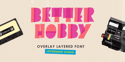 Introducing, Better Hobby - A unique overlay layered display font. This font has unique shape, very suitable for casual and playful theme design. This font also perfectly made to be applied especially in logo, and the other various formal forms such as invitations, labels, logos, magazines, books, greeting / wedding cards, packaging, fashion, make up, stationery, novels, labels or any type of advertising purpose. Features : numbers and punctuation multilingual PUA encoded We highly recommend using a program that supports OpenType features and Glyphs panels like many of Adobe apps and Corel Draw, so you can see and access all Glyph variations.
 - Dankfield by Letterhend,
$17.00 Introducing, Dankfield. A modern display typeface with high contrast and condensed style, very suitable for futuristic and techno theme. This font perfectly made to be applied especially in logo, and the other various formal forms such as invitations, labels, magazines, books, greeting / wedding cards, packaging, fashion, make up, stationery, novels, labels or any type of advertising purpose. Features : Uppercase & lowercase (alternates) Numbers and punctuation Stylistic alternates multilingual PUA encoded We highly recommend using a program that supports OpenType features and Glyphs panels like many of Adobe apps and Corel Draw, so you can see and access all Glyph variations.
 - Between Days by Letterhend,
$17.00 Introducing, Between Days, A sophisticated serif with high contrast. This typeface has been made carefully to make sure its premium quality and luxury feel. Very suitable for logo, headline, tittle, and the other various formal forms such as invitations, labels, logos, magazines, books, greeting / wedding cards, packaging, fashion, make up, stationery, novels, labels or any type of advertising purpose. Features : numbers and punctuation multilingual ligatures alternates PUA encoded We highly recommend using a program that supports OpenType features and Glyphs panels like many of Adobe apps and Corel Draw, so you can see and access all Glyph variations.
 - Metronic Slab Pro by Mostardesign,
$26.00 Metronic Slab Pro is a slab serif typeface with a technological and minimalist look for text and headlines. It has six versatile weights from Air to Black with an alternative glyph set to improve its use in different graphic contexts. Metronic Pro has a wide range of OpenType features such as: old style and proportional figures, ligatures, case sensitive forms, fractions, stylistic alternates, arrows and an icons/ornaments set. This set of 60 icons, directly inspired from the typeface improves the OpenType features and can be quickly and easily use in your web design, GUI design, graphic design or any other graphic work.
