10,000 search results
(0.048 seconds)
- American Uncial by Linotype,
$40.99American Uncial™ was designed by Victor Hammer in 1943. Uncial typefaces consist of letter forms of the Capitalis Monumentalis and the majescule cursive. The origins of Uncial faces date back to the 5th century. In 1953, American Uncial was expanded to include some new figures, also designed by Hammer, and was rereleased by Klingspor with the name Neue Hammer Unziale. The forms are based on old scripts in books of antiquity and the early Middle Ages and the font is a new variation of a classic. Neue Hammer Unziale font has been a favorite for certificates and diplomas and is recommended for headlines and shorter texts in a point size of 12 or larger. - Mariné STD by TipoType,
$19.90Mariné STD is a geometric sans but with the softness of humanistic strokes. It’s mild contrast and multiple different styles allow Mariné to work well as both a text and display font. Mariné STD is a selected version of Mariné Family. - Ideal for print and identity works. - Works well for text or display uses. - Designed for web and apps. - Look serious or look casual. - Arventa Sans Pro by preussTYPE,
$59.00 Arventa was designed to be highly legible and flexible. Arventa offers a high quality alternative to contemporary humanist sans serifs and is a flexible family for editorials and corporate branding. Arventa comes in seven weights (ExtraLight, Light, Regular, Medium, Bold, Black and UltraBlack). I wanted to create a very refined family that could be used for display or body copy, for print or digital.
 - Performing Arts JNL by Jeff Levine,
$29.00 The sheet music for "I Used to be Color Blind" (from the 1938 Fred Astaire-Ginger Rogers movie "Carefree") had its title crafted in ornate Art Deco hand lettering. Keeping the original letter forms, the interior embellishment was simplified to a dot-and-line pattern [eliminating a secondary squiggly line] for a cleaner look. The type design is now digitally available as Performing Arts JNL, in both regular and oblique versions. For those who prefer no ornamentation, there are also regular and oblique versions in solid form.
 - Jazz Beat Stencil JNL by Jeff Levine,
$29.00 The 1960 British film “Beat Girl” (released in the U.S. as “Wild for Kicks”) was a typical [for its time] story of a teenage girl looking to have some fun by hanging out with SoHo beatniks and going against parental authority. One of the posters for the film features the title in a condensed slab serif stencil form, with eroded edges. The basic letter forms were smoothed out and cleaned up resulting in Jazz Beat Stencil JNL, which is available as in both regular and oblique versions.
 - Consolas by Microsoft Corporation,
$49.00OpenType Layout features: stylistic alternates, localized forms, uppercase-sensitive forms, oldstyle figures, lining figures, arbitrary fractions, superscript, subscript. Consolas is intended for use in programming environments and other circumstances where a monospaced font is specified. All characters have the same width, like old typewriters, making it a good choice for personal and business correspondence. The improved Windows font display allowed a design with proportions closer to normal text than traditional monospaced fonts like Courier. This allows for more comfortable reading of extended text on-screen. - Gloucester by Monotype,
$29.00 Gloucester is a smart, chipper, and studious typeface that evokes British literature and historic books. It's highly legible and great for kids books. Use this font for a pub sign, a book about British history, or anything else that needs a sophisticated look.
 - Restrick by ZetDesign,
$15.00 Restrick is a strong display font. uses curved corners for flexible use on a variety of media displays. This font is very suitable for use as a headline in a newspaper, poster, or magazine. This font is available in regular and italic format.
 - Aquene by Craft Supply Co,
$20.00 Introducing Aquene – Display Serif Font Are you in search of a unique serif font with a captivating flow for your display requirements? Look no further than Aquene – Display Serif. This meticulously crafted font is designed to make your text stand out and captivate your audience. Unique Flow for Captivating Text Aquene – Display Serif font boasts a distinctive flow that sets it apart. Firstly, its elegant curves and graceful lines lend a touch of sophistication. Secondly, it’s perfect for eye-catching headlines and titles that leave a lasting impression. Versatile Usage for Various Design Needs Moreover, Aquene is remarkably versatile. It’s suitable for posters, banners, or website headers, making it ideal for different design contexts. Whether you’re working on a promotional campaign, crafting a logo, or designing social media graphics, Aquene’s adaptability shines.
 - Prismatic Spirals by MMC-TypEngine,
$93.00 PRISMATIC SPIRALS FONT! The Prismatic Spirals Font is a decorative type-system and ‘Assembling Game’, itself. Settled in squared pieces modules or tiles, embedded by unprecedented Intertwined Prismatic Structures Design, or intricate interlaced bars that may seem quite “impossible” to shape. Although it originated from the ‘Penrose Square’, it may not look totally as an Impossible Figures Type of Optical Illusions. More an “improbable” Effect in its intertwined Design, that even static can seem like a source of Kinetical Sculptures, or drive eyes into a kind of hypnosis. Prismatic Spirals has two related families, its “bold” braided version Prismatic Interlaces and the Pro version. While the default is simpler or easier to use, as all piece’s spin in same way, PRO provides a more complex intricate Design which requires typing alternating caps. Instructions: Use the Map Font Reference PDF as a guide to learn the 'tiles' position on the keyboard, then easily type and compose puzzle designs with this font! All alphanumeric keys are intuitive or easy to induce, you may easily memorize it all! Plus, often also need to consult it! *Find the Prismatic Spirals Font Map Reference Interactive PDF Here! (!) Is recommended to Print it to have the Reference in handy or just open the PDF while composing a design with this typeface to also copy and paste, when consulting is required or when it may be difficult to access, depending on the keyboard script or language. As a Tiles Type-System, the line gap space value is 0, this means that tiles line gaps are invisibly grouted, so the user can compose designs, row by row, descending to each following row by clicking Enter, same as line break, while advances on assembling characters. Background History: The first sketches of my Prismatic Knots or Spirals Designs dates back then from 2010, while started developing hand-drawn Celtic Knots and Geometric Drawings in grid paper, while engage to Typography, Sacred Geometry and the “Impossible Figures” genre… I started doing modulation tests from 2013, until around 2018, I got to unravel it in square modules or tiles from the grid, then idealized it as fonts, along with other Type projects. This took 13 years to come out since the first sketches and 6 months in edition. During the production process some additional tiles or missing pieces were thought of and added to the basic set, which firstly had only the borders, corners, crossings, nets, Trivets connectors or T parts and ends, then added with nets and borders integrations. Usage Suggestions: This type-system enables the user to ornate and generate endless decorative patterns, borders, labyrinthine designs, Mosaics, motifs, etc. It can seem just like a puzzle, but a much greater tool instead for higher purposes as to compose Enigmas and use seriously. As like also to write Real Text by assembling the key characters or pieces, this way you can literarily reproduce any Pixel Design or font to its Prismatic Spirals correspondent form, as Kufic Arabic script and further languages and compose messages easily… This Typeface was made to be contemplated, applied, and manufactured on Infinite Decorative Designs as Pavements, Tapestry, Frames, Prints, Fabrics, Bookplates, Coloring Books, Cards, covers or architectonic frontispieces, storefronts, and Jewelry, for example. Usage Tips: Notice that the line-height must be fixed to 100% or 1,0. In some cases, as on Microsoft Word for example, the line-height default is set to 1,15. So you’ll need to change to 1,0 plus remove space after paragraph, in the same dropdown menu on Paragraph section. Considering Word files too, since the text used for mapping the Designs, won't make any literal orthographical sense, the user must select to ignore the Spellcheck underlined in red, by clicking over each misspelled error or in revision, so it can be better appreciated. Also unfolding environments as Adobe Software’s, the Designer will use the character menu to set body size and line gap to same value, as a calculator to fit a layout for example of 1,000 pts high with 9 tiles high, both body size and line gap will be 111.1111 pts. Further Tips: Whenever an architect picks this decorative system to design pavements floor or walls, a printed instruction version of the layout using the ‘map’ font may be helpful and required to the masons that will lay the tiles, to place the pieces and its directions in the right way. Regarding to export PNGs images in Software’s for layered Typesetting as Adobe Illustrator a final procedure may be required, once the designs are done and can be backup it, expanding and applying merge filter, will remove a few possible line glitches and be perfected. Technical Specifications: With 8 styles and 4 subfamilies with 2 complementary weights each (Regular and Bold) therefore, Original Contour, Filled, Decor, with reticle’s decorations and 2 Map fonts with key captions. *All fonts match perfectly when central pasted for layered typesetting. All fonts have 106 glyphs, in which 48 are different keys repeated twice in both caps and shift, plus few more that were repeated for facilitating. It was settled this way in order for exchanging with Prismatic Spirals Pro font which has 96 different keys or 2 versions of each. Concerning tiles manufacturing and Printed Products as stickers or Stencils, any of its repeated pieces was measured and just rotated in different directions in each key, so when sided by other pieces in any direction will fit perfectly without mispatching errors. Copyright Disclaimer: The Font Software’s are protected by Copyright and its licenses grant the user the right to design, apply contours, plus print and manufacture in flat 2D planes only. In case of the advent of the same structures and set of pieces built in 3D Solid form, Font licenses will not be valid or authorized for casting it. © 2023 André T. A. Corrêa “Dr. Andréground” & MMC-TypEngine.
 - Komela by Okaycat,
$29.50 Komela is perfect for a poster or magazine. To be used anywhere that beautiful design plus high functionality is required. Komela is a multilingual font appropriate for publishing to international environments.
 - Zapfino Arabic by Linotype,
$29.99 Zapfino Arabic is designed by Nadine Chahine as the Arabic companion to Hermann Zapf’s iconic Zapfino typeface, with the approval of Prof. Zapf. The design is an evolution of Arabic calligraphic traditions that combines Naskh and Nastaaliq to form a backward slanted calligraphic style. The character proportions refer to Naskh traditions but the isolated and final forms bring with them an exaggerated swash-like movement that references the extravagant ascenders and descenders of Zapfino. The font contains a large number of contextual variants that work to create a smooth flow of pen movement, as well as 10 stylistic sets. The character set supports the Arabic language as well as basic Latin. Zapfino Arabic is meant to be used as a display typeface, for logos, greeting cards and short headlines. It could also work for short pieces of text, for poetry or chapter introductions, when used in a generous type size and with ample space around it. Its design is soft and elegant, and leaves a lot of room for typographic playfulness.
 - Bla Bla by S6 Foundry,
$25.00 Bla Bla is a contemporary serif typeface inspired by brutalist forms, featuring large open counters, curved, round forms, creating a modern & elegant glyph set. The organic curves with gentle repetitions create powerful and harmonious forms. Designed to be a stylish modern family it is perfect for communication and branding projects.
 - Golestan by Naghi Naghachian,
$84.00 Golestan is designed by Naghi Naghashian. It is a Font family, in 2 weights, Regular and Bold. This font is a contribution to modernisation of Arabic typography, gives the font design of Arabic letters real typographic arrangement und provides more typographic flexibility. Golestan supports Arabic, Persian and Urdu. It also includes proportional and tabular numerals for the supported languages. Golestan design fulfills the following needs: A Explicitly crafted for use in electronic media fulfills the demands of electronic communication. B Suitability for multiple applications. Gives the widest potential acceptability. C Extreme legibility not only in small sizes, but also when the type is filtered or skewed, e.g., in Photoshop or Illustrator. Golestan’s simplified forms may be artificial obliqued in InDesign or Illustrator, without any loss in quality for the effected text. D An attractive typographic image. Golestan was developed for multiple languages and writing conventions. Golestan supports Arabic, Persian and Urdu. It also includes proportional and tabular numerals for the supported languages. E The highest degree of calligraphic grace and the clarity of geometric typography.
 - Afsane by Naghi Naghachian,
$94.00 Afsane is a sans-serif headline font family designed by Naghi Naghashian in 3 weights, Light, regular and Bold.This font is a contribution to modernisation of Arabic typography, gives the font design of Arabic letters real typographic arrangement und provides more typographic flexibility. Afsane supports Arabic, Persian and Urdu. It also includes proportional and tabular numerals for the supported languages. Afsane design fulfills the following needs: A. Explicitly crafted for use in electronic media fulfills the demands of electronic communication. B. Suitability for multiple applications. Gives the widest potential acceptability. C. Extreme legibility not only in small sizes, but also when the type is filtered or skewed, e.g., in Photoshop or Illustrator. Afsane’s simplified forms may be artificial obliqued in InDesign or Illustrator, without any loss in quality for the effected text. D. An attractive typographic image. Afsane was developed for multiple languages and writing conventions. Afsane supports Arabic, Persian and Urdu. It also includes proportional and tabular numerals for the supported languages. E. The highest degree of calligraphic grace and the clarity of geometric typography.
 - Pegah by Naghi Naghachian,
$98.00 Pegah is a sans-serif font family designed by Naghi Naghashian in three weights. Pegah Light, Pegah Regular and Pegah Bold. This font family is a contribution to modernisation of Arabic typography, gives the font design of Arabic letters real typographic arrangement und provides more typographic flexibility. Pegah supports Arabic, Persian and Urdu. It also includes proportional and tabular numerals for the supported languages. Pegah design fulfills the following needs: A Explicitly crafted for use in electronic media fulfills the demands of electronic communication. B Suitability for multiple applications. Gives the widest potential acceptability. C Extreme legibility not only in small sizes, but also when the type is filtered or skewed, e.g., in Photoshop or Illustrator. Nima’s simplified forms may be artificial oblilqued in InDesign or Illustrator, without any loss in quality for the effected text. D An attractive typographic image. BaBa was developed for multiple languages and writing conventions. BaBa supports Arabic, Persian and Urdu. It also includes proportional and tabular numerals for the supported languages. E The highest degree of calligraphic grace and the clarity of geometric typography.
 - BaBa by Naghi Naghachian,
$98.00 BaBa is a sans-serif font family designed by Naghi Naghashian in three weights. BaBa Light, Baba Regular and Baba Bold. This font family is a contribution to modernisation of Arabic typography, gives the font design of Arabic letters real typographic arrangement und provides more typographic flexibility. BaBa supports Arabic, Persian and Urdu. It also includes proportional and tabular numerals for the supported languages. BaBa design fulfills the following needs: A Explicitly crafted for use in electronic media fulfills the demands of electronic communication. B Suitability for multiple applications. Gives the widest potential acceptability. C Extreme legibility not only in small sizes, but also when the type is filtered or skewed, e.g., in Photoshop or Illustrator. Nima’s simplified forms may be artificial oblilqued in InDesign or Illustrator, without any loss in quality for the effected text. D An attractive typographic image. BaBa was developed for multiple languages and writing conventions. BaBa supports Arabic, Persian and Urdu. It also includes proportional and tabular numerals for the supported languages. E The highest degree of calligraphic grace and the clarity of geometric typography.
 - Babak by Naghi Naghachian,
$74.00 Babak is designed by Naghi Naghashian. It is a Font family, in 3 weights, Light, Regular and Bold. This font is a contribution to modernisation of Arabic typography, gives the font design of Arabic letters real typographic arrangement und provides more typographic flexibility. Babak supports Arabic, Persian and Urdu. It also includes proportional and tabular numerals for the supported languages. Babak design fulfills the following needs: A Explicitly crafted for use in electronic media fulfills the demands of electronic communication. B Suitability for multiple applications. Gives the widest potential acceptability. C Extreme legibility not only in small sizes, but also when the type is filtered or skewed, e.g., in Photoshop or Illustrator. Nima’s simplified forms may be artificial obliqued in InDesign or Illustrator, without any loss in quality for the effected text. D An attractive typographic image. Babak was developed for multiple languages and writing conventions. Babak supports Arabic, Persian and Urdu. It also includes proportional and tabular numerals for the supported languages. E The highest degree of calligraphic grace and the clarity of geometric typography.
 - Hafez by Naghi Naghachian,
$88.00 Hafez is a sans-serif font family designed by Naghi Naghashian in three weights. Hafez Light, Hafez Regular and Hafez Bold. This font family is a contribution to modernisation of Arabic typography, gives the font design of Arabic letters real typographic arrangement und provides more typographic flexibility. Hafez supports Arabic, Persian and Urdu. It also includes proportional and tabular numerals for the supported languages. Hafez design fulfills the following needs: A Explicitly crafted for use in electronic media fulfills the demands of electronic communication. B Suitability for multiple applications. Gives the widest potential acceptability. C Extreme legibility not only in small sizes, but also when the type is filtered or skewed, e.g., in Photoshop or Illustrator. Nima’s simplified forms may be artificial oblilqued in InDesign or Illustrator, without any loss in quality for the effected text. D An attractive typographic image. BaBa was developed for multiple languages and writing conventions. BaBa supports Arabic, Persian and Urdu. It also includes proportional and tabular numerals for the supported languages. E The highest degree of calligraphic grace and the clarity of geometric typography.
 - Naghashian by Naghi Naghachian,
$78.00 Naghashian is designed by Naghi Naghashian. It is a Font family, in 5 weights, Light, Regular, Bold, Extra Bold and Heavy This font is a contribution to modernisation of Arabic typography, gives the font design of Arabic letters real typographic arrangement und provides more typographic flexibility. Naghashian supports Arabic, Persian and Urdu. It also includes proportional and tabular numerals for the supported languages. Naghashian design fulfills the following needs: A Explicitly crafted for use in electronic media fulfills the demands of electronic communication. B Suitability for multiple applications. Gives the widest potential acceptability. C Extreme legibility not only in small sizes, but also when the type is filtered or skewed, e.g., in Photoshop or Illustrator. Nima’s simplified forms may be artificial obliqued in InDesign or Illustrator, without any loss in quality for the effected text. D An attractive typographic image. Naghashian was developed for multiple languages and writing conventions. Naghashian supports Arabic, Persian and Urdu. It also includes proportional and tabular numerals for the supported languages. E The highest degree of calligraphic grace and the clarity of geometric typography.
 - Damavand by Naghi Naghachian,
$114.00 Damavand is designed by Naghi Naghashian. It is a Font family, in 5 weights, Light, Regular, DemiBold, Bold and Heavy. This font is a contribution to modernisation of Arabic typography, gives the font design of Arabic letters real typographic arrangement und provides more typographic flexibility. Damavand supports Arabic, Persian and Urdu. It also includes proportional and tabular numerals for the supported languages. Damavand design fulfills the following needs: A. Explicitly crafted for use in electronic media fulfills the demands of electronic communication. B. Suitability for multiple applications. Gives the widest potential acceptability. C. Extreme legibility not only in small sizes, but also when the type is filtered or skewed, e.g., in Photoshop or Illustrator. Nima’s simplified forms may be artificial obliqued in InDesign or Illustrator, without any loss in quality for the effected text. D. An attractive typographic image. Damavand was developed for multiple languages and writing conventions. Damavand supports Arabic, Persian and Urdu. It also includes proportional and tabular numerals for the supported languages. E. The highest degree of calligraphic grace and the clarity of geometric typography.
 - Ostad Arabic by Naghi Naghachian,
$64.00 Oustad Arabic is designed by Naghi Naghashian. It is a Bold headline font, in 1 weight. This font is a contribution to modernisation of Arabic typography, gives the font design of Arabic letters real typographic arrangement und provides more typographic flexibility. Oustad Arabic supports Arabic, Persian and Urdu. It also includes proportional and tabular numerals for the supported languages. OstadArabic design fulfills the following needs: A Explicitly crafted for use in electronic media fulfills the demands of electronic communication. B Suitability for multiple applications. Gives the widest potential acceptability. C Extreme legibility not only in small sizes, but also when the type is filtered or skewed, e.g., in Photoshop or Illustrator. Nima’s simplified forms may be artificial obliqued in InDesign or Illustrator, without any loss in quality for the effected text. D An attractive typographic image. Kasha was developed for multiple languages and writing conventions. Nima supports Arabic, Persian and Urdu. It also includes proportional and tabular numerals for the supported languages. E The highest degree of calligraphic grace and the clarity of geometric typography.
 - Million Dreams by Sansakerta,
$13.00 Million Dreams is an elegant and bold display font. Unique, playful and versatile serif Fot that you can combine to get curves and beautiful shapes just in seconds. Play with the ornaments to create a more stunning display. This font is suitable for use in many design forms, for example magazines, postcards, logos, vintage look, old classic ,60s, 70s, 80s era, wedding projects and many more. We recommend using Adobe Illustrator or Photoshop. Fall in love with its incredibly versatile style and use it to create gorgeous wedding invitations, beautiful stationary art, eye-catching social media posts, and much more! Cheers! Sansakerta
 - Linotype Automat by Linotype,
$29.99Distinguishing characteristics of Frank Marciulano’s Linotype Automat™ are its strictly constructed basis and its uniquely placed stroke contrasts. The emphasized vertical strokes are reminiscent of bars and give text a static feel. The forms of the letters are distinctly modern, an interpretation of a typeface meant for machines. Automat is not recommended for text but is particularly good for headlines in large point sizes, which allow its unusual forms to really stand out. - Noonvlix by ArashiGames,
$30.00 A font designed in the style of vintage stencil show-cards. Uses bold chunky geometric shapes to form characters. This font is great for creating titles for books and products.
 - Black Phantom by Aminmario Studio,
$20.00 Black Phantom font is a modern and elegant signature font with varying thickness and a charming gesture. This font is great for your creative projects such as watermark on photography, and perfect for logos & branding, photography, invitation, watermark, advertisements, product designs, stationery, wedding designs,label, product packaging, social media, movie titles, books titles, a short text even a long text letter and good for your secondary text font with sans or serif. And also for special events or anything that need handwritting taste. Don't hesitate if you have any questions. Thanks for checking out this font. I hope you enjoy it! AminMario
 - Kamane by Naghi Naghachian,
$108.00 Kamane is a new font family, designed by Naghi Naghashian. It is based on classic calligraphic “Naskh” with the modern typographic metric. It is a Font family, in 3 weights, Light, Regular and Bold. This font is a contribution to modernisation of Arabic typography, gives the font design of Arabic letters real typographic arrangement und provides more typographic flexibility. Kamane supports Arabic, Persian and Urdu. It also includes proportional and tabular numerals for the supported languages. Kamane design fulfils the following needs: A Explicitly crafted for use in electronic media fulfills the demands of electronic communication. B Suitability for multiple applications. Gives the widest potential acceptability. C Extreme legibility not only in small sizes, but also when the type is filtered or skewed, e.g., in Photoshop or Illustrator. Nima’s simplified forms may be artificial obliqued in InDesign or Illustrator, without any loss in quality for the effected text. D An attractive typographic image. Kamane was developed for multiple languages and writing conventions. Kamane supports Arabic, Persian and Urdu. It also includes proportional and tabular numerals for the supported languages. E The highest degree of calligraphic grace and the clarity of geometric typography.
 - Outscript by outdesign,
$9.00 Outscript is a "groovy script font" which has alternative to already ones. The most popular of this category has a disrepute for commercial uses. Outscript is a better way to use for amusing commercial purposes or just fun.
 - Triple Condensed Gothic by BA Graphics,
$45.00A triple condensed gothic based on the letter form of Franklin Gothic. Great for fitting a lot into a small space. With its condensed and extra bold appearance it makes a great headline face. - Anface by Andfonts,
$17.00 Anface is a bold, square font with a playful, creative letters. This font is unique because of its bold and strong letterforms that evoke a feeling of confidence and strength. The square shapes add a modern, geometric element that gives it a cool and contemporary look. In terms of functionality, Anface offers a range of styles, including regular and bold, as well as a full character set that supports multiple languages. Its special features include a full range of punctuation and symbols, making it a versatile choice for a variety of design projects. The design concept behind Anface was to create a font that was both bold and playful, making it perfect for a variety of creative projects: headlines, logos, and other design elements that required a strong and confident visual impact. Its unique square shape and bold letterforms make it a fresh and exciting addition to any designer's toolkit. Here are a few ideas for where Anface could be used: Tech companies: The geometric design of Anface could be a good fit for technology or software companies, as it has a modern and futuristic feel. Sports teams: The bold, strong letterforms of Anface could be used for sports team logos, jerseys, and other branding materials. Its square shape gives it a sporty and athletic look. Architecture firms: The clean, modern lines of Anface make it a great choice for architecture firms or any businesses related to construction or design. Art and design studios: Anface's playful, creative design would be well-suited for art and design studios, or any business related to the creative industries. Music industry: Anface's bold, attention-grabbing design could be used for music album covers, posters, or other promotional materials. Cafes and restaurants: Anface's square shape and bold design could be a good fit for cafes or restaurants that want to create a modern and unique brand identity. Its playful and creative look could help businesses stand out and create a unique visual identity.
 - Xbka by Andfonts,
$17.00 Introducing Xbka, the new must-have font for anyone looking for a vintage-modern, futuristic, cool, and sporty font. This display font is perfect for those looking to make a statement with their headlines or branding. With its unique blend of modern and vintage styles, Xbka is the perfect choice for anyone looking to give their designs a fresh and youthful feel. Its italic style adds an extra touch of elegance and creativity to any project. Whether you're designing a logo for a new sports brand, creating eye-catching headlines for a magazine or website, or adding a touch of urban style to your marketing materials, Xbka is the perfect choice. This font is great for use in a wide range of applications, including advertising, branding, web design, and print design. It's a versatile font that can be used in a variety of contexts, from sports and fitness to streetwear and fashion. Overall, Xbka is a unique and eye-catching font that is sure to make your designs stand out. So why not add it to your collection today and start creating something truly special?
 - Madurai Slab by insigne,
$24.00 Chennai’s market-tested type styles have taken new form once again. The geometric forms of Chennai and its derivant Madurai, both successful in web-based applications and logotypes, have now been adapted for the superfamily Madurai Slab, a potent, square slab serif ideal for headlines and posters. Under the surface of Madurai Slab’s straightforward geometric structure, the font’s exaggerated vertical serifs provide the face with an extra chunk that commands the reader’s attention and gives the font more impact in its heavier styles. The extra-fortified forms are anything but monotonous, though. The bolder structure of the slab is instead rational, diligently thought-out, with minimally contrasting strokes, making the sturdier look particularly legible in shorter textual content blocks. This child of Madurai contains a comprehensive range of nine weights--slender to black--and features condensed and extender selections for a complete set of fifty-four fonts. All users of the Madurai Slab collection can access numerous OpenType alternates. Madurai Slab is furnished for experienced typographers, together with alternates, compact caps and many alts like “normalized” capitals and lowercase letters that come with stems. The typeface also contains a range of numeral sets, together with fractions, old-style and lining figures with superiors and inferiors. OpenType-capable programs including Quark or the Adobe suite allow quick changes to ligatures and alternates. Previews of these options can be found in the .pdf brochure. Madurai Slab also features the glyphs to enable all Central, Eastern and Western European languages. In all, Madurai Slab supports around forty languages that utilize the prolonged Latin script, making it an excellent option for multi-lingual publications and packaging. This richness of options makes this the best slab serif family for websites as well as for print, motion graphics, logos, t-shirts and the like. Madurai Slab is a great choice when looking for a Neo-Grotesque slab serif font. In the hands of a learned designer, this new slab offers the potential for beautiful and well-blended layouts. With its widths adjusting to compact and extended content blocks, this typeface is perfect for the headings, captions and other brief, immediate messages that you need to drive your message home.
 - Quinoa by Catharsis Fonts,
$29.00 Quinoa is display typeface by Catharsis Fonts that unites the seemingly opposed concepts of clean geometric architecture and organic humanist warmth. While it is designed for display and editorial purposes, its accessible forms make for comfortable reading even at small text sizes. Its exuberant adaptive "f", "j", "Q" and refreshing titling alternates bring display text to life. Quinoa covers multilingual Latin, Cyrillic, Greek, Hebrew, Arabic, and Armenian. The Quinoa family spans four stylistic cuts (Quinoa, Quinoa Titling, Quinoa Round, and Quinoa Text) with matching hand-slanted obliques, each of which comes in nine weights. The Titling cut offers a number of alternate capital letter designs with lowercase-inspired forms for a refreshing unicase look, and the Round cut additionally removes the spurs from arched letters like n. The text cut introduces true diagonals and a two-storey "a" for a more sober, reading-friendly look. A host of other OpenType features including ligatures, contextual alternates, small caps, figure sets, and character variants are built into all cuts. Furthermore, the small caps of Quinoa, Quinoa Titling, and Quinoa Text are available as dedicated font files under the names "Quinoa SC", "Quinoa Unicase" and "Quinoa Text SC" for ease of use. Acknowledgements: I am thankful to the TypeDrawers and the Typografie.info communities for great feedback and support. In particular, Thorsten Daum has been tremendously helpful with suggestions and quality control. Thanks to Craig Eliason and Jan Willem Wennekes for their help with the Latin, Alexander L. Stetsiuk for Cyrillic, Ofir Shavit and Jonathan N. Washington for Hebrew, Khaled Hosny for Arabic, and Hrant H. Papazian for Armenian.
 - LFT Etica Sheriff by TypeTogether,
$35.00 "LFT Etica, the moralist type family by Leftloft, began at the end of 2000, but its development is ongoing as it expands to fill the astute designer’s needs. The starting point was the common, cold grotesque sans typefaces — ubiquitous and often badly applied in their everyday visual environment. The challenge was to obtain the same force, versatility, and colour, but with a much warmer feel. LFT Etica resides aesthetically somewhere between a grotesque and a humanist sans serif, resulting from a design of soft strokes with open counters and terminals. LFT Etica successfully combines forcefulness and delicacy, wrapping both with sober charm. Milan-based Leftloft studio teamed up with Octavio Pardo to develop 24 additional styles for the very successful LFT Etica type family. This expansion is a direct response to type users’ requests who found in LFT Etica a de facto choice for web design. The new styles come in two series — 12 condensed widths and 12 compressed ones — and have proven versatile in applications where the ratio between information and space becomes an important challenge. Each letter was scrutinised to ensure durability throughout time and adaptability within circumstance, so LFT Etica meets the challenge of balance head-on. With its wide current range of 40 styles and many OpenType features (four sets of numerals, fractions, arrows, and dingbats, as well as stylistic alternates), LFT Etica is a versatile typeface suitable for corporate or casual use, for printed publications as well as web design. The complete LFT Etica family, along with our entire catalogue, has been optimised for today’s varied screen uses."
 - Simple Ornaments by Gerald Gallo,
$20.00 Simple Ornaments is a collection of ornaments composed of squares, circles, and rectangles. They are ideal for use where a simple ornament is desired as an accent to a type element, such as a title, label, contact information, etc.; or to separate type elements; or for use as bullets. There is an assortment of 168 ornaments.
 - Linotype Pine by Linotype,
$40.99A self made bamboo or reed stick nicely cut down to a broad edged nib must have been the tool with which the designer Andrew Weed wrote his letters for the typeface Pine.Its irregular outline is the result of the flowing of the ink. Ideal for a headline or a poster which reflects the personal touch of the tool. - Richardson Script by Sarid Ezra,
$15.00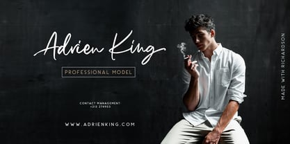 Richardson Script is a signature script with textured brush that contain stylistic alternate, underline, and a bunch of ligatures to create your own customized signature or logo design. Richardson is a signature font that you can use to make a logo for branding, beautiful fashion design, suitable for wedding invitations or handwritten quote. Also already PUA Encoded!
 - Wushin by Twinletter,
$15.00 Every design project needs fonts, and the WUSHIN Blackletter font is ideal for any that calls for a gothic touch. A great place to look for fonts for your most recent logo, label, badge, music video, or film is the WUSHIN Blackletter font! This font is ideal for any project that requires a bit of gothic flair. Its various lovely and harmonious shapes let you select the perfect word for your project.
 - Eradiate by Fontysia,
$20.00 "Eradiate" a trendy shiny font that comes in a shiny, regular, outline, shadow, extrude and background version. This font is a trendy display font that is perfect for social media or crafty projects. Use if for branding, crafts for decor, invitations, and more! All caps glyphs, numbers, and punctuation marks.
 - Coffee Matcha by Awan Senja,
$14.00 Coffee Matcha is a Lovely script font. It features a modern and elegant style that will take your designs to the next level. Whether you�re looking for fonts for Instagram or calligraphy scripts for DIY projects, Coffee Matcha will turn any creative idea into a true piece of art!