2,001 search results
(0.015 seconds)
- Carina Pro by RMU,
$35.00 Like Phenix out of the ashes the former Schriftguss hot-metal font „Rautendelein“ has come to live again. Carina Pro was carefully extended for multilingual use, and contains a few alternates which can be activated via the swash OpenType feature.
 - Altogether Ooky by Comicraft,
$19.00 It’s Creepy and it’s Kooky, it’s Altogether Ooky! Created by Comicraft’s Festering Fontmeister, John Roshell, for “The New Addams Family” TV series, Altogether Ooky is just The Thing you'll be looking for when Gomez and Morticia come knocking at your door.
 - FSY Deko by FSY Creative Lab,
$29.00 Introducing FSY Deko, a typeface inspired by the art deco style that you might be able to use for design projects with classic, retro, vintage styles to make it even cooler. It can also be used with contemporary design styles.
 - Sennit by AType,
$29.95It is not simple sennit. You know that such Russian lapti? It is footwear plaited of stripes a bark of a linden. My font too all is made from stripes. From the first up to last letter. Funny isn't it? - Deco Neue Wilde by Open Window,
$- Deco Neue Wilde is a filter font based on Deco, an original Open Window classic. It sort of speaks for itself but it reminds me of a lava lamp and the countless shapes that you could waste time watching appear.
 - Woodland Doodles by Outside the Line,
$19.00 An eye-pleasing collection of 31 Woodland Doodles. Illustrations of 11 trees--traditional and contemporary. A branch, animals, cabin, acorn, flower, leaves, mushrooms, bird’s nest, pine cone and birds on a branch. Coordinating nicely with Lake Vacation Doodles or Farm Doodles .
 - Bloomy by BrandCarry,
$19.00 Bloomy is a picture font consisting of 52 high quality flower shapes with clean outlines and a minimum of vector points. This unique set of natural forms may be well used in graphical design projects like brochures, advertisements, posters, etc.
 - Oz Handicraft BT WGL by Bitstream,
$50.99Oswald Cooper is best known for his emblematic Cooper Black™ typeface. Although he was responsible for several other fonts of roman design, Cooper never drew a sans serif typeface. But that didn’t stop George Ryan from creating one. Ryan saw a sans serif example of Cooper’s lettering in an old book and decided that it deserved to be made into a typeface. Ryan’s initial plan was to make a single-weight typeface that closely matched the slender and condensed proportions of the original lettering. While the resulting Oz Handicraft™ typeface proved to be very popular, Ryan was not satisfied with the limited offering. So, between other projects – and over many years – Ryan worked on expanding the design’s range. The completed family includes light, semi bold and bold weights to complement the original design, plus a matching suite of four “wide” designs, which are closer to normal proportions. Fonts of Oz Handicraft include a Pan-European character set that supports most Central European and many Eastern European languages. - Honest John's Shadow - Unknown license

- Charriot Deluxe - Unknown license

- Railyard Stencil JNL by Jeff Levine,
$29.00Railyard Stencil JNL is a stencil variant of Decal JNL that was set aside for a long time in a forgotten work folder. It's broad strokes and sharp serifs emulate the vintage look of old railway cars and other earlier forms of transportation. - Atomic DooDads RJH by bobarama,
$21.00 Blast into the past with Atomic DooDads, a set of 1950’s and 60’s-era dingbats. Baby boomers to late bloomers will enjoy this set of playful glyphs. Go get yourself a cup-a-joe and design the heck out of something.
 - Linotype Pegathlon by Linotype,
$29.99Linotype Pegathlon is an unusual, eye-catching typeface, perfect for headlines and short texts. The bold strokes have a mystical, Asian touch and allow a large range of applications. Whether a text should look exotic or esoteric, Linotype Pegathlon is an excellent choice. - Diva Doodles Too by Outside the Line,
$19.00Diva Doodles Too is more of Outside the Line's top selling font Diva Doodles. More girl things in a line drawn, playful style. Font includes clothes, purses, shoes, jewelry, glove, high heel, bikinis, hats, perfume, flowers and cocktails and the scripted word Diva. - Sweet Home by Font-o-Rama,
$19.00Sweet Home is a handemade font with stitching decorative symbols. The typeface follows grandma's way to use the needle. Three different pillows for this beauty: sansserif, serif and these cute little flowers for your backyard. And a key for your new home. - Contra Flare by Wiescher Design,
$16.50 Contra Flare is the organic design of my Contra family of fonts. It has beautiful curved endings – not serifs – that make it look like it was made out of flowers leafs. But still the font has an elegant look to it. Enjoy!
 - Queer Theory RegularTrial - Unknown license

- Christmas Card - Unknown license

- King Xmas Trial - Unknown license

- Cullens Shoes by Aboutype,
$24.99Decorative three-dimensional display font with cap and lowercase. Originally designed for a shoe company. Works with colors, gradients and filters. Cullens Shoes was designed for all media and works best at 30 point and above. Cullens Shoes requires subjective display kerning and compensation. - ITC Highlander by ITC,
$29.99ITC Highlander font is the work of Dave Farey and loosely based on the handwriting of the late American graphic artist and lettering master Oswald Cooper. ITC Highlander is a unique font family, but not so unusual that it is limited only to display applications. - Tubby by Suomi,
$19.00 Tubby came about when I made a book with Cooper Black as a headline font. I started playing with heavy forms, and as a result was Tubby. It has a fat and friendly feel, and with swash italics it is fairly versatile in use.
 - Sebaldus by RMU,
$25.00 The former hot-metal font Sebaldus Gotisch, a 19th century Berthold in-house design, was carefully redesigned and updated for today’s use. This font contains a long s which you can access by typing alt b or by using the historical alternate OTF feature.
 - Gothic Herbarium by 2D Typo,
$32.00 Ornamental font based on the Gothic Revival ornaments developed by Augustus Pugin (1812-1852). This is a collection of ornamental plants and flowers arranged in a convenient font file that may be always at hand. Decorate your projects with high quality and interesting ornaments!
 - News Ticker JNL by Jeff Levine,
$29.00 News Ticker JNL was inspired by some 1930s film footage of the famous electronic message sign that surrounded the New York Times building in Times Square. A blank panel is located on both the regular and broken vertical bars for use in spacing between words.
 - Max Stitch by Aboutype,
$24.99Similar to Erasurehead. Redrawn as in line, outline font for embroidery application. Works well with layers, colors, gradients and filters. Max was designed for all media and can be used in a wide range of point sizes. Max requires subjective display kerning and compensation. - Mangan Nova by Hoftype,
$49.00 Mangan Nova is the semi-condensed version of Mangan. Designed for strong headlines but with slender and economical proportions, it fosters space saving text applications while permitting very pleasant reading. Mangan Nova, as does also Mangan, comprises 14 styles and is well suited for ambitious typography. It comes in OpenType format with extended language support. All weights contain small caps, ordinals, ligatures, proportional lining figures, tabular lining figures, proportional old style figures, lining old style figures, matching currency symbols, fraction- and scientific numerals.
 - 20th Century German by Celebrity Fontz,
$24.99Ornamental initials superimposed on elaborate drawings of men and women in scenes from 20th Century German country life, with flowers, cottages, churches, and towns in the background. Includes one set of A-Z ornamental initials conveniently assigned to both the upper and lower case alphabet characters. - Radio Interference by Jeff Levine,
$29.00 The font Antique Slabserif JNL was run through a filter to create a design that looks like worn type at smaller settings or jaggedly distressed lettering in larger type heights. The end result is Radio Interference JNL, which is available in both regular and oblique versions.
 - Monde Libre by Elyas Beria,
$12.00 Monde Libre is a display typeface that exudes optimism, joy, and whimsy. I designed this typeface based on a sign in a clip from some old film footage I saw somewhere. It stayed with me as a typeface that evokes the France of my dreams. Enjoy!
 - Wedding Doodles by Outside the Line,
$19.00A font of 31 wedding icons... bow tie, shoe, bouquet, cakes, invitation, cupcakes, bon bons, wedding dress, tux, ring bearer, flower girl, suitcases, congratulations banner, balloons, garter, gift, cuff links, wedding bands, diamond ring. Use for a wedding shower flyer or make your own gift card. - Monogram Lovely by Yoga Letter,
$16.00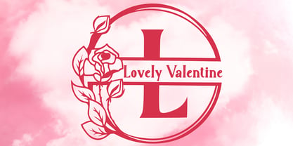 "Lovely Valentine Monogram" is a beautiful and elegant serif monogram font. This font is decorated with monograms combined with beautiful flowers. This font is equipped with uppercase, lowercase, ligatures, numerals, punctuations, and multilingual support. Very suitable for valentine, christmas, wedding, invitations, stickers, banners, posters, logos, and others.
 - Fontazia Mazzo by Deniart Systems,
$15.00 Fontazia Mazzo features a unique assortment of floral bouquets in abstract vases. A modern addition to any interior design layout or for any project where flowers say just the right thing! Like other type, these dingbats can easily be integrated into any text document or graphic program.
 - Bloktor Mosaik JNL by Jeff Levine,
$29.00Bloktor Mosaik JNL from Jeff Levine was at first a straightforward brick design sent to Typodermic's Ray Larabie for preview. Ray decided to run it through a filter to see what would happen, resulting in a font that emulates the look of cut stone or tile. - Erstwhile by Hanoded,
$15.00 I like posh English words - the ones you read in books, but actually never use. Erstwhile is such a word; it means ‘former’, but if you use it while talking to someone, it sounds quite odd. Erstwhile is a classy font family - crafted in Holland (with love!).
 - Fontazia Papilio by Deniart Systems,
$24.00 Create your fontisimo butterfly garden with this original fontazia typeface featuring 52 unique hand-drawn butterfly inspired flowers! Whether you're looking for a modern papillion fluttering about or a metamorphosis experience, bring all your butterfly garden fantasies to life with these subtly bold, subtly complex inspirations.
 - Margoth by Asterisk,
$33.00 Margot font family, has more than 1000 + glyphs in each font. The font includes advanced language support, fractions, table shapes, ligatures, and more. Perfect for graphic design and any display use. It can easily work for websites, signage, corporate, and editorial design. documents and folders, mobile interface.
 - Rutin Tutin NF by Nick's Fonts,
$10.00Schrifti Alphabeti, a delightful collection of Cyrillic typefaces for posters from the former Soviet Union, strikes again, this time with a way-out West (Vladivostok?) theme. Extrabold, extra wide and delightfully different! Both versions of the font include 1252 Latin, 1250 CE (with localization for Romanian and Moldovan). - Federal Case JNL by Jeff Levine,
$29.00Federal Case JNL is a stencil version of Government Issue JNL... adding the feel of industrial, military or high-level government espionage... From the lettering on a shipping crate to the cover of a secret folder of undercover plans, this font fits like a hand in a glove. - Naiche by Studio Sun,
$18.00 Naiche Font Family is a serif font with multi-weights experimental; it comes to 17 weights with five fonts master, from hairlines (Extra Thin) to Fat (Full). Each weight has a different style and contrast. The font was inspired by the classic 'Cooper' style, with an old-style form.


