10,000 search results
(0.055 seconds)
- Sovett by Twinletter,
$12.00 Introduces our new "Sovett" handwriting script font which is flexible in every typeface. This beautiful font you should use to create your perfect design work This font is designed with a natural touch of handwriting which is refined to create a portion and composition that suits your needs. So this font is suitable for craft, children's writing, adventure posters, food banner titles, wedding invitations, product packaging logos, quotes, social media page covers, furniture banner headlines, book covers, and much more.
 - Energize by Burntilldead,
$10.00 Energize is a sports font family with 3 weight (thin, regular, bold) & various styles of outline - extrude. The Italic styles bring another vibe of speed. This font family is built to bring active looks, racing, workouts, and other athletic activities. Its shape is rooted in the the competitive sports spirit. The Idea is to bring the dynamic shape mixed with weight , elevating athletic performance through progressive innovation of font, so whenever people see the font they think of hard work and sports.
 - Lentera Ramadhan by Dumadi,
$25.00 Hi There, Ahead of the month of Ramadan in the Hijri calendar, we have created a very amazing font. We have created the “Lentera Ramadhan” font in Hijaiya-like style and shape which is sure to make Ramadan greetings extraordinary with your best projects. equipped with Stylistic Alternate and SS01 which makes the font feel not monotonous. This font is perfect for those of you who create Ramadan poster projects, titles, banners, Instagram posts, holiday greeting cards, food menus, and other designs.
 - Rusthack by Arterfak Project,
$18.00 Rusthack is a friendly brush font, created with the playful feels of freestyle brush-lettering. This font comes from the manual brush stroke which has an informal stroke thickness that makes the font looks more natural. The versatile design, a combination of brush lettering, and handwriting that you can apply in many themes such as urban, apparel, youth, sports, holiday, food, fashion, vintage, you name it! Fonts featured : Uppercase Lowercase Numbers Punctuation Accented characters SS01 - SS02 Ligatures Thank you for watching
 - Posterama by Monotype,
$40.99 The Posterama™ typeface family contains 63 fonts and is a true journey through space and time. Designed by Jim Ford, each Posterama family contains 7 weights from Thin to Ultra Black, in 9 distinct families. What makes Posterama so unique and versatile are the eight alternative display families. By making use of a collection of alternative glyphs, Posterama sets an evocative flavor to visualize an entire century of futuristic reference points from art, architecture, poster design and science fiction into one family. Posterama Text is the base family. It has the most robust character set including upper and lowercase glyphs and pan-European language support (including Greek and Cyrillic). Note: all the other Posterama variants described below do not have lowercase letters or Greek and Cyrillic support. Posterama 1901 recalls the decoratively geometric style of Art Nouveau from the turn of the 20th century. Letterforms such as the slender, snaking ‘S’, the high-waisted ‘E’ and the underlined ‘O’ revive the spirit of Charles Rennie Mackintosh and the designers of the Viennese Secession. Posterama 1913 pays homage to the Armory Show, or 1913 Exhibition of Modern Art, which brought the revolutionary work of European artists such as Picasso, Duchamp and Kandinsky to the US for the first time to the shock and astonishment of press and public. Near-abstract, angular characters such as the ‘A’, ‘E’ and ‘N’ hint at cubism’s jagged and clashing planes. Posterama 1919 uses a small, but important, variation to set a tone when the Bauhaus was founded, and the surge in radical European typography that followed. The straight-sided, roundheaded ‘A’ adds a flavor of 1919 – this style of ‘A’ can still be seen in the Braun logo, designed in 1934. Posterama 1927 captures the year of Metropolis, The Jazz Singer and Paul Renner’s pioneering, geometric Futura typeface from 1927, which had a profound influence on design in the US and Europe. Posterama 1933 – With its low-waisted, sinuous designs, the Posterama 1933 typeface family echoes lettering of the Art Deco period, which in turn had its roots in Art Nouveau, the key influence on Posterama 1901. The two fonts make a great team and can be used interchangeably. Posterama 1945 features a few Cyrillic characters to conjure up an era when Russian art and political posters made their mark in cold war propaganda, espionage and also giant aliens and monsters. Posterama 1984 takes its typographic influences from George Orwell’s classic novel, publicity for the dystopian action and sci-fi movies (Blade Runner, Videodrome and Terminator) and games like Space Invaders and Pac-Man that made an impact at that time. Posterama 2001 was inspired by Stanley Kubrick’s science fiction masterpiece, which made extensive use of the Futura typeface. Posterama 2001 finds its cosmic orbit with its nosecone-style ‘A’ from NASA’s much-missed ‘worm’ logotype. There’s an echo, too, in Bauhaus designs from as early as 1920, whose minimalist, geometric lettering also featured a crossbar-less ‘A’.
 - Costa Std by Typofonderie,
$59.00 A mediterranean style sanserif in 4 styles The original idea of Costa was to create a contemporary mediterranean typeface style. Costa is a synthesis of the purity, as found on Greek capitals, and softness, found in Renaissance scripts. First thing was the design concept that take its roots on the Chancery script. Such writing style appeared during Italian Renaissance. Later few typefaces have been developed from such cursive models. Today most serifed typeface italic take their roots on such triangular structure we can find on gylphs like the n, p, or d. The Costa capitals remains close to pure sanserif models when the lowercases features an ending serif on many letters like the a, n, d, etc. This ending serif being more like a minimal brush effect, creating a visual contrast and referencing the exoticness of the typeface. Knowing that the Costa typeface family began life in the 90s as a bespoke typeface for Costa Crociere, an Italian cruise company — it suddenly makes sense and explains well why Jean François Porchez focused so much on Italian Chancery mixed to a certain exotism. The curvy-pointed terminals of the Costa n can obviously get find on other glyphs, such as the ending of the e, c and some capitals. So, the sanserif looks more soft and appealing, without to be to pudgy or spineless. The general effect, when set for text, remains a sanserif, even not like Rotis Semiserif. Costa is definitly not a classical typeface, or serif typeface which convey past, tradition, historicism as Garamond does beautifully. Because of the Costa crocieres original needs, Costa typeface was designed to be appropriate for any uses. Anytime you’re looking for good mood, qualitative effects, informal tone, cool atmosphere without to be unconvential or blowzy, Costa will convey to your design the required chic and nice atmosphere, from large headlines sizes, brands, to small text sizes. It’s a legible typeface, never boring. A style without neutrality which doesn’t fit comfortably into any typeface classification! Does it proves the novelty of its design and guarantees as well as its originality? Its up to you to be convinced. Barcelona trip Originally not planned, this need appeared because of a trip to Barcelona at the time of the project, where Jean François was giving a lecture. He wanted to pay an homage to that invitation to create something special. So, he designed during his flight some variations of the Spanish Ch, following ideas developed by the Argentinian type designer Rubén Fontana for his typeface called Fontana ND (published by the Barcelona foundry Bauer). Then, he presented during his lecture variations and asked to the audience which design fit the best to their language. They selected the design you can find in the fonts today. Read more about pairing Costa Type Directors Club 2000 Typographica: Our Favourite Typefaces 2004
 - Leonardo da Vincen by Ergibi Studio,
$19.00 Leonardo da Vincen Typeface Font type font with a style that is quite unique, has interesting features that can be used in many fields This font is inspired by the shape of a branch or a natural ornament that can be shaped vintage Leonardo da Vincen is also suitable for making quotes, logos, beverage label designs, badge designs, t-shirt designs, food / coffee packaging and movie poster designs.
 - Nagarawa by Beewest Studio,
$50.00 Nagarawa is an Asian style font, very suitable for various logotypes for Asian nuanced products, such as Asian food, martial arts clubs, music, novel and comic titles, apharel clothing and others.
 - AJ Quadrata by Adam Jagosz,
$25.00 Once, Blackletter was a calligraphy style. Full of ligatures, with letters bumping into each other to create an unapologetic picket-fence pattern. Some even claimed that the regularity improved legibility! But then Blackletter was cast into metal, and only a handful of established ligatures survived, while most interletter connections were disentangled. Everyone since followed suit, and hundreds of years later, digital Blackletter fonts were modelled mostly on the metal fonts that prevailed rather than the original handwriting. Up until now! AJ Quadrata is an authentic revival of the textura quadrata hand, and its major inspiration is a 15th-century Latin manuscript of the Bible from Zwolle, the Netherlands. The typeface is delivered in two flavors. The default cut is a modern take on textura quadrata that can be useful for today and tomorrow. The standard ligatures feature employs nearly all letters. The tittle of i retains its original, hasty squiggle form (except for the Turkish localization). Discretionary ligatures include medieval ligatures da, de, do, pa, pe, po (and their mixed-case counterparts!). Stylistic sets allow to use historic letter variants such as long s and rotunda r, closed-counter a, and alternate capitals. AJ Quadrata Medieval is perfect for setting Latin. Default forms of capital F, H and O are swapped with the alternates. The squiggles above i only appear for disamibiguation nearby m, n or u, as in original manuscripts. Discretionary ligatures and historic variants are promoted to the standard ligatures feature to make room in the discretionary ligatures feature for a variety of scribal abbreviations. Dedicated stylistic sets include medieval punctuation and justification alternates — glyphs with elongated terminals used for lengthening lines that end up too short. The Rubrum styles can be layered and colored to create the illuminated effect on the capital letters. Besides a faithful rendition of extended Latin including Vietnamese, numerous synthetic additions are included: polytonic Greek, Armenian, and Cyrillic (with Bulgarian and Serbian/Macedonian localizations). Both flavors of the typeface can be considered a starting point that can be further customized using OpenType features, including Stylistic Sets (some features differ between AJ Quadrata and AJ Quadrata Medieval): ss01 Alt E ss02 Descending F / Roman F ss03 Uncial H / Roman H ss04 Angular O / Round O ss05 Contextual closed-counter a ss06 Diamond-dot i j / Always dotted i, j ss07 Contextual rotunda r / No r rotunda ss08 Contextual long s / No long s ss09 Dotless y ss10 Serbian Cyrillic ss11 Alt Cyrillic de ss12 Alt Cyrillic zhe ss13 Alt Cyrillic sha ss14-ss17 [reserved for future use] ss18 Scribal punctuation ss19 Alt linking hyphen ss20 Justification alternates
 - We The People by K-Type,
$20.00 This typeface is extrapolated from the ‘We the People’ calligraphy of the handwritten US Constitution Preamble which employed a style based on German Text and Square Text exemplars from George Bickham’s penmanship copy-books, the most celebrated being The Universal Penman published in 1743. The original Constitution document was transcribed onto parchment by Jacob Shallus, a Pennsylvania Assistant Clerk, over a weekend in 1787. Shallus’s biographer, Arthur Plotnik (The Man Behind the Quill, 1987), notes that he was paid $30, a modest monthly wage at the time. He also suggests that the calligraphic headings, ‘We the People’ and ‘Article’, may have been inserted by Shallus’s 14 year old trainee son, Francis, “The manner in which the ‘Article’ headings are squeezed into the space Shallus allowed for them suggests a second hand—and perhaps not a very experienced one.” The unconventional backslant of the headings would seem to support this contention, and at the end of the document there is perhaps a novice’s inconsistency in the structure of the letter n between that used for ‘done’ and those used for ‘In Witness’. However, one has to admire the elegant swagger of the wavy t, h and l which the K-Type font extends to the b, f and k. Also, the simpler, Schwabacher-style W, an enlarged version of the lowercase w, is a little less flamboyant than the capital W from the German and Square texts in Bickham’s manuals. For designers using OpenType-aware applications, the typeface includes some Alternates, including a Bickham-style W, the letters t, h and n with added flourishes, two simpler forms of the A, and a few roman numerals for numbering articles. Also some ornamental flourishes and a round middle dot/decimal point. Punctuation marks are drawn in square, calligraphic style, but an alternative round period/full stop, for use with currency and numerals, is available at the period centered position (though placed on the baseline), accessed by Shift Option 9 on a Mac, or Alt 0183 on Windows. The full phrase, ‘We the People’, has been placed at the trademark keystroke and can be accessed by Option 2 (or Shift Option 2) on a Mac, or Alt 0153 on Windows. For designers who find the backslant awkward or unpleasant, the licensed typeface also includes two additional fonts which have a vertical aspect that may be more conducive to graphic design layouts. ‘We The People Upright’ and ‘We The People Upright Bold’ both retain the distinctive style, and the heavier weight is only slightly emboldened, just enough to add some punch.
 - Glamline by Tadiar,
$17.00 Glamline Font is classic and modern sans serif font carefully designed and well looking with Latin Extended character set. It is good for Text and Headers with lowercase and uppercase letters both! Glamline ideally works in luxury, fashion, cosmetics, wine and food areas. Please see the large preview images to see how it works.
 - Holland Matcha by Attype Studio,
$16.00 "Holland Matcha" – the handwritten font that adds a touch of organic elegance and warmth to your food and beverage brand. Elevate your identity with this unique, memorable typeface and make your culinary creations truly stand out. Explore "Holland Matcha" today for an unforgettable brand transformation. Features : - Holland Matcha Font - Multilingual, US Roman, Latin 1 Support
 - The Old Printing Press_free-version font by Fonts Cafe is a distinctive typeface that captures the allure and nostalgia of the vintage printing techniques from an era gone by. This font effortlessly ...
- Gadeg by Twinletter,
$10.00 Introducing the Gadeg sanserif font. special font with a unique and special shape adopts a modern minimalist style with a simple and elegant impression. We designed this san serif family font by paying attention to the combination of each letter to create a beautiful impression and appearance, making it easier to answer your needs, both formal and non-formal needs. This font is perfect for a wide variety of design projects, sporting events, branding, banners, posters, movie titles, food and beverage, technology, quotes, clothing, logotypes, and more. Of course, by using this font your various design projects will be perfect and amazing, because this font comes with a family of fonts, both for titles and subtitles and sentence text, start using our fonts for your amazing projects.
 - Therok by Twinletter,
$12.00 Introducing our newest font named Therok. We design this san serif family font with attention to the combination of each letter to create an elegant impression and appearance so that it makes it easy for you to use it according to what you need, both formal and non-formal needs. This font is powerful for your very extraordinary project. This font is perfect for games, sporting events, branding, banners, posters, movie titles, food and beverage, technology, quotes, clothing, logo types and more. of course, your various design projects will be perfect and extraordinary if you use this font because this font is equipped with a font family, both for titles and subtitles and sentence text, start using our fonts for your extraordinary projects.
 - Candyman by Robert Petrick,
$19.95 Bold, Playful headline and text font with fun alternate glyphs that you can access on the glyph palette through programs such as Illustrator etc. Good for many categories such as food and entertainment.
 - Nibbles by Typogama,
$19.00 Nibbles is a linear dingbat typeface inspired by the theme of food and food trucks. With symbols ranging from burgers, pancakes, or desserts, to food trucks and toilet signs, this font aims to cover all your hungry design needs! To help with its application, each pictogram can either be found through its glyph placement or by simply typing out the name of the food item. Type burger and presto, your burger pictogram will appear! With its simple application and extensive symbols, Nibbles can be used for branding, menus, editorial layouts, posters, and any food related projects.
 - Bukama by Twinletter,
$15.00 BUKAMA font is a faux Japanese font with a distinctive and unusual shape. If you use this font in a special project, it will look straight away and fit into the composition of the visual display that has an Asian design theme. Logotypes, food banners, branding, brochure, posters, movie titles, book titles, quotes, and more may all benefit from this font. Of course, using this font in your various design projects will make them excellent and outstanding; many viewers are drawn to the striking and unusual graphic display. Start utilizing this typeface in your projects to make them stand out.
 - Japan Gate by Senekaligrafika,
$12.00 "Japan Gate" is a Japanese-style display font inspired by traditional Japanese gate (Torii Gate) .This font is a sans serif font with a authentic japanese look and feel designed as unique as possible to create a beautiful and easy-to-read combination of sentences. This font is also very flexible for you to use in your various projects, ensuring that your project has a fantastic and appealing appearance that will be remembered by all audiences. Logotypes, food banners, branding, brochure, posters, movie titles, book titles, quotes, and more – may all benefit from this font. The owner of endless possibilities!
 - KOGAMA by Twinletter,
$15.00 Introducing Kogama, our newest Japanese-style inspired font, which was created specifically to carry the Asian font concept and will make your project look beautiful and appealing. Start utilizing this typeface to make your project stand out and be well received. Logotypes, food banners, branding, brochure, posters, movie titles, book titles, quotes, and more may all benefit from this font. Of course, using this font in your various design projects will make them excellent and outstanding; many viewers are drawn to the striking and unusual graphic display. Start utilizing this typeface in your projects to make them stand out. Caps only fonts.
 - Lemon Smash by Bogstav,
$18.00 Lemons here and lemons there - I really love lemons! I use them in foods, deserts and drinks. I even eat them just for the taste of it! And, I name a lot of my fonts something with lemon! This Lemon font has 3 different versions of each lowercase letter and comes in both Regular, Outside and Inside versions - use them as single fonts, or mix them for nice results! Go go Lemon Smash!
 - Moutarde by Hanoded,
$15.00 Moutarde is French for mustard. At home we don’t eat that much mustard, as it is a condiment that goes well with burgers and hotdogs. We eat Asian food a lot, so our hot sauce of choice usually is sambal. Moutarde is a good name for this fine, handmade font. Moutarde font is a rounded, easy to read, display font that comes with all the condiments - including a set of alternate a’s.
 - JollyGood Sans by Letradora,
$18.00 Finally, a serious alternative to that other comic font. After years of mocking the font that shall not be named, I decided to create an alternative. I wanted to keep the fun feel and the comic book roots, but have a more polished look. The result? JollyGood, a complete font family, with great language support, a big range of weights and styles, and a friendly look. Check out the other members of the JollyGood family
 - Locker Room by Tour De Force,
$30.00 Locker Room is display font available in single weight. Stable, compact and distinctive by design, Locker Room contains decorative half serifs that gives the font specific charm. It is intended to be used primary as font for sport clubs – from jersey, indoor and outdoor graphic, social network materials to merchandise and video clips. It also fits nicely for beverage and food labels and packages. Locker Room contains extended Latin character set with standard Ligatures.
 - Specials Board by Borderline Artistic,
$9.00 Specials Board is a clear, quirky handwritten display font in 6 weights. The font delivers a handcrafted personal feel and is great for clear messaging or to create an artisan, organic, natural aesthetic. Originally created for use in a coffee shop the font's handwritten playful nature allows it to work well across numerous use cases such as food and drink, retail, children / kids products and more. The font also includes alternatives for several glyphs.
 - RNS Pictografica Cocina by RNS Fonts,
$9.00 RNS Pictografica Cocina (Kitchen, culinary arts and food related font) it is comprised of 230 glyphs, it's based on a modular structure of a minimal thickness on lines and round corners, making a clean visually drawing, give importance to the surround white for improve contrast. The font is better used on a big white canvas for achieve visual focus. And in great sizes for more impact, however the font is legible even at small sizes.
 - Loophole by ArtyType,
$23.00 Loophole is a visually striking display typeface in 3 weights (Light, Regular & Bold), its DNA firmly rooted in the Cyclic Sans family which makes the perfect foil to this somewhat decorative font styling. The Loophole name is quite simply based on the ubiquitous hole motif, which is strategically deployed on each character across the 3 font styles. Each font contains an extended Latin character set covering Western & Central Europe, the Baltic States & Turkey.
 - Daux Lavande by Putracetol,
$23.00 Daux Lavande - Display Font is a vintage script font with a groovy and bold style that captures the essence of retro aesthetics. This font is perfect for creating a nostalgic and eye-catching visual impact in various design projects. Its unique character and vintage charm make it an ideal choice for food and beverage branding, stickers, posters, and other businesses seeking a touch of vintage flair. Daux Lavande comes with a range of features that enhance its usability and versatility. With Daux Lavande - Display Font, you have the freedom to create captivating visuals for your food and beverage branding, sticker designs, posters, and more. Its vintage script style adds a nostalgic and authentic touch to your projects, while the bold and groovy appearance grabs attention and creates a vibrant visual impact. Install this font on different operating systems, including Windows and macOS, and utilize it across various design applications to achieve the desired aesthetic and enhance your branding efforts.
 - Burger by Lián Types,
$25.00 Inspired in the world of the fast-food, my aim with Burger was to achieve a sexy slab serif font. Since it's not very common to see slabs with swashes I consider this project as an experiment with interesting results. In order to mantain an even weight on the written word, all the glyphs including the swashy ones had to look like compact blocks: This makes the font work much better used with almost no leading, as seen in posters above. Despite the formal look of its genre, this slab serif is also very playful and unique. (Maybe unhealthy food deserves better fonts already, right?) Taste Burger, come on, give it a try! On a more personal note: Why I made this font? Some months ago I started the gym and with it, an strict diet to see some results faster... Maybe my temptation is being, in Lacanian terms, "sublimated" by making delicious and unhealthy fonts.
 - Juki by Illushvara,
$14.00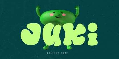 Juki is a handwritten font with bold display fun character. The groovy letters make this font great for logotype, headline, poster film, food packaging, magazine, labels or any type of advertising purpose. FEATURES : Uppercase, Lowercase, Number, Punctuation, Multilingual, PUA Encode, Opentype. If you have any question, don’t hesitate to contact me. Happy Designing !!! Thank You, Illushvara Design
 - Electra by Linotype,
$40.99 Venecian Old Face fonts had a strong influence on typeface design in the 1930s and 1940s in England. Such influence is evident in the font Electra, designed by William A. Dwiggins for Linotype in 1935. Electra combines its classic roots with the Zeitgeist of the 1930s, also displaying characteristics of the Bauhaus and Art Deco styles.
 - Chika Tattoo by Otto Maurer,
$25.00 This Font is the Sisterfont of Chinotattoo. The different is the thorn in every letter! Chika Tattoo is best for all Tattooartists and Tattoofans.You can use it to make Tattooflashs for your Tattoostudio. Chika Tattoo is a typical Tattoostyle Font. The Chinostyle comes from the Gangs of the USA (with latin roots) They often have Chist-Symbols.
 - Adieu Two Pro by Hackberry Font Foundry,
$24.95 AdieuTwo is a radical revision of Adieu which was a revision of my original font, Chivalry, that was traced from Chevalier back in the mid-1990s. Its roots are obvious, but this one has small caps, small cap figures, oldstyle figures, ligatures, and more. This is a thoroughly up-to-date font ready to be used for stylish heads.
 - Baby Tokyo by Skinny Type,
$14.00 Baby tokyo is a, bold handwritten font with an modern style. This font is PUA encoded which means you can access all of the glyphs and swashes with ease! It features a varying baseline, smooth lines, gorgeous glyphs and stunning alternates. Fall in love with Italian Foods' incredibly versatile style and use it to your favorite design projects!
 - Muffin Cake by Raditya Type,
$11.00 Muffin Cake is a suitable font when used for logos and product names. Especially products related to the world of children who are fun and cheerful. Such as food products, toys, or institutions related to the world of children, such as children's school names, the world of parenting. This font is also suitable for brand playgrounds.
 - Obscura by Rook Supply,
$17.00 Obscura is a powerful and gritty grunge font that every designer should have in their font arsenal. Each letter has a ton of rough texture, which will add a whole new layer of detail to your design project and give it a bit more of an modern edge. Try it out for everything from album covers to food labels.
 - Peter Marker by Gassstype,
$25.00 Hello Everyone, introduce our new product Peter Marker It Is Simple Marker Font with a natural feel. This handmade font will make your design has a beautiful natural touch for each details. It is perfect for any design project as Invitation,logo, book cover, craft or any design purposes. Peter Marker is Inspired by Food Logo style and combination.
 - The font by Jérôme Delage is a striking and distinctive typeface that showcases the artistic flair and creativity of its designer. This font is characterized by its brush-stroke texture, which give...
- Spike, a captivating font creation by Stephen Bird, eloquently juxtaposes the raw, energetic spirit of urban art with meticulous craftsmanship. This font embodies a dynamic interplay of aggression an...
- Cindy FA by Fontarte,
$39.00 Imelda Marcos, Cinderella - welcome to the club ... A picture font containing over sixty shoes, slippers and boots, fashionable yesterday, today and maybe tomorrow. Hand drawn by a designer Magdalena Frankowska. Not only for fetishists.