10,000 search results
(0.265 seconds)
- FS Silas Sans by Fontsmith,
$80.00 The great enigma There are hidden depths to FS Silas Sans. First impressions are of a functional, multi-purpose typeface with a cool, edgy, angular character. Gaze into its eyes a little longer, though, and you'll detect a more nuanced, colourful personality, with full, open, satisfyingly squarish forms balancing the abruptness of the sharply-angled terminals and ascenders. Authoritative, official and stern on the outside; amiable and welcoming on the inside. You’re so Dane The designers, led by Phil Garnham, were trying to capture something straight-talking, authentic, and a little... Scandinavian. ‘We were thinking about some of the characters in Danish dramas that were on in the early stages of the font’s development, like The Killing and The Bridge,’ says Phil. ‘The police officers, that is, not the psychopathic killers. Smart and a bit cool, but with a warm heart.’ For a good Danish name, we settled on Silas. It was that or Hans-Christian. The finer points Silas Sans rewards close inspection. Study, if you will, its amply squarish forms, the roomy ‘o’ and ‘e’, in particular. Observe the angular ascenders and terminals of, for example, the ‘L’, ‘I’, ‘d’ and ‘i’, inferring the movement and lift of a pen. Consider the cuts to the ‘A’ and ‘v’ that create harmony with adjacent letters. And scrutinise the subtle ink traps set within the ‘A’ and ‘Y’ for reproduction at small sizes. A fine subject, we think you’ll agree, and available in a versatile range of weights to make (with FS Silas Slab) a typographic system with a comprehensive hierarchy.
 - Kari Display by Positype,
$49.00 Kari Display is the product of a long standing idea I had to give the well-received Positype typeface, Kari, plastic surgery. Just referring to giving a typeface plastic surgery, or letter lipo, stuck in the back of my head until I was able to pick the project up. The ultimate objective was to refine Kari Display to a point where each glyph was expressed as simple as possible... and in that simplicity a sexiness would appear. Kari is a beautiful script, but it is very 'controlled' and orderly and I wanted Kari Display to break that mold with much more movement, curviness, greater modulation and a more elegant feel on the page. I did not want to take it too far, limiting the use of the typeface, but rather opted for a delicate balance of thick and thin against the added movement of the glyphs. The wealth of sketches and proposed variants during the concepting phase was encouraging and I really pushed to add as many alternate characters, ligatures, swashes (and more) as I possibly could. Just about every character has at least one or more alternates AND the complete offering of alternates completely covers a wide range of Latin-based language groups including Central European diacritics. If you are using any type of OpenType enabled application, then the Kari Display Pro typefaces are the way to go. They include everything found in the 3 separate variants for each style as well as entirely expanding offering of additional swash and ligature sets.
 - Cloverside by IKIIKOWRK,
$17.00 Proudly present Cloverside - Vintage Label Font, created by ikiiko. Where timeless elegance meets vintage charm in the world of typography. This exceptional font is a nod to the classic label style, meticulously crafted to add a touch of nostalgia to your designs. With its seamless blend of sophistication and retro flair, Cloverside captures the essence of a bygone era while maintaining a contemporary edge. Give yourself to the charm of two unique looks: the striking and adaptable Regular font and the minutely detailed Inline font. Every word is a unique piece of art, painstakingly created to convey the feeling of fine craftsmanship found in old-fashioned labels. This font is very suitable for making a vintage or retro stuff, magazine layout, book cover, food & beverages packaging, quotes, or simply as a stylish text overlay to any background image. What's Included? 2 Styles : Regular & Inline Uppercase & Lowercase Numbers & Punctuation Multilingual Support Works on PC & Mac
 - Pluto by HVD Fonts,
$40.00 Pluto - and its straight companion Pluto Sans - was designed by Hannes von Döhren. The whole family consists of 16 Pluto Uprights, 16 Pluto Italics, 16 Pluto Sans Uprights and 16 Pluto Sans Italics; 64 fonts in all. Type designer Hannes von Döhren has created Pluto, a sweet type family consisting of 16 Uprights and 16 Italics; 32 fonts in all. The fonts are informal and friendly at first sight and lend themselves to display settings, however the straight and upright architecture of Pluto also makes it perfect for longer copy. Because of its large x-height, it even performs nicely in very small sizes. This contemporary type family is ideal for use in retail, cosmetics, food and hospitality applications and advertising. Pluto is equipped for complex, professional typography. The OpenType fonts have an extended character set to support Central and Eastern European as well as Western European languages. Each font includes alternate letters, fractions, lining-, tabular numbers, scientific superior/inferior figures and a set of arrows.
 - Tintoretto by profonts,
$41.99 Tinteretto is a very beautiful, decorative Art-d�co font which is ideal for ad design about fine arts events and the world of arts and crafts as well as in restaurants, bars and for food packaging. Tintoretto harmonizes well with serif and sans serif fonts created at the beginning of the last century. It contains character sets for West and Central European as well as for Romania and Turkey. When Unger started his work on Tintoretto, he had the splendid idea of adding a Fill version to the original 3D characters. Combining both fonts make it even stronger and more beautiful. How to combine both fonts in order to achieve a color fill effect: Type your word or phrase and do not make any changes to the spacing or kerning. Duplicate or copy the original and change it to the Fill version (font change). Apply a color to the copy and position it exactly behind the original. See and love the result.
 - Antoge by Twinletter,
$12.00 Antoge is a handwritten script font with a pretty and cute feel but is still beautiful and elegant to use. This font has its own charm for you to use as a title, write names, words and sentences which of course look good and charming, and certainly this font is not only limited to that purpose but is also very special for every need of your project, be it a project. formal and non-formal, this font is still beautiful and elegant. Start creating incredible designs with this font! This captivating font also offers harmoniously beautiful abstract typography for a wide variety of design projects, including digital natural handwriting for designs, design quotes, for social media business designs, advertisements, trademarks, food and beverage promotion banners, text, posters, a signature. , and all designs require handwriting or whatever design you want. What's Included: Font file Standard glyph Binder Works on PC & Mac Simple installation It can be accessed in Adobe Illustrator, Adobe Photoshop, Adobe InDesign, and even works in Microsoft Word. PUA Encoded Characters - Fully accessible without additional design software. Fonts include multilingual support for; Afrikaans, Albanian, Croatian, Czech, Danish, Dutch, English, Estonian, Finnish, French, German, Hungarian, Italian, Norwegian, Polish, Portuguese, Slovak, Slovenian, Spanish, Swedish
 - Danielle BF by Bomparte's Fonts,
$40.00 When I first saw the scrapbook pages of Danielle Paradis, I was immediately struck by the funky-cool distinction of her handwriting style. I was inspired and felt moved to ask her for samples, from which to build a complete font. This warm and friendly font is applicable to a wide variety of uses. Use it wherever a casual cool look is desired. It's right at home on trendy restaurant menus, children's publications, organic food labels, correspondence and of course, scrapbooks, to suggest a few. A number of stylistic alternates are included.
 - Fuggles by TypeSETit,
$59.95 Take a little Inspiration, mix in some Sassy Frass and a splash of Waterfall; add hundreds of alternate forms and you have the recipe for a versatile hand writing font. This fun, scribbly little font can fool you. At first glance it looks crude and simple. But, with over 1600 glyphs, combine the right character pairs and suddenly Fuggles is a powerful script that can be used for sophisticated commercial design. Some characters are quirky, some are swashy, some are scribbly and others are elegant. So take a look at the world of Fuggles.
 - Evil Schemes by Comicraft,
$19.00 Big Brother is watching you and vile Supervillains are afoot! The cunning characters involved in this font have devised a convoluted Machiavellian plot for world domination that encompasses mind parasites, twitter, deadly viruses in the public water system and possibly a nuclear dirty bomb in a downtown Metropolitan area to which they've strapped your girlfriend and a digital clock rapidly counting down to zero! Will Good Triumph and Defeat Evil?! Stay tuned... Features: Four fonts (Regular, Italic, Bold & Bold Italic) with upper and lowercase characters. Includes Western European international characters.
 - Giulia by HVD Fonts,
$30.00 Giulia is a sweet type family consisting of 12 Fonts. It was created by Hannes von Döhren and published by HvD Fonts. Besides a fancy curly version there is a second version with a more straight architecture, still owning the same soft and friendly character. Informal and easy going at first sight and perfect for display settings, however the straight architecture of Giulia Plain also makes it nice for shorter to medium texts. This contemporary type family is ideal for use in retail, packaging, games, food, kids applications and advertising.
 - Kapsalon by Hanoded,
$12.00 It could be you’ve never heard of Kapsalon and I will forgive you for that. Kapsalon is a Dutch word, meaning ‘hairdresser’s’. Since 2003 it is also a very popular snack food, which consists of french fries, döner kebab, lettuce, sambal, garlic sauce and melted Gouda cheese, served in an aluminium tray. I have to admit that I have never eaten a Kapsalon myself, as I am not too fond of fast food. I named this font package Kapsalon, because, like its namesake, it consists of several unrelated elements that work really well when combined.
 - Hurdagif by Twinletter,
$14.00 Hurdagif is a feminine typeface that is lovely, graceful, and appealing. includes a range of letterforms integrated into OpenType alternatives, making your job more efficient. Let’s use this typeface to make your project seem great. This font is designed with a natural touch of handwriting which is refined to create a portion and composition that suits your needs. So this font is suitable for craft, children’s writing, adventure posters, food banner titles, wedding invitations, product packaging logos, quotes, social media page covers, furniture banner headlines, book covers, and much more.
 - Gadiani by Queenop Studio,
$12.00 Gadiani font is made into a nice and elegant font. Perfect for all your design projects, such as invitation cards, product logos, food brand logos, thank you cards, business card logos and more. Many alternatives will help you create whatever design you need like cute and girly handwritten letters and any other designs that require a beautiful handwritten touch! Enjoy :) Contains full set: -Uppercase -Lowercase -Alternative -Ligatures -Punctuation -Number -Multilingual support. Need help or have questions let me know. I'm happy to help. Thanks & Congratulations on the Design.
 - Moudy by Gassstype,
$23.00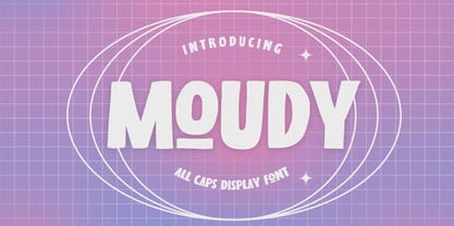 Hello Everyone, introduce our new product MOUDY is All Caps Display Font with a natural feel. This handmade font will make your design has a beautiful natural touch for each details. It is perfect for any design project as Invitation,logo, book cover, craft or any design purposes. MOUDY is Inspired by Food Logo style and combination with Unique Craft style. that will fulfill your design needs for quotes,sporty theme, logotype, wordmark, etc. This has many opentype features and support multi language. You can activate 7 Alternates glyphs OpenType panel.
 - Golden Grotesque by moriztype,
$10.00 Golden Grotesque - Designed by Moriztype. The whole family consists of 9 Golden Grotesque Uprights, 9 Golden Grotesque Italic, 19 fonts in all. The font is informal and friendly at first glance and perfect for any display setting, but the straight, upright Golden Grotesque architecture also makes it perfect for longer copies. Due to its large x-height, it even works well in very small sizes. Golden Grotesque - This contemporary type family is ideal for use in retail, cosmetic, food and hospitality applications and advertising. Golden Grotesque is equipped for complex and professional typography.
 - WALLRIDER, crafted by the talented Billy Argel, is a font that captures the raw energy and dynamic motion of urban street art. This typeface stands out due to its bold, assertive character, embodying...
- Bojimtes by Twinletter,
$12.00 Introduce Bomjites font. Calligraphy fonts are made by hand in detail on each letter character so that they can be combined with various kinds of writing design needs. This font is designed to produce lovely and beautiful words and sentences, creating beautiful writing has never been easier. Not limited to that, the bold calligraphy font is designed to keep paying attention to the beauty of each letter, there are alternate options for the letters which are certainly easy for you to access, so you can automatically customize the letters you want to enhance the visual appearance of your design project. This charming font also offers the beauty of abstract typography harmony for a wide variety of design projects, including digital natural handwriting for designs, quote designs, for social media business designs, advertisements, trademarks, food and beverage promotion banners, text, posters, a signature, and all designs require handwriting or whatever design you want. ============================================================================================================ What’s Included : File font Web Fonts Standard glyphs Ligature Works on PC & Mac Simple installations Accessible in Adobe Illustrator, Adobe Photoshop, Adobe InDesign, even work on Microsoft Word. PUA Encoded Characters – Fully accessible without additional design software. Fonts include multilingual support for; Afrikaans, Albanian, Croatian, Czech, Danish, Dutch, English, Estonian, Finnish, French, German, Hungarian, Italian, Norwegian, Polish, Portuguese, Slovak, Slovenian, Spanish, Swedish Thank you for your purchase! Hope you enjoy our font!
 - Grotesca by GroupType,
$19.00 Grotesca Extra Condensed™ defines the term ""extra condensed"". With some unusual design quirks, this sturdy design has roots in styles popular in 1920s Germany. First brought to market by the Fundicion Tipografica Richard Gans type foundry (1888-1975) in Spain, the designer of Grotesca is unknown and the font was formerly sold only in Spain.
 - Farm Bluster by Zeenesia Studio,
$14.00 Farm Bluster is a sweet and friendly handwritten font. Its natural and unique style makes it incredibly fitting to a large pool of designs. perfect for large design project like Tshirt, Advertising, bags, quotes, food , poster, fashion, custom sticker, magazine, and many others. It completed with numbers and punctuation. Multilingual support, and came with PUA encoded.
 - Fontazia Stiletto by Deniart Systems,
$20.00 The Fontazia Stiletto font was inspired by my personal obsession with shoes. This is a stylized version of some of the lovely footwear found in my personal closet as well as some of my equally obsessed friends. You'll find 52 assorted shoe illustrations ranging from sandals to boots, some a little strange, but all in good fun.
 - Joking Lemon by Bogstav,
$17.00 Joking Lemon is a playful sans serif font, which does really well with catch words or headlines that needs a casual and fun look. Both ascenders and descenders are pretty long, giving the text a kind of stretched look - but still very legible! Use Joking Lemon for toys, recipes, packaging, candy, birthday cards ... actually anything, even cat food commercials!
 - AT Move Frutta by André Toet Design,
$39.95 FRUTTA (Fruit) is a new typeface made with the ever expanding food industry in mind. But don’t let that deter you from using our font on the cover of the forthcoming cd of the Black Keys or Beady Eye or Damon Albarn or Paul Weller or Daft Punk or Whatever... Concept/Art Direction/Design: André Toet © 2017
 - Suiren by Scratch Design,
$9.00 Suiren is a handwritten font with a casual style. Suiren made for a casual design theme like summer vibes, sports, kids, food, beverage, quote, novel, book, etc. Feature: Uppercase & Lowercase Number Punctuation. Multilingual Support (ÀÁÂÃÄÅÇDÐEÈÉÊËIÌÍÎÏNÑOØÒÓÔÕÖUÙÜÚÛWYÝŸỲŸÆŒßÞþ) Support in Mac and Windows OS Easy to install We hope you like it and thank you so much for your purchase :) Scratch Design
 - French Fries by Red Rooster Collection,
$60.00 French Fries is a three-weight decorative font family. It was created and produced by Steve Jackaman (ITF) in 2017. French Fries has a casual, lighthearted, playful, hand-lettered look, and is food for the eyes at any size. The family is surprisingly versatile, and might be right at home on menus, packaging, and early education materials.
 - Konichiwa by Motokiwo,
$18.00 Brush textured with casual handwritten gesture, say hi to Konichiwa. This is hot and tasty font that very recommended for food branding such as Burger, BBQ, Coffee and Pizza. It's also great for fashion and cosmetic projects that need diversity. Features: Uppercase Lowercase Numbers & Punctuation Standard Latin Multilingual Support Ligatures Easy to use on any devices
 - Danizatti script by Slex Studio,
$15.00 I want to create a font, which is very elegant. So I made Danizatti Script, a kind of classic decorative script with a modern twist. This is a display font intended for vintage logos, fashion labels, custom card headers, badges, food packaging designs, especially wine labels. Actually a lot of great style was consumed when creating this type :) there are 300 fancy letter and punctuation glyphs. I also offer a number of viable stylistic alternatives for multiple letters. NOTE, that you will get full access to font options only in Open Type smart applications like InDesign or Illustrator. You can find more about how to access OpenType features in Adobe Apps here: http://fontfeed.com/archives/opentype-in-adobe-creative-suite-the-raiders-of-the-lost-glyphs-pt_1/ Check out my other elegant script fonts at the my frofile
 - Gumbo by Hanoded,
$17.00Lately I have been experimenting with different foods. At home, we eat a lot of Asian food, but I thought it would be nice to broaden my culinary horizon a bit. So far I have (successfully) added Georgian beef and walnut soup, Tacos (after a suggestion by my friend Stuart), Surinam Roti and various vegetarian dishes to our menu. When I created this font, I had to think of Gumbo - a dish I have never made. Gumbo is a handmade display font that comes in a rotund regular and an obese bold (with Italics). Use it for your book covers, product packaging and sticky notes. Gumbo comes with cute ‘end of word’ ligatures - just type the glyph + space and presto: you have a little swash. As for the dish Gumbo, well, I will make that this weekend! - Peanut Donuts by IKIIKOWRK,
$17.00 Proudly Present Peanut Donuts - Retro Bubble Type, created by ikiiko. Peanut Donuts is a font that perfectly encapsulates nostalgia, you can travel back in time to a time of delectable delicacies and mouthwatering delights. This retro bubble font, which was meticulously crafted, is the ideal option for your vintage products. The Peanut Donut blends your packaging, labeling, and advertising with delectably nostalgic appeal to bring the happiness and enjoyment of the past to the present. It instantly conjures up images of vintage cafes, soda fountains, and recognizable food trucks with its rounded corners and bubbly shapes. This typeface is perfect for an vintage stuff, retro poster layout, children book, comic, packaging, food & beverages and also good for quotes, or simply as a stylish text overlay to any background image. What's included? Uppercase & Lowercase Number & Punctuation Multilingual Support Works on PC & Mac
 - Steak by Sudtipos,
$59.00 Here I am, once again digging up 60-year sign lettering and trying to reconcile it with the typography of my own time. The truth is I've had this particular Alf Becker alphabet in my sights for a few years now. But in the typical way chaos shuffles the days, Buffet Script and Whomp won the battle for my attentions way back when, then Storefront beat the odds by a nose a couple of years ago. Nevertheless, revisiting Alf Becker’s work is always a breath of fresh air for me, not to mention the ego boost I get from confirming that I can still hack my way through the challenges, which is something I think people ask themselves about more often as they get older. You can never tell what may influence your work, or in this case remind you to dig it out of dust drawers and finally mould it into one of your own experiences. On my recent visits to the States and Canada, I noticed that quite a few high-end steak houses try their best to recreate an urban American 1930s atmosphere. This is quite evident in their menus, wall art, lighting, music, and so on. The ambience says your money is well spent here, because your food was originally choice-cut by a butcher who wears a suit, cooked by a chef who may be your neighbour 20 minutes from downtown, and delivered by a waitress who can do the Charleston when the lights dim and who just wouldn't mind laughing with you over drinks at the bar later. So Steak is just that, a face for menus and wall art in those places that see themselves in the kind of jazzy, noirish world where one-liners rule and exclamation points are part of a foreign language. As is usual with my lettering-inspired faces, there is very little left of the original Alf Becker alphabet. Of course, the challenges present in bringing typographic functionality to what is essentially pure hand lettering gives the spirit of the original art a hell of a rollercoaster ride. But I think that spirit survived the adventure, and may in fact be even somewhat magnified here. This font is over 850 glyphs. It’s loaded with ligatures, swashes, ending forms, alternates, ascender and descender variations, and extended Latin language support. Steak comes in 3 versions. According to your taste you can choose Barbecue, Braised or Smoked. It’s up to you!
 - Terror JNL by Jeff Levine,
$29.00Creepy...crumbly...spooky... that's Terror JNL. Originally an experimental outline font made in the early days of Jeff Levine's typographic work, it's been revised and properly spaced for the design professional. The font is based on Ray Larabie's 1990's freeware release Foo - and a hand-traced, weathered-look was applied to the letter shapes. There's no kerning and a limited character set - but Terror JNL is still perfect for any headline that depicts "things that go bump in the night"... - Analogue Pro by Ingo,
$42.00 very traditional forms strongly slanted italic consistant proportions extraordinary ligatures swashes alternate letters alternate figures lower case l with a hooked “foot” Believe it or not, there are hardly any sans serif fonts in which the lower case letter l also has the hooked form of an l. Instead, we readers have to constantly distinguish whether we are seeing an uppercase I or a lower case l — just take a look at the word “Illinois”... The ingoFont Analogue was developed for exactly this reason. The intent: To create a pretty much »ordinary«, even classical font with its most striking characteristic being the inclusion of the “crooked l.” As a model, I used the »mother of all sans serifs«, Akzidenz Grotesk from Berthold, with its beginnings going back to the 19th century. Analogue is so to say a new interpretation of Akzidenz Grotesk from ingoFonts. All characters — following the model — have been newly designed. And if you want to emphasize the shape of the hooked foot even more, you can also activate the alternate styles for d, h, m, n (Style Set 1). Conversely, the alternate a somewhat softens the “hooked” impression (Style Set 2). The slanted versions — it isn’t truly a real cursive font — are noticeably stronger with 13° than the italics in comparable fonts, and were given a round e with a mind of its own which distinguishes itself considerably compared to the upright characters in the overall appearance of the font. More modern and formal solutions in detail were chosen for some of the characters, for example the M was given lightly slanted sides; the a reflects the curves of the s; the “feet” of a, l and t match; the flared legs of K and R became a “foot”, too. General proportions were carried over almost completely with no changes from Akzidenz Grotesk as well as the slanted trimming on the open forms of a, c, e, s; in comparison, C, G and S were given straight endings. Analogue contains many ligatures, even discretional ligatures, plus proportional, old style as well as tabular figures. All in all, at first sight Analogue brings back memories of the charm of its well-known predecessor; and yet, many small differences give Analogue an unmistakable certain something...
 - Northy fifty by ryan creative,
$14.00 Creative greetings... Introducing the Northy fifty font which has a modern looking design. In this font there are additional arches at each foot of the letter so that it looks more elegant. Northy fifty has Alternate and Ligature that you can use in both modern and contemporary designs, and are suitable for use in a variety of fashion media, posters, modeling magazines, typography, promotions and other digital media. FEATURES; -Uppercase and lowercase letters. -Support Foreign, Numbers and Punctuation. -Alternative, Ligature -Regular & Italic. -Works on PC. -Simple installation. -Accessible in Adobe Illustrator, Adobe Photoshop. Adobe InDesign, it even works in Microsoft Word. -Fully accessible without additional design software. Northy fifty is coded with Unicode PUA, which allows full access to all additional characters without having to design any special software. Mac users can use the Font book, and Windows users can use the Character map to view and copy any extra characters to paste into your favorite text editor/app. Thanks for visiting, have a nice day ;)
 - Posterama by Monotype,
$40.99 The Posterama™ typeface family contains 63 fonts and is a true journey through space and time. Designed by Jim Ford, each Posterama family contains 7 weights from Thin to Ultra Black, in 9 distinct families. What makes Posterama so unique and versatile are the eight alternative display families. By making use of a collection of alternative glyphs, Posterama sets an evocative flavor to visualize an entire century of futuristic reference points from art, architecture, poster design and science fiction into one family. Posterama Text is the base family. It has the most robust character set including upper and lowercase glyphs and pan-European language support (including Greek and Cyrillic). Note: all the other Posterama variants described below do not have lowercase letters or Greek and Cyrillic support. Posterama 1901 recalls the decoratively geometric style of Art Nouveau from the turn of the 20th century. Letterforms such as the slender, snaking ‘S’, the high-waisted ‘E’ and the underlined ‘O’ revive the spirit of Charles Rennie Mackintosh and the designers of the Viennese Secession. Posterama 1913 pays homage to the Armory Show, or 1913 Exhibition of Modern Art, which brought the revolutionary work of European artists such as Picasso, Duchamp and Kandinsky to the US for the first time to the shock and astonishment of press and public. Near-abstract, angular characters such as the ‘A’, ‘E’ and ‘N’ hint at cubism’s jagged and clashing planes. Posterama 1919 uses a small, but important, variation to set a tone when the Bauhaus was founded, and the surge in radical European typography that followed. The straight-sided, roundheaded ‘A’ adds a flavor of 1919 – this style of ‘A’ can still be seen in the Braun logo, designed in 1934. Posterama 1927 captures the year of Metropolis, The Jazz Singer and Paul Renner’s pioneering, geometric Futura typeface from 1927, which had a profound influence on design in the US and Europe. Posterama 1933 – With its low-waisted, sinuous designs, the Posterama 1933 typeface family echoes lettering of the Art Deco period, which in turn had its roots in Art Nouveau, the key influence on Posterama 1901. The two fonts make a great team and can be used interchangeably. Posterama 1945 features a few Cyrillic characters to conjure up an era when Russian art and political posters made their mark in cold war propaganda, espionage and also giant aliens and monsters. Posterama 1984 takes its typographic influences from George Orwell’s classic novel, publicity for the dystopian action and sci-fi movies (Blade Runner, Videodrome and Terminator) and games like Space Invaders and Pac-Man that made an impact at that time. Posterama 2001 was inspired by Stanley Kubrick’s science fiction masterpiece, which made extensive use of the Futura typeface. Posterama 2001 finds its cosmic orbit with its nosecone-style ‘A’ from NASA’s much-missed ‘worm’ logotype. There’s an echo, too, in Bauhaus designs from as early as 1920, whose minimalist, geometric lettering also featured a crossbar-less ‘A’.
 - Costa Std by Typofonderie,
$59.00 A mediterranean style sanserif in 4 styles The original idea of Costa was to create a contemporary mediterranean typeface style. Costa is a synthesis of the purity, as found on Greek capitals, and softness, found in Renaissance scripts. First thing was the design concept that take its roots on the Chancery script. Such writing style appeared during Italian Renaissance. Later few typefaces have been developed from such cursive models. Today most serifed typeface italic take their roots on such triangular structure we can find on gylphs like the n, p, or d. The Costa capitals remains close to pure sanserif models when the lowercases features an ending serif on many letters like the a, n, d, etc. This ending serif being more like a minimal brush effect, creating a visual contrast and referencing the exoticness of the typeface. Knowing that the Costa typeface family began life in the 90s as a bespoke typeface for Costa Crociere, an Italian cruise company — it suddenly makes sense and explains well why Jean François Porchez focused so much on Italian Chancery mixed to a certain exotism. The curvy-pointed terminals of the Costa n can obviously get find on other glyphs, such as the ending of the e, c and some capitals. So, the sanserif looks more soft and appealing, without to be to pudgy or spineless. The general effect, when set for text, remains a sanserif, even not like Rotis Semiserif. Costa is definitly not a classical typeface, or serif typeface which convey past, tradition, historicism as Garamond does beautifully. Because of the Costa crocieres original needs, Costa typeface was designed to be appropriate for any uses. Anytime you’re looking for good mood, qualitative effects, informal tone, cool atmosphere without to be unconvential or blowzy, Costa will convey to your design the required chic and nice atmosphere, from large headlines sizes, brands, to small text sizes. It’s a legible typeface, never boring. A style without neutrality which doesn’t fit comfortably into any typeface classification! Does it proves the novelty of its design and guarantees as well as its originality? Its up to you to be convinced. Barcelona trip Originally not planned, this need appeared because of a trip to Barcelona at the time of the project, where Jean François was giving a lecture. He wanted to pay an homage to that invitation to create something special. So, he designed during his flight some variations of the Spanish Ch, following ideas developed by the Argentinian type designer Rubén Fontana for his typeface called Fontana ND (published by the Barcelona foundry Bauer). Then, he presented during his lecture variations and asked to the audience which design fit the best to their language. They selected the design you can find in the fonts today. Read more about pairing Costa Type Directors Club 2000 Typographica: Our Favourite Typefaces 2004
 - As of my last update in April 2023, "Pointened" by Holitter Studios appears to be a fictional creation or not widely recognized in mainstream font directories and discussions. Given that I cannot dra...
- Hornsea FC by Studio Fat Cat,
$18.00 Hornsea FC is a super condensed font family that designed for display purposes. 14 styles of Hornsea FC font will let you to explore more your creativity. Related keywords: modern font, branding font, logo font, magazine font, display font, packaging font, logotype font, contemporary font, elegant font, poster font, headline font, geomatric font, corporate font, serif font, sans serif font, classic font, advertising font, fashion font, editorial font, design font, vintage font, identity font, book font, text font, legible font, grotesk font, grotesque font, technical font, clean font, swiss font, webfont, web font, wordmark font, serif font, retro font luxury font, unique font, typography font, title font, playful font, signage font, german font, workhorse font, versatile font, neutral font, condensed font, expanded font, slab serif font, college font, sports font, sport font, slab font, football font, baseball font, athletic font, varsity font, soccer font, soccer font, basketball font, american font, ligatures font, wedding font, feminine font, classy font, chic font, script font, opentype font, contemporary font, oriq font, handwriting font, handwritten font, urban font, stylish font, fashion font, bold font, handmade font, casual font, trendy font, signature font, marker font, street font, font family,
 - Scythe, imbued with the sharpness of its namesake, evokes a blend of sleek modernity and impactful edginess in its typography. This font, mirroring the curvature and pointed ends of a scythe, embodie...
- PS Fournier Std by Typofonderie,
$59.00 Style and elegance in 14 styles PS Fournier, created by Stéphane Elbaz, is designed in tribute to Pierre Simon Fournier. Fournier was the prolific Parisian type designer whose work is best known for its iconic representation of French transitional style. PS Fournier elegantly represents the transition to the modern era of typography. Featuring three optical sizes, PS Fournier is designed to perform in any context. The Pierre Simon Fournier heritage Pierre Simon Fournier (1712—1768) was a leading innovative type designer of the mid-18th century. Early in his career, the young Pierre Simon developed a strong aesthetic that he cultivated throughout his life. His art is representative of the pre-revolutionary “Age of Enlightenment” (Siècle des Lumières). Precursor of the Modern style, Fournier’s body of work deeply influenced his times, and created the fertile ground from which the Didot family and Giambattista Bodoni developed their own styles. During the historical period of the 18th century, Fournier exemplified the intellectual pursuits of the times with his own research on type, documenting in detail the typefounding process. He also offered a unique vision: he is the first to clearly comprehend the concept of “type family,” sorting a set of similarly styled alphabets by sizes, width, and by x-heights. In addition, Fournier is one of the earliest advocates of the point system to organize the practice of typography, the point system that contemporary typographers continue to use to this day. The refined and discreet elegance of PS Fournier With a close look at the family, one finds you’ll find that the difference between the optical sizes (Petit, standard and Grand) is more than a contrast variation between the thin and the thick; the eye can also denote a palette of distinct tones: More streamlined and robust in the smaller sizes (Petit), more refined and detailed in the larger sizes (Grand). The PS Fournier standard family is designed to adapt to any situation with its intermediate optical size, from body copy to headlines. With a bit of tracking, PS Fournier Petit will make the smallest captions perfectly readable. However, Petit family is not limited to body and captions — its “slabby robustness” will make a relevant headline choice as well. PS Fournier Grand presents a higher contrast adapted to large text sizes, displays or banners. Its refined elegance makes it a perfect choice for Design, Fashion or Luxury publications. As a “modern” type PS Fournier Grand features a larger x-height than the preexistent old style typefaces such as Garamond or Jenson. These proportions provide any basic text set in PS Fournier Grand a strong typographic texture. As a result, the PS Fournier global family is a versatile alternative to the Modern typefaces commonly used in the publishing industry. The optical sizes, the large range of weights, and the design variations make this family adaptable to captions, paragraphs, and pages, as well as to large texts and displays. A leading-edge typography in the 18th century In the spirit of modernity, Pierre Simon Fournier did not find any use for the conventional swashes still produced by peers such as Caslon or Baskerville. Nevertheless the French designer created many inventive elements to decorate the page and set delightful variations in the text itself. To this regard PS Fournier includes a large set of glyphs variations, ligatures and more than one hundred glyphs for borders, rules and ornaments or — as called in French — “vignettes.” PS Fournier: A tribute to the French modern typography era by Stéphane Elbaz
 - The "Gothic Alarm Clock" font by The Font Emporium stands as a distinctive and evocative piece within the world of typography. Designed with an artistic blend of gothic sensibilities and a playful no...
- Sweater School by Typodermic,
$11.95 Introducing Sweater School, a typeface that feels like the friendly embrace of a warm sweater on a chilly day. With its casual pen strokes and relaxed letterforms, this inviting teacher’s typeface is perfect for anyone who wants to convey a sense of approachability and warmth. Sweater School is a unique typeface that draws inspiration from the print style preferred by elementary school teachers, but with significant improvements that make it easier to read and more pleasant to look at. We know how important it is to get your message across clearly, and that’s why we’ve created Sweater School with readability in mind. One of the standout features of Sweater School is its alternate characters, including a charming “J”, “I”, and “q”, as well as nut fractions (vertical fractions). These variations can be easily accessed through your application’s OpenType “stylistic alternates” capability, allowing you to add a touch of whimsy to your designs and make them stand out from the crowd. Sweater School is available in four weights and italics, making it a versatile choice for a variety of projects. Whether you’re designing a logo, creating a presentation, or crafting a social media post, Sweater School is sure to help you make a statement with its friendly, approachable style. So why not cozy up to Sweater School today? Let its inviting warmth and casual charm elevate your designs and connect with your audience in a whole new way. Most Latin-based European writing systems are supported, including the following languages. Afaan Oromo, Afar, Afrikaans, Albanian, Alsatian, Aromanian, Aymara, Bashkir (Latin), Basque, Belarusian (Latin), Bemba, Bikol, Bosnian, Breton, Cape Verdean, Creole, Catalan, Cebuano, Chamorro, Chavacano, Chichewa, Crimean Tatar (Latin), Croatian, Czech, Danish, Dawan, Dholuo, Dutch, English, Estonian, Faroese, Fijian, Filipino, Finnish, French, Frisian, Friulian, Gagauz (Latin), Galician, Ganda, Genoese, German, Greenlandic, Guadeloupean Creole, Haitian Creole, Hawaiian, Hiligaynon, Hungarian, Icelandic, Ilocano, Indonesian, Irish, Italian, Jamaican, Kaqchikel, Karakalpak (Latin), Kashubian, Kikongo, Kinyarwanda, Kirundi, Kurdish (Latin), Latvian, Lithuanian, Lombard, Low Saxon, Luxembourgish, Maasai, Makhuwa, Malay, Maltese, Māori, Moldovan, Montenegrin, Ndebele, Neapolitan, Norwegian, Novial, Occitan, Ossetian (Latin), Papiamento, Piedmontese, Polish, Portuguese, Quechua, Rarotongan, Romanian, Romansh, Sami, Sango, Saramaccan, Sardinian, Scottish Gaelic, Serbian (Latin), Shona, Sicilian, Silesian, Slovak, Slovenian, Somali, Sorbian, Sotho, Spanish, Swahili, Swazi, Swedish, Tagalog, Tahitian, Tetum, Tongan, Tshiluba, Tsonga, Tswana, Tumbuka, Turkish, Turkmen (Latin), Tuvaluan, Uzbek (Latin), Venetian, Vepsian, Võro, Walloon, Waray-Waray, Wayuu, Welsh, Wolof, Xhosa, Yapese, Zapotec Zulu and Zuni.