10,000 search results
(0.039 seconds)
- LD Hazard by Illustration Ink,
$3.00LD Hazard is a great handwritten looking font with bold strokes. - Rounded Keys by Funk King,
$5.00 Rounded Keys is a type font with a smooth, modern feel.
 - Tame by Suomi,
$25.00 This a headline font with three degrees of liveliness. Choose appropriately.
 - Stuyvesant by Image Club,
$29.99The Stuyvesant fonts include delicate incline alphabets with an engraved look. - Charmelade by Bogstav,
$17.00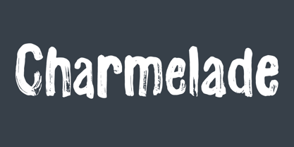 Another handmade brush font with that lovely green and organic feeling! :)
 - HeartBeats BH by BluHead Studio,
$20.00HeartBeats BH is a BluHead Studio font family with 1 style. - Empty Streets by PizzaDude.dk,
$15.00 Empty Streets is a brush made font with loads of attitude!
 - KG All Of The Stars by Kimberly Geswein,
$5.00 A whimsical star-themed font with letters inside a star shape.
 - Signs Of Faith by Fonts of Chaos,
$10.00 Signs of Faith maturity font for artworks. Make cash with it.
 - TB FireSigns by TrueBlue,
$12.00This font contains signs associated with fire safely and fire prevention. - Xantigo by PizzaDude.dk,
$20.00Xantigo is a fun, smooth and romantic font with rounded edges. - FourHand by JOEBOB graphics,
$20.00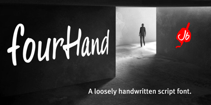 A friendly, legible, handwritten script font with a couple of ligatures.
 - Captain Blackbeard by Joanna Rzezak,
$14.90 Captain Blackbeard is a bold headline font with a western look.
 - Elamy MF by Masterfont,
$59.00 Intuitive freestyle handwriting font, with unique emphasizes on curves and rhythm.
 - Stuyvesant Engraved by Monotype,
$29.99The Stuyvesant fonts include delicate incline alphabets with an engraved look. - Tavern by FontMesa,
$25.00 Tavern is a super font family based on our Algerian Mesa design, with Tavern we've greatly expanded the usability by creating light and bold weights plus all new for 2020 with the introduction of extra bold and black weights Tavern is now a five weight family. The addition of the bold weight made it possible to go further with the design by adding open faced shadowed, outline and fill versions. Please note, the fill fonts are aligned to go with the open faced versions, they may work with the outline versions, however you will have to apply them one letter at a time. The Tavern Fill fonts may also be used a stand alone font, however, the spacing is much wider than the regular solid black weights of Tavern. In the old days of printing, fill fonts rarely lined up perfect with the open or outline font, this created a misprinted look that's much in style today. To create that misprinted look using two different colors, try layering the outline fonts offset over the top of the solid black versions. Next we come to the small caps and X versions, for a font that's mostly seen used in all caps we felt a small caps would come in handy. The X in Tavern X stands for higher X-height, we've taken our standard lowercase and raised it for greater visibility in small text and for signage where you want the look of a lowercase but it needs to be readable from the street. In August of 2016 I started the project of expanding this font into more weights after seeing the font in use where someone tried creating a bold version by adding a stroke fill around the letters. The result didn't look very good, the stroke fill also caused the shadow line to merge with the serifs on some letters. This lead me to experiment to see if a new bold weight was possible for this font and I'm pleased to say that it was. After the bold weight was finished I decided to type the regular and bold weights together in a first word thin second word bold combination, however the weight difference between the two wasn't enough contrast. This lead me to wonder if a lighter weight was possible for this font, as you can see yes it was, so now for the first time in the history of this old 1908 type design you can type a first word thin second word bold combination. So why the name change from Algerian to Tavern? Since the original font was designed in England by the Stephenson Blake type foundry I decided to give this font a name that reminded you of the country it came from, however, there were other more technical reasons. During the creation of the bold weight the engraved shadow line was sticking out too far horizontally on the bottom right of the serifs dramatically throwing the whole font off balance. The original font encountered this problem on the uppercase E, L and Z, their solution was a diagonal cut corner which was now needed across any glyph in the new bold weight with a serif on the bottom right side. In order to make the light and regular weights blend well with the bold weight diagonal cut offs were needed and added as well. This changed the look of the font from the original and why I decided to change the name, additional concerns were, if you're designing a period piece where the font needs to be authentic then this font would be too new. Regular vs. Alt version? The alternate version came about after seeing the regular version used as a logo and secondary text on a major product label. I felt that some of the features of the regular version didn't look good as smaller secondary text, this gave me the idea to create an alternate version that would work well for secondary text in an advertising layout. But don't stop there, the alternate version can be used as a logo too and feel free to exchange letters between both regular and alternate versions. Where are the original alternates from Algerian? Original alternates from Algerian are built into the regular versions of Tavern plus new alternates have been created. We're excited to introduce, for the first time, all new swash capitals for this classic font, you're going to love the way they look in your ad layout, sign or logo. The best way to access alternate letters in Tavern is with the glyph map in Adobe Illustrator and Adobe InDesign products, from Adobe Illustrator you can copy and paste into Photoshop as a smart object and take advantage of all the text layer style features Photoshop has to offer. There may be third party character maps available for accessing alternate glyphs but we can't advise you in that area. I know what you're thinking, will there be a Tavern Condensed? It takes a lot of hours to produce a large font family such as this, a future condensed version will depend on how popular this standard version is. If you love Tavern we're happy to introduce the first weathered edge version of this font called Bay Tavern available in February 2020.
 - Ico Weather by Setup,
$19.95 Ico Weather is a set of 115 symbols depicting weather, temperature, weather forecast and astronomy. To name a few, there are sun, clouds, rain, snow, thermometers, wind socks, tornados, volcanoes, weather warnings as well as symbol for raining fish. The style of Ico is inspired by the look of symbols used on the classic monochrome LCD displays. The symbols are monolinear with rounded corners, composed of a smallest possible number of elements. In addition, the rounded style is accompanied by a second style with sharp corners and more detailed drawing. All symbols of Ico share the same width, making the font compatible with the LCD typeface ION. Together, they are the perfect sollution for LCD style typography. Ico Weather is a part of a larger set. Have a look at the other available Ico fonts and don't forget to check back soon for even more additions.
 - Ico Time by Setup,
$19.95 Ico Time is a set of 115 symbols depicting time, clocks, watches and rhythm. To name a few, there are alarm clocks, binary watch, moon phases, calendars, 7-segments digits, hourglasses, sun dial as well as infinity symbol. The style of Ico is inspired by the look of symbols used on the classic monochrome LCD displays. The symbols are monolinear with rounded corners, composed of a smallest possible number of elements. In addition, the rounded style is accompanied by a second style with sharp corners and more detailed drawing. All symbols of Ico share the same width, making the font compatible with the LCD typeface ION. Together, they are the perfect solution for LCD style typography. Ico Time is a part of a larger set. Have a look at the other available Ico fonts and don't forget to check back soon for even more additions.
 - Garalda by TypeTogether,
$49.00 Type designer Xavier Dupré’s Garalda is a charming 21st century family that renews a legacy of finesse. As paragraphs on a page, Garalda’s overall impression is of a workaday personality, committed to the main purpose of the job: easy long-form reading. But setting it in display sizes proves something different: This reinvented Garamond is anything but basic. The Garalda story begins with the serendipitous finding of a book typeset in a rare Garalde, called Tory-Garamond, with which Dupré was not immediately familiar. This Garamond was used in bibliophile books in the decades surrounding 1920, but after that it became déclassé for an unknown reason. Dupré found the italic styles especially charming and discovered the family was probably the mythical Ollière Garamond cut from 1914. He obtained low resolution scans of the typeface and used them, rather than high resolution scans, as the basis for his new type family. This allowed Dupré the mental freedom to experiment and remix as he saw fit, culminating in a contemporary family with heritage. As seen in the simplistic rectangular serifs, Garalda is a humanist slab serif, but with a mix of angles and curves to give the classic shapes a fresh, unorthodox feeling. While almost invisible in paragraph text, these produce a graphic effect in display work. The set of ligatures in the roman and italics lend themselves to unique display use, such as creating lovely logotypes. In the italics, some swashes inspired by different historic Garamonds are included, sometimes breaking their curves to be more captivating. Just look at how the italic ‘*-s’ ligatures create ‘s’ with a cursive formation rather than merely a flowing slant. And how the roman ‘g’ link swings as wide as a trainer’s whip. These are all balanced by squared serifs in the roman to keep an overall mechanised regularity. The Garalda family comes in eight styles, includes some of the original arrows and ornaments, and speaks multiple languages for all typesetting needs, from pamphlets to fine book printing. The complete Garalda family, along with our entire catalogue, has been optimised for today’s varied screen uses.
 - ALS Kraft by Art. Lebedev Studio,
$63.00 A simple rough font. Kraft is a rough techno-style sans serif meant for setting text in all capitals. Instead of lowercase letters there are capitals of smaller height but with the same stroke width. They make tighter type. Characters are pressed really close together which creates the visual rhythm of very narrow and very wide openings. The wide strokes allow free use of graphics. This font is designed for putting on coarse surfaces, for breaking, crumbing, scratching, or making stencils on concrete.
 - Scratch That by Matthias Luh,
$25.00 “Scratch That” is a decorative font available in 16 different styles. All subfamilies are consistent in width, position and spacing, so multiple fonts can be layered to create even more variety - have a look at our Family Pack offers! We designed “Scratch That” with layered design in mind and for both good legibility at smaller sizes and perfect look at large dimensions. This allows widespread use: for fashion, headlines, flyers, food, packaging, posters, souvenirs, web design, invitations and many more...
 - VVDS Benigne Sans by Vintage Voyage Design Supply,
$14.00 VVDS Benigne Sans is geometric font family consisting of 8 weights ranging from Thin to Ultra Bold with matching italics. Balanced and gently Thin or fat and heavy Ultra Bold, good wide range of widths, which allow use this font not only as a Headers, also as sub-headers or block texts. Also, I love how it looks in infographics. VVDS Benigne Sans is latin-based multilingual and contains all mathematics symbols. OpenTypeFeatures Ligatures, alternates, old style numerals and fractions. Enjoy! VVDS
 - Heidth Variable by Arkitype,
$40.00 Heidth Variable has 2 styles, regular and slanted with varying extremes in width and height. It is designed as a display font for fun typographic use. Heidth is perfect for use in branding, posters, print campaigns packaging or what ever you need to have fun expressive typography. Wide or high, Heidth Variable is extremely versatile and works for any artwork layout and orientation. Please note: Being a Variable font, you will need software that supports variable fonts.i.e Adobe Illustrator, Photoshop etc.
 - School Type by STARSsoft,
$10.90 The decorative font "SchoolType" came straight from our school notebooks. We painted these letters in our notebooks, but now they can be printed on a computer. All uppercase Latin letters have the same width, which is ideal for designers. As always, we offer you a font with support for many languages. Standard and Latin Extended support such languages - English, Danish, Spanish, German, Norwegian, Polish, Portuguese, French, Swedish. Standard and extended Cyrillic are supported by languages - Russian, Belarusian, Bulgarian, Macedonian, Serbian, Ukrainian, Kazakh, Kyrgyz.
 - Regain by Fridaytype,
$17.00 Regain - Beautiful Serif Font Regain that is a font mix of old and new. This typeface has been made carefully to make sure its premium quality and luxury feel. The combination with the width of each letter forms a modern feel and is suitable for various magazines, logos, branding, photography, invitations, wedding invitations, quotes, blog headers, posters, advertisements, postcards, books, websites, etc. Feature - Regain (TTF) - Uppercase & Lowercase - Numerals & Punctuation - Multilingual - Ligature Drop any message if you any question, Thank you! Fridaytype
 - Interind Diary by Aminmario Studio,
$20.00 Introducing The new "Interind Diary" script font. A fashionable and super-chilled new handwriting font script with sexy stylish. Interind Diary font was created to look as close to a natural handwritten script as possible by including over 134 ligatures, and lowercase alternates.Comes with two styles of Regular and Italic. Mix and match lowercase regular with several lowercase alternatives to get your new ligature. Perfect for any awesome projects that need hand writing taste. With built in Opentype features, this script comes to life as if you were writing it yourself. It's highly recommended to use it in opentype capable software - there are plenty out there nowadays as technology catches up with design ... Other than Photoshop, Illustrator and Indesign, many standard simple programs now come with Opentype capabilities - even the most basic ones such as Apple's Text Edit, Pages, Keynote, iBooks Author, etc. Even Word has found ways to incorporate it. Thanks for checking out this font. I hope you enjoy it! AminMario
 - Moodie by LetterStock,
$25.00 Introducing "Moodie" - Your Retro Hand-Drawn Playful Font Bring a splash of retro playfulness to your designs with "Moodie," a font that exudes the charm of hand-drawn lettering. This font is your ticket to a whimsical journey back in time, perfect for posters, invitations, and branding projects that crave a touch of playful nostalgia. Key Features: Retro Hand-Drawn Whimsy: "Moodie" captures the whimsical essence of retro hand-drawn lettering, infusing your designs with a joyful spirit. Playful Vibes: Each character dances with a playful energy, making "Moodie" the perfect choice for designs that seek a lighthearted and retro aesthetic. Why Choose "Moodie": Craft posters that radiate a joyful retro vibe. Design invitations that set the stage for a celebration of playfulness. Establish a brand presence with a font that combines the charm of the past with a modern twist. Download "Moodie" Now and Infuse Your Designs with Retro Playful Vibes!
 - Patika by Plasebo Studio,
$29.00 Patika Typeface is a contemporary neo-grotesque font that combines modern aesthetics with functional legibility. Inspired by the timeless elegance of classic typefaces such as Helvetica, Futura, and Avant Garde, Patika offers a fresh take on the genre with its unique blend of clean lines, balanced proportions, and subtle details. Designed with utmost care and precision, Patika Typeface achieves a harmonious balance between width and height, particularly in its lowercase letters, ensuring optimal legibility across various sizes and applications. Its versatile nature makes it an ideal choice for a wide range of typographic needs, from eye-catching headlines to extensive blocks of text. Equipped with a comprehensive set of OpenType features, including alternative glyphs, fractions, arrows, ligatures, and more, Patika offers designers an array of tools to enhance their typographic compositions and add a touch of uniqueness to their designs.
 - Quiel by Ardyanatypes,
$15.00 QUIEL is a font inspired by modern and retro styles blended with elegance. With its dynamic shape, this font is suitable for any design to showcase a stylish, retro, or classic ambience. With nine available weights, QUIEL can easily be adjusted to suit various design preferences. The advantages of QUIEL are not only in its appealing appearance but also in its flexibility in terms of language. This font supports multiple languages, making it easy to use in different countries and languages. Furthermore, QUIEL comes with ligatures and alternate styles, which can enhance the visual appeal of your designs. The inclusion of alternative fonts also provides a range of options for combination. QUIEL is highly suitable for branding projects and various design needs, such as business cards, name tags, advertisements, posters, invitations, branding, logos, magazines, merchandise, and presentations. The unique modern letterforms of QUIEL allow for interesting combinations with various other font types. With its diversity and flexibility, QUIEL is the perfect choice to elevate the visual aspect of your designs, providing an elegant and captivating touch.
 - Night Visions by Wing's Art Studio,
$14.00 Night Visions: An Unsettling Hand-Drawn Brush Script Font Night Visions is a hand-drawn script font with a loose style typical of late night horror and thriller movie posters. It’s designed to look as though ink has been laid with the nervous flick of the artists brush, giving a random, imperfect, but elegant result. This font comes with the flowing script of the regular version or a complete set of non-script alternatives. Added to which there are additional character alternatives and special ligatures to experiment with for a truly hand-made look. Each version comes with a full set of uppercase and lowercase characters along with numerals, punctuation and language support. I recommend this font for anyone about to design a header or title that needs an authentically hand-made look. It’s the perfect choice for movie titles or posters, album covers, comic books, t-shirts or editorials. It’s a font that rewards experimentation and offers many options for your designs. Check out the visuals for usage ideas.
 - Synth2 by Pasternak,
$15.00 The font has a truly futuristic nature. It perfectly conveys the atmosphere of technology and futurism and it's the best choice for sci-fi and hi-tech topics and pictures. The font letters are unrounded, it's build is very simple and straight. The font includes 7 styles: thin, extra light, light, regular, medium, bold, and black. With the variety of font widths, there is the ability to make different combinations in graphic or web design projects as well. Carefully kerned letters look well in paragraphs and titles. Special attention to uppercase headings. The font counts 477 glyphs for each style. The thin style is free to use.
 - Gavora by Twinletter,
$12.00 Introducing the Gavora sans serif font. Modern strokes are the result of the harmonization of width and height, especially in lowercase letters, to support the best possible readability. Gavora Sans’ goal is to become a universal weapon not only because it works well in headlines, sorts, and long copy, but also because of its subtle neutrality. So that it creates a proportional text. of course, your various design projects will be perfect and extraordinary if you use this font because this font is equipped with a font family, both for titles and subtitles and sentence text, start using our fonts for your extraordinary projects.
 - Binomic by DearType,
$19.00 Binomic is a sort of monospaced font family. "Sort of" because it was not designed with the sole purpose of being used as a coding font, but rather as a nice alternative to monospaced fonts in graphic design projects. It's a friendly mix between your average fixed-width font and a more geometric, wider sans, thus more of a display font than a text one. The Binomic family has both upright and slanted versions, each in four convenient weights. The family is equipped with 480+ glyphs, has Latin Extended and Cyrillic support (both Russian and Bulgarian), oldstyle figures, as well as a set of cute technical characters, alternates and symbols. The Binomic family is clean, amiable and really versatile, so it will fit most design applications - from greeting cards, menus, merchandise, book covers and packaging materials to websites and apps. It is legible and modern, kind of sleek but without any pretensions.
 - Gritty Pencil by Hanoded,
$16.00 As the name implies, this font was made with a gritty pencil. Gritty Pencil comes with language support and a set of cool alternates for the lower case letters.
 - Thermometer by Woodcutter,
$55.00 Font Thermometer, with a shattered style, imitating the effect of an earthquake in your designs, ideal for posters, covers of your work, with an aspect of destruction and movement.
 - Moonllys by Ronin Design,
$15.00 Moonllys is serif font, designed with elegant and classy style. Moonllys also perfect for title and body text, with featuring ligatures and alternates will makes your design look stunning.
 - Stazin by Fo Da,
$50.00 Stazin is a display high-contrasted font comes with single-weight. Stazin supports many Latin based languages and Arabic language with almost 900 glyphs that covers many OpenType features.
 - Elgista by Zealab Fonts Division,
$10.00 Elgista is modern serif display font with design choices and a combination between high contrast, experimental, and brutalism style. Elgista comes with stylistic, alternates, ligatures and supports multilingual languages.
 - River Jade by Angele Kamp,
$24.00 River Jade a fresh signature font with lots of ligatures for that handwritten feel. And it comes with bonus clipart which will make designing so much easier and fun.
 - Butcher by RodrigoTypo,
$25.00 Butcher is a Rough font with 2 styles, a medium and a black to play with the weights, it contains the Greek and Cyrillic alphabet, special for action titles