10,000 search results
(0.036 seconds)
- Porchlight by Ana's Fonts,
$15.00 Porchlight is a soft serif font inspired by vintage French typography. It includes three weights: regular, semi bold and bold, with matching italics. It also includes bonus ornaments that complement the font beautifully, for elegant and easy designs. Included in this trendy font family: 6 fonts: regular, semibold and bold, plus italics, with over 300 glyps each, including small caps and lots of ligatures. ornaments font with 52 ornaments (13 different designs, mirrorred horizontally and vertically). borders font, with borders with different thickness. Use Porchlight in print layouts, logotype design, social media posts, branding and packaging.
 - Lancar by Twinletter,
$12.00 Lancar is a sans serif font family with lovely curving forms ideal for headings and text. The curves provide your project an exquisite and harmonious design, great for making your project look gorgeous. This font also comes with four families to help you with your job. With this typeface, you can make your project stand out. of course, your various design projects will be perfect and extraordinary if you use this font because this font is equipped with a font family, both for titles and subtitles and sentence text, start using our fonts for your extraordinary projects.
 - Regular Joe by GroupType,
$21.00 Regular Joe was first delivered to the font world by Ron and Joe. Yes, the same Ron and Joe of the ArtParts fame. A few years of being so regular, Regular Joe became, well, just bored. Regular Joe needed company. He wished for a family. After all, most of his font friends had big families. His wishes were granted by FontHaus. So Skinny and Husky were created to be with Regular and all together, they became Family Joe. All is well.
 - Ollivette Elite by Chank,
$59.00Fly your inner geek flag with this cool new "Eleet" typewriter font. It's kinda like a wonky internet translator that converts normal text into leet-speak, so you can exchange encoded love notes with cyber-hackers and goofy-gamers. The actual glyphs in this font are interchangeable with the more logical Ollivette typewriter font, but here the characters have all been moved around to create stylized interpretation of similar glyphs. So "ELEET" could also be typed "31337". Except you don't have to think about it. Get it? Got it? Good! 3NJ0¥ TH15 ƒØÑ+ & U53 !† 0FT3N. - Verao by insigne,
$24.99 Remember clear summer days as a kid? Remember open fields that you explored? Sun shining? Simple breezes sweeping past your face as you ran far and free? The feeling was uncomplicated and enjoyable. It was natural. That’s Verao, the simple spirit of summer. Alive and vibrant, Verao takes a turn away from the cold structure of today’s rigid creations and embraces the movement back to the value of things handmade. This artisan creation represents the rare, soul-invested fusion of the craftsman’s tools, materials, and hand movements, which shapes the solid--but beautifully defined--parts, pieces that, when put together, breathe a measure of life into everyday paragraphs and other bodies of text. Verao’s hand-written brush script, with its characters’ imperfect elegance and handmade quality, keeps your work looking organic. Write a word in more than a hundred different ways thanks to the large number of extra letters it offers. Two sets of lowercase alternative letters without connectors are included as is a set of swashed endings. Verao contains stylistic substitutions and ligatures, too, that you can combine however you like. Whichever way you design, the elements continue to appear balanced and separate and will undoubtedly add more personality to your design. So stop switching out cogs in your rigid set of fonts. Take time again to play with a natural face that’s both easy and energetic. Verao’s great temperament makes it a joy to design with. Let this spirit of summer take you away from the mundane. There’s a good chance Verao will lead you where you need to go. Production assistance from Lucas Azevedo.
 - Ruth Clair by Typetemp Studio,
$20.00 RuthClair Lovely Script Calligraphy whisk you away for a romantic rendezvous with your love of handwritten scripts. A little bit chic, a little bit classy, RuthClair is a must-have for any script font collection. this Fotn comes with alternatives and ligatures that create stunning logos, quotes, posts, blog posts. branding projects, magazine imagery, wedding invitations, and much more Features : Multilanguange PUA Encoded Web Font Included Contact me with an inbox message If you have any question. Thank you! Happy Creating.
 - The Junos by Maulana Creative,
$14.00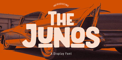 The Junos is a handwritten display sans font. With a bold stroke, rough and fun character with a bit of ligatures. To give you an extra creative work. The Junos font support multilingual more than 100+ language. This font is good for logo design, Social media, Movie Titles, Books Titles, a short text even a long text letter and good for your secondary text font with script or signature font. Make a stunning work with The Junos font. Cheers, MaulanaCreative
 - Fever Coaster by Maulana Creative,
$12.00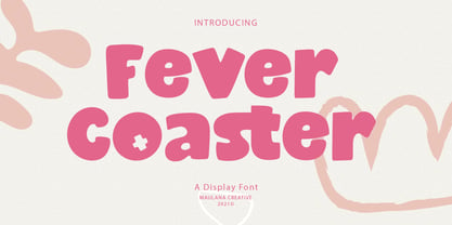 Fever Coaster Display Font is a casual handwritten font. With rough stroke, Condensed and fun character with a bit of ligatures. To give you an extra creative work. Fever Coaster font support multilingual more than 100+ language. This font is good for logo design, Social media, Movie Titles, Books Titles, a short text even a long text letter and good for your secondary text font with sans or serif. Make a stunning work with Fever Coaster font. Cheers, Maulana Creative
 - Belostika by Maulana Creative,
$14.00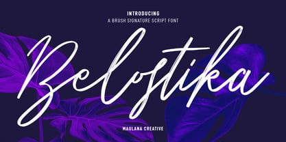 Belostika Brush Script Font is a modern smooth brush script font. With smooth brush stroke, fun character with a bit of ligatures and alternates. To give you an extra creative work. Belostika font support multilingual more than 100+ language. This font is good for logo design, Social media, Movie Titles, Books Titles, a short text even a long text letter and good for your secondary text font with sans or serif. Make a stunning work with Belostika font. Cheers, Maulana Creative
 - Frank Signature by Maulana Creative,
$12.00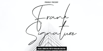 Frank Casual Signature Font is a modern feminine script font. With regular contrast stroke, fun character with some of ligatures. To give you an extra creative work. Frank Casual Signature Font support multilingual more than 100+ language. This font is good for logo design, Social media, Movie Titles, Books Titles, a short text even a long text letter and good for your secondary text font with sans or serif. Make a stunning work with Frank Casual Signature Font. Cheers, Maulana Creative
 - Hookypilots by Maulana Creative,
$12.00 Hookypilots Unique Handwritten Font Hookypilots is an expressive slanted handwritten display font. With bold stroke, fun character with a bit of ligatures and alternates. To give you an extra creative work. Hookypilots font support multilingual more than 100+ language. This font is good for logo design, Social media, Movie Titles, Books Titles, a short text even a long text letter and good for your secondary text font with sans or serif. Make a stunning work with Hookypilots font. Cheers, MaulanaCreative
 - Technique BRK Pro by CheapProFonts,
$10.00 I noticed this font for its versatile techno look - it makes wonderful logotype word images. Every letter combination is perfectly kerned so that the letters fit together nicely... Also includes some alternate letterforms, but only in their basic forms (not made in combinations with diacritics). These alternates are available via your programs' glyph palette or using the OpenType functions "Stylistic Alternates"/"ss02" and "Swash"/"ss01". Technique BRK Pro is the perfect companion for Technique Outline BRK Pro (it exactly fills the "holes") but also a nice techno font in its own right. ALL fonts from CheapProFonts have very extensive language support: They contain some unusual diacritic letters (some of which are contained in the Latin Extended-B Unicode block) supporting: Cornish, Filipino (Tagalog), Guarani, Luxembourgian, Malagasy, Romanian, Ulithian and Welsh. They also contain all glyphs in the Latin Extended-A Unicode block (which among others cover the Central European and Baltic areas) supporting: Afrikaans, Belarusian (Lacinka), Bosnian, Catalan, Chichewa, Croatian, Czech, Dutch, Esperanto, Greenlandic, Hungarian, Kashubian, Kurdish (Kurmanji), Latvian, Lithuanian, Maltese, Maori, Polish, Saami (Inari), Saami (North), Serbian (latin), Slovak(ian), Slovene, Sorbian (Lower), Sorbian (Upper), Turkish and Turkmen. And they of course contain all the usual "western" glyphs supporting: Albanian, Basque, Breton, Chamorro, Danish, Estonian, Faroese, Finnish, French, Frisian, Galican, German, Icelandic, Indonesian, Irish (Gaelic), Italian, Northern Sotho, Norwegian, Occitan, Portuguese, Rhaeto-Romance, Sami (Lule), Sami (South), Scots (Gaelic), Spanish, Swedish, Tswana, Walloon and Yapese.
 - Cutney by Twinletter,
$15.00 Introducing Cutney, a display typeface that has been meticulously developed to give the idea of a display that is fun, easy, and versatile to use. Use this font for your outstanding project, and you and your audience will be ecstatic to witness a stunning, proportionate presentation. Many viewers were taken aback, leaving you with a fantastic opportunity. This font is perfect for games, sporting events, branding, banners, posters, movie titles, book titles, quotes, logotypes, and more. of course, your various design projects will be perfect and extraordinary if you use this font because this font is equipped with a complimentary font family, both for titles and subtitles and sentence text, start using our fonts for your amazing projects.
 - Alt Robotechnica by ALT,
$20.00 Robotechnica is my first ever pixel font, I was experimenting with pixel fonts for a while and I’m happy with the result.
 - BK Monolith by Konst.ru,
$- Font with perspective for names, logotypes, titles, headers, topics etc. Font includes only uppercase letters with two alternative designs for each letter.
 - Dark Angel by Alphabet Soup,
$60.00 Selected as one of “Our Favorite Typefaces of 2013” by Typographica.org, Dark Angel is the first completely new take in decades on the traditional “blackletter” font style. It began its journey towards the light years ago when this style was born as a sketch for a new logo for the California Angels baseball team (renamed shortly thereafter the Anaheim Angels). The Angels logo never happened, but that sketch has risen from the dead and become the basis for this brand new font design—and was also the source for the name. It’s kind of blackletter in feel, but as a display font it’s so much more. It is far more legible than most “Old English” or “Gothic Script” styles, and incorporates many features never before seen in them, such as swashes, tails and a plethora of ligatures. Dark Angel can be purchased in its regular solid form, or as Dark Angel Underlight—a handtooled font. If these two fonts are purchased together, the Family package will contain a third font—Dark Angel Highlight. With this font layered over the basic font, you can achieve two–color typesetting when the highlight and the base font are assigned two different colors. Dark Angel has enough language support to make the builders of Babel envious—its 1,163 glyphs can be used to set copy in 59 different languages. From A to Z: Afrikaans, Albanian, Basque, Bemba, Bosnian, Catalan, Cornish, Croatian, Czech, Danish, Dutch, English, Esperanto, Estonian, Faroese, Filipino, Finnish, French, Galician, Ganda, German, Hungarian, Icelandic, Indonesian, Irish, Italian, Kalaallisut, Kamba, Kikuyu, Kinyarwanda, Lithuanian, Luo, Malagasy, Malay, Maltese, Manx, Morisyen, North Ndebele, Norwegian Bokmål, Norwegian Nynorsk, Nyankole, Oromo, Polish, Portuguese, Romansh, Sango, Shona, Slovak, Slovenian, Somali, Spanish, Swahili, Swedish, Swiss German, Turkish, Welsh, and last (but not least) Zulu. PLEASE NOTE: Dark Angel is a cross-platform font which depends to some extent on certain advanced OpenType features, therefore it can be used to its full potential only with programs that support those features. ADDITIONALLY: When setting Dark Angel one should ALWAYS select the “Standard Ligatures" and “Contextual Alternates” buttons in your OpenType palette. Please see the “Read–Me–First!” file in the Gallery section.
 - Salden by Canada Type,
$40.00 The Salden fonts are our tribute to the man who was dubbed the face of the Dutch book, and whose work is considered essential in 20th century Dutch design history. Helmut Salden’s exquisite book cover designs were the gold standard in the Netherlands for more than four decades. His influence over Dutch lettering artists and book designers ranges far and wide, and his work continues to be used commercially and exhibited to this very day. At the root of Salden’s design work was a unique eye for counter space and incredible lettering skills that never failed to awe, regardless of category or genre. This made our attention to his lettering all the more focused within our appreciation to his overall aesthetic. Though Salden never designed alphabets to be turned into typefaces (he drew sets of letters which he sometimes recycled and modified to fit various projects), we thought there was enough there to deduce what a few different typefaces by Salden would have looked like. The man was prolific, so there were certainly enough forms to guide us, and enough variation in style to push our excitement even further. And so we contacted the right people, obtained access to the relevant material, and had a lot of fun from there. This set covers the gamut of Salden’s lettering talents. Included are his famous caps, his untamed, chunky flare sans serif in two widths, his unique Roman letters and an italic companion and, most recognizable of all, his one-of-a-kind scripty upright italic lowercase shapes, which he used alongside Roman caps drawn specifically for that kind of combination titling. All the fonts in this set include Pan-European glyph sets. They’re also loaded with extras. Salden Roman (908 glyphs) and Salden Italic (976 glyphs) each come with built-in small caps (and caps-to-small-caps), quite a few ligatures, and two different sets of alternates. Salden Black and Salden Black Condensed (636 glyphs each) come with a set of alternates, and both lining and oldstyle figures. Salden Caps (597 glyphs) comes with a set of alternates, and Salden Titling (886 glyphs) comes with a quite a lot of swashed forms and alternates (including as many six variants for some forms), a few discretionary ligatures, and two sets of figures. There are also some form alternates for the Cyrillic and Greek sets included in all six fonts. These alphabets were enjoyably studied and meticulously developed over the past ten years or so. We consider ourselves very fortunate to be the ones bringing them to the world as our contribution to maintaining the legacy of a legendary talent and a great designer. The majority of the work was based on Salden’s original drawings, access to which was graciously provided by Museum Meermanno in The Hague. The Salden fonts were done in agreement with Stichting 1940-1945, and their sale will in part benefit Museum Meermanno.
 - Fruitygreen by Linotype,
$29.99 Fruitygreen is Indonesian designer Andi AW. Masry's second typeface following Coomeec™. Idiosyncratic but appealing forms are the signature feature of Fruitygreen™ and provide this new typeface with its truly distinctive character that you can utilize for your projects - and not just in headlines. The unique forms of fruits are not only individually fascinating, but are just as captivating when they are brought together, for example as decoration on a dining table. For Masry, these can be compared with an alphabet whose letters spell out in combination different words and with this as his inspiration, he based his designs for Fruitygreen on the versatile forms of fruits. However, it was not the whole fruits as such but rather small sections of their curves and ends that he decided to use. It is not only because of the characteristic line terminals that the rounded characters of Fruitygreen seem at first glance reminiscent of a brush-written calligraphic typeface; these are traces of the creation process, in which Masry used a digital brush. At the same time, Fruitygreen is by no means simply a brush font. Its dynamic characters reference biological forms and there is definitely something amoeba-like about them, particularly in the bolder variants, and they exude the same serenity and harmony that is inherent to organic structures. The many unconventionally shaped characters also provide for optical contrast. There is, for example, the very scaled down g", the open "q" and the lowercase "r", which has the form of the capital letter. Other letters, such as the sinuous "k" and the rounded uppercase "F" impart an exotic touch to Fruitygreen. Similarly remarkable is the "@", that has only a semi-circle. Available to the designer are other characters that can be used to accentuate a design, such as swash capitals and numerous ligatures. And, last but not least, there are also various numeral sets with oldstyle and lining figures for setting proportional text and table columns together with a selection of symbols, such as arrows and, appropriately, fruits. "
 - Equa by Thousand Type Works,
$15.00 Equa is a font based on strict grid rules. The name "Equa" comes from the equal widths of the vertical strokes, inner spaces and counters and spaces between glyphs. Its geometric construction gives it a technical look with an art deco sensibility. A system of three "weight-widths" based various sized grids gives flexibility in uses, from large condensed headlines to small blocks of text.
 - Miss Mable by Cory Maylett Design,
$25.00 Miss Mable is a high-quality, well-proportioned contemporary typeface with variations in thick and thin strokes that contains a hint of previous decades. I wanted to create enough weights and widths to make the typeface suitable for a wide range of uses where a soft, stylish, and friendly look is appropriate. The Miss Mable type family consists of 44 fonts. The family encompasses seven weights across three widths in Roman and italics plus variable versions. Each font contains a complete set of characters for Western and Central European languages. In addition, OpenType features include dynamic fractions, alternate glyphs, ligatures, plus proportional, tabular, and old-style numerals. These high-quality fonts are fully compatible with Windows, Macintosh, and Linux. Also for sale are two Miss Mable variable fonts that include all Roman and italic glyphs of every width and weight plus everything in between. For example, if you need something slightly bolder than bold and a little wider than semi-condensed, the variable fonts make that possible without distortion. Variable technology is new, however. All modern web browsers support variable fonts, but support for most desktop software is still spotty.
 - Loventica by Second Son Radiance,
$19.00 Loventica - Beauty Fashion Serif - Chic and Elegant Font Loventica is a beauty fashion serif font with a touch of elegance and charm. With same height for uppercase and lowercase, you can mix and match as you wish. Comes with condensed alternates and symbols It is perfect for your upcoming projects such as luxury logo and branding, classy editorial designs, woman’s magazines, cosmetic brands, art gallery branding, boutique branding, stationery design, blog design, modern advertising designs, card invitations, art quotes, home decor, book/cover titles, special events, and more. Loventica also support multilingual! Features : Basic Latin A-Z and a-z Numbers Punctuation Symbols Opentype Features Condensed Alternates PUA Encode Multilanguage Support I really hope you'll get pleasure using Loventica font and it will be perfect for your daily design! Contact me with an inbox message If you have any issue or question. Thank you! Second Son Radiance Std
 - Trippy Tarot by Mix Fonts,
$13.00 MIX TRIPPY TAROT is a witchy handwritten serif, sans serif AND a dingbat set. The perfect balance of cute and creep to complete any of your crafty woowoo, astrology, zodiac, mystic, spellbook, or magic projects. This family of fonts come with an abundance of glyphs, alternates and ligatures. The dingbat set is a collection of 36 doodles that perfectly go with the regular or serif Trippy Tarot font (or any other font, for that matter)! WHAT YOU'LL GET: Mix Trippy Tarot Regular Mix Trippy Tarot Little Sans Mix Trippy Tarot Dingbats Mix Trippy Tarot Regular comes with the following glyphs: ABCDEFGHIJKLMNOPQRSTUVWXYZ abcdefghijklmnopqrstuvwxyz 0123456789 !@$#%^&*()`~♥❤•· ÷×+−±≈=≠≥≤[]:;’”,.|/?{}“”‘’-–—_… ©®™‹›«»°¹²³ªº¡¿₱¢€£¥½¼¾¶§№† ÁÀÂÄÃÅĂĀĄÆĆĈČÇÐĐÉÈÊËĖĒĘĜĤIÍÌÎÏĪĮĴŁŃÑŇ ÓÒÔÖÕŌŐØŒŔŘŚŜŠȘŤȚÚÙÛÜŮŰŬŪŲẂẀŴÝŶŸŹẐŽŻÞ áàâäãåăāąæćĉčçðđéèêëėēęĝĥıíìîïīįĵłńñň óòôöõōőøœŕřśŝšșťțúùûüůűŭūųẃẁŵýŷÿźẑžżþß Ligatures: ee ff fl ft ll mm nn ss tt Alternate: Q Mix Trippy Tarot Regular comes with the following glyphs: ABCDEFGHIJKLMNOPQRSTUVWXYZ abcdefghijklmnopqrstuvwxyz 0123456789 !@$#%^&*()`~♥❤•· ×+−=[]<>:;’”,.\|/?{}“”‘’-–—_…©®™‹›«»°¹²³ªº¡¿₱¢€¥Þþß Fellow witches, enjoy!
 - Costumed Hero JNL by Jeff Levine,
$29.00 Comic books are filled with pages full of the daring adventures of crime fighters with colorful costumes, amazing abilities and wondrous powers. They have enthralled kids of all ages since the 1930s. Costumed Hero JNL emulates both the hand lettered cover titles of those vintage comics as well as the title credits from a 1960s television show based on one of these characters. With its non-conforming letter shapes and varying widths, the lighthearted look of classic comic title art can be yours. The font is available in both regular and oblique versions.
 - Sultan Ruqah by Sultan Fonts,
$50.00 Sultan Ruqah is a attracting font, Designed by Sultan Maqtari. This is one font of the Sultan Fonts families that supports a variety of scripts including Arabic, Persian, Urdu, Uthmani, and Kurdish. The Sultan Ruqah has its own family with 8 unique fonts varying in weights and width. All characters, punctuation and styling have all been improved keeping in mind the required feel and beauty of the font for a wide corporate use, The 8 fonts include lots of styles.
 - Mono Spec by Halbfett,
$30.00 Mono-Spec is a monospaced family of sans-serif type. At least in default settings, all characters across the typeface share a common width. That fixed setting is condensed, and the aesthetic style of Mono-Spec’s letterforms is very industrial. A sister family, called Mono-Spec Stencil, is also available. Its design strays away from the mechanical nature of Mono-Spec, and it channels the spirit of resistance and street culture. Mono-Spec ships in two different formats. Depending on your preference, you can install the typeface as a single Variable Font or use the family’s five static OpenType font files instead. Those weights run from Light through Bold. While the static-format fonts offer a good intermediary-step selection, users who install the Variable Font have vastly greater control over their text’s stroke width. The Mono-Spec Variable Font’s weight axis allows users to differentiate between almost 1,000 possible font weights. That enables you to fine-tune your text’s exact appearance on-screen or in print. Whatever format you choose, the Mono-Spec fonts are equipped with several OpenType features. The most striking of these can be activated via a Stylistic Set. That will replace several letters – like “B”, “E”, “F”, “H”, and “I” with double-width alternates. Those alternates take up as much space as two characters placed next to each other otherwise word. The effect of Mono-Spec’s double-width alternates is striking, and their use strikes a strong chord in any display typography applying them.
 - Denominary by Balibilly Design,
$19.00 Denominary typeface is about precision, beauty, and refinement. It's crafted with care and attention to detail for professional creative people who value quality and distinction. The Denominary typeface has an advanced feature that sets it apart from others: auto-active contextual alternates. Our font engineer writes this feature to minimize kerning between characters automatically, making it very convenient and easy to use, especially for web purposes where minimal kerning means a smaller font size. The feature adjusts the kerning based on the specific characters being used, ensuring optimal spacing between letters. Contextual alternates will push your typography project to a balanced form. We designed the letterform by considering the white space and contrast to get a natural voice and fluid, and of course, this will happen in a legible and stylish. Denominary typeface offers extensive language support and stylistic variations, thanks to its 482 glyphs. It also has discretionary ligatures, case-sensitive forms, and slashed zeroes for added typographic options. The condensed style saves space, and seven weights will provide more options. Denominary typeface brings refinement, exclusivity, and sophistication to any design project. It's a typeface that tells a story of precision, beauty, and distinction. Go ahead with the game in terms of its advanced auto-active contextual alternates feature, giving you a competitive edge in the design field.
 - Amellia by Haksen,
$12.00 Hello Font lovers, I just released my new font with the name "Amellia" "Amellia" is one of beauty script font with many alternate fonts. WHAT YOU GET? - Amellia otf with many alternates. As You can see in the preview. You will make many of version in every letters. Thanks for visited. Happy Designs
 - Hasan Elham by Hiba Studio,
$59.00 Hasan Elham is modern Kufi font with a new idea with round shapes. It is a decorative font with mechanical proportions. It is useful for titles and graphic projects. It supported Arabic, Persian and Urdu.
 - Swank by ITC,
$29.99Jill Bell's typefaces are energetic, highly decorative, and refreshingly unpredictable. Some are friendly and childlike, while others are rough and nervous. Her latest creation is ITC Swank, a connected script whose shabby-chic" sophistication communicates a worn elegance. Bell begins the design process "with black stuff on white paper," she explains, preferring to draw letters before she digitizes them. Often the inspiration for her typefaces comes from a piece of hand-lettering. "Bruno began as a reminder to buy cat food," she says, "and ITC Swank started out as a small bit of lettering for Wurlitzer Pianos." Bell finds that working with blocks of lettering is a good start for script typefaces. "If I'm drawing a script typeface, I have to write out sentences in the letters first," she explains. "Drawing each letter separately doesn't establish the flow and spontaneity that scripts deserve." Bell's newest design is ITC Swank. It's a somewhat tattered formal script with definite links to early copperplate scripts. Though probably not for wedding invitations, Swank's elegant underpinnings are evident, with its slightly narrow proportions and a baseline that can best be called "bouncy." Graphic designers will appreciate the abundance of swash letters, making it easy to create distinctive headlines and short blocks of copy. Bell has a fondness for the "open, genuine" quality of Chinese and Japanese calligraphy. "Eastern styles incorporate the natural flow of the hand," she says. "Natural, human qualities shine through. Mistakes are accepted, not scorned as in the 'white-out' Western culture." This philosophy is evident in Bell's own designs. Whether it's ITC Clover 's carefree spirit, the slightly spooky Hollyweird, Caribbean 's< rustic charm or the weathered elegance of ITC Swank, there is a natural honesty in her work." - Knocked by Crumphand,
$25.00 Introducing a new Slab Serif fonts "Knocked" Knocked fonts is an inspiration to College fonts, Varsity fonts, Athletic fonts and Retro fonts. this Knocked fonts is pretty good and good for experimenting with your design. comes with 3 styles; Regular, Rough and Stripes.
 - Hefuma by Twinletter,
$13.00 Introducing “Hefuma Font” – Where Playfulness Meets Typography! Dive into the world of creativity with Hefuma Font, a playful display font that’s set to infuse charm and imagination into your designs. Hefuma Font adds a delightful twist to your projects, making it ideal for anything from children’s books to eye-catching posters. Its whimsical style captures attention and brings a sense of joy to your work. Crafted with meticulous detail, Hefuma Font’s unique design invites readers to explore your content with curiosity. Its playful appearance radiates creativity, making it the perfect choice for projects that aim to stand out. With Hefuma Font, the possibilities are endless. Use it to inject a sense of fun into your designs and watch as your creations come to life with personality and flair. No matter the creative endeavor, Hefuma Font is your trusted companion for adding a playful touch to your work. Embrace the world of creativity, and let Hefuma Font elevate your designs to new heights. – PUA Encoded Characters – Fully accessible without additional design software.
 - Bandy by NamelaType,
$19.00 Rounded and bended slab that's why we named this font "Bandy" This font is great for you to use as a display font and is suitable for body text. cool anyway if you use it for your design and printing needs. Available in many languages, and open type features, supported with Latin and standard Cyrillic. Build with 14 fonts with 7 sizes with matching Oblique and 2 Variables
 - Cottonwood Market by Make Media Co,
$18.00 Cottonwood Market is a sweet, upright calligraphy font with loads of decorative alternates and a charming signature feel. This lovely little calligraphy font is packed with alternates, ligatures, and an authentically inked texture. It’s both romantic and delicate, with thin lines and signature glyphs. Just check out that swanky ‘k!’ Cottonwood Market has plenty of personality for branding, bridal, merchandise, signage, signatures, and more! With over 90 ligatures and alternates to play with, you can have some serious fun with this font.
 - Noah by Fontfabric,
$39.00 [Noah PDF Type Specimen] [Download 4 Free Fonts] Noah is more than just another geometric sans. With sharp details and a distinctive arrangement, it further extends the limits of the x-height, providing unparalleled flexibility. The specific structure is paired with normal width proportions, moderate contrast and vertical stress – making Noah well suited for a wide range of typographic purposes. This type family consists of 72 fonts divided into four subfamilies with different x-heights – ranging from Noah Grotesque at the bottom, through Noah and Noah Text, and extending to the highest one – Noah Head. The entire set includes styles from Thin to Black, with matching true italics and supports Extended Latin and Cyrillic scripts in more than 130 languages. The inclusion of terminals with a humanistic flavor and typographic letter alternates, such as the binocular “g” or the geometric “a”, offers a blend of the best aspects of both geometric and grotesque typeface classics. Noah features 4 weights that are available completely FREE. Features: • Over 650 glyphs in 72 styles (Thin to Black) • Extended Latin and Cyrillic scripts for more than 130 languages; • 4 different x-heights; • Normal width proportions; • Moderate contrast and vertical stress; • Geometric characteristics and terminals with humanistic flavor.
 - Retro Voice by BlessedPrint,
$20.00 Retro Voice is variable serif font meticulously crafted by BlessedPrint to evoke the nostalgic charm of the 80's. Drawing inspiration from trendy vintage magazine headlines, this font family boasts regular and italic versions. Retro Voice's variable font format provides you with boundless opportunities to fine-tune your typography. With the ability to adjust width, weight, and contrast, you can create a wide range of visual styles that cater to various design projects. No need to fumble with glyph panels; simply type a "+" after the letter to access alternate characters. This feature extends to all characters, thanks to our PUA encoding. Each character within Retro Voice has undergone a meticulous design process. Every curve, line, and thickness was refined to perfection through a precise and rigorous mathematical verification, resulting in a font that radiates luxury and elegance.
 - Blacker Sans Pro by Zetafonts,
$39.00 Blacker Sans Pro is a complete redesign and development of the original family designed by Francesco Canovaro in 2019 as a sans-serif variant of the successful Blacker created by Cosimo Lorenzo Pancini and Andrea Tartarelli. The original idea of Blacker Sans was to create a versatile pairing for Blacker, parting with its spiky wedge serifs but keeping its dark, elegant character and extending its weight range to 20 weights including italics. This Blacker Sans Pro family did also differ in contrast from the original Blacker family, choosing a more even and monolinear, almost grotesque approach. This choice that favored versatility over elegance left some of the original uses of Blacker not covered by its sans counterpart, and so two subfamilies were added, applying to the same skeleton varying degrees of contrast, from the readability-optimized medium contrast of Blacker Sans Text to the extreme variations of Blacker Sans Display, with its elegant juxtapositions of thin curves and thick black slabs. The original signature details of Blacker, like the hook shape of lowercase "f", have been complemented by new alternate forms, ligatures and swashes, with stylistic sets providing options to easily make logos and headings stand out. The wide range of OpenType features (that includes also small caps, positional numbers, and alternate punctuation) is applied to all the 60 weights of the family, each with over 1600 characters offering language support for 220+ languages using Latin, Cyrillic and Greek alphabets. Ready to make your text look gorgeous? Ditch your usual sans-serifs and try Blacker Sans Pro!
 - IL Palamede by Notope,
$25.00 IL Palamede is a typeface with just one style, referring by its name to the French chess magazine Le Palamède. Connects with chess here not only the name. Each symbol is built on a 5x5 grid with 3x3 priority. At the same time, the logic here is higher than optical compensation, so you can observe here quite dense, for example "b". Thanks to this solution, the typed text is balanced in width, and it also creates the feeling of a chess cell, where black and white cells alternate. Connects with chess here not only the name. Each symbol is built on a 5x5 grid with 3x3 priority. At the same time, the logic here is higher than optical compensation, so you can observe here quite dense, for example, "s". Thanks to this solution, the typed text is balanced in width, and it also creates the feeling of a chess cell, where black and white cells alternate. Use this font for any purpose that includes winning or enjoying.
 - Segment A Type by Kobuzan,
$35.00 Segment A is a powerful display type family with 18 styles inspired by condensed European grotesques of 19th-century, but with clear geometric proportions. In Black weights, the letterforms are inspired by the aggressive industrial graphic design of the 1960s and 70s. Both have 3 axes and are adjustable in weight, width and 10˚ italic. It is a typeface with narrow proportions, distinctive character, high-quality outline and lots of details. Characters have oblique cuts, sharp tails and highly visible ink traps. All this makes the font more aggressive and edgy. The huge x-height with short ascenders and descenders allows this typeface to be used in blocks with minimal line spacing. Features: – Total glyph set: 631 glyphs; – 18 styles (3 weights x 3 widths + italic); – Support 210+ languages; – Latin Extended; – Cyrillic Basic + Bulgarian letters; OpenType features: – Proportional numerals, tabular numerals, superiors, fractions; – Punctuations and symbols; – Arrows; – Stylistic alternates (ss01-ss05); – Ligatures; – Case-sensitive forms.
 - Rational by René Bieder,
$39.00 Rational is a contemporary representative of the Grotesk genre inspired by drawings dating back to the early 20th century. It is a highly utilitarian family focusing on clarity and simplicity by approaching the design with a strong modernist fused attitude. Rooted in Swiss traditional and pragmatic design, Rational contains ingredients like horizontal terminals and uniform widths which result in a highly functional and flexible font. This is juxtaposed with circular and subtle calligraphic elements creating a warm and approachable layer within an objective surrounding. With more than 800 glyphs per font, the family is optimized for numerous scenarios. It comes in 10 weights with matching italics containing opentype features like small caps, stylistic sets, case sensitive shapes, tabular figures and many more, making Rational the perfect choice for modern, contemporary and professional typography.
 - Density by Alandya TypeFoundry,
$15.00 Density Heavy Slab Serif Features a smooth slab serif and a wide surface that makes it especially suitable for horizontal and lengkungan compositions. This is a front view, best used at larger sizes when weight and impact are desired. It's classic with a modern edge and most importantly packed with different styles, and ligatures Density is a heavy slab serif that comes with regular, oblique, outline, outline slanted, rough, rough slanted, extrude and extrude slanted style. this font is perfect for every project. suitable for branding logo, badge design, or apparel design. This font also comes with multilingual support.