10,000 search results
(0.036 seconds)
- Drive Eddie by Ingrimayne Type,
$4.95 DrivEddie was an attempt to create a rough, hand-drawn typeface that was quirky but easily readable. It has a few serifs so it is almost but not quite san serif. All vertical stems are curved. For almost 25 years DrivEddie was a one-font family and one-font families often have limited applications. In 2020 I returned to this typeface to increase its possible uses by adding five new styles: italic, semibold, semibold-italic, bold, and bold-italic. I also corrected mistakes and added characters.
 - ALS Kraft by Art. Lebedev Studio,
$63.00 A simple rough font. Kraft is a rough techno-style sans serif meant for setting text in all capitals. Instead of lowercase letters there are capitals of smaller height but with the same stroke width. They make tighter type. Characters are pressed really close together which creates the visual rhythm of very narrow and very wide openings. The wide strokes allow free use of graphics. This font is designed for putting on coarse surfaces, for breaking, crumbing, scratching, or making stencils on concrete.
 - Gersio by Rosario Nocera,
$16.00 Gersio is a revisiting of a lapidary typeface from the 19th century designed for the horror and thriller genre but thanks to its strong distinctiveness it’s also suitable for branding. Gersio is available in light, regular and bold weights in two versions: solid and Scratched, it also offers a large selection of alternative letters. Gersio is suitable for display works, posters and billboards.
 - Signwriter Standard by Greater Albion Typefounders,
$16.50 Typeface for posters and signage. An extensive range of opentype features are incorporated:- Small Capitals, Title forms, stylistic alternates, old-style and lining numerals, ‘small capitals’ numerals, ligatures and so forth. A touch of flair an distinction is given to these solid letter forms by the provision of tiny serifs. Why not use Signwriter Standard and make an emphatic statement today!
 - Tilda Script by Roman Polishchuk,
$25.00 Tilda Script Family is a clean and lining script with regular and non-connect versions in four weights. With this family you can craft solid logotypes with a unique look, set posters and ads, and even run longer lines of copy on packaging. Tilda Script is a versatile family with extensive language support and advanced typographic features including:Ligatures, Stylistic Alternates, Stylistic Sets.
 - Hayride JNL by Jeff Levine,
$29.00 Based in part on the hand-lettered title for a piece of vintage sheet music, Hayride JNL gets both its inspiration and name from Michael Todd's 1948 production "Mexican Hayride". The original design was in outline form, and the letters with straight-lined shapes had slight curves to them. For Hayride JNL, those lines were straightened and the letters made solid in appearance.
 - Refresh Screen by Arendxstudio,
$18.00 Refresh Screen contains 3 script weights (clean, rough, alternative) and 1 solid display weight. Give your new brand, wedding invitations, and quotes a fresh hand painted look with realistic texture. Refresh Screen was created to give a natural yet stylistic look to your next project! Works Great For: Logos Labels Signage Signature Logo Title Website Etsy Product Quotes Instagram Packaging Business Card & More
 - Old Millerstown by Greater Albion Typefounders,
$16.00 Millerstown is full of that solid, 19th Century, transatlantic spirit of enterprise. It is an all capitals face, decorative but clear and legible, ideal for signage, posters and banners. "Old Millerstown" has been treated to capture the look of heavily used, weathered type, adding another vintage element to the typeface. Bring a touch of American inspired flair to your next design project!
 - Magnadens by JC Creation Design,
$10.00 Magnadens is a typography with thick, stylish lines that can be particularly suitable for headlines, posters and logos. The main peculiarity of this typography are the slightly arched stems on the edges, which gives it a solid base while maintaining a certain elegance. Some glyphs like the "h" and the alternative "n" or "m" bring a medieval connotation while remaining modern.
 - Morover by Greater Albion Typefounders,
$14.00 Morover is a lively display Fraktur, which manages to combine legibility with hand-drawn charm. All letterforms are carefully hand constructed to bring great legibility and clarity to the family of two faces-ideal for seasonal or festive work, or anywhere that vintage charm is required. The regular face offers an elaboately incised decorative design; the plain face offers solid black letterforms.
 - Sussex Semi Stencil JNL by Jeff Levine,
$29.00 A set of oil board stencils from Great Britain (probably from the 1950s) was the model for Sussex Semi Stencil JNL, which is available in both regular and oblique versions. Because many of the characters are ‘solid’ rather than containing the breaks [known as ‘islands’] of a traditional stencil letter, this is why the type design was given the ‘semi stencil’ designation.
 - The Roseberry by me55enjah,
$8.00 Introducing The Roseberry, a classic handmade serif. The Roseberry is a handmade serif display typeface, inspired by classic western poster. Imperfect lines and edges lead us to a classic look. In 3 different kind of style, The Roseberry can simply give a vintage vibe on your design. Features: * 3 different style: Roseberry Solid, Outline & Codet. * All caps, numbers and punctuation.
 - Matita Connected by Trine Rask,
$12.00 Warning: works with contextual alternate-feature, which is not showing here. Matita Connected is part of a larger type family developed from 2005-2019 with handwriting in mind. A solid script face in two weights and a dotted instructional version. With alternative glyphs based on different writing habits. For teaching, teaching material or just typography. An unchildish handwritten type family for many purposes.
 - Best Choice by Dharma Type,
$9.99 Best Choice is a family of next-generation monospaced fonts for developing, programming, coding, and table layout. Some desirable features in monospaced fonts are listed below. 1.Easy to distinguish 2.Easy to identify 3.Easy to read Best Choice has very distinguishing letterforms for confusable letters such as Zero&Oh, One&I, and Two&Z. A lot of ingenuity makes this family very distinguishable. Italics have a very large inclination angle to be distinguished from their Roman. For the same reason, Italics are slightly lighter than Romans. Italic is not cursive Italic. It is near the slanted Roman. This is an intentional design to identify Italic letters. Cursive is not suitable for programming font. Very clean and natural letterform is good for reading. Common curvature for tails and hooks makes harmony and a sense of unity. Best Choice supports almost all Latin including Vietnamese and Cyrillic. Try this all-new experiment.
 - Drop_it by Just in Type,
$18.00Drop_it is a redesign of fonts originally created to be recognized by computers using OCR (optical character recognition) softwares. Strangely, human beings fell in love for the stylistic inconsistencies of these fonts made for machines. In small sizes, Drop_it emulates the appearance of fonts in antique operational systems monitors. In large sizes, its structure is composed of capsules and pills allude the universe of medicines, drugs and rave culture. Drop_it Dingbats follow the the same grid of its alphabetic version, and can be used side by side in sign projects. Besides the traditional symbols, it present specific images from the rave culture like DJ (Disc-Jockey) and VJ (Visual-Jockey). Drop_it italic set adds velocity to text compositions using six angle variations. All the fun starts with a very unusual Break version. Fall version is a kind of "anti-italic". Slow version put your text in another rhythm. Swing have a little italic emphasis. Italic is, you know, italic. And Speed version run away. - Calligraphica by Monotype,
$49.00Calligraphica was designed because there are very few inline fonts, and even fewer inline calligraphic fonts. The original forms were written with a split pen in a single stroke. The minuscules have a rougher look and the capitals have a smoother shape to imitate hand written calligraphy with more formal, decorative initial caps. The Calligraphica family contains 6 fonts: Calligraphica Regular and Italic are the regular upright roman true italic version of the font. The ascenders on this font are a bit higher than the capital letters--this is standard for most fonts. Calligraphica LX Regular and Italic are similar to the first 2 fonts except their ascenders are longer and reach high above the capital letters--giving these fonts a taller appearance. Calligraphica SX Regular and Italic are similar to the first 2 fonts except their ascenders are shorter and are the same height as the capital letters--giving these fonts a shorter appearance. - Patihan by Jehoo Creative,
$19.00 Introducing Patihan, the font that will bring your designs to life! With sharp, strong, bold characters. Patihan font family is a combination of three different styles – Sans, Slab, and Serif – each with nine different weights: Thin, Extra Light, Light, Regular, Medium, Semibold, Bold, Extrabold, and Black. This font has beautiful Ligature and Stylistic Alternate settings, Patihan font is also equipped with the Smallcaps feature which gives more control over the typography, allowing you to create elegant and unique typography. Sans version of this typeface is versatile and easy to read, with a minimalist but impactful aesthetic. The Slab version is characterized by its solid, powerful strokes, while the Serif style has that extra classic flair with elegant curves and extreme contrast to its look. Patihan font is optimized for readability, making it a great choice for headlines, titles, and any long-form content. Ligature settings and discretionary styling add an extra layer of sophistication, making this font a great choice for magazines, branding and advertising. Overall, this font is a great choice for those looking to make a lasting impression. Its versatility, readability and unique features make it an excellent choice for any project.
 - CADILLAC PERSONAL USE - Personal use only

- Greater Neue Condensed by NicolassFonts,
$40.00 The Greater Neue font family is a modern collection consisting of 32 weights, 16 uprights, and matching italics. Condensed width consisting of 16 weights, 8 uprights, and matching italics. It is perfect for packaging, advertisements, headlines, and corporate identities. This font family is well-suited for graphic design and any type of display use.
 - Moho FX Shadow Pro by John Moore Type Foundry,
$40.00 A display font collection for fantasy headlines within the concept of Moho Condensed based in letters with shadows as Moho Umbra Regular and Italic, or simple shadow effect as Moho Shadow Regular and Italic, or font effects to be used in color layers. all ideal for interesting lettering to magazines, posters and labels design.
 - Ida by ParaType,
$30.00 Ida is a simple and utilitarian typeface reminiscent of late 19th/early 20th Century grotesques, yet having a warm and friendly nature. Closed apertures and low contrast combined with elegant skeleton of individual characters create an impression of both rationality and comfort. Technically the font is modern and functional but still calls forth the emotion of a valve radio. Ida comes in 18 styles – 6 roman weights with companion italics and 6 narrow widths. One can also benefit from the use of small caps, alternate characters and indices. The typeface was designed by Maria Kharlamova (Selezeneva) and released by ParaType in 2017.
 - Tautier by Sihan Wu,
$25.00 Tautier is a display font based on the specimen of Enge Mediaeval-Antigua, published in 1900 from the Bauer Type Foundry. It is intentionally redrawn to keep its overall narrow proportions. Based on the existing basic alphabets, Tautier is redrawn to appear more classical and friendly, as you can notice in the rounded corners around the beaks, as well as the lachrymal terminals in lowercases. Tautier is a display typeface suitable for large applications, for example, headlines for editorial design, branding, webpages, and environmental design. It currently comes as a single-styled typeface disposed to extend with an italic version.
 - Kenac by Latinotype,
$29.00 Kenac is an elegant, fresh and modern serif typeface, with unusual yet functional shapes, that combines characteristics of Roman type with elements of calligraphy and Victorian style. Its singular modulation and contrast between thick and thin strokes make it look great in titles. In order to ensure ease of use, the Kenac family includes only 5 weights while its matching italics provide contrast and make the font a harmonic choice for continuous text. Kenac has a unique appearance that makes it ideal for editorial design such as book covers and magazine website's headers as well as brand identity design.
 - Monotype Bodoni by Monotype,
$40.99 Bodoni expresses the beginning of the Industrial Revolution; its serifs are flat, think and unbracketed, while the stress is always on the mathematically vertical strokes. Bodoni believed in plenty of white space and therefore descenders are long. The M is rather narrow; in the Q the tail at first descends vertically and the R has a curled tail. The italic, like most continental modern faces, has roman serifs. Monotype Bodoni provides a clear-cut effect due to its simplicity. It reproduces well, particularly in sizes over 12pt. This font is slightly darker than Bauer Bodoni. The contrast makes Monotype Bodoni appear more condensed.
 - Gilroy by Radomir Tinkov,
$25.00 Gilroy is a modern sans serif with a geometric touch. A younger brother of the original Qanelas font family. It comes in 20 weights, 10 uprights and its matching italics. The Light & ExtraBold weights are free of charge, so you can use them to your heart’s content. Designed with powerful opentype features in mind. Each weight includes extended language support (+ Cyrillic), fractions, tabular figures, arrows, ligatures and more. Perfectly suited for graphic design and any display use. It could easily work for web, signage, corporate as well as for editorial design.
 - Niveau Serif by HVD Fonts,
$40.00 Niveau Serif - the companion of Niveau Grotesk - is a type family of six weights plus matching italics & small caps. It was designed by Hannes von Döhren in 2013. Influenced by classical nineteenth century engravers faces, the fonts are based on geometric forms. Niveau Serif has a contemporary feel and combines the clearness of a Sans with the elegance of a typeface with serifs. Niveau Serif is equipped for complex, professional typography with alternate letters, arrows, fractions and an extended character set to support Central and Eastern European as well as Western European Languages.
 - Silva Display by Blackletra,
$50.00 Designed primarily for editorial use, Silva is a superfamily ideal to typographically complex environments requiring a highly versatile typeface. With slightly condensed proportions, generous x-height, moderated ascenders and descenders and robust serifs, it is an extremely readable and economic type. Subdivided in two optical sizes, the family has a total of 26 fonts including italics. Silva has an extensive character set — with extensive language support — that provides both old style and lining figures as well as their respective tabular versions, fractions, various ligatures, small capitals, arrows and a number of different symbols.
 - Linotype Tapeside by Linotype,
$29.99Linotype Tapeside is part of the Take Type Library, chosen from the entries of the Linotype-sponsored International Digital Type Design Contests of 1994 and 1997. British designer Stephan B. Murphy created this typeface with light, regular and bold weights, each with its matching italic. Consciously awkward, the characters line themselves up and produce a young, lively image. Linotype Tapeside is best for headlines and shorter texts in point sizes of 12 and larger and its varying stroke strengths allow this font to be set more universally than others of its kind. - ITC Clearface by ITC,
$45.99 The Clearface types were originally designed by Morris Fuller Benton in 1907. Their forms expressed the Zeitgeist of the turn of the 20th century; typical and distinguishing characteristics are the forms of the a" and the "k." The ATF version did not include an accompanying Italic. In 1978, ITC's Victor Caruso was licensed by ATF to develop a new serif typeface and matching italic based on the forms of Clearface. The result was ITC Clearface, a serif typeface with marked stroke contrast and italic weights. The teardrop-formed endings of the lowercase a, c and f (also found in Caslon) define the character of the face. The type's design is also distinguished by its small -- almost slab -- serifs, a large x-height, and little stroke contrast. ITC Clearface, with its historical touch, is good for both texts and headlines, but its slightly condensed nature performs at its best when it is allowed its space.
 - Randolph by Jukebox Collection,
$32.99 Randolph is a popular font family from Jukebox done in an old fashioned copperplate etching style that harkens back to the days of old leather-bound shop ledgers and hand painted window signs. The large and wide letterforms of Randolph make a bold statement that will add solidity and impact to any design. Jukebox fonts are available in OpenType format and downloadable packages contain both .otf and .ttf versions of the font. They are compatible on both Mac and Windows. All fonts contain basic OpenType features as well as support for Latin-based and most Eastern European languages.
 - Frequent by PizzaDude.dk,
$19.00 This font was originally meant to be my last creation of 2022, but as it turned out, it was the first font of 2023 instead! Why? Well, because it took me a lot of time to complete the 150 different swahes letter combinations, the 182 different letters (not counting numbers, accented characters etc) the small caps, the subscript and the multilingual support! Anyway, it was worth the work - the Frequent font works great as a display font, or whatever you have in mind. Play around with the different versions (Regular, Solid and Inside) for great results.
 - Albertson by Arterfak Project,
$16.00 Albertson is strong retro font. Made with vintage references like an old school automotive, signage, cowboy, lumberjack, woodwork, and DIY handicraft. The modern western font that you can apply for your classic design such as the logo, logotype, label, packaging, signage, and more! Albertson is an all-caps font with a strong design, equipped with 4 sets of alternates characters that you can mix and match to get the more solid typographic looks! Also complete with multilingual, packed in total 350+ glyphs. Fonts featured : Uppercase Smallcaps Numbers & Punctuation Stylistic set 01-04 Accented characters Thank you for your support!
 - Staple by Ajeet Mestry,
$50.00 Staple is a Display Font. Each letter and number is made up of a clever arrangement of staples. Together, they retain the simplicity and beauty of a perfectly folded stapler pin. This creates a font that provides very good readability, solid shape and simple elegance that makes it perfect for use as a display font. To add elegance to the font, the letters and numerals are designed to retain the pin identity across all characters. Care has been taken so that the pins do not overlap. Nor are the pins bent or twisted into unnatural shapes to create the characters.
 - Thickset by Josh Grzybowski,
$19.99 She may not be the heaviest font on the street but Thickset can throw her weight around with the best of them. Designed as a display font, Thickset is a solid slab-serif with thin counters that makes it ideal for publications like fashion and editorial magazines. But don’t get me wrong, she’s more than willing to give anything a try. Just as long as you respect her in the morning. In addition to ligatures and fractions, Thickset’s other OpenType features include old style numbers and small caps.
 - Blooming Bluster by Letterhend,
$19.00 Blooming Bluster is a textured Sans Serif typeface. This type of font perfectly made to be applied especially in headlines which is need a standout font, and the other various formal forms such as invitations, labels, logos, magazines, books, greeting / wedding cards, packaging, fashion, make up, stationery, novels, labels or any type of advertising purpose. Features : Solid version numbers and punctuation multilingual ligatures PUA encoded We highly recommend using a program that supports OpenType features and Glyphs panels like many of Adobe apps and Corel Draw, so you can see and access all Glyph variations.
 - MRK Maston Pro by Marka Design,
$10.00 MRK Maston Pro is a vintage look display typeface with 7 versions of styles. This typeface adds a bold and iconic style to your retro and modern graphic designs. It’s perfect for any graphic design or typography project that requires a solid mood. You can also use in your UI designs for a better style and system. A stylish and extraordinary font containing all punctuations, and supports multi-languages. This font is suitable for various purposes such as street style designs, T-shirts, posters, logos, labels, packaging, branding, editorial design, UI designs, and modern purposes.
 - Wartech by Linecreative,
$16.00 Wartech slab serif inspired by vintage style with a touch of classic style. This font is built with solid foundations, strong visuals, old-school movement, and a modern minimalist style. Wartech is perfect for Jersey , athletic, poster, branding projects, Logo design, Clothing Branding, product packaging, for magazine titles. for something with the theme of sports, album title, etc What you get dear, you will get : Wartech- A clean Slab serif font including Upper & Lowercase characters(ALL CAPS), Ligatures Character Supports Multi linguage (Latin Western Europe), Numbers and Punctuation
 - BAQ Metal by Thinkdust,
$10.00 Another font for the BAQ family, BAQ metal brings back the classically solid, sturdy form of its predecessors with a rough and ready finish. The roundness of this font doesn’t take away from its impact, but does keep it from being too harsh, while the texture creates extra legibility at smaller sizes. Really though, BAQ metal works better when it’s bigger, standing out with its coarse appearance and rotund fullness. Use it to create outstanding headlines and catch people’s attention without being aggressive, even in a variety of different languages.
 - Groovy Friends by Letterhend,
$17.00 Groovy friends is a typeface with fun and playful looks. Available in two types, regular version and version with doodle dingbats as extra! This type of font perfectly made to be applied especially in storybook children or child theme which is need a standout font, and the other various formal forms such as invitations, labels, logos, magazines, books, greeting / wedding cards, packaging, fashion, make up, stationery, novels, labels or any type of advertising purpose. Features : Solid version and svg version Doodle dingbats numbers and punctuation multilingual ligatures PUA encoded
 - Self Love by Letterhend,
$19.00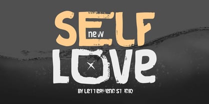 Self Love is a solid textured brush typeface.This type of font perfectly made to be applied especially in headlines which is need a standout font, and the other various formal forms such as invitations, labels, logos, magazines, books, greeting / wedding cards, packaging, fashion, make up, stationery, novels, labels or any type of advertising purpose. Features : numbers and punctuation multilingual PUA encoded We highly recommend using a program that supports OpenType features and Glyphs panels like many of Adobe apps and Corel Draw, so you can see and access all Glyph variations.
