10,000 search results
(0.093 seconds)
- Leonardo Sans by Factory738,
$10.00 Leonardo Sans is a modern sans serif with a geometric touch. It comes in 10 weights, clean and modern caps, thereby creating more variability. Designed with powerful opentype features in mind. Each weight includes extended language support, fractions, tabular figures, arrows, ligatures and more. Perfectly suited for graphic design and any display use. It could easily work for web, signage, corporate as well as for editorial design. 10 Weights (Thin, UltraLight, Light, Regular, Medium, SemiBold, Bold, ExtraBold, Black, Heavy) Oblique font is available Numbers & Punctuation Extensive Language Support Thanks for looking, and I hope you enjoy it. Check out Newgate which is a great pair for Leonardo Sans.
 - Veotec by Hashtag Type,
$29.00 Veotec is a classic humanist sans that skilfully works for both screen and print due to its steep and precise angles enabling more negative space. Not only does this methodical approach improve legibility and readability at small sizes, it allows the bolder weights to feel harmonised and consistent without the compromise of this legibility. Angles are refined and considered with a balance between sharp and round curves adding a unique feature to this font. This also gives a modern and appealing feel at large sizes. Details include 6 well constructed weights, manually edited kerning, which is more open for on-screen devices, ligatures and alternatives.
 - Baby Angel by Selotype,
$12.00 Baby Angel Script is a beautiful calligraphy design, including Regular. This font can be used for various purposes such as logos, product packaging, wedding invitations, branding, titles, signs, labels, signatures, book covers, posters, quotes, and more. Baby Angel Script is coded with Unicode PUA, which allows access to all features without special design software. Mac users can use the Letter Book, and Windows users can use Character Maps to view and copy additional characters to paste into your favorite text editor / application. If you need help or have questions, let me know or send an email "SelotypeStudio@gmail.com" I'm happy to help :) Thank you & Happy Design!
 - Anne de Marie by Alandya TypeFoundry,
$19.00 Presented ... Anne de marie Anne de marie offers a wide range of options for creating logos, titles and titles. It is suitable for books, editorials, packaging, advertising, brand imaging and more. Anne de marie includes Collection of Uppercase, Stylistic, Latin Based Language Support, Numbers and Punctuation. Set Stylistic is available in Lowercase. Anne de marie is encoded with PUA Unicode, which allows access to all features without special design software. Mac users can use Font Books, and Windows users can use Character Map to view and copy extra characters to paste into your favorite app / text editor. don't hesitate to drop me a message if you have any issues or queries
 - Nophine by Mantype Studio,
$18.00 Nophine is a typeface conceived by Sulai Man specifically for intensive editorial use, mainly in newspapers, magazines, and online, its personality and flexibility make it a true multipurpose typeface. The intermediate weights deliver a neutral look when used in text sizes, providing the usual robustness expected in a newspaper font. The unobtrusive appearance, excellent texture, and slightly colour allow it to behave flawlessly in continuous text, even in the most unforgiving editorial applications. As it becomes larger in print,Nophine shows its personality through a series of measured particularities which make it easy to remember and identify. Its energetic character, becomes evident when used for subheadings and headlines.
 - Berta by Eurotypo,
$60.00 This font is versatile and expressive, it can create appealing atmosphere and attract attention, conveying a gamut of message and emotions. It is well suited in the jobbing areas like packaging, logotypes, magazines, web pages and advertising, etc. Berta has all the advantages of OpenType features that allow a variety of combinations: You may choose to set types in connected or unconnected ways, being used as body text or headlines for its good legibility, visual impact and accurate kerning. It has swashes, standard and discretional ligatures, contextual alternates, word ending and tails. It has also an extended character set to support Central and Eastern European as well as Western European languages.
 - Merodine by Letterhend,
$19.00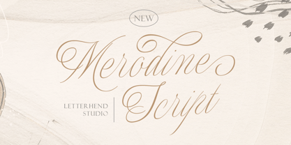 Merodine Script. A Beautiful and classy script that has many swashes that allows you to create beautiful lettering instantly. it has many stylistic set alternates that you can choose from. This font perfectly made to be applied especially in logo, and the other various formal forms such as invitations, labels, logos, magazines, books, greeting / wedding cards, packaging, fashion, make up, stationery, novels, labels or any type of advertising purpose. Features : uppercase & lowercase numbers and punctuation multilingual ligatures alternates swashes PUA encoded We highly recommend using a program that supports OpenType features and Glyphs panels like many of Adobe apps and Corel Draw, so you can see and access all Glyph variations.
 - Lisboa by Vanarchiv,
$35.00 This humanist sans-serif typeface was exhaustively designed, full-featured typeface family that reveals its character and distinctiveness in complex text. It features a large complement of ligatures, lining and old-style figures, expert characters, dingbats (arrows, brackets, and symbols for both Regular weights). In the original Lisboa Pro the forms of the letters are humanist, with hooked headterminals, the characters contains medium contrast with a left-angled stress on the strokes. After ten years from the first version publication, this new version (0.2) is available with Latin (Western, Central Europe) and Cyrillic alphabets. It was selected by Our Favorite Fonts of 2005 (Typographica).
 - Price Tags JNL by Jeff Levine,
$29.00 Price Tags JNL is a multi-use dingbat font. Along with over twenty nostalgic price tags, there is a set of individual numbers [1 thru 0 keys] and number pairs [A-T and a-i keys] for creating old-style white-on-black price tags. Blank end caps are available on the parenthesis keys, the decimal point is on the period key, catch words FOR, DOZEN and EACH are on the left and right arrows and right brace respectively, and the dollars and cents marks are on the dollar and hyphen keys. You'll even find a few extras placed upon the bracket and left brace keys.
 - Lisboa Sans by Vanarchiv,
$35.00 This humanist sans-serif typeface was exhaustively designed, full-featured typeface family that reveals its character and distinctiveness in complex settings. It features a large complement of ligatures, lining and old-style figures, expert characters, dingbats (arrows, brackets, and symbols for both Regular weights). Lisboa Sans lacks the hook-head terminals, but its structure and proportions are the same. The simplicity of the sans weight created very strong readability at small sizes. After ten years from the first version publication, this new version (0.2) is available with Latin (Western, Central Europe) and Cyrillic alphabets. It was selected by Our Favorite Fonts of 2005 (Typographica).
 - Yulica Claudy by Areatype,
$13.00 Yulica claudy is a lovely, modern calligraphic script. It features dynamic and pretty swashes and can be used for many purpose, such as titles, signatures, logos, wedding invitations, letterhead, signage, labels, newsletters, posters, badges, etc. Yulica claudy features OpenType, including the initial and terminal letters, ligatures and International support for most Western languages included. Yulica claudy PUA encoded with Unicode, which allows full access to all the extra characters without having to design special software. Mac users can use Font Book, and Windows users can use the Character Map to view and copy one additional character to paste into your text editor / favorite applications. Enjoy using
 - Americana EF by Elsner+Flake,
$35.00Americana was designed by typeface artist Richard Isbell in 1965. The generous forms of this typeface contain large inner spaces. Lines of text look light and airy and require generous line spacing. The high cross strokes and the open inner spaces make this font highly legible even in small and very small point sizes. The triangular serifs are a distinguishing characteristic of Americana. These first appeared in the 19th century in France and inspired by the developments in lithography, which allowed for freer forms. The forms were typical for advertisement and display typefaces. The sophisticated Americana is particularly suitable for advertisements and personal correspondence. - Monod by Resident,
$40.00 Created in 2009 by V.H. Fleisher, Monod is a geometric sans-serif typeface. The font has OpenType features that can be accessed in programs like the Adobe Creative Suite. These features include titling caps which are heavier & more tightly spaced than the regular caps, alternative punctuation marks, and arbitrary nut fractions (for single digit numerators & denominators). By clicking on the "gallery" tab above, you can see an illustration of the OpenType features. The "ff" tab on the "Sample Text" bar below allows you to test the OpenType features with your own text. Supported languages include: Albanian, Czech, Danish, Dutch, English, Faroese, Finnish, French, German, Icelandic, Italian, Norwegian, Portuguese, Spanish & Swedish.
 - Superba Pro by Red Rooster Collection,
$60.00 Superba Pro is a condensed Egyptian font family with short ascenders and descenders. The dots on the lowercase ‘i’ and the German umlaut-vowels are square. Haas Type Foundry created the original Superba in 1928-1930. Steve Jackaman (ITF) designed and produced a digital version of the bold weight in 1992. In 2017, Jackaman completely redrew the bold weight, added an accompanying wide weight, and expanded the glyph set to support Central and Eastern European languages. Like other slab serif faces, Superba excels at display sizes and is comfortable at subhead sizes. It is robust, and has “superb” legibility, allowing it to dominate attention in any project it is utilized in.
 - Hazelnut Pro by Eimantas Paškonis,
$- This small family can be counted as 4 fonts in 2. Because both weights contain small caps, 12 sets of stylistic alternates, and a decorative swashed form. That’s not counting dozens of ligatures in both multilingual latin and Cyrillic scripts. Plus ordinals, case-sensitive forms, and manual hinting. Due to its geometric nature, designers can manipulate vectors to change letters' dimensions for logotypes. They may seem modular, but every glyph was shaped individually to give handmade imperfections, reminiscent of wood type press. This allows for plenty of details at large sizes. Regular versions are multilingual but include only standard ligatures and case-sensitive forms.
 - Galyna Leaffe by Julia Visht,
$20.00 Galyna Leaffe - new elegant script from Julia Visht! Stylish classic for your successful projects! Harmony of classical elements and modern accents makes the font multifunctional. Classy and a little bit curvaceous Galyna Leaffe is a really must-have for your collection! Main features: -Ligatures. Set of 37 opentype ligatures allows to make your design truly unique. -Multyfunctionality. It's perfect for: elegant branding, wedding stationery, book cover designs, classy packaging, album covers, handwritten quotes, greeting cards,typographic designs, wall art, websites, photos, and so much more. -Multylangual support. English, German, Italian, French, Danish, Norwegian, Swedish, Italian, Spanish, Filipino, Scottish Gaelic, Indonesian, Irish, Swiss German, Portuguese. Happy creating!
 - Fusskia by TypeClassHeroes,
$16.00 Fusskia is a variable serif display typeface with lots of alternative style and ligatures. Its unique design with various width and weight that you can explore and combine creating rhythm and texture for comfortable reading. Fusskia support for languages such as: Danish, English, Finnish, French, German, Norwegian, Portuguese, Spanish, Swedish. In variable version, it allows multiple options when designing, adapting to different composition solutions. use this font for any branding, product packaging, invitation, quotes, label, poster, logo etc. Feature Uppercase & Lowercase Number & Symbol International Glyphs Multilingual support Alternative Ligatures Feel free to drop us a message any time and follow my shop for upcoming updates Hope you enjoy it.
 - Gerdika by Mantype Studio,
$22.00 Gerdika is a typeface conceived by Sulai Man specifically for intensive editorial use, mainly in newspapers, magazines, and online, its personality and flexibility make it a true multipurpose typeface. The intermediate weights deliver a neutral look when used in text sizes, providing the usual robustness expected in a newspaper font. The unobtrusive appearance, excellent texture, and slightly colour allow it to behave flawlessly in continuous text, even in the most unforgiving editorial applications. As it becomes larger in print,Gerdika shows its personality through a series of measured particularities which make it easy to remember and identify. Its energetic character, becomes evident when used for subheadings and headlines.
 - Johnstemp by Linotype,
$29.99As a spinoff to his Tagesstempel™ design, Georg John created Johnstemp™ in 2008. The Johnstemp family has four weights, as well as a special Mix" variant. Each of the basic fonts (Light, Medium, Bold, and Heavy) contain many alternate glyphs, allowing users to set text that realistically simulates stamped impressions. For even faster design, Johnstemp Mix is the perfect choice; it contains letters with far more stylistic and weight variation out-of-the-box, and was developed to create even livelier impressions. Here as well, many alternates are included in the character set to prevent too much repetition of the same glyphs. " - Qixohe by Twinletter,
$18.00 Qixohe is an elegant blend of tradition and modern style. With its strong Black letter characters, this font brings an irreplaceable classic element to your projects. It's the perfect choice for creating striking titles, memorable logos, or memorable prints. Qixohe's special features include alternative ligatures and characters that allow you to express your creativity to the fullest. With Qixohe, you can create a design like no other, one that will be remembered by all who see it. Whether for graphic design, branding, or printmaking projects, Qixohe will provide the character and notoriety you're looking for. So, grab Qixohe now and give your designs an unforgettable bold and elegant touch.
 - Vistr by Kobuzan,
$18.99 Vistr is a reverse-contrast display typeface inspired by western movies, infused with the tension of classic horror films. Powerful serifs, smooth curves, sharp details and an impressive contrast of strokes are unusually combined with each other. This creates a dramatic, eye-catching effect. Which is ideal for use in large sizes in titles and headlines to create a gloomy mood. This is an ALL-CAPS font. There is support for extended Latin, basic Cyrillic, and Greek. Features: – Total glyph set: 351 glyphs; – 1 style; – Support 210+ languages; – Latin Extended; – Cyrillic Basic + Bulgarian letters; – Greek; OpenType features: – Uppercase; – Proportional numerals; – Punctuations and symbols; – Arrows; – Stylistic alternates (ss01).
 - Whitenow by Proportional Lime,
$15.99 In the year 1528 Pierre Attaignant led a revolution in music printing. His method of once-press moveable type, greatly simplifying the original 3 impression process developed by Petrucci, remained in use till near the end of the 17th century. The method could only realize one line of music per staff, and the introduction of barlines as a common means of aligning multiple staves brought this method to a close after nearly two centuries of use. This font is meant to allow the printing of music using that method with the notation of that era. It is largely based on an exemplar printed by Snodham of London.
 - Clay Handwriting Pro by SoftMaker,
$7.99 Digitized handwriting fonts are a perfect way to give documents the “very special touch”. Invitations look simply better when handwritten than when printed in bland Arial or Times New Roman. Short handwritten notes look authentic and appealing. There are numerous occasions where handwritten text makes a better impression. Clay Handwriting Pro is a beautiful typeface that mimics true handwriting closely. Use Clay Handwriting Pro to create stunningly beautiful designs easily. This typeface comes with alternative characters for sophisticated typography – all easily accessible as OpenType features. A “random” feature even allows for automated random switching between variations of the same character, resulting in type that looks authentically handwritten.
 - TT Livret by TypeType,
$39.00 If you still think that an antiqua is a typeface with a strong historical character that difficult to apply in modern realities, meet the new typeface from TypeType! TT Livret is an elegant, modern and functional antiqua featuring a calm text and an expressive display subfamily. TT Livret useful links: Specimen | Graphic presentation | Customization options This font looks harmonious in books and other periodicals, on posters or on magazine covers. The scope is not limited to the printing industry, because TT Livret looks aesthetically pleasing wherever text is used. The text subfamily has uniwidth proportions and a calm spirit, oval round characters, free spacing and more open apertures. The glossy display subfamily is proportional and has round signs that are as close to a circle as possible, the apertures are closed, and the spacing is dense. The font has an intermediate subfamily - Subhead, which can look more relaxed when used as text font, or be contrasting and used as a display font. In TT Livret, we have embodied the idea of an antiqua that will be comfortable to use in modern realities. This is a functional font, where the text face does not distract from reading, and the display face, on the contrary, attracts attention. The TT Livret font family consists of 32 faces: 15 upright, 15 oblique, and 2 variable fonts. Each face has 1031 glyphs. The font contains 26 OpenType features, as well as a large number of ligatures. There are many alternative characters in italics, which are especially diverse in Cyrillic.
 - CAL Bodoni Terracina by California Type Foundry,
$47.00 Bodoni Terracina is a legible, fun-formal script face, with lots of curls. Sometimes script faces are hard to read. Sometimes being formal means that there’s no personality and there’s no fun. Enter Terracina: one of the masterpieces of font design. Some of the most personable italics ever carved. Includes powerful new features for: • Dates • Pricings • Addresses Not is only Terracina formal but fun, it’s also fun to use! In a program like Adobe Indesign or Illustrator, just highlight a word and see lots of fun options. Bodoni himself etched these symbols, and his fun-loving personality shines through. As a semi-script, it can go together with many script fonts, but it is more readable. When you need something equal parts elegant and whimsical, Terracina strikes a perfect balance to let the fun shine through, such as for holiday designs or fairytales. Terracina is a subheads font, but Bodoni also used it for paragraphs. So Terracina works well doing subhead paragraphs, especially when contrasting with the mood of the first font. And because of the swash variety, it works well for setting German and other European languages. CAL Bodoni Terracina is a member of our Origins Series. Origin Fonts are designed to be true to the original designer's intentions and fonts. Our Bodoni origin fonts ARE Bodoni fonts, not imitations or interpretations. They were drawn by Bodoni, our team just expanded it for modern use. For Terracina, Bodoni's original weight is the "Quasi-Lite" option, all other weights have been meticulously matched by the CAL Origins Team.
 - Romantically by Abo Daniel,
$13.00 Romantically -the lovely natural signature font- It is classy, it is naturally, it is beauty signature fonts... - Fantastic 417 Ligature I was created 417 ligatures to keep this font looks naturally, al bl cl dl el fl gl hl il jl kl ll ml nl ol pl ql rl sl tl ul vl wl xl yl zl at bt ct dt et ft nt ot pt qt rt st tt ut yt all ell att ett itt ott utt alt elt ilt olt ult atl etl itl otl utl ftl attl ettl ittl ottl uttl ab bb cb eb ib jb mb nb ob sb ub abb ebb ibb obb ubb abl abh ebh ibh obh ubh abt ebt ibt obt ubt ah bh ch eh gh hh ih jh mh nh oh ph rh yh zh ahh ehh ihh ohh uhh ak ek ik kk ok rk sk uk yk zk akk cc dd ee ff mm nn oo pp ss zz am em im om um amm emm imm omm umm amb amh an en in on un ann inn anb anh ank enh inh anl enl ant ent ar er ir or ur arb arh erh irh orh urh ark arl erl url art ert fr urt ce co com ay eel iu ppl erfl Ar Br Cr Dr Er Fr Gr Hr Ir Jr Kr .............and more as you seen on presentation pictures. I am also created it for multilingual characters. àl ál âl ãl äl ål æl œl èl él êl ël ìl íl îl ïl ñl òl ól ôl õl öl ùl úl ûl ül àt át ât ãt ät åt æt ............and more as you seen on presentation pictures. - Swashes Swashes make it completed. You only need adding underscore 2x after lowercase from a to j . For example a__ - Multilingual Support Fonts include punctuations and multilingual support. Romantically is perfect for branding, photography, invitations, quotes, watermarks, advertisements, product designs, labels, and much more! I hope you really enjoy it.. Regards, Abo Daniel
 - Galia by Eurotypo,
$48.00 Galia is a new font with a vintage character designed by Carine de Wandeleer, inspired by the beautiful look of Victorian calligraphy, capturing all the elegance of its flourishes. Galia has a variety of ornamental swash letters; hundreds of ornamental and descending ascenders allow a beautiful interaction of strokes and combinations, avoiding overlaps or conflicts. Galia has a total of 947 characters, in OpenType format, such as Stylistics and Contextual Alternatives, Swashes, Ligatures, up to twenty stylistic games by lowercase and three in the uppercase, which allow you to mix and match pairs of letters, in addition to a wide set of ornaments perfect for interacting with the text. To this, we add a support of central European language to adjust your design. This will help your creativity and make it easier to do the impressive and elegant typographic work. All OpenType features can be accessed through OpenType compatible applications or the character map to view and copy any of the additional characters you want to paste into your favorite text editor / application. With virtually endless ways to personalize its use, Galia helps you to design invitations, greeting cards, logos, business cards, fashion magazines, food, packaging and menus, book covers and whatever your imagination!
 - Casagrande by Italiantype,
$39.00 Casagrande Collection has been designed in 2020 by the Italiantype Team (Manuel Alvaro, Valentino Coppi and Mario De Libero), working in close collaboration with Italian lettering artist, illustrator and calligrapher Alberto Casagrande, with help from the Zetafonts Team (Francesco Canovaro, Andrea Tartarelli and Cosimo Lorenzo Pancini). The goal of the project was to use as inspiration Alberto's colorful, vintage themed digital illustration style to develop a suite of closely related typefaces that, used together, would allow designers to replicate the nostalgic charme of Italian poster and product design from the thirties and the forties. Two color overprints, coarse dithering, handmade calligraphy, reminiscences of art deco, hints of modernism and pop culture references: all this and more mixed in a exuberant and playful collection, created with illustrators, poster artists and book cover designers in mind. The final product is 24-font package with six display families with styles varying from the thirties-inspired Antifascista (3 weights + 3 dithering weights) and Deco (3 weights + 3 inline weights), to the modernist Casabau (5 weights), to the geometric Grind (4 widths), to the vintage elegance of the two script families, Reclame and Casatiello. The collection is complemented by a two-color icon set font, Casagrande Ornaments, allowing any designer to easily explore the creative possibilities of this incredibly powerful creative collection. Please Note: Casagrande Antifascista Ombra simulates fine dithering and may be processor intensive for some older computers. Use Casagrande Antifascista if it slows down your system.
 - SFT Sushka by Schrifteria Foundry,
$35.00 About SFT Sushka SFT Sushka is a narrow headline typeface that will look particularly good on the packaging of something delicious. 10 different widths and a variable font make it possible to fit the font into various limited spaces. Soft shapes and rounded notches make SFT Sushka cozy, friendly, and appetizing. But if you need a more concise and readable version, the Flat Subfamily without notches is available for you. The family forms a gradient from very narrow and quirky to wider, softer, and more fluffy styles. Therefore, the variation is not just in width and thickness, but in the overall mood as well. You can use the variable font without any concerns about unexpected intersections in the letters! Its structure is no different from static fonts. And last but not least, SFT Sushka allows for a very tight line spacing even in languages with diacritics! SFT Sushka has wide language support: 200+ Latin and 60+ Cyrillic languages. Language support Latin: Abenaki, Afaan-Oromo, Afar, Afrikaans, Albanian, Alsatian, Amis, Anuta, Aragonese, Aranese-Aromanian, Arrernte, Arvanitic (Latin), Asturian, Atayal, Aymara, Azerbaijani, Bashkir-(Latin), Basque, Belarusian (Latin), Bemba, Bikol, Bislama, Bosnian, Breton, Cape-Verdean-Creole, Catalan, Cebuano, Chamorro, Chavacano, Chichewa, Chickasaw, Cimbrian, Cofán, Cornish, Corsican, Creek, Crimean Tatar (Latin), Croatian, Czech, Danish, Dawan, Delaware, Dholuo, Drehu, Dutch, English, Esperanto, Estonian, Faroese, Fijian, Filipino, Finnish, Folkspraak, French, Frisian, Friulian, Gagauz (Latin), Galician, Ganda, Genoese, German, Gikuyu, Gooniyandi, Greenlandic (Kalaallisut), Guadeloupean-Creole, Gwich’in, Haitian-Creole, Hän, Hawaiian, Hiligaynon, Hopi, Hotcąk (Latin), Hungarian, Icelandic, Ido, Igbo, Ilocano, Indonesian, Interglossa, Interlingua, Irish, Istro-Romanian, Italian, Jamaican, Javanese-(Latin), Jèrriais, Kaingang, Kala-Lagaw-Ya, Kapampangan (Latin), Kaqchikel, Karakalpak-(Latin), Karelian (Latin), Kashubian, Kikongo, Kinyarwanda, Kiribati, Kirundi, Klingon, Kurdish-(Latin), Ladinlatinlatino-sine-Flexione, Latvian, Lithuanian, Lojban, Lombard, Low-Saxon, Luxembourgish, Maasai, Makhuwa, Malay, Maltese, Manx, Māori, Marquesan, Megleno-Romanian, Meriam-Mir, Mirandese, Mohawk, Moldovan, Montagnais, Montenegrin, Murrinh-Patha, Nagamese-Creole, Nahuatl, Ndebele, Neapolitan, Ngiyambaa, Niuean, Noongar, Norwegian, Novial, Occidental, Occitan, Onĕipŏt, Oshiwambo, Ossetian (Latin), Palauan, Papiamento, Piedmontese, Polish, Portuguese, Potawatomi, Q’eqchi’, Quechua, Rarotongan, Romanian, Romansh, Rotokas, Sami-(Inari-Sami), Sami (Lule-Sami), Sami (Northern-Sami), Sami (Southern-Sami), Samoan, Sango, Saramaccan, Sardinian, Scottish-Gaelic, Serbian-(Latin), Seri, Seychellois-Creole, Shawnee, Shona, Sicilian, Silesian, Slovak, Slovenian, Slovio-(Latin), Somali, Sorbian (Lower-Sorbian), Sorbian (Upper-Sorbian), Sotho (Northern), Sotho-(Southern), Spanish, Sranan, Sundanese (Latin), Swahili, Swazi, Swedish, Tagalog, Tahitian, Tetum, Tok-Pisin, Tokelauan, Tongan, Tshiluba, Tsonga, Tswana, Tumbuka, Turkish, Turkmen-(Latin), Tuvaluan, Tzotzil, Uzbek (Latin), Venetian, Vepsian, Volapük, Võro, Wallisian, Walloon, Waray-Waray, Warlpiri, Wayuu, Welsh, Wik-Mungkan, Wiradjuri, Wolof, Xavante, Xhosa, Yapese, Yindjibarndi, Zapotec, Zarma, Zazaki, Zulu, Zuni. Cyrillic: Adyghe, Akhvakh, Aleut (Cyrillic), Altaic, Andi, Archi, Avar, Bashkir, Belarusian (Cyrillic), Besermyan, Bosnian (Cyrillic), Bulgarian (Cyrillic), Buryat, Chechen (Cyrillic), Chukchi, Chulym, Chuvash, Dargwa, Dungan, Enets, Even (Lamut), Gagauz, Godoberi, Ingush, Kabardino-Cherkess, Karaim, Karakalpak, Karata (Karata-Tukita), Karelian, Kazakh (Cyrillic), Ket, Kildin Sámi, Kirghiz, Komi-Zyrian, Koryak, Kumyk, Lak, Lezgian, Macedonian, Moldavian (Cyrillic), Mongolian, Mordvin-moksha, Nanai, Nganasan, Oroch, Ossetian, Russian, Rusyn, Saami, Serbian (Cyrillic), Soyot-Tsaatan, Tabasaran, Tadzhik, Tatar Volgaic, Tindi, Touva, Tsez, Turkmen (Cyrillic), Udege, Udmurt, Uighur (Cyrillic), Ukrainian, Ulch, Uzbek (Cyrillic), Veps, Yukagir.
 - Reina Neue by Lián Types,
$29.00 Hey! See Reina Neue in action here! INTRODUCTION When I designed the first Reina¹ circa 2010, I was at the dawn of my career as a type designer. The S{o}TA, short for the Society of Typographic Aficionados, described it as complex display typeface incorporating hairline flourishes to a nicely heavy romantic letterform². And it was like that; that’s what I was pursuing at that time since I was very passionate about ornaments and accolades of Calligraphy. Why? I felt that Typography, in general, needed more of them. These subtle flourishes could breathe life into letters. Maybe, I thought it was the only way I could propose something new into the field of type. However, after some years, I came across a very interesting quote: –Beautiful things don’t ask for attention– Wow! What did this mean? How could something be attractive if it’s not actually showing it. Could this be applied to my work? Sure. I think every type-designer goes through this process (aka crisis) regarding his or her career. At the beginning we love everything. We are kind of blind, we only see the big picture of a project. And that’s not because we are lazy. We actually can’t see the small mistakes nor the subtleties that make something simpler beautiful. We are not able. But, the small subtleties… They are actually everything: With experience, one puts more attention into the details and learns that every single decision in type has to be first meticulously planned. Here I am now, introducing a new Reina, because I felt there was a lot of it that could be improved, also the novelty of Variable Fonts caught my attention and I had to take that to my type library. THE FONT A thing of beauty is a joy forever Now, a decade later, I’m presenting Reina Neue. This font is not just an update of its predecessor: –A thing of beauty is a joy forever– is the first line of the poem ‘Endymion’ by John Keats, and despite the meaning of “beauty” may vary from person to person, and even from time to time (as read in the last paragraph), with Reina I always wanted to bring joy to the eye. In 2010, and now, in 2020. I believe the font is today much better in every aspect. It was entirely re-designed: Its shapes and morphology in general are much more clean and pure. The range of uses for it is now wider: While the old Reina consisted in just one weight, Reina Neue was converted into a big family of many weights, even with italics, smallcaps and layered styles. The idea behind the font, this kind of enveloping atmosphere made out of flourishes, is still here in the new Reina. This time easier to get amazing results due to the big amount of available alternates per glyph and also more loyal from a systemic point of view. However, and as read in the introduction -Beautiful things don’t ask for attention-, if none of the flourishes are activated the font will look very attractive anyway. Reina Neue is ready to be used in book covers, magazines, wedding cards, dazzling posters, storefronts, clothing, perfumes, wine labels and logos of all kind. Like it happened with the previous Reina, I hope this new font satisfies every design project around the world if used, and can be a joy forever. SOME INSTRUCTIONS Before choosing the right style for your project, hear my advice: -Reina Neue Display was meant to be used at big sizes. If you plan to print the font smaller than 72pt, I suggest using Reina Neue, not Display. Otherwise, if the font will be BIG or used on a digital platform, Reina Neue Display should be your choice. For even smaller sizes, use Reina Neue Small. This style was tested and printed in 12pt with nice results. (Note for variable fonts: Print them in outlines) -Reina Italic is not a slanted version of the roman, and this means some flourishes are different between each other. The Italic version has other kind of swirls. More conservative, in general. -All the styles of Reina Capitals have Small Capitals inside. -Reina Capitals Shine should be used/paired ONLY with Reina Capitals Black. The engraved feeling can be achieved if Reina Capitals Black and Reina Capitals Shine are used as layers, with the same word. Variable fonts instructions: -For more playful versions, choose Reina Neue VF, Reina Neue Italic VF or Reina Neue Capitals VF: With them you can adjust between 3 axes: Weight (will change the weight of the font) – Optic Size (will thicken/lighten the thin strokes and open/close the tracking) – Accolades (will modify the weight of the active flourishes). SOME VIDEOS OF REINA NEUE VF https://youtu.be/8cImmT5bpQM https://youtu.be/1icWfPmKAkg https://youtu.be/YC9GkJDL1a8 NOTES 1. The original Reina, from a decade ago: https://www.myfonts.com/fonts/argentina-lian-types/reina/ 2. In 2011, Reina received an honourable mention by S{o}TA. “Great skill is shown in the detailing, and an excellent feel for the correct flow of curves and displacement of stroke weight.” https://www.typesociety.org/catalyst/2011/ Reina was featured in the “Most Popular Fonts of the year” in MyFonts in 2011 https://www.myfonts.com/newsletters/sp/201201.html In 2012, the font was also selected in Tipos Latinos, the most prestigious competition of type in Latinoamerica. https://www.tiposlatinos.com/bienales/quinta-bienal-tl2012/resultados Also, chose as a “Favorite font of the year” in Typographica. https://typographica.org/typeface-reviews/reina/
 - Vintagedeck by Ditatype,
$29.00 Vintagedeck is a charming script font that gracefully combines vintage elegance with contemporary style. Each character in Vintagedeck is crafted with care. Designed with a fairly thick weight and a shape that gently nods to rounded forms, Vintagedeck is a versatile font that brings a touch of welcoming feel. The overall looks create a warm, approachable aesthetic reminiscent of classic handwriting, yet perfectly suited for the demands of current design trends. To truly appreciate the beauty and clarity of this font, it is recommended to use it in a larger font size. This not only improves readability but also allows its unique characteristics to shine. In addition, enjoy the features here. Features: Ligatures Stylistic Sets Multilingual Supports PUA Encoded Numerals and Punctuations Vintagedeck fits in headlines, logos, posters, flyers, branding materials, greeting cards, print media, editorial layouts, and many more designs. Find out more ways to use this font by taking a look at the font preview. Thanks for purchasing our fonts. Hopefully, you have a great time using our font. Feel free to contact us anytime for further information or when you have trouble with the font. Thanks a lot and happy designing.
 - Live Grotesk by Matt Chansky,
$18.00 An exquisite neutral body copy and memorable modern headline font – all under one pixel-perfect font family. Live Grotesk is no ordinary font, in fact it's two fonts in one, seamlessly working together. When big messaging requires a charismatic headline font to activate layout designs, amplify attention, and delight audiences with brand retention – turn on "FM," Live Grotesk's headline font. When you need a body copy font that is space-efficient, a highly refined neutral with a high x-height to help with readability, particularly on screens – Live Grotesk is for you. Stylish simplicity and neutrality are key components of the signature body copy look. This is why Live Grotesk is a uniquely crafted modern font for today's modern creatives. With a variety of weights, from light to bold, you'll also enjoy the robust offering of multilingual glyphs, plus a handful of extras like the estimated symbol, directional arrows, and helpful UX characters. When the creative direction calls for memorable, approachable, and consumable typography, consider Live Grotesk to elevate your marketing tactics. It's a font alive with versatility, that's why it's called Live Grotesk.
 - Tea Chest by Linotype,
$29.99The English typographer Robert Harling created Tea Chest in 1939 with the Stephenson Blake foundry. Today, this classic design is available in digital format from Linotype GmbH. Tea Chest is a bold stencil face. The font's narrow letters are all caps, and they sport small, slab serifs. Harling's design was most likely reminiscent of the old industrial lettering painted onto boxes and wooden crates that used to be shipped all over the world on the high seas. These letters had to be simple to reproduce, easy to read, and not take up too much space! Try out Tea Chest for large signage displays, on exotic product packaging, or in magazine or newsletter headlines. - Wood Fancy Reverse JNL by Jeff Levine,
$29.00 Amongst some pages scanned and posted online of old wood type alphabets comes this lovely, ornamental design in a reversed style of white lettering on black rectangular boxes. This classic set of wood type is now available digitally as Wood Fancy Reverse JNL. There is a narrow blank box on the “less than” key for use as an end cap, and a wider blank box on the “greater than” key to use between words as a blank space if so desired.
 - Pax by Linotype,
$29.99Pax is clearly a didone, using Vox classification. The contrast between the thin lines and the thicker ones is noticeable, as you would expect from a didone. The basic form is relatively narrow, therefore I designed another Pax, slightly wider and darker, and called it Pax #2. Otherwise they are more or less identical. Pax is Latin for peace, on everyone's want list in 1995 - as well as every single year before and after that. Pax was released in 1995. - Pax 2 by Linotype,
$29.99Pax is clearly a didone, using Vox classification. The contrast between the thin lines and the thicker ones is noticeable, as you would expect from a didone. The basic form is relatively narrow, therefore I designed another Pax, slightly wider and darker, and called it Pax #2. Otherwise they are more or less identical. Pax is Latin for peace, on everyone's want list in 1995 - as well as every single year before and after that. Pax was released in 1995. - Palitura by Michael Rafailyk,
$9.00 Palitura is a display typeface designed to translate Cyrillic flavor into the Latin script. Palitura means lacquered book cover in Old Ukrainian. The design of letter shapes is inspired by Early Cyrillic handwritten letters and Ukrainian patterns that are conveyed through the sharpness of form, vertical strokes that are narrower at the bottom, stylized oblique hooks at the top, and triangular accents. Languages: 480+. Scripts: Latin, Greek, Cyrillic. Specimen: michaelrafailyk.com/typeface/specimen/Palitura.pdf The promo images used photo of Tima Miroshnichenko from Pexels.
 - Little Boxes by Resistenza,
$39.00 A new happy handwritten sans serif font has arrived! Little Boxes has been designed with felt pen on smooth paper to create the illusion of human craft and then digitalized. Three different fonts Regular, slanted and dance. Optimized shapes to obtain the best readability without loosing the analogical feeling of the original designing tool, makes this font perfect both for printing and digital environments and it allows the use of the font on any project with different media supports. This fresh font family is ready for text, but check your opentype features window while using the font and discover a beautiful set of alternate letters. Create catchy words and add more fun to any layout, which makes it a perfect match for titles and display too. A friendly typeface to give a whimsical touch to your projects. We highly recommend using Little Boxes for App, web, ePub, digital Ads, Video games, and a great fitting for printing; headlines, posters, DIY hand-lettered artwork, books, holiday cards, invitations, T-shirts, labels, packaging, artisanal goods, etc.
 - Lanche by pentagonistudio,
$19.00 Lanche Is An Modern Elegant Serif Font Inspired By Elegant Serif Typeface FAQ's : Where are the OTF's? They are included in a download link( in a text file) in your main download file. 1 user 2 computers installation (Desktop License) You may NOT use for broadcast or Cinema/Motion Picture. You may NOT resell this font in any platform without further permission from designer. Do NOT embed font files in app/game/e-pub (for desktop license) You may NOT use the fonts in templates for sale/free. ( web/print/app ) For other license use please contact us. SOFTWARE REQUIREMENTS : Fonts and alternate : No special software required they may be used in any basic program /website apps that allows standard fonts That's it folks! You can go ahead and get cracking :) Follow My Shop For Upcoming Updates Including Additional Glyphs And Language Support. And Please Message Me If You Want Your Language Included or If There Are Any Features or Glyph Requests, Feel Free to Send me A Message. Have a Good Day !
 - Hand Stamp Slab Serif Rough by TypoGraphicDesign,
$25.00 The typeface “Hand Stamp Slab Serif Rough” was designed for the Typo Graphic Design font foundry in 2017 by Manuel Viergutz. It is a display font with a classic slab serifs based on real rubber stamp letters for a authentic, rough & dirty, stamped-by-hand appearance. It provides a vintage look through state-of-the-art Open Type features such as contextual alternates that cycle automatically through 5 different letter variants for each character to create a varied look, just as if the letters were stamped by hand. The font is intended for use in logos, magazines, posters, advertisements, and as a webfont for decorative headlines. The font works best for display sizes. There are 1031 glyphs with 5× A–Z, 0–9 & a–z and 70+ decorative extras like arrows, dingbats, symbols, geometric shapes, catchwords, and many alternative letters. A range of figure set options including oldstyle figures and additional decorative ligatures (type the word “love” for ❤ … ), Versal Eszett (German Capital Sharp S), symbols, and emojis. Have fun with this font & use the DEMO-FONT (with a reduced glyph-set) FREE!