10,000 search results
(0.166 seconds)
- MB Empire by Ben Burford Fonts,
$30.00 MB Empire is a font that like MB vintage has its roots in early 20th century design, It has a distinctly english feel with its style references to the classic Gill Sans. It has a very traditional look whilst still maintaining its own modernist individuality. It comes in six weights with italics and has extended language support. With many opentype features including oldstlye & lining figures, automatic fractions and more its a font family that will work for almost any application.
 - Mohn by Ryan Keightley,
$19.00 Mohn is a sans serif font that draws inspiration from the Bauhaus movement, characterized by its geometric shapes and neo-grotesque elements. With its clear and legible forms, Mohn works as a body copy font, or blow it up larger for headlines to really see its gently rounded corner details which bring a personal and contemporary touch to any design project. Available in 7 weights with italics for each, a variety of accented glyphs, ligatures, and extra stylistic alts on select letters.
 - EB Mensch by Eko Bimantara,
$19.00EB Mensch is a complete humanist sans and serif font family. EB Mensch emphasize expressive and fun characters that visualized by it's letterforms; Large x height, low caps, spacious counters and apertures, characterized by diagonal and sunken stroke ends. Perfect for large display and also to be read in small size. Mensch contain 32 fonts consist of sans and serif styles with 8 weight from thin to black with each matching italics. Its contain more than 440 glyphs which support broad latin languages. - Granjon by Linotype,
$29.99 The design for Granjon was produced at the English branch of Linotype under the direction of George William Jones and appeared in 1928. This reproduction of a Garamond typeface was based on the typeface sample of the Frankfurt font foundry Egenolff from the year 1592 . The roman characters of the sample were made by Claude Garamond and the italic forms were designed by Robert Granjon. Jones made sure that the Granjon font remained true to the original characters of Garamond and Granjon.
 - Lexis by Typedepot,
$29.00 You can Download All 36 Demo Fonts The Lexis font family is a sans serif “super” family consisting of two sub-families - Lextis & Lexis Alt. While the first one follows the humanist model, its alternative version Lexis Alt dives way deeper into the geometric aesthetic. It’s simple yet versatile, packing great amount of well balanced weights, extensive character set and numerous Opentype features. The Lexis typefamily comes in 9 weights plus their italics, two distinctive styles and support for over 200 languages.
 - Getone by Robert Corseanschi,
$14.99 Getone is an exotic font, based on the Sereno font made by the same designer. It has a modern touch which makes it to stand out, all the glyphs are designed "out of the box" to combine each other in harmonious way. Getone is coming in ten styles : thin, ultra light, light, regular, bold and italics. Is ideally suited for advertising and packaging, festive occasions, editorial and publishing, logo, branding and creative industries, poster and billboards as well as web and screen design.
 - Corset Pro by DBSV,
$67.00 The Corset Pro is not another font, but not exactly and the same, as the previous two (Khamai Pro, Aeolus Pro) but is simple a different... But it has common elements and is based on two earlier. A new style added is Inlier, has this advantage engagement with Βlack style in the same manner explained in Aeolus Pro. And this series is composed and includes 12 fonts with 625 glyphs each, with true italics and supports Latin, Greek and Cyrillic.
 - Syakaila Script by Bejeletter,
$10.00 This is our newest product called Syakaila Script. The alternative characters were divided into several OpenType features such as Title and Swash. Syakaila can be used for wide ranges of application, such as wedding design, logo, invitations, social media posts, clothing, invitation, poster, cafe/resto sign, and many others. Features: Syakaila Script Regular Syakaila Script Italic OpenType features (Titling and Swash) Ligatures Multilingual glyphs - spread your message globally AÀÁÂÃÄÅCÇDÐEÈÉÊËIÌÍÎÏNÑOØÒÓÔÕÖUÙÜÚÛWYÝŸÆßÞþ Fonts: You can use any software that fonts can be used on it
 - NorB Note by NorFonts,
$28.00 NorB Note is a handwritten text font with an angled fat marker lettering style. You can use this font with any word processing program for text and display use, print and web projects, apps and ePub, comic books, graphic identities, branding, editorial, advertising, scrapbooking, cards and invitations and any casual lettering purpose… or even just for fun! NorB Note comes with 3 weights, each with their matching Italics, Oblique and in a Light, Normal and Condensed version. (a Chalk version is also featured!)
 - Transit Display by KC Fonts,
$24.00 Transit Display is simply two fonts: Regular & Italic. It is an all uppercase based font that takes the grungy look that you love one step further by offering you that do it yourself eroded stamp look with a modern flair. Transit Display will work with any of your stylized design needs! Transit Display also has a larger character set for multilingual support. For a customized look to your works, switch between uppercase and lowercase for a change of grunge to the letters.
 - Bloery by Runsell Type,
$20.00 Bloery is a neo grotesque font modified with extended proportion. Comes with a modern look, this font suitable for display and body text. Bloery is a good choice for editorial design, branding, app design and web design. Comes with 7 weights from Thin to Bold with each matching Italic. Contain several OpenType features: Stylistic Alternates and Figures Variation (fraction, tabular lining, numerator, denominator). Each style includes 540+ glyphs supporting all western, eastern and central european languages (over 200 languages supported).
 - Boldina by DSType,
$19.00Boldina consists of 18 fonts with a lot of personality. This is a font to be mixed. That’s its purpose and that’s why it's designed as one single weight in so many different styles. My intent was to give designers a chance to use the same typeface in many different ways, putting together sans and serif, lots of italics and even Greek, Cyrillic and CE characters. The Ligatures and the Script versions give a more poetic and more accurate feeling to the text. - Juby by Fontsphere,
$12.00 Juby is a minimalist font family with a geometric and sophisticated look. Designed especially for display purposes or even brand identity and logos. Use it for headlines, posters, visual identity, just anything that needs to stand out. It has been carefully edited, paying special attention to details, making Juby a safe choice for use at large-scale work. This font family has 3 weights with matching italics, containing uppercase and lowercase characters, numerals and a large range of punctuation (over 260 glyphs).
 - Retro Feeling by Prestige Artsy Studio,
$12.00 Retro Feeling is a bold and beautiful retro font that will take you back in time. It features a unique italic font that adds a touch of elegance to any design project. Perfect for vintage-themed designs. Retro Feeling will give your project a distinct and timeless look. Its versatility and elegance make it perfect for various design uses, from logos, posters, and display headlines to packaging and branding materials. Bring the retro vibe to your design project with Retro Feeling!
 - Specials Board by Borderline Artistic,
$9.00 Specials Board is a clear, quirky handwritten display font in 6 weights. The font delivers a handcrafted personal feel and is great for clear messaging or to create an artisan, organic, natural aesthetic. Originally created for use in a coffee shop the font's handwritten playful nature allows it to work well across numerous use cases such as food and drink, retail, children / kids products and more. The font also includes alternatives for several glyphs.
 - FS Untitled Variable by Fontsmith,
$319.99Developer-friendly The studio has developed a wide array of weights for FS Untitled – 12 in all, in roman and italic – with the intention of meeting every on-screen need. All recognisably part of a family, each weight brings a different edge or personality to headline or body copy. There’s more. Type on screen has a tendency to fill in or blow so for each weight, there’s the choice of two marginally different versions, allowing designers and developers to go up or down a touch in weight. They’re free to use the font at any size on any background colour without fear of causing optical obstacles. And to make life even easier for developers, the 12 weight pairs have each been designated with a number from 100 (Thin) to 750 (Bold), corresponding to the system used to denote font weight in CSS code. Selecting a weight is always light work. Easy on the pixels ‘It’s a digital-first world,’ says Jason Smith, ‘and I wanted to make something that was really functional for digital brands’. FS Untitled was made for modern screens. Its shapes and proportions, x-height and cap height were modelled around the pixel grids of even low-resolution displays. So there are no angles in the A, V and W, just gently curving strokes that fit, not fight, with the pixels, and reduce the dependency on font hinting. Forms are simplified and modular – there are no spurs on the r or d, for example – and the space between the dot of the i and its stem is larger than usual. The result is a clearer, more legible typeface – functional but with bags of character. Screen beginnings FS Untitled got its start on the box. Its roots lie in Fontsmith’s creation of the typeface for Channel 4’s rebrand in 2005: the classic, quirky, edgy C4 headline font, with its rounded square shapes (inspired by the classic cartoon TV shape of a squidgy rectangle), and a toned-down version for use in text, captions and content graphics. The studio has built on the characteristics that made the original face so pixel-friendly: its blend of almost-flat horizontals and verticals with just enough openness and curve at the corners to keep the font looking friendly. The curves of the o, c and e are classic Fontsmith – typical of the dedication its designers puts into sculpting letterforms. Look out for… FS Untitled wouldn’t be a Fontsmith typeface if it didn’t have its quirks, some warranted, some wanton. There’s the rounded junction at the base of the E, for example, and the strong, solid contours of the punctuation marks and numerals. Notice, too, the distinctive, open shape of the A, V, W, X and Y, created by strokes that start off straight before curving into their diagonal path. Some would call the look bow-legged; we’d call it big-hearted. - FS Untitled by Fontsmith,
$80.00 Developer-friendly The studio has developed a wide array of weights for FS Untitled – 12 in all, in roman and italic – with the intention of meeting every on-screen need. All recognisably part of a family, each weight brings a different edge or personality to headline or body copy. There’s more. Type on screen has a tendency to fill in or blow so for each weight, there’s the choice of two marginally different versions, allowing designers and developers to go up or down a touch in weight. They’re free to use the font at any size on any background colour without fear of causing optical obstacles. And to make life even easier for developers, the 12 weight pairs have each been designated with a number from 100 (Thin) to 750 (Bold), corresponding to the system used to denote font weight in CSS code. Selecting a weight is always light work. Easy on the pixels ‘It’s a digital-first world,’ says Jason Smith, ‘and I wanted to make something that was really functional for digital brands’. FS Untitled was made for modern screens. Its shapes and proportions, x-height and cap height were modelled around the pixel grids of even low-resolution displays. So there are no angles in the A, V and W, just gently curving strokes that fit, not fight, with the pixels, and reduce the dependency on font hinting. Forms are simplified and modular – there are no spurs on the r or d, for example – and the space between the dot of the i and its stem is larger than usual. The result is a clearer, more legible typeface – functional but with bags of character. Screen beginnings FS Untitled got its start on the box. Its roots lie in Fontsmith’s creation of the typeface for Channel 4’s rebrand in 2005: the classic, quirky, edgy C4 headline font, with its rounded square shapes (inspired by the classic cartoon TV shape of a squidgy rectangle), and a toned-down version for use in text, captions and content graphics. The studio has built on the characteristics that made the original face so pixel-friendly: its blend of almost-flat horizontals and verticals with just enough openness and curve at the corners to keep the font looking friendly. The curves of the o, c and e are classic Fontsmith – typical of the dedication its designers puts into sculpting letterforms. Look out for… FS Untitled wouldn’t be a Fontsmith typeface if it didn’t have its quirks, some warranted, some wanton. There’s the rounded junction at the base of the E, for example, and the strong, solid contours of the punctuation marks and numerals. Notice, too, the distinctive, open shape of the A, V, W, X and Y, created by strokes that start off straight before curving into their diagonal path. Some would call the look bow-legged; we’d call it big-hearted.
 - Acuta by Anatoletype,
$27.00 Acuta is a new all-purpose text serif with a good readability and a contemporary, robust look thanks to its low-medium contrast. The differences between thicks and thins are less strongly marked than in oldstyle text faces; yet the diagonal stress needed to facilitate reading is partly provided by the letter shape itself: sharp angles and italic construction give the right dynamism to the text. Acuta becomes very distinctive as a headline, while its big x-height makes it suitable for texts at rather small sizes too. The family consists of seven weights & correspondent italics, with a large character set. The Book and Medium weights, relatively close to each other, can both be used as “plain” weight depending on the size of the text, background color or backlighting. Small caps, oldstyle and tabular figure alternates, superiors and inferiors and ligatures are available in all styles through OpenType features. The real italics include unobtrusive swash alternates to emphasise the written feeling. Please find a specimen of Acuta (PDF) in the Gallery section.
 - Mamirolle by The Ampersand Forest,
$20.00 Sometimes a sans serif just needs a sister. Meet Mamirolle! A geometric wedge-serif companion to Mimolette! (OR is Mimolette the sans serif companion to Mamirolle.... hmmmmm....) Mamirolle, like her sister, is great for text and display alike—she's super-readable AND super-legible, and her different weights lend themselves to creating clear contrast in your textual hierarchy! And she's got some nifty features, too! Mamirolle has a two-story a and g in the upright versions, but if you want a one-story a and g, just turn on Stylistic Set 01! Her italic is a true italic, not just an oblique. Want more playful cursive alternatives in the italic? Activate Stylistic Set 02, and you've got them in the A, E, K, Q, R, and k. She's got true small caps in all styles! She's got true fractions in all styles, as well as oldstyle (small cap) and lining numerals, in both tabular and proportional widths. Best of all, perhaps, Mamirolle was made with love, as always, by yer pals in the Ampersand Forest.
 - Type Warmers JNL by Jeff Levine,
$29.00 The name Type Warmers JNL traces its lineage to small catalog booklets issued by Indianapolis' Cobb Shinn for his line of letterpress cuts; of which a few can be found included within this typeface. Presumably type could "warm up to" these stock illustrations and work hand-in-hand to deliver the message, hence the "Type Warmers" sobriquet. Originally known for illustrating many attractive and comical postcards of the early 1900s, Shinn moved into the field of purchasing stock art and redistributing them as electrotypes or "cuts", the predecessor to today's digital clip art. A number of the cartoons he sold can be found in the Shinn Kickers JNL font.
 - Interval Next by Mostardesign,
$25.00 Interval Next is a modern sans serif font family that is the successor of the successful Interval Sans Pro. Designed by Olivier Gourvat, Interval Next typeface consists of 16 fonts in 8 weights — Ultra Light, Light, Book, Regular, Medium, Semi Bold, Bold, Black— and has 4 styles. This super family combines a humanist mind with its contrasted shapes and a modern look with its open counters. With its four versatile styles (Condensed, Narrow, Roman and Wide) Interval Next has a creative palette able to meet the modern typographic demands. Its OpenType features will provide you almost unlimited multilingual support as well as small caps, case sensitive forms, proportional and tabular figures, slashed zero, numerators, superscripts, denominators, scientific inferiors, circled figures, subscript, ordinals, fractions, arrows and f-ligatures. Also extremely functional for professional editorial design, Interval Next has a pro kerning and would be extremely suitable for mobile applications, e-books, web sites, headlines, posters, signage and many more. Interval Next covers a large spectrum of languages such as West European, East European and the Cyrillic.
 - Insomniac by Hanoded,
$15.00 Insomniac is a tall, narrow, handwritten typeface. A little rough, a little shaky, a little uneven. The idea for this font came to me in the middle of the night - hence the name. Insomnia is an all caps font, but upper and lower case differ and glyphs can be freely interchanged. Comes with a diacritics dream team.
 - Fishtail by Gleb Guralnyk,
$15.00 Hi, introuducing a vintage display font = Fishtail. It's an old school font set with thin decorative shape. Fishtail typeface has narrow characters for small letters and wide shape for capital letters. Also lots of ligatures will help you to create an original lettering compositions (Make sure that “Standard Ligatures” feature is supported & enabled in your software).
 - Retro Packaging JNL by Jeff Levine,
$29.00 A vintage rubber stamp alphabet and star printing set had a package header with Art Deco-inspired lettering describing the product. Sold by a company called Elvin [circa late 50's-early 1960s], these Japanese-made sets were one of many distributed by independent toy importers and made in various configurations including [at times] tiny animal stamps. The type design on this particular item was the model for Retro Packaging JNL, available in both regular and oblique versions.
 - Campus Sans Block by MacCampus,
$30.00Linotype Creative Arrows was designed by Robert Bucan in 1998 and consists mainly of directional symbols. Arrows and symbols in many different variations can also be built together, creating unique combinations for a variety of applications. - Nexa Slab by Fontfabric,
$35.00 Nexa Slab is a geometric slab serif font whose design is based on the already popular best-seller Nexa . The font family contains 3 basic forms: italics, obliques and uprights, each of which has 8 different weights. This visual richness makes it the ideal slab serif font family for the web as well as for print, for motion graphics, logos, t-shirts and so on. It is also great for headings, fitting nicely with both small and large typesetting text blocks. Nexa Slab draws from the rich traditions of the classic Neo-Grotesque slab serif fonts such as Lubalin Graph, Rockwell and Memphis, which conceal the richness of typesetting text in its crucial advertising function. Just like these fonts, it’s design is subject to rational, carefully thought-out, thick and thin bars with a low contrast between them. The letters are characterized by the strict geometry and square proportions of the original, extra-fortified by suitably balanced slab serifs. Nexa Slab is serious without being rigid and inflexible, finished and lacking in nothing, systematic without being monotonous, and though it may seem at first glance to be more suitable for short, direct messages; in the hands of a master designer... it can build and create exquisite and harmonic designs. Open Type Features: Lining figures (proportional and tabular) The “f” ligature set Alternate characters (a, g, y) Automatic fractions Automatic numerators Automatic denomerators Automatic subscript and superscript Automatic ordinals Extended language support (most Latin-based scripts supported)*
 - Neue Frutiger by Linotype,
$71.99 The original Frutiger typeface was designed in the early 1970s by Adrian Frutiger and his studio for the way finding system of the Roissy Charles de Gaulle airport in Paris. Soon after the airport was opened, a huge demand for the typeface arose from companies wanting to employ it in other signage systems, as well as in printed matter. The Frutiger typeface came out as part of the Linotype library in 1977. Epitomizing functionality and clarity both in signage and as a bread-and-butter typeface in print, Frutiger became a modern classic. Neue Frutiger® is the 2009 version of the Frutiger typeface family. It was revised and improved by Akira Kobayashi in close collaboration with Adrian Frutiger. While Frutiger Next, the 1999 revision, introduced a new concept (including a larger x-height, a more pronounced ascender height, narrower letter-spacing and, most notably, an italic with calligraphic traits), Neue Frutiger returns to the original 1977 design. The result is a well-balanced range of 10 finely-graded weights. Despite the various changes, the ‘New Frutiger’ still fits perfectly with Frutiger and serves to harmoniously enhance the styles already in existence. Neue Frutiger Variable are font files which are featuring two axis and have a preset instance from UltraLight to ExtraBlack and Condensed to Extended. Featured in: Best Fonts for Resumes, Best Fonts for Websites, Best Fonts for PowerPoints, Best Fonts for Tattoos
 - Kandidat by Fontroll,
$30.00 Imagine being printer in the early nineteenth century, your stock isn’t the finest, your lead characters are worn out: Voilá Kandidat Rough. But wait, Kandidat isn’t the usual scan-an-old-book,-put-the-glyphs-in-a-font-and-you’re-done-font. Kandidat Rough has a variety of whopping 14 alternates for most characters. Our algorithm changes the letters automatically. All you have to do is turn on Contextual Alternates in your layout app. The algorithm is the best we’ve seen so far, and it’s so good that even same words appear in different forms. And should by coincidence words have the same glyphs, just assign a different Style Set to the first letter, and all other letters in the word will change as well (well, it depends a bit on your software). The mechanism isn’t perfect and maybe we stretched OpenType capabilities a bit over the top, but we yet haven’t seen any better routine for switching letters on the fly. Is it worth to mention that Kandidat Rough not only speaks English, but also German, French, Spanish, Dutch, Danish, Norwegian, Swedish, Croatian, Turkish and most likely some other languages? Maybe. To be sure whether your language is supported, this is the typeset of all letters: ABCDEFGHIJKLMNOPQRSTUVWXYZÀÁÂÃÄÅÆÇÈÉÊËÌÍÎÏÑÒÓÔÕÖØÙÚÛÜÝĆČĐĞ݌ފŸŽ abcdefghijklmnopqrstuvwxyzàáâãäåæçèéêëìíîïñòóôõöøùúûüýÿćčđğıœşšž Apart from that we also included the following punctuation and currency symbols: !"#$%&'()*+,-./:;?@[\]_{|}¡©«®°±¶·»¿×–—‘’‚“”„†•…‹›⁄≠☞ €¢$£¥ This sums up to nearly 3000 glyphs per font, and we have three of them: Regular, Italic and Bold. All neatly kerned. All in all a great repertoire for even the most demanding book or advert jobs with a look of old times. And now imagine you are sick of the rugged print experience Kandidat Rough delivers: go for Kandidat. This is our Scotch-ish ancestor the Rough version was made from. A sturdy, friendly, round, warm friend from the beginning of the nineteenth century. A bit dark, maybe. You will like it. Kandidat has the aforementioned type set plus complete Baltics, Eastern Europe and Cyrillic. Plus a couple of gimmicks like fleurons, stars, circled numbers, arrows, and, and, and… Kandidat Regular additionally has small caps for Latin based scripts (not Cyrillic). The spick and span Kandidat font set also consists of Regular, Italic and Bold cuts. The bold cut is on the very bold side and can nicely be used for headings, whereas Italic is a great companion for Regular. It took us some time and trouble to finish this project, but after all we are very proud of our little feat and hope you will enjoy Kandidat as much as we do. Enjoy!
 - Arsena by Apostrof,
$50.00 The font Arsena was designed for a contest on the creation of modern Ukrainian business font "Arsenal" and awarded the 3rd prize. A little squared figure which is enlightened from the middle, unobvious, but the existing modular grid, simplified, but not a primitive design of letters, mathematically defined optimum inclination angle, counterbalanced ratio of thickness, an optimum spacing and a manual kerning - all of this is for the best reproduction in any conditions as well as for the maximum clarity and readability. Asymmetric slab serifs make the font Ukrainian and at the same time have a modern and dynamic look. Besides its highlighting function, Italics also have an independent assignment. The Italics are made under calligraphic traditions in a modern style of mono-thickness (but optically compensated) and in particular, in combination with alternative initials of the same style and it is relevant to use it in a private letter, or in the design of the official greetings, etc. It is also promoted by four typographic ornamental motives. Due to the above-mentioned qualities this font can be used successfully for a wide range of tasks - from business to mass media, publishing, advertising and accidental.
 - Etnier by Ahmad Jamaludin,
$17.00 Introducing Etnier – A brand-new modern family with a unique! Etnier is a modern variable font. Essentially, it's a sans-serif font with a sturdy and squared appearance, ensuring excellent legibility. It offers various widths and italics that provide versatility for your designs. The bolder, the stronger – this defines Etnier. Its bold and robust qualities, especially in the italic version, make it ideal for UI/UX-related designs. In total, there are 14 font styles available, or even more if you use the single files variable. You have the flexibility to slide through the weight and width options to find the sweet spot for Etnier. shape! What's Included? Etnier Main File 14 fonts family with Weight and Oblique options Instructions (Access special characters in all apps, even in Cricut Design) Accessible in Adobe Illustrator, Adobe Photoshop, Microsoft Word even Canva! PUA Encoded Characters. Fully accessible without additional design software Language Support: Danish, English, Estonian, Filipino, Finnish, French, Friulian, Galician, German, Gusii, Indonesian, Irish, Italian, Luxembourgish, Norwegian Bokmål, Norwegian Nynorsk, Nyankole, Oromo, Portuguese, Romansh, Rombo, Spanish, Swedish, Swiss-German, Uzbek (Latin) Come and say hello over on Instagram! https://www.instagram.com/dharmas.studio/ Have a great day! Dharmas Studio
 - Almost Perfect by Sensatype Studio,
$15.00 A Nostalgic Elegant Serif font that we created special for elegant branding needs, with unique shape will be ready to add value of your brand. It so nice to leverage designer or product owner that need solutions to make their design look more stylish and modern. And specially for Almost font, We prepared any characters to help you create unlimited variations for your creative needs. Almost Nostalgic Serif font ready with: Ready with Regular and Italic version Preview as a inspirations that you can do with Almost font Ready with Lowercase and Uppercase characters Wish you enjoy our font. :)
 - Heading by Sensatype Studio,
$15.00 Heading is an Unique sans serif display font that special created for Modern needs with unique style. A New Display font that we created special for Unique branding needs, with weird style that ready to add value of your brand. It's so nice to leverage designer or product owner that need solutions to make their design look more unique and urban. Heading Display Sans Serif font ready with: Lowercase and Uppercase characters Numbers and Punctuations Ready with Regular and Italic Style Preview as a inspirations that you can do with Heading font Available for PC and Mac Wish you enjoy our font. :)
 - Giuconda by Sealoung,
$25.00 Giuconda is an elegant and modern sans font. This font provides a cleaner, more geometric look, preserving the essence and structure of an early 20th century sans classic font but with a fresh, clean and contemporary look. Giuconda consists of two subfamilies of 8 weights, ranging from Thin to Heavy, with matching italics, giving a total of 16 fonts. Giuconda is the perfect font for publishing, titles, books, magazines, and corporate designs. Its Alt version is ideal for logo types, branding, packaging, and use on the web and TV. The family contains a 355 character set that supports 207 different languages.
 - Sella Mella by Crowntype Studio,
$12.00 Sella Mella is a script type family of four fonts. It is inspired by Lovely Fonts and has a soft and welcoming look. Sella Mella can be used for branding, packaging and wherever you need a script font that is easy to read and smooth. Sella Mella has many ties, strokes, and alternative characters that will make your designs unique and beautiful. You can also purchase Sella Mella as a Font Family and adjust the weight of Sella Mella seamlessly between Italic and Bold weights. Note that you need design software that supports the Font Family. Thank You...
 - Naomi Style by Sensatype Studio,
$15.00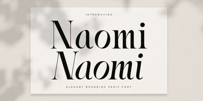 A Serif font that we created special for elegant branding needs, with extra ligature and alternates in unique shape will be ready to add value of your brand. It so nice to leverage designer or product owner that need solutions to make their design look more stylish and modern. And specially for Naomi font, We prepared any ligatures characters to help you create unlimited variations for your creative needs. Naomi Serif font ready with: Ready with Regular and Italic version Preview as a inspirations that you can do with Naomi font Ready with Lowercase and Uppercase characters Wish you enjoy our font. :)
 - Starting Linup by Sensatype Studio,
$15.00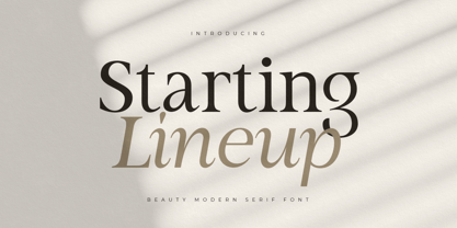 A Modern Beauty Serif font that we created special for elegant branding needs, with unique shape will be ready to add value of your brand. It so nice to leverage designer or product owner that need solutions to make their design look more stylish and modern. And specially for Almost font, We prepared any characters to help you create unlimited variations for your creative needs. Starting Lineup Beauty Modern Serif Font Family ready with: Ready with Regular and Italic version Preview as a inspirations that you can do with Starting Lineup font Ready with Lowercase and Uppercase characters Wish you enjoy our font. :)
 - Upcoming by Sensatype Studio,
$15.00 Upcoming is an Unique sans serif display font that special created for Modern needs with unique style. A New Display font that we created special for Unique branding needs, with weird style that ready to add value of your brand. It's so nice to leverage designer or product owner that need solutions to make their design look more unique and urban. Upcoming Unique Display Sans Serif font ready with: Lowercase and Uppercase characters Numbers and Punctuations Ready with Regular and Italic Style Preview as a inspirations that you can do with Upcoming font Available for PC and Mac Wish you enjoy our font. :)
 - Daphne by Ahmet Altun,
$20.00 In the beginning, this font had been designed for an affiche work as wood pattern which includes one font and medium weight. The stylish design of this font had been inclined us to create more weights and more styles. Daphne Font Family comes in three weights; normal and italic. Plus two additional styles which are wood pattern and shadow. You can get great wood pattern results with Daphne Font Family; also with colored shadows, you can get gorgeous results in poster works and t-shirt prints. Even in very small type sizes, it can be legible.
 - Kelpt by Typesketchbook,
$55.00 Kelpt font is an extra large super family of 54 fonts! Kelpt has such a big abundance of contrast, styles, weights, X-Hight. Typesketchbook consists of a very usable, clean and modern sans typeface with rounded corner. The font looks clean and geometric but it’s designed with unusual stylistic features to give the Kelpt font a special and unique touch. The complete Kelpt type family includes 9 weights with italic and X-Hight (A1-A3) versions for each of them all in all 54 fonts for a multifunctional usage, especially for cooperative work, such as website, magazine, editorial, publishing , as well as packaging.
 - Jealousy Heart by Bosstypestudio,
$12.00 Jealousy Heart is a script type family of four fonts. It is inspired by Lovely Fonts and has a soft and welcoming look. Jealousy Heart can be used for branding, packaging and wherever you need a script font that is easy to read and smooth. Jealousy Heart has many ties, strokes, and alternative characters that will make your designs unique and beautiful. You can also purchase Jealousy Heart as a Font Family and adjust the weight of Jealousy Heart seamlessly between Italic and Bold weights. Note that you need design software that supports the Font Family. Thank You...