10,000 search results
(0.039 seconds)
- Capital Ideas NF by Nick's Fonts,
$10.00A new series of eclectic decorative initials, Capital Ideas 1 NF features numbers and uppercase letters rendered in nixietube displays, along with a whimsical walk through the alphabet patterned after Milton Glaser's Hologram. Capital Ideas 2 NF features K. H. Schaefer's eponynmous Versalien for Schriftguss AG in 1927, and Walter Haettenschweiler's Breitfette Unziale from 1958, along with a fancy nine-element box border. Dressing up your next projects with these snappy caps is, indeed, a capital idea. - LTC Athena by Lanston Type Co.,
$29.95 LTC Athena brings a somewhat “lost” hot-metal typeface back from obscurity into digital Opentype format. In fall 2012, printing historian Rich Hopkins contacted P22 type foundry regarding some inked type drawings he had just uncovered from his acquisition of the Baltimore-based “Baltotype” company some 20 years ago. It is a rare face whose original matrices were destroyed and thought fully lost. The drawings included a full upper and lower case set, numerals, basic punctuation, and alternate forms of some letters. The design is a narrow deco-flavored design from the 1950s with a curious avoidance of straight lines in the stems and main strokes. The face has been expanded to over 340 characters by Miranda Roth and includes ligatures as well as a full Pan-European character set. It is released through the Lanston division of P22 in consideration of its earlier incarnation as a metal typeface.
 - Bodoni Poster by Linotype,
$29.99 Giambattista Bodoni (1740–1813) was called the King of Printers and the Bodoni font owes its creation in 1767 to his masterful cutting techniques. Predecessors in a similar style were the typefaces of Pierre Simon Fournier (1712–1768) and the Didot family (1689–1836). The Bodoni font distinguishes itself through the strength of its characters and embodies the rational thinking of the Enlightenment. The new typefaces displaced the Old Face and Transitional styles and was the most popular typeface until the mid-19th century. Bodoni’s influence on typography was dominant until the end of the 19th century and even today inspires new creations. Working with this font requires care, as the strong emphasis of the vertical strokes and the marked contrast between the fine and thick lines lessens Bodoni’s legibility, and the font is therefore better in larger print with generous spacing. Chauncey H. Griffith’s Poster Bodoni displays characteristics of the advertisement fonts of the first half of the 20th century. The font was most often used for posters and signs, eventually including neon signs.
 - Antique Unique JNL by Jeff Levine,
$29.00 A page from an 1880s type specimen book presented a unique "Barnum"-like design with top horizontal lines much thinner than the bottom ones. Titled "Ten Line Antique Compressed No. 7", the design transcends the years; for it's not only an antique wood type font, but is also reminiscent of the 1960s hippie counterculture movement. Antique Unique JNL is available in both regular and oblique versions.
 - LGF Avadar by LGF Fonts,
$9.00 Avadar is a typeface with a fine serif of straight lines and an inner line that breaks the glyph in two. The type is indicated for use in large or very large sizes, especially for display graphics; the spacing between glyphs makes the readability of the text increase.
 - Urban Barbarian by Comicraft,
$19.00 He’s been mixing one part artist and one part barbarian since 2005. Brutal, ruthless, cutthroat, he moves through the concrete jungle, unsheathing his, um, sword, taking what he wants without care or remorse. He follows no rules. He is the URBAN BARBARIAN. The Spoils of Battle Await Him! Is he Conan? Roger ‘Mad Men’ Sterling? No, he’s Dan Panosian. Artist. Author. Lover of fine women, drinker of fine scotch, drawer of fine pictures. This is his fine font. Well, one of them. See the families related to Urban Barbarian: Dan Panosian Features: Two fonts: all-uppercase GIANT and upper/lowercase DWARF.
 - Bulbia by Typogama,
$25.00 Bulbia is a single weight, display typeface inspired by the teardrop shape featured in some middle eastern design. With a bold stroke and high contrast, this font conveys a strong, unique voice that can be further enhanced through the use of it’s extensive Opentype features. Through Swash letters, decorative Titling forms or even a range of precomposed word marks, this single weight font expands into a complete design toolkit with multiple applications and possibilities. Bulbia includes an extended Latin character set and is available as an OTF font.
 - Astria by Autographis,
$39.50 Astria is a swinging script, that works best in short headlines or as a decorative Element. I like it when the lines overlap, with letters flowing into each other.
 - Crumble by Subqi Studio,
$25.00 Crumble is an elegant and classy script with signature style! Even though it is called 'Crumble' it has been made very carefully to get the best movement and flow. This font will perfect for some Display purposes like : logotypes, quotes, posters, wedding invitations, and more. You can check the preview images for better look at it and how to use the OpenType features!
 - Classic Marker by Illushvara,
$18.00 Hello, Classic Marker is a display brush font with handwritten consept inspired with classic marker line. The strokes alternates make this font outstanding and looks like grunge line classic very great for logotypes. This type of font perfectly made to be applied especially in headline, logo, food packaging, fashion magazine, labels or any type of advertising purpose. This font support Multilingual Languages. FEATURES : Uppercase Lowercase Number Punctuation Multilingual PUA Encode Opentype Alternates Ligatures If you have any question, don’t hesitate to contact me. Happy Designing !!! Thank You, Illushvara Design
 - Lagom by Fenotype,
$20.00Do you find some of the contemporary fonts just a tad too cool, restrained – even arrogant in their appearance? Here’s something to charm your worried clients with – Lagom, a polite and diplomatic type family. Use Lagom and you’ll be able to reach just that fine line between sophistication and mundane. The font family works really well with FMCG (fast moving consumergoods) products, restaurant identities and menus or way finding systems – you could even try it on a mobile app for that more human, ease-of-approach feel. Perfectly adept for contemporary needs, Lagom fonts come with smart Open Type features and the family is kept just the right sized – not too vast, not too compact. Make your designer life easier with Lagom! - Fraught by Morganismi,
$12.00 Fraught is a rough tough stencil font for hard use. Feel the touch of cracked concrete, rusty iron and undressed board. Fraught supports most European languages.
 - Jealous Radio by Bogstav,
$14.00 Each letter is handmade and drawn with a “blobbly” pen, leaving a wobbly and grungyline. The corners are rounded which adds a blurry look to the rough lines. All in all, Jealous Radio is kind-looking,soft, yet rough and really organic looking! Useful for a wide range of things: from kids products, comics, posters, invitations or even protest banners!
 - PLAKAT Wood by TypoGraphicDesign,
$19.00 The typeface PLAKAT Wood is designed from 2021 for the font foundry Typo Graphic Design by Manuel Viergutz. The display font based on the original wood letter from Paul Renners typeface Plak Schmalfette and is inspired in the past and present. The font started from 80 wood letters (analog) and was finally digitalize and extended to 640 glyphs (digital). 3 font-styles (Rough, Rough Mix, Rough Invert) + 1 icon-style with 640 glyphs (Adobe Latin 2) incl. 100+ decorative extras like icons, arrows, catch words, dingbats, emojis, symbols, geometric shapes (type the word #LOVE for ❤ or #SMILE for ☺ as OpenType-Feature dlig) and stylistic alternates (7 stylistic sets). For use in logos, magazines, posters, advertisement plus as webfont for decorative headlines. The font works best for display size. Have fun with this font & use the DEMO-FONT (with reduced glyph-set) FOR FREE! ■ Font Category: Display for headline size ■ Glyph Set: 640 glyphs (Adobe Latin 2) incl. 100+ decorative extras like icons
 - Quarca by insigne,
$24.75 Quarca's masculine power runs strong across the page with bold self-assurance and a raw energy that courses through its thick veins. Don't think the continuous, smooth geometry of this semi-modular face is captively chained to the grid, though. Quarca has been cautiously optimized to engage the reader's eye. Achieving an attractive balance to its sturdy design, the open forms of this "rounded square" geometric sans -together with a tall x-height- make the font legible even when using the compact widths. This high-impact typeface definitely doesn't sacrifice versatility for style. These compact widths, with their raw heart and strength, are perfect for callouts, while the extended widths provide you with the platform for a punchy and extremely efficient headline. The font has a thinner weight and transcends to an intense bold. The face's geometric or technological construction also tends to make it right at home on the web. The family consists of 36 fonts -six weights plus italics. Where Quarca truly stands out, though, is its wide number of OpenType typographic choices and optional glyphs, allowing you to design your piece with a personal, one-of-a-kind variant touch. These variations consist of Experimental Capitals, Angled Capital Terminals, and "Future Stencil". In all, you can find more than one hundred of these alternate glyphs. Quarca is well-suited for anything you are able to throw at it. Devised for today's multi-disciplined designer, this clear and infinitely versatile family provides tremendous value to your toolbox.
 - Linotype Animalia by Linotype,
$29.00Linotype Animalia is part of the Take Type Library, chosen from the contestants of Linotype’s International Digital Type Design Contests of 1994 and 1997. The font was designed by German artist Johannes Plass and is full of surprises. It is like a walk through the zoo, where the j is a shark chasing a small fish and the K is a moose gazing at the sky. Linotype Animalia is intended exclusively for use in headlines with large point sizes. - Protrakt Variable by Arkitype,
$10.00 Protrakt is inspired by city life and sport. It has been designed as a variable font and is best to use as a variable font to get the full enjoyment of using this typeface. However, if you do not have access to variable technology through your software, there are nine widths in the font family so this will give you just as much access to the creativity this font can provide. By using the variable sliders in your design software you have a range of weight and width options. Play around with individual letters to give your type a unique look. Included in this family are alternate characters to add even more styling options. *Unfortunately there is no option to test out the variable capabilities on MyFonts as yet. Please have a look at the poster images to get a great idea of how I have used this font. By using the variable version you only need to install one font file instead of the entire family, this saves space and time to manually select individual styles.
 - Maretha by Arterfak Project,
$15.00 Introducing our latest creation, Maretha Font Duo, a set of two fonts designed for good combinations. Script and Sans, 2 different styles that allows you to make a great custom combination of lettering designs. These fonts include some features such like alternates, swashes and ligatures to give you more options accessible in Adobe Photoshop, Illustrator, CorelDraw, etc. Maretha Script also has individual swashes you can apply in any lowercase-letters by pressing 'underscore' and 'number 0-9'. These vintage minimalism fonts are great for any design project such as vintage logos, store fonts, clothing brand, label design, wedding invitations, quotes, craft and much more.
 - Scorno by Rosario Nocera,
$22.99 Scorno is a geometric sans serif that offers a high legibility also in the lighter weights. Scorno is ideal for sports and technology. The shape of its letters makes it different from most geometric fonts, making it suitable for branding, magazines, catalogues and much more. Scorno is available in nine weights, from thin to heavy plus matching italics and it comes with open type features like old style and lining figures, ligatures, numerator, denominator, scientific figures, and fractions. What’s more, it also features the bitcoin symbol in the currencies set.
 - Nevaeh Scratch by Kufic Studio,
$15.00 Nevaeh Scratch is a stylized version of the font Nevaeh. The design has been inspired by the paper cut effect. Nevaeh Scratch has a unique design with rough and irregular linings yet, a perfect font. The font has a simple and minimalist factor with all main characters, the font is specially made for those who are in the printing and branding fields. Carefully engraved and stenciled to deliver clean cuts and design.
 - Merc by Canada Type,
$24.95 Merc is a four-letter word that stops just one y short of Mercy. Merc is also the standard street abbreviation for mercenary, or a soldier for hire. Now that the global security business has become a two hundred billion dollar industry, we thought you would like to have your very own affordable merc. Knew you'd be pleased. Merc is based on an all-cap metal face called Agitator, designed by Wolfgang Eickhoff and published by Typoart in 1960. The rough brush letters look like they were made by someone who is capable of elegance but has no time for it. These are letters that live to catch the eyes and warn them loudly: Doom is here, and if you want it screamed out, this Merc is at your service. This font contains more than 460 glyphs, which means quite a few stylistic alternates and support for the majority of Latin languages.
 - DreamTeam by Resistenza,
$43.00 Lining up on the start line is Resistenza’s DreamTeam! This fit font’s long limbs, nimble movement and shifting weight make the multiline-display (inspired by bestseller Afrobeat ) perfect to grab attention on signage, print advertising and editorial applications like book covers. DreamTeam’s distinctive forms also make it ideal for branding applications and obviously with its directional movement and the suggested speed DreamTeam’s 4 styles would be DreamSolutions on athleisure apparel and clothing lines. Check out also “Voguing” & “Afrobeat”
 - Hugehito Brush by ijemrockart,
$13.00 Introducing a lovingly handmade new typeface, Hugehito Brush, a fun and imperfect modern brushed script font with a tough of uniqueness driven. Design like a professional with this typeface that fits perfectly for your wedding invitations, street ads, Instagram posts, t-shirt design, branding, and much more.
 - Blank Manuscript by Aah Yes,
$14.95Blank Manuscript allows you to produce sophisticated musical scoresheets even on basic Word Processors - anything from simple plain staves to complex full-page orchestral scores of your own design, to write in the notation yourself. The basic stuff is really easy and straightforward, but there's some quite advanced things you can do as well. So Copy and Save these Instructions. • The main stuff is simple and tends to follow the initial letter. Treble, Bass and Alto clefs are on upper case T B A (there are more clefs, below). The 5 Lines for the clefs are on L or l. • A small v will give a small vertical line (like a bar line) and a Big U will give a Big Upright - these can start or end a line or piece. • Time Signatures - type the following letters: Think of W for Waltz and it's easy to remember that 3/4 time is on W. Then from that they go up or down together like this: V=2/4 W=3/4 X=4/4 Y=5/4 Z=6/4 Compound Times are on H I J K like this: H=3/8 I=6/8 J=9/8 K=12/8 Common Time and Cut Common symbols can be found on semi-colon and colon respectively (all begin with Co- ). 2/2 3/2 are on lower case a and b, 7/4 and 7/8 are on lower case c and d, 5/8 is on small k (think POL-k-A) • Flat signs are on the numbers. Flat signs on LINES 1 to 5 are on numbers 1 to 5. Flat signs on SPACES 1 to 5 are on numbers 6 to 0 (space 1 being above line 1, space 5 being above the top line of the stave). Sharp signs are on the letters BELOW the long-row numbers. Which is q w e r t for the sharp signs on Lines 1 to 5, and y u i o p for sharp signs on spaces 1 to 5. Doing it this way means it works the same for all clefs, whether Treble, Bass, Alto, Tenor or any other. Sharp and Flat Signs always go in this order, depending on how many sharps or flats your key signature requires: Treble Clef Sharps t i p r u o e Flats 3 9 7 4 2 8 6 Bass Clef Sharps r u o e t i w Flats 2 8 6 3 1 7 = Alto Clef Sharps o e t i w r u Flats 7 4 2 8 6 3 1 • Guitar Chord Boxes are on G and g (G for Guitar) Upper Case G has a thick line across the top Lower case g has an open top, for chords up the fretboard TAB symbols are available: Six-string Tablature is on s & S for Six. Four-string Tablature is on f & F for Four. (Lower case has the "TAB" symbol on it, Upper Case has just the lines to continue.) Five-string tablature, is on lower case "j" (as in BAN-j-O) and of course L or l will continue the 5 lines. •RARE CLEF SIGNS including Tenor Clef, are on various punctuation marks, i.e. dollar, percent, circumflex, ampersand & asterisk, above the numbers 4 to 8. NOTE: The important symbols were kept on the letter and number keys, which are fairly standard all over, but some of the less important symbols are on various punctuation keys, which in different countries are not the same as on my keyboard. If it comes out wrong on your system, all I can say is it's right on the systems we've tried, and they'll be in here somewhere, probably on a different key. CLOSING THE ENDS OF THE LINES and BAR-LINES is done with the 3 varieties of brackets - brackets, brace and parentheses - Left/Right for the Left/Right end of the line. Parentheses L/R () which are above 9, 0 give a clef with a small vertical upright (the same as a bar line). Brace L/R and Brackets L/R (both on the 2 keys to the right of P on my keyboard) will close off a staff line with tall upright bars. Brace gives a double upright - one thick, one thin. Brackets give a single tall upright. A Big Upright is on Big U, (Big U for Big Upright) and a small vertical line is on small v (small v for small vertical). The Big Upright is the maximum height, and the small vertical is exactly the same height as a stave. And there's a tall upright Bar, on Bar (which is to the left of z on my keyboard, with Shift,) which is the same height as the bar on upper case U but twice as broad. • There's a staff intended for writing melodies, which is a little bit higher up than an ordinary treble clef giving a space underneath to put lyrics in - on m and M for Melody line. Lower case has the Treble Clef on, Upper case M has just the higher-up staff lines with no clef. (Use mMMMMMMM etc.) However this clef will be in the wrong place to put in sharp and flat signs, key signatures and so on, so if you use this clef you'll have to write the sharps, flats and key signature yourself. There's also a clef that's smaller (less tall) than the ordinary clef, but with the same horizontal spacing so it will align with other standard-sized clefs - on slash (a plain clef) and backslash (with a Treble Clef). • There are some large brackets for enclosing groups of staves, such as you'd use on large orchestral scores, on Upper Case N O P Q R, which can aid clarity. N and O on the left, Q and R on the right. P is a Perpendicular line to be used on both sides to increase the height of the enclosure, in this way but with the staff lines in between: N Q P P P P P P O R OTHERS —————————————— • Repeat marks are on comma (left) and period/full stop (right). • Hyphen is left as a sort of hyphen - it's a thin line like a single staff line, with the same horizontal spacing as ordinary staff lines - in case you want to draw a line across for a Percussion Instrument, or a Title or Lyric Line. • Space is a Space, but with HALF the width or horizontal spacing as ordinary staff lines, so 2 space symbols will be the same width as a clef symbol or line. • Grave (to the left of 1 on the long row, or hold down Alt and type 0096 then let go) gives a staff line that is one eighth the width of an ordinary staff line. • If you want manuscript in a clef and key which requires a flat or sharp sign in the space underneath the 5 lines, they’re on = equals and + plus . SYMBOLS • Many of these symbols will only be useful if you have worked out in advance which bars will need them, but they are here in case you've done that and wish to include them. • Symbols for p and f (piano and forte) are on 'less than' and 'greater than' < > (above comma and full stop) and m for mezzo is on Question, next to them. They can be combined to make mp, mf, ff, pp, etc. These signs -- and other signs and symbols like Pedal Sign, Coda Sign and so on -- can be found on various punctuation mark keys, including above 1, 2, 3 in the long row, and others around the keyboard. There's a sort of logic to their layout, but in different countries the keys are likely to give different results to what is stated here, so it's probably best to just try the punctuation and see if there's any you might want to use. (But on my keyboard a Coda sign is on circumflex - because of the visual similarity. Pedal sign is on underscore. A "Sign" symbol is on exclamation mark.) They were only included in case you really need them to be printed rather than handwritten. • However, a Copyright symbol is deemed necessary, and also included are a "Registered" symbol and a TradeMark symbol. They are found in the conventional places, and can be accessed by holding down ALT and typing 0169, 0174 or 0153 respectively in the numberpad section and letting go. • Staff lines with arco and pizz. above are on capital C and D respectively ---C for ar-C-o. • An empty circle above a staff line (to indicate sections by writing letters A, B, C or 1,2,3 inside for rehearsal marks) is on n. The actual signs for an A, B, C and D in a circle above the staff line can be produced by holding down ALT and typing 0188, 0189, 0190 and 0191 respectively and letting go. • The word "Page", for indicating page numbers, is on the numbersign key. • The two quotes keys, (quote single and quote double) have symbols representing "Tempo is", and "play as triplets", respectively. • INSTRUMENT NAMES There's a whole lot of Instrument Names built in (over a hundred) which can be printed out above the clef, and you do it like this. Hold down Alt and type in the given number in the numberpad section, then let go. For Piccolo it's 0130, for Flute it's 0131, Cornet is on 0154, Violin is on 0193, and the numbers go up to over 0250, it's a fairly complete set. There's also a blank which is used to align un-named clefs on 0096. Put them at the very beginning of the line for the best results. Here they are: WOODWIND Piccolo 0130 Flute 0131 Oboe 0132 Clarinet 0133 Eng Horn 0134 Bassoon 0135 Soprano Sax 0137 Alto Sax 0138 Tenor Sax 0139 Baritone Sax 0140 Saxophone 0142 Contrabassoon 0145 Recorder 0146 Alto Flute 0147 Bass Flute 0148 Oboe d'Amore 0149 Cor anglais 0152 Pipes 0241 Whistle 0242 BRASS Cornet 0154 Trumpet 0155 Flugelhorn 0156 Trombone 0158 Euphonium 0159 Tuba 0161 French Horn 0162 Horn 0163 Tenor Trombone 0164 Bass Trombone 0165 Alto Trombone 0166 Piccolo Cornet 0167 Piccolo Trumpet 0168 Bass Trumpet 0170 Bass Tuba 0171 Brass 0172 VOICES Vocal 0175 Melody 0176 Solo 0177 Harmony 0178 Soprano 0179 Alto 0180 Tenor 0181 Baritone 0182 Treble 0183 Bass 0197 (see also PLUCKED STRINGS) Descant 0184 Mezzo Soprano 0185 Contralto 0186 Counter Tenor 0187 Lead 0206 BOWED STRINGS Strings 0192 Violin 0193 Viola 0194 Cello 0195 Contrabass 0196 Bass 0197 Double Bass 0198 Violoncello 0199 Violin 1 0200 Violin 2 0201 Fiddle 0252 PLUCKED STRINGS Harp 0202 Guitar 0203 Ac. Gtr 0204 El. Gtr 0205 Lead 0206 Bass 0197 Ac. Bass 0207 El. Bass 0208 Slide Gtr 0209 Mandolin 0210 Banjo 0211 Ukelele 0212 Zither 0213 Sitar 0214 Lute 0215 Pedal Steel 0216 Nylon Gtr. 0238 Koto 0239 Fretless 0244 KEYBOARDS + ORGAN Piano 0217 El. Piano 0218 Organ 0219 El. Organ 0220 Harpsichord 0221 Celesta 0222 Accordion 0223 Clavinet 0224 Harmonium 0225 Synth 0226 Synth Bass 0227 Keyboards 0228 Sampler 0249 PERCUSSION and TUNED PERCUSSION Percussion 0229 Drums 0230 Vibes 0231 Marimba 0232 Glockenspiel 0233 Xylophone 0234 Bass marimba 0235 Tubular Bells 0236 Steel Drums 0237 Kalimba 0240 OTHERS Harmonica 0246 Mouth Organ 0247 FX 0251 Intro 0243 Verse 0245 Refrain 0248 Chorus 0250 un-named 0096 (this is a small spacer stave for aligning clefs without a name) ALSO copyright 0169 registered 0174 TradeMark 0153 Rehearsal marks 0188-0191 (giving A, B, C, D in a circle, an empty circle is on n ) Clef signs for Treble Bass Alto without any staff lines 0253-0255 An Alphabetic List of all signs: a 2/2 time b 3/2 time c 7/4 time d 7/8 time e sharp sign, centre line f Tab sign for 4-string tab g Guitar Chord Box, no nut h half-width stave I sharp sign, third space up j Tab sign for 5-string tab k 5/8 time l Lines - 5 horizontal lines for a stave m Melody Clef - a standard clef but placed higher up, with Treble sign n Stave with an empty circle above o sharp sign, fourth space up p sharp sign, space above stave q sharp sign, bottom line r sharp sign, fourth line up s Tab sign for 6-string tab t sharp sign, top line (fifth line up) u sharp sign, second space up v vertical line (bar-line) w sharp sign, second line up x Fretboard, four strings y sharp sign, first space up z Fretboard, five strings A Alto Clef B Bass Clef C “arco” above stave D “pizz.” above stave E Double Vertical Lines F Four Horizontal lines (for 4-string tab) G Guitar Chord Box with nut H 3/8 time I 6/8 time J 9/8 time K 12/8 time L Lines - 5 horizontal lines for a stave M Melody Clef - a standard clef but placed higher up, plain N Bounding Line for grouping clefs - top left O Bounding Line for grouping clefs - bottom left P Bounding Line for grouping clefs - Perpendicular Q Bounding Line for grouping clefs - top right R Bounding Line for grouping clefs - bottom right S Six Horizontal lines (for 6-string tab) T Treble Clef U tall, thin Upright line V 2/4 time W 3 / 4 time X 4/4 time Y 5/4 time Z 6/4 time 1 flat sign, first line up (the lowest line) 2 flat sign, second line up 3 flat sign, third line up 4 flat sign, fourth line up 5 flat sign, fifth line up (the top line) 6 flat sign, first space up (the lowest space) 7 flat sign, second space up 8 flat sign, third space up 9 flat sign, fourth space up 0 flat sign, space above stave - Safir Script by Mans Greback,
$59.00 Safir Script is a happy typeface in high quality. It has a vintage look, optimized for logos, titles and slogans. The font supports hundreds of languages. It contains contextual alternates, swashes and ligatures. Write % followed by a number (0-9) to make swashes! Example: Safir%1
 - Unearthed BB by Blambot,
$20.00 Unearthed BB is an unconventional uncial font for all your calligraphic and fantasy needs. It contains a large compliment of European characters and the opentype version contains autoligatures to swap out identical, adjacent characters A-Z, a-z, and 0-9, for a more hand lettered feel.
 - Caysa by Flawlessandco,
$9.00 Introducing "Caysa" - An Elegant Display Font. Unveil the extraordinary with "Caysa," an exquisite display font that redefines elegance with its distinct and unique design. There's some connected letters and some alternates that suitable for any graphic designs such as branding materials, t-shirt, print, business cards, logo, poster, t-shirt, photography, quotes .etc This font support for some multilingual. Also contains uppercase A-Z and lowercase a-z, alternate character, numbers 0-9, and some punctuation. If you need help, just write me! Thanks so much for checking out my shop!
 - Latosce by Flawlessandco,
$9.00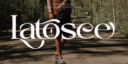 Introducing "Latosce" - An Elegant Serif Font. Embark on a journey of timeless elegance with "Latosce," a refined serif font that seamlessly blends classic charm with a contemporary touch. There's some connected letters and some alternates that suitable for any graphic designs such as branding materials, t-shirt, print, business cards, logo, poster, t-shirt, photography, quotes .etc This font support for some multilingual. Also contains uppercase A-Z and lowercase a-z, alternate character, numbers 0-9, and some punctuation. If you need help, just write me! Thanks so much for checking out my shop!
 - Radeil by Craft Supply Co,
$20.00 Radeil Vintage Font – A Unique Sans Serif Introduction to Radeil Vintage Radeil Vintage is a distinctive sans serif font with a timeless appeal. It blends vintage charm with modern simplicity. This font stands out with its unique stamp-style and rough texture. Design Features Radeil Vintage showcases a rough, textured look, resembling a hand-stamped imprint. Its characters have a slightly eroded appearance, adding to the vintage feel. The font maintains clean lines, typical of sans serif fonts, ensuring readability. Versatility and Usage Ideal for various design projects, Radeil Vintage is versatile. It’s perfect for logos, posters, and branding that require a retro touch. Its distinct style enhances both digital and print media.
 - Butter Cookie by Bogstav,
$15.00 Did you ever taste a Butter Cookie that you didn't like? I bet the answer is no. It hasn't happened to me yet. Actually I did have a butter cookie and a cup of coffee while finishing this font - and it was great! :) The font, Butter Cookie, is a playful and whimsical comic font. Like magic, the letters change as you type - but that is really not magic, but the contextual alternates...they automatically cycles through the 3 different versions as you type!
 - Red Rock by HandletterYean,
$30.00 Red Rock is a modern and tough-looking font with a strong character. Use it to make any message stand out on all of your design project, posters, business card, t-shirt, packaging, product, etc. Check out our font collection for more great and artistic fonts. Pick your most favorite font and use it as you like to reach your goals. To access the alternate glyphs, you need a program that supports openType features such as Adobe Illustrator CS, Adobe Photoshop CC, Adobe Indesign and CorelDraw. More information about how to access alternate glyphs, check out this link: http://goo.gl/ZT7PqK
 - Baby Garland by Rotterlab Studio,
$14.00 Baby Garland is a beautiful script font with a modern and elegant feel. It has a classy look that can be used for logos, branding, invitations, stationary, cards, wedding designs, social media posts, and any other design that requires a handwriting touch. This font is PUA encoded which means you can access all glyphs and swash easily! It features varied base lines, fine lines, beautiful flying machines and incredible alternatives. Thank you
 - BAQ Metal by Thinkdust,
$10.00 Another font for the BAQ family, BAQ metal brings back the classically solid, sturdy form of its predecessors with a rough and ready finish. The roundness of this font doesn’t take away from its impact, but does keep it from being too harsh, while the texture creates extra legibility at smaller sizes. Really though, BAQ metal works better when it’s bigger, standing out with its coarse appearance and rotund fullness. Use it to create outstanding headlines and catch people’s attention without being aggressive, even in a variety of different languages.
 - Niemeyer by Latinotype,
$36.00 Oscar Niemeyer is one of the greatest architects of our time—his unique way of mixing straight lines and abstract curves gives rise to an unmistakable and characteristic style. This typeface is my own tribute to Brazilian architect Oscar Niemeyer. The design process started when my wife and I visited Brazil while she was running a series of workshops on calligraphy. In my spare time, I would walk through the streets of beautiful cities like Rio de Janeiro or São Paulo, enjoying the local architecture and urban life. I had also the opportunity to attend to some of the workshops during which I was able to observe the organic of calligraphy and people. Then, I started to draw some shapes that reflected everything about this beautiful place: Niemeyer’s architecture and work and, in his own words ‘the curves on the body of the beloved woman’. This versatile typeface comes in 8 weights with matching italics, alternative characters, oldstyle figures and much more! Niemeyer is well-suited for logotypes, advertising, publishing, branding and corporate use. Special thanks to everyone in the Latinotype Team (especially to César Araya) for their support, help with corrections and digital editing.
 - Liberty Walk by Sipanji21,
$15.00 "Liberty Walk" is a display font featuring characters with straight, upright lines. Fonts like this are often used to give a clean, simple, and assertive appearance to designs. They are suitable for various design projects, including logos, posters, titles, or other design elements that require clear and upright typography.
 - Greenbriar AEF by Altered Ego,
$45.00Greenbriar AEF bears resemblance to blackletter, crisply drawn and creating a hypnotic rhythm through the interplay of stroke and counter, wieght and width. The Greenbriar numbering scheme is based on the weight and width axes of a multiple master from which the instances are generated. The first number in any of the series (1 through 5) relates to the width The second two numbers (20 through 80, in 20-unit increments) relates to the weight within the width series. Mix and match the series for a hypnotic typographic extravanganza! - Vonique 43 by Sharkshock,
$125.00 Vonique 43 is a stylish display font designed to stop passerby in their tracks. Curvaceous lowercase members define this font along with a consistently thin line weight throughout. Most are elegantly styled after circles featuring very short descenders and matching the cap height of capital letters. Vonique 43, like its predecessors, was not designed for everyday text, but eye catching logos. It's equipped with support for many different languages including Russian and Greek. Use it for a luxury brand, clothing line, or a company logo.
 - Ambleside by Hanoded,
$15.00 Ambleside is a town in the English Lake District. I used to live and work there, so I decided to name a font after it. Ambleside font is a handmade connected script font. It’s a little rough, but loveable nonetheless. Comes with all the diacritics you need!
 - Akserant Display by Din Studio,
$23.00 Akserant Display Font is an amazing display font. The font is suitable for any project like branding , lettering , tshirt print and many others. Included Files : Accents (Multilingual characters) 10 Ligatures 113 Alternates and swashes PUA encoded Numerals and Punctuation (OpenType Standard) Features with Clean and Rough Version.
 - Boyish & Weird by Rachel White Art,
$16.00 Say hello to Boyish & Weird! (I actually don't know what boyish is, but I do like how that word looks with these letters.) I had a lot of fun making this weird little font. It has oval cutouts, heavy lines, and plenty of whimsical details.