10,000 search results
(0.036 seconds)
- Ganery by Sensatype Studio,
$15.00 Madani is a sans serif font family with modern, corporate, elegant, unique and classy-look. This font crafted specials for logo design projects, ready to use on Logo, Branding, Magazine, Social Media, and Many more that needs modern touches. Madani is also included full set of: uppercase and lowercase letters 18 weights multilingual characters numerals punctuation Wish you enjoy our font. :)
 - Barley by KA Designs,
$12.00 Barley is a fantastic choice when you are looking for a script font with a modern touch. This font is hand-lettered, which gives it an authentic style. It will add a luxurious touch to any design project that you wish to create! This font is perfect for creating wedding decor and invitations, branding, logos, signatures, product packaging and much more!
 - Life Sugarly by Zaki Creative,
$10.00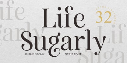 Life Sugarly is an Unique Display serif font with luxury, elegant, modern, unique and classy-look. This font crafted specials for beauty-themed projects, ready to use on Magazine, Social Media, Branding, Logo, and Many more that needs Modern touches. Life Sugarly is also included full set of: uppercase and lowercase letters multilingual characters numerals punctuation Wish you enjoy our font!
 - Megna by Sensatype Studio,
$15.00 Megna is a sans serif font with modern, corporate, elegant, unique and classy-look. This font crafted specials for logo design projects, ready to use on Logo, Branding, Magazine, Social Media, and Many more that needs modern touches. Megna is also included full set of: uppercase and lowercase letters 9 weights multilingual characters numerals punctuation Wish you enjoy our font. :)
 - Makani by Sensatype Studio,
$15.00 Makani is a sans serif font family with modern, corporate, elegant, unique and classy-look. This font crafted specials for logo design projects, ready to use on Logo, Branding, Magazine, Social Media, and Many more that needs modern touches. Makani is also included full set of: uppercase and lowercase letters 9 weights multilingual characters numerals punctuation Wish you enjoy our font. :)
 - Blue Goblet Drawn by insigne,
$5.00 This best selling series has now been extended to include a new member, Blue Goblet Drawn. Blue Goblet is hand-drawn by the artist, Cory Godbey, and is organic, charming and exuberant. Characters bounce and dance above and below the baseline and x-height, making this a whimsical and fun script. Not only is Blue Goblet Drawn a excellent choice, it also is also a versatile member of a wide family of different fonts. You can use it side by side with the original Blue Goblet fonts, and there are a wide range of ornaments available in the supplemental ornament sets--over 370 illustrations! These illustrations include doodley frames, lovely florals and other text ornaments that can be inserted into your text and resized at will. This makes the Blue Goblet series a great pick when you want a type system for a very unique and consistent look. The Blue Goblet series also continues to expand, making any of these family members a valuable investment for the future. Blue Goblet Drawn comes in three weights and three widths in each weight, with complementary italics for maximum impact for a total of eighteen pro fonts. The compact thin weights are delicate and tall, while the Regular has just enough heft for those situations where subtlety doesn't work. If you don't need the professional features, there are three stripped down fonts that include only the basic character set! Blue Goblet Drawn also includes auto-replacing ligatures that make it appear that the script was drawn by the artistís own hand--just for you! Blue Goblet Drawn also includes a wide variety of alternates that can be accessed in any OpenType enabled application. Blue Goblet includes over 190 additional glyphs and is loaded with features including an even more unique alternate alphabet. Included are swash alternates, style sets, old style figures and small caps. Please see the informative PDF brochure to see these features in action. OpenType enabled applications such as the Adobe suite or Quark can take full advantage of the automatic replacing ligatures and alternates. This family also includes the glyphs to support a wide range of languages. Blue Goblet Drawn is a great choice for friendly display type in children's books, packaging, organic packaging or other unique applications. Use Blue Goblet whenever you want to inject a handmade sense of fun and whimsy to your designs. Give the Blue Goblet series a whirl today!
 - Alrighty, let's dive into the whimsical world of the "TooneyNoodle" font, a playful creation by Nick Curtis, a designer known for his unique touch on typefaces that often evoke a strong sense of nost...
- Bourton Text by Kimmy Design,
$25.00 Bourton Text is a modern sans-serif typeface family perfect for both text type settings and display purposes. While it’s not a layering type family like its brother, Bourton, it come packed with features, extras and over 2,000 characters that make it stand on its own. HISTORY Bourton Text is a new take of the Bourton family that was one of the best-selling and favorite fonts of 2016. After countless requests for lowercase alphabet, or suggestions for a font pairing with Bourton, this new text setting family is based on the original shapes of Bourton. DESIGN & CREATION In taking Bourton Base was the starting point as they narrowest width and boldest weight. From there, lowercase shapes were designed that matched the aesthetic and details of the popular capitals. As Bourton was a heavy display font, some small tweaks were done to make it more fitting for smaller text settings, including reducing the letter-spacing and reworking some counters. Some areas needed complete reconstruction, such as the figures. The design of those began anew with a style that worked with the capitals and lowercase but also as a standalone set. Currency shapes were updated to match the numerals. Punctuation was also reimagined to work better in smaller type settings. Diacritics and extended language support was also updated and expanded to include full Latin plus language support for 219 latin based language spoken in 212 countries. Once the basic alphabet for Bourton Text Bold Narrow was formed, the font was expanded in both weight and width. Taking the weight from Bold down to Hairline, it allowed for more range in use. The typeface needed to be expanded in order to reach better as a book weight and width, in addition to a regular width, a wider version was create as well. FEATURES Once the extremes were set in place, small capital forms were designed for text and display purposes. These also allow for nested capital letters, lifted small caps and other display features offered in the typeface. One of the most popular fonts in the Bourton layering font family is Bourton Line. This led to an experimentation with rounded Bourton Text completely and thus a complete set of duplicated characters with rounded terminals. By using the Opentype Panel, a rounded font is a single click away. Every feature has been carefully thought out and updated across the entire font. In total, Bourton boasts over 2,300 glyphs, 42 font files with 3 widths and 7 weights in upright and italic.
 - Gemonica by Sensatype Studio,
$15.00 gemonica is a lovely experimental display serif font for branding and logo design that have a unique letterform. Based on our experience as a graphic designer who works for a lot of companies, we often are requested to design a logo in a unique style but with an elegant shape. So, we try to brainstorming and create this font to make the idea is going out. This is perfect for BRANDING and LOGO DESIGN. You will get classy, elegant, and certainly unique logos with this font. gemonica font is also included full set of: Uppercase and Lowercase letters Multilingual characters Numerals Punctuations Wish you enjoy our font
 - Gloomie Saturday by Timurtype,
$14.00 Introduced by Timurtype Studio! Gloomie Saturday is a Bubbly Handwritten Font this font captures the charm of handcrafted elegance with our cheerful handwritten font collection – where every word dances with personality. Enhance your designs and captivate your audience with custom lettering art. Let your words sparkle with the magic of authenticity. Explore our cheerful fonts and make your message stand out! Gloomie Saturday Font also supports multilingualism. Enhance your designs with our original fonts, feel free to comment or provide feedback, Enjoy the fonts 😊 Thank You
 - K-Block by HiH,
$10.00 K-Block was inspired by a hand-lettered sign by a young lady by the name of Kristina Lee. It captures a light-hearted, youthful feeling and is not intended to be taken too seriously. It was drawn for fun and is fun to use. Its very inconsistency insists on being casual and relaxed. Probably better for a birthday party announcement than a bank letterhead. Can you imagine a Just-For-Fun National Bank? K-Block Solid compliments K-Block and provides a stronger presence when required. For two-color work, K-Block can be layered on top of K-Block Solid to provide a different color outline for a very effective presentation. Full Western European character set plus alternate g and y, as well as a Th ligature. If you have a drawing program like Corel Draw, you can easily convert the alternate g and y to curves and stretch out the tails to underline an entire word. The zip package of each font includes two versions. There is an OTF version which is in Open PS (Post Script Type 1) format and a TTF version which is in Open TT (True Type)format. Use whichever works best for your applications. K-Block and K-Block Solid are sold separately.
 - FF Aircraft by FontFont,
$41.99 French type designer Albert Boton created this display FontFont in 2002. The font is ideally suited for advertising and packaging, music and nightlife as well as sports. FF Aircraft provides advanced typographical support with features such as ligatures, alternate characters, and case-sensitive forms. It comes with a complete range of figure set options – oldstyle and lining figures, each in tabular and proportional widths.
 - Etzada MF by Masterfont,
$59.00 Unique elegant font with condensed biblical scent. OpenType Pro Excellent support for Niqqud (Vowels). All marks are programmed to fit each glyph's shape and width. OpenType Pro includes new advanced features like Dagesh Hazak, ShevaNa, Qamatz Katan, Holam Haser and wide letters. Best used with Adobe InDesign CC that support complex Hebrew text. Please check these advanced features in this link: https://tinyurl.com/ybgdsxme
 - Crypto Cut by Vertigo,
$19.00 Crypto Cut is a narrow, sans serif, display font with three weights. Both lowercase and uppercase letters have the same width. It looks good in both classic and modern designs, logotypes, films, posters, billboards, press advertisements, websites, packaging. It provides multilingual support.
 - Chilloxine by Owl king project,
$29.00 Chilloxine is a clean font with detailed edges combined with sharp corners and one side with rounded corners. font with 18 families that bring more varied thickness and slope, with many style choices in one family, the font is very good to use for logos, titles headlines, & can even work well for text. Chilloxine is very minimalist with a clean form and is more professional.
 - Pageu by Realtype,
$14.00 Pageu is a handmade font written with a real brush pen. Written with quick movements using a brush pen. It's Handwritten with quick dry strokes. Suitable for those who need a font with real textures
 - Vintage Mintage by VP Creative Shop,
$30.00 Introducing Vintage Mintage retro font Vintage Mintage is fat, rounded font. Retro serif font loaded with alternate and ligature glyphs to make you typography truly unique! Language Support : Belarusian, Bosnian, Bulgarian, Chechen, Macedonian, Russian, Serbian, Afrikaans, Albanian, Asu, Basque, Bemba, Bena, Breton, Chiga, Colognian, Cornish, Czech, Danish, Dutch, Embu, English, Estronian, Faroese, Filipino, Finnish, French, Friulian, Galician, Ganda, German, Gusii, Hungarian, Indonesian, Irish, Italian, Jola-Fonyi, Kabuverdianu, Kalenjin, Kamba, Kikuyu, Kinyarwadna, Litvian, Lithuanian, Lower Sorbian, Luo, Luxembourish, Luyia, Machame, Makhuwa-Meetoo, Makonde, Malagasy, Maltese, Manx, Meru, Morisyen, North Ndebele, Norwegian Bokm ål, Norwegian Nynorsk, Nyankole, Ormo, Polish, Portuguese, Quechua, Romanian, Romansh, Rombo, Rundi, Rwa, Samburu, Sango, Sangu, Scottish Gaelic, Sena, Shambala, Shona, Slovak, Soga, Somali, Spanish, Swahili, Swedish, Swiss German, Taita, Teso, Turkish, Ukrainian, Upper Sorbian, Uzbek (Latin), Volap ük, Vunjo, Walser, Welsh, Western Frisian, Zulu FEATURES Uppercase, lowercase, numeral, punctuation & Symbol Cyrillic support ligature glyphs alternates Multilingual support - 95 languages No special software is required to type out the standard characters of the Typeface. How to access alternate glyphs? To access alternate glyphs in Adobe InDesign or Illustrator, choose Window Type & Tables Glyphs In Photoshop, choose Window Glyphs. In the panel that opens, click the Show menu and choose Alternates for Selection. Double-click an alternate's thumbnail to swap them out. Feel free to contact me if you have any questions! Mock ups and backgrounds used are not included. Thank you! Enjoy!
 - Aesthetic Vintage by Putracetol,
$26.00 Aesthetic Vintage is a bold vintage script font. In this font I try to combine vintage with luxury/aesthetics. So that this font can be used in various projects with retro/vintage and luxury themes. Such as logos, branding, posters, packaging, book covers, clothes/apparel, quotes, titles and others. This font come with clean and rough font version. Come with Opentype feature with a lot of alternates, its help you to make great lettering. This font is also support multi language.
 - CircuitBoredNF is a distinctive font created by Nick Curtis, a designer known for his prolific work in the world of typography. This font stands out due to its unique inspiration and design, which cl...
- Rolling Pen by Sudtipos,
$79.00 After doing this for so many years, one would think my fascination with the old history of writing would have mellowed out by now. The truth is that alongside being a calligraphy history buff, I'm a pop technology freak. Maybe even keener on the tech thing, since I just can't seem to get enough new gadgets. And after working with type technologies for so many years, I'm starting to think that writing and design technologies as we now know them, being about 2.5 post-computer generations, keep becoming more and more detached from what the very old humanity arts/tasks they essentially want to facilitate. In a world where command-z is a frequently used key combination, it’s difficult to justify expecting a Morris-made book or a Zaner-drawn sentence, but accidental artistic “mutations” become welcome, marketable features. When fluid pens were introduced, their liquid saturation influenced type design to a great extent almost overnight an influence professional designers tend to play down. Now round stroke endings are a common sight, and the saturation is so clean and measured, unlike any liquid-paper relationship possible in reality. Some designers even illustrate their work by overlaying perfect circles at stroke ends, in order to illustrate how “geometric” their work was. Because if it’s measured with precise geometry, it’s got to be meaningful design. And once in a while, by a total freak accident, the now-cherished mutations prove to have existed long before the technology that caused them. Rolling Pen was cued by just such a thing: A rounded, circular, roll-flowing calligraphy from the late nineteenth century seemingly one of those experimental takes on what inspired Business Penmanship, another font of mine. Looking at it now it certainly seems to be friendlier, more legible, and maybe even more practical and easier to execute than the standard business penmanship of those days, but I guess friendliness and simplicity were at odds with the stiff manner business liked to present itself back then, so that kind of thing remained buried in the professional penman’s oddities drawer. It would be quite a few years before all this curviness and rounding were thought of as symbolic of graceful movement, which brought such a flow closer to the idea of fine art. Even though in this case the accidental mutation just happens to not be a mutation after all, the whole technology-transforms-application argument still applies here. I'm almost sure “business” will be the last thing on people’s minds when they use this font today. One extreme example of that level of disconnect between origin and current application is shown here, with the so-called business penmanship strutting around in gloss and neon. Rolling Pen is another cup of mine that runneth over with alternates, swashes, ligatures, and other techy perks. To explore its full potential, please use it in a program that supports OpenType features for advanced typography. Enjoy the new Rolling Pen designed by Ale Paul with Neon’s visual poetry by Tomás García.
 - Alifut MF by Masterfont,
$59.00 A practical font family with 4 weights for all your day to day design needs: headlines, body text, signage etc. High legibility at small sizes. An extended sans serif typeface with rounded endings that provides a unique softness appearance without losing legibility. The Pro version is an excellent support for Niqqud (Vowels). All marks are programmed to fit each glyph's shape and width. Best used with apps that support right to left Hebrew text, like Adobe InDesign CC or MS Word.
 - Invitation Script by Intellecta Design,
$69.00 Iza W and Intellecta Design are proud to announce Invitation Script, a modern and clean revival of the classic work of the Portuguese master penman Manuel de Andrade de Figueiredo, whose work can be seen in “Nova Escola para aprender a ler, escrever, e contar (...)'' (1722). Invitation Script is the third script superfamily published by Intellecta Design, after Penabico and Van den Velde Script. Invitation Script has original letters designed by Iza W. Creative direction and core programming were provided by Paulo W. Chyrllene K assisted with some work on unusual and archaic styles, resulting in a special font - Invitation Script Archaic (soon available). Invitation started out from Andrade’s script style and evolved into a voluptuous script font family. The result is a typeface ideal for beautiful headings, signatures, art work typography, titles and short pieces of hand-lettered text. Invitation family includes two multi-table Opentype fonts, three supplementary fonts for ornaments and fleurons, and the Archaic font with some of the Andrade’s original characters. Embedded in the regular fonts are additional sets of letters. Over 40 variations are available for certain letters via the Special Sets Opentype table. The two regular versions of Invitation Script contains the following: (i) An extensive set of ligatures providing letterform variations that make eye-popping designs or simulate real handwriting. These are accessible via contextual alternates and other open-type features. (ii) Many stylistic alternates for each letter (upper and lowercase, accessed via the glyph palette, encoded in the ranges of the Special Set Opentype feature). Since there are over 1100 glyphs in each font, we suggest using the glyph palette. (iii) A set of ornaments and fleurons accessed with the glyph palette or using the Ornaments feature. Additional ornaments can be found in the two Invitation Script Ornaments fonts. (iv) Initial and final letters with artistic variations accessible using the initial and final form open-type features. (v) Major kerning work: over 6000 kerning pairs, hand-set to avoid collisions and to create intricate combinations of letters, using swashes and other resources. These powerful features are all accessible in InDesign, Illustrator, QuarkXpress and similar software. We recommend exploring the magic of this font using the glyph palette. Our sample illustrations and PDF brochures showcase the power and pizzazz of this calligraphic script. Let your imagination go wild and use Invitation Script in ways that Andrade could not have foreseen. In non-OpenType-savvy applications, Invitation Script is still an exceptionally beautiful calligraphic typeface that stands up to the competition. The regular fonts contains the complete Latin alphabet, including Central European, Vietnamese, Baltic and Turkish, with a full set of diacritics and punctuation marks. --- 1 FIGUEIREDO, Manuel de Andrade de, 1670-1735 Nova Escola para aprender a ler, escrever, e contar. Offerecida á Augusta Magestade do Senhor Dom Joaõ V. Rey de Portugal. Primeira parte / por Manoel de Andrade de Figueiredo, Mestre desta Arte nas cidades de Lisboa Occidental, e Oriental. - Lisboa Occidental: na Officina de Bernardo da Costa de Carvalho, Impressor do Serenissimo Senhor Infante, 1722. - [18], 156 p., 44 f. grav. a buril : il., ; 2º (31 cm)Engraved royal coat of arms supported by angels over the city of Lisbon, engraved portrait of the author (both of the foregoing by Bernard Picart), (12)ff., 156pp., engraved calligraphic section title, 44 engraved plates. Wood-engraved culs-de-lampe and lettrines. Sm. folio. “Andrade de Figueiredo was born in Espirito Santo, where his father was Governor of the ‘Capitania.’ The fine portrait is dated 1721 and is showing Figueiredo at the age of 48. He was an eminent calligrapher and a creator of the Portuguese handwriting until the reign of Don José I (ca. 1755). His work follows the style of the great Italian masters in its use of clubbed ascenders and descenders, and of Diaz Morante, the famous Spanish writing master, in its very elaborate show of command of hand. By his contemporaries, he was known as the ‘Morante portugues’” (Ekström). “Ce livre est un manuel, composé de quatre parties, destiné à apprendre à lire, à écrire, à conter ainsi que l’orthographe. Les planches comportent des examples d’écritures, d’alphabets et de textes ornés de remarquables traits de plume exécutés d’une main sûre et enjouée” (Jammes).
 - Selfie Neue Sharp by Lián Types,
$29.00 INTRODUCTION When I started the first Selfie back in 2014 I was aware that I was designing something innovative at some point, because at that time there were not too many, (if any) fonts which rescued so many calligraphy features being at the same time a monolinear sans. I took inspiration from the galerías’ neon signs of my home city, Buenos Aires, and incorporated the logic and ductus of the spencerian style. The result was a very versatile font with many ligatures, swashes and a friendly look. But… I wasn’t cognizant of how successful the font would become! Selfie is maybe the font of my library that I see the most when I finally go out, (type-designers tend to be their entire lives glued to a screen), when I travel, and also the font that I mostly get emails about, asking for little tweaks, new capitals, new swashes. Selfie was used by several renowned clients, became part of many ‘top fonts of the year’ lists and was published in many magazines and books about type-design. These recognitions were, at the same time, cuddles for me and my Selfie and functioned as a driving force in 2020 to start this project which I called Selfie Neue. THE FONT "Selfie for everything" Selfie Neue, because it’s totally new: All its glyphs were re-drawn, all the proportions changed for better, and the old and somehow naive forms of the first Selfie were redesigned. Selfie Neue is now a family of many members (you can choose between a Rounded or a Sharp look), from Thin to Black, and from Short to Tall (because I noticed the feel of the font changed notoriously when altering its proportions). It also includes swashy Caps, which will serve as a perfect match for the lowercase and some incredibly cute icons/dingbats (designed by the talented Melissa Cronenbold, see also Selfie Neue Rounded for more!) which, as you see in the posters, make the font even more attractive and easy to use. You'll find tons of alternates per glyph. It's impossible to get tired with Selfie! Like it happened with the old Selfie, Selfie Neue Sharp was thought for a really wide range of uses. Magazines, Book-covers, digital media, restaurants, logos, clothing, etc. Hey! The font is also a VF (Variable Font)! So you can have fun with its two axes: x-height and weight, in applications that support them. Let me take a New Sharp Selfie! TECHNICAL If you plan to print Selfie Neue VF (Rounded or Sharp), please remember to convert it to outlines first. The majority of the posters above have the "contextual" alternates activated, and this makes the capitals a little smaller. I'd recommend deactivating it if you plan to use Selfie for just one word. Use the font always with the "fi" feature activated so everything ligatures properly. The slant of the font is 24,7 degrees, so if you plan to have its stems vertical, you may use Selfie with that rotation in mind. THANKS FOR READING
 - The IndochineNF font, crafted by the talented type designer Nick Curtis, stands as a vibrant testament to the allure and timeless beauty of early 20th-century typefaces, with a unique flair that draw...
- MS Gothic UI by Microsoft Corporation,
$39.00MS UI Gothic™ features plain strokes similar to sans serif designs with proportional width Latin characters. It was modified for the display requirement of User Interfaces. This font file is 4.4 MB in size. MS Gothic is a trademark of Microsoft Corporation. MS UIGothic font Character Set: Latin-1, Japanese (Code Page 932) - Simplo by Durotype,
$49.00 Simplo: the ‘Italian Futura’. Simplo is a geometric sans serif typeface, built in sixteen styles. It is a tribute to the 1930s typeface Semplicità, designed by Nebiolo’s Alessandro Butti. Although many details of Simplo differ from Semplicità, it preserves the spirit of the original. Simplo is ideal for use in display sizes. It is also quite legible in text, and is well suited for graphic design and corporate identity design. Simplo has sixteen styles, extensive language support, eight different kinds of figures, sophisticated OpenType features — so it’s ready for advanced typographic projects. The most notable characteristics of this typeface are the ‘t’ and the ‘f’. The ‘t’ is the culmination of simplicity: a vertical line with just a simple right-side crossbar. The ‘f’ also has just a right-side crossbar, and is really tall: it reaches both the highest and lowest vertical position of the typeface. The top of the distinctive ‘s’, is much narrower than its bottom. The ‘a’, ‘b’, ‘d’, ‘g’, ‘p’, ‘q’, and ‘u’ are spurless, and show a family resemblance with Hans Reichel’s 1990s typeface Dax. However, these letters are rounder and more geometric than Dax’s counterparts, because of Dax’s higher x-height and narrower design. In Paul Shaw’s Imprint article about typefaces that have been overlooked and/or underappreciated, “Overlooked Typefaces”, he concluded his discussion of Semplicità as follows: “These idiosyncrasies suggest that Semplicità might find a warm reception today, given the current love affair with Gotham, Neutraface and Proxima—and the resurgence of ITC Avant-Garde Gothic.” Free demo font available. For more information about Simplo, download the PDF Specimen Manual.
 - Black Love Pink by Stefani Letter,
$14.00 Carefully designed, black love pink is a stunning and beautiful handwritten font with a light feel. Fall in love with its delicate and sophisticated characters, and use it for any design project that requires a romantic twist. This font is easy to use. it remains only to add symbols (--,++,--) in front, middle, and back to reveal the features. This font is PUA encoded which means you can access all of the glyphs and swashes with ease! It features a varying baseline, gorgeous glyphs, and stunning alternates.
 - Sabat Brush by Realtype,
$17.00 Sabat Brush is a handmade font written with a real brush pen. Written with quick movements using a brush pen. It's Handwritten with quick dry strokes. Suitable for those who need a font with real textures.
 - Rational Mood by Pixel Colours,
$18.00 Rational Mood is a handwritten font trio that includes an uppercase font that combines perfect with a script font and is loaded with tons of cute extra illustrations. This is a perfect font to create quotes or texts with a handwritten, natural style.
 - Heanffe by Letterara,
$12.00 Heanffe is a one-of-a-kind handwritten font with a beautiful feel. To maintain a true, hand lettered experience, this font includes the following ligatures: Alu, at, ch, dd, ee, ff, ll, oo, pp, ss, tt, ef, es, et, eth, ily, it, ith, om, ot, on, ou, ont, th, ov, ow, sh, st, ut, zz Just use your imagination, your project will become more alive and look Elegant than ever with one of the Heanffe font. Feel free to play with all the whole alternates! Heanffe also includes full set of uppercase and lowercase letters, multilingual symbols, numerals, punctuation. The font has smooth wet ink texture, so would be perfect for all designs. You can make a greeting card or a package design, or even a brand identity, craft design, any DIY project, book title, wedding invitation, identity card, packaging, Website or any purpose to make your art / design project look pretty and trendy.
 - Mantika Sans Paneuropean by Linotype,
$67.99With its well-defined characters that are readily legible even in the small font sizes, Mantika Sans by Jürgen Weltin is ideal for typesetting. The elaborately designed and highly individual set of italics enhances the attractiveness of the font.Jürgen Weltin developed the Mantika™ Sans sans serif font using older designs for an serif font as his inspiration. Nothing more than the merest suggestion of the original serifs has survived. Bevelled line endings and the slight variation in thickness of verticals, in particular, provide Mantika Sans with a very dynamic character that evokes manuscript. Short ascenders and descenders give the font a compact appearance that is also underscored by its condensed proportions. Weltin has achieved his aim of producing a typeface with excellent legibility even in small sizes not just by means of the x-height, which is tall in comparison with the capital letters, but also by using clearly defined and well differentiated designs for critical letters, such as i", "I" and "l". Lower case "i", for example, has a serif while the "l" has a curved base.In addition to uppercase numerals, Mantika Sans also has lowercase or old style numerals that have been designed so that they can be used in both tabular and proportional settings. The uppercase numerals are slightly shorter than the uppercase letters, ensuring that the latter can be sympathetically incorporated within continuous text.The Mantika Sans italics are very unusual. They are inclined at only 4.5° (the usual angle for italics is 10 - 12°) and so appear to be almost upright. In addition, they also have quite distinctive forms. The overall effect calls attention to their curvilinear, manuscript character, enhances contrasts and further emphasizes the terminals. Weltin explains: "Within the variety of forms of the italics there are many contrasting terminal elements that create dynamism. The result is a diversity of interaction between the rounded and angular forms". Mantika Sans Italic thus has all the features of a display typeface, but can also be happily used on its own to set longer text passages. Mantika Sans is available in two weights; Regular and Bold, both of which have corresponding italics sets. Mantika Sans has been designed so that the widths of the four related cuts are identical, meaning that a change of font within a single layout will have no effect on justification. In addition, the members of the Mantika Informal font family, designed by Jürgen Weltin in 2010, also have the same thickness. Other font families having weights with equal thickness can be found in the "Linotype Office Alliance series".The Mantika Sans character sets are paneuropean. There are characters for setting texts in Eastern European languages, Greek and Cyrillic. There is also a range of special symbols, including right-angled brackets, subscript and superscript lower case letters, together with numerals, arrows and many different bullet points.As a vibrant and highly legible text font, Mantika Sans has a broad spectrum of potential applications. Its unusual italics are not just perfect for use in display text. The fact that it has only four cuts means that Mantika Sans is particularly suitable for office use or for the setting of business reports. Its excellent legibility even in the small font sizes also makes it ideal as a text for electronic reading devices; this also applies to Mantika Informal.At the 3rd International Eastern Type Design Competition Granshan 2010, Mantika Sans was awarded in the category Greek text typefaces." - Mantika Sans by Linotype,
$50.99 With its well-defined characters that are readily legible even in the small font sizes, Mantika Sans by Jürgen Weltin is ideal for typesetting. The elaborately designed and highly individual set of italics enhances the attractiveness of the font.Jürgen Weltin developed the Mantika™ Sans sans serif font using older designs for an serif font as his inspiration. Nothing more than the merest suggestion of the original serifs has survived. Bevelled line endings and the slight variation in thickness of verticals, in particular, provide Mantika Sans with a very dynamic character that evokes manuscript. Short ascenders and descenders give the font a compact appearance that is also underscored by its condensed proportions. Weltin has achieved his aim of producing a typeface with excellent legibility even in small sizes not just by means of the x-height, which is tall in comparison with the capital letters, but also by using clearly defined and well differentiated designs for critical letters, such as i", "I" and "l". Lower case "i", for example, has a serif while the "l" has a curved base.In addition to uppercase numerals, Mantika Sans also has lowercase or old style numerals that have been designed so that they can be used in both tabular and proportional settings. The uppercase numerals are slightly shorter than the uppercase letters, ensuring that the latter can be sympathetically incorporated within continuous text.The Mantika Sans italics are very unusual. They are inclined at only 4.5° (the usual angle for italics is 10 - 12°) and so appear to be almost upright. In addition, they also have quite distinctive forms. The overall effect calls attention to their curvilinear, manuscript character, enhances contrasts and further emphasizes the terminals. Weltin explains: "Within the variety of forms of the italics there are many contrasting terminal elements that create dynamism. The result is a diversity of interaction between the rounded and angular forms". Mantika Sans Italic thus has all the features of a display typeface, but can also be happily used on its own to set longer text passages. Mantika Sans is available in two weights; Regular and Bold, both of which have corresponding italics sets. Mantika Sans has been designed so that the widths of the four related cuts are identical, meaning that a change of font within a single layout will have no effect on justification. In addition, the members of the Mantika Informal font family, designed by Jürgen Weltin in 2010, also have the same thickness. Other font families having weights with equal thickness can be found in the "Linotype Office Alliance series".The Mantika Sans character sets are paneuropean. There are characters for setting texts in Eastern European languages, Greek and Cyrillic. There is also a range of special symbols, including right-angled brackets, subscript and superscript lower case letters, together with numerals, arrows and many different bullet points.As a vibrant and highly legible text font, Mantika Sans has a broad spectrum of potential applications. Its unusual italics are not just perfect for use in display text. The fact that it has only four cuts means that Mantika Sans is particularly suitable for office use or for the setting of business reports. Its excellent legibility even in the small font sizes also makes it ideal as a text for electronic reading devices; this also applies to Mantika Informal.At the 3rd International Eastern Type Design Competition Granshan 2010, Mantika Sans was awarded in the category Greek text typefaces."
 - DrumagStudioNF, a font crafted by Nick Curtis, is a true representation of vintage charm meeting modern design sensibilities. This typeface stands out for its bold and distinctive character shapes th...
- Latin CT by CastleType,
$59.00 The Latin family of typefaces, first popular in the last half of the nineteenth century, is characterized by its large, sharp, triangular serifs. With six widths (from Extra Condensed to Wide), Latin CT offers the most extensive collection of Latin fonts available, each with a large character set that includes support for all European languages including those that use the Cyrillic alphabet. From the sleek elegance of Latin CT Extra Condensed to the brash boldness of Latin CT Wide, you will find a width to fit your contemporary typographic needs.
 - Sister Frisky by Chank,
$99.00 Sister Frisky jumps up and down and drinks a lot of coffee. There are no two parallel lines in this font, and no right angles. Here's a flashy, dancing, retro script with an sharp edge and clear wit!
 - Meritocracy by Up Up Creative,
$29.00 Introducing Meritocracy, a full-featured handwritten font with tons of alternate characters and OpenType features. My goal with this font was to make you a typeface that will look as much like hand lettering as possible. Using the built-in OpenType pseudo-random contextual alternates and over 300 individually drawn ligatures, you can infuse your typography with personality and variety.** OpenType Features Meritocracy comes with more than 900 glyphs! Specific OpenType features include contextual alternates, stylistic alternates, a second stylistic set for variety, multiple alternate glyphs for many letters (accessed through the glyphs panel), multilingual support (including multiple currency symbols), standard numbers, and seven ampersand styles. It also includes 325+ standard and discretionary ligatures, all of them individually hand-drawn to be different from all other glyphs in the font. These ligatures allow you to give a super-realistic hand-lettered look to your typography. You can write the same word in so many different ways if you combine the default set, stylistic set 01, and standard and discretionary ligatures in different ways. SPECIAL OPENTYPE FEATURE: If you are using OpenType-capable software like Adobe Illustrator, Photoshop, InDesign, or CorelDraw and you have contextual alternates turned on, you can see the letters randomize themselves as you type, mixing from the default character set and stylistic set 01. (You can always turn on contextual alternates after you have already typed your passage and it will randomize all at once, or you can choose to turn off contextual alternates and substitute specific glyphs yourself - I find that if I'm typing a word or two, I prefer to control the individual glyphs myself; if I'm typing a paragraph, I like to use the built-in randomness of the contextual alternates feature). Note that this pseudo-randomization (aka contextual alternate feature) is ON by default in Apple's Pages app and OFF by default in Microsoft Word, but it can be turned on. The OpenType features can be very easily accessed by using OpenType-savvy programs such as Adobe Illustrator and Adobe InDesign. (To access most of these awesome features in Microsoft Word, you'll need to get comfortable with the advanced tab of Word's font menu. If you have questions about this, ask me!) Files included: Meritocracy-Regular.otf Please note: there is only one file for this font. That's the magic of OpenType - all of the alternates, ligatures, etc. are built right into the .otf file! Mail support : julie@upupcreative.com --- Find inspiration (and sneak peeks at my next font-in-progress) on - Instagram: http://instagram.com/julieatupupcreative - Facebook : https://www.facebook.com/upupcreative - Pinterest: https://www.pinterest.com/upupcreative - My website: http://upupcreative.com --- **PLEASE ENJOY! I can't wait to see what you make with Meritocracy! Feel free to use the #upupcreative and #meritocracyfont tags to show me what you've been up to!**
 - Lamar Pen by Three Islands Press,
$39.00 Mirabeau Buonaparte Lamar had an exotic name for a historic Texan, but he left his mark beginning in 1836, the year of Texas independence and the first year that pioneers other than mountain men made their way West. Lamar went on to become the young republic’s first elected vice-president (to President Houston) and second president -- and to author a number of interesting letters in his elegant, stylish hand. (Mirabeau B. Lamar grew up a well-to-do southerner from Georgia, and his penmanship shows it.) One of the most interesting aspects of designing old handwriting fonts, to me, is pausing to reflect on the actual moment that the letter-writer is sitting at his or her desk or table, pen in hand, putting thoughts to words -- 150 to 200 years ago. Has a complete character set, and plenty more.
 - Sunpalm Addict by YdhraStudio,
$20.00 Sunpalm Addict is a stylish modern calligraphy font. It’s containing upper & lowercase characters, all punctuation and numerals. Also contains 85 ligatures to help the text flow naturally For those of you who are needing a touch of elegance and modernity for your designs, this font was created for you! Sunpalm Addict is great for Invitations, Greeting Cards, Posters, Name Card, Quotes, Blog Header, Branding, Logo, Fashion, Apparel, Letter, Book, Magazine, Advertising Design, Stationery and more! Sunpalm Addict Features: - Upper and Lowercase Standard Characters, Punctuation, Numerals - OpenType features such as multiple ampersand (&) and many ligatures - Bonus Illustration - PUA Encoded Characters - Fully accessible without additional design software. - Includes a range of multilingual characters. You can access all those alternate characters by using a program that supports OpenType features such as Adobe Illustrator CS, Adobe Indesign & CorelDraw X6-X7. Guides to access all alternates glyphs : http://adobe.ly/1m1fn4Y Mix and match the alternate characters to add an attractive message to your design. Please, Feel free to contact me by e-mail yyudhara@gmail.com for any question about my font, Extended License document and more.
 - Absalon by Michael Nordstrom Kjaer,
$39.00 Absalon has square letter shapes. It has some characteristics semi-sharp and semi-rounded corners and it has a relatively tall x-height for legible text. To create the perfect typesetting the spaces between individual letter forms has been precisely adjusted. The Absalon font family is perfect for the web as well as for print, for display as well as longer text, for motion graphics, on the side of a van, t-shirts, logotypes and so on. The font family consist of 5 weights or 10 styles and it has 410 glyphs. A total of more than 4000 glyphs. The styles are: Light, Light Italic, Regular, Italic, Medium, Medium Italic, Bold, Bold Italic, Extra Bold & Extra Bold Italic. It has OpenType features such as automatic fractions, subscript, superscript, numerators, denomerators, ordinals and the “f” ligature set. Absalon has extended language support (most Latin-based scripts are supported). The name of the font family is Absalon and it is a reference to a Danish bishop in the middle ages. He was a key figure in the founding of Copenhagen, the Capital of Denmark.
 - Blue Bronx by Putracetol,
$24.00 Blue Bronx - Bold Vintage Scipt Font. Blue Bronx is a bold vintage script font. Blue Bronx is font we combine vintage with luxury script font. Blue Bronx can be used in various projects with retro or vintage and luxury themes. Such as logos, branding, posters, packaging, book covers, clothes/apparel, quotes, titles and others. Blue Bronx come with clean and rough font version. Come with Opentype feature with a lot of alternates, its help you to make great lettering. This font is also support multi language.