10,000 search results
(0.114 seconds)
- Merengue Script by Sudtipos,
$59.00 Merengue Script is the second typeface designed by Panco, once again together with Ale Paul, who supervised the whole development. In this opportunity, the process of shape research and the systematization of signs led him to dive into new waters. The objective was to generate a system of signs in which the construction of such was not directly bound to traditional calligraphy, nor to texts typography. Instead, the point was to create signs inspired in “Brush pen” calligraphy but with their main features drawn or literally illustrated. The result was a font with personality, authenticity and uncommon formal aspects that make Merengue Script an interesting, highly attractive and rather unusual font. From the very beginning, the search was based on creating a font with weight and good presence in big formats, but, at the same time, efficient for brief texts of small formats. The aim was to make it usable mainly in candy, sweets and chocolate packaging. The predominance of round shapes, harmonious modulations and funny and friendly-looking visual rhythms spark a special effect in the usage of Merengue Script. Texts are enhanced with an interesting visual charm, capable of transforming a very simple text into a virtual illustration that semantically reinforces the messages in a simple way, without putting legibility at risk. With a basic set of stylistic alternatives full of frills and flounces for initials, ornamental and final letters, plus a set of disconnected signs, Merengue Script offers a wide and versatile range of options for graphic designers in the process of packaging design.
 - Rantic Kafis by Product Type,
$17.00 Introducing Rantic Kafis, a classic modern font with a bold and elegant touch. This font features thick strokes and rounded edges, giving it a distinctive and sophisticated look. With its stylistic set options for upper and lowercase letters, Rantic Kafis adds a touch of individuality and creativity to any design. Rantic Kafis is the perfect font to add a classic modern feel to your work. Its thick strokes and rounded edges make it highly legible, ensuring that your designs are easy to read and understand. So if you’re looking for a font that combines the best of classic and modern design, look no further than Rantic Kafis. Download it now and start creating stunning designs that stand out from the crowd! What’s Included : - File font - All glyphs Iso Latin 1 - We highly recommend using a program that supports OpenType features and Glyphs panels like many Adobe apps and Corel Draw, so you can see and access all Glyph variations. - PUA Encoded Characters – Fully accessible without additional design software. - Fonts include Multilingual support
 - Metub by Twinletter,
$17.00 Introducing Metub, the superhero display font with a unique and powerful serif style that’s sure to make your designs stand out. Each letter is meticulously crafted to convey strength and individuality, making this font the perfect choice for bold and impactful projects. With 52 stylish alternate characters and 32 beautifully designed ligatures, Metub offers endless design possibilities that are sure to elevate your work to new heights. Whether you’re designing posters, logos, or branding materials, Metub is the ideal font for any project that demands a strong and unique aesthetic. And with multilingual support, this font is perfect for projects with a global reach. Give your designs a powerful edge with Metub today. What’s Included : - File font - All glyphs Iso Latin 1 - Alternate, Ligature - Simple installations - We highly recommend using a program that supports OpenType features and Glyphs panels like many Adobe apps and Corel Draw so that you can see and access all Glyph variations. - PUA Encoded Characters – Fully accessible without additional design software. - Fonts include Multilingual support
 - TT Commons™️ Pro by TypeType,
$39.00 Introducing TT Commons™️ Pro, version 3.300! We’ve extended our bestseller and made it even better by adding the Greek alphabet and updating the OpenType features. The TT Commons™️ Pro typeface currently includes: 5 different subfamilies: Standard, Condensed, Compact, Expanded, and Mono; 102 font styles + 2 variable fonts: TT Commons™️ Pro Variable and TT Commons™️ Pro Mono; 1546+ characters in each Mono font style set and 1656+ characters in each Standard, Condensed, Expanded, and Compact font style; 275+ languages support, along with the Vietnamese and Greek alphabets (in all subfamilies but Mono); flawless kerning and manual TrueType hinting; 32+ OpenType features.
 - Wicked Butter by Toudji Studio,
$19.00 Wicked Butter is a display font inspired by writing styles for young children, such as animated cartoons, comic posters, and so on. This font is bold but sharp and bouncy, which makes it look more playful but still strong. This font also comes with several combined letter variations. but you can still use wicked butter for many print and digital needs.
 - Freigeist by René Bieder,
$29.00 The story of Freigeist is a journey into the past, back to the early grotesk fonts and long before Helvetica and Co were standard fonts in operating systems. For what we take for granted today is the result of innovation and pioneering spirit of type foundries such as Caslon or Stephenson Blake in the 19th century, whose expressive designs are mostly forgotten today. The Freigeist family captures this untamed spirit — hence the name (German for “free spirit”) — and puts it into a contemporary context, resulting in a multi-faceted family with a wide range of applications, font styles and features for modern typesetting. Design Details Unlike other modern grotesk typefaces like Helvetica or Univers, Freigeist is characterized by a warm and dynamic appearance. It draws inspiration from various historical models such as Caslon’s Doric or the Grotesque variants of Stephenson Blake. Particularly noticeable are the narrow terminals, the serpentine S or the dynamic g in combination with ascenders that reach to the cap-height only. Italics Many italic grotesk fonts are strongly oriented towards their upright counterparts. Unfortunately, this often means that they cannot do justice to their actual task, which is to highlight words or sections of a text. The italic cuts of Freigeist try to remedy this situation by using the greatest possible formal distance while reinforcing the untamed spirit. What adds to this, is a reminiscent of handwritten forms, which can be found in a, n, y or g, as well as the German sharp s or the ampersand. Alternate Characters Alternative letterforms are ideal for customizing the overall appearance of a text, for usage in logos or they can even work as custom fonts for companies. Freigeist comes with ten stylistic alternatives that are easy to insert via the Opentype window, such as the single-storey a, a tail-less version of the a for compact text, when uses in condensed widths or a dialed down version of the r. Languages Freigeist has a built-in support for Latin and Cyrillic based languages and covers more than 210 languages. Opentype Features and Symbols The family comes with many opentype features to support modern typesetting. This includes ligatures, different number sets or alternative shapes for texts set in all caps. Styles Freigeist is available in five widths (XCon, Con, Normal, Wide, XWide) and six weights (Thin, Light, Regular, Medium, Bold, Black). Including the accompanying italics, the family comes in 60 cuts that are suitable for any application. Testfonts If you like to test the fonts before buying the full version, please follow the link below: https://www.renebieder.com/test-fonts Update 1 A lot has changed in this first update. It is more than just a 1.01 or 1.02. It is actually the 2.0! I’ve gone through all! single glyphs of the 18 master files, making the family more sharp and even a bit more modern. I’ve added some new opentype features and redesigned the italics, because I wasn’t happy enough with the result. I’ve added new kerning pairs, new metrics, and even new glyphs. Please check my website for more details on the new design and overview about the opentype features and alternate shapes. If you purchased the Freigeist family already, thanks a lot!! It is the most advanced family that I published so far. I hope that you’re happy with this new version. Thanks!
 - Jefferson Pilot NF by Nick's Fonts,
$10.00One in the series of fonts called Whiz-Bang Wood Type, intended to be set large and tight. Jefferson Pilot’s unusual letter treatment isn't for every project, but for projects that need a great "old-timey" look, it’s perfect. Named for a city in East Texas that was a port city on the late 1800s, but today is landlocked. Both versions of this font contain the Unicode 1252 Latin and Unicode 1250 Central European character sets, with localization for Romanian and Moldovan. - Paintruck by IKIIKOWRK,
$19.00 Proudly present Paintruck - Retro Bold Type, created by ikiiko. A bold vintage serif font with a strong, powerful style that instantly evokes a sense of the past with its pop-retro vibes. The ability of Paintruck to conjure a sense of nostalgia while still seeming current and new is what truly sets it distinct. Get also a good offer & FREEBIE at our site : www.ikiiko.com Enjoy our font and if you have any questions, you can contact us by email : ikiikowrk@gmail.com
 - Cattyfox by Popskraft,
$19.00 Everyone loves black, strict stylish and elegant shapes. We strive to be perfect. Right? But ... don't you think we have lost something? Maybe childish spontaneity? The Cattyfox font will take you back to those wonderful times when there was no need to be serious, when the whole world was not so serious. If you want to have some uncompromising fun, hover above the crowd to show everyone how free you are, just create something in Cattyfox font and you will understand what true freedom is.
 - Biscuiterie Monoline Script by Attract Studio,
$11.00 Biscuiterie is a Monoline Script Typeface, a classic and fun vintage script. Combination with classic & modern style fonts. This font can be used easily, even in mixing and matching with other fonts. So that it can provide alternatives and new sensations for designers or craftsmen, in working on various projects. This font you can use for various purposes. Such as logos, wedding invitations, t-shirts, letterhead, signage, labels, news, posters, badges, etc.Barlington comes with uppercase letters, lowercase letters, numbers, punctuation, and so many variations on each character including OpenType alternatives, and multilingual support. Biscuiterie features OpenType stylistic alternates, ligatures and International support for most Western Languages is included. To enable the OpenType Stylistic alternates, you need a program that supports OpenType features such as Adobe Illustrator CS, Adobe Indesign & CorelDraw X6-X7, Microsoft Word 2010 or later versions.How to access all alternative characters using Adobe Illustrator: https://www.youtube.com/watch?v=XzwjMkbB-wQ Biscuiterie is coded with PUA Unicode, which allows full access to all the extra characters without having special designing software. Mac users can use Font Book , and Windows users can use Character Map to view and copy any of the extra characters to paste into your favourite text editor/app.How to access all alternative characters, using Windows Character Map with Photoshop: https://www.youtube.com/watch?v=Go9vacoYmBw If you have any question, don't hesitate to contact me. Thanks so much for looking and Enjoy it!
 - Hela by Renegade Fonts,
$12.00 Hela is a high contrast rounded font with interpolation twist. I have a personal saying that fits this font: So long you drive around nice lettering, until you digitize it. Hela comes from lettering of an old Czech textile company called Helana, which does not exist anymore, but the signage is still on the building. The weird thing on this font is that it does not add weight on every stem from Light to Black as usual, but rather adds more and more black stems to the light skeleton. Another nice thing about this font is that it does not include unnecessary glyphs. So there are just 10 figures - you don't have to think which one is the correct figure kind for you. There is just one kind. No alternates, no italics, no opentype features - even no lowercase. Well, who would use it anyway, it is a display font! Try it yourself with Basic character set for free.
 - Modesty by Flawlessandco,
$9.00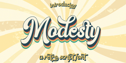 Modesty is an retro font type with a fun and groovy style that perfect for your retro vintage-themed projects. Try out some alternate characters for another visual result! There's some connected letters and some alternates that suitable for any graphic designs such as branding materials, t-shirt, print, business cards, logo, poster, t-shirt, photography, quotes .etc This font support for some multilingual. Also contains uppercase A-Z and lowercase a-z, alternate character, numbers 0-9, and some punctuation. If you need help, just write me! Thanks so much for checking out my shop!
 - Line Art Eclectrice Aligned by DJ THINK,
$95.00 Thanks for checking out LineArt ECLECTRICE (pronounced EHCK-LEHCK-TREES) Light Aligned font by Rene Toussaint (otherwise known as DJ THINK) of LineArt Foundry and Brand. This font is designed in the vein of graffiti art with stylings of hip-hop and hieroglyphic appearance. Try it in a preview window and check out if it will meet your needs for something cool and hip for your next flyer design or other type of graphic art image. Keep in mind that this is a light design and may require extra thickening in your vector program of choice with outline thickness options.
 - Dielust by Flawlessandco,
$9.00 Dielust is an retro font type with a fun and bold style that perfect for your retro vintage-themed projects. Try out some alternate characters for another visual result! There's some connected letters and some alternates that suitable for any graphic designs such as branding materials, t-shirt, print, business cards, logo, poster, t-shirt, photography, quotes .etc This font support for some multilingual. Also contains uppercase A-Z and lowercase a-z, alternate character, numbers 0-9, and some punctuation. If you need help, just write me! Thanks so much for checking out my shop!
 - Leidener by Talavera,
$40.00 This font family is inspired by printed work made by the Elzevir family back in the XVIIth century at Leiden (NL). They worked with material from several type designers, but further investigations sends us to the tracks of one in particular: Robert Granjon. Granjon italics were way ahead of his time, making some really beautiful signs like swashy ampersands and minuscule v letters. This font also contains old style figures in the same fashion as they were printed, like the flipped number 8 and open forms in 6 and 9. This is as much a revival as an original design, because of their weights bold and heavy (both with italics) that were inspired on some titles. In this font you can also find a lot of ligatures, small caps, diacritics and even a fleuron for each weight and variation. Leidener came up from two books: Constantini Imperiatoris (1611) and Exercitationum Mathematicarum (1657), printed by Louis and John Elzevir on their Leiden Workshop, back in the day.
 - Optimisti by Juliasys,
$26.00 Optimisti is Finnish for optimist – and it’s an optimistic, light-hearted feeling that this trio of handwriting fonts transfuses into all kinds messages and identities. Casual, playful and character-strong as they are, the three of them make a perfect team for headlines, slogans, teaser texts and brand naming. Besides the two original fonts – “Optimisti Smooth” and “Optimisti Sparkling” differing in outline structure and texture – “Optimisti Decor” now joined the game. Optimisti Decor is loaded with a multitude of artful elements that can convey a very festive atmosphere – or, on the contrary, ironically make fun of it. Its features are is especially striking when used in all-caps setting. Use the Optimists separately or together to make a humorous – or serious but always cordial impression in print, on the web, on packaging or even on your shopping bag … All Optimisti fonts have a Western European, a Central European and an Extended Cyrillic character set. They support approximately 100 languages.
 - Sandwich by Suitcase Type Foundry,
$85.00The all-caps display face Sandwich was inspired by historic, hand lettered sans serif alphabets with slightly sloping terminals, as found in showcard lettering and on billboards. Besides a number of alternate glyphs located in the lowercase area of the font, the typeface features about forty 'ligatures'. These are not ligatures in the traditional sense of the word, but short two- or three-letter combinations — mostly prepositions, conjunctions, articles and so on — in different languages, which are positioned vertically, not horizontally. Since the number of such pre-fabricated ligatures in a font is limited and cannot possibly cover all the desired combinations, a special algorithm programmed into the OpenType font permits the user to compose any two- or three-letter words, provided no accented characters are used. This is why Sandwich includes five versions of each letter. Using the full possibilities offered by the OpenType format, the automatic vertical aligning of glyphs is based on a combination of optional ligatures, style sets, and modified kerning. - Scala Sans Pro by Martin Majoor,
$49.00 The award-winning Scala family (1990-1993) is a worldwide bestseller and has established itself as a ‘classic’ among digital fonts. It was one of the first serious digital text fonts to support small caps, ligatures and different set of numbers. In fact Scala and Scala Sans (1990-1993) are two workhorse-like typefaces sharing a common form principle: the skeletons of both Scala and Scala Sans are identical, therefore they can be combined perfectly. Where many of the modern sans serifs (like Helvetica and Univers) have rather ‘closed’ letter shapes, the same elements in Scala Sans are much more ‘open’. This greatly improves legibility, especially in the smaller point sizes. The italic of Scala Sans is not a slanted version of the roman, but rather a ‘real’ italic. Another part of Scala is very popular among its users: Scala Hands, containing more than one hundred decorative hands and pointers, is included in the Scala fonts and is a free bonus.
 - Limitless by SG Type,
$6.00 Say hello to “Limitless” – A versatile, modern, condensed font family, perfect for creating powerful, beautiful text. This all caps typeface contains 10 individual styles, making "Limitless" super versatile and fun to experiment with. Limitless includes 10 all caps weights: Limitless ExtraLight – Nearly weightless and very delicate Limitless Light – Beautiful and elegant Limitless Regular – A great midground between lights and bolds Limitless Bold – Big, bold and beautiful Limitless ExtraBold – Visually strong and authoritative 5x Limitless Italic (ExtraLight Italic, Light Italic, Regular Italic, Bold Italic, ExtraBold Italic) With its many weights and limitless possibilities, this typeface looks amazing in magazines, on posters, logos, for branding and headlines.
 - Gelato Script by Eclectotype,
$40.00 The original Gelato Script has been updated and improved, not once, but twice. This version is kept here for legacy and compatibility issues, but I would encourage new users to check out Gelato Luxe or Gelato Fresco instead. Gelato Script is a smooth-flowing typeface with an air of familiarity. Influenced by both formal scripts and mid-Twentieth Century hand lettering. The power of OpenType is used with precision in the Contextual Alternate feature to make sure letters connect seamlessly, t’s cross where they can and swashes don't crash into neighboring glyphs. 781 glyphs make up this font, which is capable of speaking in many different languages. Alternate forms are grouped into stylistic sets to make it easy to change the mood of the text. For example, ss01 makes droopable letters drop below the baseline to break it up a little if required. I recommend using it sparingly, one glyph at a time, but if you do enable it for a whole chunk of text, the clever OpenType programming ensures that it doesn't go overboard. Sets 2, 3 and 4 bring about alternate forms of S, s, B and Q. Set 5 changes AE and OE to some perhaps controversial Upper/lowercase ligatures. Engage ss06 for the underline feature. After a word, simply type two or more underscores and a line extends backwards under the word you just typed. Don't worry if you have to break for a descender, the OpenType programming will take care of making sure it connects properly to the preceding character. Sets 7 and 8 are for alternate ampersands, and ss09 swaps the script r for a regular shaped r. There are swash capitals available for most uppercase letters, and the OpenType programming makes sure there is room for them under or over the following letters. There’s also a good amount of ligatures thrown in. The localised forms feature can be set for Polish, where acutes get steeper and lslash takes on its script form; Dutch, where IJ and ij digraphs become cool ligatured combinations; and Romanian and Moldovan, where cedillas are subsituted for comma accents. The stylistic alternates feature groups together a few of the stylistic sets for users that can't get to them directly. Gelato Script is a highly usable, powerful typeface. Perfect for everything from food packaging to wedding invitations, sports team logos to magazine headings. Use it however you see fit. Just one thing - it’s not designed for all-caps settings, so avoid that at all costs!
 - Gloss Drop by phospho,
$20.00 Gloss Drop is a wild hand lettered typeface, that passed the process of digitization without losing the spontaneous vibrancy of brush lettering. With the power of OpenType it gets real close to what you normally do with ink, brush and paper. Like in real handwriting, some, but not all, letters connect within a word. Automatic OpenType features handle the choice of inital and final forms neighbouring a gap and choose the adequate medial or isolated forms.
 - Orgon Plan by Hoftype,
$49.00 Orgon Plan is the square-cut sister of the Orgon. It represents the crispy counterpart to the sucsessfull Orgon family and was published in 2020. Orgon Plan consists of 20 styles and is well equipped for advanced typography. It comes in OpenType format with extended language support. All weights contain small caps, ligatures, superior characters, proportional lining figures, tabular lining figures, proportional old style figures, lining old style figures, matching currency symbols, fraction- and scientific numerals and matching arrows.
 - Vida Pro by Storm Type Foundry,
$55.00 The new typeface family Vida was specifically designed for Czech Television in the framework of a competition for a new logo in summer 2006. The drawing of each letter form differs finely in its logic, which is a feature invisible at first. It is constructed on a puristic base, but it doesn't reject the natural anomalies already known from ages of experience with latin alphabet. That's why e. g. upper left section of 'n' is constructed differently from that of 'r', similarly as 'd' doesn't repeat right-bottom ending after 'u', '9' is not inverted '6'. Such details improve reading in continuous text. The behavior of all weights is consistent on CRT, plasma or LCD screens due to monolinear design; the lightest weight doesn't fade, the darkest isn't blurred, all is legible and clear in smallest sizes. Stem connections and endings were adjusted to avoid undesirable optical darkening. The goal we desired was to achieve balance appearance in both electronic and printed form.
 - Anteri Signature by Mans Greback,
$59.00 Anteri Signature is a beautifully crafted handwriting font that exudes a cute and feminine charm. With its cursive calligraphy style, this font brings a delightful touch to your creative projects, making them feel personal and inviting. Ideal for personal branding, stationery, greeting cards, and social media posts, Anteri Signature is a versatile font that adds a heartwarming and elegant touch to your designs. The font is characterized by its swash alternates, allowing you to create a truly customized and unique typographical experience. Use underscore _ anywhere in a word to make a swash. Example: Love_letter Features available when downloaded: Use multiple underscores to make longer underlines. Use % at the end of any word to make a swash letter. Example: Scrap__book% Write # before or after any word to make a tail letter. Example: #cuteness# The Anteri Signature font family includes four high-quality styles to suit various design needs: Regular: The perfect balance of elegance and playfulness Bold: A stronger, more assertive presence for impactful designs Italic: Adds a touch of whimsy and flair to your text Bold Italic: Combines the assertiveness of bold with the expressive nature of italic Built with advanced OpenType functionality, Anteri Signature ensures top-notch quality and provides you with full control and customizability. It includes stylistic alternates, ligatures, and other features to make your designs truly unique. The font is built with advanced OpenType functionality and has a guaranteed top-notch quality, containing stylistic and contextual alternates, ligatures and more features; all to give you full control and customizability. It has extensive lingual support, covering all Latin-based languages, from Northern Europe to South Africa, from America to South-East Asia. It contains all characters and symbols you'll ever need, including all punctuation and numbers.
 - Vintage Mintage by VP Creative Shop,
$30.00 Introducing Vintage Mintage retro font Vintage Mintage is fat, rounded font. Retro serif font loaded with alternate and ligature glyphs to make you typography truly unique! Language Support : Belarusian, Bosnian, Bulgarian, Chechen, Macedonian, Russian, Serbian, Afrikaans, Albanian, Asu, Basque, Bemba, Bena, Breton, Chiga, Colognian, Cornish, Czech, Danish, Dutch, Embu, English, Estronian, Faroese, Filipino, Finnish, French, Friulian, Galician, Ganda, German, Gusii, Hungarian, Indonesian, Irish, Italian, Jola-Fonyi, Kabuverdianu, Kalenjin, Kamba, Kikuyu, Kinyarwadna, Litvian, Lithuanian, Lower Sorbian, Luo, Luxembourish, Luyia, Machame, Makhuwa-Meetoo, Makonde, Malagasy, Maltese, Manx, Meru, Morisyen, North Ndebele, Norwegian Bokm ål, Norwegian Nynorsk, Nyankole, Ormo, Polish, Portuguese, Quechua, Romanian, Romansh, Rombo, Rundi, Rwa, Samburu, Sango, Sangu, Scottish Gaelic, Sena, Shambala, Shona, Slovak, Soga, Somali, Spanish, Swahili, Swedish, Swiss German, Taita, Teso, Turkish, Ukrainian, Upper Sorbian, Uzbek (Latin), Volap ük, Vunjo, Walser, Welsh, Western Frisian, Zulu FEATURES Uppercase, lowercase, numeral, punctuation & Symbol Cyrillic support ligature glyphs alternates Multilingual support - 95 languages No special software is required to type out the standard characters of the Typeface. How to access alternate glyphs? To access alternate glyphs in Adobe InDesign or Illustrator, choose Window Type & Tables Glyphs In Photoshop, choose Window Glyphs. In the panel that opens, click the Show menu and choose Alternates for Selection. Double-click an alternate's thumbnail to swap them out. Feel free to contact me if you have any questions! Mock ups and backgrounds used are not included. Thank you! Enjoy!
 - Super Cute by Create Big Supply,
$17.00 Created with love and attention to detail, this font instantly brings out the natural characteristics of your projects, adding a playful and whimsical touch. Whether you're designing websites, SVG graphics, home decor items, branding materials, blogs, logos, invitations, or more, Super Cute is the perfect choice to infuse your creations with charm and character. Super Cute offers a versatile combination of uppercase and lowercase letters, providing endless possibilities for your typographic compositions. It also includes a comprehensive set of numbers and punctuation marks, ensuring your designs are complete and well-balanced. With multilingual support, this font allows you to communicate your message effectively across different languages and cultures. With PUA Encoding, Super Cute unlocks additional special characters and glyphs, allowing you to add extra flair and uniqueness to your designs.
 - Kobely by Partnrz,
$15.00 Kobely is a reproduction of a local broadcaster's real handwriting. My daughter thought her boss's handwriting was so neat and uniform, it would make a great font and asked if I would be willing to create it. I agreed. She had him write out all the basic characters, which he gladly did with both a standard ink pen and a Sharpie¨ marker. I then turned it into a three weight family, perfect for use on post-it notes, shopping and to-do lists - anywhere you need the natural feel of real handwriting. I created it in various weights to spare you from adding a stroke to make it bolder. Adding a stroke can often compromise the small details of a font. Kobely is designed to be readable in even the boldest weight!
 - Quase Display by DSType,
$40.00 Quase is a very free interpretation of the types found in the “Specimen of Printing Types” by William Caslon from 1785. We didn’t want to follow any of the models introduced in the Specimens, but rather gather a series of typographic aspects that we found useful and interesting from the several sizes and styles available and then give them consistency and new proportions so they could fit our very own purpose. We wanted to start with Caslon and then transform it into an editorial typeface, hence the increase of the x-height and the radical reduction of the ascenders and descenders. Despite the Display, Headline and Text fonts we also wanted to make a single weight Poster version with, inspired by the mechanical script introduced in the Double-Pica Script, to be used in magazines or as a complementary display typeface.
 - Quase Poster by DSType,
$40.00 Quase is a very free interpretation of the types found in the “Specimen of Printing Types” by William Caslon from 1785. We didn’t want to follow any of the models introduced in the Specimens, but rather gather a series of typographic aspects that we found useful and interesting from the several sizes and styles available and then give them consistency and new proportions so they could fit our very own purpose. We wanted to start with Caslon and then transform it into an editorial typeface, hence the increase of the x-height and the radical reduction of the ascenders and descenders. Despite the Display, Headline and Text fonts we also wanted to make a single weight Poster version with, inspired by the mechanical script introduced in the Double-Pica Script, to be used in magazines or as a complementary display typeface.
 - Quase Headline by DSType,
$40.00 Quase is a very free interpretation of the types found in the “Specimen of Printing Types” by William Caslon from 1785. We didn’t want to follow any of the models introduced in the Specimens, but rather gather a series of typographic aspects that we found useful and interesting from the several sizes and styles available and then give them consistency and new proportions so they could fit our very own purpose. We wanted to start with Caslon and then transform it into an editorial typeface, hence the increase of the x-height and the radical reduction of the ascenders and descenders. Despite the Display, Headline and Text fonts we also wanted to make a single weight Poster version with, inspired by the mechanical script introduced in the Double-Pica Script, to be used in magazines or as a complementary display typeface.
 - Quase Text by DSType,
$40.00 Quase is a very free interpretation of the types found in the “Specimen of Printing Types” by William Caslon from 1785. We didn’t want to follow any of the models introduced in the Specimens, but rather gather a series of typographic aspects that we found useful and interesting from the several sizes and styles available and then give them consistency and new proportions so they could fit our very own purpose. We wanted to start with Caslon and then transform it into an editorial typeface, hence the increase of the x-height and the radical reduction of the ascenders and descenders. Despite the Display, Headline and Text fonts we also wanted to make a single weight Poster version with, inspired by the mechanical script introduced in the Double-Pica Script, to be used in magazines or as a complementary display typeface.
 - Monolight by Mostardesign,
$25.00 The Monolight font family is a modern and versatile creation that perfectly blends roundness and simplicity to give your designs a modern and elegant look. With its low-contrast characteristics, this font family can be used for a wide variety of communication projects, ranging from advertising posters to institutional communication media, to professional presentations. In addition to its aesthetic design, Monolight offers advanced technical features, including a set of stylistic variants that allow you to explore different options for customizing letter style. This font is also case sensitive, meaning uppercase and lowercase letters are designed to work harmoniously together. Furthermore, Monolight comes equipped with a complete set of old-style and tabular numerals, providing great precision in tables and professional documents. This feature is particularly useful for professionals in marketing, finance, and accounting who seek to give their tables a professional and well-organized appearance. Finally, the Monolight font is available in 9 weights ranging from Thin to Heavy with corresponding italics, allowing designers to play with contrasts and typographic effects to give their creations a unique and personalized look. With its advanced features and elegant design, the Monolight font is the perfect tool for communication and design professionals looking to create modern and professional projects that stand out from the competition.
 - Roller Poster by HiH,
$12.00 Roller Poster is named after Alfred Roller. In 1902, Roller created a poster to advertise the 16th exhibit of Austrian Artists and Sculptures Association, representing the Vienna Secession movement. The exhibit was to take place in Vienna during January & February 1903. The location is not mentioned because everyone in Vienna knew it would be held at the exhibit hall in the Secession Building at Friedrichstraþe 12, a few blocks south of the Opernring, near the Naschmarkt. Designed by Joseph Maria Olbrich in 1897, the buiilding has been restored and stands today as one finest of the many fine examples of Art Nouveau architecture in Vienna (see vienna_secession_bldg.jpg). Because of its dome, it is called “the golden cabbage.” The poster itself is unique. The word “secession” is in one type style and takes up two-thirds of the elongated poster. At the bottom of the poster are the details in a different lettering style. It is this second style at the bottom that is the basis for the font Roller Poster. In keeping with our regular naming conventions, we were going to call it Roller Gezeichnete (hand-drawn), but the wonderful play on both words and the shape of the three S’s in secession was too compelling. In November 1965 there was an exhibit of Jugendstil and Expressionist art at the University of California. Alfred Roller’s Secession Poster was part of that exhibit. Wes Wilson was designing promotional material at Contact Printing in San Francisco. Among their clients was a rock promoter named Bill Graham, staging dance-concerts at Fillmore Auditorium. Wilson saw the catalog from the UC exhibit and Roller’s lettering. Wilson adapted Roller’s letter forms to his own fluid style. The result was the poster for the August 12-13, 1966 Jefferson Airplane/Grateful Dead concert at Fillmore put on by Graham (BG23-1). Wilson continued to use Roller’s letter forms on most of the posters he did for Graham through May 1967, when he stopped working for Graham. The posters were extremely successful and the lettering style along with Roller’s letter forms were picked up by other artists, including Bonnie MacLean, Clifford Charles Seeley, James Gardner, and others. The Secession poster and the Fillmore posters have inspired a number of fonts in addition to ours. Among them are JONAH BLACK (& WHITE) by Rececca Alaccari, LOVE SOLID by Leslie Carbarga and MOJO by Jim Parkinson. Each is different and yet each clearly shows its bloodlines. Our font differs in two ways: 1) the general differences in the interpretation of the letter forms and 2) the modification of the basic letter form to incorporate the diacriticals within the implied frame of the letter, after the manner of the original design by Roller. We borrowed Carbarga’s solution to the slashed O and used it, in a modified form, for other characters as well to accomplish the same purpose. We recommend that you buy ours and at least one of the other three. According to Alaccari, a version called URBAN was released by Franklin Lettering in the 70’s (and is shown on page 51 of The Solotype Catalog). For comparison of our font to original design, see image files roller_poster_2s.jpg of original poster and roller_poster_2sx.jpg showing reconstruction using our font for the lower portion (recontructed area indicated by blue bar). Please note the consistency of character width. In the lower case, 23 of the basic 26 letters are 1/2 EM Square wide. The ‘i’ is an eighth narrower, while the ‘m’& ‘w’ are one quarter wider. All the Upper Case letters are 1/8 EM wider than the lower case. This is to make it easier to fill a geometrical shape like a rectangle, allowing you to capture a little of the flavor of Wes Wilson’s Fillmore West poster using only a word processor. We have also included a number of shapes for use as spacers and endcaps. If you have a drawing program that allows you to edit an ‘envelope’ around the letters to distort their shape, you can really get creative. I used Corel Draw for the gallary images, but there are other programs that can accomplish the same thing. The image file “roller_poster_keys.jpg” shows the complete character set with the keystrokes required for each character (see “HiH_Font_readme.txt” for instruction on inserting the non-keyboard characters). The file “roller_poster_widths.jpg” shows the exact width of each character in EM units (based on 1000 units per EM square). You will notice that the font is set wide for readability. However, most programs will allow you to tighten up on the character spacing after the manner of Roller & Wilson. In MS Word, for example, go to the FORMAT menu > FONT > CHARACTER SPACING. Go to the second Drop-Down Menu, labeled ‘Spacing’ and select "condensed' and then set the amount that you want to condense ‘by’ (key on the little arrows); two points (2.0) is a godd place to start. Let your motto be EXPLORE & EXPERIMENT. Art Nouveau has always been one of my favorite movements in art -- I grew up in a home with a couple of Mucha prints hanging on the living room wall. Perhaps because of that and because I lived through the sixties, I have enjoyed researching and designing this font more than any other I have worked on. Let’s face it (pardon the pun), Roller Poster is a FUN font. You owe it to yourself to have fun using it.
 - Angulosa M.8 by Ingo,
$38.00 At first glance, »Angulosa M.8« is one of those fonts that a technician or engineer would probably draw. And yet it differs fundamentally from typefaces constructed in this way. The right angle forms the basic element of the »Angulosa M.8«, but that's about it with the pure mathematics. Serif-like upstrokes and downstrokes on some letters improve readability, and carefully used slants makes the appearance a little friendlier. The proportions are not based on any mathematical principle, but are derived from freehand writing of the letterforms with a broad quill. In terms of style, »Angulosa M.8« belongs most closely to the modernist, constructivist typeface attempts, such as those undertaken at the Bauhaus in the 1930s. The styles of »Angulosa M.8« range from "Condensed" to "Expanded", from "Light" to "Black", plus the respective oblique form, which in this font is slanted to the left. All variants can be adjusted continuously in the variable font: the font width ranges from 50 to 150, font weight from 300 to 900, upright [0] and italic [1]. The »Angulosa M.8« supports all European languages including Eastern and Central European, Turkish, Greek and Cyrillic.
 - Refrankt by Groteskly Yours,
$35.00 Refrankt is a multifunctional sans-serif type family with 18 styles, ranging from Thin to Black with matching italic styles. The key visual feature of Refrankt is its wider characters and expanded proportions, which accentuate the character of the type family and extend its application. Refrankt works well as a display font but can also be used comfortably in headings and larger bodies of text. Refrankt offers a clean and thoughtful take on the functional grotesque sans-serif style and can be used in a wide variety of projects, from UI/UX design to packaging and branding. It can also be employed as a font for logos and word marks. Whether you're looking for bold, sturdy letterforms or dynamic flexibility, Refrankt readily adapts to any task. Refrankt would look at home in projects related to technology, athletics, industrial design and many more. The functionality of Refrankt is defined by its multilingual support (200+ languages) and its extensive OpenType features, such as Case-Sensitive Punctuation and Stylistic Alternates, among many others. In addition to a standard set of figures, Refrankt includes tabular figures, old-style figures, superiors, inferiors, and fractions. The entire character set comprises over 800 glyphs. Free trials available on our website: https://groteskly.xyz/ Refrankt Features: • 18 Fonts (9 Upright & 9 Italic) • Variable Font • 800+ characters/font • 200+ languages supported • Extensive OpenType Features • Versatile and Multifunctional
 - Sweet Upright Script by Sweet,
$39.00Sweet Upright Script is the first release for Sweet Fonts Collection, published by MVB Fonts. It is an interpreted revival of a vintage, social engraving lettering style that was popular during the 20th Century. It is probably the first digital version of the design. With the advent of the engraving machine (a pantograph device) around 1900, commercial engraving moved from the use of hand-cut plates to the use of masterplates (lettering patterns). Lettering was traced from the masterplate using the engraving machine, letter by letter, onto a coated steel plate, that would then be etched in a chemical bath. The resulting plate was used to print engraved stationery with the raised print distinctive to the process. Many of these lettering styles were used for decades for commercial and social applications (letterheads, wedding invitations, etc.), but as they were merely traced alphabets, were not "fonts". Many remain unavailable in digital form. Over time, a number of the most popular styles were adapted to phototype, which sped up the process of plating for engraving, avoiding the need to trace each letter by hand with the engraving machine. Later, when type went digital, these phototype fonts were revived as digital fonts. As a result, the styles offered by engravers narrowed over time, as has the range of engraving styles revived in digital form. - Ben by Motokiwo,
$20.00 Ben is a simple sans serif font that we made for use on projects that require a touch of elegance. We believe simplicity is the ultimate form of sophistication and give all the idea to Ben. This font is a mirror of our personality. Ben consist of 18 faces (9 weights with italics). All fonts include uppercase, lowercase, numeral, punctuation, and special characters. The weights will give you dynamic control to use Ben in any typography projects.
 - Original Quality by Hanoded,
$15.00 Original Quality: I often see these words on various objects - from T-shirts to sprinkles and cookies. In fact, I see this term so often that I decided to name a font after it. Original Quality font is an adaptation of an older font of mine called Butterfly Ball. It is a totally different typeface, but I hope it hasn’t lost its original quality… ;-) Comes with all the diacritics you want, plus a handful of cute stylistic alternates.
 - Asegunt by Twinletter,
$12.00 Asegunt is an abstract handwritten font but looks lovely on the eyes. with original hand strokes mixed together to make words and sentences This font is designed with a natural touch of handwriting which is refined to create a portion and composition that suits your needs. So this font is suitable for craft, children's writing, adventure posters, food banner titles, wedding invitations, product packaging logos, quotes, social media page covers, furniture banner headlines, book covers, and much more.
 - Bluewind by Nathatype,
$29.00 Bluewind is an elegant script font that is designed to replicate the beauty of a handwritten signature. Every letter in this font is crafted with a subtle and low-contrast approach creating an effortless appearance reminiscent of an artist's signature on paper. The calibrated spacing and graceful curves ensure that it remains not only visually captivating but also easy to read. You can use this font in headlines, logos, posters, invitations, name cards, branding materials, and many more.