10,000 search results
(0.336 seconds)
- Wukang by Twinletter,
$15.00 Want to go bold with a classic and elegant look? Introducing Wukang Blackletter font. Our latest gothic font evokes confident elegance with striking details on each side of the lettering. This font can be used in a variety of projects to create a vintage and elegant style. Use it to enhance visual projects, titles, or banners, packaging with a bold classic look that exudes style, elegance, and strong personality.
 - Blah Blah Upper by Comicraft,
$49.00 Because You Demanded It! The Collectors Item Classic BLAH BLAH BLAH makes a triumphant return as an all-uppercase comic book lettering workhorse. Complete with auto-ligatures and our groundbreaking Crossbar I Technology, to put that sneaky & enigmatic character exactly where it belongs! Includes full sets of Western & Central European accents.
 - Bounesva by Ilhamtaro,
$14.00 BOUNESVA is a bold, all-caps serif font, perfect for motorcycle and vintage-related designs. A fairly simple font with not much variation from the serifs of the past. With only a thick feature and the hook is a little fat. This font is also suitable for headlines or short texts not for paragraphs. In addition to vintage motorcycle designs, this font is also suitable for modern designs. To enable the OpenType Stylistic alternates, you need a program that supports OpenType features such as Adobe Illustrator CS, Adobe Indesign & CorelDraw X6-X7. Guides to access all alternates glyphs : http://adobe.ly/1m1fn4Y Cheers!
 - Amstrong Script by Lucky Type,
$14.00 Introducing Amstrong Signature Script font. Hi Designers, come again to complete your script font collection! This is a classic thin font with an italic style. This font comes with several modern swirly alternates that can make your work look elegant, sweet and perfect. With this style, this font will be suitable for logos, branding projects, product packaging, mugs, quotes, posters, shopping bags, logos, t-shirts, book covers, business cards, invitation cards, greeting cards, and all your other beautiful projects. Amstrong Signature Script font, includes various language support. You can use this font for your work very easily because it contains many features. Contains a complete set of upper and lowercase letters, punctuation, numbers and multilingual support. This font also includes several ligatures and alternative styles Set Stylistic For those of you who have software that is able to work OpenType (Corel Draw / Photoshop / Illustrator / InDesign). Files include: Amstrong Signature Script.OTF If you don't have a program that supports OpenType features such as Adobe Illustrator and CorelDraw X Version, you can access all alternative glyphs using Font Book (Mac) or Character Map (Windows): How to access all alternative characters using Adobe Illustrator: https://www.youtube.com/watch?v=XzwjMkbB-wQ How to access all alternative characters, using Windows Character Map with Photoshop: https://www.youtube.com/watch?v=Go9vacoYmBw
 - Vasarely by B2302,
$33.00 VASARELY has famous roots, its name is related to optical arts own Victor Vasarely. Dropping the field of Op-Art, you already know where we have been aiming at. The REGULAR and LIGHT cuts of VASARELY are quite ordinary, rectangular, but legible typefaces, but with the BOLD and EXTRABOLD versions you will be able to build diverse illusive type illustrations and layouts. Being build on a strict grid with same dimensions, the eye-affecting black-and-white contrast should trigger different optical effects. As an extra we build an EXTRUDED version as well. Have fun!
 - Clinto by XdCreative,
$29.00 Clinto Sans Serif Clinto Sans is a simple geometric sans serif font Clinto Sans are constructed using basic geometric shapes such as circles, squares, and triangles. The letterforms are based on simple geometric proportions, resulting in a consistent and harmonious visual rhythm. Clinto sans serif fonts embrace simplicity and have a minimalistic approach. They aim to reduce letterforms to their essential elements, eliminating any unnecessary embellishments or flourishes Clinto Sans also has Straight Lines and Clean Edges. Clinto Sans also have open apertures, which refer to the space enclosed by the curved or diagonal strokes of certain letters like "a," "e," "g," and "s." The open apertures contribute to legibility and readability, especially at smaller sizes. Special features: - Ink trap Ink traps are small recessed areas or notches incorporated into the corners or junctions of letterforms. They were originally designed for letterpress printing to prevent ink from filling in and distorting the shapes, especially at small sizes. However, in modern digital fonts, ink traps are often used as a design element to add visual interest and maintain legibility at small sizes or in low-resolution environments. - Alternates Stylistic alternates offer alternative shapes or forms for certain letters in the font, a, e, g, and r, etc. Stylistic alternates can be accessed through OpenType features in design software. OpenType is a font format that allows for advanced typographic features and character substitutions, you can access the alternate letterforms through the glyphs palette or the OpenType panel in their design software and apply them selectively to specific letters. Thank You _
 - Born Spirit by Dora Typefoundry,
$17.00 Introducing the Born Spirit font, it is a display typeface that demands attention with a bold vintage look. Sharp hooks and strong lines create a sense of toughness. It's great to tap into designers or product owners who need solutions to make their designs look more uniquely elegant. Features: Uppercase, numbers, punctuations; Multilingual support. PUA Encoded We highly recommend using a program that supports OpenType features and Glyphs panels like Adobe apps and Corel Draw, so you can see and access all Glyph variations. This type of family has become the work of true love, making it as easy and fun as possible.I really hope you enjoy it! Thank you Enjoy the font and go get creative :)
 - Bale Mono by moretype,
$28.00 Bale Mono is the monospaced companion of Bale. This Mono font brings a technical edge to the cool professionalism of Bale. Originally developed as a part of a corporate identity, Bale is a warm and confident sans-serif font. With its generous counters and angled terminals Bale is a dependable work horse with enough flare to add interest to any typographical landscape. This hardworking font comes equipped with small caps, automatic fractions, proportional/tabular lining and old style figures and alternative glyphs and is the must for any typographic toolkit.
 - Grashrock by Arterfak Project,
$25.00 Grashrock is a fast font, with an aggressive motion of the brush strokes. Designed with high attention to detail of the brush, Grashrock inspires you to create a dynamic design in which the font is all-caps, giving you many options to mix and match the letters. Grashrock is a strong font, fast, brave, and confident. Equipped with alternates characters, ligatures, and swashes. Perfect for display on your shirts, cards, flyers, quotes, logotype, books, decals, and many more! What you'll get : Uppercase Smallcaps Numbers & punctuations Stylistic alternates Ligatures Multilingual support. Regards, Ramz
 - Bale by moretype,
$28.00 Originally developed as a part of a corporate identity, Bale is a warm and confident sans-serif font. With its generous counters and angled terminals Bale is a dependable work horse with enough flare to add interest to any typographical landscape. This hardworking font comes equipped with small caps, automatic fractions, proportional/tabular lining and old style figures and alternative glyphs and is the must for any typographic toolkit. Bale Mono is the monospaced companion of Bale. This Mono font brings a technical edge to the cool professionalism of Bale.
 - Chili by FontMesa,
$29.00 Chili is a version of our Texas Chili font with the spurs removed. The Chili font family also includes a Unicase i that's balanced to the weight of the uppercase. You'll need an application such as Adobe Creative Suite or any other Opentype aware program to access the alternate Unicase i in the Chili font family. Chili is a trademark of Fontmesa LLC
 - Bome by Nirmana Visual,
$22.00 Introducing Bume Display psychedelic font, designed to transport you to another dimension with its bold. With its fluid and organic shapes, our psychedelic font is perfect for creating striking headlines, logos, and branding materials that demand attention. The intricate curves and loops in this font create an ethereal and dreamlike quality that perfectly captures the essence of the psychedelic aesthetic.
 - Chili Chips by Epiclinez,
$18.00 Chili Chips is a playful handwritten font. Looks great on a children's craft, teaching material, quotes, or any other design that needs a splash of cuteness! This font is supporting 66 languages, from English to Zulu. It is also PUA encoded and has open-type features such as ligatures to help you create that authentic handwritten look. Thanks, hope you enjoy our fonts.
 - Orotund by Canada Type,
$24.95 This is the digitization and considerable expansion of the cheeky and enormously popular film type Eightball, one of the most widely used faces of the 1970s and 1980s. Round and happy like a bouncy ball, these are letters after a sign maker’s own heart. Seen everywhere in its film version, from bingo and pool hall parlor signs to comic books, now this computer version opens the door for the happy roundness to be used on a much larger scale by anyone who designs layouts on a computer. The original film type included a few alternates. We included them, but we added many more as well. So make sure to check out the various OpenType features in your program while using this font. Eightball is great for a variety of applications, including signage, rubber stamps, poster design, titling, cartoons, comics, and pretty much anything where happy and round fit in.
 - FacetsNF - 100% free

- JunebugStompNF - 100% free

- UppenArmsNF - 100% free

- Neue Frutiger Paneuropean by Linotype,
$79.00During planning for the new Roissy Charles de Gaulle airport in Paris at the beginning of the 1970s, it was determined that the airport's signage system had to include the clearest and most legible lettering possible. The development of all signage was put into the hands of Adrian Frutiger and his studio. The team carried out their task so effectively that a huge demand for their typeface soon arose from customers who wanted to employ it in other signage systems, and in printed materials as well. The Frutiger® typeface not only established new standards for signage, but also for a range of other areas in which a clear and legible design would be required, especially for small point sizes and bread-and-butter type. The typeface family that which emerged as a result of this demand was added into the Linotype library as "Frutiger" in 1977. Frutiger Next, created in 1999, is a further development of Frutiger, not necessarily a rethinking of the design itself. It was based on a new concept, the most obvious visual characteristics of which is the larger x-height, as well as a more pronounced ascender height and descender depth for lower case letters in relation to capitals. This new design created a balanced image and included considerably narrower letterspacing. Frutiger Next meets the demand for a space-saving, modern humanist sans. 2009's Neue Frutiger is a rethink of the 1977 Frutiger family, now revised and improved by Akira Kobayashi in close collaboration with Adrian Frutiger. Despite the various changes, this "New Frutiger" still fits perfectly with the original Frutiger family, and serves to harmoniously enhance the weights and styles already in existence. The perfect mix, guaranteed Neue Frutiger has the same character height as Frutiger. As a result of this, already existing Frutiger styles can be mixed with Neue Frutiger where necessary. Likewise, Neue Frutiger is perfect for use alongside Frutiger Serif. Newly added are the "Neue Frutiger 1450" weights. Especially for the requirements of the newly released German DIN 1450 norm we have built together with Adrian Frutiger specific weights of the Neue Frutiger. The lowercase l" is curved at the baseline to better differentiate between the cap "I", additionally the number "0" has a dot inside to better differentiate between the cap "O", and the number "1" is now a serifed 1. The font contains additionally the origin letterforms from the regular Neue Frutiger font which can be accessed through an Opentype feature." - Neue Frutiger Cyrillic by Linotype,
$89.00During planning for the new Roissy Charles de Gaulle airport in Paris at the beginning of the 1970s, it was determined that the airport's signage system had to include the clearest and most legible lettering possible. The development of all signage was put into the hands of Adrian Frutiger and his studio. The team carried out their task so effectively that a huge demand for their typeface soon arose from customers who wanted to employ it in other signage systems, and in printed materials as well. The Frutiger® typeface not only established new standards for signage, but also for a range of other areas in which a clear and legible design would be required, especially for small point sizes and bread-and-butter type. The typeface family that which emerged as a result of this demand was added into the Linotype library as "Frutiger" in 1977. Frutiger Next, created in 1999, is a further development of Frutiger, not necessarily a rethinking of the design itself. It was based on a new concept, the most obvious visual characteristics of which is the larger x-height, as well as a more pronounced ascender height and descender depth for lower case letters in relation to capitals. This new design created a balanced image and included considerably narrower letterspacing. Frutiger Next meets the demand for a space-saving, modern humanist sans. 2009's Neue Frutiger is a rethink of the 1977 Frutiger family, now revised and improved by Akira Kobayashi in close collaboration with Adrian Frutiger. Despite the various changes, this "New Frutiger" still fits perfectly with the original Frutiger family, and serves to harmoniously enhance the weights and styles already in existence. The perfect mix, guaranteed Neue Frutiger has the same character height as Frutiger. As a result of this, already existing Frutiger styles can be mixed with Neue Frutiger where necessary. Likewise, Neue Frutiger is perfect for use alongside Frutiger Serif. Newly added are the "Neue Frutiger 1450" weights. Especially for the requirements of the newly released German DIN 1450 norm we have built together with Adrian Frutiger specific weights of the Neue Frutiger. The lowercase l" is curved at the baseline to better differentiate between the cap "I", additionally the number "0" has a dot inside to better differentiate between the cap "O", and the number "1" is now a serifed 1. The font contains additionally the origin letterforms from the regular Neue Frutiger font which can be accessed through an Opentype feature." - Neue Frutiger 1450 by Linotype,
$71.99 During planning for the new Roissy Charles de Gaulle airport in Paris at the beginning of the 1970s, it was determined that the airport's signage system had to include the clearest and most legible lettering possible. The development of all signage was put into the hands of Adrian Frutiger and his studio. The team carried out their task so effectively that a huge demand for their typeface soon arose from customers who wanted to employ it in other signage systems, and in printed materials as well. The Frutiger® typeface not only established new standards for signage, but also for a range of other areas in which a clear and legible design would be required, especially for small point sizes and bread-and-butter type. The typeface family that which emerged as a result of this demand was added into the Linotype library as "Frutiger" in 1977. Frutiger Next, created in 1999, is a further development of Frutiger, not necessarily a rethinking of the design itself. It was based on a new concept, the most obvious visual characteristics of which is the larger x-height, as well as a more pronounced ascender height and descender depth for lower case letters in relation to capitals. This new design created a balanced image and included considerably narrower letterspacing. Frutiger Next meets the demand for a space-saving, modern humanist sans. 2009's Neue Frutiger is a rethink of the 1977 Frutiger family, now revised and improved by Akira Kobayashi in close collaboration with Adrian Frutiger. Despite the various changes, this "New Frutiger" still fits perfectly with the original Frutiger family, and serves to harmoniously enhance the weights and styles already in existence. The perfect mix, guaranteed Neue Frutiger has the same character height as Frutiger. As a result of this, already existing Frutiger styles can be mixed with Neue Frutiger where necessary. Likewise, Neue Frutiger is perfect for use alongside Frutiger Serif. Newly added are the "Neue Frutiger 1450" weights. Especially for the requirements of the newly released German DIN 1450 norm we have built together with Adrian Frutiger specific weights of the Neue Frutiger. The lowercase l" is curved at the baseline to better differentiate between the cap "I", additionally the number "0" has a dot inside to better differentiate between the cap "O", and the number "1" is now a serifed 1. The font contains additionally the origin letterforms from the regular Neue Frutiger font which can be accessed through an Opentype feature."
 - Emencut by Twinletter,
$15.00 Emencut sans serif, and everything in between. San Serif is a hot trend, and we have the hottest ones. Our newest font family is waiting for you to get it: The San Serif family offers 18 different styles, each with a unique look. Use this typeface in your design or business projects, of course, your various design projects will be perfect and extraordinary if you use this font because this font is equipped with a font family, both for titles and subtitles and sentence text, start using our fonts for your extraordinary projects.
 - Brenta by Ludwig Type,
$45.00 Brenta is a crisp typeface with open counters and compact proportions, its name referring to a range of mountains in northern Italy. Like its namesake, Brenta is characterized by sharp-edged and sturdy forms, but also by its clarity and elegance. Strong serifs, flat and bold shoulders and open terminals pronounce the horizontal and help to guide the eye along the line. Very fine junctures keep the characters sharply defined and create dynamic light traps. Visit this minisite to see the Brenta webfonts in action: http://brenta.ludwigtype.de
 - Sweety Pie by LePine Studios,
$10.00 Originally designed as a companion font to a series of illustrations by Phillip LePine, this font stands beautifully on its own. Featuring letterforms with curls and varied line weight, it captures a feeling of the carefree days of our youth.
 - Laillie Dream by Midvel,
$11.00 This is our new font, Laillie Dream is playful handwritten typeface. Laillie Dream comes with three weight, include uppercase, lowercase, number, punctuation, multilingual. This font is suitable to design especially poster, logo, book cover, greeting card, quotes, advertising poster, and anymore
 - Nosy Note by PizzaDude.dk,
$16.00 Nosy Notes is originally handdrawn, but I digitally traced my sketches and the result is this font - a smooth, super steady and legible comic font. I've added multilingual support, in order for you to be nosy in all kinds of languages! :)
 - DaDi Arm by inknagir,
$15.00 New Font for Armenian Designers. This is an Armenian handwritten font. The font is comprised of Armenian letters only All Caps, numbers, and minimal punctuation.
 - Greatest Fortune by Atharuah Studios,
$15.00 Greatest Fortune is an incredibly realistic and perfect handwritten font duo. The combination of various ligature (uniquely designed letter combinations) makes the font look more natural. In addition, the Greatest Fortune font also includes an all-caps version, complete with an alternative to the letters A-Z. Suitable as emphasis in a word or as a standalone font. Each font file includes uppercase, lowercase, numbers, punctuation, and multilingual support. This font also contains 61 ligatures which make the font look very natural. That's it! I hope you enjoy it. Feel free to comment if there are issues or queries. You can also say hello to me on Instagram: https://www.instagram.com/atharuah_ Thank You!
 - Madame Karoline by Raditya Type,
$25.00 This time, I would like to introduce a bold typeface called "Madame Karoline", which has an attractive retro atmosphere. This font looks interesting too, as I've added some alternatives that you can use. Don't forget to add an extruded style to make your design look more appealing. This font is suitable for those who want a design that shows an old-school side but still relates to a modern look that is attractive . No problem if you have experience using this font in your designs. Make this font one of your computer's font collection.
 - Calli Cat by Attype Studio,
$12.00 Calli cat is display font inspired by Pattern of Calico Cats. Calli Cat is layered Font that simple to use to make a word like calico pattern. Calli cat perfectly match for any product like book cover, t-shirt, branding, promotion, social media post, quotes, crafting, photography and more. What's included: - Ending Swash - Layered Fonts - Multilingual Support - Made it into separated file to make it easier to use by beginner & separated file user can use the font with software which doesn't accept open type features. Hope you enjoy with our font! Attype Studio
 - Rhositania by Mercurial,
$19.00 Hello.. Rhositania is a simple and classy font, comes with a variety of uniqueness and beauty, opentype features such as stylistic alternates, initial and final forms, and ligatures. We keep this font looking elegant, classy, easy to read, stylish, easy to remember, and easy to use. Rhositania Font is the right choice for watermarks on photography, signature or signature logo design, quotes, album covers, business cards, and many other design projects. From business cards to photo watermarks, Rhositania are here to increase your work to the highest level. Rhositania requires no special software to use or access the alternate letters. You can even use Rhositania in basic writing apps like Word For those with Opentype capable software ( Photoshop CC or any version of Illustrator/ Indesign), Rhositania also comes with Opentype features such as access to all the alternate letters and double letter ligatures. Features : Uppercase & Lowercase, International Languange & Symbols Support Punctuation & Number PUA Unicode Range, Standard Ligatures, Discretionary Ligatures, Stylistic Alternates, Swash & many more character. Don't forget to visit our store and see other products we will be happy if you don't hesitate to put likes and comments.
 - Gothic Tuscan One by HiH,
$12.00 Gothic Tuscan One is a all-cap condensed gothic with round terminals and decorative “tuscan” center spurs. It was first shown by William H. Page of Norwich, Connecticut among his wood type specimen pages of 1859. Gothic Tuscan One exemplifies the strength of decorative wood types: large, simple type forms that provide the visual boldness sought by advertisers of the Victorian period. While our marketing has gotten so very sophisticated, there is always a place for simple, visually strong typeface. Although about 14 miles inland, Norwich lies at the head of the Thames River. The river is both wide and deep, and therefore was not bridged in the early 20th century. From the 17th century until then, if you wanted to get from Groton on the west bank to the whaling port of New London on the east bank by land, you had to had to go by way of Norwich. Because of its size, the Thames is navigable all the way from Norwich to New London. Docks were built in Norwich around 1685 and the city became Connecticut’s 2nd largest port by 1800. With the construction of the Norwich & Worcester Railroad in 1835, Page could easily ship his wood type north by rail or south by coastal schooner. Included with our font, Gothic Tuscan One, are two 19th century printer’s ornaments of sailing ships similar to those that sailed up the Thames to Norwich. There is also a more contemporary glyph of a whale, looking quite pleased that the only whaling ship left in Connecticut is the Charles W. Morgan, permanently moored at Mystic Seaport. Reference: Moon’s Handbooks, Connecticut 2nd Edition (Emeryville CA 2004). Gothic Tuscan One ML represents a major extension of the original release, with the following changes: 1. Added glyphs for the 1250 Central Europe, the 1252 Turkish and the 1257 Baltic Code Pages. Added glyphs to complete standard 1252 Western Europe Code Page. Special glyphs relocated and assigned Unicode codepoints, some in Private Use area. Total of 332 glyphs. 2. Added OpenType GSUB layout features: pnum, ornm and dlig. 3. Added 330 kerning pairs. 4. Revised vertical metrics for improved cross-platform line spacing. 5. Redesigned mathamatical operators 6. Included of both tabular (std) & proportional numbers (optional). 7. Refined various glyph outlines. Please note that some older applications may only be able to access the Western Europe character set (approximately 221 glyphs). The zip package includes two versions of the font at no extra charge. There is an OTF version which is in Open PS (Post Script Type 1) format and a TTF version which is in Open TT (True Type)format. Use whichever works best for your applications.
 - Skippy Sharp by Chank,
$99.00 Skippy Sharp was drawn by Skippy McFadden in 1995 and faxed to Mister Chank Diesel. Chank completed the character set, added extensive kerning and created a very friendly, informal marker handwriting font. The font is also enhanced for OpenType use with Contextual Alternates for a more natural and organic handwriting style, and true Small Caps, too.
 - Mirabelle by Magpie Paper Works,
$14.00 Mirabelle from Magpie Paper Works is a family of four hand-lettered fonts designed to coordinate with each other or stand alone as display faces. Each font was created with a felt-tipped pen & ink, and includes a full set of capital and lowercase letters, as well as multi-lingual support, currency figures, numerals, and punctuation.
 - Kino MT by Monotype,
$29.99Kino font was designed in 1930 by Martin Dovey for the Monotype Corporation. Heavy in weight with the letters clipped at the top and bottom, Kino is unique among display types. Display typefaces with triangular serifs are sometimes called Latins and Kino is referred to as a serifless Latin. Use Kino font sparingly in informal display situations." - Parkway by Chank,
$49.00 The Parkway font family was inspired the Parkway Theater marquee in south Minneapolis and the abandoned hotel signage along a strip of U.S. highway running from Tallahassee to Tampa in Florida. A classic retro font trio, the Parkways speak of nostalgia and Americana. Looks like the little metal tag that dealers stick on the trunk of new cars.
 - Hai Brush by Sabrcreative,
$30.00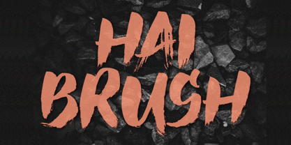 Unleash your creativity with the all-caps captivating Hai Brush Font. This unique typeface effortlessly combines the raw energy of hand brush strokes with a touch of elegance, making it an exceptional choice for a variety of design endeavors. Whether you're crafting logos, posters, or branding materials, Hai Brush Font adds an authentic, artistic flair to your projects.
 - Party Doodles Too by Outside the Line,
$19.00 Party Doodles Too is the companion font to the popular font Party Doodles. 29 fun icons including a tray of champagne glasses, appetizers, balloons, pinwheel, stork with a baby, ace of hearts playing card, top hat and tunes, dice, bowling ball and pins, gifts, party umbrellas, cakes, cupcakes, ice cream, lollipop, drinks, corkscrew, noise makers, banners and candy.
 - Roundlane by Zealab Fonts Division,
$10.00 Roundlane is a font inspired by retro badges antique labels, and includes all-caps, multilingual support, alternates signs, numbers & punctuation. It works well for album covers, video tittles, stickers, clothing brand names, t-shirt designs, badges designs, banner, flyer and more. I can’t wait to see what you guys will come up with with using this font!
 - Sanstara by Prasetype,
$12.00 Sanstara is rounded, modern all caps sans serif font. This font is PUA encoded which means you can access all of the glyphs and swashes with ease! Add it confidently to your favorite creations and let yourself be amazed by the outcome generated. -Letters, numbers, punctuation, multilingual support. -Italic and regular versions Any Questions? just ask!
 - Sidelle by Beary,
$15.00 Sidelle is an amazing hand lettering script that is attractive and natural. Every single letter have been carefully crafted to make your text look beautiful. This font is suitable for invitations, branding, advertising, classic design, poster designs, and more. This font is PUA encoded so you can access extras from character map in most design software.


