10,000 search results
(0.162 seconds)
- Funky Chunk NF by Nick's Fonts,
$10.00Lettering whiz Carl Holmes called this creation "Pelt Emphasis Script", and its funky, chunky charm will indeed lend emphasis to any headline it graces. The Postscript and Truetype versions contain a complete Latin language character set (Unicode 1252); in addition, the Opentype version supports Unicode 1250 (Central European) languages as well. - P22 Acropolis by P22 Type Foundry,
$24.95 P22 Acropolis is P22's tribute to the enduring contribution of Classical Greece to world culture. This set features two typefaces in the style of ancient Greek stone carvings (one modern: Now, and one of authentic ancient Greek characters: Then) and 52 graphic extras drawn from coinage and vase paintings.
 - Naroid Initials JNL by Jeff Levine,
$29.00Naroid Initials JNL is one of the most ultra-compressed sets of initials available in digital type. These twenty-six initials are so narrow that a test print with all of the letters at 2-1/2 inches in height took up no more than about 5 inches in width! - Blond by Tour De Force,
$25.00 Blond is modern sans serif family with 22 members - 11 weights from Thin to Heavy with matching Italics. Distinctive, recognizable and uniform, Blonde family is well balanced typeface that will find appliance in any situation - from editorial design to web design. Contains extended Latin character map and small Stylistic set.
 - NT Fest by Novo Typo,
$26.00 Fest is a highly detailed, ornamental unicase typeface for display use. Designed by Novo Typo - (typo)graphic designers from Amsterdam - The Netherlands. Fest is perfect for designing sophisticated logos, fashionable headings or other beautiful display typography. The glyph set of Fest contains a lot of extra elegant glyphs, swooshes and ligatures.
 - Pink by ITC,
$29.00Pink is the work of British designer Timothy Donaldson, a sans serif in a style typical of the 1990s. Capitals are slightly condensed and feature unusual variations in stroke widths and the lowercase has an even more irregular stroke pattern, yet an even texture is produced when used in word settings. - Aerovias Brasil NF by Nick's Fonts,
$10.00Eponymous logotype lettering on an airline timetable from 1948 inspired this exercise in aerodynamics. This typeface’s streamlined design remains fresh, even sixty-plus years on. Both versions include the complete Unicode Latin 1252, Central European 1250 and Turkish 1254 character sets, as well as localization for Lithuanian, Moldovan and Romanian. - Serba by Sealoung,
$15.00 Serba is a fun, unique look serif display. With a modern look, it looks perfect when paired with a conventional serif/sans serif. It can be used for mastheads, posters, business identity and just about anything else. The all-inclusive also includes the complete set: All caps Multilingual character Number Punctuation
 - Hoosier Daddy by Parkinson,
$20.00 Hoosier Daddy is based on Foundry Type samples from various mid-19th century specimen books. This shaded slab serif was made by conforming several different cuts of the styles, filling out the character set, and adding a few contemporary touches for freshness. This is a display face. Use it big.
 - Montage by ITC,
$29.00Montage was designed by Alan Dempsey. Like the name suggests, the design was inspired by the arrangement of elements such as torn paper, cut-outs, scratch board and stencilled letters. Montage is a creative, eye-catching alphabet of casually drawn letterforms set on a background of daub-like brush strokes. - Bla Bla by S6 Foundry,
$25.00 Bla Bla is a contemporary serif typeface inspired by brutalist forms, featuring large open counters, curved, round forms, creating a modern & elegant glyph set. The organic curves with gentle repetitions create powerful and harmonious forms. Designed to be a stylish modern family it is perfect for communication and branding projects.
 - Space Deco JNL by Jeff Levine,
$29.00 Hand lettering used on the packaging of a space-themed rubber stamp toy set is the basis for Space Deco JNL. Blending the classic thick-and-thin line weights of the Art Deco style with sharply angled cross strokes evoked a sense of movement and "future" in this unique lettering design.
 - Fast Freddy NF by Nick's Fonts,
$10.00An uncredited typeface from Photo-Lettering Inc. named Palisade Graphic was the inspiration for this Art Deco fantasy. Bold and brash, it adds undeniable impact to period-themed headlines. Both versions include the complete Latin 1252, Central European 1250 and Turkish 1254 character sets, with localization for Lithuanian, Moldovan and Romanian. - Karty Solid by Eurotypo,
$22.00 Karty Solid is a freehand typeface that was inspired by John Baskerville’s designs. Karty Solid comes in three version: Regular, condensed and Expanded, including a large set of swashes, ligatures and stylistic alternatives, which bring the chance to create logotypes, originals headlines for fashion magazines, children books, advertising and much more.
 - Two Lines Loop by Kaer,
$21.00 Alphabet set made of two white parallel lines. They are looked like infinite looped icons. Ideal for dynamic app, minimalism design, sports identity, technology adv. What's included? Uppercase (lowercase are the same) Numbers Symbols Punctuation Multilingual support Please feel free to request any help you need: kaer.pro@gmail.com Best, Roman.
 - Verbum by Eurotypo,
$44.00 Verbum is a modern fun and casual script with a unique and modern look. Verbum contains 627 glyphs including stylistics and contextual alternates, swashes, stylistic sets, ligatures and ornaments for a genuine handwriting effect. Verbum looks good in children's books, fashion, magazines, wedding invitations, greeting cards, logos, packaging and more!
 - Freestyle Script by ITC,
$29.99 Freestyle Script is the work of designer Martin Wait. It is an informal display typeface which perfectly renders the spontaneous qualities of hand-rendered brush lettering. Its capitals can be used alone in word settings and are complemented by an extensive lower case alphabet which includes ligatures of every imaginable variety.
 - Sally Script BH by BluHead Studio,
$25.00Sally Script BH, is based on the handwriting of a BluHead friend. This fun design has a round, open feel which lends itself to conveying warm messages for that personal touch in all your cards, journals, etc. Plus, the character set includes support for many languages, along with some cool ligatures! - Athalia Script by Letterhend,
$16.00 Introducing, Athalia, a lovely modern script that bring luxury feel. The natural hand writing script is suitable for you who needs a typeface for headline, logotype, apparel, invitation, branding, packaging, advertising etc. This typeface is comes in uppercase, lowercase, punctuation, symbols & numerals, stylistic set alternate, ligatures, etc also support multilingual.
 - Greatly by Letterhend,
$12.00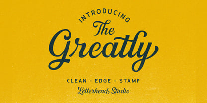 Greatly Script gives you a classic feel and is really perfect for you who needs a typeface for especially logotype, apparel, invitations, branding, packaging, advertising, and more. Greatly comes in uppercase, lowercase, with punctuations, symbols and numerals, stylistic alternate sets, ligatures, also multi-lingual support and is already PUA encoded.
 - Blah Blah Upper by Comicraft,
$49.00 Because You Demanded It! The Collectors Item Classic BLAH BLAH BLAH makes a triumphant return as an all-uppercase comic book lettering workhorse. Complete with auto-ligatures and our groundbreaking Crossbar I Technology, to put that sneaky & enigmatic character exactly where it belongs! Includes full sets of Western & Central European accents.
 - Bosque by Latinotype,
$29.00 Bosque is a typeface designed by Paula Nazal and Daniel Hernandez. It belongs to handmade style, it's rough and raw with soft edges. It has 6 variants: Normal, Wood, Shadow, Wood Shadow, Dingbats y Shadow One, this gives great versatility. It possess a wide set of characters, ligatures and some alternates.
 - Roma Initial Caps JNL by Jeff Levine,
$29.00Roma Initial Caps JNL is a set of alphabet caps drawn from elegant lettering found in an old sign painter's manual. The upper case keys have the letters in white on black backgrounds, while the lower case has the letters in black on a white background with a black border. - British Stencil JNL by Jeff Levine,
$29.00 British Stencil JNL was sketched from images of a vintage stencil set made by Reese and Sons of England that was being sold on ebay. In truth, this is a semi-stencil, as some of the characters are solid; lacking the breaks in the letter shapes so typical of stencil alphabets.
 - Dollar Days JNL by Jeff Levine,
$29.00 The National Show Card Writer sign making set contained many different sizes and styles of lettering stencils, and additional type designs could be purchased as add-ons. This product was one of the many economical ways merchants, religious organizations, schools and others could make their own signs at low cost.
 - Arbeit Technik by Studio Few,
$20.00 Arbeit Technik, a semi-mono condensed variation of the Arbeit Pro typeface, is designed specifically for technical drawings and user interface applications. With a Stylistic Set that allows users to remove the 'mono' style serifs, this typeface offers versatility and a clean, professional appearance perfect for a variety of design projects.
 - Citta Novela by Jvne77 Studio,
$12.00 Jvne77 Studio presents: Cittá Novela is an upright typeface family inspired by vintage architecture from the mid 20's to the 60's. A classy and didonesque streamlined sans which will perfectly set in a poor line space for Titling and text. Multilingual, diacritics, ligatures and alternates for near 570 glyphes.
 - Outline Sans JNL by Jeff Levine,
$29.00 The cover of the 1939 sheet music for "I Wonder Who's Kissing Her Now" has the title set in an outline sans - or is in an inline? With almost equal space and line weights, it can be either! Outline Sans JNL in available digitally in both regular and oblique versions.
 - Merry Snowmen by Greater Albion Typefounders,
$5.00 Merry Snowmen is a piece of winter fun-is a set of hand-drawn snowwmen figures, ideal for Christmas or any other time when cold and snow are about. It complements our Merry Fleurons and Christmas Fleurons faces, and is ideal for all your cards, gift labels, invitations, posters and banners.
 - Deco Paragraph Initials JNL by Jeff Levine,
$29.00 Deco Paragraph Initials JNL contains an alphabet based on the typeface Monthly Adventures JNL and is set within an attractively framed border. Suitable for personalized stationery, used as paragraph drop caps or as decorative monograms, these Art Deco-flavored letters add the charm and clean look of the "Streamline Era".
 - Karmilla by Akufadhl,
$25.00 Karmilla is a Didone upright script styled typeface. Strong contrast between thick and thin lines. Presenting a luxurious and Feminine character and creating more elegant, classical design. With a wide range of Latin based language support and a lot of features such as Swash, Stylistic Set, Small Caps and more.
 - Minimal by Kmaz,
$10.00 Minimal is a distinguished sans serif display family with minimalistic modern edges, designed by Khalid Al-Mazrouei and published by Kmaz. Minimal packs a complete set of uppercase and lowercase letters, numbers and punctuation and comes in 3 weights (Thin, Regular, and Bold). Perfect for headlines, magazines, and much more.
 - Marking Device JNL by Jeff Levine,
$29.00 Similar to date and numbering stamps, there once was manufactured rotary band stamps with different letter and number configurations that were used for various identification purposes. From a set of vintage bands acquired from a now-closed rubber stamp shop, Marking Device JNL replicates the serif typeface used on these devices.
 - CA Rusty Nail by Cape Arcona Type Foundry,
$19.00 Rusty Nail is a carefully hand-made uppercase only typeface with a full Central European character set which comes in two styles, Regular & Bold. It was created for a liquor company where hand-made letters were part of the corporate design. It’s perfect for labels or lettering with a "used look".
 - Opkrop by Jipatype,
$25.00 Opkrom is Thai language mean Crispy or Crunchy. With informal sans serif style look like semi handwriting give feel friendly and warm . It support major Latin scripts and Thai scripts. It have stylistic set for Thai script. Opkrop is suited for headline on packaging, print ad and various graphic work.
 - Calevor by DM Studio,
$15.00 The Calevor Elegant Font is a sophisticated and refined typeface that embodies timeless beauty and a touch of class. With its graceful letterforms and stylish design, this font adds an air of elegance and professionalism to your branding, invitations, editorials, and various design projects. Features: Elegant and Timeless Style: The Calevor Elegant Font exudes a timeless and sophisticated aesthetic. Its graceful letterforms, balanced proportions, and stylish design create an atmosphere of refined elegance, making it perfect for projects that demand a touch of class and sophistication. Refined Design: The font's design is characterized by its clean lines and harmonious curves. It's meticulously crafted to ensure every detail reflects the epitome of elegance, making it suitable for projects that require a polished and professional look. Versatile Application: This font is versatile and well-suited for a wide range of design projects where an elegant and timeless typeface is needed. Use it in branding, invitations, editorial design, luxury packaging, and more to add an element of sophistication and class to your designs. Uppercase and Lowercase Letters: The font includes both uppercase and lowercase letters, providing flexibility and creative freedom in your designs. Mix and match the cases to create visually appealing and balanced typography. Punctuation and Symbols: In addition to the alphabet, the Calevor Elegant Font includes a comprehensive set of punctuation marks, numerals, and common symbols. This ensures consistency and ease of use when incorporating the font into your design projects. Easy to Use: Installing and utilizing the Calevor Elegant Font is hassle-free. It is compatible with both Windows and Mac operating systems and seamlessly integrates into popular design software such as Adobe Photoshop, Illustrator, and InDesign. This ensures a smooth and efficient design workflow. Elevate your designs with the timeless elegance of the Calevor Elegant Font. Let its graceful letterforms and refined design add an air of sophistication and professionalism to your branding, invitations, and various design projects. Embrace the classic beauty of this font and create designs that exude elegance and style.
 - 1510 Nancy by GLC,
$20.00 This set of decorated initial letters was inspired by those used in 1510 in Nancy (France, Lorraine) for printing of "Recueil ou croniques des hystoires des royaulmes d'Austrasie ou France orientale[...]" Author Symphorien Champion, unknown printer. There were three sorts of initials family, but only one complete and clear, except a very few characters. The printer used some letters to represent others, as V, turned over to make a A, D to make a Q, M for E, So, the reconstruction was a little less difficult. Thorn, Eth, L slash and O slash were also added. The original font's letters was only drawn in white on a black background only, but it was tempting to propose a negative version in black on white. A few letters have multiple appearance, but only the A was clear enough to be reproduced. It can be used as variously as web-site titles, posters and flyer design, publishing texts looking like ancient ones, or greeting cards, all various sorts of presentations, as a very decorative, elegant and luxurious additional font... This font supports strong enlargements revealing its fine details and remaining very smart. Its original medieval height is about one inch equivalent to about three to four lines of characters. This font may be used with all our blackletter fonts, but as well with "1543 Humane Jenson", "1557 Italic" and "1742 Civilite", without any fear about anachronism.
 - Noad Sans by Groteskly Yours,
$60.00 Noad Sans is an experimental sans serif typeface with a strong character and some very unique visual features. At the core of Noad Sans is a sturdy sans serif with closed apertures and fairly simple letterforms. The defining feature of Noad Sans, however, is its visualised nodes: all control points of Bézier curves in each of the fonts in the family are intentionally visualised. The effect of this feature is largely defined by the usage: in titles and larger bodies of text, the visualised nodes stand out and create a rhythmic pattern of their own. In smaller sizes, the sans serif base of the font becomes more prominent and the nodes create a visual fuzz. Noad Sans comes in 6 styles and as a Variable Font with two axes–Optical Size and Slant. The size of each node can be changed from the smallest (Mini and Mini Italic) to the largest (Extra and Extra Italic). Variable Font technology allows you to fine tune the size of the nodes and the slant angle, so that your version of Noad Sans can be truly unique. Noad Sans has a large character set of 570+ glyphs, covering the vast majority of Latin based languages. In addition to that there are dozens of special characters, punctuation, numbers, and symbols. Noad Sans is equipped with a number of useful OpenType features, such as Case-Sensitive Punctuation, Stylistic Alternates, Ligatures, Fractions and many more. Noad Sans began as an experimental project, and during its development the spirit of experimentation was at the heart of the project. Thanks to the unique nature of the typeface, it can feel at home in a variety of settings: from web development, graphic and product design to more novel uses like 3D and NFTs. Noad Sans type family includes 6 static fonts (Mini, Mini Italic, Regular, Regular Italic, Extra and Extra Italic) and one variable font. Each style can be purchased separately. There is a free trial version of Noad Sans that can be downloaded free of charge on MyFonts. For more information on the typeface, feel free to download Noad Sans PDF Specimen.
 - Compiler by Identity Letters,
$39.00 Legible, technical, clear—with a hint of retro: Compiler is a no-frills font family straight from the heart of a microprocessor. Inspired by console typefaces, the humanist sans serif typeface combines a large x-height with striking serifs on certain letters such as i and l. Those serifs evoke the aesthetics of monospace typefaces for programming. Even though Compiler is a proportional typeface, this detail improves glyph recognition and helps differentiate between individual letters. Combined with vertical stroke ends, which allow for particularly even spacing, the serifs make for an extremely legible typeface. (Even in small sizes.) Brand recognition guaranteed: Compiler is ideal for applications that require a mechanical flavor without appearing offish. You can use it for websites, apps, branding, corporate design, annual reports, signage, and many other areas with perfect results. Compiler consists of two font families; the second one is Compiler Plain. In Compiler Plain, the signature letters lose their serifs and the forms of "a" and "g" are simplified. This way, the shapes are neutralized. The technical impression recedes into the background. Both families can be combined smoothly: you might use the standard Compiler fonts for display sizes and Compiler Plain styles for body copy. For total design control, you can toggle each of the defining design elements individually from Compiler to Compiler Plain and vice versa. Just use Stylistic Sets to fine-tune your Compiler fonts. Compiler provides you with 8 weights in 4 variations: Upright, Italics, Plain Upright and Plain Italics. That's a total of 32 fonts. Each style contains more than 860 glyphs, including advanced typographic tools such as proportional and tabular figures (both lining and old-style) or small caps—something you'll rarely find in this genre. Other glyphs are optimized for display sizes, such as circled figures and various arrows. There's also a set of glyphs designed for web use: with symbols for shopping carts, hamburger menus or checkboxes, you can implement your web projects elegantly and consistently without relying on third-party tools (like an external icon font). Powered by highly productive OpenType functions, Compiler is an intermedia workhorse straight from cyberspace.
 - Diane Script by GroupType,
$27.00 In 1995, FontHaus came upon a rare opportunity to create a revival of Aries, a little known and previously unavailable typeface by the legendary Eric Gill. Discovering a lost typeface by one of the major designers of the 20th Century, was the discovery of a buried treasure, and being the first type company to release it was an honor. Thirteen years later, FontHaus came across another little known typeface treasure: Diane. Designed by the legendary French designer Roger Excoffon in 1956, this remarkable script has never been faithfully recreated until now. In close collaboration with Mark Simonson, FontHaus and Mr. Simonson painstakingly researched rare type books, publications, European metal type services, and period showings from the United States, England, Germany and from the University of Groningen in the Netherlands. Finding full specimens of the font turned out to be quite a challenge. In most cases, only the caps and lowercase were shown. Furthermore, the more we researched Diane, many curious facts came to light. The caps in earlier specimens of Diane are completely different from specimens published later, suggesting that the face was redesigned at some point, perhaps in the mid-1960s. So we are left with two different sets of caps. The original had very elaborate, swirly strokes, very characteristic of Excoffon¹s gestural designs for posters and logos. Later on, these appear to have been replaced by a set of simpler, more traditional script caps. The original caps are criticized in one source Mark found (Practical Handbook on Display Typefaces, 1959) as being "exquisite" but "not highly legible". Perhaps this is what led to the simpler caps being introduced. Nevertheless, FontHaus's release includes not only both sets of caps, but a range of alternates and a number of new characters not originally available such as the Euro, and a magnificent alternate Ampersand to name a few.