10,000 search results
(0.045 seconds)
- Radian by Ayca Atalay,
$8.00 Radian is a modern geometric sans serif typeface that comes in 16 weights: 8 upright fonts and their matching italics. Radian works well in any graphic design project and purpose, both as a display typeface and in smaller sizes.
 - Engineer by GRIN3 (Nowak),
$15.00 Engineer is a new, completely redesigned and improved version of my font TechnicznaPomoc, which was released for the first time in 2001. Language support includes Western, Central and Eastern European character sets, as well as Baltic and Turkish languages.
 - JT Marnie by JAM Type Design,
$14.00 The design is influenced by the geometric style sans serif faces which were popular during the 1920s and 30s. The JT Marnie font family is well suited for headlines and small blocks of text, particularly in advertising and packaging.
 - Single Tyne by Jonahfonts,
$35.00 A single top serif creates a modern look between serifs and a single weight font. SingleTyne contains short ascenders and descenders for tight line spacing designed as a display face that also works well for short sentences and paragraphs.
 - Venti CF by Connary Fagen,
$35.00 Venti CF is a geometric font family with a warm, engaging character. Inviting and versatile, Venti's subtle human overtones are well suited to headlines, logos, and short text. Venti includes Latin and Cyrillic scripts across eight weights with obliques.
 - Spaghetti Cyrillic by Ira Dvilyuk,
$17.00 The Spaghetti playful cute font includes the main & alternative uppercase, and main & alternative lowercase, and the full set of double letters in an upper and lowercase, and a large range of numerals and punctuation. The Spaghetti font will be perfect for use in all your fun design projects be it logos, labels, packaging design, blog headlines. Also, it will look great on mugs, cards, kids books headlines, or other typographic projects. Spaghetti cute playful font contains the Cyrillic glyphs too. The Cyrillic part of the font contains a full set of uppercase lowercase, and the Spaghetti Symbols is an additional font with 52 hand-drawn doodles, catchwords, arrows, and swashes and can help to make your design more original. Combine and arrange swashes and illustrations to create your own designs and make borders, frames, dividers, logos, and more (just use A-Z and a-z keys in the included Spaghetti Symbols font). A different symbol is assigned to every uppercase or lowercase standard character so you do not need graphics software just simply type the letter you need. Multilingual Support for 31 languages: Latin glyphs for Afrikaans, Albanian, Basque, Bosnian, Catalan, Danish, Dutch, English, Estonian, Faroese, Filipino, Finnish, French, Galician, Indonesian, Irish, Italian, Malay, Norwegian Bokmål, Portuguese, Slovenian, Spanish, Swahili, Swedish, Turkish, Welsh, Zulu. And Cyrillic glyphs support for Russian, Belorussian, Bulgarian and Ukrainian languages. Thanks!
 - Antoine by Anastasia Kuznetsova,
$19.00 Introducing Antoine — is a vintage retro display typeface. The three font combinations I launched are very compatible if for the victorian classic design concept. As for if the font was worn by itself, without combinations are also brave!! In addition to many get unique character, luxury, brave and elegant. You also have a collection ornament, very suitable if in the gradient. This font is also very easy to use with other design programs or with out design program. Antoine Typeface is perfect for beverage label design project. coffee label. logotype design, badges, classic wedding concept. victorian design concept and so on. gig poster, letterhead, droop cap, titles, and any artworks. Now it’s your time to go crazy and explore the uniqueness of this typeface!! I invite you to familiarize yourself with the preliminary images and hope that you will be imbued with my vision of this creative font, which, I am sure, will be suitable for all the interesting projects you are working on. Fonts can be opened and used in any software that can read standard fonts, even in MS Word. No special software is required to get started. It is recommended to use it in Adobe Illustrator or Adobe Photoshop. Made with love and magic ♡ Thank you for reading it, and do not hesitate to send me a message if you have any questions! ~ Anastasia
 - GOBAH by Product Type,
$15.00 Welcome to Gobah, a font that presents the future atmosphere in an amazingly modern and futuristic style. Are you looking for the perfect solution for modern, futuristic, sci-fi, and future-themed projects? Gobah is the right choice. Gobah is a font that transports you to an extraordinary world with a unique look that reflects a sophisticated future feel. Each letter is uniquely designed, giving your project a modern, innovative, and charming look. With Gobah, you can steal the show and create an unforgettable impression. The main benefit of Gobah is its ability to deliver stunning styles. Each letter has an exclusive design, creating an eye-catching futuristic look. This font will give your projects a strong visual appeal, reinforcing the message you want to convey. Gobah also supports multilingualism, allowing you to display text in multiple languages without a hitch. This flexibility ensures that you can easily reach a global audience and convey your message with consistent clarity across cultural contexts. Take a step forward in your design with Gobah. This font will give a stunning modern and futuristic twist, creating a memorable impression on your logos, posters, and web presence. Let Gobah be the right choice for your vibrant, modern, futuristic, sci-fi, and future projects.
 - Cabella Anderson by Create Big Supply,
$15.00 Experience the elegance and grace of Cabella Anderson, a sophisticated signature handwriting font that will elevate your designs to new heights. With its fluid strokes and contemporary style, Cabella Anderson brings a touch of refinement to any creative project. This versatile font features both uppercase and lowercase letters, offering you flexibility and creative freedom to craft captivating designs. Whether you're designing logos, branding materials, invitations, or any other project that requires a personalized touch, Cabella Anderson will leave a lasting impression. In addition to its stylish aesthetics, Cabella Anderson is designed to be practical and user-friendly. It includes a wide range of numbers and punctuations, ensuring seamless integration of numerical information into your designs. The font also supports multiple languages, enabling you to communicate effectively with a global audience. Cabella Anderson is equipped with PUA (Private Use Area) encoding, allowing you to access special characters, ligatures, and alternate letterforms. This feature empowers you to add unique flourishes and customize your typography, giving your designs a distinct and memorable look. Visit our store on Creative Market to unlock the full potential of Cabella Anderson. Download this exquisite signature handwriting font and let your creativity soar as you create stunning designs that make a statement.
 - UXB by astroluxtype,
$30.00 UXB Stencil and its companion UXB Spray contain both the stencil and the sprayed letters in two fonts. The font is a headline display uppercase only character set, which is duplicated in the lowercase keys, identical in form (except for an alternate “Z”). No need to remember to hit the caps lock, the font will work with lowercase key strokes. UXB Spray is also a headline display uppercase only character set but, includes a few “drip” characters (find them in the lowercase key positions) these apply when you have held the spraycan over the stencil too long and made a mess. Use separately or together for a maximum design explosion. The fonts used together with color can create many nice design effects- by offsetting characters and putting one font in front of the other for a second effect. UXB it’s an emergency.
 - Imperfection by LIGHTDESIGNS,
$9.00 IMPERFECTION Is a hand-written san-serif font inspired by human imperfections (mistakes). This is the first font created by LIGHTDESIGNS. It has no consistency in it's design which made the font looks like a lot of mistakes has been made. But this is done with purpose. With these characteristics, the font is given the name "IMPERFECTION', With surprising font and glyph designs, the intent of this font design is to pass a message that says, "SUCCESS IS NOT THE ACHIEVEMENT OF PERFECTION, BUT THE ACCOMMODATION OF IMPERFECTION™ This font design will be a fit in every design project it is utilised like logos, posters, flyers, magazine, card designs e.t.c. This font can be nicely pairs with script fonts & San serif font.
 - Colossal Love by Create Big Supply,
$17.00 Experience the beauty and authenticity of Colossal Love, a mesmerizing handwritten font that will captivate your audience. With its natural feel and resemblance to real handwriting, Colossal Love adds a personal touch to your designs. Whether you're creating wedding invitations, stationery art, or eye-catching social media posts, this font will infuse your projects with elegance and charm. Colossal Love features a comprehensive set of uppercase and lowercase letters, allowing you to create versatile typography that suits your creative vision. The font also includes numbers and punctuation, ensuring seamless integration into your designs. Its multilingual support allows you to communicate your message effectively across different languages, making it accessible to a global audience. What sets Colossal Love apart is its extensive collection of ligatures. These ligatures enhance the natural flow of the font, creating seamless connections between letters and giving your text a handcrafted appearance. The result is a unique and authentic look that captures the essence of handwritten elegance. With PUA encoding, accessing the amazing glyphs and ligatures of Colossal Love is effortless. This feature ensures that you can fully explore the font's potential and unlock its hidden treasures with ease. Let your creativity soar as you experiment with different combinations and give your designs a personal and heartfelt touch. Discover the beauty of Colossal Love and bring a touch of handwritten elegance to your projects. Add a personal and intimate feel to your designs and make a lasting impression on your audience.
 - Frock by Wahyu and Sani Co.,
$28.00 Please welcome Frock! It is a sans serif typeface for broad range of usage. It is designed with a slightly slanted oval shaped counters, medium contrast and based on American gothic typefaces with "not so formal" feel. The italic styles are flowy and almost true italic. Swash alternates for some uppercases and lowercases are useful for logo, display and poster. This family comes with 16 styles, uprights and matching italics, consisting of 8 weights from thin to ultra. It is also equipped with useful OpenType features such as Ordinals, Superiors, Stylistic Sets, Proportional Lining Figures, Standard Ligatures, Discretionary Ligatures, Fractions, Numerators & Denominators. Each font has 770+ glyphs including swash alternates which covers Western & Eastern Europe, and other Latin based languages – over 200 languages supported! Frock will be suitable for many creative projects. This typeface will be perfect for logos, packaging, greeting cards, presentations, headlines, lettering, posters, branding, quotes, titles, magazines, headings, web layouts, mobile applications, art quotes, advertising, invitations, packaging design, books, book title, and more!
 - Velo Serif Display by House Industries,
$33.00 Velo leads layouts with a grand tour champion’s panache but is also a hard-working design domestique for text-heavy applications. Superelliptical shapes and sturdy serifs will keep pace with contemporary culture with an aesthetic agility that will never go out of style. Velo Serif includes sixteen fonts: Twelve display styles ranging from thin to black with complementary italics and four text styles designed for longer settings. Velo Serif Display features an increased x-height for more illustrative headlines while Velo Serif Text maintains a readable cadence in high word count environments. Typeface design by House Industries, Christian Schwartz, Mitja Miklavčič and Ben Kiel. FEATURES Text vs Display: Velo Text maintains the distinctive style of its Display siblings, but is enhanced for optimum legibility in running text settings. Key ligature combinations keep headlines and running text flowing smoothly. Velo Serif Text includes a complete small cap alphabet to add another typographic dimension to your layouts. Select Velo Serif figures include illustrative alternates to display numerical superiority.
 - Andallusia Script by MrLetters,
$20.00 Description Andalusia Script is perfect for branding, wedding invitations, magazines, mugs, business cards, quotes, posters, and many more that you can use on your big project will be very beautiful. Andalusia Script is equipped with the OpenType feature and has many glyphs. and of course having a lot of glyphs will be able to choose letters to your liking, lots of variations and choices for each letter, so you can customize your design choices and also support other languages. to use a variety of flying machines, you need a program that supports OpenType features such as Adobe Photoshop CS / Adobe Photoshop CC, Adobe Illustrator CS / Adobe Illustrator CC, Adobe Indesign and Corel Draw and many more programs that support OpenType. If you don't have a program that supports OpenType, you can access all the alternate glyphs using Font Book (Mac) or Character Map (Windows) if you have any question, don't hesitate to contact me by email. hello.mrletters@gmail.com Thanks and happy designing :-) Thank You for purchase
 - Sonata Allegro by Tamar Fonts,
$35.00 “The Emperor Has Clothes” Like in music — the Allegro Sonata form consists of three main sections—the Exposition (section), the Development, and the Recapitulation — so in regard to this Allegro Sonata font family — there is an Exposition (font), a Development, and a Recapitulation—in which each theme is restated alongside its development material. While the Recapitulation font is perfect for titling and branding, the Exposition is perfect for branding {as demonstrated in the Inspiration Gallery pertaining this font} as well as being a comfortable read in long runs of text. The Exposition rounded, mono-line, with great x height, contemporary—A Synthesis Between Geometric & Hand-drawn—font, is at times geometric and at times hand drawn; in the end it all came down to finding the balance in a typeface between the robustness needed to function as a text face and enough refinement to look good as a display font. Following the Exposition, comes the Development (section), decorative, botanic-like, exuberant and playful font, signifying ABUNDANCE [of possibilities] & BENEVOLENCE—in regard to each theme/character, and to demonstrate—that 'structures' in music, are solid structures—like architecture {contrary to the words of J. W. von Goethe, who said: “Music is liquid architecture; Architecture is frozen music”}, just in some spiritual domain that is far beyond one's physical senses to grasp. Like in my art and music works in which I consider its 'Texture' element of vital importance, so is the case when it comes to type, as apparent in my previous Phone Pro/Polyphony font, as well as in this current Sonata Allegro/Development font. Each glyph has its own uniqueness, and when meeting with others, will provide dynamic and pleasing proximity. And due to the [individualistic] nature of this Development font, just a minimal amount of kerning/pairing were necessary... The development font is an extravagant design that looks best when used at large sizes—perfect for titling, logo, product packaging, branding project, wedding, or just used to express words against some [light or dark] background. Finally, “The (Exposition Font) Emperor Has (the Development Font) Clothes!” As said, there are three fonts/styles altogether in this Sonata Allegro type family, designed with the intention of harmonizing between Latin and Hebrew, which makes it an ideal font for the side-by-side use of Latin and Hebrew characters. However, they are being sold separately (kindly search for “Sonata Allegro Hebrew” on this MyFonts site), so they are economical for those interested just in either one of them. My aim is to shake up the type-design world with a range of distinctive fonts which break away from the generic letterforms, to make your design projects stand out—as a graphic designer, add this font to your most creative ideas for projects. This typeface has [lots of ligatures /] OpenType features, to enhance your designs even more — happy designing! Sonata Allegro Features: · 3 Weights/Styles · Multilingual Support · Proportional Figures & Ligatures While using this product, if you encounter any problem or spot something we may have missed, please don't hesitate to write to us; we would love to hear your feedback—in order to further fine-tune our products. Copyright Tamar Fonts/Hillel Glueck 2022 ALL RIGHTS RESERVED Any unauthorized distribution of my work is strictly prohibited, and will be prosecuted; do the right thing, and do not participate in the piracy of my typefaces; if you appreciate my work, then please pay for it and help me prosper — thank you!
 - Sonata Allegro Hebrew by Tamar Fonts,
$35.00 “The Emperor Has Clothes” Like in music — the Allegro Sonata form consists of three main sections—the Exposition (section), the Development, and the Recapitulation — so in regard to this Allegro Sonata font family — there is an Exposition (font), a Development, and a Recapitulation—in which each theme is restated alongside its development material. While the Recapitulation font is perfect for titling and branding, the Exposition is perfect for branding {as demonstrated in the Inspiration Gallery pertaining this font} as well as being a comfortable read in long runs of text. The Exposition rounded, mono-line, with great x height, contemporary—A Synthesis Between Geometric & Hand-drawn—font, is at times geometric and at times hand drawn; in the end it all came down to finding the balance in a typeface between the robustness needed to function as a text face and enough refinement to look good as a display font. Following the Exposition, comes the Development (section), decorative, botanic-like, exuberant and playful font, signifying ABUNDANCE [of possibilities] & BENEVOLENCE—in regard to each theme/character, and to demonstrate—that 'structures' in music, are solid structures—like architecture {contrary to the words of J. W. von Goethe, who said: “Music is liquid architecture; Architecture is frozen music”}, just in some spiritual domain that is far beyond one's physical senses to grasp. Like in my art and music works in which I consider its 'Texture' element of vital importance, so is the case when it comes to type, as apparent in my previous Phone Pro/Polyphony font, as well as in this current Sonata Allegro/Development font. Each glyph has its own uniqueness, and when meeting with others, will provide dynamic and pleasing proximity. And due to the [individualistic] nature of this Development font, just a minimal amount of kerning/pairing were necessary... The development font is an extravagant design that looks best when used at large sizes—perfect for titling, logo, product packaging, branding project, wedding, or just used to express words against some [light or dark] background. Finally, “The (Exposition Font) Emperor Has (the Development Font) Clothes!” As said, there are three fonts/styles altogether in this Sonata Allegro type family, designed with the intention of harmonizing between Latin and Hebrew, which makes it an ideal font for the side-by-side use of Latin and Hebrew characters. However, they are being sold separately (kindly search for “Sonata Allegro Hebrew” on this MyFonts site), so they are economical for those interested just in either one of them. My aim is to shake up the type-design world with a range of distinctive fonts which break away from the generic letterforms, to make your design projects stand out—as a graphic designer, add this font to your most creative ideas for projects. This typeface has [lots of ligatures /] OpenType features, to enhance your designs even more — happy designing! Sonata Allegro Features: · 3 Weights/Styles · Multilingual Support · Proportional Figures & Ligatures While using this product, if you encounter any problem or spot something we may have missed, please don't hesitate to write to us; we would love to hear your feedback—in order to further fine-tune our products. Copyright Tamar Fonts/Hillel Glueck 2022 ALL RIGHTS RESERVED Any unauthorized distribution of my work is strictly prohibited, and will be prosecuted; do the right thing, and do not participate in the piracy of my typefaces; if you appreciate my work, then please pay for it and help me prosper — thank you!
 - Prismatic Spirals Pro by MMC-TypEngine,
$182.00 PRISMATIC SPIRALS PRO FONT! The Prismatic Spirals PRO is a Decorative Type-System and ‘Assembling Game’, itself. Settled in squared pieces modules or tiles, embedded by unprecedented Intertwined Prismatic Structures Design, or intricate interlaced bars that may seem quite “impossible” to shape. Although it originated from the ‘Penrose Square’, it may not look totally as an Impossible Figures Type of Optical Illusions. More an “improbable” Effect in its intertwined Design, that even static can seem like a source of Kinetical Sculptures, or drive eyes into a kind of hypnosis. Prismatic Spirals Pro has two related Typefaces both more basic or easier to use versions, the Default Family plus its “bold” braided version Prismatic Interlaces… PRO provides a more advanced, complex, and twisted Design, plus requires to be typed alternating caps. Instructions: Use the Map Font Reference PDF as a guide to learn the 'tiles' position on the keyboard, then easily type and compose puzzle designs with this font! All alphanumeric keys are intuitive or easy to induce, you may easily memorize it all! Plus, often also need to consult it! *Find the Prismatic Spirals Pro Font Map Reference PDF Here! (!) Is recommended Print it to have the Reference or open the PDF to also copy and paste, when consulting is required or when it may be difficult to access, depending on the keyboard script or language. The 2 glyphs sets are separated in colors for facilitating. Also use the Map Font with key captions or switch to it for ensure that the characters are alternating between both uppercase and lowercase letters as other Keys as numbers, marks, and punctuation along the strings, holding Shift one by one or actually two by two. As a Tiles Type-System, the line gap space value is 0, this means that tiles line gaps are invisibly grouted, so the user can compose designs, row by row, descending to each following row by clicking Enter, same as line break, while advances on assembling characters. Background History: The first sketches of my Prismatic Knots or Spirals Designs dates back then from 2010, while started developing hand-drawn Celtic Knots and Geometric Drawings in grid paper, while engage to Typography, Sacred Geometry and the “Impossible Figures” genre… I started doing modulation tests from 2013, until around 2018, I got to unravel it in square modules or tiles from the grid, then idealized it as fonts, along with other Type projects. This took 13 years to come out since the first sketches and 6 months in edition. During the production process some additional tiles or missing pieces were thought of and added to the basic set, which firstly had only the borders, corners, crossings, nets, Trivets connectors or T parts and ends, then added with nets and borders integrations. Usage Suggestions: This type-system enables the user to ornate and generate endless decorative patterns, borders, labyrinthine designs, Mosaics, motifs, etc. It can seem just like a puzzle, but a much greater tool instead for higher purposes as to compose Enigmas and use seriously. As like also to write Real Text by assembling the key characters or pieces, this way you can literarily reproduce any Pixel Design or font to its Prismatic Spirals correspondent form, as Kufic Arabic script and further languages and compose messages easily… This Typeface was made to be contemplated, applied, and manufactured on Infinite Decorative Designs as Pavements, Tapestry, Frames, Prints, Fabrics, Bookplates, Coloring Books, Cards, covers or architectonic frontispieces, storefronts, and Jewelry, for example. Usage Tips: Notice that the line-height must be fixed to 100% or 1,0. In some cases, as on Microsoft Word for example, the line-height default is set to 1,15. So you’ll need to change to 1,0 plus remove space after paragraph, in the same dropdown menu on Paragraph section. Considering Word files too, since the text used for mapping the Designs, won't make any literal orthographical sense, the user must select to ignore the Spellcheck underlined in red, by clicking over each misspelled error or in revision, so it can be better appreciated. Also unfolding environments as Adobe Software’s, the Designer will use the character menu to set body size and line gap to same value, as a calculator to fit a layout for example of 1,000 pts high with 9 tiles high, both body size and line gap will be 111.1111 pts. Further Tips: Whenever an architect picks this decorative system to design pavements floor or walls, a printed instruction version of the layout using the ‘map’ font may be helpful and required to the masons that will lay the tiles, to place the pieces and its directions in the right way. Regarding to export PNGs images in Software’s for layered Typesetting as Adobe Illustrator a final procedure may be required, once the designs are done and can be backup it, expanding and applying merge filter, will remove a few possible line glitches and be perfected. Technical Specifications: With 8 styles and 4 subfamilies with 2 complementary weights each (Regular and Bold) therefore, Original Contour, Filled, Decor, with reticle’s decorations and 2 Map fonts with key captions. *All fonts match perfectly when central pasted for layered typesetting. All fonts have 106 glyphs, in which 96 are different keys with 2 versions of each of both caps and shift keys, plus a few repeated for facilitating. It was settled this way in order for exchanging with its Prismatic relative fonts which has only 48 different keys repeated twice. Concerning tiles manufacturing and Printed Products as stickers or Stencils, any of its repeated pieces was measured and just rotated in different directions in each key, so when sided by other pieces in any direction will fit perfectly without mispatching errors. Copyright Disclaimer: The Font Software’s are protected by Copyright and its licenses grant the user the right to design, apply contours, plus print and manufacture in flat 2D planes only. In case of the advent of the same structures and set of pieces built in 3D Solid form, Font licenses will not be valid or authorized for casting it. © 2023 André T. A. Corrêa “Dr. Andréground” & MMC-TypEngine.
 - Reline Rosery by Nathatype,
$29.00 Reline Rosery is an elegant serif font that radiates sophistication and grace. With its delicate letterforms and light weight, this typeface exudes a refined and gentle charm. The defining feature of this serif lies in its slender and graceful serifs, which add a touch of elegance to each letter. The light weight of the font enhances its delicate nature, giving it a subtle and airy appearance. This font is perfect for projects that require a refined and sophisticated typography choice. Reline Rosery captures the essence of timeless beauty. The serifs are meticulously crafted to create a sense of harmony and balance, while the light weight adds a contemporary twist. This font strikes the perfect balance between tradition and modernity. The letterforms are carefully designed to maintain legibility and clarity, even in the light weight. Each letter retains its distinctive characteristics, allowing your message to be easily understood. You can also enjoy the various features available in this font. Features: Alternates Ligatures Multilingual Supports PUA Encoded Numerals and Punctuations Reline Rosery fits in branding materials, book covers, wedding invitations, or any project that demands a touch of elegance, this font will bring a sense of refinement and beauty. It is particularly well-suited for applications related to luxury, fashion, beauty, and lifestyle. Find out more ways to use this font by taking a look at the font preview. Thanks for purchasing our fonts. Hopefully, you have a great time using our font. Feel free to contact us anytime for further information or when you have trouble with the font. Thanks a lot and happy designing.
 - Adora Bella by PeachCreme,
$20.00 We're excited to unveil our new beautiful script font, "Adora Bella." "Adora Bella" was inspired by clean handwriting with a natural flow and works well for various designs, including wedding stationery, Instagram quotes, modern logos, packaging, websites, and many more. "Adora Bella" features fabulous beginning and ending lowercase swashes as well as lowercase heart swashes. A connecting heart swash may be used to tie two words or letters together; however, it is important to remember that this is intended to be used for joining lowercase words.
 - HandXpression by SullivanStudio,
$9.95 HandXpression was created with a stylus, imitating the experience of writing on a whiteboard with a marker. Its 646 glyphs cover from the Western to a wide part of Eastern European (Latin) alphabets. It also has all Greek letters for Math usage: yes, HandXpression makes formulas, and they look great, especially with LaTeX/XeTeX systems. The font has true italics, as well as some useful OpenType features: fractions, capital spacing, scientific superiors/inferiors, old style numbers, as well as standard ligatures and localized forms. Enjoy!
 - Henceforth by Hanoded,
$15.00 Henceforth is a hand-drawn, all caps didone-style typeface. It is a little rough, a little uneven, but lively and elegant as well. Comes with an abundance of diacritics and, lo and behold, some end-ligatures as well.
 - MB GEOMETRIXA by Ben Burford Fonts,
$25.00 Inspired from geometric curves and circles, an audacious lower case display face with some alternate characters in Upper and Lower case glyphs. Great for Logos and Logotypes, headlines and larger text. Works well with smaller strap lines as well.
 - Caneline by Gatype,
$14.00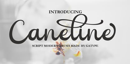 Caneline is an elegant classic script font, this font is equipped with various opentype features such as Stylistic Set & Ligature as well as multi-language support. Equipped with 90+ stylistic sets, this font has a large selection of glyphs / characters. This font is perfect for your design needs such as wedding invitations, logo designs, branding, social media designs, books, magazines, etc.
 - Bfrika by Holland Fonts,
$30.00Bfrika is an 'Africa inspired' typeface and a contribution for the typographic issue 'National Typographica' of I-Juici Magazine, in South Africa. This geometrical decorative design represents bold simplicity, directness and rythm. The name evolved from text for the spread in the magazine. The B replaces the A. Africa be free. Bfrika. The concept behind Bfrika is to generate an unpredictable visual rhythm in an attractive decorative presentation. Filling up the white space around the letters accentuates form over function, thus creating an interference of visual impressions with its legibility. This visual rhythm is amplified by its redundancy in a text, only pausing at a break or a word space. Based on the concept of separate printing forms in letterpress, Bfrika Two Tone and Bfribat Two Tone separate the letter from the outside form in two fonts. Placing two text frames exactly on top of each other and assigning each part of these font to a frame in a different color, offers a quick way to add color. Originally Bfrika was designed for I-Jusi magazine #17, National Typografika, South Afrika 2001. Bfribat and both two tone fonts were created for Building Letters, a fund raiser for orphanages in Kenya and Uganda (www.buildingletters.org) and are also available for Mac and PC at www.hollandfonts.com and will be distributed in 2004 through associated foundries. - String by Lián Types,
$45.00 Inspired by the sound of acoustic guitars, delicacy of harps and elegance of the engrossers script, String is a trendy monoline font which will for sure make unique layouts for your pieces of design. Combining String with String Hole in the same word is a good idea when a more playful rhythm is needed. The font works particularly well when standing on photographs, so be ready to use it in magazines with food, landscapes or super models. I like thinking of String as a distilled version of Erotica. A more “pure” relative of hers. When I designed Erotica, I was so in love with the spencerian style that I knew it'd be hard to just abandon it. With that in mind, this time my aim was to take the subtlety of it to the limit. So, in order to do that I had to find out what was actually the secret of its beauty. I found that the essence of Erotica, in other words, its ductus was the most responsible. The result is a font made of hairlines with a lot of emphasis on the pureness of the form and, (with a lot of inspiration in music) the sensation of continuity between its letters as if they were written with a string. Try String and its flowing melody.
 - Amorie by Kimmy Design,
$12.00 Amorie is a tall and skinny hand drawn font. It comes in various weight and styles, and with an array of opentype options. Built to appear completely hand crafted, different designers could produce completely different results, selecting either Modella (classic and chic), Nova (fun and fancy) or SC (Small Caps and all business.) Each style comes in light, medium and bold and has an accompanying italics version. Opentype for this font includes Contextual Alternatives, which produces three versions of each character, making sure no two identical letters appear next to each other thus giving your design a fully authentic look. There are also stylistic alternatives, which offer different style to a select few characters, including capital letters: A, K, R, Q, Y and lowercase letters: a, e, k, t, y. Lastly, is a large set of swashes, 3 for each letter they accompany. For the most part this includes the whole uppercase alphabet as well as lower case letters with an ascender or descender. Amorie includes a large set of graphic extras, including stylish frames, arrows, line breaks, corners, flourishes and more. The complete package gives you one unbeatable font family. If you do not use Opentype but are using a program that includes a full glyph panel, you will be able to access each of the style variations you want.
 - Withrose by Sakha Design,
$14.00 Withrose is a romantic and elegant handwritten font. Its distinct and well rounded letters make this font a masterpiece. Fall in love with its incredibly versatile style and use it to create spectacular designs! Withrose is PUA encoded which means you can access all of the glyphs and swashes with ease!
 - Risans Basic by Richard Ham Lettertype Ontwikkeling,
$24.99Font with more than 400 glyphs. This font can be used for the most comman languages and can als used for the basic calculus. Some glyphs for the fractions (and special rootfunction) there are used special characters (which be can used with the key code f0000 till f00014 (and Alt + X)) - Dotum by Microsoft Corporation,
$129.00Dotum™ features plain strokes similar to sans serif designs with proportional Latin characters, and works well for on-screen display such as user interfaces. This Dotum font file is 5.2 MB in size. Dotum is a trademark of Microsoft Corporation. Dotum font Character Set: Latin 1, Korean code page 949 - Night Fashion by Hatftype,
$15.00 Night Fashion - Street Art Graffiti Font is a free style font that has the characteristics of street art that shows freedom and is filled with unique characters. Features : • Character Set A-Z • Numerals & Punctuations (OpenType Standard) • Accents (Multilingual characters) • Ligature • Alternate There it is. I really hope you enjoy it.
 - Michiamelly by Nandatype Studio,
$10.00 Michiamelly is a fancy, bold font with multilingual support. This is a very versatile font that works well in both large and small sizes. Michiamelly is perfect for branding projects, logos, wedding designs, social media posts, advertising, product packaging, product design, labels, photography, watermarks, invitations or any project you're working on.
 - Aryzena by Scratch Design,
$9.00 Aryzena is handwritten, textured, artistic brush script. This font also has swash characters that make your design more attractive and natural, giving your text an authentic and laid-back characteristic. This font works well in designs for clothing, tittle books, quotes, branding, logos, packaging designs, posters, invitation, mural and more!
 - Gold Fever by FontMesa,
$25.00Gold Fever is a revival of the old classic Caxtonian font originaly designed in the mid to late 1800s. Along with the original engraved shadow version new styles have been created making this decorative font set more complete. The new styles include a solid black, open faced, condensed and fill versions. - MS Gothic by Microsoft Corporation,
$39.00MS Gothic™ Japanese font features plain strokes similar to sans serif designs, and works well for on-screen display such as user interfaces. This file is 4.4 MB in size. MS Gothic is a trademark of Microsoft Corporation. MS Gothic font Character Set: Latin-1, Japanese (Code Page 932) - Funky Hype by Hatftype,
$15.00 Funky Hype - Street Art Graffiti Font is a free style font that has the characteristics of street art that shows freedom and is filled with unique characters. Features : • Character Set A-Z • Numerals & Punctuations (OpenType Standard) • Accents (Multilingual characters) • Ligature • Alternate There it is. I really hope you enjoy it.
 - Ratatam by alphabeet.at,
$40.00 Ratatam is a variable egyptian font face. There are eight weights from thin to black, but a lot more opportunities with the variable font, and a decor style with inner elements. Useful open type features, which are optional as well as contextual alternates and positions, are defined, all small caps integrated.
 - Brick City by IC Fonts,
$25.00 This is a Cartoonish Brick Font that is reminiscent of some of the Brick Buildings you would see in the Inner Cities. Feel Free to add some graffiti to the brick wall to give it your own Graff City signature. It is also available in a 3d Brick Block Font.
 - Cooperative by Hafontia,
$99.00 Cooperative is a retro style poster font in Hebrew and Latin. Is based on a printed example of a vintage handmade wood type from the 1950's. This sans serif font is available in both regular and bold versions, with a dirty and grungy styles as well in regular and bold.
 - Dry Billow S by Tadiar,
$13.00 DryBillows Font is unusual decorative font carefully designed and well looking with Latin Extended character set. It is good for Text and Headers with lowercase and uppercase letters both! DryBillows ideally works in luxury, fashion, cosmetics, wine and food areas. Please see the large preview images to see how it works.