10,000 search results
(0.245 seconds)
- Nimbusant Bresslo by DePlictis Types,
$31.00 Nimbussant Bresslo is a contemporary sans and attipic unicase were lowercase alternates with smallcaps creating an unusual look that can be used in posters, logo design and headings or small bold plain texts. This grotesque typeface supports most of the latin based languages and also kyrillic and greek alphabets. For a plus of a modern and young appeal, some of the letters have a very sharp, straight and minimalist body design but you may find also their stylistic alternates to better emulate the look you find more appropiate for your design.
 - Romford Stencil by Paula Minelgaite,
$30.79 Romford Stencil is a Brexit inspired typeface. It’s letterforms represent the idea of a union splitting apart and the stylistic differences between the upper and lower case symbolise the notion of being different from one another. Research for this typeface started off in Romford which is an area where the majority of UK voters wanted to leave the European Union, hence the name. Romford Stencil is designed to be readable for body copy and look impressive when used as a display typeface. However, the bigger it's size the better it looks, especially in all capitals.
 - Mynor by The Northern Block,
$49.50 A modern squarish sans inspired by machine-readable typefaces of the 1950s, including OCR-A and B. Smooth curved contours with a humanist touch sit in harmony alongside pure straight lines. Contrasting shapes create a modern aesthetic pleasing to the eye and pixel perfect execution for modern-day scenarios. Details include seven weights with matching italics, six variable widths and 445 characters per style. Opentype features consist of five variations of numerals with stylistic zero’s, inferiors, superiors, fractions, case sensitive forms, ligatures, arrows and language support covering Western, South and Central Europe.
 - Bilton by Fettle Foundry,
$10.00 Bilton is a sans-serif typeface with the personality of serif and an incredibly large X-height. Intended for headlines and display sizes, Hutton can also be used at body sizes if needed. High contrast, sharp angles, and subtle serif-like flares are used throughout the design, making Bilton feel playful yet classy. Featuring ten styles – five roman and five matching italics – Bilton is suitable for a wide range of uses. The family supports more than 300 latin-based languages, and features contextual alternatives for character combinations and languages.
 - Nanueng by Jipatype,
$27.00 ฟอนต์sหน้าหนึ่ง เป็นอักษรแบบแซนเซอริฟที่แบบอักษรโดยรวมมีความเป็นสีเหลี่ยม ซึ่งแบบอักษรจากหนังสือพิมพ์เป็นแรงบันดาลใจ ดูแข็งแกร่ง มีความเป็นเครื่องกล เครื่องจัก ทันสมัย เหมาะสำหรับการใช้พาดหัว รองพาดหัว มีทั้งหมด 9 น้ำหนักและตัวเอียงของแต่ละน้ำหนักรวมทั้งหมดมี 18 สไตล์ และมีฟีเจอร์อื่น ๆ เช่น Small Caps หรือ Stylistic Set 01 และฟีเจอร์อื่น ๆ พร้อมให้คุณได้เลือกใช้งาน รองรับหลากหลายภาษา Nanueng is a sans serif display typeface with square shape base. Inspiration from typeface on the Thai newspapers. Look strong, machine and modern feel. Suitable for headline, sub-headline Comes with 9 weights and italics of each weight total 18 styles, and there are features such as Small Caps or Stylistic Set 01 and many features available for you. Support multi-languages.
 - Decalcomania JNL by Jeff Levine,
$29.00 Decalcomania JNL is based on examples of gold and black water-applied initial decals made by the Transfer Monogram Company of Chicago circa the 1940s. It is presumed the patterns for the letters were hand cut, possibly explaining the variations in line widths and character shapes. These eccentricities were left intact and followed through to the other characters in order to represent a more "authentic" digital version of these vintage decals. Decalcomania JNL is available in both the regular (outline) version, and a solid black version, as well as obliques of both styles.
 - Architype Ingenieur by The Foundry,
$50.00 Architype Ingenieur was inspired by Wim Crouwel’s late 1950s exhibition catalogues and posters, for which he had created a few geometrically constructed, simplified letterforms. In the 1960 Venice Biennale Dutch entry poster, he drew grid-based letters with 45-degree angles for ‘olanda’, the style influenced by his boyhood fascination with naval lettering. A subtle variation appeared in the Stedelijk Museum catalogue for painter Jean Brusselmans. Several dot matrix versions followed. The themes and systems in these early letterforms are encapsulated in this new four weight family Architype Ingenieur.
 - CG Gothic by Monotype,
$29.99This is a family of "Gothic" types from the Monotype Design Studio. The faces named "Gothic No. 1 through 4" were produced by Compugraphic. Gothic No. 1 is a condensed, late 19th century American-style sans serif typeface. Gothic No. 2 and Gothic No. 3 are based on the Metro #2 series, designed by W.A. Dwiggins for Mergenthaler Linotype during the 1920s and 30s. Gothic No. 4 looks vaguely like Gothic number one, but is heavier and smaller on the body. Gothic Extra Light Extended is a very light and wide design. - Towards by Almarkha Type,
$29.00 Towards Minimalis Stencil Our latest product inspired by the famous logo is simple but classy, made with precision and measured. very good for combining your design work with a clear line and a circle with several different weights that are very comfortable in the design area you are easy to read and as a title on a blog or magazine page Towards Elegant Sans Family has symbols and punctuation and unique alternative letters perfect for logos & branding, photography, invitation, watermark, advertisements,product designs, stationery, wedding designs,label ,product packaging.
 - FF Magda Clean by FontFont,
$62.99 Swiss type designer Cornel Windlin created this display and slab FontFont in 1995. The family has 9 weights, ranging from Thin to Black and is ideally suited for advertising and packaging, editorial and publishing, logo, branding and creative industries as well as poster and billboards. FF Magda provides advanced typographical support with features such as ligatures, alternate characters, case-sensitive forms, and stylistic alternates. It comes with tabular lining and tabular oldstyle figures. This FontFont is a member of the FF Magda super family, which also includes FF Magda Clean and FF Magda Clean Mono.
 - Xavier by CastleType,
$29.00 The Xavier family of typefaces is based on the delightful deco typeface called Ashley Crawford, originally designed in 1930 by Ashley Havinden. After designing Xavier Black (Serif) and Xavier Sans Black, I added Bold Sans, Medium and Medium Sans and finally added lowercase to the medium weights. Although more manageable than Ashley Crawford, Xavier, due to its very playful nature (splayed A, M, etc.) needs to be used with care, especially in terms of spacing. Xavier is a playful typeface and I have been particularly pleased to see it used in children's books.
 - Mechanic Gothic DST by Red Rooster Collection,
$60.00 Based on character shapes with origins rooted in the work of 19th Century American wood type makers, DST Mechanic Gothic draws influence from the poster types found in the impactful advertising during the Industrial revolution. It has several classic condensed sans-serif elements, and although Darren Scott has injected a contemporary twist to refresh the character shapes, this typeface does not deny its roots. Darren Scott's original Mechanic Gothic design has been adapted and re-crafted to give a more conventional range of weights and italics for this exclusive re-release.
 - FF Kava by FontFont,
$68.99 German type designer Yanone created this sans FontFont between 2009 and 2010. The family has 10 weights, ranging from Thin to Black (including italics) and is ideally suited for advertising and packaging, festive occasions, editorial and publishing, logo, branding and creative industries as well as poster and billboards. FF Kava provides advanced typographical support with features such as ligatures, small capitals, alternate characters, case-sensitive forms, fractions, and super- and subscript characters. It comes with a complete range of figure set options – oldstyle and lining figures, each in tabular and proportional widths.
 - CA Hail To The King by Cape Arcona Type Foundry,
$19.00 Created exclusively for an exhibition catalog for the exhibition 'Hail to the King, Baby!'. CA Hail to the King is based upon different letters taken from handmade signs from all over the world. You will find a lot of unexpected specials: irregular character sizes and styles (uppercase characters are bold; lowercase characters are in regular style) everything that makes CA Hail to the King so varied and unpredictable. In addition to west European diacritics an extensive central European character set were added including some very nice stylistic alternates.
 - Bodoni Classic Stencil by Wiescher Design,
$39.50 Bodoni Classic Stencil is another of my personal additions to the Bodoni Classic Family that Giambattista would have never made. In his days people had enough skill and the neccessary time to put beautiful handlettering on parcels and cases. No need for stencils! Today we do not need them either since shipping has gone barcode crazy, but for some reason stencil-letters are very much in fashion. Bodoni letters lend themselves perfectly to be stenciled so I just did the whole alphabet; not just the capitals. Yours, Gert Wiescher
 - FF Sari by FontFont,
$65.99 German type designer Hans Reichel created this sans FontFont in 1999. The family has 12 weights, ranging from Light to Black (including italics) and is ideally suited for advertising and packaging, festive occasions, editorial and publishing, logo, branding and creative industries, poster and billboards as well as web and screen design. FF Sari provides advanced typographical support with features such as ligatures, small capitals, alternate characters, case-sensitive forms, fractions, and super- and subscript characters. It comes with a complete range of figure set options – oldstyle and lining figures, each in tabular and proportional widths.
 - Mitram by JAM Type Design,
$14.00 The Mitram family has 7 weights, ranging from Thin to ExtraBold (including italics) and is ideally suited for advertising and packaging, book text, logo, branding and creative industries, small text, way finding and signage as well as web and screen design. Mitram provides advanced typographical support with features such as ligatures, alternate characters, case-sensitive forms, fractions, and super—and subscript characters. It comes with a complete range of figure set options—old style and lining figures, each in tabular and proportional widths. The typeface supports Western, Central and South-Eastern European and Vietnamese languages.
 - FF Magda Clean Mono by FontFont,
$62.99Swiss type designer Cornel Windlin created this display and slab FontFont in 1995. The family has 9 weights, ranging from Thin to Black and is ideally suited for advertising and packaging, editorial and publishing, logo, branding and creative industries as well as poster and billboards. FF Magda provides advanced typographical support with features such as ligatures, alternate characters, case-sensitive forms, and stylistic alternates. It comes with tabular lining and tabular oldstyle figures. This FontFont is a member of the FF Magda super family, which also includes FF Magda Clean and FF Magda Clean Mono. - FF Dagny by FontFont,
$68.99 Swedish type designers Örjan Nordling and Göran Söderström created this sans FontFont in 2009. The family has 12 weights, ranging from Thin to Black (including italics) and is ideally suited for editorial and publishing, logo, branding and creative industries, poster and billboards, software and gaming as well as web and screen design. FF Dagny provides advanced typographical support with features such as small capitals, case-sensitive forms, fractions, super- and subscript characters, and stylistic alternates. It comes with proportional lining, tabular oldstyle, and tabular lining figures. In 2011, FF Dagny received the ISTD award.
 - Mag Mixer by ParaType,
$30.00 MagMixer, a display typeface, was designed in 2005 for ParaType by Dmitry Kirsanov. During work on Magistral the designer had an idea of creating a more decorative face based on Magistral shapes but reflecting an industrial and mechanichal approach. Each glyph has maximal contrast between strokes and horizontal shift in shape. The result is some strange and enigmatic but legible letterforms with active inner rhythm. Its letters are reminiscent of building construction, chess board, and many other things that corresponding to author's task. For use in advertising and display typography.
 - Alathena by Studio Sun,
$20.00 Alathena was inspired by the French art decade between art nouveau to art deco, comes with 2 style, Alternative swash and Modern deco, with some modified ligatures. Available with 6 Weights, Thin, Extra Light, Light, Regular, Bold, Extra Bold with support 75+ language (Latin Pro), and contains OpenType features. - Matching small caps for all weights. - Old Style Figure. - Full "f" Ligature set. - 20+ Optional (discretionary) ligatures. - Over 400+ Swash Characters. - Automatic Fractions. - Automatic Ordinals. - Extended language support for most Latin-based Western and Central European languages, including all the swash and alternate characters.
 - Huben by Minor Praxis,
$20.00 Inspired by a dark techno typography design style which tends to utilize space of a module. Designed for headlines, titling, large-format prints and posters. Huben is a wide extended width based, dense kern, a strong of a structures and heavy looks, make it more loud and on-point type of impression. Matched with basic sans serif typefaces as a body copy. Available regular and italic in standard and outlined version of styles with multi languages support. Ligatures, stylistic alternates, and some stuff like icons and symbols are added.
 - Griffo Classico by Linotype,
$29.99Griffo Classico™ was produced by Franko Luin in 1993. It is a revival inspired by the types cut by Francesco Griffo for the Venetian printer Aldus Manutius at the end of the fifteenth century. The roman is based on the type Griffo cut in 1496 for Bembo's de Aetna," and the italic on a type he cut in 1501 for an edition of Virgil. Griffo did not make separate italic caps, so Luin designed his own for Griffo Classico. This is a serviceable family with five weights, including small caps. - FF Transit by FontFont,
$65.99 German design agency MetaDesign created this sans FontFont in 1997. The family has 18 weights, ranging from Regular to Black (including italics) and is ideally suited for advertising and packaging, editorial and publishing, logo, branding and creative industries, small text as well as wayfinding and signage. FF Transit provides advanced typographical support with features such as ligatures, alternate characters, case-sensitive forms, fractions, super- and subscript characters, and stylistic alternates. It comes with a complete range of figure set options – oldstyle and lining figures, each in tabular and proportional widths.
 - Ongunkan Armanen Runes by Runic World Tamgacı,
$50.00 The Armanen runes (or Armanen Futharkh) are a series of 18 runes, closely based on the historical Younger Futhark, introduced by Austrian mysticist and Germanic revivalist Guido von List in his Das Geheimnis der Runen (English: "The Secret of the Runes"), published as a periodical article in 1906, and as a standalone publication in 1908. The name Armanen runes associates the runes with the postulated Armanen, whom von List saw as ancient Aryan priest-kings. The Armanen runes continue in use today in esotericism and in currents of Germanic neopaganism.
 - Marco Polo by Linotype,
$29.99Franko Luin, Marco Polo's designer, on this typeface: Marco Polo is a 'massacrated' oldstyle typeface that can be used in the same way as, e.g., Caslon Antique. I designed it - if the word design is appropriate in this case - to give the users an alternative so that they are not always directed to the same choice. For the same reason I made Marco Polo rounder. The name comes from the famous Venetian globetrotter, who has nothing at all to do with the typeface, since printing and punchcutting were still an invention of the future. - Mr. Victoria by Gulce Baycik,
$10.00 Almost all of my works are conceived out of my love of illustration and handmade crafts. In this case, Mr. Victoria’s hand-lettered quality reflects its sensitivity and warmth. Mr. Victoria contains West European diacritics & ligatures and is highly suitable for international environments & publications. As an elegant & charming display typeface, Mr. Victoria shines with color and is suitable for impressive invitations, classy headlines and logotypes. Mr. Victoria also contains a group of mustache icons for you to glamorize your designs! Enjoy it you shall, as much as I did creating it.
 - Macho Modular by CAST,
$45.00 Macho was designed in 2010 for MAN, Museo d'Arte Provincia di Nuoro, as a part of the corporate identity designed by Sabina Era. Macho is based on the idea of modular widths of the 20th-century typesetting systems, as the Olivetti Margherita and the hot-metal Linotype machine. The basic module is 7,5 percent of the body size (75 upm units) and every letter width is up to 20 modules. Every letter has the same width across different weights. Macho includes a large set of boxes and underlines that can be overlapped on the letters.
 - Drawboard BT by Bitstream,
$50.99Drawn by Italian graphic designer Nicola Serradimigni, Drawboard is a fun, freeform display typeface. Serradimigni based each character on a rectangle and kept the use of curved shapes and diagonals to a minimum. Serradimigni had intended to use his sketches as a basis for a more precise outline, but we liked the spontaneity of the drawings so much that we encouraged him to keep that motif. The looseness of Drawboard is the result. The character set supports Central Europe, and includes some upper and lowercase alternates accessible via OpenType features. - Deco Design JNL by Jeff Levine,
$29.00 Hand lettering isn’t a perfect art form, and this is why it often has an appeal over formal typesetting. Individual interpretation can lead to variations in style, character shape and overall design concept. Case in point: The hand-drawn title for the1933 sheet music “Why Can’t This Night Go on Forever” is a simple Art Deco sans, however it mixes character widths and even angles the letter ‘C’ in a nonconventional way. Deco Design JNL is the digital version of this alphabet, which is available in both regular and oblique versions.
 - Koch Schrift by Ingo,
$42.00 A heavy blackletter; Rudolf Koch’s first type from 1909. On an old page full of type specimen from the 1930s, the type is described as ”Schwabacher (used by the Deutsche Reichsbahn [German Imperial Railway]).“ As a matter of fact, it is the first print of the Offenbach script master Rudolf Koch, who came out with this typeface in 1909. At that time, it was given the name ”Neudeutsch“ (New German). Later, it became very popular under the name Koch-Schrift, and was at times the official typeface of the Deutsche Reichsbahn (German Imperial Railway).
 - Monumental Gothic by Scriptorium,
$18.00For Monumental Gothic, we delved into the archives and found some old rubbings and photos of monumental brasses from British tombs of the 12th and 13th centuries. The sources included famous monuments like the tomb of Richard II and less well known inscriptions with similar style lettering. The rubbings were made by Dave Nalle in the 1970s (when they still let you have access to the the brasses). Monumental Gothic includes some alternate characters, plus upper and lower case characters, numbers and a selection of very interesting decorative emblems to complement the text. - FF Zine Slab Display by FontFont,
$65.99 German type designer Ole Schäfer created this slab FontFont in 2001. The family has 10 weights, ranging from Regular to Black (including italics) and is ideally suited for editorial and publishing. FF Zine Slab Display provides advanced typographical support with features such as ligatures, alternate characters, case-sensitive forms, super- and subscript characters, and stylistic alternates. It comes with tabular lining and proportional lining figures. This FontFont is a member of the FF Zine super family, which also includes FF Zine Sans Display and FF Zine Serif Display.
 - Mission Art by Woodside Graphics,
$19.95Mission Art contains 26 design elements from many of the California missions. From a dove about to alight on a mission wall, to floral accents of all kinds, to a mission cross, there's a design here for everyone and every purpose. An important part of this collection is 6 decorative borders that are designed in such a way that they can be used as single elements by themselves, or repeated to make a long border across a page. They join seamlessly by simply typing the appropriate letter over and over again. - Alter Biom by Glen Jan,
$30.00 Alter Biom is eclectic sans-serif inspired by many type styles from calligraphy and blackletter to modernism. It will work great as titles and headlines, short display-textlines on book covers, magazines, packaging or posters. On the web this type must be used in large point sizes for best legibility. It supports Latin Extended-A (Western, Central Europe, Baltic, Turkish) and Cyrillic encoding languages and contain minimal set of opentype features – lining digits, case sensitive punctuation, small-numeric forms and scripted fractions. Fully functional Demo style is distributed free for non-commercial using.
 - Bernhard Fashion Pro by SoftMaker,
$15.99 Lucian Bernhard designed this typeface for American Type Founders in 1929. Bernhard Fashion sports tall ascenders, stylish embellishments, and much taller than normal capitals that drop below the baseline. This extra light typeface radiates elegance and lightness. SoftMaker’s Bernhard Fashion Pro typeface comes with a huge character set that covers not only Western European languages, but also includes Central European, Baltic, Croatian, Slovene, Romanian, and Turkish characters. Case-sensitive punctuation signs for all-caps titles are included as well as many fractions, an extensive set of ligatures, and separate sets of tabular and proportional digits.
 - Lorenza by Almarkha Type,
$25.00 LORENZA Elegant Sans Family Our latest product inspired by the famous logo is simple but classy, made with precision and measured. very good for combining your design work with a clear line and a circle with several different weights that are very comfortable in the design area you are easy to read and as a title on a blog or magazine page LORENZA Elegant Sans Family has symbols and punctuation and unique alternative letters perfect for logos & branding, photography, invitation, watermark, advertisements,product designs, stationery, wedding designs,label , and product packaging.
 - Baker Half by Ingrimayne Type,
$9.00 One of the odder things I remember from high school (50+ years ago) is the tile floor of hexagons in the bathroom. There is something fascinating with the way hexagons fill the plane. BakerHalfDozen is made of white letters that fit on black, hexagonal tiles. BakerHalfWhite switches the letters to black on white tiles, and BakerHalfBare eliminates the tiles. There are no true lower-case letters, but some letters have alternate shapes. To make the tiles line up right, alternate lines must be indented half a space. Use the {} characters (brackets) to do this.
 - Zosimo Cyrillic by Delicious Type,
$39.00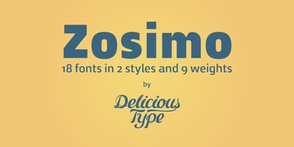 Zosimo is a neo-grotesque typeface created by designer Ron Gilad (Delicious Type) in cooperation with renowned typographer Oded Ezer based on his ubiquitous Alchemist typeface. Carefully drawn curves, robust shapes and a range of OpenType features make Zosimo a great choice for designing logotypes, signage, titling, texts and more. Zosimo now comes in three families: Standard (full Latin support), Cyrillic (basic Latin and Cyrillic) and Pro (all included). Totalling in 9 weights, roman and italic, Zosimo can accommodate all your type-related design needs in one big happy family.
 - ITC Mister Chuckles by ITC,
$29.99Round, firm, and bursting at the seams with good humor, ITC Mister Chuckles is based on the premise that barrel shapes have pleasant associations. Think: beer-barrel polkas, a barrel of fun, or a barrel of laughs, and you'll get the idea. Designer Nick Curtis has combined sans serif sturdiness, a hint of 1930s deco and a handful of giggles in this remarkably versatile all-cap face. If the typographic occasion calls for mirth and merriment, invite Mister Chuckles to the party. You'll have more fun than a barrel of monkeys!