10,000 search results
(0.025 seconds)
- Catseye by Device,
$39.00 A casual sans that harks back to the very English style of book jacket and poster art of the late 50's and early 60's. The turned-in terminals are reminicent of Stephenson Blake's Grotesque 9, and the italic provides unique cursive versions of the lowercase characters. Available in a "narrow" version as well as two standard weights, this face lends itself to the wider letterspacing that evokes hot metal.
 - Library Book Initials JNL by Jeff Levine,
$29.00 Library Book Initials JNL was modeled from examples of Sidney Gaunt's Publicity Initials; originally sold in metal type by Barnhart Brothers and Spindler as a companion to the Publicity Gothic typeface. The smoothed-down lines of the original characters allow for these initials to balace better when set against complementary type faces. A regular version is on the upper case keys, with an oblique version on the lower case keys.
 - Goudy Text CT by CastleType,
$19.00 This version of Goudy Text is based on drawings from which Frederic Goudy based his Goudy Text typeface. However, there is a big difference between his original drawings (in The Alphabet and Elements of Lettering) and the subsequent metal type version, and my version maintains the greater warmth (and irregularities) of the original drawings. Goudy's Lombardy caps look especially nice when used as initial capitals with Goudy Text.
 - Lazurski by ParaType,
$30.00 Designed at Polygraphmash type design bureau in 1984 by Vladimir Yefimov, with the addition of demi and demi italic. Based on a hot-metal typeface (1962) by Moscow book designer Vadim Lazurski (1909–1994), inspired by the early 16th century typefaces of Italian Renaissance. The typeface is useful for text and display composition, in fiction and art books. An 'expert set' was added by ParaType (ParaGraph) in 1997.
 - Gallivant by Jonahfonts,
$39.00 Slightly condensed with a taller lowercase, Gallivant carries itself very well. Similar to classic thick-and-thin san-serif faces with stems slightly facing inward. Note: OpenType variants may only be accessible via OpenType-aware applications.
 - Lazare Grotesk by Nootype,
$40.00 A dynamic and strong new Grotesk, Lazare Grotesk is a family of 21 styles. The family comprises seven weight, from UltraThin to Black, with not only italic but with backslanted too, which allows to make fun and cool layout. In the black weight the font is particularly contrasted. This family contains many OpenType features, such as Alternates, Proportional Figure, Tabular Figures, Old Styles Figures, Numerators, Superscript, Denominators, Scientific Inferiors, Subscript, Ordinals and Fractions, which make that typeface useful in various projects. The fonts have an extended characters set to support Central, Eastern and Western European languages. Lazare Grotesk supports Latin and Cyrillic, all these languages are covered: Latin language support: Afar, Afrikaans, Albanian, Asturian, Azeri, Basque, Bosnian, Breton, Bulgarian, Catalan, Cornish, Corsican, Croatian, Czech, Danish, Dutch, English, Esperanto, Estonian, Faroese, Filipino, Finnish, Flemish, French, Frisian, Friulian, Gaelic, Galician, German, Greenlandic, Hungarian, Icelandic, Indonesian, Irish, Italian, Kurdish, Latin, Latvian, Lithuanian, Luxembourgish, Malagasy, Malay, Maltese, Maori, Moldavian, Norwegian, Occitan, Polish, Portuguese, Provençal, Romanian, Romansch, Saami, Samoan, Scots, Scottish, Serbian, Slovak, Slovenian, Spanish, Swahili, Swedish, Tagalog, Turkish, Walloon, Welsh, Wolof Cyrillic language support: Adyghe, Avar, Belarusian, Bulgarian, Buryat, Chechen, Erzya, Ingush, Kabardian, Kalmyk, Karachay-Balkar, Karakalpak, Kazakh, Komi, Kyrgyz, Lak, Macedonian, Moldovan, Mongol, Permyak, Russian, Rusyn, Serbian, Tatar, Tofa, Tuvan, Ukrainian, Uzbek
 - KG Build A Game by Kimberly Geswein,
$5.00 Build your own board game! This unique font contains lots of bits and pieces to put together your very own custom board game. Print the backgrounds large on cardstock and use the blank die outline to createa custom die! This is a great creativity builder for kids – let them create their own game with their own rules! Alisha Peare of The Bubbly Blonde has come up with a great free synonym/antonym game to showcase some of the ways you can use this font. Download her excellent game for free here: http://www.teacherspayteachers.com/Product/Lost-Leprechaun-AntonymSynonym-Game-Board-FREEBIE
 - Scripps College Old Style by Monotype,
$49.00The story of Scripps College Old Style is a heart-warming and inspiring chronicle about a young librarian, a handful of students, a wealthy grandmother, a dedicated educator -- and two eminent American type designers. The story begins in 1938, when Dorothy Drake, the newly hired librarian at Scripps College, a small women's college in southern California, became an impromptu dinner companion of the American type designer Fred Goudy. By the 1990s, the original fonts that Goudy had created for Scripps College in the 1940s had become prized -- but they were seldom-used antiques. Scripps needed digital versions of the metal fonts. This goal posed two immediate challenges: finding a designer familiar with letterpress printing who was skilled at creating digital fonts, and locating the money to commission the designer's services. The first challenge was the easiest to conquer. Sumner Stone was my first and only choice," recalls Kitty Maryatt, the current curator of the Scripps College Press. "I knew he had letterpress experience, was an accomplished calligrapher, and that his typeface designs were simply exquisite. The choice was easy."The second challenge was more difficult. It took the dedication, hard work and tenacity of Maryatt to bring the beautiful Goudy designs into the twenty-first century. While Stone was eager to begin work on the project, the college had no more money for new typeface designs in the 1990s than it did in the1930s. Years of lobbying, cajoling and letter writing were necessary to obtain the college's approval for the design project. Once she had the necessary funding, the design brief posed yet a third challenge. Goudy had provided two sizes of type to the Press: 14 point and 16 point. Which would serve as the foundation for Stone's work? In addition, the Goudy fonts were quite worn. Should Stone use printed samples as his design master, or base his work on the original Goudy renderings? The 14-point master drawings were the ultimate choice, with the stipulation that the finished fonts would provide both a seamless transition from the worn metal versions and a faithful representation of the original Goudy designs. Once the budget and design brief were established, the process of converting the original Goudy drawings into digital fonts took just a little over two months. Stone delivered finished products to Scripps in the fall of 1997. The first official use of the fonts was to set an announcement for a lecture by Stone at Scripps in February of 1998. But the story is not quite finished. Maryatt was so pleased with the new digital fonts, she wanted to share them with the graphic design community. At Stone's suggestion, she contacted Monotype Imaging with the hope that the company would add the new designs to its library. An easy decision! Now Monotype Imaging is part of the story. We are proud to announce the release of Scripps College Old Style as a Monotype Classic font. The once exclusive font of metal type is now available in digital form for designers around the world. " - Klisse by Gassstype,
$22.00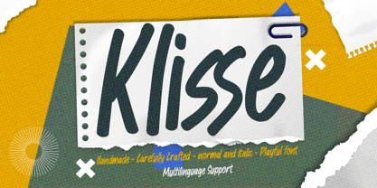 Klisse is Handmade Carefully Playful Font Display Font that will make your designs look modern, unique and fun. It’s perfect for labels, quotes, posters, DIY projects, branding, packaging, greeting cards, websites, photos, photography overlays, signs, window art, scrapbooking, tags and so much more!
 - Kasdio by Din Studio,
$29.00 Kasdio is a casual brush font. Made for any professional project branding. Every letter has a unique and beautiful touch. Includes: Kasdio (OTF) Features: Beautiful Ligatures PUA Encoded Multilingual Support Numerals and Punctuation Thank you for downloading premium fonts from DIn Studio
 - Digital-LED by B1 Industries,
$6.00 I wanted to create a custom LED font, so I did, making sure to check for errors... It is useful for many things. (Electronically and in Real Life) (e.g. Documents, coding, signage, games, LED signs, calculators, etc.)
 - Vertebrata by Fulvio Bisca,
$39.00 Vertebrata is a serif type family of six fonts, designed by Fulvio Bisca between 2011 and 2014. It embodies features from different ages of writing and history of typography: the solemnity of Capitalis Monumentalis in uppercase and small caps, rhythm of Textura in lowercase, sturdiness of 1800 Slab Serifs in the overall look and feel, and a contemporary modular approach to the construction process. In spite of the geometric genesis of the letterforms, special attention has been paid to optical corrections, in order to obtain a natural and legible design. With more than 500 glyphs per font and carefully designed small capitals, Vertebrata is a complete OpenType family, including multilingual and advanced typographic features. Regular, Italic, Bold and Bold Italic styles are intended for both text and display applications, whereas Black and Black Italic are more suitable for display size settings.
 - Taca by Rúben R Dias,
$42.00 Taca is a typeface built around a shape that Portuguese designer Rúben R Dias calls a “squircle” — neither square nor circle. We usually associate the rounded, convex box with the television screens of the 1960s and Aldo Novarese’s classic typeface, Eurostile. But whereas Eurostile is cold and machined, Taca is warm and rugged, as if it was molded from clay or carved from stone. Taca’s organic nature is also derived from another unique feature: rounded crotches at the right angles where perpendicular strokes meet. This subtle finish, along with blunt stroke endings, softens the otherwise rigid skeleton. With such a strong conceptual vision, Taca could be relegated to the bin of experimental designs, severely limited in their application. But that fate is usually born of a less experienced maker. As a teacher, designer, and letterpress printer, Dias is a type user, keenly aware of the functional requirements of good type. Taca is therefore not a slave to its concept, but a working font family, effective in various sizes and environments. Its lettershapes break away from the base shape whenever it makes sense for legibility, while still maintaining the flavor of the design as a whole. That said, a set of squircle-shaped alternates give the user the flexibility to get more stylized if the situation calls for it. Fitting to its functional aims, Taca has many of the features one expects of a proper text font: upper and lowercase figures, case-sensitive punctuation, and Extended Latin language support. The simplicity, openness, and squareness of Taca’s forms also make it an ideal design for the pixel grid of screen displays.
 - Norwill by Din Studio,
$29.00 Norwill is a modern display font. Made for any professional project especially that related to the sports. Beside that, this font can be used for printing, branding and quotes. Features: PUA Encoded Multilingual Support Numerals and Punctuation Thank you for downloading premium fonts from Din Studio
 - Nostagila by Forberas Club,
$16.00 This font is made based on memories from the past. Where is writing in a diary that tells about everyday stories. Are you ready to write a story with this font? or did you want to make a crafty item, this font will do it too.
 - Fundstueck by Ingo,
$12.00 Inspired by a find a coarse but decorative font was created. "Fundstueck" ist the German term for it. Fonts can be so simple. That is what I was thinking as my attention was turned to this rusty piece of metal. Only a few centimeters in size, I couldn’t imagine which purpose it might truly serve. But my eyes also saw an E, even a well-proportioned E: a width to height ratio of approximately 2/3, black and fine strokes with a 1/2 proportion — could I create more characters on this basis? Thought it, did it. The form is based on a 5mm unit. The strikingly thick middle stroke of E suggests that the emphasis is not necessarily placed on the typical stroke, and likewise with the other characters. But if the font is going to be somewhat legible, then you cannot leave out slanted strokes completely. Eventually I found enough varying solutions for all letters of the alphabet and figures. A font designed in this way doesn’t really have to be extremely legible, which is why I forwent creating lower case letters. Nevertheless, Fundstueck still contains some diverse forms in the layout of upper and lower case letters. Thus, the typeface is a bit richer in variety. By the way — the “lower” letters with accents and umlauts stay between the baseline and cap height. And with that, you get wonderful ribbon-type lines.
 - Bauer Bodoni by URW Type Foundry,
$39.99 Giambattista Bodoni of Parma designed and cut his typefaces circa 1790. The Bodoni types were the first of the Modern type designs in which hairlines contrast sharply with bolder stems, and serifs are unbracketed. The Bauer Bodoni font family derives from a cutting for metal type in 1926, retaining many of the original features. As with all versions of this typeface, the contrast between thick and thin strokes of Bauer Bodoni should be taken into consideration as the thin strokes can appear to fade out under certain printing processes.
 - Ironbridge by Device,
$29.00 A cast iron plaque from Bristol Temple Meads Station serves as inspiration for this antique font. The plaque commemorates the design contribution of Isambard Kingdom Brunel, who in March 1833 at only 27 was appointed chief engineer of the Great Western Railway, the line that links London to Bristol. This helped establish Brunel as one of the world’s leading engineers. Impressive achievements along the route include viaducts at Hanwell and Chippenham, Maidenhead Bridge, Box Tunnel and Bristol Temple Meads Station. Ironbridge evokes industrial heritage, gothic spookiness or eroded heavy metal.
 - URW Akropolis by URW Type Foundry,
$39.99 The design of this display face is based on the hot metal typeface Acropolis, issued by the German type foundry Ludwig Wagner in Leipzig in 1940. To further increase its usefulness a Cyrillic was added to it: URW Akropolis, redrawn and digitally remastered by Coen Hofmann for the URW Font Forum, is a true display design that should not be set below 48 point if you want to preserve it's fine details like the open triangular sections, e.g. in L, G, S, T etc. and gain the full typographic splendidness of this beautiful typeface.
 - Boondock by Canada Type,
$24.95Boondock is another Imre Reiner design resurrected from the ashes of hot metal type for digital use. This wild paint font is a revival of the fascinating Bazaar brush type from 1956. Boondock has some very unique characters that combine to form a statement of casual but loud strength, seriousness and raw primal emotion. Great for short sudden-impact spurts, like book cover titles, single sentence headers, movie posters and music sleeves. Redrawn from original specimen by Patrick Griffin, and expanded with some built-in extras too add to the convenience of this digital version. - Forest Shaded by ITC,
$29.00Forest Shaded is the work of Martin Wait. It is reminiscent of the countless eccentric advertisement typefaces at the turn of 20th century. The industrial revolution in England saw the beginning of business advertisement and demanded ever more new and showy typefaces. Forest Shaded is an ornamental outline font and its thick figures have lively, even eccentric, forms, whose shading makes them look three dimensional. Forest Shaded is reminiscent of display window and metal sign typefaces of the late 19th and early 20th centures and is perfect for headlines in large point sizes. - LTC Archive Ornaments by Lanston Type Co.,
$24.95 Unlike previous dingbat fonts released from Lanston Type Co., Archive Ornaments derives from a unique collection of brass ornament plates that were originally used in creating the matrices for casting metal type. Using the plates as a reference point allowed for a more precise rendering of the ornaments. Letterpress prints were made directly from the brass plates, which were then re-drawn and digitized. Each character has been optimized for the combination of decorative borders and patterns as well as individual accentuation. The completed digitized font contains over 100 glyphs, ranging in style from geometric to organic designs.
 - Voltage by Laura Worthington,
$19.00 Voltage is an unexpected and energetic standout in the world of script fonts. Evocative of the metal lettering on automobiles of the past, Voltage references the late days of the Industrial Age; its structured lettering emphasizes practicality and uniformity that is assertive, yet down-to-earth. Voltage provides 154 unique swash designs (a total of 348 swash variations), 39 alternates, and 15 ligatures. See what’s included! http://bit.ly/1wsNonR These fonts have been specially coded for access of all the swashes, alternates and ornaments without the need for professional design software! Info and instructions here: http://lauraworthingtontype.com/faqs/
 - Opera House by Solotype,
$19.95This is a fake and a fraud and not a bad-looking type. We did this to imitate the look of an old wood poster font, but it is completely new. Don't tell anyone. Please note: no lowercase. - Bubblez by Almarkha Type,
$25.00 Bubblez – Fun Craft font that will make your designs look unique and fun. It’s perfect for labels, quotes, posters, DIY projects, branding, packaging, greeting cards, websites, photos, photography overlays, signs, window art, scrapbooking, tags and so much more!
 - Pinnacle JY Pro by JY&A,
$55.00 JY Pinnacle is a distinctive text family, with at least 3,100 kerning pairs (for text fonts) and collections of alternative characters for roman, italic and cap and small cap. Pinnacle has an awareness of tradition, but is individual and fresh. Its oblique axis for lowercase letters such as the o and e is meant to aid legibility.
 - Donsky by Lemonthe,
$14.00 Donsky is a dry brush font. Suitable for any projects such as logos, branding projects, product packaging, mugs, quotes, posters, shopping bags, t-shirts, book covers, labels, photography, watermark, and more. Use this gorgeous and unique handwritten font to bring any DIY project to life!
 - Krea Sans by Krea SK,
$32.99 The inspiration for designing this font was our company logo, that we created first. The design is influenced by a typeface called Din. The main characteristic and features are clean, minimalistic, geometric. Young playful companies and clients could definitely use this font for their branding.
 - Santino by Sudtipos,
$39.00 Santino is a rounded monoline, post-bauhaus geometric font with smooth extremes and a touch of modern sensuality. It is named after Ariel "Negro" Di Lisio's son. The fonts were designed by Ariel Di Lisio and digitized by Alejandro Paul.
 - Tannenberg Fett - Personal use only

- LCR Rainy Daze - Unknown license

- Western Americana by Celebrity Fontz,
$24.99Western Americana is a unique collection of signatures of 72 famous American frontiersmen, gunslingers, Wild West personalities, outlaws, and Indians in a high-quality font. A must-have for autograph collectors, desktop publishers, lovers of history, or anyone who has ever dreamed of sending a letter, card, or e-mail "signed" as if by one of these famous Western celebrities. This font includes signatures from the following American West personalities: William Frederick Cody ("Buffalo Bill"), George Armstrong Custer, Meriwether Lewis, William Clark, Kit Carson, Joseph Brant, David Crockett, Wyatt Earp, Geronimo, James Bowie, Daniel Boone, Sam Houston, Calamity Jane, Sitting Bull, William H. Bonney ("Billy the Kid"), Cole Younger, Bob Younger, Jim Younger, Pat Floyd Garrett, James Butler "Wild Bill" Hickok, Squire Boone, Samuel Colt, Gordon William Lillie ("Pawnee Bill"), Annie Oakley, William Barret Travis, Allan Pinkerton, Jose de Galvez, George Rogers Clark, George Crook, John Charles Fremont, George Croghan, Simon Kenton, Maj. Frederick Benteen, James Wilkinson, Nelson Appleton Miles, Philip Kearny, Chief G.H.M. Johnson, William George Fargo, William Barclay "Bat" Masterson, King Philip, Frank James, Eleazer Williams, Henry Wells, Junipero Serra, John Sevier, John Ross, Joseph Virgo, Chief Joseph, Red Jacket, Manuel Lisa, Julian Dubuque, John Augustus Sutter, Manuel Lisa, Jesse James, Jesse James alias Thomas Howard, Manasseh Cutler, Robert Newton Ford, Emmett Dalton, Henry McCarty alias Greenville Mellen Dodge, Edward Zane Carroll Judson ("Ned Buntline"), Rain-in-the-Face, James Robertson, Zebulon Pike, Chief Two Guns White Calf, Pierre Chouteau Jr., Frank Butler, Isaac Shelby, Moses Austin, Moses Cleveland, Rufus Putnam, Pierre Chouteau Sr., Father Pierre Jean De Smet, and Auguste Chouteau. This font behaves exactly like any other font. Each signature is mapped to a regular character on your keyboard. Open any Windows application, select the installed font, and type a letter, and the signature will appear at that point on the page. Painstaking craftsmanship and an incredible collection of hard-to-find signatures go into this one-of-a-kind font. Comes with a character map. - Zushboy by PizzaDude.dk,
$20.00Zushboy is a ragged verion of my own tagging style (even though it has been years and years since I did a thing like that!). The font is spaced tight in order to copycat a real homeboy's handwriting! Yo! - Roundhead by Solotype,
$19.95A surprisingly modern looking condensed sans serif issued by Mackellar, Smiths & Jordan foundry in 1887. Its narrow width makes it useful for long copy headlines. Designed by the freelance type cutter Charles Beeler who did many fonts for Mackellar. - Classica Pro by URW Type Foundry,
$35.99 Classica Pro by Bernd Möllenstädt A real alternative for letterpress printing A masterpiece It was only after many years, shortly before the end of his life, Bernd Möllenstädt brought out these early drafts of his Classica Light and Light Italic from his drawer, and asked me to produce for him on the computer a Bold and Bold Italic, from which we later wanted to interpolate further cuts like Regular and so on. The boldening of letters with an oblique axis and with hairlines which should not grow to the same extent as the general line widths, is hard to cope with perfectly, even for the smartest computer program, and even more so, when it concerns an as complicated set of data as those conceived by Bernd. The automatically generated result could therefore only be a first step that had to be improved manually later. This was about the stage that we had reached when Bernd died in March 2013, leaving me behind with comprehensive corrections on proofs of this automatically generated Bold. Although I was aware that it would mean a lot of work to complete the project, I did not want to leave it unfinished and decided to finalize and publish the Classica, also in Bernd‘s honor. In the course of the two years that I worked on this font family it somewhat naturally became also my own. New details were added and some of the existing changed. A book typeface requires the supreme and forgives rarely, it represents a true masterpiece. My intention and my ambition were to create a real alternative for letterpress printing, with a font family that contains all the typographic options for an excellent typesetting, and is better readable and has a better appearance than other existing typefaces. Whether this was achieved, the reader may decide. Volker Schnebel, Hamburg, december 2014
 - Isara by Autographis,
$39.50 Isara is a rough script written with a flat-nibbed marker, scanned and then carefully digitized to keep that spontaneous feeling.
 - Kickout by Din Studio,
$29.00 Kickout is a classic sport font. Made for any professional project especially that related to the sports. Beside that, this font can be used for printing, branding and quotes. Features: Stylistic Set PUA Encoded Multilingual Support Numerals and Punctuation Thank you for downloading premium fonts from Din Studio
 - Darknight by Din Studio,
$29.00 Darknight is a classic sport font. Made for any professional project especially that related to the sports. Beside that, this font can be used for printing, branding and quotes. Features: Alternates Stylistic Set PUA Encoded Multilingual Support Numerals and Punctuation Thank you for downloading premium fonts from Din Studio
 - Candymore by Epiclinez,
$18.00 Candymore is a fun and playful handwritten font. Its simple and friendly style is suitable for your DIY or crafting projects. This font has 197 glyphs and its supporting 66 languages, from English to Zulu. Have fun with this super cute font and explore its awesomeness. Thank You!
 - Sweet Mango Italic by Letterafandi Studio,
$18.00 Sweet Mango is a modern sans serif font. This font is perfect for logos, greeting cards, package design, brand identity, craft designs, any DIY projects, book titles, wedding invitations, packaging, and more. Include 4 style font : Sweet Mango Regular Sweet Mango Italic Sweet Mango Bold Sweet Mango Italic Bold

