10,000 search results
(0.032 seconds)
- Shaq Attack NF by Nick's Fonts,
$10.00No: Jethro Bodine didn't design this typeface although, to look at it, you might be tempted to think so. Rather, the pattern was a product of the fertile imagination of famed lettering artist Alf Becker. The lowercase letters are the same as the uppercase, but angled differently so, if you want a randomized appearance, you can activate Contextual Alternates and the font will do the shift-key double-clutching needed. Both versions include the complete Unicode Latin 1252, Central European 1250 and Turkish 1254 character sets, with localization for Moldovan and Romanian. - Niveau Serif by HVD Fonts,
$40.00 Niveau Serif - the companion of Niveau Grotesk - is a type family of six weights plus matching italics & small caps. It was designed by Hannes von Döhren in 2013. Influenced by classical nineteenth century engravers faces, the fonts are based on geometric forms. Niveau Serif has a contemporary feel and combines the clearness of a Sans with the elegance of a typeface with serifs. Niveau Serif is equipped for complex, professional typography with alternate letters, arrows, fractions and an extended character set to support Central and Eastern European as well as Western European Languages.
 - Dissonus by Dawnland,
$13.00 DisSonus X is ideal for: Initial characters - give your text an unparalleled facelift! Headlines - create a unique look for your posters, event graphics, book covers & music/media/game packaging. Preamble - reanimate the introduction... The bread text on the gallery images is written in Nihil . DisSonusX was revised 2012 and now hold a full character set of basic english/latin letters and west european diacritics! Note that there are no digits in this font. Use a fitting antiqua such as Berkeley Book or (insert your favourite version here) Garamond.
 - Baggage Claim JNL by Jeff Levine,
$29.00 Sometimes type designs are set aside as one project takes priority over another and occasionally it becomes overlooked. One such example is a set of extra bold, sans serif stencil characters drawn out in 2017. Regrettably, as much time has passed, no backstory can be applied to this typeface. It was checked against existing releases in the Jeff Levine Fonts library and didn’t seem to have been re-worked for any subsequent release. With this in mind, Baggage Claim JNL makes its belated appearance and is available in both regular and oblique versions.
 - Kanvas by Mans Greback,
$29.00 Kanvas is a flowing calligraphy script. The typeface was drawn and created by Måns Grebäck between 2017 and 2020. Its flowing shapes are inherited from mid-century advertising, being soft and friendly while retaining a sturdy forward movement. Kanvas is a typeface family consisting of five weights: Thin, Light, Regular, Bold and Black. Use it for an invitation card, in a celebratory context or as a logotype. The font contains all characters you'll ever need, including all punctuation and numbers. It has an extensive lingual support, covering all European Latin-based scripts.
 - Mamontov by omtype,
$49.00 Originally Mamontov has been inspired by poster (usually wooden) types of the end of 19th—the beginning of 20th centuries. The type family was named after Savva Ivanovich Mamontov (1841-1918), Russian industrialist and patron of the arts. Massive asymmetric serifs, stocky proportions, type weight... are traces of harsh imperial reality. And soft forms of ovals, exaggerated compensators, humanistic curves of serifs and horizontal strokes betray the sensitivity and artistry of Savva Ivanovich. Mamontov has 25 styles, ranging from Light to Black and from Condensed to Wide, with more than 1000 characters per font.
 - Cira Sans by Huerta Tipográfica,
$45.00 Cira is a superfamily with 7 weights and italics under two main styles: sans and serif. The original concept was created for Katachi Media as a corporate font for text and experimentation in an iPad magazine. It has a diversity of outlines with straight angles which create unusual shapes and counterforms. Its middle weights are suitable for text and can be combined with extreme weights at display sizes. Cira is a versatile superfamily with an original and modern feeling and it’s a great option for giving identity to your designs.
 - Linotype Fresh Ewka by Linotype,
$29.00Linotype Fresh Ewka is part of the Take Type Library, chosen from the contestants of Linotype’s International Digital Type Design Contests of 1994 and 1997. This fun font was designed by Polish artist Dariusz Nowak-Nova and each letter seems to be a work in itself. The fine hair lines are decorated with tiny squares and look like wires with nodes while the thicker strokes have indefinite contours and seem to have been made with a thick brush. Linotype Fresh Ewka is suitable for headlines in large point sizes. - Caffe by IHOF,
$24.95 Caffe was originally designed for the Artz Gallery Cafe in Budapest Hungary. The design is a contemporary handwriting style adapted from examples in lettering exercise books. It has been redrawn and expanded into six styles. The four weights were created by drawing the style using different mediums: Cappuccino in pen, Pastry in felt-tip, Lemonade in brush, and Tobacco—the original—in pencil. Poster and Poster Inline round out the family and are well suited for display purposes. This font family is perfect for bistro menus or other European-flavored poster and print design.
 - Spekulatus by Bogstav,
$18.00 Spekulatus is a made up name, and that was what I needed for a font like this. I am not sure which category it fits in: grunge, square, handmade, rough or maybe even graffiti? Well, let's just say that it fits in all 5 - or perhaps even more? All letters are handdrawn, and messed up a bit with a thin fine white liner, leaving a gentle grungy and worn effect. I've added 5 different versions of each letter, which is quite nice - not having the same letters repeating all the time!
 - Beckford Script by Dear Alison,
$29.00 Brush lettered scripts have such a quick expressive quality to them and have amazed me since I was a little girl. The quick whip of the wrist can make or break a letterform so easily. They are filled with personality and visual flavor. Beckford Script taps into that association and brings a quick handed sassiness reminiscent of vintage travel brochures and old pulp and romance novels. But for whatever you might need this script for, you'll find it up for the task. Spice up your font collection and pick up Beckford Script today!
 - Terrified AOE by Astigmatic,
$19.00 Terrified AOE was inspired by vintage horror movie poster titling from the 1960's. It is a Capitals and smallcaps typeface, that really feels like a mix of three typefaces in one. While the Capitals and Smallcaps typesetting works to the effect of the original inspirations, each case also works well amongst itself independently, and having very different vibes. I've always been a huge fan of horror movies, and some of the lettering from vintage horror movie posters are so cool and alive, I only wish there were more of them recreated as display fonts.
 - Brannboll Connect by Mans Greback,
$59.00 Brannboll Connect is a script sport typeface. The baseball-style lettering was drawn by Måns Grebäck in 2020. It is a specialist connected typeface: Each character and all their parts are physically connected, making it a lettering perfect for laser cutting, signs, jewelry, woodworking and embroidery. It also comes with the additional, decorative style Brannboll Connect Swash, which contains ten cool swashes to give the graphic extra expression. It has a very extensive lingual support, covering all European Latin scripts. The font contains all characters you'll ever need, including all punctuation and numbers.
 - Nvma Titling by Stone Type Foundry,
$49.00 Nvma is based on Roman letterforms which appeared during the period from the earliest extant examples in the sixth or seventh century BC until the end of the third century BC. For Nvma the J, U and W had to be fantasies as they did not exist until much later, similar to the G, numerals and other non-alphabetic signs in the font. Thus not all of the archaic forms are represented in Nvma. Nvma was designed to work with Magma, as it matches the weights and heights for Magma Thin and Magma Titling Thin.
 - Zigzag by Volcano Type,
$60.00 ZIGZAG is a funny font family whose letters have four varieties each in order to multiply expressions and attract the eye by breaking the rhythm of reading. There are two styles available Rounded and Not Rounded. The variations oscillate between a hand-drawn design and a geometric or imaginative drawing. Opentype’s function lets you choose between different variations of each glyph and contextual variables allow to mix the styles. Benoît Bodhuin designed ZIGZAG Rounded in 2011/12 for the theatre Vivat. In 2013 ZIGZAG Rounded was supplemented by ZIGZAG Not Rounded.
 - Trečiokas by Rokas Cicenas,
$9.00 I present you Trečiokas typeface. This two font family is based on written letters that were sketched by using paint markers and afterwards pollished digitally. Glyphs mostly are connected, leaving some separate, as a contrast to round and soft letter shapes. It includes extended latin character set. In 2013 I made the Aerofont project, which included custom music instruments that were made based on Trečiokas Normal letter shapes. The main idea was to connect music and typography, by making sound emitting letters. You can watch the project video here.
 - Broadletter JNL by Jeff Levine,
$29.00Modern digital typography pushes many designers to try and achieve visual perfection with their lettering. In the days of wooden type, the premise was more in creating a font that "sold" the message (possibly, in part due to the lack of advanced tooling to achieve uniformity). In many styles of wood type (such as the one used as a model for Broadletter JNL), there are vast differences within the character design, weight and symmetry from letter to letter. This is now looked upon as "old fashioned" and "charming" - part of the appeal of this typeface. - Banner by ITC,
$29.99The calligraphy font Banner was designed by Martin Wait in 1986 and mixes the character of the 1940s with that of the 1980s in its forms. The round and somewhat reserved lower case letters make a balanced basis for the generous capitals. Black outer contours surround a white inner area and are heavier on the right side of the figures, making the characters look as though they have shadows. Banner should be used in point sizes of 18 and larger and is meant for lighthearted short texts or headlines. - Monotype Bernard by Monotype,
$40.99In the early years of the twentieth century a number of romans with a soft and slightly script like quality were evolved. Although they did not represent the future in terms of the major design influences that were to appear after the First World War, they were a break with the past, and were developed further in the nineteen twenties and thirties. Monotype Bernard Condensed is closely associated with this period, a condensed roman evoking an easy charm. The Monotype Bernard Condensed font offers many display applications where warmth and friendliness is required. - Impact Wide by Geoffrey Lee,
$21.00Impact wide was developed from the designer's original drawings for the production of 'Impact' metal type, with many detail changes because of the density of the letters. These include the restoration of the bevelled i and j dots of the original. Character maps show some useful alternative characters in both roman and italic. Included are a crossbar numeral 1, mirror quotes and some sorts which were cast in metal but never reproduced in digitized versions of the typeface. There is also a font-specific Euro symbol. (Impact is a trademark of The Type Museum, London). - Bucintoro by Three Islands Press,
$24.00Bucintoro is a modern version of the rotunda blackletter, the Gothic book hand of Italy and Spain in the 14th, 15th, and 16th centuries. As the name implies, it's more "rotund" than the tall, angular Textur blackletter used in Germany that Gutenberg imitated. While the use of blackletter continued far into the 20th century in Germany and Scandinavia, the rotunda gave way to roman (and later also italic) letterforms in Italy, France, and Spain. It's less well known these days. Bucintoro has upper- and lowercase alphabets, numerals, punctuation, diacritics but lacks such modern characters as currency symbols. Has light, medium, and black weights. - Kadonk by Typodermic,
$11.95 Listen to the rumbling roar of the mighty Kadonk! This barbaric typeface will strike fear into the hearts of your enemies with its brutal and spiky design. Its sharp edges and aggressive curves are as merciless as a battle cry. With Kadonk, you’ll never be held back by plain and repetitive characters. This savage typeface features unique letter pair ligatures that break up the monotony and give your words a ferocious edge. Incorporate Kadonk’s primordial, savage war cry into your messaging and let your audience know that you mean business. With its powerful presence and fierce spirit, Kadonk will help you dominate the battlefield of design. So, sound the drums of war and unleash the fury of Kadonk! Most Latin-based European writing systems are supported, including the following languages. Afaan Oromo, Afar, Afrikaans, Albanian, Alsatian, Aromanian, Aymara, Bashkir (Latin), Basque, Belarusian (Latin), Bemba, Bikol, Bosnian, Breton, Cape Verdean, Creole, Catalan, Cebuano, Chamorro, Chavacano, Chichewa, Crimean Tatar (Latin), Croatian, Czech, Danish, Dawan, Dholuo, Dutch, English, Estonian, Faroese, Fijian, Filipino, Finnish, French, Frisian, Friulian, Gagauz (Latin), Galician, Ganda, Genoese, German, Greenlandic, Guadeloupean Creole, Haitian Creole, Hawaiian, Hiligaynon, Hungarian, Icelandic, Ilocano, Indonesian, Irish, Italian, Jamaican, Kaqchikel, Karakalpak (Latin), Kashubian, Kikongo, Kinyarwanda, Kirundi, Kurdish (Latin), Latvian, Lithuanian, Lombard, Low Saxon, Luxembourgish, Maasai, Makhuwa, Malay, Maltese, Māori, Moldovan, Montenegrin, Ndebele, Neapolitan, Norwegian, Novial, Occitan, Ossetian (Latin), Papiamento, Piedmontese, Polish, Portuguese, Quechua, Rarotongan, Romanian, Romansh, Sami, Sango, Saramaccan, Sardinian, Scottish Gaelic, Serbian (Latin), Shona, Sicilian, Silesian, Slovak, Slovenian, Somali, Sorbian, Sotho, Spanish, Swahili, Swazi, Swedish, Tagalog, Tahitian, Tetum, Tongan, Tshiluba, Tsonga, Tswana, Tumbuka, Turkish, Turkmen (Latin), Tuvaluan, Uzbek (Latin), Venetian, Vepsian, Võro, Walloon, Waray-Waray, Wayuu, Welsh, Wolof, Xhosa, Yapese, Zapotec Zulu and Zuni.
 - XLeefMeAlone by Ingrimayne Type,
$14.95 XLeafMeAlone is a collection of leaf silhouettes from common Indiana trees based on actual leaves. Various leaves, selected for their good looks not their intelligence, were scanned and hand-traced. Some species, such as some oaks, are over-represented because they are more picturesque than others, such as apple or peach. LeafMeAlone was featured in the “Type Drawer” column of Personal Publishing (later renamed Business Publishing--I do not know if it still exists) in November of 1990.
 - Quadrat Grotesk by ParaType,
$30.00 PT Quadrat Grotesk™ was designed for ParaType in 2001 by Vladimir Pavlikov. An expanded sans serif with square letterforms due to what the face was named. Based on the shapes of one of old Russian wooden types. Wooden types were used for placard display composition at large sizes. Their printouts retained wooden texture and traces of handling. These features are reflected in the shapes of Quadrat Grotesk. It is a good typeface for display and advertising typography.
 - Piambis by Aga Silva,
$24.99 Piambis Family has been featured in "Slanted #28 Contemporary Typefaces 2016/17" This handwritten font family that boasts great variety of glyphs - many of which are fancy alternates for standard letters (click on text written in Piambis below, then click on “Glyphs”). This font is designed so the letters are available via standard programs ie. Word. It is recommended however that you use professional software such as Photoshop or Illustrator to make your work easier as there are over 1600 glyphs in each of the fonts included in Piambis family. About the family: The chief difference between the files in the family are finishes to the capital letters (in all languages) and appearance of the lowercase “f”. The fonts support all languages that use latin script - yes - Vietnamese (Tiếng Việt) and Pinyin is also available.
 - ITC Don't Panic by ITC,
$29.99ITC Don't Panic's distressed shapes and craggy outlines evoke the feeling you get when you're just barely in control of a situation. This is type design on the edge. ITC Panic is further down the emotional track, when you've actually lost control and there is no hope in sight. Thompson says the inspiration for these faces arrived one day in the mail. I received an envelope that looked like it had a rough trip; the type that was stamped on it had a tired, ragged appearance. Ironically, the haggard envelope woke me up. I got excited and wanted to replicate the look as a font of type." Thompson designed ITC Don't Panic, then stood back and looked at it and decided it cried out for a more agitated companion. ITC Don't Panic gave birth to the positively psychotic offspring, ITC Panic. Both are all-cap designs with alternate characters in the unshift position. Creating an authentically disturbed appearance proved to be a challenge for Thompson. "I tried to design agitated characters, but they looked staged. So I tried multiple photocopies, but that didn't work. Eventually, I laser-printed the basic characters, wadded up the lasers, then flattened them out and stomped on them with heavy boots. The end result was scanned and used as the basis for the rest of the design." Thompson's work on web sites and multimedia has influenced his interest in type and typography that transcends the cool, unemotional nature of the computer." - ITC Panic by ITC,
$29.99ITC Don't Panic 's distressed shapes and craggy outlines evoke the feeling you get when you're just barely in control of a situation. This is type design on the edge. ITC Panic is further down the emotional track, when you've actually lost control and there is no hope in sight. Thompson says the inspiration for these faces arrived one day in the mail. I received an envelope that looked like it had a rough trip; the type that was stamped on it had a tired, ragged appearance. Ironically, the haggard envelope woke me up. I got excited and wanted to replicate the look as a font of type." Thompson designed ITC Don't Panic, then stood back and looked at it and decided it cried out for a more agitated companion. ITC Don't Panic gave birth to the positively psychotic offspring, ITC Panic. Both are all-cap designs with alternate characters in the unshift position. Creating an authentically disturbed appearance proved to be a challenge for Thompson. "I tried to design agitated characters, but they looked staged. So I tried multiple photocopies, but that didn't work. Eventually, I laser-printed the basic characters, wadded up the lasers, then flattened them out and stomped on them with heavy boots. The end result was scanned and used as the basis for the rest of the design." Thompson's work on web sites and multimedia has influenced his interest in type and typography that transcends the cool, unemotional nature of the computer." - Merfidost Brush by Stripes Studio,
$20.00 Hi, Introducing the latest styles Merfidost Brush Font Duo with the kind of modern hand scratches, I hope you are interested in this font, if you want to use for your work this font can be used easily and simply because there are a lot of features in it to contain a complete set of letters lower and uppercase letters, assorted punctuation, numbers, and multilingual support. font also contains several ligatures and alternate style Stylistic.
 - Hello Arfelina by Stripes Studio,
$20.00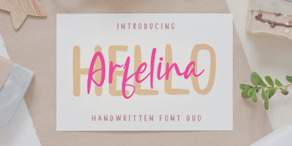 Hi, Introducing the latest styles Hello Arfelina Font Duo with the kind of modern hand scratches, I hope you are interested in this font, if you want to use for your work this font can be used easily and simply because there are a lot of features in it to contain a complete set of letters lower and uppercase letters, assorted punctuation, numbers, and multilingual support. font also contains several ligatures and alternate style Stylistic.
 - Blezja by Typoforge Studio,
$19.00 To design a font Blezja, I was inspired by an old metal tin from 1907 from Potsdam, which was used to store earplugs. From a few letters I created whole typeface - lower and uppercase characters.
 - Hannah Joie by LightHouse,
$49.00Hannah Joie was influenced by the early lettering that appeared on posters in Israel (e.g. the 1950s). The style of the lettering was bold, heavy, and prominent. Hannah Joie is an OpenType/TTF Unicode font. - DinoTracks by Ingrimayne Type,
$9.00 DinoTracks is a novelty or letterbox font in which the letters are formed with dinosaur footprints. It is readable at small point sizes, but then one cannot see that the letters are made from footprints
 - Goldie Sans by Blythe Green,
$15.00 Goldie Sans is a clean sans serif that is perfect for logos, quotes, long-form copy, and more. Both uppercase and lowercase are included in light and bold, but I am particularly fond of using it as an all caps font for logos, headlines, and short quotes. INCLUDED uppercase letters lowercase letters numbers & punctuation light and bold fonts foreign language characters
 - Quarantype by Zetafonts,
$- Trapped home during the Coronavirus outburst of March 2020 the Zetafonts team found some solace from the world-wide anxiety by designing letters for the #36daysoftype challenge. To fight dark thoughts and spread some good karma we decided to add a free font twist, selecting the best glyphs drawn to develop a collection of ten free typefaces for download. We did our best to make this little gift to the community valuable, though developed in record time: although playful and excessive, these typefaces all stem from our current research in contemporary trends and historical design solutions, bridging calligraphy and design. The typefaces have been published daily starting Monday, March 30. You can download and use the typefaces in any way you desire, as they are totally free for commercial and non-commercial use. We are not asking anything back, but feel free to share the good karma and, if you want, please consider a donation for hospitals.
 - Ghitta Bodoni Cancellaresca by Spurnej Type Foundry,
$39.00 Giambattista Bodoni was an Italian engraver, printer, and publisher who was one of the best typographers of the 18th century and became known worldwide for his iconic serif typeface. In the posthumous edition of Bodoni’s “Manual of Typography” published in 1818 by his widow Margherita “Ghitta” Dall’Aglio may also be found, among the other treasures, the Cancellaresca (Chancery). Ghitta is a redesign of this typeface in its finest form. With strong stroke contrast in 4 optical grades, 850 glyphs with wide range of language support, accented ligatures, oldstyle figures, 8 stylistic sets, and unique way of letter connection, Ghitta Bodoni Cancellaresca follows and builds on the best of Bodoni’s historical prototype and shifts further to a contemporary script typeface full of grace, neatness, and beauty. *** This font is powered by OpenType feature “Ligatures”, so it is necessary to have this function turned on. If you need support or more information, please kindly contact me: spurnej@email.cz
 - Gelica by Eclectotype,
$30.00 When work started on the design of Gelica, there wasn't the same glut of retro-ish soft serifs there is today, and if I'd managed to complete it quicker, it might have been more trendsetter than bandwagon jumper, but that's the way it goes sometimes! I still think it's useful and unique enough to be a worthwhile addition to your typographic arsenal. Although obviously influenced by Cooper, it actually owes more to the lesser known Goudy Heavyface and Ludlow Black, particularly in the concave serifs. I wanted the family to be friendly and approachable, but not overly cutesy, and usability was always the prime concern. A nice weight range with matching italics was a must, along with useful OpenType features, and various figure styles. This is a display family first and foremost, but is also comfortable at smaller sizes for longer copy, and so works well in a supporting role to a more exuberant titling font.
 - Bhuyin by Twinletter,
$17.00 "Welcome to the world of one-of-a-kind typography!" Bhuyin is a display typeface with a totally unique sense of design. Bhuyin is the ideal choice if you need a bold and distinct style for a wide range of visual design tasks. What distinguishes Bhuyin from others? Its attributes are fantastic. With ligatures and alternatives available, Bhuyin allows you to express yourself in an infinite number of ways. You can quickly construct one-of-a-kind letter combinations to lend a particular, personalized touch to any project. Because we understand the value of interacting with a worldwide audience, Bhuyin supports several languages. Your message will be clearly and successfully delivered to individuals all around the world. Are you ready to take your design to the next level? Bhuyin is ready to take your projects to the next level. Get this font now and see how Bhuyin turns every design into an unforgettable work of art.
 - TF Sadistic by Teenage Foundry,
$19.00 TF Sadistic is our display font, carefully crafted to bring a sharp and charming look to your designs. With its distinct style and versatile nature, our fonts are the perfect choice for creating attention-grabbing metallics, horror posters, and other impactful visual materials. Our sharp display fonts are designed to make a statement. Its sharp edges and unique letter shapes exude strength and power.
 - Slabton by alphabeet.at,
$40.00 Slabton is a font family in the slab serif style. There are six defined weights, from thin to black, and six italic weights as well as a variable font. All latin small caps are integrated and the font contains a lot of useful open type features and options. Also, there is an additional shaded decor style for decorative matters and elements like headlines and initials.
 - Jefferson by ParaType,
$25.00 The script font “Jefferson” is based on real handwriting of Thomas Jefferson. Luckily there is a draft of original text of the Declaration of Independence written by Jefferson available . It was used as a primary source for this font. The Jefferson font was developed by Gennady Fridman for ParaType in 2005. It is in OpenType format with a contextual substitution of letterforms and specific ligatures.