10,000 search results
(0.08 seconds)
- Rogue by Umka Type,
$19.00 Rogue - A Display Font : Rogue is a carefully crafted display font. It has Extended Latin and Cyrillic characters. It created for poster, web, brand and social media designs.
 - Cartoon Mood by Elysart,
$16.00 Introducing Cartoon Mood - a cute handwritten font by Elysart This font is perfect for children's books, logos, greeting cards, animation designs, clothes, posters, krafting, stickers, toys, and more!
 - Kantor - Unknown license

- Paper Stencil JNL by Jeff Levine,
$29.00Paper Stencil JNL is another addition to Jeff Levine's ever-growing collection of stencil fonts based on vintage source material. - Joshico by Supfonts,
$15.00 Joshico - a new fresh handmade calligraphy font. Very suitable for greeting cards, branding materials, business cards, quotes, posters, and more!
 - WOODTYPE Collection by Borutta Group,
$19.00 WOOD TYPE COLLECTION from Mateusz Machalski is a set of wonderful, warm, and weathered hand made typefaces designed by Mateusz Machalski. The Inspiration for this collection comes from a wooden letter blocks and other old technologies used for printing. WTC supports 40 different languages and contains over 300 glyphs per style. The Family consists of 20 typefaces. ENJOY!
 - PerfectPixel - Unknown license

- CCS Palmore by Creative Corner Studio,
$29.00 CCS Palmore is a vintage retro condensed display typeface combined with rounded proportions letters forms. The combination of condensed glyphs with large-rounded O and C as well as the few alternates available give the font a strong rhythm, perfectly fit for headline and titles. If you're into classic/vintage letter designs, then this typeface suits best for you. Packed with 300+ glyphs , now it’s your time to go crazy and explore the uniqueness of this typeface!
 - Anvil by Tim Rolands,
$29.00 Lend some weight to your words with Anvil! A bold, extended display face, Anvil is ideal for posters and other large design work as well as identity and logo work. This cross-platform OpenType font contains a number of ligatures, fractions, superior and inferior numerals, alternate forms and accented characters -- nearly 300 glyphs in all. Use it with an application like Adobe InDesign to access all the advanced features. Enjoy the future of typography now with this original design!
 - Gravitational Pull by Hanoded,
$15.00 My 9-year old son Sam asks a lot (a LOT!) of questions. Like: ‘what killed the dinosaurs?’ (probably an asteroid), ‘what is the distance to Pluto’ (about 7.5 billion km), ‘how big is space’ (93 billion lightyears - give or take). I am pretty sure he asked me about gravity as well. Gravitational Pull is a messy pencil script font. It comes with a whole bunch of double-letter ligatures and some really wonky glyphs. And no, in its virtual form, this font is not subject to the Earth’s gravitational pull.
 - Contax by Type Innovations,
$39.00 In the advertising industry, I was often asked to supply the art directors with ideas for a san serif type design that was not the standard Helvetica or Univers. They wanted a fresh new approach, something with generous proportion, like Avant Garde perhaps, but not as uniform in proportions. A font that would lend itself well to wide and long columns of text with lots of leading. So, I rolled up my sleeves and designed a font that meet all their criteria. Contax is the new 'Univers' for the 21st century.
 - Madison Ave. by Funk King,
$10.00 The Madison Ave. family started from Madison Ave. at Fontstruct.com. As my most downloaded font, this was an easy, although not necessarily logical choice to make – regarding taking an existing free font and attempting to offer it for purchase. The font is very basic and simple in its layout, but has achieved popularity over at Dafont with almost 80,000 downloads with its cool, understated nature and inherent sophistication. The original Madison Ave. is now 95 Madison Ave. A couple of glyphs have changed from the original, but mostly the set is the same. The big news here is the availability of multiple variations on the original. Ninety-five refers to the filter settings used to achieve the faint cross lines in the font. The sequence 95-100 provides a gradual fade to solid effect when used together. The other versions use variations on the filter settings that allow each its own distinctive flavor, while at the same time maintaining inherent characteristics of the original. Ninety-five is now joined by 55, 75, 97, 99, 100, 102, 105, 155, 175, 201, 202, and 275. 100 is the solid version which doesn’t contain the trademark lines found in 95. In 95-99, the line width varies to achieve subtle effects. 50 and 85 are distorted by reducing the filter settings in a somewhat minimizing fashion. In 102-205, these are distorted by increasing the filter settings above the normal which is what 100 represents. While some of the effects are extreme and challenge the legibility of text, these can be fun or edgy. They offer a cohesion that can be used to advantage for different projects that require the use of a modern font family.
 - Miranda Wright by Din Studio,
$29.00 Miranda Wright is a captivating serif font designed in an exquisite and elegant style. Each letter is meticulously crafted with fine details, evoking a sense of sophistication and grace. What sets Miranda Wright apart are the last few letters, which feature graceful circular swings that add a touch of charm and uniqueness to the font.. The circular swings at the end of certain letters infuse this serif with a delightful flair. These subtle and graceful details add an air of playfulness and individuality to the font, setting it apart from conventional serif typefaces. The circular swings give the font a distinctive personality, making it ideal for creative projects that seek to stand out. Its legible and elegant letterforms make it suitable for both body text and headings, while the circular swings add a touch of character that enhances the overall visual appeal. Enjoy the available features here. Features: Stylistic Sets Ligatures Multilingual Supports PUA Encoded Numerals and Punctuations Miranda Wright fits in headlines, logos, posters, flyers, invitations, greeting cards, branding materials, print media, editorial layouts, website headers, and many more. Find out more ways to use this font by taking a look at the font preview. Thanks for purchasing our fonts. Hopefully, you have a great time using our font. Feel free to contact us anytime for further information or when you have trouble with the font. Thanks a lot and happy designing.
 - Arcade King by Ditatype,
$29.00 Arcade King is an exciting display font inspired by classic arcade games. Designed in uppercase, this typeface captures the nostalgic essence of retro gaming with its playful style. With consistent letter proportions and high contrast, this font ensures easy readability while immersing you in a world of gaming fun. The consistent letter proportions of Arcade King create a sense of harmony and balance throughout the font. Each uppercase letter is carefully crafted to maintain visual cohesion, ensuring a smooth and enjoyable reading experience. This design choice guarantees that every character complements the others, resulting in a visually appealing and cohesive typographic composition. The stark difference between thick and thin strokes enhances the visibility of each letter, making them easily distinguishable even at smaller sizes. The high contrast design adds a touch of boldness and excitement to the font, capturing the essence of the arcade gaming experience. Enjoy the available features here. Features: Stylistic Sets Multilingual Supports PUA Encoded Numerals and Punctuations Arcade King fits in headlines, logos, posters, product packaging, branding materials, print media, editorial layouts, website headers, and any projects that aim to evoke a sense of fun and adventure. Find out more ways to use this font by taking a look at the font preview. Thanks for purchasing our fonts. Hopefully, you have a great time using our font. Feel free to contact us anytime for further information or when you have trouble with the font. Thanks a lot and happy designing.
 - Salma Arabic by Zaza type,
$29.00 Salma is a modern typeface inspired by the Naskh Mastry style. It stands out from traditional fonts with its high contrast and new connections between letters, creating an eye-catching aesthetic that will make any text stand out. Its bold lines and timeless appeal make Salma perfect for headlines and display typography, as well as other design projects. It comes in 5 weights ranging from light to black, allowing users to customize their designs with OpenType features. The unique look of Salma makes it ideal for logos or branding materials that require a distinctive touch. With its strong presence across different media platforms such as print publications or digital displays, this versatile typeface can be used to create impactful visuals.
 - Public Figure by Hanoded,
$15.00 During the Covid pandemic, I noticed that a lot of public figures (politicians, actors, influencers and even kings and princesses) had to apologise for not following the social distance rules, the lockdown rules or the 'stay at home' rules. They threw parties, went on holidays abroad and - in general - made a nuisance of themselves. When I finished this font, I decided to call it Public Figure! Public Figure is quite a neat, handmade font. It doesn't stick to the rules (but does like to keep up appearances), likes to party (but manages to stay safe) and brightens up your work (without being too gaudy). Public Figure comes with two alternate sets for the lower case glyphs (that cycle as you type) and a massive amount of diacritics, including Vietnamese.
 - Overspray - Personal use only

- DeLouisville - 100% free

- Fatimurgeno by Greentrik6789,
$21.00 Sans serif fonts, hundreds, or maybe thousands. There have been a lot of sans serif fonts that have been created and circulated on the internet. This font is here to increase the number of sans serif fonts circulating on the internet to be even more. Fatimurgeno comes with variable font. You can adjust the size of the weight which is suitable for the needs you want. Fatimurgeno is a various sized, clean and modern looking sans serif font. Whether you’re using it for crafting, digital designing, presentations or greeting cards making, it’s perfect! The Thick version will be perfect for a clean and strong look, and the slim version will be perfect for a soft and seductive look.
 - PN Sharkypants by Illustration Ink,
$3.00 This whimsical font family is a hand-crafted, youthful sans-serif font with three weights and two cute sister fonts...a shadow version and a "showy" version with curls and flourishes.
 - Thing by Umka Type,
$19.00 Thing - A Display Font : Thing is a carefully crafted display font. It has Extended Latin characters. It created for poster, web, brand and social media designs. This is all Caps Fonts.
 - Elaine Hanks by Sarid Ezra,
$13.00 Elaine Hanks is a fashionable signature that contain lowercase, uppercase, symbol, and also support multi language. There's a lot ligatures in this font. Elaine Hanks also comes with doodle font that you can use to make a logo for branding, beautiful fashion design, suitable for wedding invitation, or handwritten quote. Also already PUA Encoded. Plus 12 Premade logo for you! Foreign Languages Support: ÀÁÂÃÄÅÇÈÉÊËÌÍÎÏÑÒÓÔÕÖØÙÚÛÜÝßàáâãäåæçèéêëìíîïñòóôõöøùúûüýÿ What Will You Get: 30+ Doodle (Ai) 12 Premade Logo (Ai)
 - Pop Cubism by K-Type,
$20.00 The Pop Cubism fonts are inspired by Roy Lichtenstein who combined the strong outlines and benday dots of Pop Art with the fragmented viewpoints and facet line divisions of Cubism. The bold letterforms are derived from a variety of styles, both serif and sans, angular and rounded. Pop Cubism is available in two packages: Pop Cubism Shaded is a single font which contains the lines and dot tones for use in a single color. The Pop Cubism Color Kit contains three matching fonts (Pop Cubism Outline, Pop Cubism Halftone Underlay and Pop Cubism Color Underlay) for overlaying different colors of lines, dot tones, and background color.
 - Graphite Club by Comicraft,
$19.00 The eight rules of Graphite Club: You do not talk about Graphite Club… You do NOT talk about Graphite Club. If someone types "Stop" taps out “Limp,” the Graphite is over. Only two -- Waitasecond! EVERYBODY wants to talk about Graphite Club! It's the font for rough and tough typesetting that looks as etchy and sketchy, sleek and sexy as Brad Pitt on an off day. It's Light as a featherweight, it's as Regular as wetwork and as Bold as Brass Knuckles. And don't let anyone tell you this font is not special. It's as beautiful and unique as a snowflake. And so are you. Features six weights with alternate uppercase alphabets, language support for Western & Central Europe, Automatic alternates, Stylistic Alternates & Crossbar I Technology™
 - Sweetie Banana by Almarkha Type,
$23.00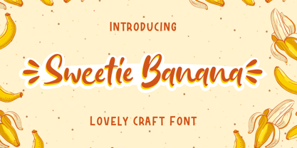 Sweetie Banana - is a Cute & Lovely Craft font with a natural handwritten feel. This handmade font will make your design has a beautiful natural touch for each details. It is perfect for any design project as Invitation,logo, book cover, craft or any design purposes. This font is PUA encoded which means you can access all of the magical glyphs and swashes with ease! It also features a wealth of special features including alternate glyphs and ligatures.
 - Lovely Sweetie by Almarkha Type,
$25.00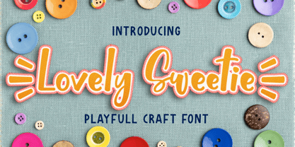 Lovely Sweetie - is a Playful Craft font with a natural handwritten feel. This handmade font will make your design has a beautiful natural touch for each details. It is perfect for any design project as Invitation,logo, book cover, craft or any design purposes. This font is PUA encoded which means you can access all of the magical glyphs and swashes with ease! It also features a wealth of special features including alternate glyphs and ligatures.
 - Diecast by Device,
$39.00 A companion piece to Mulgrave, this font is the intermediary design between the chunky Victorian style that Mulgrave reproduces and the Ministry of Transport sans introduced in 1933 and digitised as Ministry. Although they date from between 1910 and 1933, these signs show the beginnings of several features Ministry later incorporated, notably the thinner strokes and the more modern forms of the G, M, R and S. The letter widths are approaching a monospace - the L, F and E are relatively wide compared to the W and M, a feature that may have something to do to the casting process. These idiosyncracies were all ironed out when the first version of the MOT alphabet was produced. The Device digitization, as with Mulgrave, stays true to the worn and repainted original metal source material and preserves the unusual widths.
 - Crisis by SIAS,
$29.90 Crisis is a child of the dictatorship of economics. Since time is money the time budget of its production has been rigidly limited. Crisis was designed and generated completely on one single day. The target was to make a useful font while investing nothing more than absolutely indispensable. The component-based glyph construction scheme of another font has been utilized, further detailing work has been strictly limited. Due to those restrictions some letters have rather unusual shapes. This straightforward and contemporary sans (320 glyphs) is of compact proportions and very legible even when set in small sizes. In printing you get more text on one page and thus save up to 30% of paper.
 - Very Christmess - Unknown license

- Poft Sarade - Unknown license

- Marmelade Guys - Unknown license

- Reaver - Personal use only

- Worstveld Hand by Typotheticals,
$5.00 A rough hand-drawn plain sans serif that would be good for non-formal use. Do not expect a polished set of fonts from a professional, this family is hand drawn, hand spaced and hand kerned.
 - Cralic coob by Popskraft,
$12.00 The Cralic Coob font is an excellent selection when you want to infuse your designs with a playful and whimsical charm. This adorable and quirky display font adds a delightful and lighthearted element to any creative endeavor. It offers a wide range of applications, making it a versatile choice for various projects. Whether you're working on branding projects, crafting unique logos, designing wedding materials, creating eye-catching social media posts, producing captivating advertisements, or even developing product packaging and labels, the Cralic Coob font is your ideal companion. This font's handwritten style adds a personal and charming touch to photography projects, while it also elevates the elegance of invitations and stationery. With its ability to convey a sense of childlike wonder and cheerfulness, the Cralic Coob font is your go-to choice for infusing character and whimsy into your creative work. Its versatility and distinctive aesthetic make it a valuable asset for designers seeking to add that extra touch of playfulness and individuality to their projects. See other fonts from Cralic family https://www.myfonts.com/collections/cralic-font-popskraft
 - Terghosting by Tiny Hand Letter,
$14.00 ENGLISH: By installing or using this font, you are agreeing to the Product Usage Agreement: 1. This font is ONLY for PERSONAL USE || PROMOTIONAL & COMMERCIAL USE NOT ALLOWED! 2. FOR COMMERCIAL USE : https://creativefabrica.com/designer/tinyhandletter/ref/438703/ 3. Please contact us before using for any Promotional or Commercial Use! (Email: nasrunifajarita.project@gmail.com) 4. Follow our soscial media for update more great fonts and informations : Instagram: @tinyhandletter Please, let me know if you have any questions! :) Thank you :) ................................................................................................................... INDONESIA: Mengunduh dan menggunakan font ini berarti andan dianggap mengerti dan menyetujui semua syarat dan ketentuan penggunaan font dibawah ini: 1. Font ini hanya dapat digunakan untuk keperluan pribadi "Personal Use", yang berarti keperluannya tidak untuk "promosi" maupun "komersil" . Menghasilkan profit atau keuntungan baik dalam materi maupun efek promosi TIDAK DI IJINKAN! || Berlaku untuk Individu, Agensi Desain Grafis, Percetakan, atau Perusahaan/Korporasi. 2. TIDAK DIPERBOLEHKAN dalam menggunakan dan/atau memanfaatkan font ini untuk kepeluan Komersial, baik itu untuk Iklan, Buku, Promosi (social media), TV, Film, Video, Motion Graphics, Youtube, atau untuk Kemasan Produk (baik Fisik ataupun Digital) atau Media apapun dengan tujuan menghasilkan efek promosi maupun profit/keuntungan. 3. Menggunakan font ini untuk kepentingan Promosi dan/atau Komersial apapun bentuknya TANPA IZIN dari saya, akan dikenakan biaya EXTENDED LICENSE atau MINIMAL 100 kali lipat dari Lisensi Standard (biaya lebih besar berlaku untuk anda yang tidak kooperatif). 4. Hubungi kami untuk mendapatkan Informasi tentang Lisensi apa yang akan anda perlukan (Email: nasrunifajarita.project@gmail.com) Terima kasih.
 - Lonely Girl by Prioritype,
$12.00 Sometimes, just one font style is not too optimal. With this font, I present a unique and cheerful font with three styles for you. Easy and fast to use in design projects such as accessories, book covers, crafts, logos, birthday greetings, backgrounds behind, quotes, unique packaging designs, and much more that you can explore. See some of the previews above for reference. Features: -Uppercase -Lowercase -Numeral -Punctuation -Multilingual -Ligature -Alternate Note: Use a program that supports the Opentype feature and the glyph panel is available, so you can see the various alternative characters available. Examples of programs such as Adobe Illustrator, Corel Draw or Inkscape.
 - Program by Emigre,
$49.00 Program is a type designer’s typeface. It’s about the craft of typeface design and the particular details and effects that type designers fret over when they design type. It mixes different structures, stem endings, and weight distributions not usually employed in a single family of fonts. It features both rounded edges evoking the effects of reproduction, and ink traps, the technique used to counteract that effect. The idea was to create a series of fonts with strong individualistic features, challenging the constraints of a central theme that is usually imposed on a family of fonts, while still relating to each other in terms of overall look and feel.
 - Lemonilla by Zeenesia Studio,
$15.00 Lemonilla! This script font is bouncy, charming and perfect for many design projects! I've made this font as smooth as possible, reducing the amount of nodes in each glyph to ensure optimal cutting with Cricut, Silhouette or other craft machines. What’s Included : Standard glyphs Ligatures and Swash Multilingual Works on PC & Mac Simple installations Accessible in the Adobe Illustrator, Adobe Photoshop, Adobe InDesign, even work on Microsoft Word. PUA Encoded Characters – Fully accessible without additional design software. Fonts include multilingual support Image used : All photographs/pictures/vector used in the preview are not included, they are intended for illustration purpose only. Cheers! Thank You
 - Shine of Love by Namara Creative Studio,
$9.00 Cute and Playful display fonts crafted with heart, especially for you. It is perfect for children-themed designs, Such as t-shirt designs, story books, packaging, children’s activity or school projects, posters, greeting cards, valentine’s crafts, and more! Come in 03 variants : Regular, Shadow and Fun. So add it to your creative ideas and notice how it makes them stand out!
 - Ah, Lelim 200, a typographic enigma birthed from the creative chambers of Stefan Motzigemba's mind! If fonts were people, Lelim 200 would be that effortlessly cool friend who knows all the best coffe...


