10,000 search results
(0.077 seconds)
- Counthills by Namara Creative Studio,
$20.00 A modern contemporary display typeface, can be used for large headings and titles, characterized by clean lines and stylish design elements. It conveys innovation and sophistication, creating a strong visual impact in modern design projects like websites, ads, logos, and branding materials.
 - Informal Roman by ITC,
$29.00Informal is the work of lettering designer Martin Wait and is reminiscent of the late 1940s and early 1950s. Informal is worthy of its name and perfect for anything with a look of the mid-20th century or simply a casual, spontaneous appearance. - ZoodMantra by Zooddooz,
$20.00 ZoodMantra is a Pixel-Blackletter typeface developed for nostalgia purposes in the time of video games. It could represent the fantasy world, magic realms, knight's tales and warrior legend. Be suitable for commercial materials, textile design, comic books and classic video games.
 - Rock Forest by Mightyfire,
$15.00 Introducing Rock Forest, a captivating decorative display font that transforms your words into a visual masterpiece. Crafted with precision and artistic flair, this typeface is a symphony of intricate details, offering a sophisticated and ornate aesthetic that commands attention. Each letter of Rock Forest is a work of art in itself, adorned with decorative elements that exude opulence and refinement. The intricate flourishes, delicate serifs, and graceful curves come together to create a harmonious balance between extravagance and legibility. The font's design is a celebration of decorative elegance, making it the perfect choice for projects that demand a touch of grandeur.
 - Bewilderment by SavoringSurprises,
$10.00 Bewilderment is a hand lettered sans-serif font. The perfectly simple font could be used for a variety of projects, such as a design on a t-shirt, car decal, or tumbler! - Contains over 200 accented characters for language support. Some of the languages supported are: English, Spanish, Portuguese, German, Italian, French, Polish, Catalan, Irish, Norwegian, Croatian, Gaelic, and more! If you would like to know if a certain language is supported, please contact me with the language and/or any special characters you wanted to know about.
 - Katenila by Arterfak Project,
$16.00 Katenila is a cute handwriting font with a joyful taste. Inspired by marker handwriting and modern calligraphy, Katenila offers the flexibility of the upper & lowercase that you can mix and match and get your typographic mood. Katenila equipped with alternates and swash to give you more variants. This font is suitable for any design themes such as summer, bright, minimalist, holiday, feminine, and etc. Also featured with multilingual supports in 350+ glyphs total, Katenila is perfect for branding, apparel, editorial, poster, quotes, menu, and more! Thank you for visiting, and have a nice day! Ramz.
 - Oceanshore by Los Andes,
$29.00 Oceanshore is a modern display sans typeface with stencil characteristics and based on geometric shapes. That when combined gives the font a retro-futuristic look and makes it ideal for big and catchy editorial headlines. The family includes 6 styles, from Thin to Bold, each of them in a wide variety of alternates and ligatures that provides the users with a number of choices when composing. Each font comprises more than 550 characters and supports over 200 Latin languages. Seashore is well-suited for headlines, short text, posters, flyers and so on.
 - Ondo by JAM Type Design,
$23.00 Ondo is a low contrast geometric sans serif with large open counters which give the typeface a somewhat bold and contemporary appearance. This feature gives Ondo a fun yet sensible feel which can be used for both large chunks of text as well as for short headlines. Ondo comes with more than 370 glyphs, supporting a wide range of languages. With its 10 fonts, Ondo is an ideal font family for text, branding, signage, print and digital design. Give Ondo Demo Medium a try on your personal projects – completely FREE.
 - Waldo by The Northern Block,
$49.95 Waldo is a bold, stencil-focused display typeface loosely based on a 1973 science fiction movie poster for "The Battle For The Planet of The Apes". Narrow rectangular slots cut into heavyweight forms create a stylish and energetic font ideal for apparel, books, film titles, packaging and posters. Included in the font are over 400 characters with four unique styles; Black, Stencil, Outline, and Shadow. Opentype features consist of digital numerals, tabular figures, numerators, denominators and fractions. Other features cover alternate lowercase f and r, with language support for Western, South and Central Europe.
 - Tropical Trouble by SavoringSurprises,
$10.00 Tropical Trouble is a hand lettered sans-serif font. The super tall and super skinny font could be used for a variety of projects, such as labels for a jar or a name on a tumbler! Contains over 200 accented characters for language support. Some of the languages supported are: English, Spanish, Portuguese, German, Italian, French, Polish, Catalan, Irish, Norwegian, Croatian, Gaelic, and more! If you would like to know if a certain language is supported, please contact me with the language and/or any special characters you want to know about.
 - arnica by Justi,
$15.00 Arnica is a display font based on a simple geometry that uses circles (and modules) as a structure. It is an experimental project where, in place of upercases, has alternate characters and swashes. Furthermore, arnica has 50 discretionary ligatures which, when activated, give a totally different touch to the font and also has the bold weight, which reinforce the experimentalism of the project. Combining lowercases with upercases, plus discretionary ligatures and bolds, you can write the same word in several different ways. The character set offers more than 400 glyphs and support for many languages.
 - Juana by Latinotype,
$29.00 Juana is the result of a journey to self-discovery and part of a continuous exploration process. The font, based on Jazmín https://www.myfonts.com/fonts/latinotype/jazmin/ typeface, features a more developed design while still maintaining the essence of the original version. The extreme contrast between thick and thin strokes gives Juana a harmonic and stylish look. It comes in 8 weights with matching italics and includes an alternate version. The whole character set supports over 200 Latin-based languages. Juana is perfectly suited for editorial design, branding, magazines, logos, headings and more.
 - Research Remix - Personal use only

- Tapir by HVD Fonts,
$26.00 Searching for the Exceptional Designing Tapir was driven by the search for a display typeface which is doing something different than the rounded and bouncy fun faces – the letterforms should stand out with a slight touch of weirdness, creating attention and recognizabilty. A big character set, optimized spacing & kerning and lots of features make Tapir a good choice for professional usage between games, toys and skateboards.
 - English 157 by ParaType,
$30.00 The Bitstream version of Englische Schreibschrift by H. Berthold, 1970–72. An unconnected copperplate script of the English nineteenth-century fashion, so-called Spencerian. Based on pressure pointed quill calligraphy. Unlike other copperplate scripts, the letters in this face do not link up. For use in advertising and display typography in relatively small sizes. Cyrillic version was developed at ParaType in 2000 by Vladimir Yefimov.
 - Overbyte by Comicraft,
$19.00 This digitally remastered high density lettering has been bitmapped out for you by Comicraft's Eric Eng Wong. Those of you harddriving through cyberspace on the information superhighway had better zap your prams and reboot your hard disk before you're dragged into your system folder while OVERBYTE makes a major withdrawal from your atm. Do not be fooled by the name, there's nothing goofy about this typeface.
 - 1479 Caxton Initials by GLC,
$20.00 This family was created inspired from the two sets of rough initials fonts used by the famous William Caxton in Westminster (GB) in the late 1400’s. As it was normal for the time, there were not any differences between I and J, U and V. It is not a mistake. We have reconstructed the few other missing characters. This font was conceived as a supplement for our 1479 Caxton but may be used with all our Blackletters fonts.
 - Syndrome BRK Pro by CheapProFonts,
$10.00 I just loved the design idea behind this font, but the original font had a lot of ugly artifacts - so I have completely redrawn ALL the letters, before expanding the character set. The lowercase has been redrawn with a higher x-height, making the font even more usable (with more "normal" word shapes). ALL fonts from CheapProFonts have very extensive language support: They contain some unusual diacritic letters (some of which are contained in the Latin Extended-B Unicode block) supporting: Cornish, Filipino (Tagalog), Guarani, Luxembourgian, Malagasy, Romanian, Ulithian and Welsh. They also contain all glyphs in the Latin Extended-A Unicode block (which among others cover the Central European and Baltic areas) supporting: Afrikaans, Belarusian (Lacinka), Bosnian, Catalan, Chichewa, Croatian, Czech, Dutch, Esperanto, Greenlandic, Hungarian, Kashubian, Kurdish (Kurmanji), Latvian, Lithuanian, Maltese, Maori, Polish, Saami (Inari), Saami (North), Serbian (latin), Slovak(ian), Slovene, Sorbian (Lower), Sorbian (Upper), Turkish and Turkmen. And they of course contain all the usual "western" glyphs supporting: Albanian, Basque, Breton, Chamorro, Danish, Estonian, Faroese, Finnish, French, Frisian, Galican, German, Icelandic, Indonesian, Irish (Gaelic), Italian, Northern Sotho, Norwegian, Occitan, Portuguese, Rhaeto-Romance, Sami (Lule), Sami (South), Scots (Gaelic), Spanish, Swedish, Tswana, Walloon and Yapese.
 - Bauer - Unknown license

- Glimstick - Unknown license

- Report School by Typodermic,
$11.95 Report School is a geometric sans-serif typeface that was inspired by student handwriting practice worksheets. But don’t worry, it’s not just a copy of those worksheets. Report School is designed to be easily readable, with legible letterforms that make it perfect for use in educational materials. You might be wondering what makes Report School different from other school-oriented geometric sans-serif typefaces. Well, for starters, it’s designed with readability in mind. While other typefaces might prioritize pure geometry, Report School puts legibility first. That means that when you use Report School, your readers will have an easier time reading your text. And speaking of easier reading, Report School has some features that are designed to make things even more legible. For example, instead of using straight quotes for inches, feet, or degrees, you can use primes. And Report School has regular primes, double primes, and triple primes, so you can choose the right one for your needs. Plus, the numerals in Report School are tabular, which means they’re vertically aligned for easier math equation alignment. But that’s not all! If you’re using OpenType savvy applications like InDesign, Illustrator, or Photoshop, you can access even more features. For example, you can use the stylistic alternates feature to access the letters “I” and “J” with no serifs, as well as a straight lowercase “q”. And if you’re looking for something a little different, you can check out Report School’s rounded version, called Report, or a version with casual strokes, called Sweater School. If you’re looking for a typeface that’s easy to read, but still has some personality, look no further than Report School. It’s the perfect choice for any educational materials that need to be both legible and stylish. Most Latin-based European writing systems are supported, including the following languages. Afaan Oromo, Afar, Afrikaans, Albanian, Alsatian, Aromanian, Aymara, Bashkir (Latin), Basque, Belarusian (Latin), Bemba, Bikol, Bosnian, Breton, Cape Verdean, Creole, Catalan, Cebuano, Chamorro, Chavacano, Chichewa, Crimean Tatar (Latin), Croatian, Czech, Danish, Dawan, Dholuo, Dutch, English, Estonian, Faroese, Fijian, Filipino, Finnish, French, Frisian, Friulian, Gagauz (Latin), Galician, Ganda, Genoese, German, Greenlandic, Guadeloupean Creole, Haitian Creole, Hawaiian, Hiligaynon, Hungarian, Icelandic, Ilocano, Indonesian, Irish, Italian, Jamaican, Kaqchikel, Karakalpak (Latin), Kashubian, Kikongo, Kinyarwanda, Kirundi, Kurdish (Latin), Latvian, Lithuanian, Lombard, Low Saxon, Luxembourgish, Maasai, Makhuwa, Malay, Maltese, Māori, Moldovan, Montenegrin, Ndebele, Neapolitan, Norwegian, Novial, Occitan, Ossetian (Latin), Papiamento, Piedmontese, Polish, Portuguese, Quechua, Rarotongan, Romanian, Romansh, Sami, Sango, Saramaccan, Sardinian, Scottish Gaelic, Serbian (Latin), Shona, Sicilian, Silesian, Slovak, Slovenian, Somali, Sorbian, Sotho, Spanish, Swahili, Swazi, Swedish, Tagalog, Tahitian, Tetum, Tongan, Tshiluba, Tsonga, Tswana, Tumbuka, Turkish, Turkmen (Latin), Tuvaluan, Uzbek (Latin), Venetian, Vepsian, Võro, Walloon, Waray-Waray, Wayuu, Welsh, Wolof, Xhosa, Yapese, Zapotec Zulu and Zuni.
 - RM Deco by Ray Meadows,
$19.00 A mixture of bold and fine line helps this distinctive design evoke the spirit of the 1930s Jazz Age. Due to the modular nature of this design there may be a slight lack of smoothness to the curves at very large point sizes (around 100 pt and above).
 - Altum Sans by Erik Seitz,
$9.99 Altum Sans is a new clean and contemporary typeface. The geometric and condensed letterforms are designed for use in larger texts and display applications. With over 500 glyphs Altum Sans supports many languages as well as two different figure styles, interpolation breakpoints, subscript, superscript, contextual alternatives, ordinal indicators, fractions,...
 - RM Scrapheap by Ray Meadows,
$19.00 Put together from a collection of old bits and pieces, RM Scrapheap is a distinctive display face with many uses. Due to the modular nature of this design there may be a slight lack of smoothness to the curves at very large point sizes (around 100 pt and above).
 - Studio Grotesk by Jetsmax Studio,
$10.00 Studio Grotesk is a modern sans typeface with a futuristic touch. This multi-purpose typeface will grab reader's attention with its stylish and neat design. With over 500+ Glyphs, five styles and a wide range of weights its a timeless workhorse for many possible application from branding to editorial.
 - RM Softsans by Ray Meadows,
$19.00 Strong and distinctive, yet soft and cuddly. This is a rounded sans serif design that features slightly thicker horizontals. Due to the modular nature of this design there may be a slight lack of smoothness to the curves at very large point sizes (around 100 pt and above).
 - Marilyn Script by Bosstypestudio,
$14.00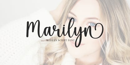 Marilyn Script in a beautiful handwritten style. Equipped with 350 glyphs. Marilyn Script is perfect for branding projects, home appliance design, product packaging, use in business cards, invitation cards, etc. Simply as a stylish text overlay onto a background image or anything that requires a touch of elegance.
 - RM Smoothsans by Ray Meadows,
$19.00 A family of soft, rounded, yet bold display faces which can successfully be used in conjunction with one another. Due to the modular nature of this design there may be a very slight lack of smoothness to the curves at extremely large point sizes (around 200 pt and above).
 - Cargi by Studio Principle Type,
$12.00 A condensed neo-grotesque typeface with a quirky personality. Cargi contains 9 weights, obliques and a variable version. Low contrast and clean forms create legibility at small sizes, but display uses are where the real character of Cargi comes out to play. 319 glyphs to support 100+ languages.
 - Shopie by Hendra Pratama,
$19.00 Shopie is a handmade script made with a marker pen. It is useful for a variety projects such as quotes, book covers, t-shirt designs, magazine titles and much more. Features: 370 Glyphs Uppercase Lowercase Symbols & Punctuation Support more than 62 Languages Support OpenType Features Support PUA Unicode
 - Hackman by The Northern Block,
$32.00 A geometric sans serif with contemporary lines. Distinctive curves are combined with classical letterforms to produce a clean, linear typeface best suited to identity, mobile and web applications. Details include 9 weights with italics, 500 characters, 5 variations of numerals, stylistic alternatives, manually edited kerning and OpenType features.
 - Private Eye JNL by Jeff Levine,
$29.00 From 1958 to 1964, one of ABC-TV’s popular shows was the detective series “77 Sunset Strip”. Based in Los Angeles, the fictional detective agency was located next door to Dino’s Lodge, (partly owned by Dean Martin and actually located at 8532 Sunset). It was originally known as the Alpine Lodge. The adjacent building where Stuart Bailey and Jeff Spencer’s private detective service was located in fact housed a popular modeling agency. The ‘77’ address did not exist outside of the realm of the series. However, a wonderful sign with Art Deco-influenced lettering graced the set (on the wall of the office foyer) saying “Bailey & Spencer Private Investigators Suites 101-102”. A screen capture of this sign served as the working model for Private Eye JNL, which is available in both regular and oblique versions.
 - Schoolyard Stencil JNL by Jeff Levine,
$29.00 A vintage lettering stencil manufactured by the E-Z Letter Stencil Company of Baltimore, Maryland was the model for Schoolyard Stencil JNL, available in both regular and oblique versions. Re-drawn digitally and following the actual bend of the steel rule dies used to cut the stencils, this typeface has not been cleaned up from its original design. Upon close examination, you will find straight angles and slight curves in the most unusual places. This was representative of the difficult work involved in bending steel cutting rule material and fitting it into small areas. For many years, E-Z Letter was the main competitor to the Stenso Lettering Company; the originator of the oil board stencil lettering guide complete with automatic spacing holes. Anyone over 40 will well-remember lettering their science fair posters, report covers and ring binders with these stencils.
 - Royal Grande by Subqi Studio,
$20.00 Introducing our first old english black letter Royal Grande. Quite basic anatomy not the contemporary style. With this not too complicated black letter that make this font good for general display projects. We also make it a black letter family because we rarely see this kind of option in the market. Another good news , we also offer the variable format this time for the new font enthusias community.
 - Evoque Text by Monotype,
$40.00 Evoque Text is a humanist serif type family specifically designed for a comfortable reading experience. This has been achieved by optically adjusting the regular weights from my original Evoque family (released November 2021). You will notice a significantly reduced x-height and longer ascenders and descenders, complemented by adjustments to weight and spacing. This makes Evoque Text a perfect choice for any long passages of text. All OpenType features have been retained from Evoque. A plethora of swash alternates and discretionary ligatures enhance Evoque Text, giving you the opportunity to embellish your typography. Simply activate Stylistic Sets to start adding these flourishes to your text. Other useful features include Small Caps at the click of a button, and Old Style Figures are an option to the default proportional figure style. There are 14 fonts altogether over 7 weights in roman and italic, you can also avail of two variable fonts which allow you to fine tune the weight to your exact liking. Evoque Text has an extensive character set (900+ glyphs) that covers every Latin European language. Key features: 7 weights in both roman and italic 80 Alternates 26 Ligatures Small Caps Variable fonts included with full family Full European character set (Latin only) 900+ glyphs per font.
 - RePublic by Suitcase Type Foundry,
$75.00In 1955 the Czech State Department of Culture, which was then in charge of all the publishing houses, organised a competition amongst printing houses and generally all book businesses for the design of a newspaper typeface. The motivation for this contest was obvious: the situation in the printing presses was appalling, with very little quality fonts existing and financial resources being too scarce to permit the purchase of type abroad. The conditions to be met by the typeface were strictly defined, and far more constrained than the ones applied to regular typefaces designed for books. A number of parameters needed to be considered, including the pressure of the printing presses and the quality of the thin newspaper ink that would have smothered any delicate strokes. Rough drafts of type designs for the competition were submitted by Vratislav Hejzl, Stanislav Marso, Frantisek Novak, Frantisek Panek, Jiri Petr, Jindrich Posekany, and the team of Stanislav Duda, Karel Misek and Josef Tyfa. The committee published its comments and corrections of the designs, and asked the designers to draw the final drafts. The winner was unambiguous — the members of the committee unanimously agreed to award Stanislav Marso’s design the first prize. His typeface was cast by Grafotechna (a state-owned enterprise) for setting with line-composing machines and also in larger sizes for hand-setting. Regular, bold, and bold condensed cuts were produced, and the face was named Public. In 2003 we decided to digitise the typeface. Drawings of the regular and italic cuts at the size of approximatively 3,5 cicero (43 pt) were used as templates for scanning. Those originals covered the complete set of caps except for the U, the lowercase, numerals, and sloped ampersand. The bold and condensed bold cuts were found in an original specimen book of the Rude Pravo newspaper printing press. These specimens included a dot, acute, colon, semicolon, hyphens, exclamation and question marks, asterisk, parentheses, square brackets, cross, section sign, and ampersand. After the regular cut was drafted, we began to modify it. All the uppercase letters were fine-tuned, the crossbar of the A was raised, E, F, and H were narrowed, L and R were significantly broadened, and the angle of the leg and arm of the K were adjusted. The vertex of the M now rests on the baseline, making the glyph broader. The apex of the N is narrower, resulting in a more regular glyph. The tail of Q was made more decorative; the uppercase S lost its implied serifs. The lowercase ascenders and descenders were slightly extended. Corrections on the lower case a were more significant, its waist being lowered in order to improve its colour and light. The top of the f was redrawn, the loop of lowercase g now has a squarer character. The diagonals of the lowercase k were harmonised with the uppercase K. The t has a more open and longer terminal, and the tail of the y matches its overall construction. Numerals are generally better proportioned. Italics have been thoroughly redrawn, and in general their slope is lessened by approximatively 2–3 degrees. The italic upper case is more consistent with the regular cut. Unlike the original, the tail of the K is not curved, and the Z is not calligraphic. The italic lower case is even further removed from the original. This concerns specifically the bottom finials of the c and e, the top of the f, the descender of the j, the serif of the k, a heavier ear on the r, a more open t, a broader v and w, a different x, and, again, a non-calligraphic z. Originally the bold cut conformed even more to the superellipse shape than the regular one, since all the glyphs had to be fitted to the same width. We have redrawn the bold cut to provide a better match with the regular. This means its shapes have become generally broader, also noticeably darker. Medium and Semibold weights were also interpolated, with a colour similar to the original bold cut. The condensed variants’ width is 85 percent of the original. The design of the Bold Condensed weights was optimised for the setting of headlines, while the lighter ones are suited for normal condensed settings. All the OpenType fonts include small caps, numerals, fractions, ligatures, and expert glyphs, conforming to the Suitcase Standard set. Over half a century of consistent quality ensures perfect legibility even in adverse printing conditions and on poor quality paper. RePublic is an exquisite newspaper and magazine type, which is equally well suited as a contemporary book face. - Bolandes by Arterfak Project,
$17.00 Introducing Bolandes, a handcrafted vintage monoline font, inspired by the vintage signage which visualizes a letterpress/inky looks and modern calligraphy. Perfect for logos, apparel, labels, posters, quotes, signage, packaging, and more! This font is all-caps font, recommended for displays. Bolandes has 340+ glyphs including many OpenType features that you can mix and match each character to get the more playful vintage typographic design. Available in three styles: Light, Bold, Aged. What you'll get : Uppercase Smallcaps Numbers & punctuation Accented characters SS01 - SS06 Stylistic Alternates Custom Ligature A great choice for the new spirit. Good luck!
 - TA Father 60 by Tural Alisoy,
$15.00 Since 2017, I have been improving my font creating skills. In the same year, I went through my father's notes and decided to make a font with his handwriting style. I completed the initial version with a lower number of glyphs in 2018. It supported only basic Latin, Turkish, and Azerbaijani alphabets. On the 15th of January 2021, my dad will turn 60. I am planning to finalize the updated version of the Father font by then. 584 glyph, 100+ Languages Set. Multilingual support: Latin basic, Latin Extended, Cyrillic, Central Europe, Turkish, Romanian, Euro, West European diacritics
 - Doedel by Majestype,
$39.00 Doedel is a strong script font that comes with over 800+ glyphs and is equipped with a host of OpenType features, works well at large size and making it a breeze to customize the feel of your design. Doedel is suitable for t-shirt design, retro design, vintage design, headline, website title, logo, sport, package or etc. To access the alternate glyph you need a program that supports OpenType features such as Adobe Illustrator CS & CorelDraw X6-X7 or you can install the multiple font for Photoshop CS. OTF & TTF font format is also available for use on both PCs and Macs.
 - Schoeffer by Proportional Lime,
$14.95 Peter Schoeffer was a printer who was apprenticed to Gutenburg and after leaving Gutenburg in 1455 he set up shop with Facob Fust. His son, Peter the Younger, moved to Mainz and carried on the trade. This particular font is based on a typeface of Peter the Younger that was cut circa 1509-1520. This font has over 900 characters. While there are only about 80 in the historical exemplar the rest have been developed for modern usage. This font is based on Typ.7:146/148G also known as Gesellschaft für Typenkunde plate no. 258.


