10,000 search results
(0.045 seconds)
- PiS Creatinin Pro by PiS,
$38.00 PiS Creatinin pro is based on a vintage ABC learning game for kids found in my grandparents attic. The narrow and high hand-drawn letters combine delicacy and chunkyness in a wonderful way, so it can be used both in huge display sizes and in small text sizes. PiS Creatinin pro - Makes you want to go back to school and learn the alphabet all over again!
 - PF Playskool Pro by Parachute,
$69.00 A great fun typeface with a straightforward childlike simplicity. It really hits home with kids, but if you want to add this extra playful personality to your designs this is the one to use. It has a strong, easy to read structure, which makes it ideal for children’s books, toys and other fun applications. Designer Alexandros Papalexis has discover the kid within. You can too!
 - Rude Slab Condensed by DSType,
$50.00 Rude was designed as a dichotomy between the Grotesque and Humanistic typographic shapes: a no-nonsense Sans and a very muscular Slab Serif companion. Showing the historically demanded consistency for such kind of typefaces, this is one of DSType's most wide-ranging and flexible type systems, introducing seven weights across seven widths, from Thin to Black and ExtraCondensed to ExtraWide, along with a wonderful set of Icons.
 - Lafleur by Resistenza,
$45.00 Inspired by the iconic Fenoglio-Lafleur Liberty building in the city of Turin, in an area with significant Stile Liberty buildings and New Gothic architecture. Lafleur is a decorative face with a remarkable art nouveau flair from 19th century. Perfect for creative contemporary uses in print and on screen. We recommend it for book covers, packaging, branding, editorial, web, advertising, apparel, purposes are endless.
 - St Friska by Stereotypes,
$34.00 St Friska, based on old movie title lettering, is made just for headlines. It comes with a slight touch and feeling of art deco but it’s designed to be contemporary in 2010 and beyond. Friska comes with a big bunch of OpenType features, so a designer can play with it like Lego, using it alongside old or new typefaces. It has stylistic sets and lots of ligatures.
 - Rude Slab ExtraCondensed by DSType,
$50.00 Rude was designed as a dichotomy between the Grotesque and Humanistic typographic shapes: a no-nonsense Sans and a very muscular Slab Serif companion. Showing the historically demanded consistency for such kind of typefaces, this is one of DSType's most wide-ranging and flexible type systems, introducing seven weights across seven widths, from Thin to Black and ExtraCondensed to ExtraWide, along with a wonderful set of Icons.
 - Century Expanded by Bitstream,
$29.99Shortly after the preparation of the original Century, the two Bentons (father Linn Boyd and son Morris Fuller) prepared a wider version for De Vinne’s press and called it Century Broadface. In 1900 ATF released the design for general use as Century Expanded, one of the most popular and effective of typefaces, to this day the text face of the New York Daily News. - Bornholm Allinge by Trine Rask,
$25.00 Bornholm Allinge is named after a village "Allinge" on the only rocky island in Denmark "Bornholm" It is the third face in a series of rough stone cut typefaces, that shares proportions, but differs in any other aspect like different pieces of rock. It is a powerful face, but still very friendly. Good for very big sizes, but can be used for small texts, movie titles, cartoons …
 - Schreibmeister by RMU,
$30.00 Schreibmeister is my interpretation of Arno Drescher’s design for Ludwig Wagner, Leipzig, completed in 1958. The letters X and x were improved as well as some ligatures. The letter E has an alternative, and the small d comes with two alternatives, of which one form can be reached by typing the partial different key. Generally it is recommended to activate both Standard and Discretionary ligatures.
 - DF A Bit by Dutchfonts,
$33.00 DF A Bit is made for screen display which is the final form of a lot of information nowadays. But there is more in this BIT... in display sizes it unfolds it’s skin, a beautiful ink on paper structure caused by the letterpress printing of copper lines. Analogue BITS indeed. With all the wealth of the ‘non perfect’, to please the eye and to satisfy the mind.
 - Rude ExtraCondensed by DSType,
$50.00 Rude was designed as a dichotomy between the Grotesque and Humanistic typographic shapes: a no-nonsense Sans and a very muscular Slab Serif companion. Showing the historically demanded consistency for such kind of typefaces, this is one of DSType's most wide-ranging and flexible type systems, introducing seven weights across seven widths, from Thin to Black and ExtraCondensed to ExtraWide, along with a wonderful set of Icons.
 - Outgribe NF by Nick's Fonts,
$10.00This rough, raw typeface is based on the lettering in Ben Shahn's iconic poster protesting the execution of Bartolomeo Vanzetti and Nicolo Sacco in 1927. All possible uppercase and lowercase forms have been kerned, and activating Contextual Alternates in OpenType-aware applications will alternate those forms for a more random appearance. Both versions contain the complete Latin 1252, Central European 1250 and Turkish 1254 character sets. - Rude SemiCondensed by DSType,
$50.00 Rude was designed as a dichotomy between the Grotesque and Humanistic typographic shapes: a no-nonsense Sans and a very muscular Slab Serif companion. Showing the historically demanded consistency for such kind of typefaces, this is one of DSType's most wide-ranging and flexible type systems, introducing seven weights across seven widths, from Thin to Black and ExtraCondensed to ExtraWide, along with a wonderful set of Icons.
 - Occulista by VersusTwin,
$39.00 Occulista began as a modern take on a vintage tri-line style of typeface, but quickly evolved into something quite different. This heavyweight optically-stimulating family features nine weights, with alternate uppercase letters in place of lowercase. This typeface works best in eye-catching headlines or short bursts of text, and the variant styles can applied to accent key wordings in many interesting combinations.
 - Rude Slab SemiWide by DSType,
$50.00 Rude was designed as a dichotomy between the Grotesque and Humanistic typographic shapes: a no-nonsense Sans and a very muscular Slab Serif companion. Showing the historically demanded consistency for such kind of typefaces, this is one of DSType's most wide-ranging and flexible type systems, introducing seven weights across seven widths, from Thin to Black and ExtraCondensed to ExtraWide, along with a wonderful set of Icons.
 - Rude SemiWide by DSType,
$50.00 Rude was designed as a dichotomy between the Grotesque and Humanistic typographic shapes: a no-nonsense Sans and a very muscular Slab Serif companion. Showing the historically demanded consistency for such kind of typefaces, this is one of DSType's most wide-ranging and flexible type systems, introducing seven weights across seven widths, from Thin to Black and ExtraCondensed to ExtraWide, along with a wonderful set of Icons.
 - Rude Slab Wide by DSType,
$50.00 Rude was designed as a dichotomy between the Grotesque and Humanistic typographic shapes: a no-nonsense Sans and a very muscular Slab Serif companion. Showing the historically demanded consistency for such kind of typefaces, this is one of DSType's most wide-ranging and flexible type systems, introducing seven weights across seven widths, from Thin to Black and ExtraCondensed to ExtraWide, along with a wonderful set of Icons.
 - Anne Bonny by Melli Diete,
$50.00 Anne Bonny is a modern face with a candy touch. She is noble and confident, bloomy and playful. If you want to give your texts a warm and fabulous note, Anne Bonny is the right one. You can choose between a range of Open Type Features, for example the Swashes Feature for decorating the Upright styles letters as well as the Italics. Share your vision!
 - Weirdtopia by Invasi Studio,
$19.00 Weirdtopia - is retro, fun, and playful. It really ties together your piece to make it feel retro. Perfect for making any project like header, quote, layout magazine, and others. Even better if used on the 60s and 70s design projects. A mix of psychedelia and groovy, it came with open-type features such as stylistic alternates that you can modify to fit your own style.
 - Something Fishy by Kate Brankin,
$17.00 A recent walk down memory lane through old college sketchbooks revealed a collection of caricature fish doodles. Then the sketches were discovered by my son who, being a marine life enthusiast, promptly demanded that I draw more fish. Thus, a collection of 71 fish-inspired drawings and bubbly numbers was born. There is even a lemon, since no fish is really complete without one.
 - Racers Energy by Din Studio,
$29.00 Do you want energetic designs? Racer energy is a font created in capital letters with the racing theme producing courageous strong impressions in no time making it worth adding to your design list. Letters are made similar to firm rectangle blocks with sharp-angles. Enjoy other incredible features available on this font. Features: Multilingual Supports PUA Encoded Numerals and Punctuation This font looks great on any design projects such as posters, banners, logos, book covers, headings, printed products, merchandise, social media, etc. Find out more ways to use this font by taking a look at the font preview. Purchase it now. Happy designing.
 - Dayna Silva by Keristyper Studio,
$14.00 Dayna Silva - Elegant Script Font is a modern handwritten script font with a lovely touch. Dayna Silva Font will work perfectly for fashion, e-commerce brands, trend blogs, wedding boutiques, or any business that wants to appear upscale and chic. Dayna Silva Font multilingual support: Afrikaans, Albanian, Catalan, Danish, Dutch, English, Estonian, French, Finnish, German, Icelandic, Indonesian, Italian, Malay, Norwegian, Portuguese, Spanish, Swedish, Zulu, and many more. What’s Included : Standard & Multilingual glyphs Ligature Works on PC & Mac Simple installations Accessible in Adobe Illustrator, Adobe Photoshop, Adobe InDesign, and even work on Microsoft Word. Hope you enjoy our font!
 - TE New Sarah by Tharwat Emara,
$35.00 Its one of the NEW SARAH ( Arabic – LATIN – URDO) fonts, a spontaneous free line characterized by beauty and speed of reading. To be used in advertisements, writing titles, magazines, cartoons, films, serials, comics and plays. NEW SARAH font is one of the ( Arabic – LATIN – URDO) fonts. It is the most common font and is written in most Arab countries because it has the potential to be written in a narrow space when compared to other Arabic fonts. It is used in the titles of books, magazines, daily newspapers, commercials, banners, advertising, holiday cards, newspaper headlines, Introduction to students.
 - Mode Style by Motokiwo,
$10.00 Fashion is about style, pairing the right one with the best one. Let me introduce Mode Style, best paired font between Sans Serif and Handwritten Script. It's suitable for logo, display purpose, or something else that needs elegant style. YOU'LL GET: 1. Mode Style Sans, an elegant Sans Serif font with medium wide characters. This is All Caps font with large range of punctuation and multilingual support. 2. Mode Style Script, a classy thin Handwritten Script font with natural pen stroke feel. Comes with ligature make this font more close to the real handwritten, also support multilingual and already PUA Encoded.
 - Mozaquen by Javatypestd,
$10.00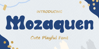 Introducing Mozaquen is a cute font with a modern style and made in a way that follows current trends, a quirky font perfect for all of your craft projects! Mozaquen best uses for Logotype, heading, cover, poster, logos, quotes, product packaging, header, merchandise, social media & greeting cards and many more. This font is also support multi language. What’s Included : - Standard glyphs - Works on PC & Mac - Simple installations - Accessible in Adobe Illustrator, Adobe Photoshop, Adobe InDesign, even work on Microsoft Word. - PUA Encoded Characters – Fully accessible without additional design software. - Fonts include multilingual support Thank you for your purchase! Hope you enjoy our font!
 - Yaddasht by Si47ash Fonts,
$24.00 The most popular Persian / Arabic handwriting fonts! Yaddasht [means Note], is a child-like, fantasy and simple handwritten font which supports Persian, Arabic and basic Latin. This font which comes in 2 weights, brings a full diacritics set with it. Shahab Siavash, the designer has done more than 30 fonts and got featured on Behance, Microsoft, McGill University research website, Hackernoon, Fontself, FontsInUse,... Astaneh text and headline font which is one of his latest designs, already got professional typographers, lay-out and book designers' attention as well as some of the most recognizable publications in Arabic/Persian communities.
 - Burning Hammer by Putracetol,
$28.00 Burning Hammer is a fire display font. This font is inspired by the fire flame shape. There is a version of fire that has sparks on it and there is also one that doesn't, it becomes an alternate character in this font. In addition, this font also has a ligature that makes the fire impression of this font more real. With these variations, it will make it easier for you to create creativity for your project. Burning Hammer would be perfect for branding, logo, product, title, quotes, doodle, comic, books, greeting cards, toys, posters, baby clothing, picture books, etc.
 - The Vindest by Skypia,
$15.00 Hello! Let me Introduce you my latest font creation called The Vindest ! The Vindest is a bold retro font with a lot of alternate glyphs. This font is perfectly match for groovy retro and vintage design. The Vindest font is also usable in a wide range of works such as logos, covers, posters, quotes, product packaging, merchandise, social media and much more! Use this font and let your creativity vibing!! Feature : Ligature & Alternate glyphs Multilingual Language Works on PC & Mac Simple installations Accessible in the Adobe Illustrator, Adobe Photoshop, even works on Microsoft Word. Thank you!
 - Bremlin by Grezline Studio,
$23.00 Hello! Let me Introduce you my latest font creation called Bremlin! Bremlin is a bold retro font with a lot of alternate glyphs. This font is perfectly match for groovy retro and vintage design. Bremlin font is also usable in a wide range of works such as logos, covers, posters, quotes, product packaging, merchandise, social media and much more! Use this font and let your creativity vibing!! Feature : - Ligature & Alternate glyphs - Multilingual Language - Works on PC & Mac - Simple installations - Accessible in the Adobe Illustrator, Adobe Photoshop, Adobe InDesign, even works on Microsoft Word. Thank you! Grezline Studio - Akhmad Reza Fauzi
 - TE Sara Modern by Tharwat Emara,
$20.00 Its one of the SARA modern ( Arabic – LATIN – URDO) fonts, a spontaneous free line characterized by beauty and speed of reading. To be used in advertisements, writing titles, magazines, cartoons, films, serials, comics and plays. SARA MODERN font is one of the ( Arabic – LATIN – URDO) fonts. It is the most common font and is written in most Arab countries because it has the potential to be written in a narrow space when compared to other Arabic fonts. It is used in the titles of books, magazines, daily newspapers, commercials, banners, advertising, holiday cards, newspaper headlines, Introduction to students.
 - Ds Hand by CozyFonts,
$25.00 Ds Hand Font Family is a handwritten font designed by Tom Nikosey, based on Danielle Nikosey’s printing style. Tom is an American Graphic Designer specializing in Typographic Design and Illustration. Ds Hand is available in Regular & Bold weights CozyFonts Foundry is Tom's intro into the world of font design. Ds Hand Family is a tribute and gift to his daughter. Ds Hand, at first glance, gives a hand drawn aesthetic feel but on closer inspection, when set as text, this font gives off a cool, organized, legibly organic read. Also available in Bold. This is the 5th Hand Drawn Font Family from CozyFonts!
 - Santo James by Keristyper Studio,
$14.00 Introducing Santo James' handwritten font. This script font comes with a retro, modern, and vintage touch in it. Inspired by the dynamic culture, sign, and badge design. This font looks very natural, perfect for all your large projects that require a handwritten touch. Santo James Font multilingual support: Afrikaans, Albanian, Catalan, Danish, Dutch, English, Estonian, French, Finnish, German, Icelandic, Indonesian, Italian, Malay, Norwegian, Portuguese, Spanish, Swedish, Zulu, and many more. What’s Included : Standard & Multilingual glyphs Ligature Works on PC & Mac Simple installations Accessible in Adobe Illustrator, Adobe Photoshop, Adobe InDesign, and even work on Microsoft Word. Hope you enjoy our font!
 - FF Mutual by FontFont,
$50.99 FF Mutual is a friendly geometric sans serif full of subtle, unexpected details. Designer Luis Bandovas drew inspiration from an unlikely source—the credits from one of his favorite childhood shows, Space 1999—and turned that spark into a typeface that is warm and approachable, but contemporary. Bandovas built FF Mutual on a geometric skeleton, but the typeface has enough humanist touches to offset the rigidity usually found geometric designs. These touches are most apparent in the italics, where curved strokes on the “a” and “l” bring a softness to text. Generous spacing, angular details on letters like the “r” and “t,” and flared terminals on the “e,” “s,” and “c,” add further character to the design. FF Mutual’s bold shapes and retro-inspired warmth make it ideal for headlines, where the subtle details can really shine. The typeface is similarly well-suited for small blocks of text such as captions and call-outs, packaging design, and branding.
 - Orqquidea by PeGGO Fonts,
$29.00 Low contrast and clean Roman Sans with capitals based on the classic Capitalis Monumentalis proportions with uniform and modern SmallCaps, with a subtle script touch on some curved strokes, that give it a less hard feel, more organic and friendly look. The design idea born on 2013 from Roman Schemme studies, where new version of Legan and other roman typeface projects was based on too. Orqquidea was developed in 12 sizes with 659 glyphs each enhanced with professional opentype features (aalt, ccmp, locl, subs, sups, numr, dnom, frac, ordn, lnum, pnum, tnum, onum, c2sc, smcp, case, dlig, liga, zero, salt, calt, ss01, ss02, ss03, ss04), plus a complementary Orqquidea Framed version with 226 glyphs and a Orqquidea Garden version that include floral ornaments and related dingbats with 102 glyphs. It can easily adapt to print and digital environments ideal for fashion branding and corporate purposes, magazine and book headlines and titles, cosmetic label design and even on contents with a modern and artistic air.
 - Kage by Balibilly Design,
$12.00 Welcome to the old version of Kage. "Old does not mean obsolete" In April 2022, we updated whole letterforms. We redrew all glyphs and refined the nodes, corners, rounded shapes, flowing tails, etc. Of course, you can still use the update of an older version of Kage, although we highly recommend you move to the Pro version for the full benefits. Kage Pro has massive development, puts forward experimentation on alternate letters, and applies an oblique style to provide diverse style choices. Come with tons of swirly ligatures and advanced opentype features include case-sensitive forms, small caps, standard and discretionary ligatures, stylistic alternates, ordinals, fractions, numerator, denominator, superscript, subscript, circled number, slashed zero, old-style figure, tabular and lining figure. Learn more about Kage Pro here: Kage Pro 2.0 | Type Specimen About Kage The Inspiration: The radical exploration world of fashion inspires us. It leads our minds to the Neo-classical type style created during the age of enlightenment in the 18th century. It has a reasonably extreme contrast from the previous serif style, making the impression that it is emitted more expensive and classy. Organically, this Neo-Classical typeface is closely related to the fashion world, especially in Europe, and even spread across the globe. Fashion and this typeface reflect each other. After, we boldly observed Japanese fashion designer Rei Kawakubo. Famous for radical & deconstructive fashion, which makes the world of fashion more flexible and dynamic. The Design: As well as the typeface that we made, we started it with a cultural foundation of the Didone typeface. We tried to deconstruct the appearance. The decoration that better reflected the dynamic of fashion implemented in the fashionable alternate and calligraphical stylistic set ended with ball terminals. The versatile impression created is like taking off a scarf on the model's hair during a fashion show. The deconstructive image is combined with a legibility structure like the appearance of the Neo-Classical style. Kage is designed to visualize a costly and exclusive image of a thing, product, world clothing brand, famous fashion magazine, etc. The modern transitions of each letterform are softer, so when repositioning and escalating the size of this font, it will remain beautiful without injuring other elements. So, Kage is a bold choice on headlines and more prominent media with a portion of 50% even more. The Feature: Kage has 11 styles, from thin to black; all family-style consist of one variable font with two axes. The total number of glyphs is 748 in each style. She comes with tons of swirly ligatures and stylistic alternates in Advance OpenType features, including: discretionary ligatures, stylistic alternates, ordinals, fractions. Support multi-language including Western European, Central European, Southeastern European, South American, Oceanian, Vietnamese.
 - Vernacular Sans by jpFonts,
$19.95 The Vernacular trilogy was designed by Swiss designer Hans-Jürg Hunziker, who had worked for Adrian Frutiger in Paris for many years. Based on the concept of a transitional Linear Antiqua, he has developed a colorful bouquet of typefaces that contain the entire spectrum of typefaces for book design and corporate identity. Thanks to his "Swiss school" and his outstanding skills, he has succeeded in giving the typefaces a particularly noble and sympathetic expression. In addition to the Sans family, there is a Serif family and a Clarendon family, each of which, including the separately drawn italics, is equipped with 12 font weights that are finely tuned to one another. Each of the 3 font styles develops its own character, but thanks to a concept that brings the different font styles closer together, they also work well together and complement each other perfectly. Sans and Clarendon have a vertical axis and similar endings in contrast to the Serif, which has a traditional diagonal axis and horizontal endings. The straight stems and the proportions are used as an element to stress the closeness of the typeface-trilogy. They thus share a comon feature. All fonts contain tabular and proportional figures as well as old style figures. Small caps and small cap figures are also available in all fonts. In addition, some fonts have alternative characters available via style set, such as «g», which can be used to further vary the typeface. Vernacular offers all the options for well-kept typesetting for print and web - for small and large orders.
 - Vernacular Serif by jpFonts,
$19.95 The Vernacular trilogy was designed by Swiss designer Hans-Jürg Hunziker, who had worked for Adrian Frutiger in Paris for many years. Based on the concept of a transitional Linear Antiqua, he has developed a colorful bouquet of typefaces that contain the entire spectrum of typefaces for book design and corporate identity. Thanks to his "Swiss school" and his outstanding skills, he has succeeded in giving the typefaces a particularly noble and sympathetic expression. In addition to the Sans family, there is a Serif family and a Clarendon family, each of which, including the separately drawn italics, is equipped with 12 font weights that are finely tuned to one another. Each of the 3 font styles develops its own character, but thanks to a concept that brings the different font styles closer together, they also work well together and complement each other perfectly. Sans and Clarendon have a vertical axis and similar endings in contrast to the Serif, which has a traditional diagonal axis and horizontal endings. The straight stems and the proportions are used as an element to stress the closeness of the typeface-trilogy. They thus share a comon feature. All fonts contain tabular and proportional figures as well as old style figures. Small caps and small cap figures are also available in all fonts. In addition, some fonts have alternative characters available via style set, such as «g», which can be used to further vary the typeface. Vernacular offers all the options for well-kept typesetting for print and web - for small and large orders.
 - Vernacular Clarendon by jpFonts,
$19.95 The Vernacular trilogy was designed by Swiss designer Hans-Jürg Hunziker, who had worked for Adrian Frutiger in Paris for many years. Based on the concept of a transitional Linear Antiqua, he has developed a colorful bouquet of typefaces that contain the entire spectrum of typefaces for book design and corporate identity. Thanks to his "Swiss school" and his outstanding skills, he has succeeded in giving the typefaces a particularly noble and sympathetic expression. In addition to the Sans family, there is a Serif family and a Clarendon family, each of which, including the separately drawn italics, is equipped with 12 font weights that are finely tuned to one another. Each of the 3 font styles develops its own character, but thanks to a concept that brings the different font styles closer together, they also work well together and complement each other perfectly. Sans and Clarendon have a vertical axis and similar endings in contrast to the Serif, which has a traditional diagonal axis and horizontal endings. The straight stems and the proportions are used as an element to stress the closeness of the typeface-trilogy. They thus share a comon feature. All fonts contain tabular and proportional figures as well as old style figures. Small caps and small cap figures are also available in all fonts. In addition, some fonts have alternative characters available via style set, such as «g», which can be used to further vary the typeface. Vernacular offers all the options for well-kept typesetting for print and web - for small and large orders.
 - TT Ricks by TypeType,
$19.00 Attention! Important information! There is no Cyrillic support in TT Ricks! TT Ricks useful links: Specimen | Graphic presentation | Customization options About TT Ricks: We are glad to present you the new font TT Ricks, which continues the line of trendy and yet affordable TypeType Starter Kit fonts. TT Ricks is a flamboyant elzevir-type serif, for which the words “cute” or “calm” are not a fitting definition. TT Ricks can be classified as a display title typeface that works especially well at large and medium sizes in packaging design, book graphics and posters. The typeface is inspired by the pre-digital font “De Vinne”, which was designed in 1892 by the designer Gustav F. Schroeder. We liked certain aspects of the historical prototype, but at the same time, when creating TT Ricks, we did not want to limit ourselves—on the contrary, we were eager to discover a completely new spirit and bring bright details to the font. The TT Ricks typeface stands out for its strong contrast, noticeable sharp serifs, narrow letterforms with a pronounced displacement of flows in the arches. The typeface has very dense spacing, and in the bold style, the text set begins to resemble Gothic by its richness and tension. Important visual features of TT Ricks are the dashing shapes of ascenders and descenders, the thin and sharp stroke endings, and the “elzevier legs” of the letters R K k. In the lowercase round characters c e s, you can notice the pronounced slope of the oval, which contrasts with the general set of the font. These "slanted" signs and ascenders and descenders of the letters f and y are designed to cut the monotony of a set and to entertain the reader's eyes. The TT Ricks typeface consists of three weights (Regular, Medium, Bold) and one variable font. Each style consists of 553 glyphs and contains 18 OpenType features. The most interesting features are stylistic alternates for the letters R K k with alternative short leg shapes, two sets of figures for working with upper and lower case characters, and a set of original icons that further reveal the spirit of the family. Please note! If you need OTF versions of the fonts, just email us at commercial@typetype.org Attention! Important information! There is no Cyrillic support in TT Ricks! TT Ricks OpenType features: aalt, ccmp, locl, numr, ordn, tnum, onum, lnum, pnum, case, liga, calt, ss01, ss02, ss03, ss04, ss05, ss06 TT Ricks language support: Acehnese, Afar, Albanian+, Aleut (lat), Alsatian, Aragonese, Arumanian+, Asu, Aymara, Azerbaijani +, Banjar, Basque +, Belarusian (lat), Bemba, Bena, Betawi, Bislama+, Boholano+, Bosnian (lat), Breton +, Catalan+, Cebuano+, Chamorro+, Chichewa, Chiga, Colognian+, Cornish, Corsican +, Cree, Croatian, Czech+, Danish, Dutch+, Embu, English+, Esperanto, Estonian+, Faroese+, Fijian, Filipino+, Finnish, French, Frisian, Friulian+, Gaelic, Gagauz (lat), Galician+, Ganda, German+, Gikuyu, Guarani, Gusii, Haitian Creole, Hawaiian, Hiri Motu, Hungarian+, Icelandic+, Ilocano, Indonesian+, Innu-aimun, Interlingua, Irish,
 - Matwin by Eyad Al-Samman,
$10.00 The idea behind designing ‘Matwin’ font was related to the youngest children of the designer namely the M-A fraternal twin. The name of the typeface (i.e., Matwin or M-A-Twin) was composed by merging three linguistic small syllables. The ‘-Twin’ syllable refers to the non-identical twin of the designer. The ‘M-’ and ‘A-’ syllables refer to the initial letters of the twin’s first names (i.e., Muhammad and Abdul-Wli) respectively. The typeface ‘Matwin’ has a personal trait which makes it as one of the most favorite fonts for the designer among his humble collection of fonts. Modestly, it is the designer’s handwriting and it has been designed to be added to the script font family known as brush un-joined. The brief process for having this typeface alive was done by firstly scanning the real script for each Latin letter, digit, symbol which were handwritten earlier by the designer himself. Then, the combination of these many scanned characters was manipulated using digital programs to produce at the end the complete typeface. The typeface has the essential glyphs comprising the character set required for most of the Latin, Western, and Eastern European languages including the Irish language. It combines +605 characters and this makes it as a pro font. It also entitles it to be applicable for usage in many languages of different communities and nations worldwide. ‘Matwin’ is dedicated for those who search for a genuine handwriting typeface with a natural touch and informal style to be added on their different published and produced products and services. It is more preferable when it is used in artistic, typographic, and other works using the lowercase letters or by mixing both upper- and lower-case letters. Moreover, the typeface is appropriate for any type of typographic and graphic designs in web, print, and other media such as boards and walls. It is also preferable to be used in the wide fields related to publications especially children-related ones, comics, printed or handwritten menus of cafeterias and restaurants at universities and public places, as well as other prints related to services and production industries. It also can create a very personal and friendly impact when used in headlines, books and novels’ covers, posters, titles, messages, envelopes addresses, grocery lists, postcards, ads, fliers, journals, paper arts, public notices, invitations, scrapbooks, notations, products’ surfaces for organic foods and juices, logos, medical packages related to children, Android applications, as well as products and corporates branding and the like. In a nutshell, ‘Matwin’ typeface fits without a glitch those (i.e., designers, typographers, publishers, artists, packagers, service providers, and so on) who have drastic and strong tendency towards imprinting their works with spontaneous and outlandish touches made by this typeface. Please, enjoy it extremely.