10,000 search results
(0.04 seconds)
- Corn by 4RM Font,
$9.00 Corn font is handwritten with a casual impression, this font has two styles, namely regular and bold, suitable for use in casual themed designs.
 - Walbaum Antiqua Pro by RMU,
$40.00 Walbaum Antiqua Pro is an RMU redesign of a German font classic, with three different number forms and small caps throughout all font styles.
 - The Show by Sakha Design,
$14.00 The Show is a fun and friendly display font. Whimsical and a little bit quirky, this font will brighten up each of your designs!
 - Jack Smith by Epiclinez,
$18.00 Jack Smith is a signature script font with a natural handwritten feel. This font is a good choice for branding and logotype design projects.
 - Pukupuku by yamayama,
$20.00 Pukupuku is a cute round font. This font is designed based on the shape of clouds and beans, which looks somewhat like handwritten letters.
 - Stripwriter by Typotheticals,
$10.00Stripwriter is a comic style font that has a multitude of uses. While not an original idea, this style of font is always useful. - Ontime by Fontysia,
$15.00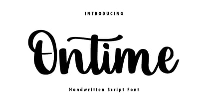 Ontime is a modern handwritten script font! This font is perfect for shirt designs, websites, branding, quotes, children's designs, blogs, logos, invitations and more!
 - Sew What JNL by Jeff Levine,
$29.00Sew What JNL is a little novelty font that gives the appearance of letters stitched into fabric. This font contains a limited character set. - Bludgeon by Monotype,
$29.99The Bludgeon font was designed by Jon H. Clinch. The lively expressive and inky splashing letterforms of the Bludgeon font have a splattered appearance. - Quadrica by Sesa Grafika,
$32.00 Quadrica is a stylish, retro script font. Its unique letterforms make this font perfect for logos, social media posts, packaging, magazine covers, and more.
 - Fribble by Letters by Wordsworth,
$23.00 Fribble is a delightful, frolicking font that works equally well as text and titling. The open type extras provide additional ‘bounce’ for the font.
 - Sketchimpact by Librito.de,
$12.00 The design for the font “sketchimpact” is based upon the typeface Impact. The font family consists of three different versions: solid, outline and lines.
 - Butter Milky by FHFont,
$19.00 Butter Milky is script font with handwritten vintage calligraphy style, with OpenType feature include of the font. Suitable for design, element design, event, logo.
 - Roskilde by Hanoded,
$15.00 Roskilde is a city in Denmark, famous for its Rock Festival and its Viking Ship museum. Roskilde font is a very legible headline font.
 - Subytro by Subtitude,
$39.00 Subytro! Use this font for sweet bold titles. It adds personality and an handmade feeling. Old Style font based on posters of the fifties.
 - Nolita by Sakha Design,
$12.00 Introducing the Nolita Font Duo, a classy pair of script and serif fonts. Nolita offers beautiful typographic harmony for a diversity of design projects.
 - Fiver by Gleb Guralnyk,
$15.00 Hi, presenting a modern decorative font set named "Fiver". It consists of five fonts with different lines variations. Thank you & have a great day!
 - JH Dima by JH Fonts,
$30.00 JH Dima is a modern style font; it is designed based on Koufi style & latin geometric fonts classification, typical for corporate identity, branding & signage...
 - Decomic Oblique by Volcano Type,
$19.00 Decomic Oblique is one of the handmade fonts of illustrator Paul Hoppe who lives in New York. The font was digitized by Boris Kahl.
 - Xylograph by Cuda Wianki,
$30.00 This font is based on 17th - 19th century woodcuts. It has many varied alternate characters and over 25 ornaments that make this font unique.
 - Rany by Haiku Monkey,
$10.00Rany is a fun, legible handwriting font with a childlike twist. Great for posters, packaging, logos, or anywhere a fun font is called for. - Roadart Grafiti by Sipanji21,
$13.00 Amanzinc Graffiti is an awesome display font that features the street art vibe. Take your designs to the next level with this stunning font!
 - Beras Berry by Forberas Club,
$16.00 Beras Berry is a fun display font. This font is perfect for fun themed designs, especially when combined with everything cute or happy moment.
 - Little Tokyo by Epiclinez,
$18.00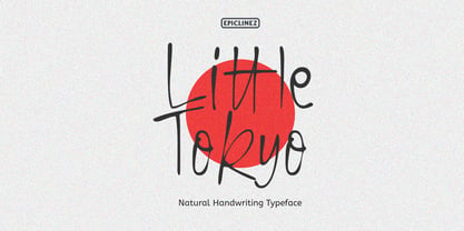 Little Tokyo is an authentic signature script font. This natural style handwritten font is suitable for various projects, such as logos, branding and packaging.
 - H-AND-S by AND,
$89.00 A common creation: (to pass from one hand to the other): For the first time, various hand-signs from diverse sources are unified into one single visual style. This compendium is the result of 15 years of incubation and 7 years of creation. In his travels throughout the world, graphic designer Jean-Benoit Levy, principal of the visual studio AND, has collected pictures of multiple hand signage. Uncertain what to do with those signs, he kept them year after year until the idea came to unify almost 200 handsigns into one single family. In accordance with this entire collection, the name of the typeface is a mix: "h-and-s". A global collection: (To put in good hands): We all have one thing in common: Hand-signs are an international language, they are meant to be understood by all of us. Each of us regularly comes in contact with modern hieroglyphs such as the hand-sign-codes that are so prevalent in our daily life. This way of communication belongs to no one in particular and to all of us in general. Even if the sense of certain signs varies from one culture to the other, there is a common hand-sign language. We are surrounded by this language of handsigns each time we step in a store, we eat, open a container of milk, we clean up, use package of wash-powder, by shaving, when we work, use tools, at home, by tearing the envelope of a condom, by traveling, etc. When we encounter these signs, we all understand them easily. A visual connection: (To go hand in hand): This typeface is a global visual statement. Collecting, ordering, redrawing, unifying. Reconstructed and assembled into one original alphabet, H-AND-S is a unique and complex signs program. Our choice is based on daily gestures and global hand-codes. Logically this typeface starts with the "American Sign Language" and expands on two type-variations, each on two levels of keyboard. The international team of H-AND-S would like to send his special thanks to all of the anonymous graphic designers throughout the world who designed different hand-signage and who influenced and inspired to create such a sign collection into one unified family. We, the global nomad team of AND, hope that you will enjoy our H-AND-S. Additional Credits Production: Studio AND. www.and.ch. Concept, Idea & Creative Direction: Jean-Benoît Lévy, Switzerland / USA. Research & Sketches: Eva Schubert, Germany. Illustration, Graphic Design & Visual Fusion: Diana Stoen, USA. Transfer, Adaptation & Refining: Moonkyung Choi, Korea. Finalization & Checking: Sylvestre Lucia, Switzerland. Coaching & Technical Advice: Mike Kohnke, USA. Creative Energy & Implementation: Joachim Müller-Lancé, Germany / USA.
 - Evita by ITC,
$29.99Gérard Mariscalchi is a self-made designer. Born in Southern France of a Spanish mother and an Italian father, he has worked as a mechanic, salesman, pilot, college teacher – even a poet (with poetry being the worst-paying of these professions, he reports.) “Throughout all this, the backbone of my career has always been design,” Mariscalchi says. “I’ve been drawing since I was five, but it wasn’t until I was twenty-four that I learned that my hobby could also help me earn a living.” It was about this same time that Mariscalchi fell in love with type. He studied the designs of masters like Excoffon, Usherwood and Frutiger, as well as the work of calligraphers and type designers such as Plantin, Cochin and Dürer. With such an eclectic background, it’s no surprise that Mariscalchi’s typeface designs are inspired by many sources. Baylac and Evita reflect the style of the art nouveau and art deco periods, while Marnie was created as an homage to the great Lithuanian calligrapher Villu Toots. However, the touch of French elegance and distinction Mariscalchi brings to his work is all his own. Baylac Who says thirteen is an unlucky number? Three capitals and ten lowercase letters from a poster by L. Baylac, a relatively obscure Art Nouveau designer, served as the foundation for this typeface. The finished design has lush curves that give the face drama without diminishing its versatility. On the practical side, Baylac’s condensed proportions make it perfect for those situations where there’s a lot to say and not much room in which to say it Evita Mariscalchi based the design of Evita on hand lettering he found in a restaurant menu, and considers this typeface one of his most difficult design challenges. “The main problem was to render the big weight difference between the thin and the thick strokes without creating printing problems at small point sizes,” he says. Unlike most scripts, Evita is upright, with the design characteristics of a serif typeface. Mariscalchi named the face for a close friend. The end result is a charming design that is light, airy, and slightly sassy. Marnie Based on Art Nouveau calligraphic lettering, Marnie is elegant, inviting, and absolutely charming. Mariscalchi paid special attention to letter shapes and proportions to guarantee high levels of character legibility. He also kept weight transition in character strokes to modest levels, enabling the face to be used at relatively small sizes – an unusual asset for a formal script. Marnie’s capital letters are expansive designs with flowing swash strokes that wrap affectionately around adjoining lowercase letters. The design easily captures the spontaneous qualities of hand-rendered brush lettering. - Baylac by ITC,
$29.99Gérard Mariscalchi is a self-made designer. Born in Southern France of a Spanish mother and an Italian father, he has worked as a mechanic, salesman, pilot, college teacher – even a poet (with poetry being the worst-paying of these professions, he reports.) “Throughout all this, the backbone of my career has always been design,” Mariscalchi says. “I’ve been drawing since I was five, but it wasn’t until I was twenty-four that I learned that my hobby could also help me earn a living.” It was about this same time that Mariscalchi fell in love with type. He studied the designs of masters like Excoffon, Usherwood and Frutiger, as well as the work of calligraphers and type designers such as Plantin, Cochin and Dürer. With such an eclectic background, it’s no surprise that Mariscalchi’s typeface designs are inspired by many sources. Baylac and Evita reflect the style of the art nouveau and art deco periods, while Marnie was created as an homage to the great Lithuanian calligrapher Villu Toots. However, the touch of French elegance and distinction Mariscalchi brings to his work is all his own. Baylac Who says thirteen is an unlucky number? Three capitals and ten lowercase letters from a poster by L. Baylac, a relatively obscure Art Nouveau designer, served as the foundation for this typeface. The finished design has lush curves that give the face drama without diminishing its versatility. On the practical side, Baylac’s condensed proportions make it perfect for those situations where there’s a lot to say and not much room in which to say it Evita Mariscalchi based the design of Evita on hand lettering he found in a restaurant menu, and considers this typeface one of his most difficult design challenges. “The main problem was to render the big weight difference between the thin and the thick strokes without creating printing problems at small point sizes,” he says. Unlike most scripts, Evita is upright, with the design characteristics of a serif typeface. Mariscalchi named the face for a close friend. The end result is a charming design that is light, airy, and slightly sassy. Marnie Based on Art Nouveau calligraphic lettering, Marnie is elegant, inviting, and absolutely charming. Mariscalchi paid special attention to letter shapes and proportions to guarantee high levels of character legibility. He also kept weight transition in character strokes to modest levels, enabling the face to be used at relatively small sizes – an unusual asset for a formal script. Marnie’s capital letters are expansive designs with flowing swash strokes that wrap affectionately around adjoining lowercase letters. The design easily captures the spontaneous qualities of hand-rendered brush lettering. - Beyond Babylon by URW Type Foundry,
$35.99 Babylon was a civilisation that stretched from Bagdad to the Persian Gulf. There is an Old and new Babylonia, the era of Babylon civilization and the biblical Babylon. The oldest scriptures to be found since the rise of civilisation are Babylonic. The Christian, the Jewish and the Arabic culture find its origin in the Middle East. And share more or less the same history, the same roots and DNA. One people, but in reality a melting pot of close related cultures whom could not be more far apart, hostile and suspicious towards each other. An eye for an eye, tooth for a tooth. One could say this disagreement is still alive today and has deeply infected all of our systems. Beyond Babylon is sculpted after Hebrew, Arabic character style elements in a European writing. It questions what happened after the great Babylonic confusion. Did the words finally come across? Did they realize the distant and gap was maybe smaller than expected. This typeface is related to my former character Eurabia. As an artist I like to play with contradictions. Use opposite elements and mould them in to one understandable piece and in addition a thought to chew on. Otherwise the experimental ore shape lovin' typeface user could be very happy with an addition feature to the existing characters. One option more to express your selves in writing. Also this typeface is really suitable for theme writing or advertising. ----------- Babylon war eine Zivilisation die sich von Bagdad bis zum Persischen Golf erstreckte. Es gibt das alte und das neue Babylon, die Ära der Babylon Zivilisation und das biblische Babylon. Die ältesten Schriften, welche seit dem Aufstieg der Zivilisation gefunden wurden, sind babylonisch. Die Christen, die Juden und die arabische Kultur finden ihren Ursprung im Mittleren Osten. Sie teilen mehr oder weniger die gleiche Geschichte, die gleichen Wurzeln und DNA: Ein Volk. Aber in Wirklichkeit waren sie ein Schmelztiegel aus eng verwandten Kulturen, welche sich nicht ferner sein könnten: feindselig und misstrauisch zueinander. Auge um Auge, Zahn um Zahn. Man könnte behaupten, diese Unstimmigkeit bestehe noch heute und hätte all unsere Systeme stark infiziert. Beyond Babylon ist eine europäische Schrift, geformt nach hebräischen und arabischen Stilelementen der Zeichen. Sie hinterfragt die Geschehnisse nach der der Babylonischen Sprachverwirrung. Kamen die Worte endlich an? Haben sie realisiert, dass die Weite des Spalts zwischen ihnen vielleicht geringer war als erwartet. Diese Schrift ist verwandt mit meinen vorigen Zeichen der Eurabia. Als Künstlerin mag ich es mit Widersprüchen zu spielen, gegensätzliche Elemente zu einem vernehmbaren Ganzen zu verschmelzen und einen kniffligen Gedanken zu erzeugen. Andererseits könnte der experimentelle oder formenverliebte Nutzer sehr glücklich über eine zusätzliche Funktion der bestehenden Zeichen sein. Eine weite Möglichkeit sich im Schreiben auszudrücken. Diese Schrift ist auch für Werbung sehr geeignet.
 - Marnie by ITC,
$29.99Gérard Mariscalchi is a self-made designer. Born in Southern France of a Spanish mother and an Italian father, he has worked as a mechanic, salesman, pilot, college teacher – even a poet (with poetry being the worst-paying of these professions, he reports.) “Throughout all this, the backbone of my career has always been design,” Mariscalchi says. “I’ve been drawing since I was five, but it wasn’t until I was twenty-four that I learned that my hobby could also help me earn a living.” It was about this same time that Mariscalchi fell in love with type. He studied the designs of masters like Excoffon, Usherwood and Frutiger, as well as the work of calligraphers and type designers such as Plantin, Cochin and Dürer. With such an eclectic background, it’s no surprise that Mariscalchi’s typeface designs are inspired by many sources. Baylac and Evita reflect the style of the art nouveau and art deco periods, while Marnie was created as an homage to the great Lithuanian calligrapher Villu Toots. However, the touch of French elegance and distinction Mariscalchi brings to his work is all his own. Baylac Who says thirteen is an unlucky number? Three capitals and ten lowercase letters from a poster by L. Baylac, a relatively obscure Art Nouveau designer, served as the foundation for this typeface. The finished design has lush curves that give the face drama without diminishing its versatility. On the practical side, Baylac’s condensed proportions make it perfect for those situations where there’s a lot to say and not much room in which to say it Evita Mariscalchi based the design of Evita on hand lettering he found in a restaurant menu, and considers this typeface one of his most difficult design challenges. “The main problem was to render the big weight difference between the thin and the thick strokes without creating printing problems at small point sizes,” he says. Unlike most scripts, Evita is upright, with the design characteristics of a serif typeface. Mariscalchi named the face for a close friend. The end result is a charming design that is light, airy, and slightly sassy. Marnie Based on Art Nouveau calligraphic lettering, Marnie is elegant, inviting, and absolutely charming. Mariscalchi paid special attention to letter shapes and proportions to guarantee high levels of character legibility. He also kept weight transition in character strokes to modest levels, enabling the face to be used at relatively small sizes – an unusual asset for a formal script. Marnie’s capital letters are expansive designs with flowing swash strokes that wrap affectionately around adjoining lowercase letters. The design easily captures the spontaneous qualities of hand-rendered brush lettering. - Analogue Pro by Ingo,
$42.00 very traditional forms strongly slanted italic consistant proportions extraordinary ligatures swashes alternate letters alternate figures lower case l with a hooked “foot” Believe it or not, there are hardly any sans serif fonts in which the lower case letter l also has the hooked form of an l. Instead, we readers have to constantly distinguish whether we are seeing an uppercase I or a lower case l — just take a look at the word “Illinois”... The ingoFont Analogue was developed for exactly this reason. The intent: To create a pretty much »ordinary«, even classical font with its most striking characteristic being the inclusion of the “crooked l.” As a model, I used the »mother of all sans serifs«, Akzidenz Grotesk from Berthold, with its beginnings going back to the 19th century. Analogue is so to say a new interpretation of Akzidenz Grotesk from ingoFonts. All characters — following the model — have been newly designed. And if you want to emphasize the shape of the hooked foot even more, you can also activate the alternate styles for d, h, m, n (Style Set 1). Conversely, the alternate a somewhat softens the “hooked” impression (Style Set 2). The slanted versions — it isn’t truly a real cursive font — are noticeably stronger with 13° than the italics in comparable fonts, and were given a round e with a mind of its own which distinguishes itself considerably compared to the upright characters in the overall appearance of the font. More modern and formal solutions in detail were chosen for some of the characters, for example the M was given lightly slanted sides; the a reflects the curves of the s; the “feet” of a, l and t match; the flared legs of K and R became a “foot”, too. General proportions were carried over almost completely with no changes from Akzidenz Grotesk as well as the slanted trimming on the open forms of a, c, e, s; in comparison, C, G and S were given straight endings. Analogue contains many ligatures, even discretional ligatures, plus proportional, old style as well as tabular figures. All in all, at first sight Analogue brings back memories of the charm of its well-known predecessor; and yet, many small differences give Analogue an unmistakable certain something...
 - Pea Karen's Doodles - Unknown license

- Cityscape™ - Unknown license

- Bou College - Personal use only

- Pea Amy*Rica - Unknown license

- Pea Whinney Skinney - Unknown license

- Baphomet™ - Unknown license

- Apollyon™ - Unknown license

- Iphegenia™ - Unknown license

- Pea Mystie Unicase - Unknown license

- Pea Karen's Print - Unknown license


