10,000 search results
(0.053 seconds)
- Versatile Azalea by Letterhanna Studio,
$19.00 Versatile Azalea brush font is textured brush font using a contemporary approach to design, equipped with a lot of underline swashes. Versatile Azalea is suitable for a number of display or decorative designs. It will add a luxury spark to any design project that you wish to create! Fall in love with its incredibly versatile style and use it to create spectacular designs! FEATURES - Uppercase and Lowercase letters - Numbering and Punctuations - Multilingual Support - Ligatures - Underline swashes
 - Andovine by Stringlabs Creative Studio,
$25.00 Andovine is a strong and powerful display font with a vintage feel. Fall in love with its raw authenticity. Andovine is a handbrush font with authentic style. This font is made with a brush pen with very careful techniques, so the results are charismatic and have enchanting characteristics.
 - French Typewriter by Typorium,
$15.00 French Typewriter is a slab serif typeface created in 2019 by Jean-Renaud Cuaz. It takes roots in the typewriting font styles with a French flair. In the history of this font style, early typewriters were initially thought to be replacements for printing and so featured proportional fonts, before being replaced by monospaced typefaces. French Typewriter was created with proportional design, departing from the constraint of identical width and space. Designed for vintage and modern use with a script influenced italic, French Typewriter provides a large range of weights from Extra Light to Black with matching italics offering a large palette of styles for both vintage and modern design. A series of swash capitales has been created for all 6 italic weights along with ligatures and alternative a, g, y signs to provide opportunities for attractive text design. Fine tuned kerning has been implemented to make this slab serif font family greatly legible in small size. Condensed styles will be available in 2019.
 - Rectal by Say Studio,
$15.00 Rectal - Modern Retro Serif Rectal is A Vintage Modern Retro Serif Rectal font is a well-balanced retro modern vintage font with a fancy, playful, unique, and versatile vintage serif family with 60+ alternates and Ligatures that you can combine to get curves and beautiful shapes easily just in seconds. It is a display font with moderate contrast that perfect for branding projects, logo, wedding designs, social media posts, advertisements, product packaging, product designs, label, photography, watermark, invitation, stationery, and any projects, it makes with a high level of legibility. What's Included: - Rectal Regular - Rectal Italic - Multingual Support - Ligature & Huge Stylistic alternates - Works on PC & Mac Recommended using Adobe Illustrator or Adobe Photoshop. Wish you enjoy our font and if you have any questions, don't hesitate to drop message & I'm happy to help :) Thanks. Have a wonderful Day Say Studio
 - Bumsy by Flavortype,
$24.00 Bumsy, A new carefully crafted Heavy Sans Serif Typeface. It’s Versatile, Fun, Cute and Beauty feel that you get in Bumsy. Bumsy Created with the happy and fun feeling, so the looks it represent how we feel. Bumsy comes with 3 width : Condensed, Narrow and Regular. if you want more width, you can also use the Variable Width. Bumsy also comes with beautiful swashes, Every glyphs for alternates are curated for the best and possible without eliminate characteristic of this fonts. Our creation on the display to give you a reference what it looks like on your project. such as Branding, Header, Logotype, Poster, Magazine, Packaging, Food Menus, and etc. It shows that Bumsy clearly can accommodate various design style.
 - Pln Hyeonbatang by Ziwoosoft,
$300.00 Hyeonbatang is a modern and comfortable body typeface with readability and aesthetics with a slim designed letter width.
 - Cocogoose Pro by Zetafonts,
$39.00 Discover Cocogoose Pro Narrow Weights! Designed by Cosimo Lorenzo Pancini in 2013, Cocogoose was first expanded in 2015 with the help of Francesco Canovaro who co-designed the decorative display weights and Andrea Tartarelli who developed the condensed widths. In 2020 a full redesign of the typeface has been published: Cocogoose Pro now includes new widths, weights, open type features and characters, thanks to the help of Mario De Libero. Influenced by vernacular sign-painting and modernist ideals, Cocogoose is drawn on a classic geometric sans skeleton, softened by rounded corners and slight visual corrections. Its very low contrast, dark color and tall x-height make it a solid choice for all designers looking for a powerful display typeface for logos, headings and vintage-inspired branding. The tall x-height makes texts set in Cocogoose very readable even at small sizes, while the bold regular weight allows for maximum impact when used as a branding, signage or decorative typeface. Cocogoose Pro was designed as a highly reliable tool for design problem solving, and given all the features a graphic designer needs, starting from its wide range of widths and weights. Its 2000+ latin, cyrillic and greek characters make sure it covers over 200 languages worldwide, while its comprehensive set of open type features allows faultless typesetting thanks to small capitals, positional numbers & case sensitive forms. A wide range of alternate letterforms, developed along nine different stylistic sets, gives you an extra level of design fine-tuning. The layerable and color-ready display variants include inline, outline, shadow and a letterpress version that can simulate the effect of old print, also thanks to programmed randomization of its letters. Cocogoose Pro has been completely re-engineered in 2020 to include extra features and technologies. A variable font version allows you to fine tune precisely the appearance of the text while minimizing download size on the web. A darkmode weight range has been added to the whole family, to keep consistency of effect when the typeface is used in reverse on the web and in dark mode interfaces. Also, a new text subfamily has been developed for body text usage, to keep the look and feel of Cocogoose while maximizing readability on screen and on the printed page.
 - Butterfly Wingz by Ingrimayne Type,
$5.00 IngrimayneType has put letters inside a variety of objects, including bowling pins, book covers, coffee mugs, teapots, pumpkins, Christmas ornaments, train cars, tombstones, old bottles, circles, and rectangles. In each case the letters were placed on a single shape. The use of the Opentype feature of contextual alternatives makes it easy to use two different but alternating shapes. ButterflyWingz puts its letters on the right and left wings of a butterfly. The wings provide a large surface for drawing letters, but they have a odd shape so letters must be distorted to fit. The wings are symmetrical but some letters are not, so the right and left wing versions of the same letter are sometimes quite different. Without the contextual alternative feature one could design a typeface like ButterflyWingz but the user would have to alternate upper and lower case keys. With contextual alternatives turned on, the computer automatically alternates the letters creating a line of complete butterflies. Turning on the Opentype feature stylistic styles one (ss01) replaces the empty spaces with empty wings. However, sometimes an empty wing at the end of a line is unwanted and it can be removed by changing the typeface or by turning off the stylistic style for that character. The family contains two styles, a filled style and an outline style. They can be used separately or together in layers to add color. (Empty wings are on the logicalnot and registered characters.) ButterflyWingz is hard to read and should be used in small doses for decorative effects.
 - Ammer Handwriting by Schriftlabor,
$18.99 Austrian Cartoonist Wolfgang Ammer lent his handwriting to this font, which was produced by Miriam Surányi. Wolfgang already uses the font in his daily routine: It facilitates corrections and translations of his cartoons for international newspapers. Rich in contextual alternates, Ammer contains about 1800 glyphs. Each character has multiple alternates. And a complex OpenType substitution feature makes sure that the same variant does not appear twice in a line. As a special gimmick, the font contains a Tic Tac Toe game: To activate it, type a # and turn on stylistic set 20. Then use digits 1–9 for setting the naughts and crosses on their places. The enclosed TT variant has a reduced glyph set and therefore a smaller file size, hence it is better suited for use on the web.
 - Typer Pro by (v) design,
$25.00 Typer Pro (formerly Consul Typewriter Pro) is a modern OpenType font family reviving the look of old typewriters. Its carefully converted forms are detailed enough even for high pointsizes while keeping a reasonable number of outline points. Typer Pro comes in two variants: Typer Pro Mono is strictly monospaced (all characters occupy the same amount of horizontal space – this way old typewriters usually operated). However, sometimes a more even appearance may be desirable. Therefore, Typer Pro Text has been proportionally altered for a more pleasant and balanced look. Moreover, it is possible to achieve both proportional and monospaced look in both families via Stylistic Sets. You can choose from four different weights in each family and pick characters from its extensive glyph set. Typer also contains a number of Stylistic alternates, randomly replaced alternative letters to avoid the repetition of letters in a word. Typer Pro is a versatile typeface and is perfectly legible even at small sizes and on-screen. When printed, it looks best at its original size around 11–12 pt. Typer supports many OpenType features and offers great multilingual support for most of Latin-based languages. Feel free to download the detailed PDF Specimen.
 - Benton Sans Std by Font Bureau,
$40.00 In 1903, faced with the welter of sanserif typefaces offered by ATF, Morris Fuller Benton designed News Gothic, which became a 20th-century standard. In 1995 Tobias Frere-Jones studied drawings in the Smithsonian and started a redesign. Cyrus Highsmith reviewed News Gothic, and with the Font Bureau studio expanded it into Benton Sans, a far-reaching new series, with matched weights and widths, offering performance well beyond the limits of the original; FB 1995-2012
 - Kommon Grotesk by TypeK,
$39.00 Introducing our foundry with the new Sans Serif typeface, Kommon™Grotesk, a super family with 96 styles. Different width from Extended to Compressed, variety of weights from Thin to Super, made Kommon™Grotesk suitable for multiple usage. The typeface was crafted till clean and simple. It has high legibility with modern and clear look to be use as text or display font. Kommon™Grotesk is effective displaying on many medias, both print and on screen.
 - Refresh by Scholtz Fonts,
$12.00 Refresh was inspired and partly based on handwritten text from advertisements for a popular cola-based soft drink from the 1950s. I designed the missing characters in the handwriting style of the original. The Refresh family comes in three styles: - Lite- possibly the most elegant of the three styles -- use at larger sizes for greater legibility; - Med -of intermediate weight - more legible than Lite; - Blak - for bolder statements and best readabilty. Refresh, with its three styles, is ideal for any display work needing a feminine, handwritten effect. Use it for product branding, book covers, invitations, greeting cards where you're looking for charm and movement. Refresh has not been designed to be used with capital letters placed next to one another: it is not advisable to use text in "ALL CAPS". The best effects for headings and subheads are obtained with an initial upper case letter followed by lower case characters. If you are using upper and lower case then it is not necessary to use kerning. Refresh contains over 250 characters - (upper and lower case characters, punctuation, numerals, symbols and accented characters are present). It has all the accented characters used in the major European languages.
 - Collogue by Heyfonts,
$25.00 Collogue - Variable Font is a cutting-edge and versatile typeface that brings a new level of adaptability to display typography. Unlike traditional fonts with fixed styles, a variable font allows designers to manipulate various aspects of the typeface, such as weight, width, and slant, along a continuous spectrum. Here's a comprehensive explanation of the features and functions of the Display Variable Font: Key Features: -Adaptive Design Elements: The primary feature of the Display Variable Font is its adaptability. -Designers can seamlessly vary specific attributes of the font, including weight, width, slant, and more. -This flexibility empowers designers to fine-tune the typography to suit the visual aesthetics of their projects. -Single Font File, Multiple Styles: Display Variable Fonts consolidate multiple styles into a single font file. This eliminates the need for separate files for different styles, providing a streamlined and efficient solution for designers. -Smooth Transitions: Changes in the font attributes occur smoothly and continuously. Unlike traditional fonts that switch abruptly between styles, a Display Variable Font ensures a fluid transition, allowing for a more harmonious and visually pleasing typographic experience. -Precision Control: Designers have precise control over the variation axis, enabling them to adjust the font's appearance with granular precision. This level of control enhances the typographic customization possibilities and allows for fine-tuning based on specific design requirements. -Responsive Typography: Display Variable Fonts excel in responsive design. They adapt gracefully to various screen sizes and resolutions, ensuring optimal readability and aesthetics across different devices. Functions: -Dynamic Branding: For brands looking to establish a dynamic and adaptable visual identity, Display Variable Fonts offer the perfect solution. The font's ability to adjust seamlessly allows for a versatile and cohesive branding experience across diverse applications. -Editorial Freedom: In editorial design, Display Variable Fonts provide editorial teams with the freedom to experiment with typography. The font can be adjusted to suit different sections or emphasis points within publications, enhancing the overall visual appeal. -Web Design Innovation: Display Variable Fonts are at the forefront of innovation in web design. They enable designers to create dynamic and interactive typographic elements that respond to user interactions, contributing to a modern and engaging web experience. -Attention-Grabbing Displays: Whether used in signage, banners, or large-scale displays, Display Variable Fonts stand out with their adaptability. Designers can experiment with different styles within a single font to create attention-grabbing and visually dynamic displays. -Customizable Interfaces: In digital interfaces, Display Variable Fonts provide a customizable typographic experience. Designers can optimize text elements for different device sizes and orientations, ensuring a seamless and visually pleasing user interface. -Innovative Advertising: Display Variable Fonts offer a fresh approach to advertising typography. Brands and advertisers can leverage the font's adaptability to create visually striking and memorable campaigns across various media channels. In summary, Display Variable Fonts represent a groundbreaking evolution in typographic design, providing designers with unprecedented flexibility and control
 - Rotundus by dayflash,
$35.99 Rotundus is an elegant sans serif typeface based on geometric shapes. Precise lines and accurate curves with sharp corners are the main characteristics of this fresh and modern font family. While unconventional letterforms give Rotundus its distinctive appearance, a tall x-height and a condensed width provide good legibility and nice readability even at smaller sizes. With its contemporary feel, Rotundus is suitable for almost any type of analogue and digital application. A rounded sibling of Rotundus is available as Rotundus Rounded. The Rotundus font family includes unique letterforms, exclusive ligatures and extensive OpenType features. Rotundus comes in six weights with matching italics.
 - Rotundus Rounded by dayflash,
$35.99 Rotundus Rounded is a rounded sibling of Rotundus, an elegant sans serif typeface based on geometric shapes. Precise lines and accurate curves with soft edges are the main characteristics of this fresh and modern font family. While unconventional letterforms give Rotundus Rounded its distinctive appearance, a tall x-height and a condensed width provide good legibility and nice readability even at smaller sizes. With its contemporary feel, Rotundus Rounded is suitable for almost any type of analogue and digital application. The Rotundus Rounded font family includes unique letterforms, exclusive ligatures and extensive OpenType features. Rotundus Rounded comes in six weights with matching italics.
 - Franie by That That Creative,
$50.00 Franie is a variable geometric sans serif font family with 72 styles. Fully customize the width, weight and italic angle. This modern clean typeface is perfect for contemporary layouts for print, magazines, posters, web, social media, branding logos, or whatever.
 - Abigaila Delinta by Letterena Studios,
$9.00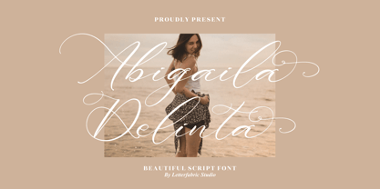 Abigaila Delinta feels equally charming and elegant. It will add a luxury spark to any design project that you wish to create! This font is PUA encoded which means you can access all of the amazing glyphs and ligatures with ease!
 - Nutnik by Hanoded,
$20.00 Nutnik was made using cut out cardboard letters, black paint and some brushes. The result is a highly legible, yet grungy font. It comes with all the diacritics you could possibly wish for and stylistic alternates for the lower case letters.
 - Mono Spec Stencil by Halbfett,
$30.00 Mono-Spec Stencil is a monospaced family of sans-serif type. At least in default settings, all characters across the typeface share a common width, which is immediately noticeable for its condensed nature. Mono-Spec Stencil is a sibling of a non-stencil family, simply named Mono-Spec. Characters in each are just as wide, allowing Mono-Spec Stencil to be used together with Mono-Spec, as a secondary typeface. As a typeface whose characters are stencil-shaped, this design channels the spirit of resistance and street culture. When you look at the family, remember that it ships in two different formats. Depending on your preference, you can install the typeface as a single Variable Font or use the family’s five static OpenType font files instead. Those weights run from Light through Bold. While the static-format fonts offer a good intermediary-step selection, users who install the Variable Font have vastly greater control over their text’s stroke width. The Mono-Spec Stencil Variable Font’s weight axis allows users to differentiate between almost 1,000 possible font weights. That enables you to fine-tune your text’s exact appearance on-screen or in print. Whatever format you choose, the Mono-Spec Stencil fonts are equipped with several OpenType features. The most striking of these can be activated via a Stylistic Set. That will replace several letters – like “B”, “E”, “F”, “H”, and “I” with double-width alternates. Those alternates take up as much space as two characters placed next to each other otherwise word. The effect of Mono-Spec Stencil’s double-width alternates is striking, and their use strikes a strong chord in any display typography applying them.
 - The College Block II font is a Display Slab-Serif typeface that is inherently associated with collegiate and sports themes, making it perfect for university sweaters or ...
- Trump Script by Canada Type,
$29.95 One of the earliest fonts published by Canada Type was Tiger Script, Phil Rutter's digitization of Jaguar, Georg Trump's 1967 wild calligraphic brush face. In 2010, when the font was revisited for an update, it was shown that it too light for applications under 24 pt, and too irregular for applications over 64 pt. So the face was redigitized from scratch. This new digitization brings a more seamless contour and a much steadier stroke, and much better outlines for use at both extremes of scaling. Language support was also greatly expanded, and many alternates and ligatures were added to the redigitized character set. The name was also changed to Trump Script, to better reflect the origins of the design. Trump Script is a master calligrapher's hand producing very uncommon jolts and bursts of sharpness. It showcases some of the most suprising letter forms ever drawn, like the very unique treatments of B, K, W, Y and Z. In the lowercase one can see the cattiest g ever made, and some of the wildest shapes in the f, j, p, y and z. Trump Script comes in all popular formats. The TrueType and PostScript packages are comprised of two fonts. The OpenType version, Trump Script Pro, combines both fonts into one, and includes features for intelligent substitution in software that supports advanced typography. Language support includes Western, Central and Eastern European character sets, as well as Baltic, Esperanto, Maltese, Turkish, and Celtic/Welsh languages.
 - The Jumbalo font is an extremely heavy and playful display typeface, characterized by its thick, bulbous, and completely rounded characters. It evokes a strong sense of retro aesthetics, reminiscent ...
- Dupont Gothic by Hexagon Foundry,
$19.00 Dupont Gothic is a sleek and contemporary sans-serif font that embodies elegance, clarity, and modernity. With its clean lines, balanced proportions, and distinctive character, Dupont Gothic is a versatile typeface that can be used in many ways. The simplicity of Dupont Gothic lends itself to a wide range of applications. Whether used for headlines, body text, or branding, this font possesses a quality to effortlessly adapt to different design contexts. The font comes in 10 weights with matching oblique characters, 2 widths, and 2 style sets that ensure the endless combinations and possibilities.
 - Dear Sans by Stiggy & Sands,
$24.00 The Dear Sans Collection is comprised of four widths ranging from Condensed, Regular, Expanded, and Wide; each of which are comprised of a three font family of weights: Book, Regular & Bold. Cleanly readable, with just a slight hint of silliness, the Dear Sans Collection brings adds the perfect level of lightheartedness to your designs. The Dear Sans Collection comes with: - Approx. 367 Character Glyph Set per font - including standard & punctuation, international language support, and basic “fi fl” ligatures per font. - 3 Weights per family including: Book, Regular, and Bold. - Loads of Personality for your designs.
 - Roanne by Tour De Force,
$25.00 Roanne is a sans serif family named after a town in France. This font family contains 2 width variations: Normal and Condensed, and all together counts 44 font styles. Equipped with OpenType features (Tabular Figures, Fractions, Stylistic Alternates, Localization for Serbia, Poland and the Netherlands, Case Sensitive brackets) for extended Latin and Cyrillic character set with a small charming set of Dingbats. For easier usage as webfont, Roanne font files contain numeric values for CSS weight attribute – 100, 150, 200, 300, 400, 500, 600, 700, 800, 850, 900.
 - Zaphire by 38-lineart,
$24.00 Zaphire is a humble sans serif font, delicately infused with a hint of monographic handwriting, seamlessly blending classic elegance with a touch of contemporary experimentation. Comprising a singular variable font, it gracefully encompasses the essence of 49 distinct fonts, gracefully navigating through 7 weights and 7 widths. Its uniqueness is understated yet undeniable, making it a valuable addition for those seeking to infuse creativity into various artistic endeavors. Zaphire's versatility extends gracefully to contemporary art, posters, and provides an enriching touch to the written word in books and magazines
 - Lobster 1.0 - 100% free

- Sica Condensed by dooType,
$30.00 The Sica Family was designed in order to address issues related to technology, while maintaining humanistic forms. Thus, a font with square shapes emerged, but with smooth curves and slightly rounded terminals making it friendly. The family has three widths – condensed, normal and expanded – each of them with six weights and their respective italics, resulting in 36 fonts. With particular details and open shapes that increase legibility, it can be used for both text compositions as well for display sizes. It has 774 glyphs, covering more than 50 languages, as well as ligatures, lining, oldstyle, tabular and proportional figures, fractions, superiors, inferiors, and small caps, all of them accessible through OpenType features.
 - Sica Expanded by dooType,
$30.00The Sica Family was designed in order to address issues related to technology, while maintaining humanistic forms. Thus, a font with square shapes emerged, but with smooth curves and slightly rounded terminals making it friendly. The family has three widths – condensed, normal and expanded – each of them with six weights and their respective italics, resulting in 36 fonts. With particular details and open shapes that increase legibility, it can be used for both text compositions as well for display sizes. It has 774 glyphs, covering more than 50 languages, as well as ligatures, lining, oldstyle, tabular and proportional figures, fractions, superiors, inferiors, and small caps, all of them accessible through OpenType features. - Sica by dooType,
$30.00The Sica Family was designed in order to address issues related to technology, while maintaining humanistic forms. Thus, a font with square shapes emerged, but with smooth curves and slightly rounded terminals making it friendly. The family has three widths – condensed, normal and expanded – each of them with six weights and their respective italics, resulting in 36 fonts. With particular details and open shapes that increase legibility, it can be used for both text compositions as well for display sizes. It has 774 glyphs, covering more than 50 languages, as well as ligatures, lining, oldstyle, tabular and proportional figures, fractions, superiors, inferiors, and small caps, all of them accessible through OpenType features. - Nurnberg by Vintage Voyage Design Supply,
$20.00 Nürnberg (Nuremberg in eng.) New blackletter-sans font family in modern look with contrasts elements in six widths. Impressive style with non-typical Blackletter uppercases as alternates and normal Sans as standard. In the company with good-looking lowercases and their alternates you can get outstanding result for your project. Six widths give you wide range of use. Massive Bold or Black will be really good in none-long magazine headlines, some logos or cafe/bar signs, menu's or coffeeshops. Medium or Regular is for normally (not giant) text blocks or any of accented texts. Light and Thin are good in big pt. Short word forms or numerals is just awesome.
 - Valverde by Jehoo Creative,
$20.00 Valverde is a super-serif font family with 2 widths condensed and normal, each width consists of 18 fonts and has a complete weight from thin to black combined with beautiful italic cuts to meet the needs of any design in any format. Inspired by the type of vintage look that has recently become a trend, this letter character has an elegant, sharp impression. Opentype features such as Stylistic Alternate and Ligature on the Valverde family make it look more aesthetic so that it fits in a classy modern look. Stunningly beautiful and modern serifs make them an essential addition to any type of tool kit.
 - Nauman Neue by The Northern Block,
$39.95 Nauman Neue is a modern humanist sans serif typeface made for the screen. Broad open letter forms are combined with precise geometry to create a functional and legible font that’s ideal for web and on-screen applications. In 2021 Nauman was expanded to sixty styles, including two helpful widths condensed and semi-condensed. Included in the font are 900 characters per style, ten weights and three widths with matching italics. Opentype features consist of seven numerals variations, including inferiors, superiors, fractions, tabular, lining, and old style. It also has alternate lowercase a, e, I, M, small caps, arrows and language support covering Western, South, Central Europe and Vietnamese.
 - Polli Sans by Will Albin-Clark,
$- Polli Sans is a sans serif geometric font, designed with both proportional and fixed-width styles in mind. Polli is great for large scale display purposes and small scale copy. The proportional’s curvy form makes it super useful for title type, and the detailed technical fixed-width sub-family is perfect for any informative body of text. Polli is designed as an homage to common type practices of the early 21st centric corporate America. Borrowing from friendly styles you’ve seen before but with contemporary challenging elements.
 - Grillmaster by FontMesa,
$25.00 Grillmaster is a nice clean sans serif that you'll find many uses for with eight widths and eight weights in each width set plus italics. It’s always grillin' season with Grillmaster; at 128 font files strong Grillmaster is ready to serve large crowds and dinner parties. So put on some cheap shades and cutoff jeans, then fire up the grill and turn up that perfect song on the radio: the Grillmaster is here to satisfy your appetite; I guarantee you won't go home hungry.
 - Maternellecolor creuse is a delightful and whimsically designed font that seems to carry the innocence and creativity of a child's world right into the realm of typography. Crafted with a keen eye fo...
- Dragonflight Pro by Fontforecast,
$29.00 Dragonflight Pro is a script collection of four modern calligraphy fonts. Each glyph was hand-drawn with a brass folded pen dipped in ink. The tip of the folded pen resembles the shape of a dragonfly’s wing, hence the name. By tilting the pen variations in line width are made. This produces fun, expressive letters with a spontaneous personality. The regular and rough version of Dragonflight Pro have alternate glyphs that can either be accessed by the swashes feature, stylistic set 1, or the glyphs panel, depending on the application you are using. There are lots of discretionary ligatures that offer even more variation. By typing _1 to _10 you can access bonus swashes that are part of Dragonflight Pro Regular and Rough. Both fonts have 567 glyphs. Dragonflight Pro Sans is an all caps font with 402 glyphs, also hand-drawn with the folded pen, that compliments the other styles perfectly. Dragonflight Pro Extra offers an additional 117 swashes, doodles and ink splatters. With Discretionary Ligatures activated you can type an underscore in front of a letter and (when available) this gives you the rough version of the glyph.
 - Gorilas by DLetters Studio,
$10.00 GORILAS Handbrush Font is a font with an available brushstroke style with a set of uppercase all with number and punctuation support, and Ligatures making this font perfect for your awesome project.
 - Bylum by Adam B. Ford,
$16.00 Bylum is put together with a bulbous line segment that makes up the bulk of the font. The verticals bulge out in the middle, the curves vary in width along their lengths. This gives the font a relaxed sway to it even while its verticals are upright and its design is fairly regimented.
