10,000 search results
(0.066 seconds)
- Othist by Maulana Creative,
$14.00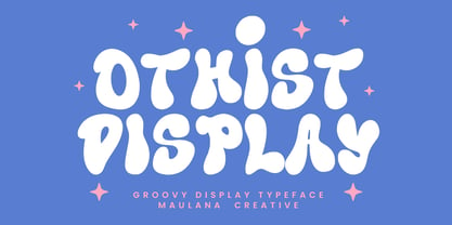 Othist Groovy display typeface. With three weight stroke, fun character with a bit of ligatures. To give you an extra creative work. Othist Groovy display typeface support multilingual more than 100+ language. This font is good for logo design, Social media, Movie Titles, Books Titles, a short text even a long text letter and good for your secondary text font with sans or serif. Make a stunning work with Othist Groovy display typeface. - Uppercase Cheers, Maulana Creative
 - Torpedo by Red Rooster Collection,
$60.00 Torpedo is a five-weight rounded, compressed sans serif font family. It was designed by Steve Jackaman over a several-year period, and was released in 2017 alongside its sister typefaces Coliseum Pro and Clydesdale. Torpedo, whose name was inspired by round torpedo warheads, is a visually sturdy font that maintains excellent legibility. Torpedo is flexible in its applications, like its violent namesake; it is explosive at large sizes, and still works efficiently at low profiles.
 - SF Pumice by Sultan Fonts,
$10.00 Pumice is a modern sans-serif typeface with characteristic and defined features. This font Name was inspired by the Aden pumice. Its design is composed of diverse 8 styles. Create unique designs by combining any of the upright weights with matching italics. Pumice includes a matching Latin design and support for Arabic, Persian, Kurdish, and Urdu. Pumice was specially designed for branding, advertising, editorial design, Web, and use on Tv and social media. Designers: Sultan Maqtari Publisher: Sultan Fonts
 - Citadina by Graviton,
$24.00 Citadina font family has been designed for Graviton Font Foundry by Pablo Balcells in 2016. It is a sans serif typeface with a geometrical, mechanic, neutral appearence and a slightly condensed design which makes it particularly effective for space economizing. It has been conceived to be most suitable for short and middle length text blocks, as well as on all sized headlines. Citadina consists of 12 styles. Each containing small caps and glyph coverage for several languages.
 - Novecento Slab by Synthview,
$22.00 Novecento Slab is the “slab serif” companion of Novecento Sans , a font family inspired on european typographic tendencies between the second half of 19th century and first half of the 20th. This font face is designed to be used mostly for headlines, visual identities or short sentences, both in big and small sizes. Novecento Slab family comes in 32 styles, speaks 76 latin based languages, has 590 glyphs and 16 stylistic opentype features for advanced typography.
 - Lectori Salutem by HoboArt,
$10.00Is it royal, or is it dandyish? Either way it's sure to catch the eye. Prepare for titling figures any movie executive would be jealous of using. Do you write sci-fi, fantasy, costume, or cult; or is your announcement for an off-beat wedding? Lectori Salutem offers salutations to the reader, and a kick. Lectori Salutem is the serif counterpart of the Lectori Salutem Sans font. A postmodern font with slightly romantic features, and playful ligatures. - The Chaffy by XdCreative,
$25.00 About The Chaffy The creation of the chaffy is inspired by classic and vintage fonts, with a touch of Slightly calligraphic, with variable stress angle and high contrast. The Chaffy is a display font type, so it is perfectly suited for graphic design and any display use ( for the logos, t-shirts, the web as well as for print, and also great for headings), The Chaffy is perfect pairing for Giane Gothic sans or Giane Serif Thank You _xdCreative
 - Venio by Craft Supply Co,
$20.00 Venio – Double Line Font: Display Typography with Art Deco Flair Deco-inspired Elegance Infused with Art Deco sophistication, Venio, a double-line sans-serif font, brings timeless elegance to your designs. Distinctive Display Presence Venio ensures a bold yet refined aesthetic for logos and headlines, making your display stand out with its distinctive double-line design. Artful Symmetry Paying homage to Art Deco’s geometric precision, Venio’s symmetrical lines provide a visually pleasing experience, adding a touch of artistic flair.
 - Auge Unicase by Eliezer Grawe,
$5.00 Auge Unicase is a sans serif display font, extra-condensed, with a unicase style. It is a geometric and very modular font that has a "modern-vintage" feeling. It is good for titles and short texts. Auge Unicase has a set of alternates, accessible by contextual alternates and stylistic set. It was designed following the Underware Latin Plus character set, supporting 219 Latin based languages (see https://underware.nl/latin_plus/languages/). Version 1.1 now has Cyrillic support and 757 glyphs.
 - Intensiva by Graviton,
$24.00 Intensiva font family has been designed for Graviton Font Foundry by Pablo Balcells in 2019. It is a slightly condensed, humanistic sans serif typeface with angular details and shortened endings that provide an unorthodox appearance. Despite of this particular features, it is suitable for any kind of project, text length, size and, due to it subtle condensation, it is particularly effective for space economizing. Intensiva consists of 8 styles, each containing small caps and glyph coverage for several languages.
 - MC Minosh by Maulana Creative,
$14.00 Minosh is a vintage display typeface. With three weight stroke, fun character with a bit of ligatures. To give you an extra creative work. Minosh vintage display typeface support multilingual more than 100+ language. This font is good for logo design, Social media, Movie Titles, Books Titles, a short text even a long text letter and good for your secondary text font with sans or serif. Make a stunning work with Minosh vintage display typeface. Cheers, Maulana Creative
 - Astaneh by Si47ash Fonts,
$24.00 Super clean, yet sophisticated! Astaneh with its 2 weights brings a modern and clean sans serif Arabic/Persian typeface to life! Shahab Siavash, the designer has done more than 30 fonts and got featured on Behance, Microsoft, McGill University research website, Hackernoon, Fontself, FontsInUse,... Astaneh text and headline font which is one of his latest designs, already got professional typographers, lay-out and book designers' attention as well as some of the most recognizable publications in Arabic/Persian communities.
 - Shinokai by Lukas Schiltknecht,
$14.00 The Shinokai is a sans serif of two weights that is both dynamic and consequent. Originally concepted as a font for application letters by Lukas Schiltknecht it quickly became a more sophisticated piece of work. This Typeface is inspired by some of his favorite fonts the FF DIN and the ITC Officina. It is made to suit a variety of uses like advertising and packaging, film and tv, editorial and publishing as well as posters and billboards.
 - Kiddo by EPtackArts,
$3.00 Kiddo is a whimsical, handwritten font family created for use along side children's media. It pairs nicely with Monterrat and other neat, rounded sans serif fonts. It looks great with brightly colored, soft illustrations to create lively layouts full of movement. The characters are simple and easy to read as to not compete with the semi-inconsistent baselines and stroke weights. The line variations add a lot of character to the typeface that really compliments a good story.
 - Salin by Hurufatfont,
$19.00 Salin is a modern sans serif font family with a geometric and humanist touch. Salin has totally 20 fonts with 10 weights and their appropriate italics. It contains rich opentype features. Includes extended language support, fractions, table figures, arrows, ligatures and more for each weight. Ideal for corporate identity, poster, brochure, orientation signs, and all kinds of graphic design works. “Salin News" and "Salin News Italic” are specially made for long paragraph texts which are written with small sizes.
 - Rolexa by Storictype,
$19.00 Rolexa is a new carefully crafted serif fonts. The Ideas of this fonts are from wide range of reference, from classic, until the modern era. So the looks of this fonts must be in the wide range of the reference above. It’s Versatile and Luxury feel that you get in Rolexa Typefaces. Immerse your design in the world of elegance and refinement with our premium serif luxury typeface, designed to bring a sense of grandeur to your creative endeavors. Experience the epitome of luxury in typography with our meticulously crafted serif typeface, exuding timeless beauty and grace for your high-end designs. As you can see our creation on the display such as Branding, Header, Logotype, Poster, Magazine, Packaging, Wedding Invitation with art deco style, and etc. It shows that Rolexa can accommodate various design style. Features : - Character Set A-Z - Numerals & Punctuations (OpenType Standard) - Disrectionary Ligatures - Accents (Multilingual characters) Thank You
 - Savaneta by Arterfak Project,
$20.00 Savaneta is an all caps stylish serif font, designed for display and headline. Inspired by the classic metal movable type (circa the 1440s), with the medium serif thickness. Savaneta is a versatile serif combined with calligraphic sense by adding about 300+ alternates characters so you can create a calligraphic design with ease! This font looks strong and feminine at the same time, that possible to be applied for many purposes. Savaneta is perfect for logos, logotype, letterhead, branding, cards, wedding invitations, label design, posters, apparel, quotes, and short body text. It contains over 500 glyphs and is complete with basic Latin characters. P.S: To access the alternates characters, you need a program with OpenType panel like Adobe Illustrator, Adobe Photoshop, or you can simply copy-paste the alternates characters by accessing Font Book (Mac) and Characters Map (Win) Features included: Uppercase Small case Numbers Symbol Standard Latin accents. Stylistic alternates Stylistic set 01-10 Thank you for visiting, and have a nice day!
 - Banknote 1948 by Ingo,
$39.00 A very expanded sans serif font in capital letters inspired by the inscription on a bank note Old bank notes tend to have a very typical typography. Usually they carry decorative and elaborately designed markings. For one thing, they must be practically impossible to forge and for another, they should make a respectable and legitimate impression. And in the days of copper and steel engravings, that meant nothing less than creating ornate, shaded or otherwise complicated scripts. Designing the appropriate script was literally in the hands of the engraver. That’s why I noticed this bank note from 1948. It is the first 20 mark bill in the then newly created currency ”Deutsche Mark.“ All other bank notes of the 1948 series show daintier forms of typography with an obvious tendency toward modern face. The 1949 series which followed shortly thereafter reveals the more complicated script as well. For whatever reason, only this 20 mark bill displays this extremely expanded sans serif variation of the otherwise Roman form applied. This peculiarity led me in the year 2010 to create a complete font from the single word ”Banknote.“ Back to those days in the 40’s, the initial edition of DM bank notes was carried out by a special US-American printer who was under pressure of completing on time and whose engravers not only engraved but also designed. So that’s why the bank notes resemble dollars and don’t even look like European currency. That also explains some of the uniquely designed characters when looked at in detail. Especially the almost serif type form on the letters C, G, S and Z, but also L and T owe their look to the ”American touch.“ The ingoFont Banknote 1948 comprises all characters of the Latin typeface according to ISO 8859 for all European languages including Turkish and Baltic languages. In order to maintain the character of the original, the ”creation“ of lower case letters was waived. This factor doesn’t contribute to legibility, but this kind of type is not intended for long texts anyway; rather, it unfolds its entire attraction when used as a display font, for example on posters. Banknote 1948 is also very suitable for distortion and other alien techniques, without too much harm being done to the characteristic forms. With Banknote 1948 ingoFonts discloses a font like scripts which were used in advertising of the 1940’s and 50’s and were popular around the world. But even today the use of this kind of font can be expedient, especially considering how Banknote 1948, for its time of origin, impresses with amazingly modern detail.
 - Prima Script by Wiescher Design,
$24.00 »Prima Script« was designed especially for use in Menus and Cook-books. One of my sons is a chef in Munich and he was always bugging me to make a new font for his menus. I already designed one for him »Konstantin« but he likes to have new stuff every couple of years what I understood. So here is the new »Prima Script« (that’s what he said when he first saw the font). To give it more usability I made alternate initials and end letters as well as medieval cyphers. Then I did a couple of swashes and a handdrawn Sans font to complete the set. Have fun!
 - Noytur by Product Type,
$15.00 Introducing the new font Noytur is a simple, beautifully crafted typeface that combines the ethnic look of the Arabic symbols with the solidity of a sans-serif font. Its readability is exceptional while keeping its Middle East vibe. The Noytur typeface looks great for headline products, Branding, greeting, poster art, religious event, and more. of course, your various design projects will be perfect and extraordinary if you use this font because this font is equipped with a font family, both for titles and subtitles and sentence text, start using our fonts for your extraordinary projects.
 - MC Sattel Hintar by Maulana Creative,
$14.00 Sattel Hintar Brush Script Font Sattel Hintar is a brush script font. With rough brush stroke, fun character with a bit of ligatures and has a two files lowercase alternates. To give you an extra creative work. Sattel Hintar font support multilingual more than 100+ language. This font is good for logo design, Social media, Movie Titles, Books Titles, a short text even a long text letter and good for your secondary text font with sans or serif. Make a stunning work with Sattel Hintar font. Cheers, MaulanaCreative
 - Slantinel by Illunatic,
$9.95 Slantinel is a versatile sans-serif type family with lots of personality! It consists of 9 fonts coming with 3 weights in 3 versions each and supports many international languages. Slantinel works best in small to medium sizes and is useful in a wide variety of settings such as childrens books, packaging designs, greeting cards and much more due to its handwritten feel and its many distinct details.
 - Fortima by Meat Studio,
$30.50 Fortima is a 12 style angular sans serif that utilises subtle modular shapes, designed by Stew Deane. The result is a font with character that adapts to a variety of sectors and brands, and is suitable for anything from advertising and branding to web and screen. The angular shapes help create a unique aesthetic that are instantly recognisable and have impact and character in large or small sizes.
 - Epoha by Tour De Force,
$30.00 Epoha is geometrical sans-serif font family available in 3 widths and 4 weights. With rounded edges that soften design of the letters, Epoha delivers functionality on the first place – it is neutral, versatile, legible and easily applicable for any project. Equipped with extended Latin and Cyrillic language coverages, Epoha in widths and weights diversity allows use of typographical contrast in editorial use or branding, to package design, posters and websites.
 - Core Gaon by S-Core,
$59.00 CoreGaon is a modern sans-serif font. The main characteristics of the typeface are rounded edges of strokes and soft look & feel. Restrained angles of diagonal make text be in good order and it is helpful for legibility and readability. Supported codepages are MS Windows 1252 Latin1 and MS Windows 949 Korean consisting of 11,172 Korean letters and Symbols except Chinese. We suggest to use for books, magazines and posters.
 - Good Grief PB by Pink Broccoli,
$14.00 An ever so slightly off kilter sans-serif, Good Grief started as a digitization of a film typeface called Carmel by LetterGraphics. From there, this fun and friendly typeface was taken from its limited character set and fleshed out to a fully functional typeface. With the legibility of a text typeface, yet the personality of a display type, Good Grief - why haven't you gotten this fantastic font yet?
 - Causten by Trustha,
$25.00 Causten is a geometric sans serif font family with maintains rationality in designing each form. With use the sharpness of the eyes, and remain logical, so that balance is maintained in each form. So, it will get a clean, neat, and perfect shape. Causten comes with 9 weights and matching oblique, making it 18 styles. It makes perfect for all creative projects. Also, some alternative glyphs will be an attractive choice.
 - Guile by Bunny Dojo,
$10.00 A timeless and mighty sans-serif, Guile's chiseled forms make the font ideal for reaching into history, while its minimalism and balance are fit for propelling into the future. Guile voraciously absorbs and enhances the style of its surroundings. In sports, it's a true team player, from the jerseys to the on-air presentation. In film, it's a blockbuster star, from the title treatment to the billing block.
 - Sebino by Nine Font,
$25.00 Sebino family is a neutral sans-serif type family with 9 weights, from thin to black, with corresponding italics. Sebino has a large x-height with open apertures which make texts more legible at small sizes. Each font includes opentype features such as Proportional Figures, Tabular Figures, Numerator, Superscript, Subscript, Case-Sensitive, Denominators, Scientific Inferiors, Ordinals, Ligatures and Fractions. Sebino will make your artworks better with its clean & clear shapes.
 - Decima Mono Round by TipografiaRamis,
$39.00 Decima Mono Round – another addition to the Decima fonts family. Decima Mono Round is a modern monospaced condensed sans serif family with classic geometric design, built in three weights and six styles. The letterforms in roman style are techno (engineered) in appearance, while italics remind one of elegant handwriting balanced with Roman geometry. The typeface is released in OpenType format with extended support for most Latin languages, as well as Cyrillic.
 - Grossesbuch by Andrey Ukhanev,
$9.00 Grossesbuch is a modern sans serif typeface. The starting point of which was the sketchbook pages. Using a wide-nib nib, I turned the nib so that the stroke was always wide. The sketchbook pages looked like posters. Later, having become interested in fonts, I decided to transfer the drawn letters and make a typeface. I think that the range of use is various accidents: posters, headlines, postcards, captions.
 - Not So Grotesk JNL by Jeff Levine,
$29.00 A circa-1920s book on lettering entitled "Book of Alphabets" by Regan Publishing displayed an example of a Grotesk typeface (a popular style of sans serif of the time). This design was re-drawn digitally as Not So Grotesk JNL and is available in four varieties - regular, oblique, condensed and condensed oblique. Not So Grotesk JNL is the perfect companion font family to use alongside Simply Grotesk JNL.
 - Egg Farm JNL by Jeff Levine,
$29.00 The opening titles and credits of the 1947 film comedy “The Egg and I” were done in a hand lettered casual sans serif typeface which inspired the digital font Egg Farm JNL; available in both regular and oblique versions. “The Egg and I” introduced audiences to Ma and Pa Kettle as portrayed by Marjorie Main and Percy Kilbride, who went on to do a number of additional films as those characters.
 - Corqen by Muksal Creatives,
$13.00 Corqen is an Display Sans Serif font, and with a style that is very different from the others. Its weight is superior in posters, social media, headlines, magazine titles, clothing, large print formats - and wherever you want to be seen. Inspired by the style of design that is currently popular, this is the answer to all the needs of every idea that you will pour into in this modern era.
 - Brodaers Expanded by Trustha,
$17.00 Brodaers Expanded is a display sans serif font. With the initial concept of the inner shape, made round. Comes in six styles, which makes it easier for the project you are working on, as well as alternative glyphs as an attractive option. Brodaers Expanded is an expanded version of Brodaers typeface. It comes with 400+ glyphs, which also include multilingual languages. Brodaers is perfect for headlines, branding, and many more.
 - Livemono by Letterhend,
$17.00 Livemono is a new monospaced sans serif. It looks clean and and very suitable for coding style. The typeface is versatile to blend in your design- with 6 weight, ranging from bold, light, medium, regular, semibold, and thin. Perfect anywhere you need a right finas touches for branding, publishing, titles, book, magazine , and use on UI/UX design. Features: Variable Font uppercase & lowercase numbers and punctuation multilingual 6 weight PUA encoded
 - Order Form JNL by Jeff Levine,
$29.00 In the MacKellar, Smiths & Jordan type specimen book of 1892 are examples of Lining Gothic Extended, a wide sans serif typeface. A lining font has the numerals aligned with the capital letter height, rather than following the “Old Style” method of smaller figures that could also descend below the baseline. Order Form JNL is the digital version of this design, and is available in both regular and oblique versions.
 - Serca by Adam Ladd,
$25.00 Serca is a structured geometric sans serif font family with normal and condensed proportions. It is professional and precise, open and legible. The modern, clean design lends itself to being a workhorse for a variety of applications—branding, advertising, websites, mobile apps, logos, magazines, etc.—able to be used in both small body text and large headlines alike. The vast range of weights gives plenty of options to choose from.
 - Kaufmann LT by Linotype,
$29.99Kaufmann font was designed in 1936 for the American Type Founders by Max R. Kaufmann, a letterer, typographer, and one-time art director for McCalls magazine. Kaufmann is a connecting script typeface with a smooth, slightly whimsical look. Its monoweight is unusual in a script type but allows for a nice texture on the page when it is combined with sans serif text type. The bold Kaufmann is fine display type. - Pigeon Post by Hanoded,
$15.00 I have no particular love for pigeons, but I read an interesting article about war pigeons being used to send messages to an fro. One pigeon (called William of Orange) even saved more than 2000 soldiers during the Battle of Arnhem. Pigeon Post is a lovely cartoon and kids font. It comes in a sans and a serif style, so there’s really no excuse for not using it!