10,000 search results
(0.172 seconds)
- Typewriter DirtY by Matthias Luh,
$32.00 Typewriter DirtY is related to the Typewriter BasiX and Typewriter Revo fonts. While Revo has a very clean and simple outline, BasiX is a bit washed out and looks worn. DirtY goes a step further and has a very dirty, worn, fuzzy, grungy vintage look – even more so than BasiX. Typewriter DirtY is especially suitable for headlines, logos, covers, slogans and much more. BasiX and Revo are recommended for longer texts. Although Typewriter DirtY looks good even in small font size, it is a bit more complex to render because of its detailed outlines. Typewriter Revo, BasiX and Dirty are monospaced typewriter fonts, which are matched to each other. They have the same dimensions and generally somewhat similar contours. Therefore, they can be perfectly mixed and matched with each other.
 - Janda Romantic - Personal use only

- Janda Christmas Doodles - Personal use only

- Good Summer by Sipanji21,
$15.00 Good Summer is a handwritten font with playfull touch. It offers support of English Language. Standard punctuation glyphs are included. Great for crafters and graphics artist alike. Compatible with all operation systems. Its playfulness make it great for creative projects, be inspirational wall posters, logo, branding, and more.
 - Kavinas by Ekahermawan,
$15.00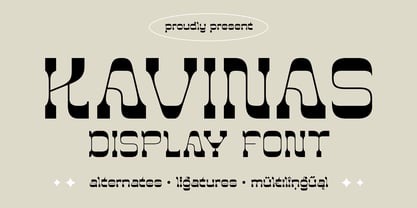 Kavinas is an unique display font that comes with alternates characters and ligatures characters. Kavinas will give you a wide range to create an attractive typographic design result for many different projects such as logo design, branding, poster, magazine, labels, merchandise, invitation, presentation, advertising, quotes and so much more! FEATURES: OpenType support Playfull to use (with ligatures and alternates options) Multilingual support PUA Encoded If you need support or more information about this item, please kindly contact me : ekahermawanputu@gmail.com Thank you so much.. I really hope you enjoy when using it!
 - Kathak by Ekahermawan,
$14.00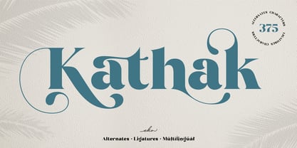 Please welcome Kathak. Kathak is a display serif font. Kathak is specially designed to make your typography design result looks more beautiful with tons of alternates and ligatures characters. Kathak is versatile font for many different projects such as logo, branding, poster, magazines, labels, merchandise, invitation, presentation, advertising, quotes and so much more! FEATURES: OpenType support Playfull to use (with ligatures and alternates options) Multilingual support PUA Encoded If you need support or more information about this item, please kindly contact me : ekahermawanputu@gmail.com Thank you so much.. I really hope you enjoy when using it!
 - Lilatia by Zaki Creative,
$10.00 Please welcome Lilatia. Lilatia is a display serif font. Lilatia is specially designed to make your typography design result looks more beautiful with tons of alternates and ligatures characters. Lilatia is versatile font for many different projects such as logo, branding, poster, magazines, labels, merchandise, invitation, presentation, advertising, quotes and so much more! FEATURES: TTF File Playfull to use (with ligatures and alternates options) Multilingual support PUA Encoded If you need support or more information about this item, please kindly contact me : zakicreative6@gmail.com Thank you so much.. I really hope you enjoy when using it!
 - Shallota by Ekahermawan,
$23.00 Shallota is stylish designed font for any display use with 9 weights from Thin to Black. Shallota also includes a bunch of alternate characters (PUA Encoded) and ligatures to give you a wide range for create an unique typographic design results. Shallota is versatile font for many different projects such as logo, branding, poster, magazines, labels, merchandise, invitation, presentation, advertising, quotes and so much more! FEATURES: * OpenType support * Playfull to use (with ligatures and alternates options) * Multilingual support * PUA Encoded If you need support or more information about this item please kindly contact me : ekahermawanputu@gmail.com Thank you so much.. I really hope you enjoy when using it!
 - Valjean by Solotype,
$19.95Here is a wood type from Tubbs & Co., about 1900. Its lack of decoration reflects the changes that were rapidly occurring in the design of printed pieces at the beginning of the 1900s. There were several similar types in metal in the first decade of the 20th century. - Theatrical Stencil JNL by Jeff Levine,
$29.00 A vintage hand-punched brass stencil for the Pasadena Playhouse spotted online was the basis for Theatrical Stencil JNL. Slight variations in the letter forms from other similar designs might not quickly be noticed, but there is always a charm in the hand-made look of any stenciled lettering.
 - FS Split Sans by Fontsmith,
$80.00 Quirky and irregular FS Split is no ordinary typeface. Its irregular proportions make it unique, with round letters appearing wide, and straight letters narrow. Other quirks include its eclectic crossbars – the uppercase ‘A’ has an unusually low bar, while the bar on ‘G’ is particularly long. The uppercase has many interesting features in fact, including large counters, closed terminals on certain letters like ‘J’, and a cap-height that lines up with ascenders. The lowercase also holds surprises – the dots on ‘i’ and ‘j’ are unusually large, and some characters, such as ‘g’, feature double-storey counters. An extreme but stylish italic The italic versions of FS Split Sans and Serif are particularly striking. While similar in style to their upright, Roman versions, they take on a larger-than-usual 18-degree angle, making the forward-slant more dramatic. Although the main purpose of any italic is to help words and phrases stand out, this unique execution helps to make the italic variants of FS Split stylish fonts in their own right – they would work brilliantly on magazine covers, in titles and headlines, pull quotes, and even used commercially in logos and corporate branding. Serif and sans: a split personality FS Split Sans and Serif have their differences but also their similarities, contrasting and complementing each other perfectly. This ‘love hate’ relationship inspired the name of the typeface family, and means the two variants provide a versatile, typographic palette for use in graphics and branding. While its proportions are similar to the sans, the serif has a bigger contrast between its weights of bold, regular and light, bracketed serifs, and different styles of terminals, some being straight and others ball-shaped. FS Split Sans has more subtlety and simplicity, with a smaller weight contrast, less flamboyant terminals, and more consistent counter sizes. The two variants are distinct yet alike, so can be used successfully either in isolation or together.
 - FS Split Serif by Fontsmith,
$80.00 Quirky and irregular FS Split is no ordinary typeface. Its irregular proportions make it unique, with round letters appearing wide, and straight letters narrow. Other quirks include its eclectic crossbars – the uppercase ‘A’ has an unusually low bar, while the bar on ‘G’ is particularly long. The uppercase has many interesting features in fact, including large counters, closed terminals on certain letters like ‘J’, and a cap-height that lines up with ascenders. The lowercase also holds surprises – the dots on ‘i’ and ‘j’ are unusually large, and some characters, such as ‘g’, feature double-storey counters. An extreme but stylish italic The italic versions of FS Split Sans and Serif are particularly striking. While similar in style to their upright, Roman versions, they take on a larger-than-usual 18-degree angle, making the forward-slant more dramatic. Although the main purpose of any italic is to help words and phrases stand out, this unique execution helps to make the italic variants of FS Split stylish fonts in their own right – they would work brilliantly on magazine covers, in titles and headlines, pull quotes, and even used commercially in logos and corporate branding. Serif and sans: a split personality FS Split Sans and Serif have their differences but also their similarities, contrasting and complementing each other perfectly. This ‘love hate’ relationship inspired the name of the typeface family, and means the two variants provide a versatile, typographic palette for use in graphics and branding. While its proportions are similar to the sans, the serif has a bigger contrast between its weights of bold, regular and light, bracketed serifs, and different styles of terminals, some being straight and others ball-shaped. FS Split Sans has more subtlety and simplicity, with a smaller weight contrast, less flamboyant terminals, and more consistent counter sizes. The two variants are distinct yet alike, so can be used successfully either in isolation or together.
 - Gothic 13 by Linotype,
$29.99Gothic 13 is a bold condensed sans serif typeface. Originally designed in small sizes, Gothic 13 is very similar to Modern Gothic Condensed, which was a turn-of-the-20th-century modernization of a popular nineteenth century style. Until Linotype integrated it into their technology, it did not exist in sizes larger than 24 point. The design used for digitization was the 18-point. Gothic 13 is ideal for display work, especially where space is at a premium. - Horndon by ITC,
$29.99Horndon is a decorative revival of late art nouveau style typefaces. The robust, high waist forms of these letters lend a unique, early 20th Century feeling of optimism to text designed with them. The letterforms themselves have adapted a three dimensional appearance: they each sport an individual drop shadow. Horndon is an all caps typeface, which was originally designed in 1984 by Martin Wait for Letraset. A similar art nouveau typeface, Galadriel, is also available from Linotype." - Last Tango JNL by Jeff Levine,
$29.00 The hand lettered title found on the 1924 sheet music for the tango “Sentimiento Gaucho” (“Sentimental Gaucho”) offered a different take on the thick-and-thin lettering that permeated the late 1920s through the Art Deco age. A ‘slash’ or ‘swipe’ is cut through the characters (similar to “Directa JNL” – another take on this type of design). Last Tango JNL is the digital recreation of this novelty lettering and is available in both regular and oblique versions.
 - Somatype by ArtyType,
$29.00 As with any attempt at a new typeface, you want to create something different. A difficult task as most legible fonts are based on something previous. Somatype isn't actually based on any particular font but it has unavoidable similarities to others. The important difference here being the distinctive quirk of the connection points going opposite to the norm; exemplified best by the lower case d & e. Once devised, the unique characteristic was applied wherever possible, keeping the rest of the characters in a sympathetic, rounded style. I first designed this in the light weight version, seeing it working best as a large open display font for magazines etc. but realized it would be too light for body copy at small scale, so, medium and bold weights were created to resolve that issue. Incidentally, the word ‘somatype’ literally means body-type.
 - Vodka by Fenotype,
$19.00 Vodka - a display pack with an edge. Vodka is a display combo pack of four styles and six fonts. Vodka fonts are clean but soft. Vodka's core is two weights of a Brush Script and a Monoline Script with similar characters. Vodka Sans is a bold sans with very soft features. Vodka Sans lowercase letters are a bit condensed version of uppercase. Vodka Slab is a rounded bold display type. Vodka Brush and Pen are equipped with automatic Contextual Alternates and Standard Ligatures that help to keep the flow smooth. For more expressive letters there’s Swash Alternates for every standard letter. Vodka fonts are designed to play together but can easily be used as themselves too. For the best price purchase the whole pack!
 - Basile by Tipo,
$85.00 Basile is the conclusion of a process that began with the learning of italic handwriting in a roballos-Naab studio course. In this workshop I developed a variation of chancery handwriting which had a more pronounced wider than its historical model. While making the digitalization, the forms were modified to obtain a similar spirit to the one in the handwriting, but thinking about the text in small sizes. Also incorporating three sets of forms enlarged the family: italic, swash and extra swash. And the addition of initials and terminals sets.
 - Linotype Fehrle Display by Linotype,
$29.99Erich Fehrle designed this robust alphabet for headlines and titles in 1976. The constructed figures of Linotype Fehrle Display were built on the geometric form of the rectangle. Lines of text look closed and compact. The letter forms are the result of fine open spaces. Design-specific characteristics of Linotype Fehrle Display are its serif-like additions to the strokes of the figures a, c, G or M, and the alternating rounded and angular outlines of the figures a, e, s and others. Typefaces similar to Linotype Fehrle Display: Bigband, Frutiger 95. - Monumental Gothic by Scriptorium,
$18.00For Monumental Gothic, we delved into the archives and found some old rubbings and photos of monumental brasses from British tombs of the 12th and 13th centuries. The sources included famous monuments like the tomb of Richard II and less well known inscriptions with similar style lettering. The rubbings were made by Dave Nalle in the 1970s (when they still let you have access to the the brasses). Monumental Gothic includes some alternate characters, plus upper and lower case characters, numbers and a selection of very interesting decorative emblems to complement the text. - Kopitha by Ekahermawan,
$15.00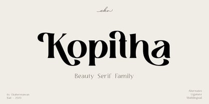 Kopitha is a beauty serif family with 5 weights from Light to ExtraBold. Kopitha also includes alternate characters (PUA Encoded) and ligatures to give you a wide range for create an unique typographic design results. Kopitha is suitable font for many different projects such as logo, branding, poster, magazines, label, merchandise, invitation, presentation, advertising, quotes and so much more! FEATURES: OpenType support Playfull to use (with ligatures and alternates options) Multilingual support PUA Encoded If you need support or more information about this item please kindly contact me : ekahermawanputu@gmail.com Thank you so much I really hope you enjoy when using it!
 - Frastha by Ekahermawan,
$20.00 Frastha font is unique and beauty display family with 7 weights from Thin to Bold. Frastha also includes a bunch of alternate characters (PUA Encoded) and ligatures to give you a wide range for create an excellent typographic design results for many different projects such as logo, branding, poster, magazines, labels, merchandise, invitation, presentation, advertising, quotes and so much more! FEATURES: OpenType support Playfull to use (with ligatures and alternates options) Multilingual support PUA Encoded If you need support or more information about this item please kindly contact me : ekahermawanputu@gmail.com Thank you so much.. I really hope you enjoy when using it!
 - Tecnica by Graviton,
$20.00 Tecnica font family has been designed for Graviton Font Foundry by Pablo Balcells. It is a modular, geometric, sans serif typeface with a slightly condensed design and subtle rounded angles. It has been conceived to be most suitable for all sized headlines, as well as short and middle length text blocks. The standard styles give texts a classic appearence while alternate styles give texts a playfull one. Tecnica consists of 4 styles, 2 weights plus alternates, each containing small caps and glyph coverage for several languages.
 - HGB Bacco by HGB fonts,
$23.00 Since 2005, I have repeatedly attempted to create a neutral-looking grotesque with a humanistic character. I wanted a pleasant, soft typeface. The typeface should appear similar to Helvetica or Univers, but with more open shapes and therefore better readability. The features are deliberately reserved with 4 gradations plus italics. The onum feature for Old Style Figures contains additional alternative letters such as a looped g. The italics have a swash feature with some decorative shapes. As a sans serif, HGB Bacco does not appear to be technically constructed, but has a friendly, open character and is also suitable for longer texts.
 - Roadie PB by Pink Broccoli,
$16.00 Roadie was inspired by a 1981 Hallmark card with lettering that was full of frolicking fun. Filled with a childish persona and a playful bounce, this Roadie has a lot to offer. As with some of my previous type designs, it is a typographic dance, wonderfully skipping across designs, surprising with each letter typed. With an extensive character set, and clean sharpie marker-like look, Roadie is a joy to typeset with, and it comes with a stylistic alternates feature that shuffles the Capitals and lowercase that share similar unicase forms that add to the quirky playfulness.
 - Ekeras by Type Innovations,
$39.00 Ekeras is an original design by Alex Kaczun. It is a display font not intended for text use. It was designed specifically for display headlines, logotype, branding and similar applications. Primarily a display, this extremely versatile font has generous proportions, large counters and loose fitting which also allow the font to work well across a wide range of text sizes. The entire font has an original look which is strong, dynamic, machine generated and can be widely used in publications and advertising. Ekeras is a futuristic, techno-looking and dynamic typeface with an appearance of machined-like parts with sharp and rounded edges. The large Pro font character set supports most Central European and many Eastern European languages.
 - Simplified by Redy Studio,
$19.00 Simplified – Casual Chic Font Simplified is a casual and natural font, with a spirit of clean-cut modern and classic. This typeface has been specially designed to give a feeling of casual luxury. This is not easy typography! We have done a lot of effort to build this font. In the past, we have experimented with a ton of fonts that are similar to Simplified, and Simplified is better in every aspect that I have found, including some OpenType features and ligatures, lowercase beginning & ending swashes that you can use to make your own style. In short, it’s a typeface that you must have! Simplified features: A full set of upper & lowercase characters Numbers & punctuation 63 Gorgeous ligatures Lowercase beginning swashes Lowercase ending swashes Multilingual symbols PUA Encoded Characters – Fully accessible without additional design software. Feel free to give me a message if you have a problem or question. Thank you so much for taking the time to look at one of our products.
 - Apocalyptic by Artisticandunique,
$9.00 Apocalyptic - Sans Serif Font Family - Multilingual - 24 Style (2022) Apocalyptic - Sans serif font family is a futuristic-modern font. The emotional integrity it creates due to its structure is suitable for use in technology, science, space and similar subject contents.Apocalyptic - sans serif font family, from Thin to Heavy, offers a full range of expression for interfaces and corporate design; in multiple languages, from print to screen media.It offers rich solutions to your creative projects with its alternative versions.You can easily use the sans serif font feature in many areas.You can create your text with normal characters and highlight Heavy characters and titles. It is functional in many sizes and environments that you can use as a main actor in strong headlines. If you are looking for a font with these features, Apocalyptic sans serif font family may meet your needs. With this font you can create your unique designs. If you have a question, please contact me. Have a good time.
 - Mellony by Alit Design,
$12.00 Introducing Mellony brush script font which has a elegant hand lettering brush style. So it looks naturally handmade, the Mellony family is unique because it has more choice of characters, like a swash, end characters and many more. This font is best used for your design project that has the concept of fun, girly, romantic and elegant. Can also be applied to the design of a logotype, header website, wedding logo, romantic design, make some lettering a quote, t-shirt design etc. Mellony family font has two font styles that are similar but a different character, namely Mellony regular and Mellony dry brush. The Mellony family deserve to be one of your fonts collections, because it is unique, elegant and has many options of alternative glyphs for your fresh designs. Thank you and enjoy :)
 - Newcastle by FaceType,
$9.00 Newcastle gives you great opportunities for spicy typography. If you find some similarities to one of our fonts, ‘Blitzplakat’, you are right. We took it to the next level and made it even better: We extended the range of letters, added optional catchwords, extra shapes, shadows, dust and arrows. Here is a lead to get the most out of Newcastle: Use ‘Discretionary Ligatures’ in the OpenType section of your layout program of choice to turn frequent short words like ‘and’, ‘of’ or ‘from’ into catchwords. Choose ‘Styleformat 01’ to make them vertical. Keep ‘Contextual Alternates’ activated to make consecutive letters look more realistic (the second letter will be replaced automatically by a slightly different looking version). Want to roughen the look of your design even more? Add the dust hidden in the ‘Extras’ style by typing underscore, emdash, endash or hyphen. This font is vintage fun - let’s party!
 - Cornfield JNL by Jeff Levine,
$29.00Cornfield JNL was inspired by lettering found on a 1950s box of popcorn. The unusual character shapes add a nostalgic, folksy charm from the Heartland or a slightly Western feel to projects reflecting simpler times. - Janda Rosalie - Personal use only

- Coming Home - Personal use only

- Just Realize - Personal use only

- Wofferine by Sipanji21,
$8.00 Wofferine is a Serif Handwritten Font with Playfull touch. it offers support of English Language. Standard punctuation glyphs are included and multilingual support also. Great for crafters and graphics artist alike. Compatible with all opration system. its playfulness make it great for creative projects, be inspirational wall posters, logo, brand etc.
 - Scripta Pro by John Moore Type Foundry,
$54.00 Scripta is a family of typefaces that leads "Scripta Pro", a commercial script writing similar to those used in ads advertising the decades 40 and 50, with fine lettering combinations of that time, Scripta Pro is ideal for composing headlines and subheads and this is supplied in two weights. This system is complemented by a Roman Sans "Scripta Gothic" an artdeco style typeface to harmonize with the style of that fonts. To add style to set fonts, created "Scripta Icons", one dingbats font based on a series of graphs that help recreate the ornamental fantasies of a postwar generation, a society in transition between the classical world and ornament and promises of a cosmic and atomic world. For those wishing to use words made was created "Scripta Catchwords". "Scripta Pro" is a script typeface inspired by the style works of the american typeface designer LH Copeland.
 - Lumios Marker by My Creative Land,
$29.99 Lumios is a freehand casual marker script that was created using Pilot Sign Pen. It has both extended Latin and basic Cyrillic support that is enhanced with oodles of ligatures (latin as well as cyrillic) and alternates. As a compliment to the script I also created Lumios Design Elements font that can be useful in brand design, greeting cards design etc. Both fonts were carefully traced by hand and have clean edges, hence they are safe to use in all graphic design software (including but not limited to Adobe Suite, Silhouette and Cricut Design, Affinity Designer etc) as well as on websites. The script is fully unicode mapped. To use it in Silhouette and similar applications that do not support OpenType features (yet), you may need to use your default Mac/Windows software such as Font Book or Character Map to select alternates you need. Lumios Marker is a perfect companion to Lumios Typewriter, sharing the same soft curves and clean letter edges.
 - Fagelyne by Krafted,
$10.00 Looking for a modern and extravagant font that is easily memorable? In the sea of similar designs, something unconventional but tasteful will certainly put your brand on the map. Introducing Fagelyne - A Modern Elegant Font. Use this font for promotional material, ads, web pages, apps, clothing, printed material, and anything else you need to make your brand shine. What you’ll get: Multilingual & Ligature Support Full sets of Punctuation and Numerals Compatible with: Adobe Suite Microsoft Office KeyNote Pages Software Requirements: The fonts that you’ll receive in the pack are widely supported by most software. In order to get the full functionality of the selection of standard ligatures (custom created letters) in the script font, any software that can read OpenType fonts will work. We hope you enjoy this font and that it makes your branding sparkle! Feel free to reach out to us if you’d like more information or if you have any concerns.
 - Timesquare by Campotype,
$25.00 The initial idea of timesquare typeface inspired by Helvetica when presenting the board information on a subway escalator in Time Square, Manhattan, New York. This confirms strength the legend of Helvetica is not lost amid rampant nice fonts in the site. Therefore it should not appropriate that this timesquare fonts come to rival the greatness of Helvetica. Fonts timesquare thrive (since 2008 for self used) of the basic forms of Helvetica to timesquare born in different shapes and sizes. The greatest challenge during development timesquare is both shape similarity to Helvetica directly, as well as to other fonts inspired by Helvetica. Timesquare's main characteristics are the wide character, modern touch and individually, can work well on a wide variety of applications in books, brochures and magazines as well as applications in advertising. This typeface has been developed on the Latin character sets. Hopefully useful.
 - Dhaks by Ekahermawan,
$12.00 Introducing our unique display font that we call "Dhaks". Dhaks font has an unique shape on each character. Dhaks font comes with a bunch of alternates characters and ligatures characters that will give you a wide range to create a beautiful typographic design result for many different projects such as logo design, branding, poster, magazine, labels, merchandise, invitation, presentation, advertising, quotes and so much more! FEATURES: OpenType support Playfull to use (with ligatures and alternates options) Multilingual support PUA Encoded If you need support or more information about this item, please kindly contact me : ekahermawanputu@gmail.com Thank you so much I really hope you enjoy when using it!


