10,000 search results
(0.044 seconds)
- Screen Star JNL by Jeff Levine,
$29.00 The opening credits to the original (1937) version of “A Star is Born” starring Janet Gaynor and Frederic March was hand lettered in an Art Deco style with rounded terminals that emulated the look of neon signage – alluding to the glitz and glamour of 1930s Hollywood. Screen Star JNL is the digital revival of that lettering, and is available in both regular and oblique versions.
 - LineDrive by Ingrimayne Type,
$12.95 LineDrive was inspired by an obscure 19th century type design. It has no curved lines and what are normally circular elements in the lower-case letters are diamond-shaped. It might work best with only upper-case letters, which have a Victorian feel to them. In addition to the two weights of plain and bold, the family includes a shadowed version and an inline (or outlined) version.
 - Perigord by Scriptorium,
$18.00Perigord has mixed origins. It was inspired by Gutenberg’s capitals and by lettering developed by German designer Ernst Bentele, but its calligraphic antecedents go back to French initials of the Carolingian period. The result of this is a formal, attractive and antique look which we hope you'll like. The full version includes alternate forms for many of the letters, as well as numbers and punctuation. - Organic Cotton by Dan Cotton Lettering,
$12.00 Organic Cotton is a straightforward, friendly and highly legible typeface. The lettering is based on contemporary brush/pen lettering with a little fun and lushness added. It is solid, fluid and organic without being hippie-dippy or whimsical - not that I am opposed to those things. Organic Cotton is well suited for packaging and branding and it comes with a 69 alternates, 28 swashes, and 14 ornaments.
 - Vermandois by Magpie Paper Works,
$68.00 Rough yet refined, kinetic and distinctive, the handdrawn Vermandois family mimics original calligraphy with exceptional accuracy. Perfect for correspondence, invitations, unique branding and display, Vermandois' connecting letters, caps and ink blots make a mark. Vermandois regular includes contextual ligatures and double-letter ligatures, alternate caps, preposition & title word glyphs, old style numerals, international support, currencies and fractions. VermandExtra includes 52 coordinating strokes, splashes and splatters.
 - Silent Cinema JNL by Jeff Levine,
$29.00 “The Film Daily” issue for August 30, 1927 ran an ad for Tiffany Pictures in which all of the main text was hand lettered in a sans serif style displaying the beginnings of the Art Deco movement. With their rounded terminals, the characters were designed using a round nib lettering pen. Redrawn digitally as Silent Cinema JNL, it is now available in both regular and oblique versions.
 - BlinkHead by DePlictis Types,
$26.00 BlinkHead is a powerfull block typeface inspired by industrial revolution and machineries. It comes in three styles for the moment with possibility to be added more later. It has a dynamic, curved letter ending that makes it perfect for some modern logo designs purpose and even powerful headlines. The folded style comes as an option to change some letters in plain text for more dynamic appeal.
 - Template Shadow by Jeff Levine,
$29.00 A series of lettering guides called “Mimeostyle” for the A. B. Dick Company of Chicago (produced for use in making mimeograph machine printing stencils) were custom manufactured by the Wright-Regan Instrument Company (Wrico). One design featured a sans serif letter produced in Shadow relief, with a touch of Art Deco flair. This is now available as Template Shadow JNL, in both regular and oblique versions.
 - Rail Travel JNL by Jeff Levine,
$29.00 Here’s yet another interpretation of the classic “thick and thin” sans serif lettering most popular during the Art Deco era. This particular design comes to you through the courtesy of a hand lettered 1930s travel poster from the Pennsylvania Railroad. Some capitals are much wider than others, while the lower case ‘i’ is somewhat truncated. Rail Travel JNL is available in both regular and oblique versions.
 - Maccaroni by URW Type Foundry,
$39.99 David Kowalski’s typeface Maccaroni is based on a logo type and has been designed to a complete typeface in Prof. Veljovic’s Type Design course at HAW Hamburg. Maccaroni breaks the traditional brush scripts and offers a unique design. Each letter is present in triplicate in order to achieve the illusion of a hand-written typeface. The OpenType programming ensures that two identical letters won’t follow each other.
 - Marry Gold by Inumocca,
$16.00 MARRY GOLD is A Retro Display Typeface, Come from 70s Style. The Typeface comes with Stylistic Set and Ligature Combinations Exellent typeface to use for covering your Project, like Branding, Movie Title, Headline Letter, Bookcover or Book Content, Magazine cover, Poster, Quotes Lettering, Logos, and more your project design. - Unique glyphs - Multilingual Characters Support - UPPERCASE - Lowercase - Numeric - Symbol - Punctuation Character - Ligature - Stylistic Set (ss01 - ss06) inumocca type
 - Rusulica by Type Fleet,
$12.00 Rusulica pure luxury Rusulica script is designed to express handwriting in a modern and glamorous fashion. Its letter construction is pure and fluid. Because of its ornamental and playful design, it offers plenty of possibilities. Rusulica has a high contrast and there is an alternate for almost every capital letter. The typeface’s x-height is bigger than usual and it is constructed at a 30° angle.
 - Arts And Crafts Hand BA by Bannigan Artworks,
$19.95This is an original typeface designed in the Arts And Crafts style. It is similar to Arts And Crafts GS, but with a more organic hand lettering style true to the Arts and Crafts movement. It is loosely inspired by the decorative lettering of Jessie Marion King, and the Scottish style of Charles Rennie Mackintosh of the Glasgow School, from which Jessie received her training. - Flipboard JNL by Jeff Levine,
$29.00 You've seen them all around -- on alarm clocks, tote boards, scoreboards and in many other venues we take for granted in our daily lives -- displays with letters and numbers that flip down to reveal other letters or numbers. Flipboard JNL is a digital recreation of these mechanical sign displays. There is a limited character set, and a blank panel is located on the equal sign keystroke.
 - Schreibmeister by RMU,
$30.00 Schreibmeister is my interpretation of Arno Drescher’s design for Ludwig Wagner, Leipzig, completed in 1958. The letters X and x were improved as well as some ligatures. The letter E has an alternative, and the small d comes with two alternatives, of which one form can be reached by typing the partial different key. Generally it is recommended to activate both Standard and Discretionary ligatures.
 - Quickbrush by Trial by Cupcakes,
$29.00 Like its cousin Quickpen, Quickbrush is an unfussy, confidently jotted script, with lots of rich texture to recreate the skips and jumps that appear in brush pen lettering. Contextual alternates for lowercase letters mimic starting and ending marks, to make each word look truly written by hand. It’s a typeface you’ll reach for again and again, for any project that needs a casual, handwritten touch.
 - Shattered Dreams JNL by Jeff Levine,
$29.00 Another filter effect version of Adhesive Serif Letters JNL (of which the original design was modeled after some vintage gummed letters used for signage) and is called Shattered Dreams JNL. This variant has jagged edges all around and is kind of reminiscent of shapes you could make with a small magnet and iron filings. Shattered Dreams JNL is available in both regular and oblique versions.
 - Sentiment JNL by Jeff Levine,
$29.00 From the 1917 sheet music for "The World Has Been So Mean to Me" comes a wonderfully hand lettered chamfered sans with varying widths and character shapes, now released digitally as Sentiment JNL in both regular and oblique versions. This informal bit of lettering retains the stylish elements of the Art Nouveau period without the extreme eccentricities found in some typographic designs of the period.
 - Deco Roundpoint JNL by Jeff Levine,
$29.00 On the sheet music cover of the 1931 song "When the Autumn Leaves of Life Begin to Fall", the title is hand-lettered using a round tipped nib pen. The combination of both an Art Deco lettering style and the rounded ends of the characters creates an exquisite, yet simple type design digitally preserved as Deco Roundpoint JNL; available in both regular and oblique versions.
 - Bolt Display by SilverStag,
$19.00 Introducing Bolt Display – picture this: uppercase letters with rounded corners, inviting you in with a warm, approachable embrace. Or, if you're feeling adventurous, the outlined uppercase stylistic set that adds that contemporary edge to your work. On the flip side, lowercase letters with sharp corners confidently declare their presence, while the lowercase outlined stylistic set strikes the perfect balance between structure and artistic freedom.
 - Ratyin by Kavoon,
$14.00 Oxygen Script made with a transparent line texture. Suitable for use in title design such as invitations, signboards, book titles, stationery designs, quotes, branding, logos, greeting cards, packaging designs, posters, and more. Files Include: Punctuation & numbers Splashes Splatters Alternate letters Uppercase letters Multi Language Supported Languages - French, Spanish, English, Catalan, Galician, Basque, Portuguese, Italian, Albanian, Afrikaans, Dutch, German, Danish, Swedish, Norwegian, Finnish, Faroese, Icelandic, Irish and Scottish.
 - Komunidad Hebrew Script by Jonahfonts,
$42.00 Komunidad is the Hebrew version of ”Quintana Light”. Suitable for logos and packaging statements. Invoking the OpenType / CONTEXTUAL variant produces the word terminals for all lower-case letterforms as well as diacritic letters. Final Hebrew Glyphs are also added. This can be done individually for each letter as well. Komunidad also contain alternative Swashes and TabOldstyle numerals. (OpenType-Variants may only be accessible via OpenType-aware applications.)
 - Anarckhie by Ingrimayne Type,
$12.95 Anarckhie is a decorative slab-serifed typeface with a calligraphic origin. The horizontal elements of the upper-case letters are below their midpoint, and the x-height of the lower-case letters is unusually small. There is some variation in the weights of the horizontal, vertical, and diagonal elements. The small x-height makes this typeface appear smaller than its point size would indicate.
 - Amalta by Infonta,
$30.00 Amalta is a Display typeface with calligraphic background. It inherits weight and letter constructions from the original brush lettering. Amalta's Latin and Cyrillic sets were designed simultaneously with an equal attention to details and overall pattern. They both include initial and final swash forms which can be used by a typographer's choice. Amalta is suitable for large sized typesetting: headlines, few-line texts, etc.
 - CCS Neue Rinjani by Creative Corner Studio,
$29.00 Neue Rinjani is a all-caps sans serif with Wide Stretch contemporary typographic, vintage futuristic art-deco touch Streamline influence of the 1930s and 1940s. A mix from the old Euro-American signage/advertising letters and modern clean sans serif, carefully mousecrafted to bring you the genuine feel of the era. If you're into classic/vintage letter designs, then this typeface suits best for you.
 - Piano Music JNL by Jeff Levine,
$29.00 A 1910 collection of piano sheet music called “Presser’s Economy Group” had that name hand lettered in a fancy serif lettering style that could fall somewhere between Art Nouveau and semi-calligraphic. No matter the label you attach to the style, it makes for a wonderful digital type revival. The end result is Piano Music JNL, which is available in both regular and oblique versions.
 - Nationale by Greater Albion Typefounders,
$15.00 Nationale is inspired by the lettering of early 20th century share certificates and bonds. It includes a complete set of stylistic alternates for all letter forms, and two sizes of numerals. National speaks of the steam age, and the age of traditional design and engineering, when aesthetic concerns mattered just as much as function. Bring a touch of the elegant past to your work with Nationale.
 - French Pastry JNL by Jeff Levine,
$29.00 A little ditty from France circa the 1940s called "J'ai Rêvé Dans Tes Bras" (which loosely translated means "I've Dreamed in Your Arms") offered up its title hand lettered in an interesting Art Deco sans. This formed the basis for French Pastry JNL, a tasty typographical tidbit further preserving the wide choice of lettering styles hand-crafted for popular sheet music of past decades.
 - Quesky by CBRTEXT Studio,
$12.00 Quesky is a classy Handwritten Script in a casual and distinctive style that is perfect for your branding design, and will also be very beautiful in your wedding invitations and business cards and especially for your brand logo. Quesky has beautiful uppercase and lowercase letters, numbers, and very realistic binding standards. Quesky also has several alternative letters that can make your project look modern, luxurious and classy.
 - Prismatiq JNL by Jeff Levine,
$29.00Prismatiq JNL was modeled from lettering found in a French alphabet book from the turn of the last century - the type sample appearing online at an image sharing site. All of the imperfections of hand-lettering were left intact. This is a limited character set comprising A-Z, 1-0, basic punctuation, forward slash and dollar and cents signs, and is best used in large headline applications. - Janda Stylish Script by Kimberly Geswein,
$5.00 I love the trends in handwritten calligraphy and wanted to play with playful lettering. I've heard from many of my customers that they don't use Open Type software and feel limited in the cool features of OT scripts because of this, so I've replaced the | (bar key) with a left-sided tail to start the lowercase r and s in words that begin with those letters.
 - San Louis by Inumocca,
$25.00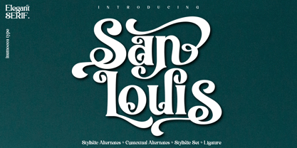 San Louis is an Elegant Serif typeface , Modern , Classy and Glamour Worlds. Awesome Stylictic Set, Beautiful Ligature and unique contecttual alternates, stylistic alternates. Really playful typeface to covering your Project, like Lettering, Website Interface, Magazine, Branding, Poster, wedding invitations, Quotes Lettering, Logos, and more your project design. - Unique glyphs - Multilingual Characters - UPPERCASE - Lowercase - Numeric - Symbol - Punctuation Character - Ligature - Contextual Alternates - Stylistic Alternates - SS01, SS02, SS03, SS04
 - SugarBoo by Inumocca,
$20.00 SugarBoo is A Reverse-Contrast letterform , Modern look, Fresh, eyecatching, strong character and power full. The Typeface comes with Stylistic Set Combinations Exellent typeface to use for covering your Project, like Branding, Movie Title, Headline Letter, Bookcover or Book Content, Magazine cover, Poster, Quotes Lettering, Logos, and more your project design. - Unique glyphs - Multilingual Characters Support - UPPERCASE - Lowercase - Numeric - Symbol - Punctuation Character - Stylistic Set inumocca type Studio
 - Outscript by outdesign,
$9.00 Outscript is a "groovy script font" which has alternative to already ones. The most popular of this category has a disrepute for commercial uses. Outscript is a better way to use for amusing commercial purposes or just fun.
 - Bali Script by Eclectotype,
$40.00 Inspired by the Indonesian island’s laid back feel and easy going culture, Bali Script is a tribute to the hand-lettered signage on beach bars, surf shacks and cafes. The swell of the stroke endings and the bolder-than-your-average gooey look convey a cool, contemporary take on baseball scripts. Overlay Bali Script Highlight for a cartoonish, glossy finish. Perfect for logos. This font is jam-packed with OpenType features that make smooth flowing text a doddle. Contextual alternates and ligatures are best left on by default. The alternates especially work a subtle magic that helps letters connect with an even rhythm, and automatically substitutes letters with the best fit alternatives based on their context, such as at the end of words, or adjacent to certain other letters. There are four stylistic sets (or all grouped together in the stylistic alternates feature for those without easy access to them) which do the following: SS01 - changes the r to a script form SS02 - makes certain caps more ‘scripty’ SS03 - capital I (and accented versions of it) get serifs SS04 - underline function. typing two or more underscores extends on underline beneath the previous word. Also included for your pleasure - oldstyle figures, automatic fractions, superior and inferior numbers, ordinals, some discretionary ligatures, swash alternates and extended language support.
 - Wakerobin by Monotype,
$50.99 Wakerobin takes its charming swagger from the hand-painted billboard, poster and signage lettering of the mid-19th century. These showy styles did everything they could to stand out from the background cacophony of advertising, with signwriters using sharp and high contrast serif letters, squared block shapes, or art nouveau forms to grab the attention of passersby. Wakerobin embraces the spirit of these letterforms, bringing these various styles together in one typeface - as if users had their own sign painter on hand. Just as lettering artists had to adapt to a variety of sizes - from wide streetcar lettering to compressed forms that squeezed into narrow Victorian windows - the variable version of Wakerobin scales up and down in width to fit whatever environment the user’s working in. The static fonts come in three widths and five weights. As well as its adaptability, Wakerobin is bursting with vintage flavour, making it hard to ignore. Its distinctive, spiky serifs would be right at home on food and drinks packaging, as well as shop windows, adverts, and any other place that calls for some typographic showmanship. It performs particularly well in busy environments, or anywhere with a lot of visual noise - just as its historic predecessors did. And while Wakerobin is first and foremost a display typeface, it’s surprisingly elegant when used at text size, or in the lighter end of the weight spectrum.
 - Stat Display Pro by Jure Kožuh,
$45.00 www.Stat-Type.com Complementary Type Family Stat Text Pro Stat Display Pro is an information design sans serif type family legible in circumstances of low visibility. Its large character set with multiple weights is defined by optimal size ratio, distinctive letter shapes, wide aperture and balanced counters. Stat Display Pro remains legible in unfavorable circumstances of distance, size, movement and similar. It contains nearly 700 glyphs, including diacritics, ligatures, small caps, old–style figures, arrows and more. This enables it to achieve wide language support. It consists of four main (Light, Regular, Medium, Bold) and four secondary, negative weights (Light Negative, Regular Negative, Medium Negative, Bold Negative) which are accompanied by their corresponding obliques. Stat Display Pro type family has higher than average x height (72% of cap height) which is accompanied by matching ascender and descender size ratios. With its distinctive letter shape detail it minimizes the possibility of letter shape confusion, while optimizing legibility with wide aperture and balanced counters. Its main intended use is information design, where it, with its characteristics, meets the requirements of wayfinding, infographics, table setting and much, much more. The development of the type family was based on research in legibility to achieve highly legible letter shapes, while not diminishing their visual character. A detailed description of Stat Pro type family is available at Stat-Type.com where a DEMO font can be downloaded.
 - Eveningnews by Wiescher Design,
$39.50 Since many years I live in Munich and read the daily newspaper Abendzeitung. One morning they had redesigned the paper, using Eric Gill's Joanna for the body copy and a tweaked version of Franklin Gothic for the headlines. Since both typefaces are my all-time favorites, I was very pleased. The old hand-lettered title lettering designed by in-house designer Ernst Friedrich Adler around 1947 or 48 was untouched as it always was. Adler had worked for the newspaper an incredible 47 years! Ernst Friedrich Adler celebrated his 100th birthday in the summer of 2007 looking very healthy. But someone had adapted his title lettering for use in the chapter headings, and I did not like the way that was done. Every morning I saw those letters and thought "one day I have to clean that up". About 15 years later I finally did it! Being at it, I designed the whole typeface and added a second fancy cut. And, what do you know, the people at the Abendzeitung called me up and said they liked what I did and started using it. So since that day in 2005 I can read my morning paper without having to wonder about the chapter headings. Well maybe one day they will do another redesign and maybe they will use another one of my fonts. Your editorial typeface designer, Gert
 - PR Vanaheim by PR Fonts,
$10.00 This is a perfect font for historical or fantasy titles. It is influenced by ancient Nordic runes. the strokes flare slightly, to a concave terminal for a finely carved appearance. There are two sets of capitals in PR-Vanaheim-DC (Dual Capitals); one set of narrow letters, more closely related to Runic forms, and one set which includes wider and circular letters, which can be freely combined with the narrow letters for the variety associated with hand lettering. There is one version with dots placed in the centre of large counters and one version without the dots. The broad caps character set includes characters which allow for tight spacing; a dropped L, and a tall T. There are also two different lowercase sets, one modern, and one archaic, all of which can be freely mixed to fine tune the appearance of your text. Here is the brief description of the available faces: PR-Vanaheim-Med-DC-01 Duplex Caps PR-Vanaheim-Med-DC-02 Duplex Caps, Dotted counters and dot space PR-Vanaheim-Med-DC-03 Duplex Caps, Dotted counters PR-Vanaheim-Med-LC-04 Broad Caps, with modern style lower case. PR-Vanaheim-Med-LC-05 Narrow Caps, with modern style lower case. PR-Vanaheim-Med-LC-06 Broad Caps, with archaic lower case. PR-Vanaheim-Med-LC-07 Narrow Caps, with archaic lower case.
 - Wakerobin Variable by Monotype,
$209.99Wakerobin takes its charming swagger from the hand-painted billboard, poster and signage lettering of the mid-19th century. These showy styles did everything they could to stand out from the background cacophony of advertising, with signwriters using sharp and high contrast serif letters, squared block shapes, or art nouveau forms to grab the attention of passersby. Wakerobin embraces the spirit of these letterforms, bringing these various styles together in one typeface - as if users had their own sign painter on hand. Just as lettering artists had to adapt to a variety of sizes - from wide streetcar lettering to compressed forms that squeezed into narrow Victorian windows - the variable version of Wakerobin scales up and down in width to fit whatever environment the user’s working in. The static fonts come in three widths and five weights. As well as its adaptability, Wakerobin is bursting with vintage flavour, making it hard to ignore. Its distinctive, spiky serifs would be right at home on food and drinks packaging, as well as shop windows, adverts, and any other place that calls for some typographic showmanship. It performs particularly well in busy environments, or anywhere with a lot of visual noise - just as its historic predecessors did. And while Wakerobin is first and foremost a display typeface, it’s surprisingly elegant when used at text size, or in the lighter end of the weight spectrum.