10,000 search results
(0.187 seconds)
- Wiltona Brush by Stripes Studio,
$20.00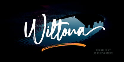 Hi, Introducing the latest styles Wiltona Brush with the kind of modern hand scratches, I hope you are interested in this font, if you want to use for your work this font can be used easily and simply because there are a lot of features in it to contain a complete set of letters lower and uppercase letters, assorted punctuation, numbers, and multilingual support. font also contains several ligatures and alternate style Stylistic.
 - Bring Love by Stripes Studio,
$20.00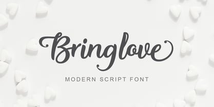 Hi, Introducing the latest styles Bring love with the kind of modern hand scratches, I hope you are interested in this font, if you want to use for your work this font can be used easily and simply because there are a lot of features in it to contain a complete set of letters lower and uppercase letters, assorted punctuation, numbers, and multilingual support. font also contains several ligatures and alternate style Stylistic.
 - Bostary Brush by Stripes Studio,
$20.00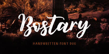 Hi, Introducing the latest styles Bostary Brush with the kind of modern hand scratches, I hope you are interested in this font, if you want to use for your work this font can be used easily and simply because there are a lot of features in it to contain a complete set of letters lower and uppercase letters, assorted punctuation, numbers, and multilingual support. font also contains several ligatures and alternate style Stylistic.
 - Kelysia Brush by Stripes Studio,
$20.00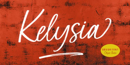 Hi, Introducing the latest styles Kelysia Brush with the kind of modern hand scratches, I hope you are interested in this font, if you want to use for your work this font can be used easily and simply because there are a lot of features in it to contain a complete set of letters lower and uppercase letters, assorted punctuation, numbers, and multilingual support. font also contains several ligatures and alternate style Stylistic.
 - Muscat Syrup by Larin Type Co,
$18.00 Muscat Syrup this amazing handwritten font is light and elegant, will emphasize your personality in any project and will charm you with its signature. This font includes alternates for Uppercase and Lowercase, also a lot ligatures for lower case make your signature with them. You can use it to create logos, branding, t-shirts, book covers, stationery, marketing, blogs, magazines, cosmetics, signage, and more. This font is easy to use has OpenType features.
 - Molynia Script by Stripes Studio,
$20.00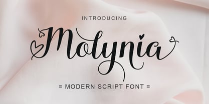 Hi, Introducing the latest styles Molynia Script with the kind of modern hand scratches, I hope you are interested in this font, if you want to use for your work this font can be used easily and simply because there are a lot of features in it to contain a complete set of letters lower and uppercase letters, assorted punctuation, numbers, and multilingual support. font also contains several ligatures and alternate style Stylistic.
 - Materhorn NF by Nick's Fonts,
$10.00This is a new and improved version of an old freeware font named Materhorn, hased on a design originally called Fanfare, designed by Louis Oppenheim in 1927 for H Berthold AG. The outlines have been completely redrawn, the entire font has been thoughtfully hand-kerned, and OpenType features have been added. Additionally, the font contains not only the complete Latin language character set (Unicode 1252) plus also support for Central European (Unicode 1250) languages - JollyGood Sans by Letradora,
$18.00 Finally, a serious alternative to that other comic font. After years of mocking the font that shall not be named, I decided to create an alternative. I wanted to keep the fun feel and the comic book roots, but have a more polished look. The result? JollyGood, a complete font family, with great language support, a big range of weights and styles, and a friendly look. Check out the other members of the JollyGood family
 - Coreta by Wasabib Type Foundry,
$13.00 Coreta is an elegant serif font that combines classic charm with modern flexibility. With its smooth curves, this font creates stunning visual harmony. Perfect for a variety of projects, from wedding invitations to corporate designs. Thoughtful letter proportions ensure optimal readability at any size. Coreta is not just a font, it's an impressive statement of art. With its unique capabilities, it elevates the appeal of every design with a versatile touch of elegance.
 - Masky by Graphicxell,
$19.00 Masky is a unique and very elegant font for branding and logo designs Elegant serif typeface combined with a classy and modern style. This type of font is very suitable for your various needs such as branding projects, logos, wedding designs, social media posts, advertisements, product packaging, product designs, labels, photography, watermarks, invitations, stationery, and any project, created with high level of readability. you will not be disappointed if you buy this font!!
 - Bortane Brush by Stripes Studio,
$20.00 Hi, Introducing the latest styles Bortane Brush with the kind of modern hand scratches, I hope you are interested in this font, if you want to use for your work this font can be used easily and simply because there are a lot of features in it to contain a complete set of letters lower and uppercase letters, assorted punctuation, numbers, and multilingual support. font also contains several ligatures and alternate style Stylistic.
 - Chelson Brush by Stripes Studio,
$20.00 Hi, Introducing the latest styles Chelson Brush with the kind of modern hand scratches, I hope you are interested in this font, if you want to use for your work this font can be used easily and simply because there are a lot of features in it to contain a complete set of letters lower and uppercase letters, assorted punctuation, numbers, and multilingual support. font also contains several ligatures and alternate style Stylistic.
 - Cavilay Script by Putracetol,
$24.00 Cavilay Script is a beautiful script and wedding font. This font is feminime, elegant, messy and modern. Cavilay Script perfect for wedding event, anniversary, birthday,greeting cards, logotype, branding, wedding invite and card, elegant logo, poster, packaging, stationery, website, and any other projects requiring a handwritten and luxurious touch. Come with open type feature with a lot of alternates, its help you to make great lettering. This font is also support multi language.
 - Hello Yasmin by Stripes Studio,
$20.00 Hi, Introducing the latest styles Hello Yasmin with the kind of modern hand scratches, I hope you are interested in this font, if you want to use for your work this font can be used easily and simply because there are a lot of features in it to contain a complete set of letters lower and uppercase letters, assorted punctuation, numbers, and multilingual support. font also contains several ligatures and alternate style Stylistic.
 - Roadstone by Putracetol,
$24.00 Roadstone is a modern stylish script font that inspired by streetwear and combination hand lettering style. Bold in every character, making this font the perfect fit for your apparel project. Also ideal for logos, badge, label, apparel, club, event, handwritten quotes, product packaging, header, poster, merchandise, social media & greeting cards. Roadstone come with opentype feature like a lot of alternates. Its help you to make beautiful lettering. This font is also support multi language
 - Love Style by Stripes Studio,
$20.00 Hi, Introducing the latest styles Love Style with the kind of modern hand scratches, I hope you are interested in this font, if you want to use for your work this font can be used easily and simply because there are a lot of features in it to contain a complete set of letters lower and uppercase letters, assorted punctuation, numbers, and multilingual support. font also contains several ligatures and alternate style Stylistic.
 - Beach Rock by Stripes Studio,
$20.00 Hi, Introducing the latest styles Beach Rock with the kind of modern hand scratches, I hope you are interested in this font, if you want to use for your work this font can be used easily and simply because there are a lot of features in it to contain a complete set of letters lower and uppercase letters, assorted punctuation, numbers, and multilingual support. font also contains several ligatures and alternate style Stylistic.
 - Konstantin by Wiescher Design,
$39.50 My son Konstantin wants to become a cook. So I thought it would be a nice idea if I designed a script for his fabulous future menus as a gift for him. I think he will become a great cook. The three Konstantin cuts can be mixed. The A cut has the most straightforward letterforms, the B cut has more swashes in the capitals and swinging descenders and last but not least, the C cut gives you some fancy lowercase letters. All three cuts have different numerals. If you mix the fonts be careful not to overdo things, mostly - even with scripts - less is more. Your family designer Gert
 - Sunday Fish by PizzaDude.dk,
$15.00 I am not sure if there is such a thing as a Sunday Fish. But anyway, now you have a font with that name! My idea of a Sunday Fish is a lazy, goofy and kinda laid back one. One you'd like to play around with, and a friend for life - not that kind of fish that ends up on your plate! :) Sunday Fish has massive language support and 4 different versions of each lowercase letter, and these automatically cycle as you type! It comes in 4 different layered versions, which works well together - just play around with the layers and your favourite colours!
 - Salsero by Plau,
$49.00 Cabrón, listen. Nosotros made a new fuente (only one file, cabrón, not super family – it can be variable, you just have to stretch it). Compra te, just buy it, or get it via Adobe Fonts. Go for it, amigo. Salsero hablas spanish en primero lugar, pero many other languages. German, english, french and most gringo languages tu cabeza can think of. Salsero has contraste invertido and all kinds of crazy curves, curvas locas, amigo. If you compreende this text, then you surely have compatibilidade, compatibility with Salsero, cabrón. No doubt you will like this fuente full of happy and not so happy mistakes, erritos.
 - Enge Journal Antiqua by RMU,
$30.00 Hermann Zehnpfundt’s Enge Journal Antiqua, released by the Emil Gursch Foundry, Berlin, in 1910, revived and redesigned. This font contains also a long s, which can be reached by typing option + b, or turning the round s into the long one by using the OT feature historical forms. It is recommended to also use the OT feature discretionary ligatures to get access to all ligatures in this font.
 - Fleischmann Gotisch PT by preussTYPE,
$29.00 Johann Michael Fleischmann was born June 15th, 1707 in Wöhrd near Nuremberg. After attending Latinschool he started an apprenticeship as punchcutter in the crafts enterprise of Konstantin Hartwig in Nuremberg, which ought to last six years. For his extraordinary talent Fleischmann completed his apprenticeship after four and a half years, which was very unusual. 1727 his years of travel (very common in these days) began, during which he perfected his handcraft by working in different enterprises as journeyman. First location was Frankfurt/Main where he worked for nearly a year at the renowned type foundery of Luther and Egenolff. Passing Mainz he continued to Holland, where he arrived in November 1728 and stayed till he died in 1768. In Amsterdam he worked for several type founderies, among others some weeks for Izaak van der Putte; in The Hague for Hermanus Uytwerf. Between 1729 and 1732 he created several exquisite alphabets for Uytwerf, which were published under his own name (after his move to Holland Fleischmann abandoned the second n in his name), apparently following the stream of the time. After the two years with Uytwerf, Fleischmann returned to Amsterdam, where he established his own buiseness as punchcutter; following an advice of the bookkeeper and printer from Basel Rudolf Wetstein he opened his own type foundery 1732, which he sold in 1735 to Wetstein for financial reasons. In the following Fleischmann created several types and matrices exclusively for Wetstein. In 1743 after the type foundery was sold by Wetstein’s son Hendrik Floris to the upcoming enterprise of Izaak and Johannes Enschedé, Fleischmann worked as independent punchcutter mostly for this house in Haarlem. Recognizing his exceptional skills soon Fleischmann was consigned to cutting the difficult small-sized font types. The corresponding titling alphabets were mostly done by Jaques-Francois Rosart, who also cut the main part of the ornaments and borders used in the font examples of Enschedé. Fleischmann created for Enschedé numerous fonts. The font example published 1768 by Enschedé contains 3 titling alphabets, 16 antiquacuts, 14 italic cuts, 13 textura- and 2 scriptcuts, 2 greek typesets (upper cases and ligatures), 1 arabic, 1 malayan and 7 armenian font systems, 5 sets of musicnotes and the poliphonian musicnotesystem by Fleischmann. In total he brought into being about 100 alphabets - the fruits of fourty years of creative work as a punchcutter. Fleischmann died May 27th, 1768 at the age of 61. For a long time he was thought one of the leading punchcutters in Europe. A tragedy, that his creating fell into the turning of baroque to classicism. The following generations could not take much pleasure in his imaginative fonts, which were more connected to the sensuous baroque than to the bare rationalism of the upcoming industrialisation. Unfortunately therefore his masterpieces did not survive the 19th century and person and work of Fleischmann sank into oblivion. The impressive re-interpretation of the Fleischmann Antiqua and the corresponding italics by Erhard Kaiser from Leipzig, which were done for the Dutch Type Library from 1993 to 1997, snatched Fleischmann away from being forgotten by history. Therefore we want to place strong emphasis on this beautiful font. Fleischman Gotisch The other fonts by Fleischmann are only known to a small circle of connoisseurs and enthusiasts. So far they are not available in adequat quality for modern systems. Same applies the "Fleischman Gotisch", which has been made available cross platform to modern typeset-systems as CFF Open Type font through the presented sample. The Fleischman Gotisch has been proved to be one of the fonts, on which Fleischmann spent a good deal of his best effort; this font simply was near to his heart. Between 1744 and 1762 he created 13 different sizes of this font. All follow the same principles of forms, but their richness of details has been adapted to the particular sizes. In later times the font was modified more or less sensitive by various type founderies; letters were added, changed to current taste or replaced by others; so that nowadays a unique and binding mastercopy of this font is missing. Likewise the name of the font underwent several changes. Fleischmann himself probably never named his font, as he did with none of his fonts. By Enschedé this textura was named Nederduits, later on Nederduitsch. When the font was offered by the german type foundery Flinsch in Frankfurt/Main, the more convenient name of Fleischmann-Gotisch was chosen. In his "Masterbook of the font" and his "Abstract about the Et-character" Jan Tschichold refered to it as "Duyts" again. To honour the genious of Johann Michael Fleischmann we decided to name the writing "Fleischmann Gotisch PT" (unhyphenated). Developing the digital Fleischman Gotisch I decided not to use one of the thirteen sizes as binding mastercopy, but corresponding to the typical ductus of the font to re-create an independent use of forms strongly based on Fleischmann´s language of forms. All ascenders and descenders were standardised. Some characters, identified as added later on, were eliminated (especially the round lower case-R and several versions of longs- respectively f-ligatures) and others were adjusted to the principles of Fleischmann. Where indicated the diverse characters were integrated as alternative. They can be selected in the corresponding menu. All for the correct german black letter necessary longs and other ligatures were generated. Through the according integration into the feature-code about 85% of all ligatures in the type can be generated automatically. Problematic combinations (Fl, Fk, Fh, ll, lh, lk, lb) were created as ligatures and are likewise constructed automatically. A historically interesting letter is the "round r", which was already designated by Fleischmann; it is used after preceding round letters. Likewise interesting is the inventive form of the &-character, which is mentioned by Tschichold in his corresponding abstract. Nevertheless despite all interpretation it was very important to me to maintain the utmost fidelity to the original. With this digital version of a phantastic texturfont of the late baroque I hope to contribute to a blossoming of interest for this genious master of his kind: Johann Michel Fleischmann. OpenType features: - Unicode (ISO 10646-2) - contains 520 glyphes - Basic Latin - Latin-1 Supplement - Latin Extended-A - Latin Extended-B - Central European Glyhps - Ornaments - Fractions - Standard ligatures - Discretionary ligatures - Historical ligatures - Kerning-Table
 - Sign Language by Comicraft,
$39.00 Here at Comicraft we have seen the signs on the headline news, we have read the portents of things to come... yes, just as thunder is a sign of storm, just as pumpkins outside Ralph's on November the 1st are sure to be on sale, just as fresh produce becomes rotten, as sure as night turns to day, dark turns to gray, winter turns to spring and milk turns sour if you leave it out on the kitchen table overnight... Yes, here at Comicraft we know there's a signpost up ahead... a sign heading not into the twilight zone, but down a road of hope and hard work, a banner year, a red letter day, we know it's time to knuckle down, soldier on and pull ourselves up by our bootstraps. Well, we should probably pull ourselves up by our bootstraps BEFORE we soldier on, NEVERTHELESS, here it is -- not a soundbite, not an unfulfilled campaign promise -- SignLanguage is a font that makes the impossible possible, a font that cuts the taxes for 95% of American families, a font that closes down Gitmo and brings our troops home from Iraq. Senator Joe "Six Pack" Biden has described SignLanguage as articulate and bright and clean -- and a nice-looking font. In conclusion, Comicraft recommends you elect Sign Language.
 - Selectric Melt by Indian Summer Studio,
$45.00 A classical 20-th century's (1900s to 1980s) typewriter font for both text and large display usage, titles, signage... A new thicker version of Selectric (2016), as if typed using not a thin carbon ribbon but a coarse fabric one. Both are available on a different models of Selectrics. Made after rare enough samples of the same style used during 1980s in the USSR. Based on the actual letter proportions of the original typewriter Selectric (2016) (Cyrillic ball). This time not monospaced as before, but proportional. The single known so far previous typewriter vector typeface with this 'ink blotting' effect (similarly expanded serifs) as in Dodo (2008) is ITC American Typewriter (1974; by Joel Kaden and Tony Stan) and all its hand drawn analogs from 1980s (and perhaps before). Which, in turn, is resembling ATF Bulletin Typewriter's (1925, 1933; by Morris Fuller Benton) overall proportions, geometry, and even had some natural ink expands in its paper sample (but not by design, as I see it).
 - Bitsumishi Pro v2 by CheapProFonts,
$10.00 A squarish uppercase font perfect for logos and short eye-catching headings. The lowercase contains some alternate letterforms - more specifically: uppercase have closed forms (I made a new A D and R), and lowercase have some open alternatives (new B E F P and T in addition to the A D and R). I noticed the two width version of the H and made similar normal and wide versions of J and L. Then I added lots of missing glyphs and all the diacritic letters, of course - and finally the family has been expanded to 7 weights AND corresponding Italics! Enjoy! ALL fonts from CheapProFonts have very extensive language support: They contain some unusual diacritic letters (some of which are contained in the Latin Extended-B Unicode block) supporting: Cornish, Filipino (Tagalog), Guarani, Luxembourgian, Malagasy, Romanian, Ulithian and Welsh. They also contain all glyphs in the Latin Extended-A Unicode block (which among others cover the Central European and Baltic areas) supporting: Afrikaans, Belarusian (Lacinka), Bosnian, Catalan, Chichewa, Croatian, Czech, Dutch, Esperanto, Greenlandic, Hungarian, Kashubian, Kurdish (Kurmanji), Latvian, Lithuanian, Maltese, Maori, Polish, Saami (Inari), Saami (North), Serbian (latin), Slovak(ian), Slovene, Sorbian (Lower), Sorbian (Upper), Turkish and Turkmen. And they of course contain all the usual "western" glyphs supporting: Albanian, Basque, Breton, Chamorro, Danish, Estonian, Faroese, Finnish, French, Frisian, Galican, German, Icelandic, Indonesian, Irish (Gaelic), Italian, Northern Sotho, Norwegian, Occitan, Portuguese, Rhaeto-Romance, Sami (Lule), Sami (South), Scots (Gaelic), Spanish, Swedish, Tswana, Walloon and Yapese.
 - LDJ Fadoodle by Illustration Ink,
$3.00Do a little digital doodling with this creative font. Download this font and create out of the ordinary lettering for scrapbooking and desktop publishing. It's the perfect choice for adding handwritten appeal. - Brong Geduny by Product Type,
$17.00 Show creativity and urban spirit with the Brong Geduny font, a display-themed masterpiece that presents a bubble graffiti style that is strong, bold, and fun. With uniqueness in every line, this font creates an unforgettable look for your design projects. Brong Geduny offers two complementary styles: regular for a bold look and outline for a lighter but still expressive touch. Its bubble graffiti style provides a touch that is so bold and vibrant, giving unmatched character to every word you write. This font not only provides a unique look but is also very functional. With multilingual support, Brong Geduny allows you to easily express your ideas and messages in multiple languages. Conquer your creativity with Brong Geduny, a font that will not only be the right choice for your design projects but will also be the talk of the online world. Immediately choose the appropriate style and create an extraordinary design with a truly urban touch!
 - Antio by Nantia.co,
$12.00 ANTIO Greek Font is a brush font. ANTIO Greek Font is an all Caps marker font. Also, the font is a multilingual font with Greek (of course), Latin characters and diacritics. The style of this typeface is perfect for your modern graphic design needs. Food packaging, restaurant menus, coffee and bar menus, and food industry branding are some examples of the numeral applications of this typeface. The shabby-chic style of the font is perfect for your graphic design needs like social media quotes, blog headers, posters, art projects and why not packaging, and logotypes.
 - Trouble Child by Ana's Fonts,
$16.00 Trouble Child is a playful all caps display font with lots of variations and a set of extras. Use Trouble Child in any design that needs a bold font, such as logotypes, quotes and social media posts, website and magazine layouts, and poster designs. Trouble Child includes: Trouble Child font 4 variations: outline, blackout, underline and outblack versions of the font Trouble Child Extras font, with doodles, shapes and border elements (seen in the previews) 2 SVG fonts: regular and blackout Software requirements for the SVG fonts: Photoshop CC2017+ // Illustrator CC2018+
 - Gracela by Yukita Creative,
$14.00 Introducing the Gracella font in the Elegant Sans Serif style. A versatile font that can be used for both formal and casual. Gracela is a regular style font, not too thin nor too thick, and very suitable for the needs of logos, branding, websites, Features. - Supports all languages in the world (37) - Versatile Single Font. - One font for all needs. Make sure you test out the fonts using one of our examples before making any purchases to know what you're getting yourself into. Thank you for taking care when choosing fonts!
 - Familiar Pro - 100% free

- Foobar Pro - 100% free

- Geometry Soft Pro Bold N - 100% free

- Gameness by Typodermic,
$11.95 Step back into the 1990s with Gameness, the font that embodies the spirit of the era’s gaming culture. Inspired by the Game Boy box art for Final Fantasy Adventure, Gameness evokes a sense of nostalgia while still looking fresh and modern. But this isn’t just any retro font. Gameness is sleek and sophisticated, with a narrow elegance that sets it apart from other throwback designs. Its tall letters are perfect for headlines, logos, and branding materials, giving your projects a bold, confident look. For clients who demand only the best, Gameness comes with an alternate barred “A”, adding even more versatility to your designs. And in OpenType-enabled applications, the “S” shape subtly alters to match the adjacent letters, ensuring a smooth, harmonious look every time. So why settle for ordinary fonts when you can make a statement with Gameness? Download it now and bring a touch of retro cool to your next project. Most Latin-based European writing systems are supported, including the following languages. Afaan Oromo, Afar, Afrikaans, Albanian, Alsatian, Aromanian, Aymara, Bashkir (Latin), Basque, Belarusian (Latin), Bemba, Bikol, Bosnian, Breton, Cape Verdean, Creole, Catalan, Cebuano, Chamorro, Chavacano, Chichewa, Crimean Tatar (Latin), Croatian, Czech, Danish, Dawan, Dholuo, Dutch, English, Estonian, Faroese, Fijian, Filipino, Finnish, French, Frisian, Friulian, Gagauz (Latin), Galician, Ganda, Genoese, German, Greenlandic, Guadeloupean Creole, Haitian Creole, Hawaiian, Hiligaynon, Hungarian, Icelandic, Ilocano, Indonesian, Irish, Italian, Jamaican, Kaqchikel, Karakalpak (Latin), Kashubian, Kikongo, Kinyarwanda, Kirundi, Kurdish (Latin), Latvian, Lithuanian, Lombard, Low Saxon, Luxembourgish, Maasai, Makhuwa, Malay, Maltese, Māori, Moldovan, Montenegrin, Ndebele, Neapolitan, Norwegian, Novial, Occitan, Ossetian (Latin), Papiamento, Piedmontese, Polish, Portuguese, Quechua, Rarotongan, Romanian, Romansh, Sami, Sango, Saramaccan, Sardinian, Scottish Gaelic, Serbian (Latin), Shona, Sicilian, Silesian, Slovak, Slovenian, Somali, Sorbian, Sotho, Spanish, Swahili, Swazi, Swedish, Tagalog, Tahitian, Tetum, Tongan, Tshiluba, Tsonga, Tswana, Tumbuka, Turkish, Turkmen (Latin), Tuvaluan, Uzbek (Latin), Venetian, Vepsian, Võro, Walloon, Waray-Waray, Wayuu, Welsh, Wolof, Xhosa, Yapese, Zapotec Zulu and Zuni.
 - Arabetic Sans Serif by Arabetics,
$32.00 The Arabetic Sans Serif type family follows the guidelines of the Mutamathil type style but also illustrates the effects of adding and removing Latin-like serifs on Arabetic scripts legibility. It has only one glyph for every basic Arabic Unicode character or letter as defined in Unicode Standards version 5.1. Arabetic Sans Serif employs variable x-height values. It includes all required Lam-Alif ligatures and uses ligature substitutions and selected marks positioning but it does not use any other glyph substitutions or forming. Text strings composed using types of this family are non-cursive with stand-alone isolated glyphs. Tatweel (or Kashida) glyph is a zero width space. Keying it before any glyph will display that glyph’s isolated form. Keying it before Alif Lam Lam Ha will display the Allah ligature. Arabetic Sans Serif family includes both Arabic and Arabic-Indic numerals; all required diacritic marks, Allah ligature, in addition to all standard English keyboard punctuations and major currency symbols. Fonts are available in regular, italic, bold, and bold italic styles.
 - Recta by Canada Type,
$24.95 Recta was one of Aldo Novarese’s earliest contributions to the massive surge of the European sans serif genre that was booming in the middle of the 20th century. Initially published just one year after Neue Haas Grotesk came out of Switzerland and Univers out of France, and at a time when Akzidenz Grotesk and DIN were riding high in Germany and Gill Sans was making waves in Great Britain, it was intended to compete with all of those foundry faces, and later came to be known as the “Italian Helvetica”. It maintains traditional simplicity as its high point of functionality, while showing minimal infusion of humanistic traits. It shows that the construct of the grotesk does not have to be rigid, and can indeed have a touch of Italian flair. While the original Recta family lacked a proper suite of weights and widths, this digital version comes in five weights, corresponding italics, four condensed fonts, and small caps in four weights. It also includes a wide-ranging character set for extended Latin language support.
 - Someri by Arabetics,
$39.00 Someri (English: Sumerian) is an Arabetic type design with a Cuneiform spirit. The Someri family follows the guidelines of the Mutamathil Taqlidi type style. It has one glyph for every basic Arabic Unicode character or letter, as defined in Unicode Standards version 5.1, and one additional, final-position, glyph for each Arabic letter that is normally connected with other letters from both sides in traditional cursive Arabic strings. Someri employs variable x-height values. It includes all required Lam-Alif ligatures and uses ligature substitutions and selected marks positioning but it does not use any other glyph substitutions or forming. Text strings composed using types of this family are non-cursive with stand-alone isolated glyphs. Tatweel (or Kashida) glyph is a zero width space. Keying it before any glyph will display that glyph isolated form. Keying it before Alif Lam Lam Ha will display the Allah ligature. Someri family includes both Arabic and Arabic-Indic numerals; all required diacritic marks, Allah ligature, in addition to all standard English keyboard punctuations and major currency symbols. Fonts are available in regular and italic styles.
 - Silsilah by Arabetics,
$39.00 The Silsilah family follows the guidelines of the Mutamathil Taqlidi type style. It has one glyph for every basic Arabic Unicode character or letter, as defined in Unicode Standards version 5.1, and one additional, final-position, glyph for each Arabic letter that is normally connected with other letters from both sides in traditional cursive Arabic strings. Silsilah employs variable x-height values. It includes all required Lam-Alif ligatures and uses ligature substitutions and selected marks positioning but it does not use any other glyph substitutions or forming. Text strings composed using types of this family are non-cursive with stand-alone isolated glyphs. Tatweel (or Kashida) glyph is a zero width space. Keying it before any glyph will display that glyph isolated form. Keying it before Alif Lam Lam Ha will display the Allah ligature. Silsilah family includes both Arabic and Arabic-Indic numerals; all required diacritic marks, Allah ligature, in addition to all standard English keyboard punctuations and major currency symbols. Fonts are available in regular and italic styles.
 - Arabetic Serif by Arabetics,
$32.00 The Arabetic Serif type family follows the guidelines of the Mutamathil type style but also illustrates the effects of adding and removing Latin-like serifs on Arabetic scripts legibility. It has only one glyph for every basic Arabic Unicode character or letter as defined in Unicode Standards version 5.1. Arabetic Serif employs variable x-height values. It includes all required Lam-Alif ligatures and uses ligature substitutions and selected marks positioning but it does not use any other glyph substitutions or forming. Text strings composed using types of this family are non-cursive with stand-alone isolated glyphs. Tatweel (or Kashida) glyph is a zero width space. Keying it before any glyph will display that glyph isolated form. Keying it before Alif Lam Lam Ha will display the Allah ligature. Arabetic Serif family includes both Arabic and Arabic-Indic numerals; all required diacritic marks, Allah ligature, in addition to all standard English keyboard punctuations and major currency symbols. Fonts are available in regular, italic, bold, and bold italic styles.
 - Faber Fraktur by Ingo,
$22.00 A modern black-letter, so to speak. Composed of a few basic elements with a wide-quill ductus. Faber Fraktur was based on the idea that it must be possible to create a modern black-letter type. The typeface is ”constructed“ according to the same principles as a script without serifs: as few varied basic forms as possible, omission of frills which make the type difficult to read and repetition of similar forms. The typical contrasting strokes of the original handwritten black-letter script are retained nonetheless. The elements of this typeface were even pre-formed with the quill. All characters are reduced to their basic skeleton. The fanciness and manifold ”breaks“ or fractures typical of black-letter typefaces are considerably reduced to just a few essentials. Faber Fraktur is a very legible type perfectly suitable for long texts. It does not appear nearly as foreign and archaic as the old black-letter fonts. The capital letters especially have a charm of their own radiating a kind of playfulness in spite of their severe form.


