10,000 search results
(0.058 seconds)
- Lacoste Celtic by Ronny Studio,
$19.00 Introducing, Lacoste Celtic, A sophisticated ligature serif from us. This typeface has been made carefully to make sure its premium quality and luxury feel. The ligatures makes this typeface unique and stands out rather than the regular serif font, very suitable for logo, headline, tittle, and the other various formal forms such as invitations, labels, logos, magazines, books, greeting / wedding cards, packaging, fashion, make up, stationery, novels, labels or any type of advertising purpose. Features : - Lowercase & Uppercase - numbers and punctuation - multilingual - ligatures - alternates - PUA encoded Please contact us if you have any questions. Enjoy Crafting and thanks for supporting us! :) Thank you
 - Small Bunny by Illushvara,
$12.00 Small Bunny is a display font mix with two character styles. Made it special for Valentine's and Easter Season. Suitable for you who needs a typeface for greeting cards, logotype, Easter invitations, Valentines day, branding, book cover, packaging, advertising, watermark, merchandise or make a craft gift, etc. This typeface is comes in uppercase, lowercase, punctuation's, symbols & numerals, support opentype features in Private Use Area (PUA) Unicode. Stylistic set in 2 alternate, ligatures, etc. Also support multilingual. If you have any question, don’t hesitate to contact me by email or send me massage. Happy designing !!! Thank you, Bayu Suwirya
 - Italian Breakfast by Roland Hüse Design,
$12.00 Italian Breakfast is a handwritten, fun and happy modern calligraphy script font designed with iPad. Carefully crafted, clean vectors in Glyphs App. You can create beautiful hand-made typography with its bouncy, organic flow. Contains all Wester and Central European accented characters, currencies: Thai Baht, Euro, Dollar and Yen. For additional accents and/or customisation please feel free to message me here or email contact@rolandhuse.com Italian Breakfast is perfect for all your creative projects wether it be indie logos, printed quotes, invitations, greeting cards, Instagram posts, products, packaging, blog headers etc. Happy creating and good luck with your work!
 - Monni by Matt Chansky,
$29.00 Meet Monni, a clean and balanced sans-serif typeface family—fresh-faced and cosmopolitan with a high x-height. Monni sports finely crafted angles, complemented by confident squared punctuation. This sans-serif has a universal appeal accentuated by select modern angles. Perfect for campaign work with its memorable lines, clear consistency, and optimization for screens. Noteworthy for both headline and body copy needs. Monni is sure to aid in brand retention. Monni is generously multilingual, including Ukrainian and comes in 5 weights, from light to black. With nearly 800 total glyphs, Monni’s versatility will make an excellent addition to any professional font collection.
 - Kono by Thinkdust,
$10.00 Kono is a font straight from the modern, gritty, warfare computer game genre. Rough and ready, with letters that double as numbers and look fit to be sprayed on a bunker wall, Kono brings you a bleak example of the near-future, where pragmatism rules out over artistry. Kono itself, ironically, is stylistically crafted to capture this feeling, carefully selecting the perfect mix between flat, straight lines and rounded corners, using wide, squat characters to mimic practical architectural styles. Kono is great for capturing a bleak but somewhat heroic attitude, whether you want to use that to encourage optimism or advertise pessimism.
 - Bokena by IbraCreative,
$17.00 Bokena is a remarkably elegant serif font that exudes timeless sophistication and grace. Its beautifully crafted letterforms feature delicate, elongated serifs that effortlessly convey a sense of refinement and luxury. With a perfect balance between thin and thick strokes, Bokena achieves a harmonious and legible appearance, making it an ideal choice for conveying a sense of sophistication and tradition in various design projects, from high-end branding to elegant invitations and editorial layouts. This typeface’s inherent grace and versatility make it a standout choice for those seeking to add a touch of timeless elegance to their visual creations.
 - BR Shape by Brink,
$30.00 A contemporary geometric type family in 18 styles. Built with precision, simplicity and a subtle warmth. Flexibility is the founding principle around which BR Shape was designed. The family is open, accessible and puts content first. Perfect for displaying text with complete clarity and purity. BR Shape is available in 18 finely crafted styles, with nine weights ranging from Hairline to Super. The fonts also provide advanced typographic support with OpenType features such as case sensitive forms, icons, stylistic alternates and multiple figure sets. Also containing advanced language support as standard. For custom inquiries please contact: mail@brinktype.com
 - Brockies by Ronny Studio,
$19.00 Brockies is a sporty, strong, and elegant typeface, with a college style. Inspired by design styles that are currently popular, this is the answer to every need for ideas that you will pour in this modern era, with a thick and sturdy style in each letter as if this font has a soul in it. It excels on posters, social media, headlines, headlines, large format print - and anywhere else you want attention. Features : - Lowercase & Uppercase ( All Caps ) - numbers and punctuation - multilingual - Ligature - alternates - PUA encoded Please contact us if you have any questions. Enjoy Crafting and thanks for supporting us! :) Thank you
 - BR Cobane by Brink,
$30.00 A modern neo-grotesque type family of 16 styles. BR Cobane is a fine balance of functionality and contemporary characteristics. Precisely drawn with a modern aesthetic in mind, Cobane has familiar qualities associated with the classic grotesques, but combines them with a stronger modern geometric flavour. BR Cobane is available in 16 finely crafted styles, with eight weights ranging from Thin to Black. The fonts also provide advanced typographic support with OpenType features such as case sensitive forms, icons, stylistic alternates, slashed zeros, and multiple figure sets. Also containing advanced language support as standard. For custom inquiries please contact: mail@brinktype.com
 - Irongate by CozyFonts,
$25.00 The Irongate Font Family has a retro personality. The common denominators, in all the glyphs, is a blunt center serif. The main top & bottom of each Cap & lower case glyphs have 'fan serifs', yep serifs that fan out. This font's influence is based on a monogram I designed for my daughter's wedding where she described her image of the event being 'Classic with a Vintage Flair'. Irongate can be pictured on many things dated from 1918 - 2018. The font is available in 4 basic weights Light, Regular, Bold & Extra Bold. An additional pdf is included that gives the code for an additional 14 Dingbats, with each weight. Irongate works extremely well with Invites, Stationary, Signage, Embroidery, Letterpress, Ads, Logos and anything that feels Industrial or Hand-Crafted, eg. Coffee, Breweries, Antiques, Woodcuts, Western Styles, Sports Styles, etc.
 - La Jolla ES - 100% free

- York Script ES - Unknown license

- Olde European ES - Unknown license

- Cheedo by Aah Yes,
$7.95Cheedo is a bold funky font with a white internal stripe, with two variations - one having occasional outline stars, the other without. The packages contain both OTF and TTF versions -install either OTF or TTF, not both. - Cut Sans Serif by Aksharasarovara,
$25.00The thought behind this font was not to join vertical, horizontal and diagonal stems. Each stem is designed separately and arranged in a good manner to create glyphs. Something different from tradition; liberal, but in the limit. - Missale Lunea by astype,
$36.00 Missale Lunea is a calligraphic uncial typeface with a female note. The font offers lots of stylistic alternates, signs, zodiacs & symbols. OpenType features: stylistic alternates signs, zodiac & symbols, proportional, medieval numerals, Roman numerals numerators, denominators and fractions
 - Bandoliers by PintassilgoPrints,
$19.90 Dusty and charmingly rustic, Bandoliers is a hand-drawn family of eight loud speaking fonts. Not quite sure which one to pick? Ask the dust... Or just take them all! (Be sure to put your earplugs in!)
 - Coconut Milk by Susan Brand Design,
$10.00 Coconut Milk Script is a fun new handwritten font with lots of personality. It contains multi-lingual support with accented characters for international Western European users, as well as a special double "tt" ligature and stylistic alternative.
 - PIXymbols Highway Signs by Page Studio Graphics,
$139.00A font with all the symbol signs used by the U.S. Department of Transportation, as provided for in the MUTCD (Manual on Uniform Traffic Control Devices). Drawn to meet the US DOT's exact specifications for highway signs. - Same Old English JNL by Jeff Levine,
$29.00 Same Old English JNL is your basic, everyday Old English text font with one small difference—it more resembles a hand-lettered typeface complete with tiny inconsistencies than it does the "perfect" versions found in printer's type.
 - American Grunge by Hanoded,
$15.00 American Grunge is a spooky font. It was created using a steel pen and China ink - and a lot of splatter. American Grunge is my tribute to that nineties wave of fantastic music coming out of Seattle.
 - Salsbury by Typodermic,
$11.95 Introducing Salsbury—the typeface that takes you back to the days of vintage carnivals and county fairs. With its distinct retro aesthetic, Salsbury captures the playful energy of old-timey posters and advertisements. But what sets Salsbury apart is its handmade feel. Instead of being computer-generated, it was crafted to resemble a hand-cut screen print, adding an extra layer of authenticity to your designs. Whether you’re looking to create eye-catching headlines or add a touch of whimsy to your branding, Salsbury has got you covered. Its vibrant colors and bold lines demand attention, drawing the eye and leaving a lasting impression. And with a range of glyphs and alternate characters, you can customize your designs to fit your vision. So why settle for a run-of-the-mill typeface when you can evoke the nostalgic charm of vintage carnivals with Salsbury? Give your designs that extra oomph and let Salsbury transport you to a bygone era of fun and adventure. Most Latin-based European writing systems are supported, including the following languages. Afaan Oromo, Afar, Afrikaans, Albanian, Alsatian, Aromanian, Aymara, Bashkir (Latin), Basque, Belarusian (Latin), Bemba, Bikol, Bosnian, Breton, Cape Verdean, Creole, Catalan, Cebuano, Chamorro, Chavacano, Chichewa, Crimean Tatar (Latin), Croatian, Czech, Danish, Dawan, Dholuo, Dutch, English, Estonian, Faroese, Fijian, Filipino, Finnish, French, Frisian, Friulian, Gagauz (Latin), Galician, Ganda, Genoese, German, Greenlandic, Guadeloupean Creole, Haitian Creole, Hawaiian, Hiligaynon, Hungarian, Icelandic, Ilocano, Indonesian, Irish, Italian, Jamaican, Kaqchikel, Karakalpak (Latin), Kashubian, Kikongo, Kinyarwanda, Kirundi, Kurdish (Latin), Latvian, Lithuanian, Lombard, Low Saxon, Luxembourgish, Maasai, Makhuwa, Malay, Maltese, Māori, Moldovan, Montenegrin, Ndebele, Neapolitan, Norwegian, Novial, Occitan, Ossetian (Latin), Papiamento, Piedmontese, Polish, Portuguese, Quechua, Rarotongan, Romanian, Romansh, Sami, Sango, Saramaccan, Sardinian, Scottish Gaelic, Serbian (Latin), Shona, Sicilian, Silesian, Slovak, Slovenian, Somali, Sorbian, Sotho, Spanish, Swahili, Swazi, Swedish, Tagalog, Tahitian, Tetum, Tongan, Tshiluba, Tsonga, Tswana, Tumbuka, Turkish, Turkmen (Latin), Tuvaluan, Uzbek (Latin), Venetian, Vepsian, Võro, Walloon, Waray-Waray, Wayuu, Welsh, Wolof, Xhosa, Yapese, Zapotec Zulu and Zuni.
 - Rimouski by Typodermic,
$11.95 Introducing Rimouski, the rounded geometric typeface that brings a touch of refined elegance to any design project. With its perfectly crafted letterforms and soft, precise points, Rimouski adds a sense of sophistication that is hard to come by. One of the unique features of Rimouski is its OpenType “stylistic alternates” function. This allows you to generate a variety of oddly angled characters that add a quirky twist to your design. The result is a typeface that is not only geometric, but also dynamic and playful. Rimouski is available in five different weights and italics, making it a versatile choice for any project. Whether you’re creating a logo, designing a website, or working on a print project, Rimouski will bring a touch of class to your design. So if you’re looking for a typeface that combines geometric precision with a refined appearance, look no further than Rimouski. Its unique letterforms and distinctive style will make your project stand out from the crowd. Most Latin-based European writing systems are supported, including the following languages. Afaan Oromo, Afar, Afrikaans, Albanian, Alsatian, Aromanian, Aymara, Bashkir (Latin), Basque, Belarusian (Latin), Bemba, Bikol, Bosnian, Breton, Cape Verdean, Creole, Catalan, Cebuano, Chamorro, Chavacano, Chichewa, Crimean Tatar (Latin), Croatian, Czech, Danish, Dawan, Dholuo, Dutch, English, Estonian, Faroese, Fijian, Filipino, Finnish, French, Frisian, Friulian, Gagauz (Latin), Galician, Ganda, Genoese, German, Greenlandic, Guadeloupean Creole, Haitian Creole, Hawaiian, Hiligaynon, Hungarian, Icelandic, Ilocano, Indonesian, Irish, Italian, Jamaican, Kaqchikel, Karakalpak (Latin), Kashubian, Kikongo, Kinyarwanda, Kirundi, Kurdish (Latin), Latvian, Lithuanian, Lombard, Low Saxon, Luxembourgish, Maasai, Makhuwa, Malay, Maltese, Māori, Moldovan, Montenegrin, Ndebele, Neapolitan, Norwegian, Novial, Occitan, Ossetian (Latin), Papiamento, Piedmontese, Polish, Portuguese, Quechua, Rarotongan, Romanian, Romansh, Sami, Sango, Saramaccan, Sardinian, Scottish Gaelic, Serbian (Latin), Shona, Sicilian, Silesian, Slovak, Slovenian, Somali, Sorbian, Sotho, Spanish, Swahili, Swazi, Swedish, Tagalog, Tahitian, Tetum, Tongan, Tshiluba, Tsonga, Tswana, Tumbuka, Turkish, Turkmen (Latin), Tuvaluan, Uzbek (Latin), Venetian, Vepsian, Võro, Walloon, Waray-Waray, Wayuu, Welsh, Wolof, Xhosa, Yapese, Zapotec Zulu and Zuni.
 - Superego by Typodermic,
$11.95 The futuristic innovation of Superego—the ultimate geometric-techno typeface that will revolutionize your message like never before. With its creative aesthetic, Superego is a powerful force inspired by the cabinet artwork of the 1981 arcade game, Stargate. With an unyielding sense of innovation and technological perfection, Superego features primitive geometric shapes and unconventional letterforms that are nothing short of extraordinary. Every single letter is crafted to perfection, making each message you create a work of art. Superego is more than just a typeface. It’s a testament to the future of design, a bold and daring statement that refuses to be silenced. Superego will elevate your message to new heights, bringing a unique and unexpected edge to your designs. This is not your average typeface. This is a transformative tool that will leave a lasting impression on anyone who encounters it. So join the revolution and experience the unparalleled power of Superego today. Most Latin-based European writing systems are supported, including the following languages. Afaan Oromo, Afar, Afrikaans, Albanian, Alsatian, Aromanian, Aymara, Bashkir (Latin), Basque, Belarusian (Latin), Bemba, Bikol, Bosnian, Breton, Cape Verdean, Creole, Catalan, Cebuano, Chamorro, Chavacano, Chichewa, Crimean Tatar (Latin), Croatian, Czech, Danish, Dawan, Dholuo, Dutch, English, Estonian, Faroese, Fijian, Filipino, Finnish, French, Frisian, Friulian, Gagauz (Latin), Galician, Ganda, Genoese, German, Greenlandic, Guadeloupean Creole, Haitian Creole, Hawaiian, Hiligaynon, Hungarian, Icelandic, Ilocano, Indonesian, Irish, Italian, Jamaican, Kaqchikel, Karakalpak (Latin), Kashubian, Kikongo, Kinyarwanda, Kirundi, Kurdish (Latin), Latvian, Lithuanian, Lombard, Low Saxon, Luxembourgish, Maasai, Makhuwa, Malay, Maltese, Māori, Moldovan, Montenegrin, Ndebele, Neapolitan, Norwegian, Novial, Occitan, Ossetian (Latin), Papiamento, Piedmontese, Polish, Portuguese, Quechua, Rarotongan, Romanian, Romansh, Sami, Sango, Saramaccan, Sardinian, Scottish Gaelic, Serbian (Latin), Shona, Sicilian, Silesian, Slovak, Slovenian, Somali, Sorbian, Sotho, Spanish, Swahili, Swazi, Swedish, Tagalog, Tahitian, Tetum, Tongan, Tshiluba, Tsonga, Tswana, Tumbuka, Turkish, Turkmen (Latin), Tuvaluan, Uzbek (Latin), Venetian, Vepsian, Võro, Walloon, Waray-Waray, Wayuu, Welsh, Wolof, Xhosa, Yapese, Zapotec Zulu and Zuni.
 - Ghibli by Eyad Al-Samman,
$- The word ‘Ghibli’ per se refers to a Saharan hot and dry wind commonly known as the Sirocco. In Arabic language, ‘Ghibli’ is known as ‘Qibli or Kibli’, meaning ‘Southern’ for those Arabic nations who live in the North of Africa. The ‘Ghibli’ wind is most common during spring and autumn, and can blow at almost 60mph; it is this wind which is responsible for the dry, dusty conditions on the Mediterranean coast of North Africa. ‘Ghibli’ can last for days making life miserable and is therefore feared by the desert dwellers in that region. It can also have profound effect on the landscape by moving vast quantities of sand and dunes. Inspired by the Studio Ghibli’s unique and magical characters, the ‘Ghibli’ typeface is designed as a Latin free and literary serif typeface. It strongly expresses transition, imagination, sharpness, characterization, and modernization. It is a literary type that can capture the eyesight of readers and other observers with its acute and stylistic letterforms, dots, and numerals. It has transitional serifs and it is generally based upon the Latin printing style of the 18th and 19th centuries, with a pronounced vertical contrast in stroke emphasis (i.e., vertical strokes being heavier than the horizontal strokes). It has more regular forms in which serifs are bracketed and more symmetrical. The main characteristic of ‘Ghibli’ typeface is in its new designed serif letters. Special letters that can be described as having modern designs include small ‘g’, ‘p’ (with their open ends), ‘x’, and capital ‘B’, ‘P’, ‘Q’, and ‘R’ (with their open ends). ‘Ghibli’ typeface has also both of lining and old-style numerals which makes it more suitable for any literary and printing purposes. This gratuitous font comes in only two weights (i.e., Ghibli Regular and Ghibli Bold). It is absolutely preferable to be used in the wide fields related to literature and publication industry. This includes typing titles of diverse literary and academic books, readable texts of novels, novellas, short stories, prose, poetry, textbooks, newspapers, and magazines. It is also notable if chosen for designs that include movies’ titles, logos of academic institutions such as colleges and universities, organizations and associations’ names, medical packages such as those dedicated for tablets and syrups, and also other different educational and social materials. ‘Ghibli’ is simply a free literary typeface dedicated for all who want to write and read using a modern and stylish serif font. Enjoy it.
 - Bageline by Bosstypestudio,
$12.00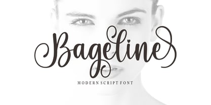 Bageline in a beautiful handwritten style. Equipped with 300 glyphs. Bageline is perfect for branding projects, home appliance design, product packaging, use in business cards, invitation cards, etc. Simply as a stylish text overlay onto a background image or anything that requires a touch of elegance.
 - Spiral by ARTypes,
$35.00 Spiral is a digital transcription of a design by Joseph Blumenthal (1897-1990) which was hand-cut by Louis Hoell and cast by the Bauer foundry in 1930. The design with an italic added was later cut for Monotype and issued in 1936 as Emerson 320.
 - Baghira by Identity Letters,
$39.00 Like its feline namesake from Kipling’s “Jungle Book”, Baghira has an elegant, smooth appearance and an impressive set of large, sharp teeth. With smoothly drawn curves, precisely placed corners, and rectangular dots, Baghira is a design rooted in the here and now. Its true italics gently allude to calligraphic roots, but overall, Baghira doesn’t follow any historical model. This cool cat sets his own standards. Designed by Christian Gruber & Moritz Kleinsorge, the Baghira font family consists of 8 fonts, with 4 weights ranging from Regular to Bold. Its character set contains 800 characters per style and is suited to quality typography in editorial design, corporate design and advertising.
 - Vendetta by Emigre,
$69.00 The famous roman type cut in Venice by Nicolas Jenson, and used in 1470 for his printing of the tract, De Evangelica Praeparatione, Eusebius, has usually been declared the seminal and definitive representative of a class of types known as Venetian Old Style. The Jenson type is thought to have been the primary model for types that immediately followed. Subsequent 15th-century Venetian Old Style types, cut by other punchcutters in Venice and elsewhere in Italy, are also worthy of study, but have been largely neglected by 20th-century type designers. There were many versions of Venetian Old Style types produced in the final quarter of the quattrocento. The exact number is unknown, but numerous printed examples survive, though the actual types, matrices, and punches are long gone. All these types are not, however, conspicuously Jensonian in character. Each shows a liberal amount of individuality, inconsistency, and eccentricity. My fascination with these historical types began in the 1970s and eventually led to the production of my first text typeface, Iowan Old Style (Bitstream, 1991). Sometime in the early 1990s, I started doodling letters for another Venetian typeface. The letters were pieced together from sections of circles and squares. The n, a standard lowercase control character in a text typeface, came first. Its most unusual feature was its head serif, a bisected quadrant of a circle. My aim was to see if its sharp beak would work with blunt, rectangular, foot serifs. Next, I wanted to see if I could construct a set of capital letters by following a similar design system. Rectangular serifs, or what we today call "slab serifs," were common in early roman printing types, particularly text types cut in Italy before 1500. Slab serifs are evident on both lowercase and uppercase characters in roman types of the Incunabula period, but they are seen mainly at the feet of the lowercase letters. The head serifs on lowercase letters of early roman types were usually angled. They were not arched, like mine. Oddly, there seems to be no actual historical precedent for my approach. Another characteristic of my arched serif is that the side opposite the arch is flat, not concave. Arched, concave serifs were used extensively in early italic types, a genre which first appeared more than a quarter century after roman types. Their forms followed humanistic cursive writing, common in Italy since before movable type was used there. Initially, italic characters were all lowercase, set with upright capitals (a practice I much admire and would like to see revived). Sloped italic capitals were not introduced until the middle of the sixteenth century, and they have very little to do with the evolution of humanist scripts. In contrast to the cursive writing on which italic types were based, formal book hands used by humanist scholars to transcribe classical texts served as a source of inspiration for the lowercase letters of the first roman types cut in Italy. While book hands were not as informal as cursive scripts, they still had features which could be said to be more calligraphic than geometric in detail. Over time, though, the copied vestiges of calligraphy virtually disappeared from roman fonts, and type became more rational. This profound change in the way type developed was also due in part to popular interest in the classical inscriptions of Roman antiquity. Imperial Roman letters, or majuscules, became models for the capital letters in nearly all early roman printing types. So it was, that the first letters in my typeface arose from pondering how shapes of lowercase letters and capital letters relate to one another in terms of classical ideals and geometric proportions, two pinnacles in a range of artistic notions which emerged during the Italian Renaissance. Indeed, such ideas are interesting to explore, but in the field of type design they often lead to dead ends. It is generally acknowledged, for instance, that pure geometry, as a strict approach to type design, has limitations. No roman alphabet, based solely on the circle and square, has ever been ideal for continuous reading. This much, I knew from the start. In the course of developing my typeface for text, innumerable compromises were made. Even though the finished letterforms retain a measure of geometric structure, they were modified again and again to improve their performance en masse. Each modification caused further deviation from my original scheme, and gave every font a slightly different direction. In the lower case letters especially, I made countless variations, and diverged significantly from my original plan. For example, not all the arcs remained radial, and they were designed to vary from font to font. Such variety added to the individuality of each style. The counters of many letters are described by intersecting arcs or angled facets, and the bowls are not round. In the capitals, angular bracketing was used practically everywhere stems and serifs meet, accentuating the terseness of the characters. As a result of all my tinkering, the entire family took on a kind of rich, familiar, coarseness - akin to roman types of the late 1400s. In his book, Printing Types D. B. Updike wrote: "Almost all Italian roman fonts in the last half of the fifteenth century had an air of "security" and generous ease extremely agreeable to the eye. Indeed, there is nothing better than fine Italian roman type in the whole history of typography." It does seem a shame that only in the 20th century have revivals of these beautiful types found acceptance in the English language. For four centuries (circa 1500 - circa 1900) Venetian Old Style faces were definitely not in favor in any living language. Recently, though, reinterpretations of early Italian printing types have been returning with a vengeance. The name Vendetta, which as an Italian sound I like, struck me as being a word that could be taken to signifiy a comeback of types designed in the Venetian style. In closing, I should add that a large measure of Vendetta's overall character comes from a synthesis of ideas, old and new. Hallmarks of roman type design from the Incunabula period are blended with contemporary concerns for the optimal display of letterforms on computer screens. Vendetta is thus not a historical revival. It is instead an indirect but personal digital homage to the roman types of punchcutters whose work was influenced by the example Jenson set in 1470. John Downer.
 - Andron 2 EIR Corpus by SIAS,
$34.90 SIAS opens a new chapter in Irish vernacular typography: the Andron-2-Irish font family. The genes of the insular typographic heritage have been blended with the timeless classical style of the versatile Andron series. Whereas most Irish-style fonts available more or less stick to ancient designs, Andron-2-EIR is different: it’s an entirely new design in which Irishness meets the beauty of a matured Venetian Roman text face. Envision a new horizon for setting Irish text in its own visual mode! Now you can utilize Italics, Semibold and Small capitals for Irish just as you have been doing in other languages for a long time. But the icing on the cake is the fifth font: Andron Irish Middlecase honours the rich medieval tradition of Ireland by a special uncial-style glyph set. It corresponds to the Andron MC series. Last but not least the Irish type connoisseur will relish this font package for it’s unique utilization of Opentype functionality. In Opentype-aware applications, by just ticking a box you can switch to the special insular forms of s and r. By ticking another box you can transform the text from modern-day orthography to the traditional spelling with lenited consonants. This built-in intelligence has never been implemented in any Irish font before. Briefly, the Opentype substitution features are: [Ligatures] – default basic f-ligatures; [Descretionary Ligatures] – more ligatures for typographic reason, mainly t- and long-s-combinations; [Style set 1] – turns all lowercase r and s into their insular glyph variants; [Style set 2] – replaces all consonant-h digraphs by dotted consonants (ḃċḋḟġṁṗṡẛṫ, ḂĊḊḞĠṀṖṠṪ), works for lowercase, uppercase and upper-lowercase alike; [Style set 3] – provides another range of additional special ligatures (for Regular and Italic only); [Oldstyle figures] – turns the default lining figures into proportional oldstyle figures. Andron Irish will also perfectly combine with every other Andron product in mixed settings. For an overview please go to the SIAS main page. For a quick reference go to Andron Latin, Andron Greek, Andron English or Andron MC. For more wonderful new Irish fonts look at Hibernica and Ardagh!
 - Ornamental Deco 2D by 2D Typo,
$36.00 This font was inspired by Lviv ArtDeco architecture dominating in 1920s-30s. This collection of ornaments is a graphic representation of building decorative elements, mostly of metal tracery elements and wall bas-relief. This font can be used for a variety of purposes, in graphic design as well as in industrial design.
 - Bonaro by Sabrcreative,
$20.00 Introducing the Bonaro Vintage Retro Serif All Caps Font, a versatile collection that brings timeless elegance and a touch of nostalgia to your design projects. With its 10 distinct styles, this font offers a treasure trove of possibilities, making it an essential asset for designers seeking to infuse their work with vintage charm.
 - Avenir Next Georgian by Linotype,
$49.00 The original Avenir typeface was designed by Adrian Frutiger in 1988, after years of having an interest in sans serif typefaces. The word Avenir means “future” in French and hints that the typeface owes some of its interpretation to Futura. But unlike Futura , Avenir is not purely geometric; it has vertical strokes that are thicker than the horizontals, an “o” that is not a perfect circle, and shortened ascenders. These nuances aid in legibility and give Avenir a harmonious and sensible appearance for both texts and headlines. In 2012, Akira Kobayashi worked alongside Avenir’s esteemed creator Adrian Frutiger to bring Avenir Next to life, as a new take on the classic Avenir. The goal of the project was to take a beautifully designed sans and update it so that its technical standards surpass the status quo, leaving us with a truly superior sans family. Since then, Monotype expanded the typeface to accommodate more languages. Akira’s deep familiarity with existing iterations of the Frutiger designs, along with his understanding of the design philosophy of the man himself, made him uniquely suited to lead the creation of different language fonts. Avenir Next World family, the most recent release from Monotype, is an expansive family of fonts that offers support for more than 150 languages and scripts that include Latin, Cyrillic, Greek, Hebrew, Arabic, Georgian, Armenian and Thai. Avenir Next World contains 10 weights, from UltraLight to ExtraBlack.
 - Christmas Chances by Putracetol,
$16.00 Christmas Chances - Christmas Font is a captivating display typeface designed to evoke the festive spirit of Christmas. With its elegant serif letterforms, this font adds a touch of sophistication to your holiday-themed designs. It comes with ligatures and six unique alternative decorations, including Santa hats, Christmas trees, Santa Claus, festive ornaments, Christmas cakes, and more. These decorative elements allow you to infuse the holiday spirit into your projects, making it perfect for various Christmas-themed designs. This font is specifically crafted for Christmas-themed projects, making it a versatile choice for a wide range of applications, including t-shirt designs, invitation cards, greeting cards, mugs, gift designs, Christmas ornaments, and much more. Christmas Chances - Christmas Font is your go-to choice for spreading holiday cheer and warmth in your creative endeavors.
 - Gantrol by Beary,
$15.00 Gantrol is an amazing hand lettered, bold script with a retro feel, attractive swashes and alternates! Every single letter has been carefully crafted to make your text looks beautiful. This font is suitable for headlines, logos, typography design, t-shirt design, invitations, branding, packaging, advertising, classic designs, poster design, and more. I hope this can make inspire you from your work. Font is PUA encoded so you can access extras from character map in most design software. To enable the OpenType Stylistic alternates, you need a program that supports OpenType features such as Adobe Illustrator CS, Adobe Indesign & CorelDraw. There are additional ways to access alternates, using Character Map (Windows), Nexus Font (Windows), Font Book (Mac) or a software program such as PopChar (for Windows and Mac). Happy Creating
 - Kaneishia Script by Solidtype,
$14.00 A new modern calligraphy font, with elegant touch, stylish and lovely. It comes with a handy set of opentype stylistic, use the beautiful ligatures, alternates and swashes. You need a program that supports OpenType features such as Adobe Illustrator CS, Adobe Photoshop CC, Adobe Indesign, Microsoft Word 2010. It is perfect for logo, greetings, branding, quotes, prints, invitations and crafting. All lowercase letters include alternates, beginning & end swashes, that makes the font look fabulous! These are all coded with PUA Unicode. Mac users can use Font Book and Windows users can use Character Map to view and copy any of the extra characters to paste into your favourite text editor/app. For sans serif only available for uppercase letters, numbers, punctuation and all fonts are available in multilingual support. Thanks and have a wonderful day :)
 - Kloetzchen by TypoGraphicDesign,
$9.00 The typeface Klötzchen (german word for blocks) is designed from 2020 for the font foundry Typo Graphic Design by Manuel Viergutz | Typo Graphic Design × Peter Eckartz | kleinholzTYPO as a political statement #climatejustice The display font based on the original wood letter from Peter Eckartz (kleinholzTYPO). The technic is called Reifendreherei from the Erzgebirge. Craft Tools like Hobel and Fräsmaschine. The idea based from Gert Schaaf (Spielzeugproduzent in Wittlich, 1970s). The font started from 41 wood letters (analog) and was finally digitalize and extended to 374 glyphs (digital). Thanks to Alex Branczyk for the Klötzchen. 3 font-styles (Wood, Clean, Impact) + 1 icon-style with 374 glyphs (Adobe Latin 1) incl. 100+ decorative extras like icons, arrows, dingbats, emojis, symbols, geometric shapes (type the word #LOVE for ❤️or #SMILE for
 - Teenage Rockstar by Teenage Foundry,
$19.00 TF Teenage Rockstar Display Script Font - a stylized design that is sure to bring a touch of elegance and sophistication to your projects. Our font features swooping tails on select lowercase letters, adding an extra level of flourish and personality that is sure to capture attention. There are 2 styles available (Regular & Extrude). Both font versions are meticulously crafted with attention to detail, ensuring that each letterform maintains its structural integrity while still conveying its unique style. With our display script font, you can create designs that are both elegant and impactful, giving you the freedom to express your creativity with confidence. Features: Uppercase, Lowercase, Numeral, Opentype Features, Punctuation & Multilingual. Note: To access tails, just type underscore + underscore + numeral. The alternates feature must be active. Example __3 For any questions please contact me 🙂 Thanks!
 - Rosabelia Script by Solidtype,
$16.00 A new modern script font with elegant touch, casual and lovely. It comes with a handy set of opentype stylistic, use the beautiful ligatures, alternates and swashes. You need a program that supports OpenType features such as Adobe Illustrator CS, Adobe Photoshop CC, Adobe Indesign, Microsoft Word 2010. It is perfect for logo, greetings, branding, quotes, prints, invitations and crafting. All lowercase letters include alternates, beginning & end swashes, that makes the font look fabulous! These are all coded with PUA Unicode. Mac users can use Font Book and Windows users can use Character Map to view and copy any of the extra characters to paste into your favourite text editor/app. For sans serif only available for uppercase letters, numbers, punctuation and all fonts are available in multilingual support. Thanks and have a wonderful day :)
 - Bubpop by SAMUEL DESIGN,
$19.00 The name of this font is Bubpop. The features of the serif body are combined with the non-sans-serif body. Structuring and reconstructing the serif font, we get a very modern font effect. The font effect is not only rounded, but also has clever ideas and solemn details. This treatment makes this font more widely used and remains different.


