10,000 search results
(0.076 seconds)
- alien strawberry - Unknown license

- Breathe Neue by Lián Types,
$37.00 Breathe Neue is not just an update of my renowned Breathe of 2010, this is something else... Many times I find myself looking for inspiration in my previous creations. The original Breathe has something on its essence: Something that almost 10 years later still caught my attention. Like its name suggests, letters seem to be breathing, moving, alive. Many years passed so I asked myself if there was still something I could do for it, something to get the most of that beautiful essence... Suddenly, I was already working on its curves: Many new loops, more polished, more refined. Also the proportion and spacing were altered to embellish the font. Breathe Neue’s swashes are addictive. I couldn't find another word. Irresistible? Maybe. Once you see some of its loops you want to see more. I believe this might be due to its very geometrical feel, which match well with the bodonian curves of the font. See also how well it works with Breathe Caps. And what if you combine them with Breathe Special? wow. I'm still young (yeah, sure) and I believe there're still many years ahead to enjoy this great profession, and to make many new (and astonishing, I hope) fonts. But I also think, it’s time to pamper my first creations. They deserve the best treatment, after all, they were once a success! This is what I did with my lovely Breathe. I hope you like it.
 - Racetrack by Type Innovations,
$39.00 Racetrack is the work of American type designer, Alex Kaczun, and was conceived as a result of developing a logo for a client. Alex was experimenting with a uniform grid pattern, outline and inline, connecting the dots which lead to this interesting typeface effect. Racetrack is a bold display font, which also works well at many point sizes. It has a futuristic appeal with straight lines and sharp corners. The uniform strokes, inline treatment and symmetry make for a powerful headline. The applications for this font design are endless.
 - Naston by Sopheynoft,
$49.00 Naston Regular is the font of choice for those who seek an elegant and versatile typeface. With its timeless design, Naston Regular adds sophistication to a wide array of applications, be it formal invitations, business presentations, or creative projects. Its meticulously crafted letterforms prioritize readability while maintaining a unique and distinctive style, leaving a lasting impression on your audience. This font's broad language support and impeccable craftsmanship ensure a seamless reading experience, making it an excellent choice for anyone who values professionalism and aesthetics in their design projects. Choose Naston Regular to elevate your content and effectively convey your message with clarity and elegance.
 - Abhiarga by IbraCreative,
$17.00 Abhiarga is an elegant display serif font that seamlessly blends sophistication with a touch of modernity. Its gracefully crafted letterforms exude a timeless charm, characterized by subtly flared serifs and well-balanced proportions. The typeface strikes a harmonious balance between traditional serif elements and contemporary design trends, making it versatile for various applications. Abhiarga’s intricate details lend a sense of refinement, making it ideal for titles, headlines, and other prominent display settings where a touch of classical sophistication is desired. The font’s intricate strokes and intricate serifs contribute to a distinctive aesthetic, ensuring that Abhiarga stands out with a dignified presence while maintaining readability and visual appeal.
 - Tanamera by Jolicia Type,
$19.00 Introducing Tanamera: Your Portal to Psychedelic Nostalgia Product Description: Unleash the vibrant energy of the '60s and '70s with Tanamera, the ultimate psychedelic type display font that channels the essence of retro vintage style. Whether you're designing a groovy poster, an album cover, or revamping your branding, Tanamera is your ticket to a kaleidoscopic journey through time. Key Features: 1. Psychedelic Vibes: Tanamera captures the essence of a bygone era, where peace, love, and creativity reigned. Its mesmerizing swirls and curves will transport you to the heart of the psychedelic revolution. 2. Vintage Aesthetic: With carefully crafted glyphs that pay homage to the fonts of the past, Tanamera adds an authentic touch of nostalgia to your projects, effortlessly embodying the essence of the retro era. 3. Endless Customization: Tanamera comes with a variety of alternates and ligatures, providing you with endless possibilities to create unique and eye-catching typography that stands out from the crowd. 4. Versatile Usage: Whether you're designing for print or digital media, Tanamera adapts seamlessly to various applications, from posters, branding, and advertising, to websites and social media. 5. High-Quality Craftsmanship: Crafted with precision and attention to detail, Tanamera is a high-quality font that ensures crisp, sharp lines and smooth curves, making it perfect for both small and large-scale projects. 6. Easy to Use: Tanamera is user-friendly and compatible with popular design software, ensuring a smooth and hassle-free integration into your creative process. Why Choose Tanamera? Tanamera is not just a font; it's a portal to the past, a gateway to a world of vibrant colors, free-spirited expression, and boundless creativity. It's your chance to infuse your designs with the unmistakable energy and style of the psychedelic era, creating a visual experience that captivates and enchants your audience. Let Tanamera be your guide to reviving the past while embracing the future. Elevate your design projects with this captivating font, and watch as your creations come to life with the magic of retro vintage style. Get Tanamera today and embark on a journey through time that will leave a lasting impression on anyone who sees your work.
 - Bullets by Wiescher Design,
$6.00 BulletNumbers come in very handy for all kinds of lists that don't exceed 100 categories. I have long since been using my own Bullets in positive and negative and four styles, serif, sans, engravers and script, a fitting one for every occasion. Now I added six more designs and perfected the Bullets for all of you. The following is a »must read«! Here is how to use them: (Important! Set letterspacing to '0', otherwise the two digit numbers will have gaps!!!) The numbers 1-0 reside on the standard keys. Two digit numbers 01-99 can be composed out of left and right half circles by using (lowercase) 'abcdefghij' for the first digit (left half circle) and 'lmnopqrstu' for the second digit (right half circle). The critical pairs (all combinations with 1) can be found in various places. Type '!' for 10, '#' for 11, '$' 12, '%' for 13, '&' for 14, '(' for 15, ')' for 16, '*' for 17, '+' for 18, ',' for 19, '-' for 21, '.' for 31, '/' for 41, ':' for 51, ';' for 61, '?' for 81, '_' for 91. The two arrows are on the < and > keys. '100' can be found with shift+option+1. Last but not least, the capital letter bullets A-Z can be found on the shift+letter A-Z. Your very practical Gert Wiescher
 - Bullet Numbers by Wiescher Design,
$9.50 This is a must read!!! BulletNumbers come in very handy for all kinds of lists that don't exceed 100 categories. I have long since been using my own BulletNumbers in positive and negative and four styles, serif, sans, engravers and script, a fitting one for every occasion. Now I perfected them for all of you. Here is how to use them: (Important! Set letterspacing to '0', otherwise the two digit numbers will overlap!!!) The numbers 1-0 reside on the standard keys. Two digit numbers 01-99 can be composed out of left and right half circles by using (lowercase) 'abcdefghij' for the first digit (left half circle) and 'lmnopqrstu' for the second digit (right half circle). The critical pairs (all combinations with 1) can be found in various places. Type '!' for 10, '#' for 11, '$' 12, '%' for 13, '&' for 14, '(' for 15, ')' for 16, '*' for 17, '+' for 18, ',' for 19, '-' for 21, '.' for 31, '/' for 41, ':' for 51, ';' for 61, '?' for 81, '_' for 91. The two arrows are on the < and > keys. '100' can be found with shift+option+1. Last but not least, the capital letter bullets A-Z can be found on the shift+letter A-Z. Yours very practical Gert Wiescher
 - La Rosaleda by Mevstory Studio,
$15.00 La Rosaleda Font Duo is a ligature font pair with 30 amazing chic logo templates. With this open type font duo you can explore your creativity in unlimited way. To recreate your brand all you need is mix and match from the La Rosa font duo. This font duo is full of stylish ligatures, so that your writing with La Rosaleda can stand out. - Font Features: All fonts are OpenType fonts All fonts are fully vector designed Accurate kerning for all serif family Amazing ligatures to look natural in script font Alternative characters for script lowercase alphabets Multilingual Support for Both Scrip and Serif All OpenType fonts, Serif and Script. 30 Fully editable logos for Adobe Photoshop or Adobe Illustrator Font installing help file for PC and Mac Web-fonts for Script and Serif
 - Darmhagh Underwood by Evertype,
$20.00Darmhagh Underwood is a “rough” monowidth font based on the face used on the old Underwood manual typewriter. Darmhagh Underwood was first digitized in 1999 by Michael Everson and originally used the MacGaelic character set on the Macintosh platform, and ISO/IEC 8859-14 on the PC. In 2008 Darmhagh Underwood version 3 was released in OpenType format, completely compliant with Unicode encoding and with an extended character set. The particular Underwood typewriter from which samples were taken to design Darmhagh Underwood is on display in the National Library of Ireland. It belonged to Conradh na Gaeilge and was used to draft armistice documentation which led to the end of the Irish War of Independence in 1921. Darmhagh is pronounced [ˈdaɾuː]. - Multipolar by MYSTERIAN,
$9.00 This typeface was designed as the house style by and for design studio Mysterian. It was drafted and completed during most of 2020. The intention of the design of the forms was to develop a unique signification in the mind, but one that could have potential relevant associations such as with sci-fi. The solution, brought along with a fascination with this rarely seen pattern in type, was to taper round forms. The name 'Multipolar' was inspired by the term used by game theorist Daniel Schmachtenberger, which is a kind of event that seemed relevant to the Covid-period in which the font was made. Alternate characters include: Two Ampersands Upper and Lowercase PI Upper and Lowercase Eszett Latin Characters
 - Rebekah by Ascender,
$29.99 Rebekah Pro is a revival of ATF’s Piranesi family, the regular being designed by Willard Sniffin, and the remaining weights designed by Morris Fuller Benton. Tom Rickner first revived Benton’s Italic for use in his wedding invitations for his marriage to Rebekah Zapf in 2006. He completed the character set in 2009. Rebekah Pro captures the elegance and distinction of the original. Tom carefully studied samples from 1930s American Type Founders catalogues and created a digital version with meticulous care. While considered an informal script because its letterforms do not connect, Rebekah Pro has graceful strokes and a truly elegant appearance. Tom created a variety of typographic enhancements not found in the original Piranesi italic font. These OpenType typographic features offer a distinguishing touch to everything from invitations and announcements to greeting cards and advertisements. Rebekah Pro contains the Latin 1 character set and the following OpenType typographic features: Swashes, Small Capitals, Ligatures, Alternates, Oldstyle Figures, Proportional Lining Figures, Tabular Lining Figures and Ornaments.
 - Silvestre Weygel by Intellecta Design,
$20.90 A complete figurative alphabet was published by one Peter Flotner (ca. 1485-1546) in 1534. In Flotner’s alphabet, naked or nearly-naked figures are posed singly or disposed in pairs to form the various letters. Unlike de Grassi’s alphabet, we find only human figures here, no other animals. And unlike Tory’s illustrations, these letters seem an end in themselves, rather than the means of demonstrating a design strategy. Flotner’s alphabet was imitated by other engravers. The letters G and N are reproduced from an alphabet published by one Martin Weygel in Bavaria in 1560. Peter Flötner , c.1485-1546, German medalist and artisan, possibly Swiss by birth. He was active in decorative sculpture, wood carving, and other crafts, making medals and plaques and furnishing designs of classical motifs for silversmiths. He was in Nuremberg by 1522 and did most of his work there, although he made two trips to Italy. Flötner is now regarded as a pioneer of the German Renaissance. His Kunstbuch was published in 1549. In the Metropolitan Museum are five of his bronze plaques illustrating biblical episodes. A stylistical tip : Use this caps with SchneiderBuchDeutsch, as shown in the banners above, to create a perfect historiated layout.
 - Hoodie by TypeUnion,
$25.00 Hoodie was born out of a love for retro Americana and vintage signs but designed with a contemporary fresh twist that makes the font a true attention seeker. The font is made up of 7 weights, plus 3 fun specials (dots, lines and shade) that create a multitude of uses and options. From logos to packaging and everything in between, Hoodie will be an attention grabber in all types of layouts and placements. Hoodie has features such as extensive language support, case sensitive characters, ligatures and number options (Denominator, Numerator, Superior and Inferiors), making it a truly versatile font.
 - Sebastian Pro by Storm Type Foundry,
$32.00Sans-serif typefaces compensate for their basic handicap – an absence of serifs – with a softening modulation typical of roman typefaces. Grotesques often inherit a hypertrophy of the x-height, which is very efficient, but not very beautiful. They are like dogs with fat bodies and short legs. Why do we love old Garamonds? Beside beautifully modeled details, they possess aspect-ratios of parts within characters that timelessly and beauteously parallel the anatomy of the human body. Proportions of thighs, arms or legs have their universal rules, but cannot be measured by pixels and millimeters. These sometimes produce almost unnoticeable inner tensions, perceptible only very slowly, after a period of living with the type. Serifed typefaces are open to many possibilities in this regard; when a character is mounted on its edges with serifs, what is happening in between is more freely up to the designer. In the case of grotesques, everything is visible; the shape of the letter must exist in absolute nakedness and total simplicity, and must somehow also be spirited and original. - Novelin by Designova,
$25.00 Novelin is a modern typeface with a unique design and a perfect choice for creating logotypes, branding, headlines, corporate identities, and marketing materials for web, digital & print alike. The typeface will be great for branding, logo/logotype design projects, marketing graphics, banners, posters, signage, corporate identities, and editorial design.
 - Netherland Perpendicular by Greater Albion Typefounders,
$16.00 Netherland Perpendicular, a family of five typefaces, is Greater Albion’s end of year Blackletter release for 2015. It is designed in the fine traditions of Victorian Revival Blackletter, where historical veracity is ever sacrificed to aesthetic calm. The five typefaces share uniform metrics, making for charming colour overlay effects.
 - Emphasis by ITC,
$29.00Emphasis is the work of lettering artist Martin Wait. Its eye-catching double line effect highlights any display in an authoritative, contemporary style. Emphasis is an all caps alphabet which offers an alternative to conventional brush lettering styles, giving a casual yet robust look wherever it is used. - Pleatures by Craft Supply Co,
$10.00 Pleatures is a psychedelic typeface with riotous shape that great to make your design vibing. It can be used to create almost all types of design projects like print materials. Just use your imagination and your project will become more alive and look great than ever with this typeface.
 - Dual by North Type,
$- DUAL is a full width sans-serif typeface with an experimental side. Its straight lines and 90 degree angles give it a very geometric feel without hindering its legibility. It’s now available in 6 weights, ranging from 100 to 600. The idea behind DUAL has been brewing for quite some time, and though there has been many “experimental” released in the past, it does have its unique features. For starters, it is a fully usable and legible font in its original state. Also, its 251 alternate glyphs and 10 stylistic sets are, of course, its main attraction making DUAL a very versatile typeface for any user, from the casual designer to the hardcore artist. Finally, it has extensive additional language support for the Americas and parts of Europe. With its 563 glyphs, It’s actually two fonts in one, and thus the name DUAL. Enjoy!
 - everyone - Unknown license

- Manutius Pro by RMU,
$35.00 A pleasant looking slab serif font family which was originally released by the Wagner foundry as hot-metal fonts. These fonts avoid the appearance of being constructed, and this is underlined by the beautiful swash caps in the Italic style.
 - Bingbong by Letteralle,
$19.00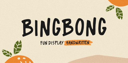 Introducing Bingbong Font! Bingbong is a fun and cheerful allcaps handwritten font display. This font is suitable for handwriting logos, T-shirts, merchandise, quotes, social media posts, advertising, and a lot more! Bingbong comes with an accent language. Thank You!
 - Vapor by The Hiscott Foundry,
$35.00This font was inspired by the swirling steam drawn on a chalkboard at a coffee shop. Not actually a script font though it has a similar feel. This font dances and twirls the way a wisp of smoke or steam would. - Gueton by Twinletter,
$17.00 Introducing Gueton, the retro condensed font that adds a classic touch to your designs. This font features a timeless and stylish retro look and comes with 20 alternate characters and 25 ligatures that beautifully complement its unique design. Whether you’re working on a vintage-inspired project or just want to add some nostalgic charm to your work, Gueton is a perfect choice. Not only does Gueton offer stunning design features, but it also supports multiple languages, making it a versatile font for a wide range of projects. Whether you’re designing a logo, poster, or website, Gueton’s classic and modern blend will give your work a standout and professional look. Check out our collection now and elevate your designs with this elegant and sophisticated font. What’s Included : - File font - All glyphs Iso Latin 1 - Alternate, Ligature - Simple installations - We highly recommend using a program that supports OpenType features and Glyphs panels like many Adobe apps and Corel Draw so that you can see and access all Glyph variations. - PUA Encoded Characters – Fully accessible without additional design software. - Fonts include Multilingual support
 - MVB Greymantle by MVB,
$39.00Kanna Aoki had fairy tales in mind when she designed MVB Greymantle. She drew dots with a felt pen to build up the forms, giving them their particular rough character. The “Extras” font contains a set of whimsical illustrations, including a portrait of Greymantle—her 18-pound cat, a set of curly initial caps, and border parts. MVB Greymantle has been spotted on numerous children's books, in magazines, in salad dressing advertisements, and on food packaging. - Litter Funk by PizzaDude.dk,
$15.00 You may already have guessed it...Litter Funk is experimental typography. Some letters are fat blocks, others have stars, stripes or dots, some are funny and funky while others are plain weird - but all in all, they leave a really nice confusing effect when used. Due to the contextual alternates, each letter comes in 5 different versions, and automatically cycle as you type. Well, the font was fun to make - I hope you have fun using it! :)
 - Qonitta by Zamjump,
$17.00 Called QONITTA is a serif display with a character that is beautiful, and elegant. With the addition of beautiful ligatures and alternatives to make your typography truly unique. No special software is required to type standard Typeface characters. To access Opentype Ligatures and Alternates, you need software that supports the Opentype feature in fonts. multi language support File Included : - Upper case and Lower case - Ligature - Alternate - Uniq dot (a underscore underscore, b underscore underscore, c underscore underscore)
 - Romanica by K-Type,
$20.00 ROMANICA is a relaxed humanist sans with subtly curved corners and slightly flared glyphic terminals that are expressively angled where appropriate. Romanica has the authority of the ages without the harshness of many classically inspired typefaces. All eight fonts include a full complement of Latin Extended-A characters, Welsh diacritics, Irish dotted consonants, and additional oldstyle numerals. ROMANICA is available in three packages - • Basic Family (Regular, Italic, Bold & Bold Italic) • Light (Light & Light Italic) • Medium (Medium & Medium Italic)
 - VTC-SumiSlasherOne - Personal use only

- VTC-KomikSkans-Two - Personal use only

- Lunar Modular by Comicraft,
$19.00 TOUCHDOWN! This is not a Hoax, not a What If, not an Imaginary Font! The Eagle has Landed... Comicraft's latest manned mission: Space Age Faces for Space Age Spaces! Our Apollo Modules have settled in the moondust and our Astronauts are buckled up in the Rover collecting little rocks and looking for suitable spots to play golf. We invested billions and billions of dollars to send these fonts into space using the largest and most powerful rockets ever built, and rest assured, our Orbiter is coated with a phenolic epoxy resin ablative heatshield to protect you for your journey back to Earth. Features: Six fonts (Modular, Modular-Bold, Orbiter, Orbiter-Bold, Rover, Rover-Bold) with upper and lower case characters. Opentype version of Orbiter also includes 52 auto-ligatures.
 - Seriguela by Latinotype,
$29.00 Seriguela is an ultra condensed sans serif typeface with a unique personality. It comes in normal and display versions, each with 9 weights, as well as italics and reverse italics totaling 54 fonts. Seriguela is flavor in motion and each part of its system works together to captivate you, combining emotion and usability, allowing you to create attractive and unique designs. Seriguela followed a very distinctive recipe to design its alphabet: it started with a grotesque base and applied movement and joy in a very original way. The blacker and more contrasted, the tastier. The contrast in its display version is one of the most important features of Seriguela: the unconventional relationship between thick and thin lines, as it does not strictly follow any historical model of contrast construction and makes it noticeable. Its high contrast is not present in every single character and it is often in the “wrong” places. The original charm of Seriguela is maintained throughout all its styles. With peculiar details: the verticality and its proportions, as well as terminals that resemble hooks in some curves, a characteristic that breaks with the vertical modular rhythm. Seriguela is a versatile font system, designed primarily for display uses with a need of visual impact.
 - Nanami Rounded by Thinkdust,
$10.00 Nanami Rounded is a heavily engineered follow up to the hugely successful Nanami, which debuted at MyFonts #1 Hot New Fonts for over 2 weeks. Nanami Rounded is a carefully engineered take on the original Nanami family. We kept the curve very slight in order to keep the clean corporate balance, and not to go into a style that was too friendly. Nanami Rounded consists of 18 weights ranging from Thin through to Black. It has also extensive support for over 50 languages, and as a font family that works well both in headlines and bodycopy, Nanami Rounded is the perfect choice for a whole variety of creative briefs. The gentler, softer follow-up to the popular Nanami, Nanami Rounded is also motivated by the artistry of Japan. Smoothing the hard lines and definite corners of its predecessor just slightly, Nanami Rounded is still clearly defined and crisp enough to work in whatever context you need. If Nanami is a battle hardened Samurai, Nanami Rounded is the lotus blossom favour handed to him as he leaves his home village to go to war. If Nanami Rounded isn't quite floating your boat why not check out it’s counterparts Nanami and Nanami Handmade.
 - PF Encore Sans Pro by Parachute,
$79.00 Encore Sans Pro is a sans serif which projects an image of reliability, authority and competence making it ideal for corporate applications. A functional typeface which combines utility with style. It’s subtle round characteristics such as the slightly curved-in edges, create a distinctly contemporary look, blending effectively traditional with modern details. Encore Sans Pro has received 3 international awards and distinctions including a Silver at the european ED Awards 2010. This is a contemporary typeface which may function as the perfect alternative to several overused classic sans. Encore Sans Pro does not pretend being different but it does claim its own personality. It is simple and stylish. Furthermore, it is extremely versatile. It comes with 22 weights and supports simultaneously Latin, Greek and Cyrillic. Each font contains 1535 glyphs and is loaded with 22 advanced OpenType features. Extreme weights, such as the elegant hairline, are carefully designed to establish an even color throughout, while ultra black despite its heavy characteristics is quite legible and powerful. Other intermediate weights such as light and book are ideal as body text for magazines and catalogs. Every font in this series has been completed with 270 copyright-free symbols, for packaging, public areas, environment, transportation, computers, fabric care and urban life.
 - Systeme Robraille - Unknown license

- Vital Formations - Unknown license

- PopUps - Unknown license

- Ratfern by Muksal Creatives,
$10.00 Raftern is a unique and modern family of Sans serif fonts. Simply Conception has 10 families Regular font, starting from the small thin to the largest Heavy. This typeface is versatile and can be used successfully in magazines, posters, branding, websites.
 - Onamura by Balibilly Design,
$22.00 Initially, letterform was inspired by the gothic style of Romance decorative letters in transitional art in the Middle Ages. The conservative type in the Gothic era, especially in decorative romance, has led to the Victorian style being embedded in several forms as accents related but not forced to be combined. Rounded serif seems conventional combined with historically relevant letterform to create a harmonious blend. The art nouveau style also inspires this typeface. Approach to architectural ornamentation from 1880 to 1915, adopting the dynamic lines and curves typical of the civilization of the time. Continue time travel; we also present a more modern form influenced by the digitalization of art nouveau derivatives, familiarly called the psychedelic style. Paying homage to predecessors, we presented The Onamura font in a Japanese Ukiyo-e style that influenced the fine arts movement that broke old conservative art in Europe. We designed this font carefully with the information about the Middle Ages, Ukiyo-E, & Art Nouveau that greatly influenced art worldwide. In this font family, there are collaboration vibes. Both are the basis of the phenomenal blend of idealism between western and Japanese artists. Consisting of 10 fonts in 10 weights, it features an extended charset of over 850 glyphs, covering multilingual support, including Western European, Central European, and Southeastern European. Complete with advanced open type features like stylistic alternates, discretionary ligatures, ordinals, small caps, fractions, and case-sensitive forms. The elegant and refined details seen in this font provide a new aesthetic input, satisfy contemporary style, and give a range of choices for luxury typographic projects. This font is perfectly suited for high-impact headlines. Advance open-type features are stunning on logos, branding, magazines, website, etc. Supports languages: Afrikaans, Albanian, Asu, Basque, Bemba, Bena, Bosnian, Catalan, Cebuano, Chiga, Colognian, Cornish, Corsican, Croatian, Czech, Danish, Dutch, English, Estonian, Faroese, Filipino, Finnish, French, Friulian, Galician, Ganda, German, Gusii, Hungarian, Icelandic, Ido, Inari Sami, Indonesian, Interlingua, Irish, Italian, Javanese, Jju, Jola-Fonyi, Kabuverdianu, Kalaallisut, Kalenjin, Kinyarwanda, Kurdish, Latvian, Lithuanian, Lojban, Low German, Lower Sorbian, Luo, Luxembourgish, Luyia, Machame, Makhuwa-Meetto, Makonde, Malagasy, Malay, Maltese, Manx, Maori, Morisyen, North Ndebele, Northern Sami, Northern Sotho, Norwegian Bokmål, Norwegian Nynorsk, Nyanja, Nyankole, Occitan, Oromo, Polish, Portuguese, Romanian, Romansh, Rombo, Rundi, Rwa, Samburu, Sango, Sangu, Sardinian, Scottish Gaelic, Sena, Shambala, Shona, Slovak, Slovenian, Soga, Somali, South Ndebele, Southern Sotho, Spanish, Swahili, Swati, Swedish, Swiss German, Taita, Taroko, Teso, Tsonga, Tswana, Turkish, Turkmen, Upper Sorbian, Vunjo, Walloon, Welsh, Western Frisian, Wolof, Xhosa, Zulu


