10,000 search results
(0.056 seconds)
- Bentara Script by Alpha Bento,
$12.00 Bentara Script is a calligraphy font that comes with beautiful alternative characters. Calligraphy of copper plate with handlettering style. Designed to convey stylish elegance. Bentara Script attracts like a typeface that is soft and luxurious, clean, feminine, sensual, glamorous, simple and very easy to read. Its classic style is very suitable to be applied to all kinds of formal items such as invitations, labels, menus, Logos, fashion, make up, stationery, letterpress, romantic novels, magazines, books, greeting / wedding cards, packaging, labels. Bentara Script including multiple language support. With OpenType features with stylistic alternates, ligatures and swash characters, that allows you to mix and match pairs of letters to fit your design To enable the OpenType Stylistic alternates, you need a program that supports OpenType features such as Adobe Illustrator CS, Adobe Indesign & CorelDraw X6-X7, Microsoft Word 2010 or later versions. (Windows), Font Book (Mac) or a software program such as PopChar (for Windows and Mac). If you need help or advice, please contact me by e-mail: alphabento.16@gmail.com Thank you, Alpha Bento
 - Rachela by MrLetters,
$15.00 Introducing:Rachela Lovely Calligraphy! A new and beautiful font, created to meet your needs in creating a beautiful and elegant design, this font is special for you. Rachela Lovely Calligraphy Font is perfect for branding, wedding invitations, magazines, mugs, business cards, quotes, posters, and more you can use on your big project would be very beautiful. This font has been equipped with OpenType features and has many glyphs. By having many of these glyphs will be able to choose the letters according to your liking, lots of variations and options for each letter, so you can customize your design choices and also have other languages supported. This font is perfect for use with programs that support OpenType features like Adobe Photoshop Cs / Adobe Photoshop CC, Adobe Illustrator CS / Adobe Illustrator CC, Adobe Indesign and Corel Draw and many more programs that support OpenType. I've also included a special alternative so you can use any program. This font can be used by everyone! If you have any questions, please feel free to contact me by email at hello.mrletters@gmail.com. Thank you and congratulations designing :-)
 - Nagbuloe by Luhop Creative,
$24.00 Nagbuloe is a offers beautiful typographic harmony for a diversity of design projects, including logos & branding, social media posts, and others.So Nagbuloe come with 4 style Regular,Italic,Outline and Shadow. Nagbuloe Come with Opentype feature with a lot of alternates, its help you to make great lettering. Nagbuloe is also support multi language. To access the alternate glyphs, you need a program that supports OpenType features such as Adobe Illustrator CS, Adobe Photoshop CC, Adobe Indesign and Corel Draw.
 - Chevane Dream by GuseType,
$15.00 Chevane Dream is a decorative serif font, this font is inspired by starlight. The characteristic of this font is its sharpness and light weight, which makes this font look more elegant and luxurious. Chevane Dream can be used for various projects such as branding & identity, posters, magazines, logos, albums and much more. Chevane Dream also has several features including multilingual support glyphs, alternative glyphs and ligatures, this feature can make your writing look more stylish.
 - Breviary by Heyfonts,
$18.00 Breviary - Display Typeface "UNIQUE serif modern font" likely refers to a typeface that combines elements of traditional serif design with contemporary and distinctive features. Serif fonts have small lines or strokes attached to the ends of characters, which can contribute to a more formal or traditional appearance. The term "modern" in this context typically implies a contemporary or updated style. Here's an explanation of the characteristics and significance of a UNIQUE serif modern font: -Serif Elements: Serifs are the small lines or strokes at the ends of characters, and they are a hallmark of traditional typography. In a UNIQUE serif modern font, these serif elements are likely to be present but may have a distinctive shape or style that sets them apart from more conventional serif fonts. -Contemporary Design: The "modern" aspect of the font suggests a contemporary or updated design. This may involve a departure from the more classical serif styles seen in traditional typefaces, incorporating modern design principles, cleaner lines, and a more minimalist aesthetic. -Distinctive Characters: A UNIQUE serif modern font is likely to feature characters with unique and individual design elements. This could include unconventional serifs, letter shapes, or other stylistic details that make the font stand out and contribute to its uniqueness. -Versatility: While serif fonts are often associated with formality and readability, a UNIQUE serif modern font may offer versatility suitable for a range of design applications. It could be used in both traditional and modern contexts, providing flexibility for various design projects. -Applicability to Branding: Fonts play a crucial role in branding, and a UNIQUE serif modern font could be an excellent choice for businesses or projects that want to convey a sense of tradition and reliability while maintaining a contemporary and innovative image. -Digital and Print Design: Modern serif fonts are often designed with both digital and print applications in mind. The clarity of the typeface, even at smaller sizes, and its aesthetic appeal make it suitable for a variety of design projects, from websites and apps to print materials like brochures and posters. -Attention to Detail: The uniqueness of the font may be reflected in the careful attention to detail in each character. This could include refined curves, balanced proportions, and other design elements that contribute to the overall visual appeal and readability of the font. -Available Features: Unique serif modern fonts may come with additional features, such as alternative characters, ligatures, or stylistic sets, allowing designers to customize the appearance of the text for specific design needs.
 - TOMO Claire by TOMO Fonts,
$10.00 TOMO Claire is a handmade typeface with a relaxed style and committed to the environment. It comes in two styles, Regular and Waste with a distressed look. This typeface is ideal for all types of projects related to the care of the environment and everything else. Be green! Act now!
 - Karty Solid by Eurotypo,
$22.00 Karty Solid is a freehand typeface that was inspired by John Baskerville’s designs. Karty Solid comes in three version: Regular, condensed and Expanded, including a large set of swashes, ligatures and stylistic alternatives, which bring the chance to create logotypes, originals headlines for fashion magazines, children books, advertising and much more.
 - Greatly by Letterhend,
$12.00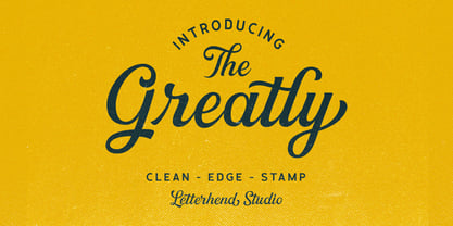 Greatly Script gives you a classic feel and is really perfect for you who needs a typeface for especially logotype, apparel, invitations, branding, packaging, advertising, and more. Greatly comes in uppercase, lowercase, with punctuations, symbols and numerals, stylistic alternate sets, ligatures, also multi-lingual support and is already PUA encoded.
 - Tahu Bullats by HansCo,
$15.00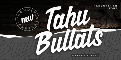 Tahu Bullats a Handwriting typeface. Tahu Bullats is a bold and fun typeface with many ligatures and alternates. Comes with a full uppercase, lowercase, numbers and punctuation + standard multilingual support. It’s great for branding, logo designs, lettering, logotype, clothing, posters, magazines, and much more. We recommend using Adobe Illustrator or Photoshop.
 - Fun Play by FunFont,
$17.00 Fun Play is A Fun and Playful display typeface family with 5 wights variant; from Light to Bold. Comes with many features; Multilingual Support, Ligatures, Stylistic Alternate and more. Each character represents a child's joy. ‘Fun Play’ can be used for branding, packaging, headline and all styles of children-related design.
 - Minimal by Kmaz,
$10.00 Minimal is a distinguished sans serif display family with minimalistic modern edges, designed by Khalid Al-Mazrouei and published by Kmaz. Minimal packs a complete set of uppercase and lowercase letters, numbers and punctuation and comes in 3 weights (Thin, Regular, and Bold). Perfect for headlines, magazines, and much more.
 - Ahimsa by Satori TF,
$12.00 Ahimsa is a dynamic humanist sans serif family. It comes in 6 weights with matching italics. It contains a lot of contrast in the connection to the stems in order to give it a more dynamic feel, and also has low descenders and a large x-height and great legibility.
 - Nabire 1943 by XdCreative,
$29.00 Nabire Grotesk 1943 Nabire Grotesk 1943 is a type of sans-serif font that has a simple character and clean geometric shapes, with a lack of ornament. Nabire Grotesk 1943 has an ink trap feature, which is a feature of certain typefaces designed for printing in small sizes. Nabire Grotesk 1943 also has clean features, and modern lines and are considered to be a more neutral and versatile typeface, making them well-suited for a variety of uses, such as headlines, titles, and body text. They are also often used in digital environments, where their simple and straightforward design is considered to be more legible on screens. Nabire Grotesk 1943 come up with 18 styles from thin to heavy and matching italics, More than 300+ supported languages: Cyrillic script (15 of 93 languages supported) Greek script (1 of 3 languages supported) Latin script (295 of 544 languages supported) Thank You
 - Deportivo by 8AV,
$15.00 Welcome Deportivo - Spanish for sporty. Deportivo is a simple and powerful typeface based on the lettering on vintage sports equipment. I saw it as a brand on a pair of old skis and fell in love with it because it is so bold and it can be easily read while moving at high speed, making it perfect in a sports and dynamic environment. Due to its high legibility, it gets great results with sports teams, league names and t-shirt numbers and race indications. The high x-height gives the typeface a unique look and a strong tone of voice - that will echo in each arena and outside making it perfect also for headlines in newspapers and magazines and product names. Keep scoring!
 - Speed Bump by Three Islands Press,
$19.00 I, uh, don't know quite what to say. I'd toiled so long over Pumpkinseed back in '96 that I guess I needed a good, wild ride to shake out the head cramps, or something. Whatever grabbed me, it forced me to sit down and design a typeface real fast directly in Fontographer (had never done that before). Took less than two hours to finish the regular character set. No way to explain it, but the exercise actually paid off -- I think. And now that there was Speed Bump, there simply had to be a companion dingbat set. (Beats the heck out of me.) So check out Speed Bump's wacky character(s) and, if you're really bored, the 200-some-odd little pictures in Speed Bump Pi.
 - ITC Portago by ITC,
$29.99 ITC Portago was designed by Luis Siquot, who admits to a tendency toward unusual typefaces that can be read in text yet also work well in display settings. ITC Portago is a robust alphabet of caps and slightly smaller caps. It is a stencil face, based on the lettering on crates and luggage. Siquot says that his intention drawing Portago was to obtain a neutral, classical, very condensed grotesque stencil shape that is readable in text sizes, showing at the same time the 'movement' produced by the nicked edges. And of course the more obvious rough effect in headline sizes." At small sizes, Portago is best set with slightly looser letterspacing, as capital combinations usually do. Portago includes numerals in both full and small caps proportions.
 - Ful • Fruitful & Universal Labels by S P I C I O,
$88.88 What is ful? ful is a useful and universal language of symbols for food products. Why use ful? ful is a simple visual system. With ful, you’ll never have to read the entire label to know the basic information. With ful, you have access to the basic information much faster. Answering the questions: • What kind of diet is it? [Diet] • How to store, prepare, and use? [Use] • Can I eat it? [Warnings] Why create ful? • To have the basic information quickly, anywhere in the world. • To create a more homogeneous design. • To solve some of the basic problems with the old designs. • To accelerate the process of consumer choice. • To provide as much information as possible in the least possible space. http://ful.graphics/
 - Sina by Hoftype,
$- Sina is a strong, sturdy and self-confident serif accented face. Distinct ascenders and descenders in classical proportions ensure pleasant reading. Robust but assertively warm, it recalls and references the virtues of early classical printing types but presents a distinctly contemporary look. With its even text flow it works very well for long texts. It is also great for headlines and in larger styles. An extended, fine-tuned range of weights renders it suitable for almost every application. Sina comes in 12 styles and in OpenType format. All styles contain standard and discretionary ligatures, small caps, proportional lining figures, tabular lining figures, proportional old style figures, lining old style figures, matching currency symbols, fractions, and scientific numerals. Sina supports West European, Central and East European languages.
 - Supra by Wiescher Design,
$29.00 »Supra« – designed by Gert Wiescher in 2012/13 – is a new sans typeface family of eight weights with matching italics. Supra is influenced by current and past sans typefaces, but has a completely new look. The pleasant flow and warm touch combined with great legibility makes Supra unique. The light and normal weights and the dominant x-height with its high ascenders make for easy reading of long copy. The heavy and x-light weights are great for elegant headlines. Supra is an OpenType family for professional typography with an extended character set of over 700 glyphs. It supports more than 40 Central- and Eastern-European as well as many Western languages. Ligatures, different figures, fractions, currency symbols and smallcaps can be found in all cuts.
 - Billiboldy by Gie Studio,
$10.00 Are you planning to do an amazing piece of work to make lots of people smile happily while taking your hat off every time? If so, this is the right time to give your work a little touch with a sincere and elegant writing. Introducing Billiboldy- A New Bold Script Font Billiboldy is a cursive and thick lettered handwritten bold script font, crafted to give your headlines and logotype projects a stylish touch. This font reads as strong, dynamic and can add tons of nostalgic character to your designs. This font includes Multilingual Options to make your branding globally acceptable. Features: - Ligatures - Stylistic Sets - Multilingual Support - PUA Encoded - Numerals and Punctuation - Special underscore character 7 style - Special doodles for front and back of letters or sentences Thank you for your visit and downloading premium fonts from Gie Studio
 - Akahe by Product Type,
$17.00 Introducing Akahe, a font that blends traditional elegance with modern sophistication. With its thick strokes and serif edges, Akahe adds a touch of classic style to any design. And with its stylistic set options for upper and lowercase letters, you can personalize the font to suit your unique style. Whether you’re working on a website, a brochure, or a branding project, Akahe is the perfect font to elevate your designs. Its thick strokes and serif edges make it highly legible, so your designs will always be easy to read and understand. But Akahe isn’t just beautiful, it’s also versatile and functional. You can use its stylistic set options to customize the font to your specific needs, making it perfect for a wide range of design projects. And with its comprehensive character set, you can create designs in multiple languages. So why settle for a standard font when you can have Akahe? Download it today and start creating designs that are both classic and modern, sophisticated and stylish. Whether you’re working on a large-scale project or just looking for a new font for your personal designs, Akahe is a perfect choice. What’s Included : - File fon - All glyphs Iso Latin 1 - We highly recommend using a program that supports OpenType features and Glyphs panels like - many Adobe apps and Corel Draw, so you can see and access all Glyph variations. - PUA Encoded Characters – Fully accessible without additional design software. - Fonts include Multilingual support
 - Sabon Paneuropean by Linotype,
$45.99Jan Tschichold designed Sabon in 1964, and it was produced jointly by three foundries: D. Stempel AG, Linotype and Monotype. This was in response to a request from German master printers to make a font family that was the same design for the three metal type technologies of the time: foundry type for hand composition, linecasting, and single-type machine composition. Tschichold turned to the sixteenth century for inspiration, and the story has a complicated family thread that connects his Sabon design to the Garamond lineage. Jakob Sabon, who the type is named for, was a student of the great French punchcutter Claude Garamond. He completed a set of his teacher's punches after Garamond's death in 1561. Sabon became owner of a German foundry when he married the granddaughter of the Frankfurt printer, Christian Egenolff. Sabon died in 1580, and his widow married Konrad Berner, who took over the foundry. Tschichold loosely based his design on types from the 1592 specimen sheet issued by the Egenolff-Berner foundry: a 14-point roman attributed to Claude Garamond, and an italic attributed to Robert Granjon. Sabon was the typeface name chosen for this twentieth century revival and joint venture in production; this name avoided confusion with other fonts connected with the names of Garamond and Granjon. Classic, elegant, and extremely legible, Sabon is one of the most beautiful Garamond variations. Always a good choice for book typography, the Sabon family is also particularly good for text and headlines in magazines, advertisements, documentation, business reports, corporate design, multimedia, and correspondence. Sabon combines well with: Sans serif fonts such as Frutiger, Syntax. Slab serif fonts such as PMN Caecilia, Clairvaux. Fun fonts such as Grafilone, Animalia, Araby Rafique. See also the new revised version Sabon Next from the Platinum Collection." - Luckiest by Krismagraph,
$19.00 Luckiest is a Stylish Ligature Serif Font. Its soft curves mixed with high-contrast glyphs, give it a feminine and masculine quality. Come in two versions, namely Regular & Italic. It comes with beauty ligatures. Great in layout design for quotes or body copy, best used as a display for headings, logos, branding, magazines, product packaging, and invitations. Accessible in Adobe Illustrator, Adobe Photoshop, Adobe InDesign, and even work on Microsoft Word. PUA Encoded Characters – Fully accessible without additional design software. Fonts include multilingual support: Afrikaans, Albanian, Asu, Basque, Bemba, Bena, Breton, Catalan, Chiga, Colognian, Cornish, Croatian, Czech, Danish, Dutch, Embu, English, Esperanto, Estonian, Faroese, Filipino, Finnish, French, Friulian, Galician, German, Gusii, Hungarian, Indonesian, Irish, Italian, Kabuverdianu, Kalenjin Kamba, Kikuyu, Kinyarwanda, Latvian, Lithuanian, Lower, Sorbian, Luo, Luxembourgish, Luyia, Machame, Makhuwa-Meetto, Makonde, Malagasy, Maltese, Manx, Meru, Morisyen, North, Ndebele, Norwegian, Bokmål, Norwegian, Nynorsk, Nyankole, Oromo, Polish Portuguese, Quechua, Romanian, Romansh, Rombo, Rundi, Rwa, Samburu, Sango, Sangu, Scottish, Gaelic, Sena, Serbian, Shambala, Shona, Slovak, Soga, Somali, Spanish, Swahili, Swedish, Swiss German, Taita, Teso, Turkish, Upper, Sorbian, Uzbek (Latin), Volapük, Vunjo, Walser, Welsh, Western, Frisian, Zulu. Image used: All photographs/pictures/vectors used in the preview are not included, they are intended for illustration only. Feel free to follow, like, and share. Thanks so much for checking out my shop!
 - Lalibela by CyberGraphics,
$43.00My motivation for designing the Lalibela family (which is based on Bodoni) was to pay homage to Ethiopic script. The script has been around for about 3 000 years, but I took artistic licence to deviate from the original model and add personal touches. I chose Bodoni as a historical model because of its display value and not its text size use because the extreme contrast made it difficult to read at small sizes. A Modern typeface characterized by consistently horizontal stress, flat and un-bracketed serifs, and a high contrast between thin and thick strokes, were the final step in typography two-hundred-year journey away from calligraphy. The austerity, simplicity and greater contrast style was perfected.Contrary to all the refinements in Bodoni, I have revisited calligraphy with the font Lalibela that mimics Ethiopic Script. It was drawn with a much larger x height and less geometric than Bodoni for its primary use as a display font. For example, a lot of italic serifs were added to the roman face as well as 16 additional ligatures to obtain more a feel of calligraphy. I made the serifs thicker and bracket one side with straight steps obtaining a reduced contrast to withstand breaking up at smaller sizes.An additional variant, "Lalibela Alternate" was designed to provide an interesting mixing possibilities with the Bold face for more expressive headlines. - Uechi is an intriguing font, born out of collaboration and creativity. Created by American composer and typographer David Rakowski, Uechi is not just a typeface but a reflection of an artistic journe...
- Wavy Lines by Patria Ari,
$15.00 Introducing Wavy Lines – wave line font in uppercase and lowercase. This font can use to support your project to make design more beautiful. Wavy Lines suitable for book cover, merchandise, poster, title, quotes, and many more!
 - Backnotes by Silverdav,
$14.00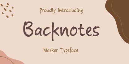 Backnotes font is a handwritten font with unique strokes, designed to enhance your designs so that your designs become more beautiful. Perfect for logo, wedding invitations, t-shirt, quotes, magazines, signature, branding silhouette, and many more.
 - Segatha by Ef Studio,
$15.00 Segatha is a beautiful casual handwritten font with beginning and ending lowercase swashes, 94 ligatures that add more beautiful and aesthetic fonts to perfect your extraordinary project. very suitable for branding, invitations, watermarks, photography, and more.
 - Shelf Tags JNL by Jeff Levine,
$29.00 Before the mid-to-late 1970s, when retailers started to embrace UPC (universal price code) technology on a grand scale, pricing merchandise took on many forms. One method especially popular with variety stores (such as Woolworth's, McCrory's, Kress, etc.) were pre-printed price tags that came in small pads and were inserted into metal holders. Shelf Tags JNL recreates a vintage price tag based on examples seen online, and allows the user different ways to create their own vintage-style price tags. You can either utilize the round pen nib style numbers and price marks to place on any size or type tag, or type out prices using the reversed characters (white on black) along with the two end caps provided to form a complete tag unit. For the more adventurous, a complete blank tag is also provided in case the desire is to print a solid color tag background and [using the regular numbers] crate prices in custom colors. Two sets of smaller number (for "floating" cents prices) are also provided in regular numbers and reverse panels. As an extra bonus, there is a set of 1 through zero, dollar sign, cents sign and decimal point individual black-on-white outlined panels for making individual pricing numbers. The keyboard layout for the various characters is as follows: asterisk key - regular cents sign (no panel) dollar sign key - regular dollar sign (no panel) period key - regular decimal point (no panel) left and right parenthesis keys - panel end caps (to form price tags) colon key - reverse decimal point on black panel 1 thru 0 keys - regular numbers (no panels) A through J keys - small regular numbers (no panels) K and L keys - truncated [shorter width] end caps M through Y keys - individual price numbers (black on white with black border a through j keys - reverse numbers on black panels k key - reverse dollar sign on black panel l key - reverse cents sign on black panel m through v keys - reverse small numbers on black panels w through z keys - blank rectangular panels of varying widths equal sign key - full black panel price tag hyphen key - blank rectangular black panel based on the width of most number panels
 - Myna by Milatype,
$15.00 Myna is a modern geometric sans font family, primarily designed to be a lightweight web font. But is also suitable for any other purpose, such as brand design or editorial design, or any other use case that require clean and elegant geometric sans font. It contains 54 styles, divided into Condensed, Regular and Expanded weight, with 18 styles in each (9 upright, and 9 italic styles), ranging from Thin to Black styles, and are all available in one variable font. All styles are manually TrueType hinted to produce sharp glyph outlines for easier reading at small text sizes. And all contain OpenType features: Fractions, Kerning, Ordinals, Scientific Inferiors, Subscript, Superscript.
 - Space Time by Lauren Ashpole,
$15.00 What can I say? I like fonts with stars. Space Time is a hand drawn font with a lot of variety. I started designing the regular version with the characters slightly touching but it wasn't quite what I had in my head. I’d imagined tightly spaced letters with overlapping shadows and the only way to get that effect was to create a second version with stackable layers. That means this download includes regular, base, outline, shadow, and stars files. Plus, the base and outline can be used for stacking or work fine as standalone fonts. This font is all caps but the lowercase letters feature alternative styles.
 - Lucida Grande by Monotype,
$50.99 Lucida Grande is a humanist sans serif font with a large x-height, clear letterforms, and space-saving economy. Its easy reading qualities make it legible for printing and screen displays even down to small sizes. Lucida Grande is part of the Lucida superfamily of fonts from Bigelow & Holmes. Lucida is highly regarded for legibility and its extensive range of type styles. The Lucida Grande family has eight fonts with weights from Thin to Black with matching italics. Each font has 674 glyphs and supports the W1G character set. This includes Latin, Greek and Cyrillic alphabets to support many languages in Europe, the Americas, and worldwide.
 - Risbeg by Craft Supply Co,
$20.00 Risbeg – Elegant Serif Font: A Font for Impactful Titles Timeless Elegance Meets Modern Design Risbeg Elegant Serif Font blends classic serif features with a modern twist, creating a stylish and engaging visual experience. Its well-crafted curves and distinct serifs make it perfect for titles that demand attention. Each character in Risbeg is designed with precision, ensuring a harmonious balance in your designs. Versatile and Readable Risbeg stands out for its versatility, adapting seamlessly to various design needs. Whether it’s for branding, editorial layouts, or digital media, this font maintains readability across different mediums. Its clear, crisp lines make reading effortless, even in dense text blocks.
 - Cristal Text by Johannes Krenner,
$5.00 »Cristal Text« has nice to read lower case letters. It contains 636 letters per font style and some Open Type features: Different stylistic alternates and different sets of numerals. It is not monospaced: Therefor it stays not true to an underlying grid like it’s bigger brother »Cristal True«. But this offers a better legibility. The basis of this font is a Union-Jack or sixteen-segment display (SISD). I have found myself in the need of a precise and well-made font, that simulates the look of such a LCD display. Also it should offer enough letters and language support for the whole European region as well as different font styles.
 - Happy Brain Creepy Thalamus by TypoGraphicDesign,
$19.00 CONCEPT/ CHARACTERISTICS The base was a head-vein illustration. This served as a design grid. Novel letterforms were sought and found. Hand-drawn analog and digitized later. Experimentally, novel, fresh and an eye-catcher. Completely new insights into the human brain. A font for happy thoughts. ghostly visions, or simply for the next freshen party flyers. APPLICATION AREA The happy, creepy, Horror handmade font »Happy Brain Creepy Thalamus« with many language support would look good at headlines. Magazines or websites, party flyer, movie posters, music Poster, music covers or webbanner. TECHNICAL SPECIFICATIONS Headline Font | Display Font | Handmade Horror Font "Happy Brain Creepy Thalamus" OpenType Font with 283 glyphs, alternative letters and ligatures (with accents & €) & 1 style (regular).
 - Boosters by Nathatype,
$29.00 Looking for a vintage and bold font to captivate your audience or clients,? If you need to create have a t-shirt branding company, or need to create a new menu - then this is the perfect font for you. Boosters-A Vintage Font Boldy Vintage is a bold, fun, and vintage typeface that is made in uppercase and lowercase. This font is the best to maximize the amount of street vibe and vintage vibes. Ideal to create amazing headings, logos, menus, and social media graphics. Our font always includes Multilingual Support to make your branding reach a global audience. Features: Ligatures Alternates Bonus Oranament PUA Encoded Numerals and Punctuation Thank you for downloading premium fonts from Nathatype
 - Nur Hidayah by Anomali Creative,
$10.00 Introducing Nur Hidayah Arabic Calligraphic Font this is an Arabic display style font that weaves intellect with imagination in a harmonious flow of letterforms. Nur Hidayah Arabic Calligraphic Font demonstrates a mysterious beauty of Arabic typography which is found to be essential for narrative content titling. The font is also suitable for branding and visual advertising. in the Arabic Language, Nur Hidayah refers to the Holy Enlightment. It also indicates the person who’s allready get a clear bright enlightment in their spiritual journey. The font features a unique writing style with a solid geometric structure which suits titling and creative heading. Nur Hidayah Arabic Calligraphic Font consists of three (3) style; Regular, dotted and Bold.
 - Cairoli Now by Italiantype,
$39.00 Cairoli was originally cast by Italian foundry Nebiolo in 1928, as a license of a design by Wagner & Schmidt, known as Neue moderne Grotesk. Its solid grotesque design (later developed as Aurora by Weber and Akzidenz-Grotesk by Haas) was extremely successful: it anticipated the versatility of sans serif superfamilies thanks to its range of weights and widths, while still retaining some eccentricities from end-of the century lead and wood type. In 2020 the Italiantype team directed by Cosimo Lorenzo Pancini and Mario De Libero decided to produce a revival of Cairoli, extending the original weight and width range and developing both a faithful Classic version and a Now variant. The Cairoli Classic family keeps the original low x-height range, very display-oriented, and normalizes the design while emphasizing the original peculiarities like the hook cuts in curved letters, the high-waisted uppercase R and the squared ovals of the letterforms. Cairoli Now is developed with an higher x-height, more suited for text and digital use, and adds to the original design deeper ink-traps and round punctuation, while slightly correcting the curves for a more contemporary look. Born as an exercise in subtlety and love for lost letterforms, Cairoli stands, like its lead ancestor from a century ago, at the crossroads between artsy craftsmanship and industrial needs. Its deviations from the norm are small enough to give it personality without affecting readability, and the expanded weight and width range make it into a workhorse superfamily with open type features (alternates, stylistic sets, positional numbers) and coverage of over two hundred languages using the latin extended alphabet.
 - Cairoli Classic by Italiantype,
$39.00 Cairoli was originally cast by Italian foundry Nebiolo in 1928, as a license of a design by Wagner & Schmidt, known as Neue moderne Grotesk. Its solid grotesque design (later developed as Aurora by Weber and Akzidenz-Grotesk by Haas) was extremely successful: it anticipated the versatility of sans serif superfamilies thanks to its range of weights and widths, while still retaining some eccentricities from end-of the century lead and wood type. In 2020 the Italiantype team directed by Cosimo Lorenzo Pancini and Mario De Libero decided to produce a revival of Cairoli, extending the original weight and width range and developing both a faithful Classic version and a Now variant. The Cairoli Classic family keeps the original low x-height range, very display-oriented, and normalizes the design while emphasizing the original peculiarities like the hook cuts in curved letters, the high-waisted uppercase R and the squared ovals of the letterforms. Cairoli Now is developed with an higher x-height, more suited for text and digital use, and adds to the original design deeper ink-traps and round punctuation, while slightly correcting the curves for a more contemporary look. Born as an exercise in subtlety and love for lost letterforms, Cairoli stands, like its lead ancestor from a century ago, at the crossroads between artsy craftsmanship and industrial needs. Its deviations from the norm are small enough to give it personality without affecting readability, and the expanded weight and width range make it into a workhorse superfamily with open type features (alternates, stylistic sets, positional numbers) and coverage of over two hundred languages using the latin extended alphabet.
 - Wooden Alphabet by Yumna Type,
$25.00 Wooden Alphabet is a peculiar wood texture and shape-inspiring display font having unique, attractive letter designs in prominent uppercases along with wood textures to express natural nuances. All of the font letters are very carefully, smoothly designed in detail as if they were made of real wood. In fact, wood textures on the letters leave the impressions of warmth and nature on the designs. Wooden Alphabet excels at the ability to create natural impressions and warm nuances in order to make your designs look interestingly different for increasing the product’s attractiveness. Such a wood-themed font is a perfect match for any nature, environment, or organic related products. To be greatly legible, you can use it for big text sizes. Wooden Alphabet provides a clipart in accordance with the font theme as a bonus and features you can enjoy. Features: Multilingual Supports PUA Encoded Numerals and Punctuations Wooden Alphabet fits best for various design projects, such as brandings, headings, magazine covers, quotes, printed products, merchandise, social media, etc. Find out more ways to use this font by taking a look at the font preview. Thanks for purchasing our fonts. Hopefully, you have a great time using our font. Feel free to contact us anytime for further information or when you have trouble with the font. Thanks a lot and happy designing.