10,000 search results
(0.066 seconds)
- Mix Sonic by Mix Fonts,
$13.00 MIX SONIC is a font pair inspired by the night sky. You get a round, bouncy and plump decorative san serif in MIX SONIC MOON and an all-uppercase and moon and stars dingbat hybrid in MIX SONIC STAR. The shapes of these glyphs capture the various phases of the moon, and how it lights up eerily lights up the night sky at each phase. MIX SONIC MOON and MIX SONIC STAR are great additions to your font collection. Make it a go-to font for all your projects of the mystic, astrology, magic, zodiac, elemental, witchcraft or divine variety. Use together, or separately, both font sets are sure to delight! MIX SONIC MOON comes with the following glyphs: ABCDEFGHIJKLMNOPQRSTUVWXYZ abcdefghijklmnopqrstuvwxyz 0123456789 !@#$%^&*()`~♥♥✿•· ÷×+−±≈=≠≥≤[]<>:;’”,.\|/?{}“”‘’-–—_… ©®™‹›«»°¹²³ªº¡¿₱¢€£¥½¼¾¶§№† ÁÀÂÄÃÅĂĀĄÆĆĈČÇÐĐÉÈÊËĖĒĘĜĤIÍÌÎÏĪĮĴŁŃÑŇÓÒÔÖÕŌŐ ØŒŔŘŚŜŠŞȘŤȚÚÙÛÜŮŰŬŪŲẂẀŴÝŶŸŹẐŽŻÞẞ áàâäãåăāąæćĉčçðđéèêëėēęĝĥıíìîïīįĵłńñňóòôöõōő øœŕřśŝšşșťțúùûüůűŭūųẃẁŵýŷÿźẑžżþß MIX SONIC STAR comes with the following glyphs: ABCDEFGHIJKLMNOPQRSTUVWXYZ abcdefghijklmnopqrstu-vwxyz 0123456789 !@#$%^&*()`~+= []<>:;’”,.\|/?{}“”‘’-_‹›₱¢€£¥ Fellow witches, enjoy!
 - Inflate PTx by Pedro Teixeira,
$20.00 Introducing the Inflate PTx font family, a delightful and playful typeface collection that embodies the buoyant spirit of celebration and festivity. This font can be use in old and new apps that use/read fonts, because it's format (old school format :)), not OpenType SVG format. To install fast on the PC: right click in the OpenType file, then "Install". But if you want to open the file, please be pacient. It takes time to open and read the OpenType file depending of the capacity of your PC. The Inflate PTx font family is tailor-made for creative projects, from birthday party invitations and children's book illustrations to social media graphics for Instagram or themed event posters. Its rounded edges and bubbly forms infuse any design with an infectious sense of joy and lightheartedness, making it an ideal choice for those seeking a playful and festive typographic solution.
 - Lust by Positype,
$49.00 Lust’s original masters were completely redrawn, expanded, with a new optical size added based on customer requests. Lust now sports 6 fonts, instead of the original 4: Standard, Display, Fine, and complementing Italics. The character set has been expanded as well to include more OpenType features and more swashes. The Lust Collection is the culmination of 5 years of exploration and development, and I am very excited to share it with everyone. When the original Lust was first conceived in 2010 and released a year and half later, I had planned for a Script and a Sans to accompany it. The Script was released about a year later, but I paused the Sans. The primary reason was the amount of feedback and requests I was receiving for alternate versions, expansions, and ‘hey, have you considered making?’ and so on. I listen to my customers and what they are needing… and besides, I was stalling with the Sans. Like Optima and other earlier high-contrast sans, they are difficult to deliver responsibly without suffering from ill-conceived excess or timidity. The new Lust Collection aggregates all of that past customer feedback and distills it into 6 separate families, each adhering to the original Lust precept of exercises in indulgence and each based in large part on the original 2010 exemplars produced for Lust. I just hate that it took so long to deliver, but better right, than rushed, I imagine.
 - HWT Star Ornaments by Hamilton Wood Type Collection,
$24.95 Star Ornaments are seen as a long standing companion to many wood type poster layouts. Various manufacturers managed to derive many variations of the five pointed star motif and offered them as a ubiquitous ornament option in almost all of their catalogs. Manufacturers such as Wm. H Page, Morgans & Wilcox, Tubbs Mfg. Co. and of course, Hamilton Wood Type each had their own slight variations. This digital font features almost 100 glyphs of mostly stars, but it also features a unique star border that can create boxes just like the modular offerings of the 19th century. The twist on this digital version is the inclusion of additional connection options that become a unique lettering 'kit' that can create typography or maze-like connections using a limited set of component parts.
 - WildSong by Scholtz Fonts,
$19.00 WildSong was inspired by the exuberant flight and beautiful song of birds. While most brush scripts take their cue from mid-twentieth century samples, WildSong is a fresh, contemporary alternative. WildSong reflects a dynamic interplay between dark and light, creating a sense of drama while hinting at a calligraphic background. Words suggest a baseline, yet are not bound by it. Letters interweave in a seemingly random dance, sometimes connecting smoothly, then breaking that connection as a calligraphic scribe does intuitively. Exuberant swash alternatives to uppercase letters, as well as ligatures can be accessed through both the type and glyph palettes. The font contains over 235 characters - (upper and lower case characters, punctuation, numerals, symbols and accented characters are present). It has all the accented characters used in the major European languages.
 - Shiny Ink Display by Lloyd David Designs,
$14.99 Hi there, thanks for looking at my first typeface. It began as one of my original sketches back in 2019 as a freelance graphic designer trying to create unique letterforms that I could use for posters or websites with other possible use cases in mind for commercial use. The sketches were then passed on to and worked on with Vladimir Tsagolov who has more experience in creating professional typefaces, the experience for me was invaluable, and I have many more typefaces I'm now working on. Shiny Ink Display is a collection of hand drawn fonts based on the flow of reflective viscous ink with 7 styles, some styles can be interchangeable and used on top of each other. For example, Shiny Ink Display Plain, can be used with Shiny Ink Display Plain Lined to create shadows underneath it, at angles not available with the Shadow styles you'll see in the font collection. Shiny Ink Display has various use cases, maybe even infinite, but more specifically for posters or websites with large text, though it bodes quite well at smaller sizes, and is visually appealing to its viewers as long as it's at a legible font size. When it comes to font pairing, Shiny Ink Display works especially well with Monospace and sans-serif fonts. You can check the poster examples on this page to help you imagine what you could do with the font styles. I also had in mind manufactured products, but I could leave that to you to create your ideas with the available font styles. In regards to languages or typing on a keyboard, most of the English/European latin or cyrillic language keys are supported, so you'll have lots of glyph characters to play with for a number of ideas you may have. All the best with your projects using my fonts, if there are any issues, don't hesitate to contact me for support: lloyddaviddesigns.co.uk - Lloyd David
 - Architype Albers by The Foundry,
$50.00 Architype Konstrukt is a collection of avant-garde typefaces deriving mainly from the work of artists/designers of the inter-war years, whose ideals have helped to shape the design philosophies of the modernist movement in Europe. Due to their experimental nature character sets may be limited. Architype Albers draws on early grid-based attempts by Josef Albers, in 1926, to design an alphabet by reducing the forms to purely geometric elements – the square, triangle and parts of a circle – and in the process creating an unusual stencil effect typeface.
 - Architype Van Doesburg by The Foundry,
$99.00 Architype Konstrukt is a collection of avant-garde typefaces deriving mainly from the work of artists/designers of the inter-war years, whose ideals have helped to shape the design philosophies of the modernist movement in Europe. Due to their experimental nature character sets may be limited. Architype Van Doesburg derives from the 1919 experimental geometric alphabet by Theo van Doesburg, whose work was heavily influenced by De Stijl theories, specifically rectangularity. The typeface has been constructed on the same 5 x 5 grid, and is limited by his ‘single alphabet’ theory.
 - Congress by Monotype,
$29.99Congress from Adrian Williams was shown for the first time at the Association Typographique International Congress, which proved to be so popular in 1980 at Kiel; designed to present a style equally appealling in European languages. Many characters are more condensed than is usual, while others have had certain elements exagerated, bringing notice to new elements of certain letters. The concept being to bring an equality of importance to the whole, producing a collection of International characters working together in harmony on the page -- a common aim that Europeans wish of any Congress. - Architype Van der Leck by The Foundry,
$50.00 Architype Konstrukt is a collection of avant-garde typefaces deriving mainly from the work of artists/designers of the inter-war years, whose ideals have helped to shape the design philosophies of the modernist movement in Europe. Due to their experimental nature character sets may be limited. Architype Van der Leck originates from the lettering that Bart Van der Leck created for ‘Flax’ magazine in 1941. The letterforms‘ restricted shapes and abstract, stencil-like forms reflect the strong geometric language of De Stijl and show influence from his abstract paintings.
 - Architype Bayer Type by The Foundry,
$99.00 Architype Universal is a collection of avant-garde typefaces deriving mainly from the work of artists/designers of the inter-war years, whose ideals underpin the design philosophies of the modernist movement in Europe. Their ‘universal’, ‘single alphabet’ theory limits the character sets. Architype Bayer-type is based upon Herbert Bayer’s 1931 universal, modern serifed alphabet. Although the ‘modern’ style appears to be a radical departure from his first sans single alphabet of 1925, the structure of this later serifed style is still grid based and geometrically constructed.
 - CA Edwald by Cape Arcona Type Foundry,
$40.00 CA Edwald, the superbly crafted alphabet design now available in 5 weights, combining the familiar, the unusual, the practical and the aesthetic. Plan ahead and make use of the assorted logo letters that add distinction to your headline. CA Edwald is a welcome addition to our ever-growing collection of alphabet designs. It is prepared to meet your graphic requirements. Now there is one trusty Musketeer for today’s advertising. The illegitimate child of Oswald Bruce Cooper and Ed Benguiat, a mixture or even the “best of”: CA EDWALD.
 - Al Zephyre Conquer by Aluyeah Studio,
$125.00 Hello Aluyeaholics! Unveiling the Zephyre Conquer, a luxurious windy ligature display typeface, which masterfully blends the mysterious allure of the zephyr with the beauty and grace. It's a unique amalgamation of mindful design and desire that creates an inexplicably elegant aesthetic. Conquer and capture attention whilst adding a dash of elegance to your projects with Zephyre Conquer. Indulge in an opulent collection of more than 200+ quick-access ligatures and alternatives with Zephyre Conquer. It presents everyone the luxury to summon deeper creativity and mold their artistry with grace.
 - Sava by Adobe,
$35.00Sava is a calligraphic capitals and small capitals design by Jovica Veljović. Available in six weights--light, regular, medium, semibold, bold and black--it includes support for most western and central European languages, as well as for Greek and many Cyrillic languages. Typographic features include a series of non-standard ligatures and a large collection of specialized Byzantine ornaments. Influenced by the forms of medieval calligraphy, Sava is named after St. Sava, the first Archbishop of Serbia, who was famous as a peacemaker, and for his educational and charitable works. - Mission Art by Woodside Graphics,
$19.95Mission Art contains 26 design elements from many of the California missions. From a dove about to alight on a mission wall, to floral accents of all kinds, to a mission cross, there's a design here for everyone and every purpose. An important part of this collection is 6 decorative borders that are designed in such a way that they can be used as single elements by themselves, or repeated to make a long border across a page. They join seamlessly by simply typing the appropriate letter over and over again. - Sutro by Parkinson,
$25.00 My affection for Slab Serifs began in the early 1960s in Kansas City with Rob Roy Kelly and his fabulous collection of wood type. In the 1970s tried to re-create a Nebiolo Egiziano for Roger Black. Again for Roger, in the 1980s I designed a Slab Serif logo for Newsweek Magazine. Finally, in 2003, designed the Sutro Family. There were things I didn't like about it, so when I did Version 2 for Open Type, I changed it around a little, making it a much nicer Sutro.
 - Edda by profonts,
$41.99 Edda Pro is another art nouveau revival by German type designer Ralph M. Unger. Edda Pro is based on Edda, designed in 1900 by Heinrich Heinz Heune for Schelter & Giesecke, Leipzig, Germany. Unger redesigned the beautiful forms, completed and expanded this outline caps-only typeface for the profonts library. Also, he added a nice collection of very useful frames and ornaments in EPS format supplied with the OTF version of Edda Pro.Edda Pro can be used for anything in advertising, signmaking, posters, restaurants, hairdressing, paint, wallpaper and so on.
 - Havelock by XO Type Co,
$40.00 Four interchangeable all-caps typefaces, made specifically for designers to layer and play with. Here’s more at the designer’s site. It combines hard and soft, geometry and pattern. Layer and mix styles within a single word, retaining coherent visual tone. Havelock Solid operates as a background layer, Multiline sits nicely atop it, Inline frames Multiline’s center strokes, and Stencil lets details peek through. If you’re working with translucent color, the blending can be gorgeous. Please note, if you're also looking at Havelock Titling: both collections are included in Havelock Complete for a lower price.
 - Attic Antique by Three Islands Press,
$29.00 Attic Antique by Three Islands Press. Flipping through a friend’s old hardbound collection of John Burroughs nature essays a while back, I thought it'd be fun to try to develop a typeface with the same uneven, imperfect look to it. I picked and chose among various printed characters, enlarged them somewhat with a photocopier, then hand-rendered each. Had to custom-make some of the accents and symbols, then added a couple goofy dingbats just for the heck of it. The result: an amazingly legible serif family akin to the Century faces.
 - Altemus Stars by Altemus Creative,
$11.00 Stars contains 174 characters; a variety of solid and dimensional star designs with from three to twelve points, pentagrams, sheriff stars, stars of david, outline stars, burst stars and airforce stars. Stars Two contains 174 characters; a variety of five pointed outline stars with centers, star designs composed from various geometric shapes with from three to eight points, jagged stars, quilt stars, outline stars, starfish, arrow stars, burst stars, drop shadow stars, ragged starbursts, double stars and air force stars. Stars Three is a collection of 174 star designs.
 - Fuel Uni Extended by VersusTwin,
$39.00 The Fuel Uni Extended typefaces are a modern update on the techno sans extended for stronger impact, adding further versatility with unicase design complete with soft rounded corners as well as decorative inktraps. Stylistic Alternates included within all styles are alternates for the capital B, E, and R, as well as lowercase g characters, as well as all of their accented siblings. The Fuel Complete package bundles all of the dynamic styles of the Fuel, Fuel Extended, Fuel Uni, Fuel Uni Extended, and Fuel Script typefaces into one powerhouse of a collection.
 - Congress Sans by Club Type,
$36.99 This sans serif type was completed in 1985, a descendant of the earlier serifed Congress shown for the first time at the Association Typographique International Congress, which proved to be so popular in 1980 at Kiel; designed to present a style equally appealing in European languages. Many characters are more condensed than is usual, while others have been exaggerated. The concept being to bring an equality of importance to the whole, producing a collection of International characters working together in harmony on the page-a common aim that Europeans wish of any Congress.
 - Toonerville NF by Nick's Fonts,
$10.00The original sheet music for Ted (Is Everybody Happy?) Lewis’ signature tune, When My Baby Smiles at Me, inspired this whimsical wonder. The sheet music was discovered in the Library of Congress American Memory Collection, an incredible online resource. The typeface gets its name from a slightly loony early 1900s comic strip by Fontaine Fox. This new and improved version has beefed-up outlines, so it renders well even at smaller sizes. Both versions contain the complete Unicode 1252 (Latin) and Unicode 1250 (Central European) character sets, with localization for Romanian and Moldovan. - Architype Schwitters by The Foundry,
$99.00 Architype Konstrukt is a collection of avant-garde typefaces deriving mainly from the work of artists/designers of the inter-war years, whose ideals have helped to shape the design philosophies of the modernist movement in Europe. Due to their experimental nature character sets may be limited. Architype Schwitters was developed from the phonetic experiments made by Kurt Schwitters with his 1927 universal alphabet, where he attempted to link sound and shape. He ‘played with’ using heavier, wider, rounded forms to convey the vowels, creating a unique visual speech texture.
 - Behrensschrift iF Plus by Ingo,
$29.00 Peter Behrens’ renowned art nouveau type from 1902 – with ornaments. Newly revised and neatly digitalized by Ingo Zimmermann In 1902, Peter Behrens (1869–1940), architect, designer and typographer, created a new ”German“ type which became very successful very quickly for the Rudhard’sche Gießerei (foundry which later became Gebr. Klingspor AG) in Offenbach am Main. It served, for example, as the official German type for the world expositions in 1904 and 1910. Behrens himself writes about the development of this type ”...For the actual form of my type, I took the technical principle of the Gothic script, the stroke of the quill feather. The proportions of height and width and the boldness of the strokes of the Gothic letters were also decisive for me in producing a German character. A cohesive character could be hoped for by avoiding all non-necessities and by strictly carrying out the design principle of holding the quill at an angle…“ By the way, when “long s” is activated, the typographically correct “round s” is automatically placed at the end of the word so that you need only pay attention to the correct s on syllable endings within words. When using “long s,” you must ensure the correct use of the rules for the Fraktur font: “round s” is always at the end of the word, also in compound words. For those of you who want to be even more correct, read the corresponding article in >> Wikipedia. Peter Behrens also drew matching ornaments for his typeface – we have likewise carefully revised these decorative touches and arranged them into a font. The "Behrens-Schrift" fits best on all topics that have something to do with art history or the time around 1900.
 - Brotherhood by 38-lineart,
$19.00 The current trend is social media, friendship connection applications and personal web portfolios. This media is used to tell about existence, most people like to upload photos on social media networks, even for personal web portfolios, sometimes people prefer to see the side of daily activities rather than products which are offered. Photos are visual responses, and there are many stories that can be told from a photo. But it will look more interesting if it is added with captions. The very appropriate caption is a text in handwriting. This is what inspired us to create attractive handwriting for social media and networking. We started to do a little research to see the trends of this type of font. Here are some of our notes; 1. Texts are usually in the form of relaxed, non-connected handwriting. 2. There are several connected glyphs, usually by the letters 'o', 'i' and 'y'. And double letters like ‘ll’ and ‘tt’. We anticipate this by making ligature for common texts written concatenated. 3. For personal web portfolio needs, provide affirmation as a characteristic. So the first letter is usually in the form of uppercase which is more prominent than the lowercase rhythm. Prominent but still in proportion. So this is "Brotherhood", a handwritten font that you can use for personal brands, captions and even paragraph writing. Expand your friendship and make your business more closely to your customers as a "Brotherhood" with this font.
 - Amanah Script by Alifinart Studio,
$15.00 Amanah Script is a handwritten font with a casual and modern calligraphy style. This font offers a large number of Stylistic Alternates, as well as beginning and ending swashes. This font has a total of 1660 glyphs, including capital letters, lowercase, numeral and punctuation, multilingual accents, swashes, and includes a large number of stylistic alternates and heart swashes (for lowercase letters). Amanah Script can be used for wedding card designs, invitation, best for photographer, traveling, blogging watermark or craft. Key Features: - Multilingual Accents - Stylistic Alternates up to 15 choices - Has a heart connected feature - Activate Stylistic Alternate by simply adding "period" (.) and “number” (1-15) to each lowercase letter. - Has ligature features so that the letters connect well together - Has OpenType and PUA Encodes feature. As I mentioned earlier, Amanah Script has a large number of Stylistic Alternates features, up to 15 options for lowercase letters. Interestingly, you can activate all Stylistic Alternates that are owned by each letter, just by typing; letter + period + number. For example: a.1 a.2 a.3 or b.1 b.2 b.3 and so on. As for activating the heart connected for each lowercase letters is quite easy, just by typing; letter + underscore + underscore + underscore + letter. For example: a___a or b___b and so on. If there are things you want to ask, don't hesitate to contact my email. Alifinart Studio alifinart@gmail.com Thank you.
 - Hockeynight Sans Rough by XTOPH,
$25.00 "Hockeynight Sans Rough" is the Letterpress version of my font "Hockeynight Sans". It's a contemporary college-sports font with the little twist – that its a misprinted grunge font. With its detailed grunge textures it is designed to go big and bold. "Hockeynight Sans Rough" is an uppercase font and it offers alternate glyphs as lowercases. Also you find a lot of bonus glyphs in the alternate glyphs panel! It pairs perfect with my other "Hockeynight" Fonts – Check it out!
 - HU Ketchup KR by Heummdesign,
$25.00 In HU Ketchup KR, the consonant and vowel strokes are naturally connected to add writing power to the thick headline, and the vowels are shaped like 'ㅅ', adding personality and cuteness at the same time.
 - Rolling Story by Bejeletter,
$12.00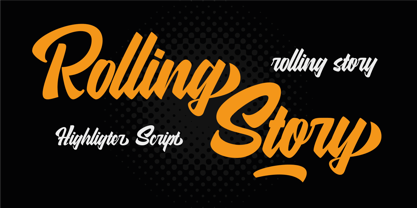 Rolling Story is a highligter script, connecting script that can appear both retro and contemporary. Suitable for design, element design, fashion blogs, vintage, wedding, event, t-shirt, logo, badges, sticker, and awesome work, and more.
 - Script Love by Okaycat,
$29.95 Script Love is a connected cursive script appearing as hand written in three weights: fine pen, pen & marker. Script Love features extended characters, containing West European diacritics & ligatures, making it suitable for international environments & publications.
 - Suomi Slab Serif by Suomi,
$19.00 All typewriter types are rounded and especially American Typewriter has an almost too-slick appearance. Suomi Slab Serif has the glyph shapes similar to typewriting, but the serifs, terminals and connections are crisp and sharp.
 - Magic Space by Flawlessandco,
$9.00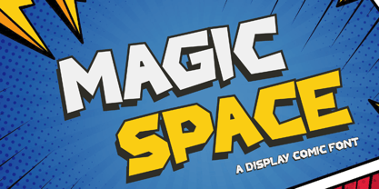 Magic Space is a Playful Comic Display Font. Embark on a whimsical journey through the cosmos with "Magic Space," a captivating comic display font that adds an enchanting touch to your designs. There's some connected letters and some alternates that suitable for any graphic designs. This font support for some multilingual. Also contains uppercase A-Z and lowercase a-z, alternate character, numbers 0-9, and some punctuation. If you need help, just write me! Thanks so much for checking out my shop!
 - Faston by Flawlessandco,
$9.00 Faston is a Modern Display Sans Serif Font. Unleash the power of contemporary design with Faston, a dynamic and versatile display sans serif font that elevates your projects to the cutting edge. There's some connected letters and some alternates that suitable for any graphic designs. This font support for some multilingual. Also contains uppercase A-Z and lowercase a-z, alternate character, numbers 0-9, and some punctuation. If you need help, just write me! Thanks so much for checking out my shop!
 - Make Wish by Flawlessandco,
$9.00 Make Wish is a Handwritten Funny Font. Unleash a burst of laughter and lightheartedness with "Make Wish," a delightful handwritten font that adds a touch of humor and playfulness to your designs. There's some connected letters and some alternates that suitable for any graphic designs. This font support for some multilingual. Also contains uppercase A-Z and lowercase a-z, alternate character, numbers 0-9, and some punctuation. If you need help, just write me! Thanks so much for checking out my shop!
 - Woly Wonka by Flawlessandco,
$9.00 Introducing "Woly Wonka" - A Display Sans Font. Step into a world of whimsy and imagination with "Woly Wonka," a captivating display sans font that adds a touch of playfulness to your designs. There's some connected letters and some alternates that suitable for any graphic designs. This font support for some multilingual. Also contains uppercase A-Z and lowercase a-z, alternate character, numbers 0-9, and some punctuation. If you need help, just write me! Thanks so much for checking out my shop!
 - Flower Island by Flawlessandco,
$9.00 Flower Island - A Playful Bubble Display Font. Immerse yourself in the whimsical world of Flower Island, a delightful bubble display font that adds a touch of fun and playfulness to your designs. There's some connected letters and some alternates that suitable for any graphic designs. This font support for some multilingual. Also contains uppercase A-Z and lowercase a-z, alternate character, numbers 0-9, and some punctuation. If you need help, just write me! Thanks so much for checking out my shop!
 - Gable Antique Condensed SG by Spiece Graphics,
$39.00 This Art Nouveau typeface was created around the turn of the 20th century by the Bauer Type Foundry in Germany. A unique foot and head serif treatment is the key design feature in this antique revival. Many vertical stems terminate in what has been called “the swooping, pointy-foot look.” A marvel to look at and a joy to set, Gable Antique Condensed will be a lasting asset to your growing typeface collection. Gable Antique Condensed is also available in the OpenType Std format. Some new characters have been added to this OpenType version. Advanced features currently work in Adobe Creative Suite InDesign, Creative Suite Illustrator, and Quark XPress 7. Check for OpenType advanced feature support in other applications as it gradually becomes available with upgrades.
 - Charman Serif by Propertype,
$12.00 The Charman Serif Font Family Pack is an Elegant serif font that comes in 20 different weights. Designed to reflect nature, creating a sense of softness and natural expression. The concept is pushed in a usability-focused direction, to serve as both a bold tool and a classy communicator. Charman Serif is encoded with Unicode PUA, which allows full access to all additional characters without having to design any special software. Mac users can use Font Book, and Windows users can use Character Map to view and copy any additional characters to paste into your favorite text editor/app. The Charman Serif character set combines many of the features of open type - additional symbols, both standard and optional, as well as punctuation in case and lower case - resulting in a stable workhorse set ready to handle projects of any size. I hope you enjoy using the Charman Serif font and that it will be a perfect addition to your font collection!
 - HWT Unit Gothic by Hamilton Wood Type Collection,
$39.95 The Unit Gothic series was released by Hamilton Manufacturing Co. in 1907. This sans serif family features one of the first multi width/weight type 'systems' anticipating the Univers font system by 50 years. This set of 7 fonts was designed to aid in press room efficiency and with its incremental variation in widths gave poster printers unprecedented flexibility in fitting copy while using consistently harmonious fonts. This HWT release is the first ever digital version of these fonts. Each font contains 600 glyphs including Greek and Cyrillic character sets as well as alternate characters which are based on the actual special character production patterns from the Hamilton Wood Type Museum collection. HWT Unit Gothic system features: •HWT Unit Gothic 716 - 50% wider •HWT Unit Gothic 717 - 25% wider •HWT Unit Gothic 718 - (Standard width which others are based on) •HWT Unit Gothic 719 - 25% narrower •HWT Unit Gothic 720 - 50% narrower •HWT Unit Gothic 721 - 62.5% narrower •HWT Unit Gothic 722 - 75% narrower